Laptop Mag Verdict
Android 12 restores the quirky personality of Google's mobile OS and patches long-standing issues with the addition of a universal search, one-handed mode, and more.
Pros
- +
Tons of new practical additions like universal search
- +
Fresh and fluid Material You redesign
- +
Improved privacy tools
Cons
- -
Limited to a handful of phones
- -
Full-screen notification panel
- -
Third-party devs yet to release Material You update
Why you can trust Laptop Mag
For the last few years, Google has had a singular goal for Android: transform it into a more mature OS. That meant stripping away Android’s geeky neon themes, cleaning up core areas like settings for simplicity, and shifting its focus to making the OS more approachable to people who have never used it. Heck, the company even quit naming new releases after desserts so that it’s “more accessible to global users.”
Google has arguably emerged triumphant from that mission. Today, Android is more refined than ever. It’s better at securing your data, seeding updates to non-Google phones, and out of the box, its onboarding process no longer overwhelms new users. In doing so, however, Google left behind what brought Android so far. Android’s journey to a mature mobile OS robbed it of its quirky personality. Features that helped it stand out, like widgets and customization, were overlooked and now lag behind iOS.
So for Android’s 12th major release, Google is returning to its roots. The latest update is designed to breathe fun back into Android, and after spending weeks with the beta, I’m glad to report it makes Android a joy to use again.
Note: This review was written using the Android 12 beta. We will provide an update after the OS is officially rolled out to users.
A more personal Android
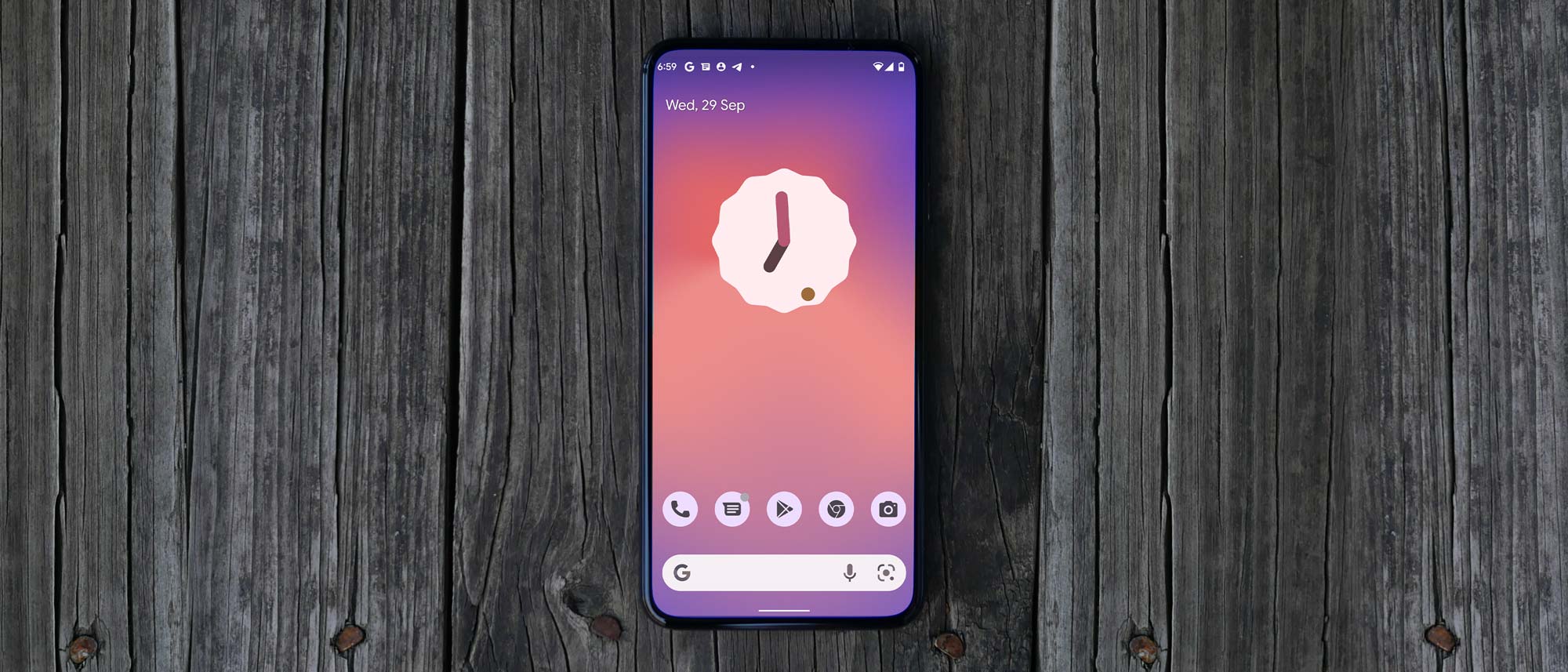
The centerpiece of Android 12 is a radical new design language called Material You. It’s the mobile OS’s biggest facelift in years and influences everything from how elements move and look to how they respond to your touch. It replaces Android’s increasingly utilitarian look with big, bold visuals, smoother animations, and colorful transitions. It’s all meant to feel more playful and allows Android to come alive.
Material You’s backbone is a personalized system that “adapts to you.” When you switch your wallpaper, it automatically draws its most dominant colors and applies them to everything from buttons, to sliders, to icon backgrounds, and more. It’s quite clever and not too overpowering. Most importantly, it doesn’t get in the way of function, and you have the option to fine-tune its effects.
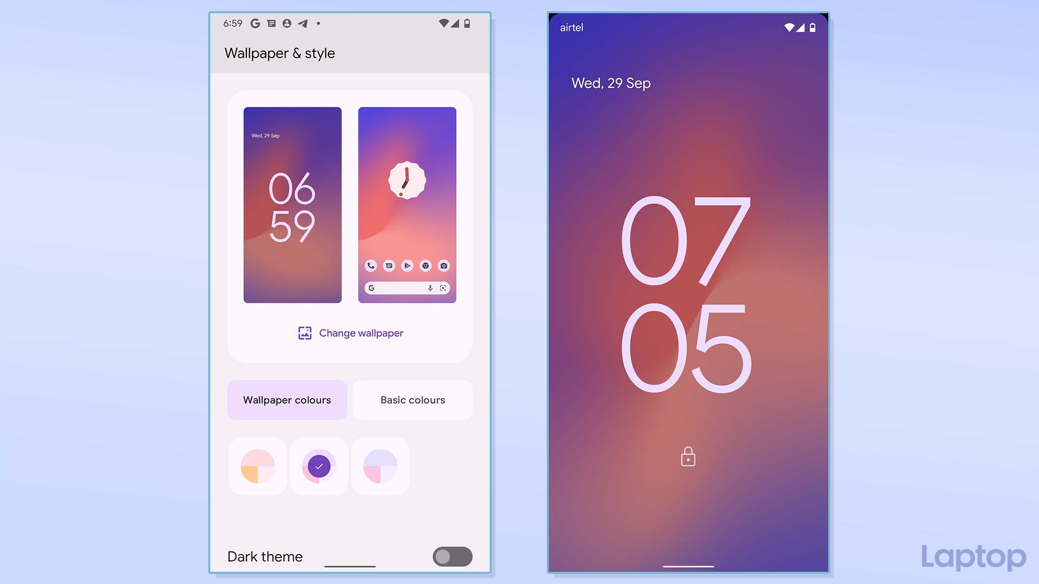
Material You is, however, not just about colors and themes. It represents a broad set of principles that spawn a friendlier and more accessible Android. For instance, on the lockscreen, a large clock now takes center stage, but once you have one or more pending notifications, it moves to the corner to make room. When you plug in your phone, a splash of light greets you. The volume and brightness sliders have been enlarged for better clarity. The list goes on.
These changes, of course, mean you’ll see less in the same screen space, but that’s a tradeoff Google is gambling on to build an approachable OS, and it has worked out. In my time with Material You, I found it a fresh, fluid take on an OS that desperately needed an overhaul. The novelty hasn’t worn off either because, as I said, it’s not simply about looks, it affects your entire experience with Android.
Widgets have received some long-overdue attention, too, and a new modern and playful system will hopefully be enough to convince developers to update their abandoned and aging designs. Google has refreshed its homescreen clocks to give an idea of what widgets on Android will soon look like (if developers get on board), and it’s promising.
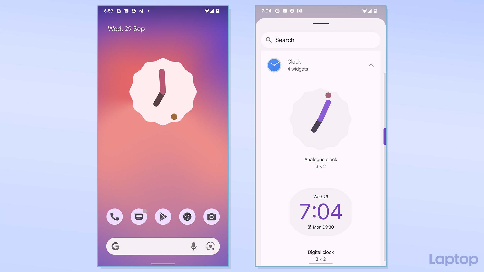
Unlike previous iterations, Material You also seems a lot more confident and consistent. The redesign has already made its way to the most remote corners of Android as well as Google’s own apps. Compared to Material Design from 2014, Material You doesn’t feel like it’s being shoehorned in and feels more natural than any facelift Google has released.
Though Google claims it has included a range of performance optimizations to ensure Material You doesn’t bog down your phone, the spike in animations has led to regular stutters and jitters on my Pixel 3. Fortunately, these are minor enough for me to say they’ll likely be patched in the final release.
A busier notification panel
Google has a habit of toying with the notification system in every update, and Android 12 is no exception. It’s been remodeled to house a bunch of frequented sections like smart home controls, digital wallets, quick settings, and notifications.
If that sounds like too much to fit, that’s because it is. The good thing is Material You’s aesthetic has enabled Google to do this in a clean, elegant manner. Since the new design is so generous with space, you will have no trouble getting used to this notification shade. Thanks to the big buttons, spacious indentations, and accented backgrounds, everything’s easy to read and hit with your fingers.
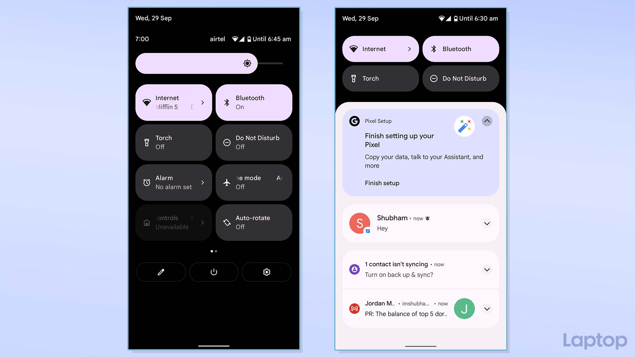
The larger quick settings tiles also let you do more without redirecting you to the settings app. Tapping the new “Internet” tile, for example, pulls up a bottom panel where you can adjust your mobile network and Wi-Fi preferences.
My only complaint is that the notification panel no longer floats. Similar to iOS, it takes up the entire screen, interrupting whatever else you’re doing at the moment. At the same time, I agree that the new system works better than stuffing home and payment controls in the power menu.
Form and function
Android 12 isn’t only a cosmetic update. Google has addressed a swathe of Android’s shortcomings with this release. The most significant of them all is a universal search.
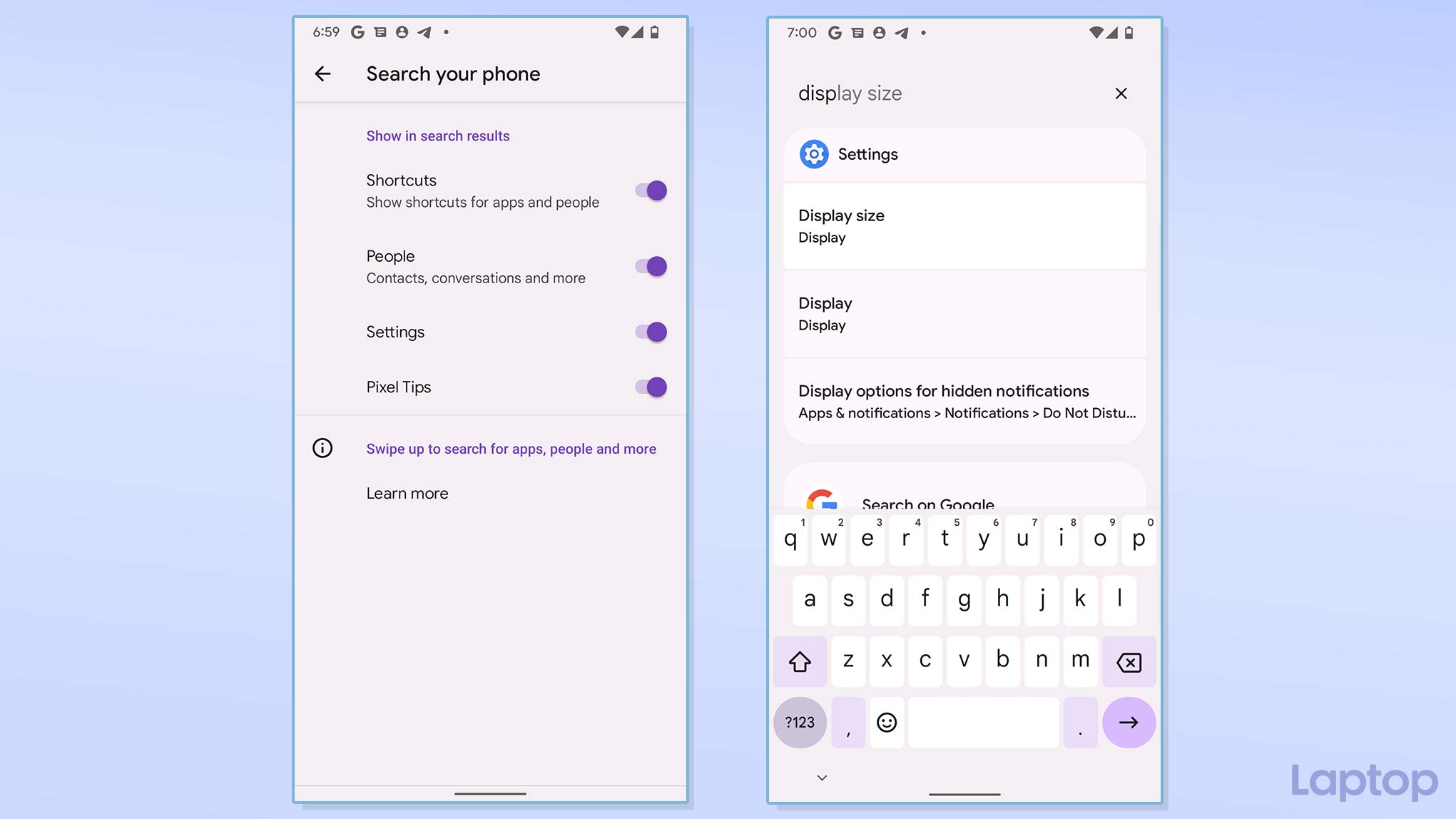
Yes, Android, at long last, has a built-in search that lets you look up contacts, settings, files, and the works from a single place. It’s placed at the top of the app drawer, but you can program it to activate with a swipe-up gesture on the homescreen.
Another key addition is a one-handed mode, which functions pretty much like iOS’s Reachability -- swipe down on the bottom edge to lower the screen’s content. Plus, you can now take scrolling screenshots by default on Android. This means if there’s a long web page you’d like to capture, you don’t have to take multiple screenshots. Android can stitch them into one image for you.
Privacy gets a boost in Android 12 too. There’s now a dashboard that offers an overview of how often apps are accessing your phone’s sensitive permissions, such as location, microphone, and what have you. On top of that, whenever an app uses your camera or microphone, Android will notify you with an indicator at the top of the screen, and a set of new Quick Settings tiles allow you to toggle off these modules instantly. On Android 12, you can also share your approximate location with apps instead of your exact whereabouts.
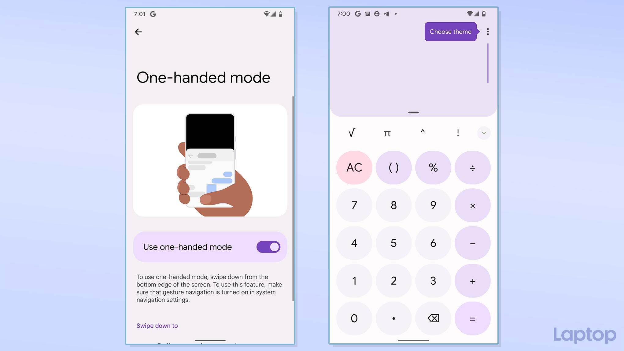
The latest features patch some of the most gaping holes in Android. And I don’t mind that most of them have been borrowed from iOS. Tools like a one-handed mode and a universal search are staples of a modern mobile OS, and it’s nice to see Google finally stepping up to add them to Android.
I’m especially pleased with Google’s implementation of search. It’s quick, responsive, and scours through a range of your phone’s sections. Soon, there’s a chance you will be able to look up content from third-party apps right from a central search bar.
Gearing up for a folding future of phones
Android 12, in addition, sets the stage for the next generation of smartphones: foldables. Reports suggest Android 12.1 will focus on folding screens with features like a desktop-like dock, better split-screen functionality, and more.
Whether you’ll receive this update and how much of it depends on your manufacturer. But one thing’s clear to me: Android 12 is meant to be a true smartphone OS rather than an experimental blueprint for others. Google has consistently faced criticism for the lack of features on its homegrown phones compared to OEM skins. Given that it’s going all in for its next flagship, the Pixel 6, the software needs to be capable of standing toe-to-toe with the competition. And Android 12 succeeds in doing that.
Android 12 has something for everyone. Whether you're a long-time user who has felt the decline in improvements for quintessential Android features like customization in recent updates or someone who's been frustrated by the lack of no-brainer, essential tools, such as universal search, it's got you covered. It also marks a new chapter for Google's mobile OS and culminates the years of work to build a mature Android into a coherent, personalized interface. Its fate, however, ultimately rests on how quickly it can convince developers to update their apps for Material You. But even until then, especially if you're on stock Android, you've plenty to look forward to and get excited for.
Shubham Agarwal is a freelance technology journalist from Ahmedabad, India. His work has previously appeared in Business Insider, Fast Company, HuffPost, and more. You can reach out to him on Twitter.
