Windows 10 vs. OS X El Capitan: Why Microsoft Wins
Microsoft says Windows 10 is fresh yet familiar, which is a nice way of saying it's a do-over for people who didn't like Windows 8. But what an impressive do-over it is.
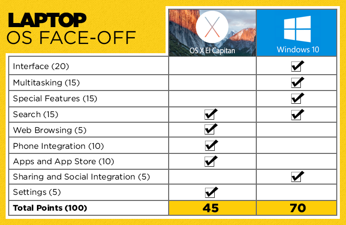
In fact, Windows 10 surpasses Apple's upcoming OS X El Capitan in some key areas, like multitasking and personal assistance. It's not that El Capitan isn't a worthy upgrade for Mac owners; it finally offers split-screen capability, along with revamped apps and performance improvements. Windows 10 offers PC users just a bit more.
After using both the near-final version of Windows 10 and the public beta of El Capitan for a few weeks, we compared the two operating systems across nine categories on a 100-point scale. (Some rounds are worth more than others.) Based on our experience, Microsoft's platform is now the one to beat. Here's why.
Editors' note: This comparison does not include performance, as we evaluated the public beta version of OS X El Capitan. We also tested a near-final version of Windows 10, which did have some bugs. Once Apple releases the final version of El Capitan in the fall, we'll be ready to evaluate any performance gains and revisit this comparison.
Interface (20 Points)
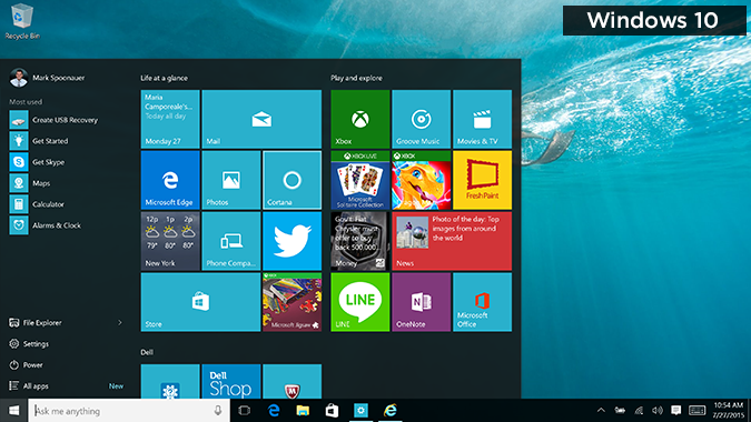
Ah, this is more like it. Windows 10 delivers a Start menu you'll actually like to use; it combines the best of Windows 8 and Windows 7. You'll see shortcuts to the File Explorer, Documents, and Settings on the left, along with your most frequently used programs, and dynamic Live Tiles on the right for apps like Mail, Calendar and Photos. You can easily pin apps to this Start menu.
It's nice that you can resize the Live Tile side of the Start menu by dragging the slider to the right, but it makes the presentation look more cluttered. I do appreciate the prominence of the Search field in Windows 10 (bottom left), as opposed to the small magnifying glass in the top-right corner of El Capitan. Another plus for Windows 10 is that all apps are now treated the same, so you can click to close Windows Store apps just as you would any desktop app. Previously, Modern-style apps had to be closed by dragging them to the bottom of the screen.
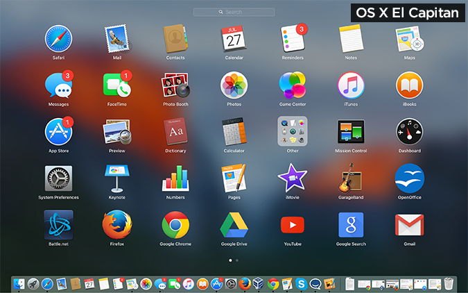
OS X's dock is the same as last time around (modern and flat), and it remains easy to use.
Get The Snapshot, our free newsletter on the future of computing
Sign up to receive The Snapshot, a free special dispatch from Laptop Mag, in your inbox.
Mission Control, which lets you see all of your open apps at once, now does a better job of positioning thumbnails so they're in a similar location to where they are on the desktop, without confusing overlaps.
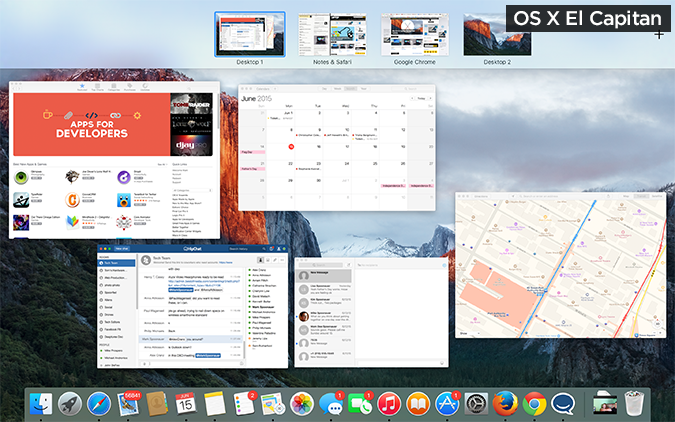
Too bad you can't close apps from the Mission Control view. In Windows 10's similar Task View, you can close apps just by clicking on an X in the top right of the thumbnail.
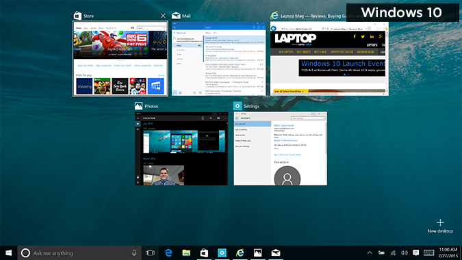
Winner: Windows 10. Though it's more cluttered than El Capitan, Microsoft's UI is more engaging, compelling and customizable.
Multitasking (15 Points)
Apple is playing catch-up with multitasking, and Microsoft is pulling ahead. The good news for Mac owners is that El Capitan brings a new Split View feature that lets you view two apps at once side by side. To enable it, you just press and hold the green full-screen button in the upper-left corner of a window. You'll then select another app from a view of thumbnails. You can resize the app windows using the slider in the middle of the screen or swap the position of the windows.
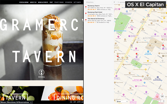
El Capitan also lets you drag windows to the top of the display to enter Mission Control and access the Spaces Bar. From there, you can drop the app onto another full-screen thumbnail to enter Split Screen mode. This seems like more work.
The Snap feature in Windows 10 is more robust, enabling users to have four apps on the screen at once. A Snap Assist view (which shows thumbnails of open apps) lets you pick the subsequent apps you want to snap. As with Windows 8, snapping the first window is easy; just drag the windows to the left or right side of your screen. That's simpler than the long press El Capitan requires.
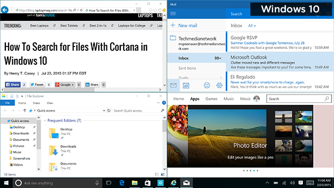
Another benefit of Windows 10 is the automatic-snap feature, a carryover from Windows 8. For instance, if you click on a link in an email, the Edge browser will load and snap to the right side of the screen. That's convenient.
Winner: Windows 10. You can snap more windows at once, and you can automatically snap two windows at once.
Special Features (15 Points)
Cortana, a voice-enabled personal assistant that does more than just answer questions, is the star of the show for Windows 10. Like Google Now, Cortana provides cards that give you a quick glance at the weather, news, sports scores, restaurant recommendations and more. Cortana gets smarter the more you use it, but you can personalize it right off the bat via the Notebook settings. Where the heck is Siri for the desktop, Apple? It remains missing in action in El Capitan.
I especially like that Windows 10 lets you use your voice to dictate both emails and reminders. The reminders can be contextual, too. For example, I asked Cortana to remind me to ask Avram about our Windows 10 coverage plans next time I email him. Sure enough, a little alert popped up while I was writing the message in the Mail app.
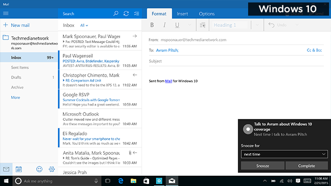
If you own a 2-in-1 device, the Continuum feature in Windows 10 will ask you whether you want to switch to tablet mode when you detach the display or flip it around. Apps that were windowed will automatically switch to full-screen mode.
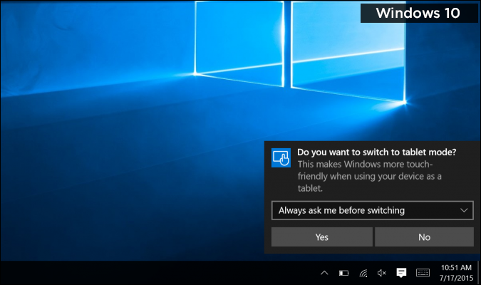
OS X doesn't support touch displays, but its Handoff feature will let you pick up where you left off in an app on your iPad.
Other special features in Windows 10 include DirectX 12 for better graphics performance, and the ability to stream Xbox One games to your PC.
Because OS X El Capitan isn't a major release for Apple but more of a fine-tuning of the features introduced in last year's Yosemite, it doesn't offer many special features other than Split View and some enhanced apps. Actually, most of the special sauce in El Capitan is under the hood. The biggest deal in this regard is the addition of Metal graphics technology, which promises to boost performance by allowing the CPU and GPU to tag-team. The result is up to 10 times faster performance, for smoother gameplay and more speed in pro-level apps. (We will wait for the final version in the fall to test these claims.)
Winner: Windows 10. Microsoft's latest OS simply offers more features for everyday users and power users alike.
Search (15 points)
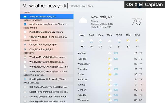
Improved Spotlight searching is a "tent pole" feature of El Capitan, as it now delivers results for additional topics, such as sports, weather, stocks, transit directions and even Web video. For instance, if you type "New York Weather," you'll see the hourly forecast followed by the 10-day forecast.
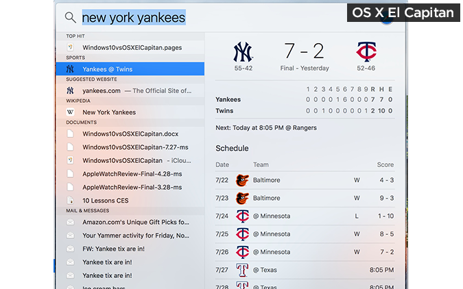
And when I searched for "New York Yankees," I saw the final score of yesterday's game, along with the team's upcoming schedule.
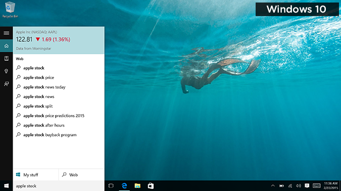
Windows 10 offers similar functionality. Cortana gave me Apple's stock info and the current weather without requiring me to launch the browser. It also showed me the Yankees score (and I didn't even have to search for that one; it just showed up as a card after I entered my preferences during setup).
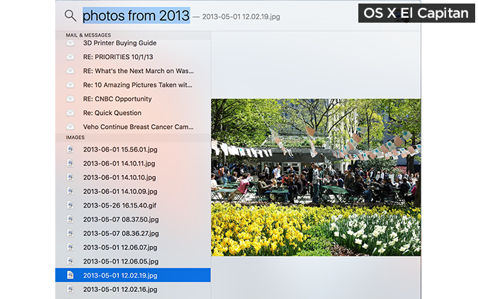
Another feature OS X and Windows 10 share is natural-language search. For instance, I could type "photos from 2013" in El Capitan and then see a list of results, although I had to scroll down to see them.
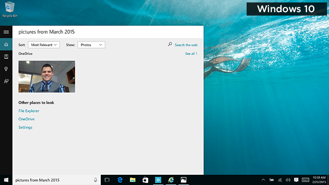
In Windows 10, I could type or say the phrase, and the Search Photos button would appear right up top.
The advantage that El Capitan has is that it starts showing and filtering results as you type. When I searched for "documents I worked on yesterday" in both operating systems, I could see the Word doc I was looking for right away in OS X, but in Windows 10, I had to click Search Documents first.
Winner: Tie. Cortana lets you search via voice or text, but El Capitan saves you time by searching for results as you type.
Web Browsing (5 points)
Sure, you could always download Chrome or Firefox, but both Apple and Microsoft are making a big deal about the improvements in their built-in browsers for El Capitan and Windows 10.
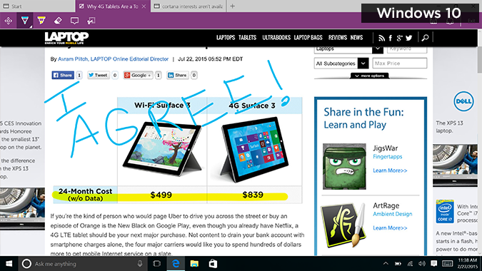
With the new Edge browser in Windows 10, Microsoft cleared away the clutter while adding clever new tools. These include a digital pen and highlighter for marking up pages (best with a pen or touch screen, but it works fine with a touchpad), as well as a way to insert typed notes on the page. You can then save the marked-up page, add it to OneNote or share it with others.
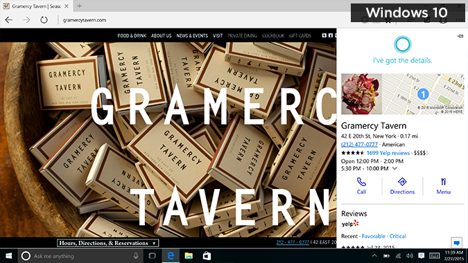
Another highlight is Cortana integration. For instance, if you're on a restaurant page, Microsoft's assistant will pop up in the address bar, alerting you that it can provide more info. This includes the address, phone number and Yelp reviews. Microsoft plans to extend this capability to other categories, but it hasn't yet announced which ones. Hotels seem like a good next step.
The address bar is smarter in Edge, too, allowing you to look up everything from weather and stocks to unit conversions without leaving the bar. However, Safari has similar smarts with its Spotlight suggestions. Plus, Safari offers a good selection of browser extensions (e.g., Pinterest, 1Password, Save to Pocket); it will take time for those to come to Edge.
Apple's browser stands out with Pinned Sites, which are essentially smaller tabs of your favorite sites that are easier to spot than regular tabs. Unlike Edge, Safari also lets you mute noisy tabs right from the address bar, which comes in handy when rogue video ads start playing.
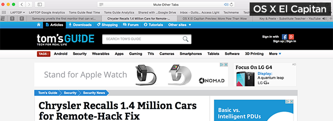
Both Edge and Safari offer an ad-free, distraction-free reading view for articles, but Edge tended to strip away too much, including some embedded tweets in a CNN story on the feud between Nicki Minaj and Taylor Swift. With Safari, you can even change the font and theme. Both browsers also provide a Reading List feature so you can save articles to read later, though I found Safari's method for adding articles easier.
Winner: OS X El Capitan. The Edge browser is better for sharing, but the Pinned Sites feature and ability to silence any tab makes Safari more compelling for everyday surfing.
Phone Integration (10 points)
One of the best reasons to get a Mac instead of a Windows PC is how seamlessly the iPhone works with OS X. Introduced in OS X Yosemite, the Continuity feature allows you to make and take calls from your phone on the desktop, as well as send and receive text messages. Windows 10 doesn't do that.
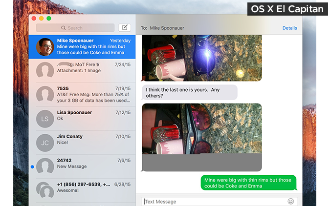
Another key feature of Continuity is Handoff, which lets you start a task on your iOS device and finish it on your Mac, whether you're composing an email, reading a Web article or working on a document. This also works in the reverse direction, so you can pick up where you left off on your iPhone or iPad. Last but not least is AirDrop; although it can be glitchy at times, it enables you to share files from your iOS device to the Mac and vice versa over Wi-Fi.
For the few Windows Phone owners out there, Windows 10 does have some tricks up its sleeve, starting with Cortana. For example, if you create a reminder on the desktop, it will follow you to your Windows Phone. Things will get a lot more interesting when Continuum for Phones debuts with Windows 10 for Mobile later this year. This smartphone OS will enable Windows Phones to deliver texts, apps and more to your PC or other big screen. Unfortunately, this perk will require new hardware.
What won't require new hardware are Universal Apps for Windows 10. Windows Phone owners can essentially download the same app once for both desktop and mobile, and it will work in both places. Examples include Twitter, Netflix and Adobe Photoshop Express. Alas, OS X and iOS remain separate, even as Apple's operating systems pick up more of the same features.
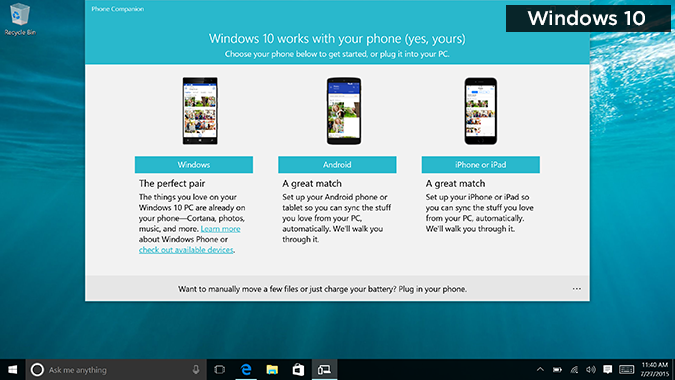
If you own an Android phone or an iPhone, the built-in Phone Companion app in Windows 10 will help you sync your files to the desktop.
Winner: OS X El Capitan. iPhones and Macs just work better together.
Built-In Apps and App Stores (10 Points)
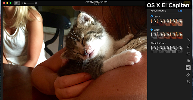
Microsoft offers a lot more apps for the desktop than OS X does, but for this face-off, I'm focusing on built-in apps and the respective app-store experiences. Microsoft is highlighting six key apps in Windows 10: Photos, Maps, Groove Music, Movies & TV, Mail, and Calendar. Photos is a particular standout because it automatically creates albums of photos you take around the same time. The Photos app also offers a robust set of editing tools and filters, although I don't like how the image shrinks when you go to edit the photo. This doesn't happen in Apple's updated Photos app.
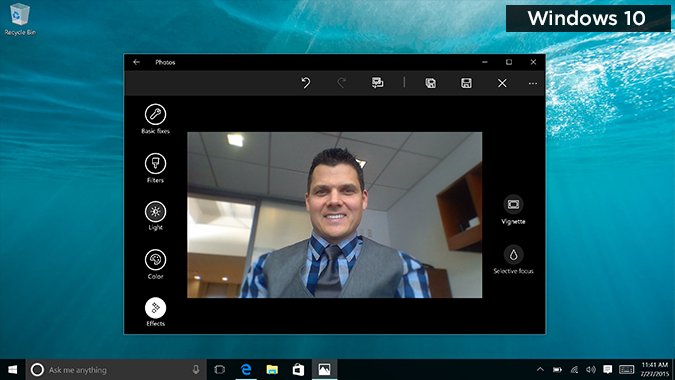
Apple Photos does a great job of automatically backing up your iPhone photos to the app via iCloud Photo Library. The interface looks a little too bare and iOS-like at first, but once you start editing, you'll see all sorts of options, including Enhance, Filters, Adjust (for light, color, etc.) and Retouch. The Smart Sliders make it easy to adjust your pics, and Apple uniquely lets you make photo books from within the app. But the best is yet to come with Extensions, which will enable shutterbugs to integrate filters and editing tools from other apps.
Both Windows 10 and OS X El Capitan have built-in Mail apps, with Microsoft focusing on adding Word-style formatting and touch gestures. I also like that you can quickly switch to the Calendar app. Mail in OS X also adds gestures, such as swiping on messages to trash them, but it pulls ahead of Windows 10 by suggesting new contacts and events based on the content of messages. If you're composing more than one message at the same time, you can juggle them in multiple tabs when you're in full-screen mode.
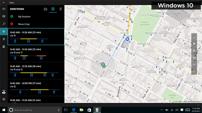
As far as the Maps apps go, Apple's Maps app looks cleaner and is easier on the eyes, thanks to the color-coded points of interest.
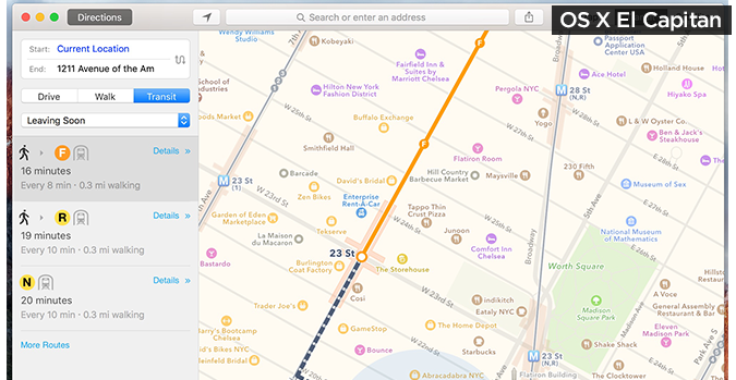
The Microsoft Maps app looks monochrome and low-res by comparison. Both apps offer transit directions, but Apple Maps includes features Windows 10 doesn't, such as place cards for stations, as well as the ability to send directions to your iPhone or Apple Watch.
It's clear that Microsoft has made the Windows Store more desktop friendly, but it's still best experienced with a touch screen. You scroll vertically to see different categories and swipe left to right to see options within them.
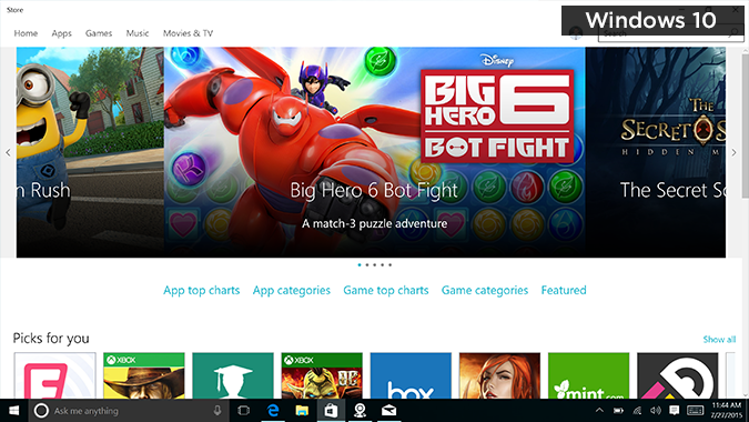
The Apple App Store fits more information into the same area, which makes it a bit easier to use.
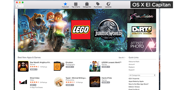
Winner: OS X El Capitan. Apple's built-in apps are better designed and, in many cases, more capable.
Sharing and Social Integration (5 points)
These two operating systems take different approaches to sharing. With OS X El Capitan, you get Twitter, Facebook and LinkedIn included, in addition to Messages and Mail. You can also share to Reminders or Notes. However, if you want more social sharing options, you can't add them.
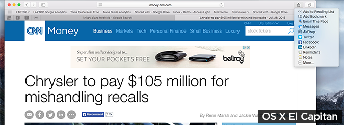
Windows 10 is more open in this regard. If a given app you download has a sharing "contract" with Windows, you can share via that app. I had no problem adding Facebook and Twitter, but there's no LinkedIn app, so I couldn't add that. However, there are lots of other third-party apps that will let you share via Windows 10, including Tweetium (an alternative Twitter client), Tubecast (YouTube) and Pouch (a Pocket client, formerly Read It Later).
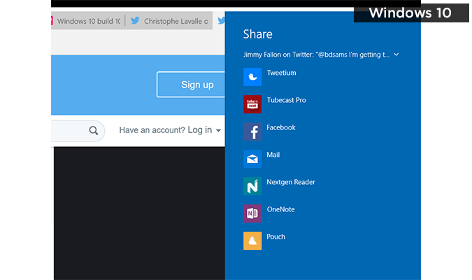
Winner: Windows 10. Even though you have to work a little bit, Microsoft's social sharing approach is more open.
Settings (5 points)
Microsoft deserves kudos for Action Center in Windows 10, which combines notifications with several quick-settings buttons on the bottom right.
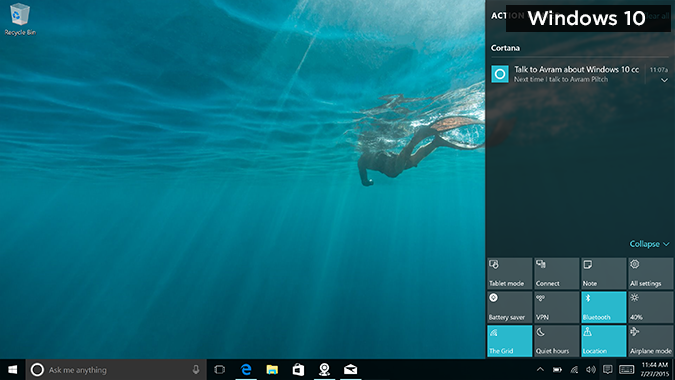
However, there are two separate Settings menus: a simpler one and the more traditional desktop menu. For example, under Power & Sleep, you'll see just two timers for turning off the screen: one for battery power and one for plugged in. If you want to create a power plan or choose what the power button does, you'll need to click Additional Power Settings.
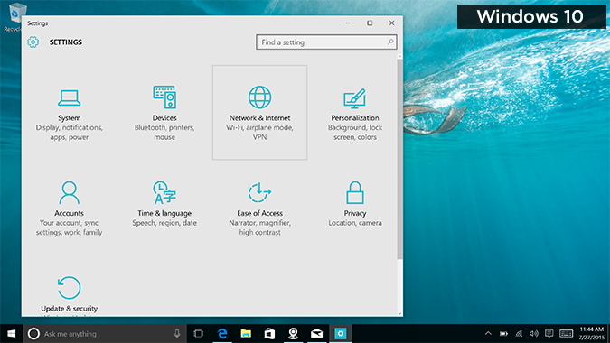
OS X El Capitan doesn't really have a Quick Settings menu, which would have been nice, given that iOS has a Control Center. I also don't like that the Notification Center is separate. However, El Capitan's settings are more streamlined because all of them are in one easy-to-understand System Preferences menu. There's no digging required, whether you want to tweak the trackpad settings or customize notifications.
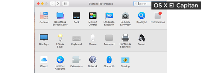
Winner: OS X El Capitan. One settings menu is better than two.
Overall Winner: Windows 10
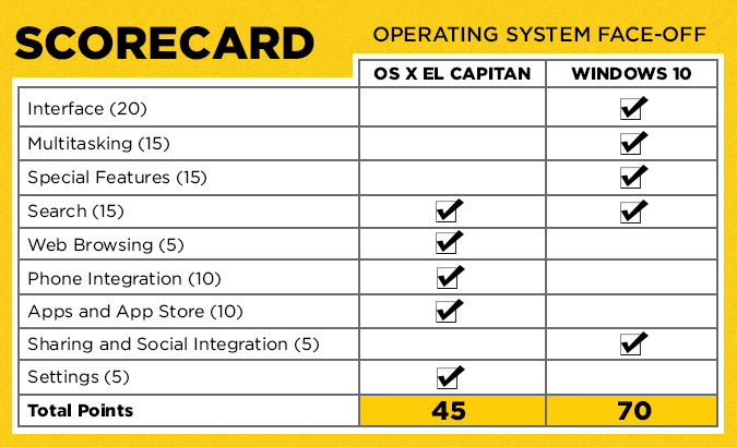
The choice between OS X El Capitan and Windows 10 isn't just about software. Some people choose MacBooks because they prefer the design, or they like that OS X is less susceptible to malware (although it's out there). On the other hand, there are plenty of great Windows laptops and 2-in-1 devices available, many with touch screens and at lower prices. Based on these new platforms and the experiences they offer, the edge in this battle goes to Windows 10.
Microsoft's new OS makes it easier to multitask compared to OS X, and it's more dynamic and personal without being overwhelming. Even if you don't like the idea of talking to your PC, Cortana is a very useful assistant, whether you want to set reminders, compose emails, search or just see who won the game without Web surfing. I also prefer Windows 10's Task View to OS X's Mission Control, because you can close apps using the former.
Where OS X El Capitan excels is in its integration with the iPhone, and its beefed-up apps (especially Mail, Safari and Notes). The enhanced Spotlight search feature is also quite good, and Safari's Pinned Tabs are convenient. Overall, though, Windows 10 is a more ambitious and satisfying release.
- Best 2-in-1s (Laptop/Tablet Hybrids)
- The Best Laptops for Every Need
- 12 Computer Security Mistakes You're Probably Making
Windows 10 Basics
- 7 Settings to Change Right Away
- Windows 10 Keyboard Shortcuts to Save You Clicks
- 5 Ways to Take Screenshots
- Change Your Password in Windows 10
- Uninstall Programs in Windows 10
- Enable or Disable Tablet Mode
- Add a User (Child or Adult)
- Change the Screen Resolution
- Sync Your Settings Across Devices
- Sync iPhone with Windows 10
- Control Windows 10 with Your Voice
- Upgrade to Windows 10 From Windows 7 or 8
- Eliminate Blue Light With Night Light
- Create a New Folder
- Get to the Desktop in Windows 10
- Add a Printer
- All Windows 10 Tips
- Set Alarms
Having issues with Windows 10? Our sister site, Tom’s Hardware, has a team of staffers standing by in the forums to answer your questions 24/7.

