Laptop Mag Verdict
Windows 8 gives Microsoft a beautiful, responsive, and touch-friendly platform for tablets, but it works better on slates than the desktop.
Pros
- +
Attractive, touch-friendly interface
- +
Tightly integrated with cloud
- +
Compelling search feature
- +
Fast boots
- +
Slick Bing apps
Cons
- -
Competing interfaces lead to confusion
- -
Few Windows 8 apps for now
- -
No Start menu
Why you can trust Laptop Mag
It's no secret that Microsoft is way behind in the tablet space. As iPads and Android devices dominate the market, slates powered by Windows 7's touch-unfriendly interface are barely a blip on the radar. With Windows 8, Steve Ballmer & Co. hope to change the company's fortunes by introducing an entirely new user interface and software ecosystem, one that lives alongside the window metaphor that the company has used for the past 25 years. Windows 8's new tile-based UI improves the user experience on tablets and laptops alike, and the new Windows Store offers some pretty compelling apps at this early stage. But has Microsoft struck the right balance between modern and traditional computing?
Cloud Connected: Windows Account and SkyDrive
Click to Enlarge
When you first install Windows 8, you are prompted to log in with or create a new Microsoft account. By using a Microsoft account, your settings and preferences are stored in the cloud and synced across any Windows 8 devices you log into. When we logged into a second PC with the same username and designated that PC as a "trusted computer" in settings, we saw that our desktop wallpaper, social media networks and SkyDrive account all appeared on the new machine at next login. Microsoft deserves a lot of credit for making all of this work seamlessly behind the scenes.
If you need to install Windows 8 without an Internet connection or you just don't want to have a Microsoft account, you can create a local account that exists only on a single system. We strongly encourage you to use a Microsoft account, though, because it provides a single login for all the different Microsoft services you use. When we made a local account and then opened the People, Music, Video and SkyDrive apps for the first time, we were asked for the same username and password for each app.
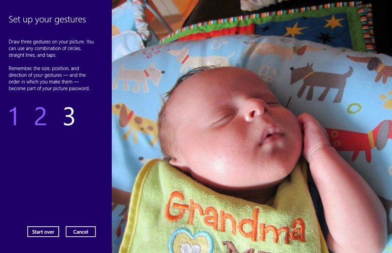
Click to EnlargeWhen setting up your account, you have a choice of three verification methods. By default, the system will take your Microsoft account password or the password you set for your local account. However, in the settings menu you can opt for a 4-digit pin or a picture password, which consists of three custom gestures you perform over a custom photo of your choice.
Of the verification methods, we found picture password best for the tablet, because it did not require us to type anything. However, doing the exact same gestures over the same spot on a photo is more of a challenge with a mouse or touchpad. For keyboard users, we recommend sticking with the password or the PIN.
Sign up to receive The Snapshot, a free special dispatch from Laptop Mag, in your inbox.
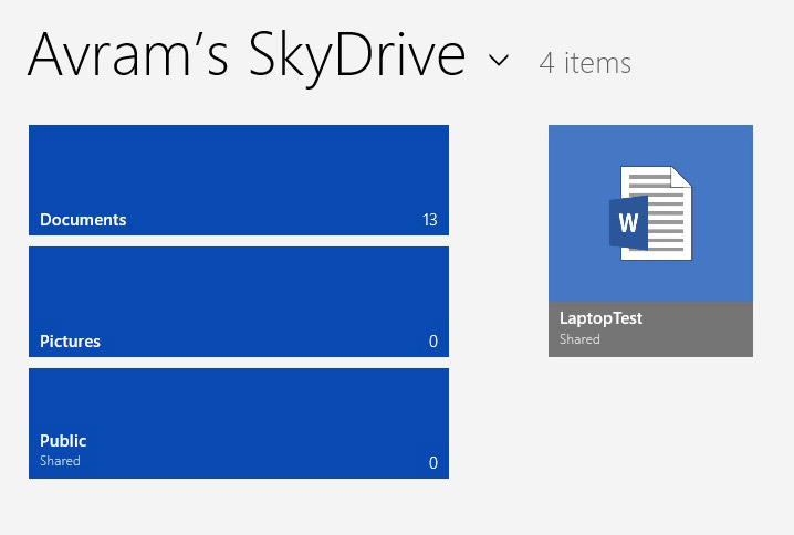
Microsoft has integrated its SkyDrive Cloud storage service into the OS, preloading a Windows 8-styled SkyDrive app and placing its tile in a prominent location on the Start screen. Whether or not they use Windows 8, SkyDrive users get 7GB of free storage with the option to buy additional capacity. The cloud service allows you to not only store files, but also to edit and create Word, Excel, PowerPoint and OneNote documents in the Cloud.
The preloaded SkyDrive App provides a simple but attractive front-end for the service. It opens to a very basic screen showing the number of Documents, Pictures and publicly shared files you have in your account. You can then click through to any of these folders to view their online contents and upload or download files from them. If you want to edit or create a document, the app sends you to Internet Explorer.
In a puzzling business decision, Microsoft does not preload its SkyDrive application for the desktop. However, users have the option to download and install SkyDrive for Windows on their own, which will allow them to save and open files directly to SkyDrive and sync folders in the file system to the cloud.
Modern UI
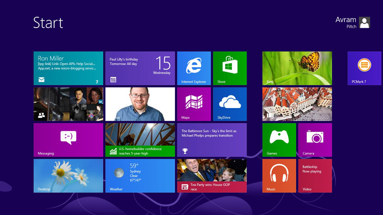
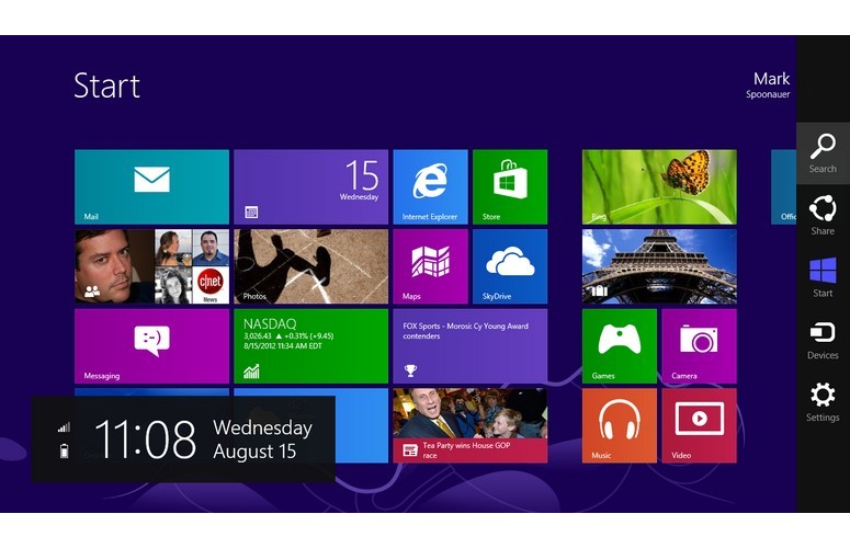
Click to EnlargeIf you're used to using Windows and haven't tried one of the various Windows 8 previews, you're in for a shock. Microsoft has added a second tile-based interface it calls the "Windows 8 user interface" on top of the traditional windowed desktop.
After you log into Windows, the first screen you see is the Start screen, which contains a series of tiles, representing your applications and shortcuts. You can scroll to your right to see more shortcuts and you can drag the tiles around from column to column and even create custom groups by dragging the tiles around.
Most of the preloaded tiles are shortcuts to a special new kind of software that will only run on Windows 8 and only within the new tile-based UI. These new applications' tiles can be turned into self-updating "live tiles" that show new content directly on the Start screen. For example, we were able to see quotes for companies we were following directly in the stock app's tile and social updates from friends in the People app's tile.
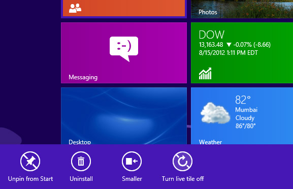
Click to EnlargeIf you find its live updates annoying, you can right click any tile to change its settings. You can also change the size of tiles to large (full column) or small (half a column). Even at their smallest size, these tiles are much easier to target with a finger than icons on the Windows desktop.
When you launch a Windows 8 style app, that program appears as full screen with no window bar, task bar or any other navigation present. You can close an app by either swiping or dragging it down from the top of the screen to the very bottom.
Click to EnlargeWithin a Windows 8 app, swiping up from the bottom of the screen or right clicking/swiping down on a touchpad brings up the app bar, a context-sensitive menu for that program. (You can also use the Windows + Z keyboard shortcut.) In Internet Explorer, for example, the app bar shows thumbnails for all your open browser tabs. On the Start screen, the app bar shows a button that will take you to an All apps menu that shows thumbnails for absolutely every program you have installed.
Desktop Enhancements, Dual Interfaces
Click to Enlarge
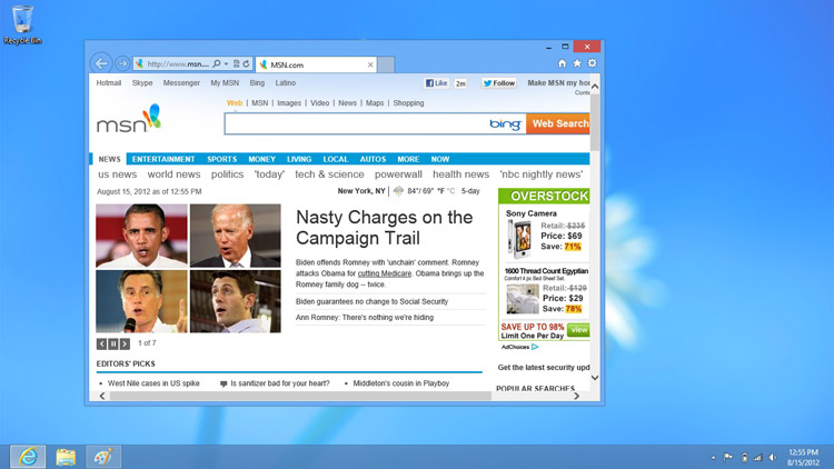
To underscore its commitment to the new apps and UI, Microsoft has made sure that the desktop environment itself is actually an app that you have to launch from the Modern UI Start screen, either by clicking its tile or the tile of a desktop app. You cannot run desktop apps in the Modern UI environment nor can you run Windows 8 apps on the desktop. There's also no way to boot directly to the desktop.
While it's impossible to avoid the Modern UI, it's also practically impossible to avoid visiting the desktop, because many of Microsoft's own built-in apps still run in a window, including Windows Paint, Notepad and Calculator. There are also actually two different control panels: a very scaled-down one for Modern UI and a full-featured Control panel that only runs on the desktop and lets you do everything you can do in Windows 7, from changing the screen resolution to partitioning disks. Adding to the confusion is that there are two different versions of Internet Explorer 10, one for desktop and one for Modern UI.
The look and feel of the desktop environment is practically identical to that of Windows 7 interface, with one big exception; there's no Start menu. Instead, Microsoft has put a shortcut to the Start screen that appears when you hover your mouse over the lower left-hand corner of the desktop.
Because of the missing Start menu, we found ourselves often forced to leave the desktop, just to launch an application from the Start screen that took us right back to the desktop again. For example, if we were using File explorer on the desktop and then wanted to launch Windows Paint, we had to go to the Start screen, find the shortcut for Paint and then click it, only to be returned back to the desktop again. While it's true that users can pin shortcuts to the taskbar, leave shortcut icons laying around on the desktop or create keyboard shortcuts, most users will likely find themselves using the Start screen a lot of the time, whether they like it or not.
In addition to the lack of a Start button, users will notice that the desktop environment's aesthetic is much blander than in Windows 7. Where Windows 7 used an Aero glass effect that made window title bars and the taskbar transparent, Windows 8's desktop is made of boring flat surfaces with no gradients and few special effects. We suspect Microsoft made this move to improve performance.
Docking and Task Switching
Click to EnlargeIn Windows 8, you can dock one Windows 8 app next to another by dragging its window to the either side of the screen, though the docked app only uses a small portion of the screen real estate and can only be docked to the left or right and cannot be resized. The docked app disappears when you're on the Start screen.
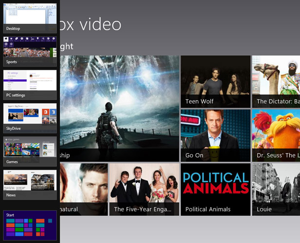
To see a list of open Windows 8 apps and choose between them, you can launch the Switcher, a slim vertical bar that appears on the left side of the screen when you swipe in from the left and then back again on a touch screen or on a touchpad which has the appropriate drivers. If you are using a mouse or a touchpad that doesn't have special Windows 8 drivers, you must move the pointer to the upper left corner of the screen, wait half a second for an icon of your most recently used app to appear and then slide the pointer down to make the Switcher appear. Hitting Windows + Tab on the keyboard also works.
Click to EnlargeThe Switcher menu shows a list of thumbnails for your currently-open Windows 8 apps, but with several caveats. First, unlike the traditional taskbar, the Switcher does not show icons for the foreground application. Second, any docked application does not appear in Switcher.
The most serious problem with Switcher, however, is that it displays the entire Desktop as just a single thumbnail, no matter how many traditional desktop applications you have open. Fortunately, if you dock the desktop "app" to the right or left of a Windows 8 app, you can see thumbnails of open desktop programs displayed vertically.
Of course, you don't need Switcher to toggle between open tasks. If you have a tablet, you can swipe rapidly from the left to browse through open Windows 8 apps. You can also use the good old fashioned Alt + Tab keyboard shortcut to switch between all open apps, even desktop programs.
Charms and Universal Search
Click to EnlargeSwiping in from the right edge on a touch screen or touchpad with special Windows 8 drivers will make the Charms menu appear on the right side of the screen, with icons for Search, Share, Home, Devices and Settings.
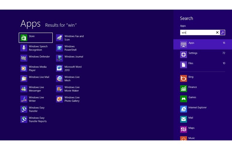
Windows 8's universal search function might be its best feature. By either clicking the search icon in the charms menu or simply typing when you're on the Start screen, you can query nearly anything on your device or on the web. The search application, which runs full screen in the Modern UI, consists of two panes. The larger left pane shows results while the right pane contains the free text search box and a long list of icons, representing different things you can search.
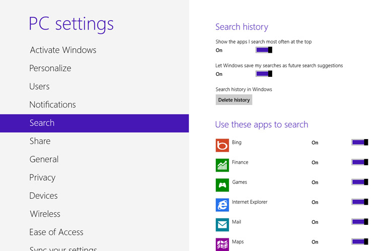
Click to EnlargeBy default, Search queries your list of installed applications, but you can select icons that allow you to search Microsoft's app store, the Web via Bing, your email, your contacts or any of a dozen other Windows 8 applications. New applications can even add themselves to the search list.
Since the Start screen doesn't list any of the preloaded desktop applications by default, we found ourselves using search to get to Windows Paint or the command prompt. Strangely, applications within the Control Panel are invisible to search. When we searched for "Computer Management" or "Mouse," both sub apps under the Control Panel, we got zero results.
Overall, we found search fast and helpful, but we wish there were some advanced settings that let it dig deeper. For example, when we performed a file search for *.docx and *.jpg, Windows only found files that were in User folders. It failed to detect a JPG we put in the root of the C drive or thousands of pictures we had on another partition. We also found it annoying that the search app always defaulted to searching our apps, even if we had searched something else the previous time we used it. We also would have appreciated the ability to search more than one thing at a time (for example, files and the Web).
Sharing
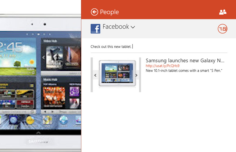
Click to EnlargeThe Share charm in Windows 8 provides a compelling, cross-application service. If you're in a Windows 8 application that enables sharing and click the Share charm, you're presented with a list of options for sending the document, URL, story, photo or some other data to your friends. The list of sharing options that appears depends on what services you have installed that have Windows 8's sharing contract enabled.
When we found a news story we liked in the USA Today app, we clicked the Share charm and were presented with the option to share it either via the Mail or the People app. When we selected Mail, the Mail app opened a new message for us and docked it to the right of the USA Today app. The blank message featured the headline, thumbnail, link and blurb of the article and allowed us to edit the subject line, to field and body before sending. When we tried to share the same article via the People app, we were presented with the option of sharing via either Facebook or Twitter; an editor appeared to let us compose a message.
Devices and Settings Charms
Click to EnlargeThe Devices charm allows you to output what you're working on to any attached printers, projectors or home theater devices such as a TV. The Home charm simply returns you to the Start screen, something you could do a number of other ways, including hitting the Windows key on your keyboard or hitting the Windows button on your tablet.
Click to EnlargeThe Settings charm provides both settings for the current app and a list of global options for your system. For example, when we clicked the Settings charm from within the Photo app, we saw a set of options, including the ability to set what services and locations it pulls the pictures from.
At the bottom of the Settings panel are buttons for controlling the sound and Wi-Fi connection, along with the Power button you need to shut down or restart the system. The link to the Modern UI's settings menu also appears here.
Tablet Experience
Though Windows 8 feels somewhat clunky when used with a mouse, the Modern UI really shines on a tablet. When we installed Windows 8 on a Samsung Series 7 slate, we were able to navigate around the interface with a number of sleek and intuitive gestures that aren't available with mouse or keyboard. (Better laptop touchpads should mirror the touch-screen experience.)
We enjoyed flipping through open apps by swiping inward from the left edge, bringing up the app bar by swiping up from the bottom or down from the top and launching the Charms menu by swiping in from the right. We found the gesture for launching the Switcher was a bit more difficult to execute, as it involves two motions: swiping in from the left a little bit and then back to the right. Swiping down to close apps was sometimes frustrating, too, requiring multiple swipes. Hopefully, final hardware built to run Microsoft's OS will perform more smoothly.
Like other tablet operating systems, Windows 8 works in both portrait and landscape modes. However, it's clear that the apps and UI are designed for landscape viewing because most scroll horizontally.
News apps like Bing Sports looked particularly attractive on our tablet, because they format their articles into scrollable columns. We enjoyed reading articles about baseball and then swiping down to choose from other sports.
The virtual keyboard has large, well-spaced dark gray keys that were very easy to target with our fingers. It doesn't support tracing between keys like Swype does on the Android platform, but the keys do make a pleasant typing sound when you hit them. We do wish that Microsoft included a number row above the letters instead of forcing you into a secondary menu.
When we tried to use the desktop on the tablet, we ran into many of the same problems we've experienced on Windows 7 slates. Icons were much smaller and harder to target than tiles on the Start screen, and tapping widgets like the close button or menu items in applications was a bit of a challenge because our fingers were often thicker than the object we wanted to touch. When we wanted to copy photos to our tablet from a USB key, we had to use file explorer and drag the tiny file icon from the window pane over to the tiny Pictures library folder. This action proved difficult and resulted in several unwanted taps.
Any time tablet users need to browse the file system with Explorer, change a setting in the control panel or run a desktop app, they'll be back on the desktop, dealing with these challenges. However, we were able to effectively drag windows around with some practice, and we found the desktop virtual keyboard as accurate as its Modern UI counterpart.
New Desktop Features
Click to Enlarge
Though Microsoft appears to have focused more effort on the new Modern UI, it has added a handful of new features that only work in desktop mode. The most useful of these is File History, which creates a version of history of any files stored in your libraries or on your desktop, along with contacts and favorites and stores all those files on external drive.
To test File History, we went into Control Panel and configured a USB flash drive to hold our file history and set Windows to scan our files for changes every 10 minutes (1 hour is default). We then took a photo of a baby from our Pictures library and drew a goatee on it. After 15 minutes, we went back into the File History application in Control Panel and selected restore, where we were able to find and replace the original, unaltered version of the photo.
Click to Enlarge
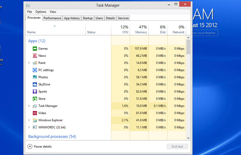
A more detailed task manager, which shows a more colorful list of apps, combines all CPU usage into one chart rather than one for each core. We particularly appreciated the tab that lists startup apps and how much impact each has on boot time.. We particularly like the App history tab, which shows how much CPU time and bandwidth each of your apps has used during that session.
The file explorer has also been revamped a bit so that it now uses ribbon-style menus like those we've seen in Microsoft Office, Windows Paint and many other Microsoft programs.
If you have a second screen attached to your computer, you'll appreciate Windows 8's improved multimonitor support, which now places the taskbar on all of your screens. Strangely, the Modern UI only appears on one of your two screens, the primary one by default. The other screen always shows the desktop, even at startup.
Touchpad Gestures and Mouse Hovers
If you're using a keyboard and mouse rather than a touch screen, Microsoft provides other ways to change apps and pull up menus.
With a mouse, you must hover the pointer briefly over different corners of the screen, a process we learned to live with, but found less-than-optimal because of the slight delay involved. To pull up the switcher menu, you must hover in the upper left corner, wait for an icon to appear in the corner and then pull the pointer down. To pull up the Charms menu, you hover in the upper right corner. You can also get the Start screen by hovering in the lower left corner, though hitting the Windows key works better. Right clicking brings up the app bar.
If you're using a touchpad and if that touchpad has appropriate Windows 8 drivers, you can use multitouch gestures to bring out these menus. With gesture support, you can get to the Switcher by swiping in from the left. Pull up the app bar by swiping down from the top or open the Charms menu by swiping in from the right. Unfortunately, the testbeds we used did not have special Windows 8 touchpad drivers that would enable this functionality.
Apps and Windows Store
Click to Enlarge
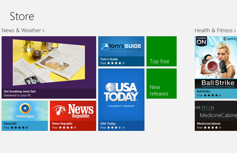
With the introduction of its new operating system, Microsoft is launching its own Windows Store to help users find both new modern-style Windows 8 apps, along with a few select desktop apps. The Windows Store appears as its own Windows 8 app with a tile on the Start screen.
The store divides apps into several categories, including games, social, entertainment, photo, music, news, travel and productivity. As you scroll horizontally through the categories, each one has attractive tiles representing highlighted apps and most have tiles for top free apps and new releases.
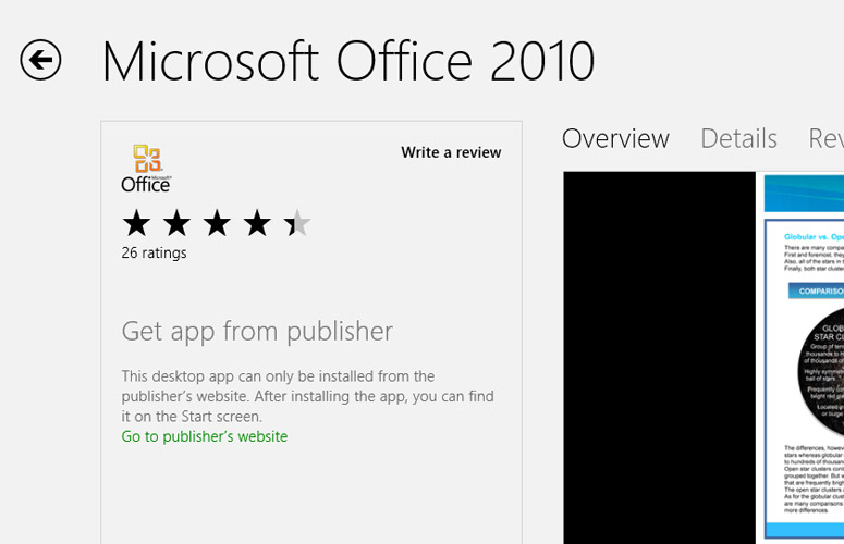
Click to EnlargeUnfortunately, the selection of apps is pretty small at this stage. During our testing, we found that there were only 467 apps in the store. A dozen of these were desktop apps that cannot be downloaded or purchased directly through the store; these included Microsoft Office, Adobe Lightroom, Visual studio, Adobe Reader and WinZip. Some of the 455 Windows 8 apps were written in non-English languages such as Chinese, Spanish or Russian. Of the English language apps, most were lightweight news apps, casual games or gateways to cloud services like ASUS WebStorage or Splashtop.
We didn't find any of the types of core applications we typically download on Android or iOS tablets. We didn't see any alternative browsers, Google apps, official apps from the major social networks, word processors, spreadsheets or file managers. The games we saw were all casual games. There were no video editors and only one real photo editor, the appropriately named FotoEditor. We expect the selection of apps to improve dramatically over time.
Our favorite applications thus far were from news services. Both USA Today and Tom's Hardware provided attractive front ends for their content, complete with large photos. We also enjoyed playing around with Fresh Paint, a drawing app that turns your screen into a canvas and lets you pick the brushes. Musixmatch is another cool app, which provides searchable song lyrics and links to music videos for thousands of songs, including some rare ones.
Internet Explorer
Click to EnlargeWith Windows 8, Microsoft has upgraded the preloaded Internet Explorer browser to version 10, providing separate versions for both the Modern UI and desktop environments. While the desktop version looks identical to IE 9, the Modern UI version takes up the full screen, with just an address bar at the bottom. To see a list of open tabs or add a new tab, you'll need to open the app bar.
On touch-screen devices, the Modern UI version of IE allows you to swipe left and right to go back and forward through your browser history. The browser also allows Web developers to build touch gesture support into their online applications.
Where IE 9 introduced the concept of pinning sites to the taskbar, IE 10 kicks it up a notch by allowing users to pin sites to the Start screen and Web developers to provide updates directly to those tiles, even when you don't have the sites open.
In addition to its new features, IE 10 also provides better performance than its predecessor. When we ran the Peacekeeper browser benchmark on a Core i5 test system, IE 10 returned a score of 2,754, which was significantly better than IE 9's mark of 2,290. However, that's still behind Chrome 21's score of 4,352.
IE 10 also took just 104.45 milliseconds to complete the Sunspider JavaScript test, which is faster than both IE 9 (149.7 ms) and Chrome 21 (149.2 ms). IE 10 was able to run Microsoft's fishbowl animation with 1,000 fish at a rate of 46 frames per second, which beats the tar out of IE 9's mark of 29 fps and Chrome 21's rate of 38 fps.
People App
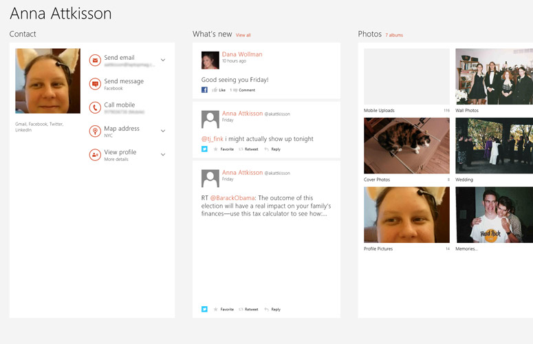
One of Microsoft's most important preloaded programs is its People app, which combines contact management with social media updates to help you keep tabs on all your friends.
Setting up the app, which currently supports Facebook, Twitter, LinkedIn, Microsoft and Gmail accounts (but not Google+ or Pinterest), was a snap as we were asked to provide credentials for each account and then created a long horizontally-scrollable list of contacts with thumbnails. Oddly, the contacts are sorted by first name, not last name first.
Click to EnlargeThe People app was particularly good at merging contacts that appeared in multiple accounts and combining all their information into a single profile. When we clicked on a contact's name, we were able to see that person's phone number, email address, map location and their latest updates. However, the app sometimes failed to link Twitter handles from the other accounts, though we had the option to form such links manually.
Click to Enlarge
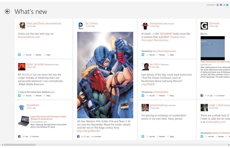
Our biggest complaint about the People app is that, when you launch it, it simply drops you into a static alphabetical list of your contacts, rather than a list of updates. If you want to see a feed of all your updates across social networks, you need to click the What's New or Unread Notifications links that appear on the contacts screen. Considering that the People app's live tile shows photos from your friends' updates, it's disappointing that when you click that tile, you don't actually see the updates it was promoting.
Mail and Messaging Apps
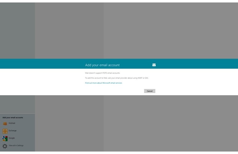
Click to EnlargeSetting up the Windows 8 mail app can be a pain, depending on what accounts you have. When we first clicked on the Mail icon, it asked us whether the email address we used as a login was an Exchange, IMAP or POP account. When we clicked POP, instead of giving us a settings page, the app rudely informed us that "Mail doesn't support POP3 email accounts," and advised us to call our email provider and ask for a different kind of account. Considering that many ISPs give you POP accounts by default and Microsoft's previous email clients all supported this popular standard, the lack of POP is a pretty big oversight.
Click to EnlargeAfter hitting the Cancel button, we were given the option of adding Gmail, Outlook.com, Hotmail or IMAP accounts, but no longer saw an option to add Exchange. Even when we tried setting Exchange on first login, we were not given all the advanced settings, like the ability to toggle SSL, and we were not able to set up our account.
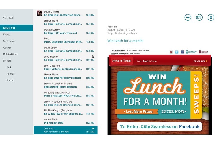
However, the Mail app did not use Windows 8's notification system to inform us of incoming messages, even though we had it set to do so. If we were on the Start screen when a new message arrived, the live tile for the Mail app would show the sender and subject line of that message. But when we clicked the live tile, we were not taken directly to the new message, but instead returned to whatever we were doing in the mail app last or, if the app was not running already, we were sent to the inbox list.
Microsoft's instant messaging app seemed to work reasonably well, but only has support for Facebook and Microsoft Messenger. Other popular messaging protocols like Google Talk and AOL Instant Messenger weren't available at press time.
Bing Apps
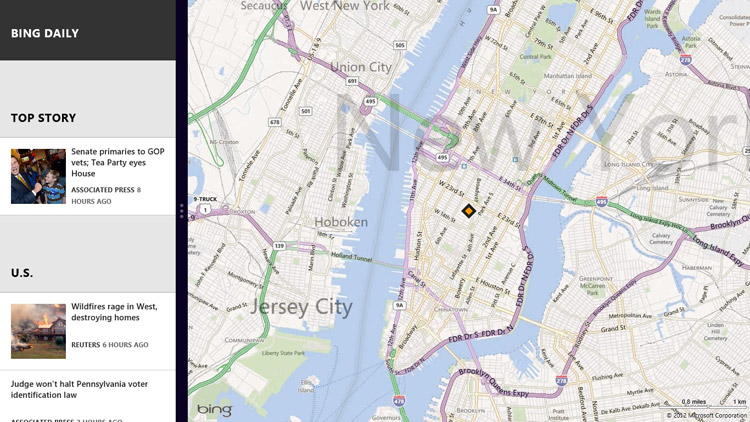
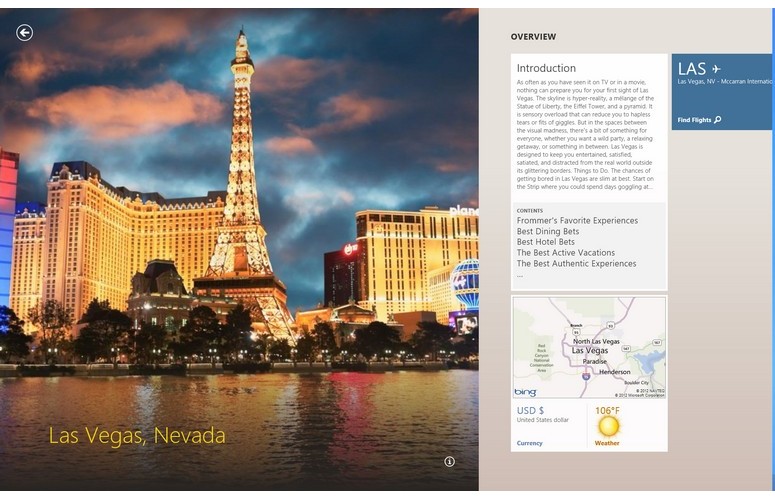
Click to EnlargeMicrosoft includes a set of Bing apps in Windows 8 that provide an attractive interface for its services. Bing Weather offers a graphically rich set of forecasts. Bing Travel lets you learn more about a destination or plan your trip. Bing Maps provides directions and an aerial view of points of interest, but no street view.
We liked the rich reading experience provided by Bing Sports and Bing News, both of which feature a series of news stories from major outlets that are formatted with large, rich images and horizontal columns of text that reminded us of a newspaper.
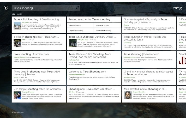
Click to EnlargeUnfortunately, when it comes to web search, the main Bing app provides a confusing and disjointed experience. We liked the attractive, graphical wallpaper on Bing and the list of trending topics it presents at the bottom of the screen. However, when you get a list of results and then click on them, the app sends you to Internet Explorer where the pages load. After we opened a result and wanted to return to the results page, we realized that hitting the back button in IE wouldn't work, because the results remain in the Bing app. We had to actually switch apps just to go to the results.
Microsoft recommends that users dock the Bing app next to Internet explorer, but we don't think you should need to have two apps open to conduct a simple web search.
Video, Music, and Xbox Games Stores
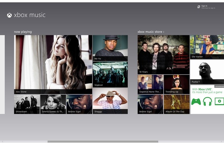
Click to EnlargeMicrosoft also includes Windows 8 apps for its Xbox Music and Xbox video stores. We found both media stores attractive and highly functional and appreciated the ability attractive tiles of popular albums and movies. We particularly liked the movie trailer screens which show a trailer in the left pane, while displaying a description in the right pane.
Microsoft's Xbox Games app lists available games both for Windows 8 and for Xbox, while showing which games you've played recently. You can also see your avatar if you've set one up along with achievements.
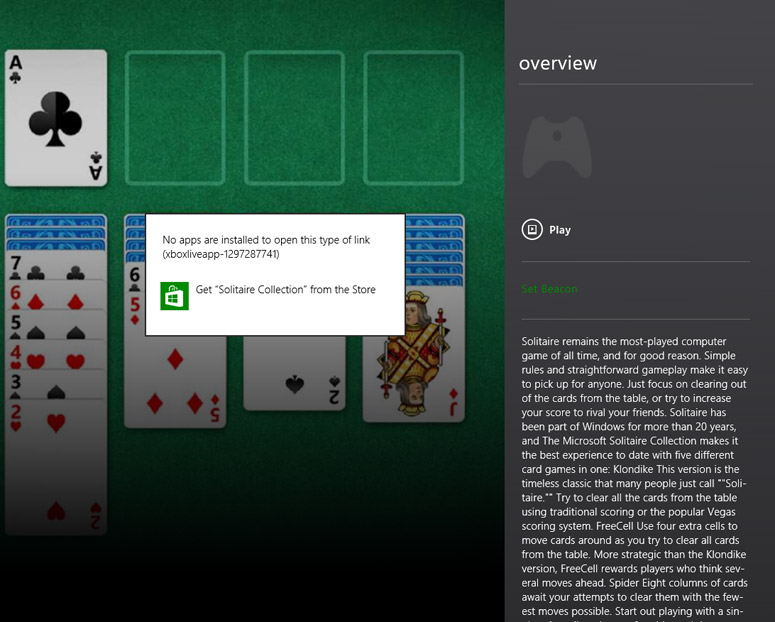
Click to EnlargeHowever, we found it annoying that you can't download any of the advertised games directly from this app. When we clicked on Solitaire Collection, for example, the Play button was grayed out but we saw a description of it. We then clicked on the Explore game icon to view more information and there the Play button was available. However, when we clicked it, we got an error message that told us to go back to the Store app to purchase it. Why not just let users download titles directly from this app?
Performance
With a new code base, WIndows 8 promises improved performance and stability. Though the UI felt smooth, we didn't see a dramatic improvement in real-world benchmarks--with one exception.
A ThinkPad T430 testbed completed the LAPTOP File Transfer test, in which we copy 4.97GB of mixed media files, in 2 minutes and 38 seconds in Windows 8, about 40 seconds longer than it took in Windows 7 (1:57). In Windows 8, it took the testbed, 4 minutes and 23 seconds to complete the LAPTOP Spreadsheet macro test, in which we match 20,000 names with their addresses. That time is 13 seconds faster than the same system returned on Windows 7.
Boot time is the one area where we saw significant and noticeable improvement. Even with the T430's slow-moving hard drive, Windows 8 booted in a mere 25 seconds as compared to 49 seconds for Windows 7. On Geekbench, a synthetic benchmark that measures overall performance, the system scored 8,521 on Windows 8, much higher than its mark of 7,117 in Windows 7.
Thoughout our use of WIndows 8 the system seemed fairly stable, as we did not get any blue screens or application crashes. However, when we tried to run the benchmark PCMark7 under Windows 8, it locked the ThinkPad up so badly that we had to pull the battery out and restart the computer.
Installation and Upgrade Process
Gone are the days of the hour-long install. After booting off of a USB key, we were able to do a clean install of Windows 8 in a mere 7 minutes on a Core i5 system with an SSD. On a hard drive-based notebook, the process took a little bit longer. During that time, we were asked to make a minimum number of choices.
After, booting up, selecting a drive to install on, and entering a product key, Windows proceeded to copy and expand some files and then rebooted. After reboot, we were first asked to pick a background color for the Start screen. Then, we had the choice of either creating / entering a Microsoft account for syncing our data and settings with the cloud or of creating a local account that does not connect to the cloud.
After selecting the account, we had to configure our wireless connection, a step which disconnected users can skip until later. Finally, we had the choice of either using express settings or configuring a few settings for privacy and windows updates. After some more disk activity, Windows 8 booted up for the first time and we were presented with the Start screen.
Click to EnlargePerforming an upgrade installation from within Windows 7 was also fairly seemless, though we ran into one small issue in our tests. When we performed the upgrade on a Dell Inspiron 14z, the Windows 8 installer informed us that two of our drivers -- Intel's USB 3.0 driver and Atheros's Bluetooth driver would need to be uninstalled before we could continue. After we uninstalled both and rebooted, we were unable to read off of the USB key with the Windows 8 installer on it.
However, once we restored the driver and copied the install files to the hard drive rather than running them off the flash drive, the installation proceeded smoothly. Strangely, only six of our desktop apps were given tiles on the Start screen and some of these were built-in apps like Sticky Notes.
Versions and Upgrade Pricing
Windows 8 is available in two main versions: Windows 8 and Windows 8 Pro. As with Windows 7, the "pro" version of the operating system has a handful of additional business and enthusiast-friendly features like encryption, virtualization and PC management capabilities. Microsoft has posted a feature comparison chart on its Building Windows blog.
At launch on October 26th, Microsoft will offer all Windows 7, Vista and XP users the opportunity to purchase a Windows Pro upgrade for just $39.99. Users who bought a qualifying Windows 7 PC earlier this year will be able to purchase an upgrade to Windows 8 for $14.99.
Verdict
Windows 8 represents a radical change for Microsoft, not just with its user interface, but in terms of the entire ecosystem of software and services. The new Modern style UI and Windows 8 apps provide an attractive, touch-friendly experience for tablet users. There are also some new features every Windows 8 user will love, regardless of whether they're using a slate, laptop or desktop. The near-magical Windows ID syncing and SkyDrive integration demonstrate that Microsoft gets the cloud. We also appreciate how easy it is to share items virtually anywhere from within the OS.
On the other hand, desktop users will be annoyed by the lack of a Start menu and the need to constantly switch back and forth between windowed and full-screen environments. We're also not a fan of the lag introduced by the hover gestures for the Task Switcher and Charms menus when using a mouse. This is the first version of Windows we can remember where Microsoft is forcing users into a new interface without giving them the choice to stick with the experience to which they're accustomed.
If you're a Windows 7 user and you don't have a touch-screen device, you can safely skip this upgrade for now and wait to see how this new ecosystem of apps matures. However, if you're buying a new laptop or tablet, Windows 8 provides a compelling experience that's worth the learning curve.
Microsoft Windows 8 Specs
| Company Website | www.microsoft.com |
| Disk Space | 16GB (32-bit version), 20GB (64-bit version) |
| Platforms | Windows |
| Required Processor | 1-GHz or Higher |
| Required RAM | 1GB (32-bit version), 2GB (64-bit version) |
| Software Type | Operating Systems |

