Laptop Mag Verdict
The first Android 3.0 tablet features innovative software and 4G capability, but buggy performance and a limited number of compelling apps at launch hold this slate back.
Pros
- +
Innovative interface
- +
Interactive widgets
- +
Strong core Google apps
- +
4G support coming soon
- +
Google video chat works well
- +
Loud speakers
Cons
- -
Narrow viewing angles
- -
Buggy software
- -
Not a lot of compelling tablet-friendly apps
- -
Power button on back
- -
Fairly expensive
Why you can trust Laptop Mag
It's not an oversized phone with tablet stuff tacked on. The Motorola Xoom is the first slate that's powered by Android 3.0, an OS built from the ground up with larger screens in mind. We're talking a completely fresh interface with interactive widgets, a revamped notification system, and lots of 3D eye candy. The hardware is pretty powerful, too, including Nvidia's dual-core Tegra processor and front and back cameras. The Xoom costs a pretty steep $599 with a two-year contract ($799 without) with 3G connectivity, but you'll be able to upgrade to 4G for free by the second quarter of this year. Flash support is also on the way. So how well does the Xoom work, and what about the apps? We have the answers to those questions and more in our in-depth review.
Design
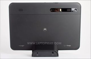
The Xoom is streamlined and sturdy but not exactly elegant. Google designed Android 3.0 so that tablet makers wouldn't need to include the traditional buttons found on phones. There's no Home, Back, Search, or Menu hard keys; it's all software. However, we think Motorola tried to make the Xoom look a bit too clean. The power button is on the back of the device. This key isn't that difficult to find by feel, but its placement will still confuse and turn off many users.
Despite being smaller than the iPad (9.8 x 6.6 x 0.5 inches vs 9.6 x 7.5 x 0.5 inches), the Xoom actually weighs more (1.6 vs 1.5 pounds). This extra tenth of a pound doesn't sound like much, but we noticed it when holding the device for extended periods of time. Although the iPad's aluminum back looks and feels classier, we like the soft-touch finish on the Xoom's rear. In addition to the power button, the Xoom's back also houses two powerful stereo speakers and a 5-megapixel camera accompanied by a dual-LED flash.
When the tablet is held in landscape mode, the two volume buttons are on the left side. A headphone jack and SIM Card slot line the top, and on the bottom you'll find a tiny proprietary power jack, a microUSB port (for syncing with a PC) and a mini HDMI port. We wish the Xoom could charge over USB.
Click to enlarge

Click to enlarge
Display and Audio
As you might imagine, the real focus of attention is the Xoom's 10.1-inch display (1280 x 800 pixels). We could easily tell that this panel was sharper than the iPad's 9.7-inch screen (1024 x 768) when we loaded NYTimes.com. The Xoom displayed several more headlines without having to scroll down. Both screens are about as bright, but the Xoom's screen had a cooler, bluish cast compared to the iPad's warmer, yellowish tones. However, the IPS screen on the iPad has wider viewing angles, and we noticed that the Xoom's panel picked up fingerprints faster.

Click to enlarge
Android 3.0 Software and Interface
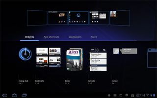
While Android 3.0 borrows some ingredients from its phone-based cousins, it's presented in a completely different way, and we're not just talking about dual-pane apps. Press and hold on any one of the five home screens and you'll see a nifty animation that zooms out to a view of all of them, allowing users to drag app shortcuts and new interactive widgets to whichever screen they want. Some of our favorite widgets include Gmail (which lets you scroll through your inbox without opening the app) and YouTube (for flipping through the most popular videos using a 3D UI).
Click to enlarge
The top left of the home screen houses a search bar and a shortcut to activate Voice Actions. We appreciated the dual-pane view within search, which shows your query on the left and the results on the right. The top right of the home screen has an Apps button, as well as a + button for adding widgets and apps to the home screens (though, again, you can do this just by pressing and holding the desktop).
The System Bar along the bottom of the screen always displays the Home, Back, and Recent Apps buttons on the left side. When you press the Recent Apps button, you'll see live thumbnails of the last five apps you had open (six if you're holding the device in portrait mode). With Android phones, you have to press and hold the home button to see simple icons, so this tool makes it a cinch to switch between apps. We just wish you could close apps from this menu.
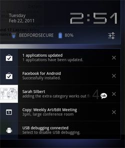
Click to enlargeForget about dragging down from the top of the screen to see notifications as you do on Android phones. The right side of the System Bar houses the revamped notification area, which displays everything from e-mail alerts and music controls (if you're playing a track) to Twitter mentions and incoming instant messages. Each notification gets its own icon going from left to right, but you can see them all at once if you just touch the displayed time; in this view you'll see all your notifications stacked vertically--and you can easily dismiss each one by touching the X next to it.
It could be more subtle, but we like that, when you expand the notification view, whatever app you're in grays out. From the notification menu, you can also tweak or activate various settings (such as airplane mode and brightness) without opening the Settings app. Strangely, the Wi-Fi option in this view doesn't have an On/Off toggle like the others.
Where's the universal Menu button? Google wisely eradicated this option in favor of an Action Bar along the top right of the screen. This Action Bar displays various options when you're within an app. For example, in Gmail, you'll see buttons for Compose, Refresh, and Search and a separate button for accessing Settings.
The big takeaway is that Android 3.0 makes the most of a tablet's larger canvas while making customization easier and more fun for users. However, navigating Honeycomb requires a little more thought and effort than iOS, and it required a learning curve for Android phone owners.
Keyboard and Cut and Paste
We found the Xoom's keyboard to be accurate and fast, and because of this tablet's narrower body you don't have to reach as far across the screen when typing in portrait mode. We'd like to see Google add a number row like HP is doing with its TouchPad, but overall the keyboard works just fine.

Click to enlarge
Android 3.0 benefits from a solid cut and paste experience both in Gmail and in the browser. You just press and hold to select text and then drag the little markers. On the top of the screen in the Action Bar, you'll see various options, including Copy, Select All, and Share. We just wish this option extended to third-party apps.
Web Browsing

Click to enlargeWhat a difference tabs make. While you can find browsers on the iPad that support tabs (such as Atomic), it's nice that Google baked this functionality into its browser for Android 3.0. Just press the + button above the address bar to open a new site without leaving the one you're on. The bookmarks menu also makes surfing better by showing 15 of your favorite sites at once, and you can synchronize bookmarks with Google Chrome. Those who want to cover their tracks can open a tab in Incognito mode, which won't appear in your history and won't leave cookies. Unfortunately, the Xoom doesn't support Flash right now (which is surprising), but Flash Player 10.2 will become available for this tablet in the coming weeks.
Over Verizon Wireless' 3G network, sites opened fairly quickly. The full versions of CNN.com and Yahoo loaded in 17 seconds and 8 seconds, respectively. However, the mobile sites loaded first, and we had to scroll down to the bottom of the page to switch to the more traditional desktop view--and there isn't a browser setting to force sites to load in desktop mode, either. The full NYTimes.com site loaded in a decent 18 seconds, and the full site loaded the first time. It's obvious that Google needs to work with sites to make sure they're detecting Android 3.0 tablets properly.
In fact, when you load Yahoo on the iPad, a special tablet version loads automatically; the 3G version of Apple's tablet did so in 10 seconds. In the same location, however, the 3G iPad took a longer 40 seconds to load the full versions of CNN and NYTimes.com over AT&T's network. Verizon's Xoom will get a major speed boost come the second quarter, when the carrier will let owners upgrade this tablet to its blazing 4G LTE network. That means speeds will increase from the 600 Kbps to 1.5 Mbps downloads and 800 to 900 Kbps uploads we saw to 5 to 12 Mbps down and 2 to 5 Mbps up. This will require a firmware upgrade--and (we're presuming) a visit to a Verizon Wireless store to pick up a SIM card.
If you want to use the Xoom as a mobile hotspot, this feature is included in the data plan. While it's easy to set up, we'd prefer a dedicated app to having to dig into the settings.
The bad news is that Android 3.0 still segregates Gmail and E-mail (for other accounts) as separate apps. That means you don't get a unified inbox. The good news is that each app has a similar look and feel, with a dual-pane view that displays folders on the left and new messages on the right using black text on a white background. In both apps you'll notice another new Android 3.0 feature--dragging and dropping. You can easily move a message into a specific folder just by moving it with your finger. However, we wish you could create new labels or folders on the Xoom; you'll have to go to the desktop for that. We had no problem opening attachments, from Word docs to PDFs, using the Quickoffice app.

Click to enlarge
Google Talk and Video Chat
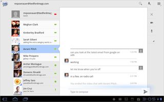
It's about time Google had an answer to FaceTime. Right within the redesigned Google Talk app, which displays contacts on the left and messages on the right, you'll find a video camera icon indicating which people have Google video chat installed on their desktop (or tablet). If the person doesn't have the video plug-in installed but can accept voice calls, you'll see a microphone icon.
Click to enlarge
On our tests, the video quality was much better than Qik's Android service for Android tablets and phones. Audio and video remained mostly in sync, though the other caller complained of blurriness when we waved our hand. Plus, you can make calls over both 3G and Wi-Fi, though you'll see better results with the latter connection. We've seen slightly better quality from FaceTime.

Click to enlarge
Google Apps (YouTube, Books, Maps, Body)
Google has put its best foot forward in terms of showing the developer community what's possible with this platform. A prime is example is the redesigned YouTube app, which greets you with a slick 3D video wall. Just press a clip you want to play, or hit the browse option in the Action Bar to find something specific; next to each clip you'll see related videos. A high-quality clip of Justin Bieber being shot and killed on CSI looked much better over Wi-Fi than 3G.

Click to enlarge
Want something to read on the go? Google Books has you covered with millions of titles, including New York Times Best Sellers such as the The Girl Who Kicked The Hornet's Nest ($9.99) and Room ($11.99). We like the animated 3D page flips, and you can also adjust the brightness, text settings and line height. However, you can't highlight or annotate books.

Click to enlarge
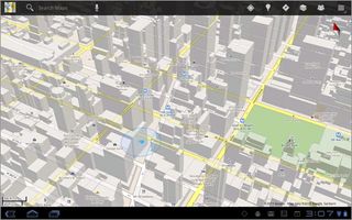
Google's Maps app also flexes Android 3.0's graphical muscle with vector-based maps that load quickly. When you zoom in and drag two fingers down on the screen, you'll see renderings of 3D buildings. This app also supports Street View, and its panoramic display of Broadway looked a lot more compelling on this 10.1-inch tablet than on our phone. You can even use this slate as a navigation device via its built-in GPS, though it's not practical to dock the Xoom in a car.
Click to enlarge
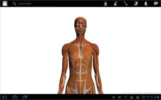
A fun diversion is Google Body, which presents a 3D image of the human figure and lets you switch to various views (muscle, skeleton, etc.).
Click to enlarge
Android Market and Third-Party Apps
Given that the iPad has more than 50,000 apps in its arsenal, the fact that Android is starting with just 46 apps (and counting) optimized for the Xoom's larger display seems kind of weak. Still, Google deserves credit for redesigning the Market itself, and some of the apps tailor-made for slates look pretty good.
When you go to the Market, you'll see a strip of featured apps along the top you can scroll through, and down below you'll see a specific Android Apps for Tablets section. Below that you'll see a grid of the top free Android apps overall, followed by best-selling apps and Verizon apps. Along the right side of the screen is a list of categories that you can drill down into.
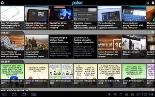
Some of the tablet apps we tried were impressive, especially news apps such as CNN and Pulse. Both apps use a tile-based interface that's easy to navigate. CNN emphasizes video and the ability to create iReports on the fly--complete with photos and video--while Pulse is more about pulling in feeds from around the web.
Click to enlarge
The Twitter app was underwhelming, presenting text that was too small to easily read. We also tried some games, including Cordy, Dungeon Defender, and Galaxy on Fire 2. None of these titles blew us away. Cordy, a 3D platform game, had cute visuals but unintuitive controls; Dungeon Defender had lackluster graphics; and Galaxy on Fire 2 (a space shooter) handled frenetic action well but didn't have any sound and the accelerometer controls failed to work. Granted, some of these games are previews, but so far the iPad has nothing to fear in this department.
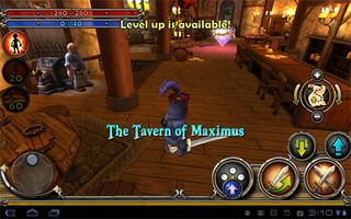
Click to enlarge
You can also download older apps; Google says that most phone apps scale nicely to the Xoom's 1280 x 800 display, but we saw decidedly mixed results. Angry Birds looked smooth and crisp on the screen, but Pandora looked very stretched, with small album covers scrunched up in the left top corner.
Specs and Performance
When you have a 1-GHz dual-core Tegra 2 processor and a full 1GB of RAM, you expect blistering performance, but the Xoom just didn't feel very fast in our testing. Take the accelerometer: In many cases, it took three seconds for the screen to just change orientation. We also encountered a fair number of app crashes and blank screens when trying to open some apps. That's not good when you're trying to go up against the iPad. At least right now, Android 3.0 feels buggy on the Xoom.

Click to enlarge
In terms of synthetic performance, the Xoom is certainly faster than the single-core Galaxy Tab. For example, in the CPU portion of the Benchmark app, the Xoom scored 2,995, much higher than the Tab's 1,720. In the Graphics portion of the same test, the Xoom notched 380.7 vs. 31 for the Tab. So this Tegra-powered tablet certainly has a lot of horsepower; it just doesn't seem properly tuned yet. Another example: Music playback stuttered when we tried to open the Android Market.
In terms of storage, the Xoom comes equipped with 32GB of internal memory, and Motorola says the device will support an additional 32GB via microSD.
| Row 0 - Cell 0 | Motorola Xoom | Samsung Galaxy Tab |
| CPU Score | 7,720 | 2,995 |
| Graphics | 380.7 | 31 |
Music and Video
When you combine the Xoom's powerful stereo speakers with a new 3D makeover of the music app, this tablet is a pretty compelling partner for rocking out. The main view of the app displays album art that you can flip through, or you can touch the Action Bar to choose a specific album or artist (or you can search). When you exit the app, you can control playback using the little widget in the System Bar, which also displays album art. As of the time of this review, Amazon MP3 wasn't available to download from the market, but we assume that option is coming.
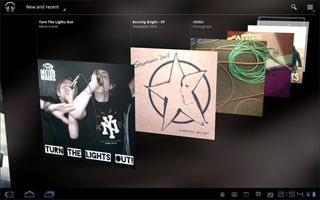
Click to enlarge
One of the Xoom's highlight features is the ability to play back 1080p video, and sure enough an included Timescapes clip looked fantastic when we output it via HDMI to a big-screen TV. Our own recorded movies also played smoothly, but the Xoom wouldn't play QuickTime files. Other than YouTube, we didn't see any premium video options (Amazon, Hulu Plus, or Netflix), so at least for now, you're on your own for content.
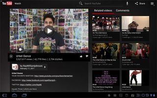
Click to enlarge
Camera and Camcorder
The Xoom features a 5-MP camera on the back with dual-LED flash, which can also record 720p video. A new circular control panel to the right of the preview window lets you adjust everything from the flash and white balance to scene modes. You can also zoom in, though only digitally. A photo of a fruit stand exhibited good color accuracy but looked a bit soft; indoors, the flash blew out our subject. The camcorder fared a bit better, recording smooth and detailed footage of moving traffic in New York City.

Click to enlarge

Click to enlarge
Touching a thumbnail in the bottom left corner loads the Gallery, where you can flip through photos and videos or start a slideshow. Android 3.0 also makes it easy to share images via multiple services, including Facebook, Picasa, and Twitter. (This is not something the iPad offers.)
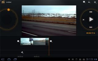
Click to enlarge
Google includes Movie Studio, a fairly robust editing app that lets you trim footage and add effects and transitions as well as titles and music. We cobbled together a short clip (below) in only a few minutes, but we noticed that the Xoom started to bog down when previewing and editing footage.
Battery Life
Motorola rates the Xoom's battery for up to 10 hours of video playback. On our test (continuous web surfing over 3G), the tablet lasted about 8 hours on a charge. That's pretty good endurance, and it's just short of the runtime offered by the Verizon Galaxy Tab (8:18) and the AT&T iPad 3G (8:21). We'll update this review once we get a Wi-Fi runtime.
| Row 0 - Cell 0 | Motorola Xoom | Samsung Galaxy Tab | AT&T iPad |
| Battery Score (In Hours) | 8:00 | 8:18 | 8:21 |
Accessories
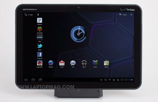
Motorola will make several accessories available for the Xoom, including a carrying case, two docks, and a Bluetooth keyboard. (Pricing will be announced soon.) We found the case to be a hassle to use. It was a bit tough to pry the Xoom out, and half of the case just flapped around when open.
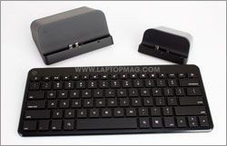
Click to enlargeThe Standard Dock just includes a power jack and audio output, but the Speaker HD Dock blew us away. This dock really amplified the sound when watching music and videos, and it includes an HDMI output. Oddly, neither dock includes a microUSB port for syncing with a PC.
Last but not least, the Bluetooth keyboard's isolated layout provided decent feedback and includes lots of shortcut keys to various apps. The pairing process was simple, too.
Pricing and Value
If you want the 3G/4G capable Xoom, you have two options. Verizon will sell you this tablet with a two-year contract for $599, or you can get an unsubsidized version for $799. A Wi-Fi only version of the Xoom will cost $599. By comparison, the Wi-Fi only iPad goes for $499, while the 3G version (no contract) costs $629.
Data plans start at 1GB for $20 per month, but you can also get 3GB ($35), 5GB ($50), or 10GB ($80). Once Verizon rolls out 4G for this device, we would definitely recommend a minimum of 3G, or higher if you're going to use the mobile hotspot feature. If you opted for the cheapest data plans, you'd be paying $1,079 over two years.
Click to enlarge
Verdict
In some ways, the Motorola Xoom is a bona fide next-generation tablet. Android 3.0 feels like a thoroughly modern and thoughtful OS, and the software and hardware work well together in certain respects, such as the high-quality video chats via the front-facing camera. On the other hand, this slate was surprisingly buggy in our testing, and the tablet app selection really pales in comparison to what you'll find on the iPad. Then there's the price: $599 is a lot to spend on a device that isn't yet fully baked. Yes, Flash support will be added in a few weeks, but 4G won't come until later. While you could say the Xoom is future-proof, we'd wait for all the pieces to fall into place--and for more stable software--before investing in this tablet. With the iPad 2 on the way, these improvements can't come soon enough.
Motorola Xoom (Verizon Wireless) Specs
| Brand | Motorola |
| CPU | 1-GHz Nvidia Tegra 2 |
| Camera Resolution | 5MP |
| Card Reader Size | 32GB |
| Card Readers | SIM, microSD |
| Company Website | http://www.motorola.com |
| Display Resolution | 1280 x 800 |
| Display Size | 10.1 |
| Front-Facing Camera Resolution | 2.0MP |
| Has Bluetooth | Yes |
| OS | Android 3.0 |
| Ports | Headphone, Mini-HDMI |
| RAM Included | 1GB |
| RAM Upgradeable | 1GB |
| Size | 9.8 x 6.6 x 0.5 inches |
| Storage Drive Size | 32GB |
| Storage Drive Type | Flash Memory |
| USB Ports | 1 |
| Weight | 1.6 pounds |
| Wi-Fi | 802.11b/g/n |

