Laptop Mag Verdict
While it packs a powerful Tegra 2 processor and offers fantastic battery life, this Android tablet's custom interface and software dampen the user experience.
Pros
- +
Unique interface
- +
Good split touch keyboard
- +
Very long battery life
- +
Strong media playback
- +
Good selection of apps through Handango
Cons
- -
Sluggish performance
- -
No Android Market access or Flash support
- -
Google's apps not included
- -
Downloading apps take too many steps
- -
Can't customize home screens
- -
Bulky, unattractive design
Why you can trust Laptop Mag
Viewsonic's 10-inch G Tablet is designed to compete with the Galaxy Tab and iPad for your gadget dollars. At first glance, the slate has strong specs: a bright 1024 x 600 display, a front-facing webcam, and a powerful dual-core Tegra 2 CPU. It also features the unique Tap nTap UI layered on top of Android 2.2, which is designed to be consumer friendly. But do the unique features and the reasonable $399 price tag add up to a compelling product?
Editor's Note: We updated this review in January to reflect a recent update to the G Tablet's software build.
Design
At 10.5 x 6.8 x 0.5 inches, the G Tablet isn't the smallest slate on the block by any stretch. At 1.55 pounds, it weighs as much as the iPad. It's much bulkier than the iPad and the 7-inch Galaxy Tab, though. The glossy black plastic on the front and the matte black on the back look and feel a bit cheap. We could hear the slate creaking in our hand when we picked it up.
Ports
On the left side of the G Tablet, you'll find a headphone jack, a mini USB port for connecting to the PC, a full size USB port for attaching USB drives, and a microSD card reader. Unfortunately, you can't charge the G Tablet via USB. Instead, you must a dedicated AC adpater that connnects to its own jack on the slate. A docking port on the bottom of the G Tablet is designed to support HDMI output, but there's no mention of an adapter on ViewSonic's site.

Click to enlarge
Screen and Touch Experience
The 10.1-inch 1024 x 600 screen on the G Tablet has sharp images but colors seem muted. Viewing angles are solid at 90 degrees to the left or right when holding the device perpendicular to the ground or a table. However, when the slate is resting flat on its back, you must be right on top of it or images wash out completely. Unfortunately, there's no kickstand to prop up the device. We also noticed that the G Tablet picked up lots of fingerprint smudges, more than the iPad.
The screen supports two-fingered multitouch gestures such as pinch to zoom with little noticeable lag. The built-in accelerometer isn't as responsive as we liked; we sometimes had to shake the device to get it to detect its orientation and readjust.
User Interface
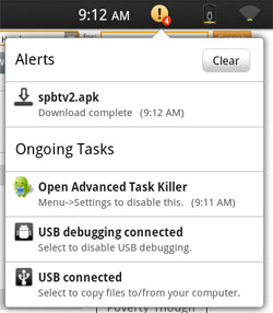
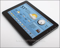
Click to enlargeThough the G Tablet is powered by Google's Android 2.2 OS, Viewsonic chose to replace the stock Android interface with a Tap ‘n Tap software. The UI looks friendly on the surface, but its sluggish performance and lame preloaded apps drag the entire device down.
The first thing you'll notice about Tap ‘n Tap is that the status bar area of the screen looks different than on a typical Android device. In the upper left corner is a Tap ‘n Tap logo that looks a little bit like the NBC peacock. When you touch it, you are transported back to the home screen.
On the right side is an orange circle icon that has a number within it for the number of alerts programs have given you. So if an app wants to give you an alert, you can only read that alert by tapping the orange icon; it won't appear in the status bar like it does on other Android devices. There are also icons for the battery meter and Wi-Fi connection that are much larger but less attractive than those you'll find on a typical Android slate like the Galaxy Tab.
Where most Android devices have up to seven desktops on which you can put custom widgets or shortcuts to apps, the G Tablet has three screens, each with a series of widgets you can't remove or customize.
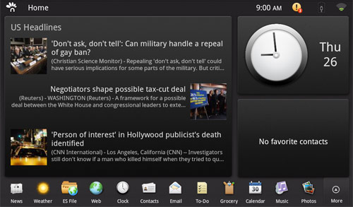
One screen contains a list of favorite contacts, a clock, and a small headlines widget that updates itself dynamically with the latest news. Tapping on this widget launches the Tap ‘n Tap news app, which shows a larger swath of headlines and allows you to choose between different categories of news such as U.S., World, and Sci/Tech. You can also hit the settings button and add custom news tabs for keywords (tablets, for example).
Click to enlarge
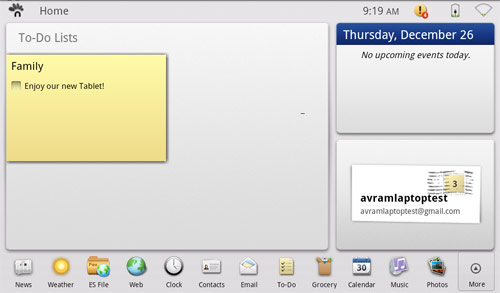
Another home screen contains a to-do list widget, a list of events from your calendar, and a widget that shows how many unread e-mails you have. Redundant in its features, the third desktop contains a larger news widget, a clock widget, and a smaller favorite contacts widget.
Click to enlarge
Along the bottom of the screen is a single row of shortcuts to Tap ‘n Taps built-in apps and a More button that opens the screen up to show all your apps.
Unfortunately, there's no way to see a list of open apps. Where in regular Android, you can task switch by long-pressing the home button; that doesn't work on the G Tablet--you must return to the home screen and then reopen an app to switch to it. This extra step is particularly annoying.
Classic Mode
If you can't stand the Tap ‘n Tap UI, you can open an app that's labeled "classic mode" and be transported to a shell that looks and feels like Android 2.1 or 2.2. In Classic mode, you have three desktops, which you can use to store shortcuts for your apps or hold display standard Android widgets. You can even change the wallpaper on these desktops to your liking. On the right side of the desktop you'll see shortcuts for the Web browser, the apps menu (which shows all apps on a black background), and another button that switches you back to regular Tap ‘n Tap mode.
Unfortunately, aside from the desktop and app menu, nothing else changes in Classic mode. Instead of having standard Android icons and a pulldown task drawer, the UI still has the same Tap ‘n Tap status area with the same identical Wi-Fi icon, status update button, and lame Tap ‘n Tap peacock logo in the upper left corner. When you click into settings, you still get the Tap ‘n Tap settings menu, not the Android settings menu. And you still can't see a list of open tasks by holding down the home button. Even the browser and e-mail client are the same Tap ‘n Tap apps.
Virtual Keyboard
One of the only features of the proprietary Tap ‘n Tap UI that we actually like is its split virtual keyboard. When in landscape mode, the keyboard gets cut down the middle at the line between the G and H keys so you can to type with your thumbs and not have to stretch too far to target those middle keys. When in portrait mode, the keyboard doesn't split, but does have nice, large keys.

Click to enlarge
Unfortunately, the G Tablet does not support haptic feedback on the keyboard or anywhere else, so you won't feel any response when you tap the keys. Those who like the Swype keyboard that can use on the Galaxy Tab and other Android devices are also out of luck.
Bundled Apps
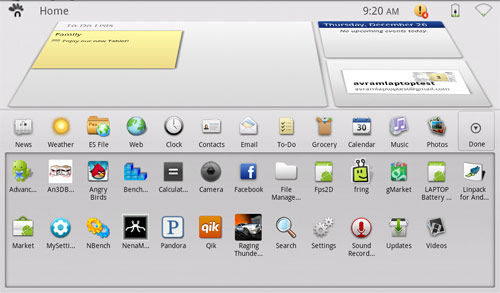
You won't find any of Google's apps on the G Tablet, so forget about Google Calendar, Google photo gallery, Gmail, YouTube, or Google Maps. Instead, the preloaded software build includes a few mediocre apps with low-tech designs.
Click to enlarge
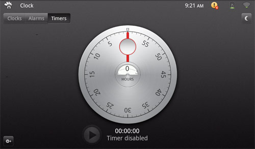
The News app provides the same feed of headlines you get from the desktop news widget. The Weather app provides a large, graphical display of the current and upcoming weather in your area with giant images of a sun or clouds. Es File Explorer allows you to browse files and folders on the internal storage or external SD card. The Clock app shows the time and allows you to set alarms and timers. The To-Do app allows you to create post-it notes that appear on one of the desktop screens.
Click to enlarge
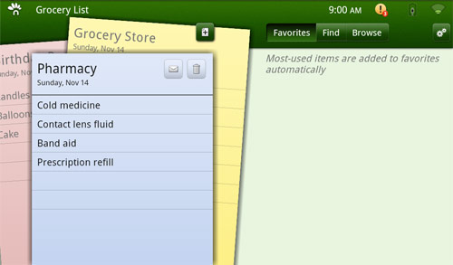
The Grocery app lets you create a shopping list of things to buy when you go to the store that you can even share via e-mail, but you can't check things off your list as you buy them and, frankly, we can't imagine someone lugging this heavy tablet around the supermarket. The calendar app allows you to enter your appointments and have them appear on the desktop widget of upcoming appointments, but it doesn't sync with cloud applications like Google calendar, though it can download appointments from an ICS file.
Click to enlarge
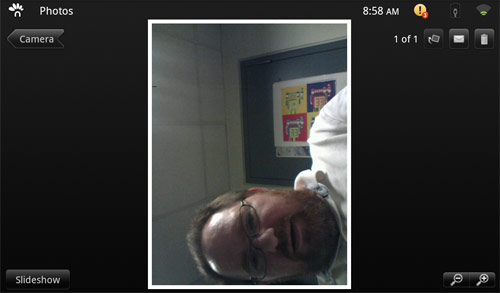
The Photos app allows you to view and organize your pictures, though it is much less attractive and functional (no editing or sharing) than Google's own Gallery app. The music app helps you organize albums and songs that you have stored on the device. The camera app allows you to shoot photos or videos of yourself with the 1.3 megapixel front-facing lens, but since there's no rear lens and the app doesn't do video chat, it seems a little useless.
Click to enlarge
App Store
Because Google hasn't certified the G Tablet as eligible for its apps, the slate doesn't come with the official Android Market. However, it does have a shortcut that links to the Handango web site, where you can download several good apps. For example, we were able to find Facebook, the Dolphin HD browser, Raging Thunder 2 (a racing game), Pandora, Twitter, and Advanced Task Killer. However a couple of apps such as Fring wasn't and Droid Record weren't there. Plus, Angry Birds wouldn't play; we just got a blank screen with sound.
The other problem with Handango is that its download process is not tailored for the G Tablet. To download an app, you must search for it, click on the download button, then choose the "Download to PC" option on a list of choises that includes "Email to Phone" and "SMS to Phone." However, since your tablet isn't a PC and there are no instructions, we can imagine users getting very confused.
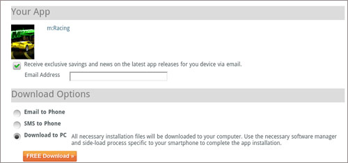
Click to enlarge
Then, once you click the download button, there's no status indicator to let you know that your program is actually downloading. You must tap on the orange alerts icon in the status bar to see the download progress and then tap on the download's name to install it. Since the download status is hidden in the alert menu, most users will have a hard time figuring this out.
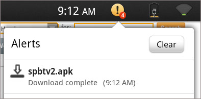
Click to enlarge
By downloading some apps from the market to an Android phone and copying them, we were able to sideload anything we wanted, though most users wouldn't know how to do this.
Video Playback and Sound
Since there's no YouTube app and no video or music store, you'll have to bring your own unprotected media files to the device if you want to watch or listen to anything. When we put a 1080p MP4 of the Iron Man 2 Trailer on the internal memory, it played back smoothly and sharply. It's too bad that there's no HDMI-out port to output all the hi-def goodness to a large screen. As stated above, the viewing angles were decent when the tablet was propped up, but there's no kickstand and everything washes out when you lay the device flat on its back.
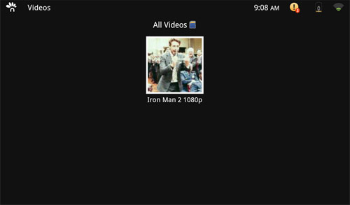
Click to enlarge
When we loaded some MP3s onto the memory, the music application didn't list them, but when we surfed to the music folder with the ES File manager and tapped on an MP3 of Eric Clapton's "Wonderful Tonight" sound was true but monotone and sound was so low, at maximum volume, that voices were difficult to hear.
E-mail and Messaging
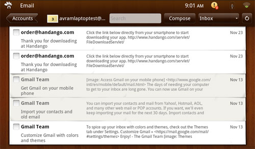
There's no Gmail application, but the built-in Tap ‘n Tap client allows you to add all kinds of e-mail accounts, from Gmail to POP3, IMAP, and Exchange. The software tries way too hard to be cute, by having a wood paneled theme and showing you a giant stamped envelope when you open it. Unlike the Galaxy Tab e-mail client, which takes advantage of that device's hi-res screen by offering you a two-pane design, the inbox is just a single column that gets covered over by a message as soon as you open it. The only good thing we can say about the mail client is that, if you get a new message, an icon appears in the e-mail area on the desktop.
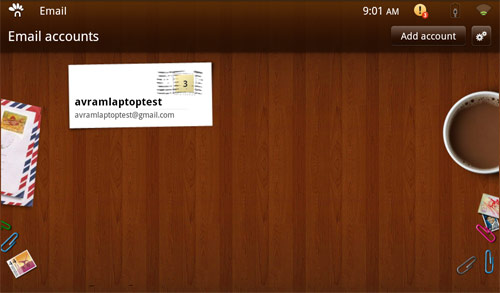
Click to enlarge
Click to enlarge
There is no instant messaging or chat software preloaded on the G Tablet and no obvious way to make use of the front-facing camera for video chat. However, we were able to sideload Fring onto the device and conduct a video call where our call partner saw our pixilated, choppy image. The only sound we heard was static. However, Fring and other Android video chat clients, such as Qik, have rarely worked well on any device we tested.
Web Surfing
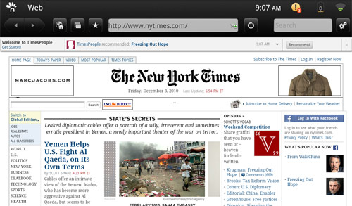
The G Tablet's web browser provided a reasonable surfing experience, though like everything else on the system, it was sometimes slow to register our taps. Web pages looked solid and plenty of content was visible without zooming because of the screen's 1024 x 600 resolution. However, mobile Flash is not supported so you can forget about watching videos from CBS or Fox.com. Pinch-to-zoom worked reasonably well.
Click to enlarge
Performance
Click to enlargeBefore we installed the latest software update from Viewsonic, everything we did in the Tap ‘n Tap UI seemed sluggish, from switching apps to launching the browser to playing games. We even experienced periodic locks and crashes. It's no wonder then that Staples pulled the G Tablet from its shelves in December and claimed the device suffered from a manufacturing defect.
However, after we installed Viewsonic's over-the-air update in late December, we noticed a dramatic improvement in usability. With the update installed, apps opened relatively quickly and we were able to switch tasks without crashes or stuttering. However, we still noticed that the screen would occasionally lag for a second when switching screens in the UI, such as when we switched from the desktop to the apps menu in Classic mode.
When we ran synthetic tests, the strength of the Tegra 2 hardware shined through. On Linpack, the G Tablet scored a whopping 36.1455, way higher than the 14 turned in by the Samsung Galaxy Tab (T-Mobile), or the 4.3 offered by the CherryPal CherryPad. Even the fast Epic 4G managed only 7.9. On An3DBench graphics test, the G Tablet scored 630625, which is only a bit lower than the Galaxy Tab (7075). On Nbench's Integer, Floating Point, and Memory tests, the G Tablet scored 23.7388, 3.931.10, and 2.771.16, respectively. The Galaxy Tab scored 4, 0.77, and 2.9 in the same tests.
Battery Life
Using our web surfing test, which involves continuous surfing over Wi-Fi, the G Tablet lasted a whopping 11 hours and 17 minutes, about much longer than the Galaxy Tab (8:30) and the iPad (9 hours). That's the longest battery life we've seen on any tablet, and there was still 6 percent left in reserve.
Warranty
Viewsonic backs the G Tablet with a one year limited warranty on parts and labor. The company offers both online and phone support.
Value and Verdict
The Viewsonic G Tablet has a few things going for it. We like the long battery life, access to popular apps through Handango, and relatively low price. However, it's hard to recommend this slate because of its uninspired design and downright annoying Tap ‘n Tap software that permeates every layer of the user experience. Turning on Classic Mode doesn't provide a pure Android experience, either. We have heard about users hacking the device and installing regular Android 2.2 with good results. If you're up for that, you can turn the G Tablet into a better slate, but you shouldn't have to root a device just to make it usable. If you're looking for a media slate, either spend the extra money for the iPad or Galaxy Tab, or wait until better tablets ship.
ViewSonic G-Tablet Specs
| Brand | Viewsonic |
| CPU | 1GHz NVIDIA Tegra 2 - Dual-core ARM Cortex-A9 |
| Card Readers | microSD |
| Company Website | www.viewsonic.com |
| Display Resolution | 1024x600 |
| Display Size | 10.1 |
| Front-Facing Camera Resolution | 1.3MP |
| Has Bluetooth | Yes |
| OS | Android 2.2 |
| Ports | Headphone, miniUSB |
| RAM Included | 512MB |
| Size | 10.5 x 6.8 x 0.54 inches |
| Storage Drive Size | 16GB |
| Storage Drive Type | Flash Memory |
| USB Ports | 1 |
| Warranty / Support | One year parts and labor. |
| Weight | 1.55 pounds |
| Wi-Fi | 802.11b/g/n |

