Laptop Mag Verdict
Amazon's first phone boasts some head-turning innovations, but it doesn't do enough to compete with the top handsets.
Pros
- +
Solid, understated design
- +
Comes with one year of Prime membership
- +
Amazon Instant Video app
- +
Fun Dynamic Perspective display
Cons
- -
Heavy, given small screen size
- -
Lower-resolution screen than competitors'
- -
Below-average battery life
- -
Limited voice controls
Why you can trust Laptop Mag
The Amazon Fire wants to be the David Copperfield of the smartphone world. Here are just a few of the tricks up its sleeve: It can instantly recognize millions of products with the push of a button, deliver 3D-like images on a 2D screen and give you access to your own genie in a bottle (the Mayday feature for on-the-fly troubleshooting). This AT&T exclusive also includes a year of free Prime membership -- a $99 value -- plus unlimited cloud storage for photos. While impressive for a first attempt at a phone, the Fire's magic starts to wear off once you start using it as your everyday device.
[sc:video id="xrM3I1cTocmzK2S1pMSDW1bzrDaecR7D" width="575" height="398"]
Design
In a year in which Samsung is using dimpled patterns and chrome trim and HTC is using brushed aluminum for its phones, the Fire Phone stands out for its subdued looks. Except for the silver Amazon logo on the back, the entire device is black, which can be seen as either a model of understatement or a lack of imagination.
Reminiscent of the Google Nexus 4 and the iPhone 4s, the back of the Fire is a sheet of Gorilla Glass, which looks attractive and surprisingly didn't pick up as many fingerprints as I would have expected. I also liked the slightly rubberized edges, which helped keep the phone firmly in my hand.
At each corner on the front is a camera, with a fifth camera to the right of the speaker at the top. Below the display is a small, oval button that acts much like the Home button on the iPhone 5s.
Regardless of what you think of its looks, the Fire is a solid phone. It's also quite hefty, given its small screen size. At 5.6 ounces, it weighs as much as the larger HTC One M8, and is a half-ounce heavier than the Galaxy S5. I definitely noticed the weight.
MORE: 25 Best Amazon Appstore Apps
Measuring 5.5 x 2.6 x 0.35 inches, the Fire phone is narrower than the HTC One M8 (5.8 x 2.8 x 0.37 inches) and the Galaxy S5 (5.6 x 2.9 x 0.32 inches). I found it far easier to reach my thumb all the way across the display without having to shift the Fire in my hand, as you have to do with many other phablets.
Along the Fire phone's left edge are volume controls, a camera button and the SIM card slot. The top edge has a power button, speaker and 3.5mm headphone jack, and the bottom has a micro USB port, along with another speaker. You can't add a microSD card -- a bummer that's somewhat mitigated by the unlimited cloud storage for photos.
Display
The Fire's display is notable in that its size -- 4.7 inches -- and its resolution -- 1280 x 720 pixels -- are both lower than what you'll find on almost all other flagship phones. Both the HTC One (5 inches) and the S5 (5.1 inches) sport 1080p displays, and the LG G3 has a 5.5-inch, 2560 x 1440p QHD display. (The iPhone 5s' 4-inch, 1136 x 640p display is the lone exception.)
Despite the display's lower resolution, videos, movies and images looked bright and crisp. In the opening scene of Star Trek: Into Darkness, the crimson foliage of the alien planet looked blood-red, and the natives' yellow garments really popped on the small screen.
Measuring 493 nits, the Fire has one of the brightest displays yet, outshining the HTC One M8 (402 nits), the Galaxy S5 (373 nits) and even the iPhone 5s (470 nits).
But brightness isn't everything. The Fire's Delta-E score of 5.2 (numbers closer to 0 are better) means the device's display is less accurate in displaying colors than the One M8 (4.1), the S5 (0.9) and the excellent 5s (0.05).
Able to display 96.1 percent of the sRGB color gamut, the Fire phone's screen shows colors far less saturated than the S5 (158.4 percent) and the One M8 (115 percent), but was just slightly less than the iPhone 5s' 98.4 percent.
Dynamic Perspective
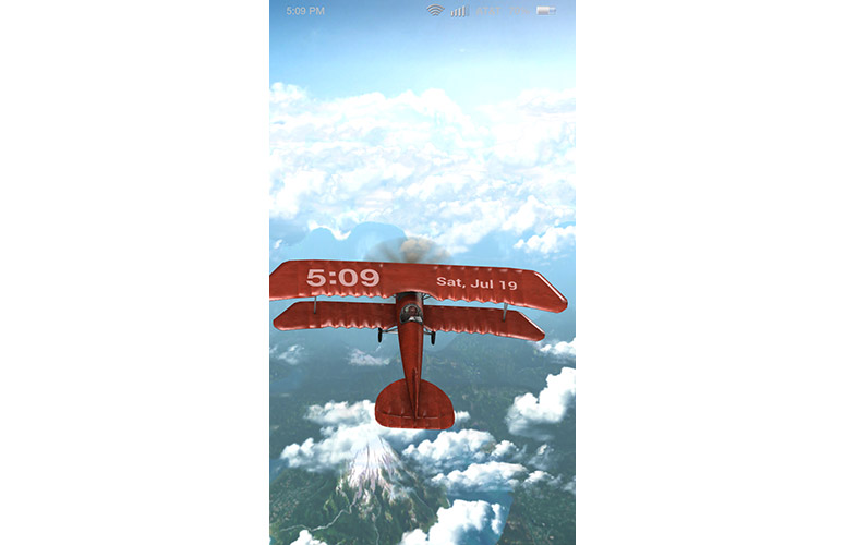
Click to EnlargeThose four cameras at the corners of the Fire phone aren't for taking the most awesome selfie ever. They're the face of Amazon's Dynamic Perspective technology, which can adjust the view of whatever's on-screen by determining where your head is relative to the phone.
The technology is on display on the lock screen; you can select one of 19 different dynamic images that move as you tilt the phone around. My personal favorite was the Barnstormer, a biplane that flies around with three other planes and a blimp. It was so much fun to look at that I didn't want to unlock the phone. "Is this a game?" asked a colleague.
But Dynamic Perspective is intended for more than just eye candy, as it can provide additional contextual information without getting in the way. For example, in the Maps app, if you search for restaurants, they will initially appear as small, yellow pinpoints. Tilt the phone slightly, and small tags will appear, along with their names and Yelp ratings.
If you're reading a long article in the Silk browser, tilting the phone back or forward will let you scroll down or up the page; it's very sensitive, which gives you fine-tuned control over how fast or slow it scrolls. It's exceptionally unfortunate that you can't use this feature in the Kindle app when reading a book.
MORE: 12 Gadgets Ahead of Their Time
At launch, there will be about 150 to 175 apps and games that use the Dynamic Perspective, including iHeartRadio, NBC News, Slacker, Skype and Flipboard. However, at least during our testing, any amount of tilting the Fire phone didn't produce results in either Skype or Flipboard.
In all, Dynamic Perspective is an interesting technology that helps the Fire stand out from other phones, but I'm not sure how practical it is just yet.
In the game Crazy Snowboard, you can move your character by tilting your head to the left and right, and get some serious air by moving your head up and down. After a few minutes of this, though, I felt like I had whiplash. It was easier -- and less painful -- to move the phone instead of my head. But the experience was no different when I played the racing game Asphalt 8, which is not optimized for Dynamic Perspective. Using the phone's accelerometer, I was able to move around easily enough simply by tilting the phone.
Bottom line: Amazon needs to do a better job of showing how Dynamic Perspective is better -- and enables more features -- than the simple accelerometer found in most other phones.
Interface and Operating System
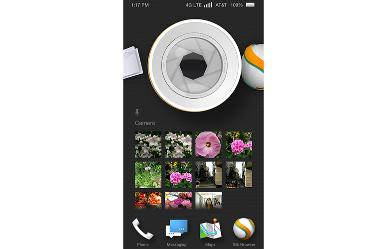
Click to EnlargeWhile it has Android 4.2.2 at its core, the Fire 3.5 operating system on the Fire phone is far removed from Google's original interface. And while I like that Amazon has set its interface apart from Android and iOS, there are a few things that could be improved.
A status bar at the top shows time on the left, and Wi-Fi, connectivity and the battery level on the right. You can set this bar to appear only when you tilt the phone, or have it remain on perpetually.
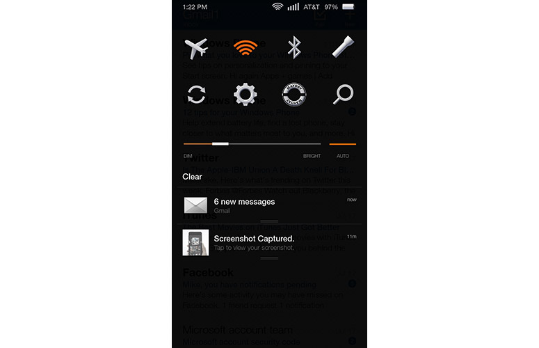
Click to EnlargeSwipe down from the top -- or give the phone a quick swivel to the left-- and the Notifications window appears. At the top are eight quick settings: Airplane Mode, Wi-Fi, Bluetooth, Flashlight, Sync, Settings, Mayday and Search. Below these options is a slider bar to adjust display brightness. Tilt the phone to the left or right, and the labels for all the icons will appear -- a subtle instance of Dynamic Perspective at work.
As with its tablets, the top third of Amazon's Fire phone interface has a carousel of the apps and content you most recently used. A new twist here is that, if you press and hold an icon, you can pin it to the carousel. It's a handy addition, but you can't specify the order in which pinned icons are shown (the icon you most recently pinned goes to the front). Also, scrolling through the Fire's carousel quickly becomes tedious.
Beneath the icon is content related to that app. For example, underneath the Silk icon is a scrollable list of recently visited URLs. If the Mail icon is front and center, you can read the first few lines of an email, delete them right there or click on them to open the full message. It's a great way to quickly get to what you need.
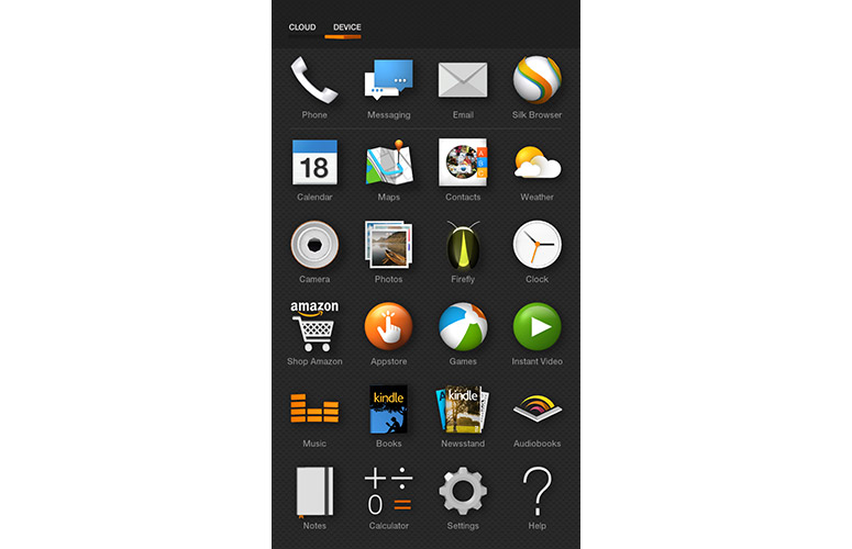
Click to EnlargeAt the bottom are four icons that by default are Phone, Messaging, Email, and the Silk browser. You can swap them out for any app you'd like, but you can't have more than four at any one time.
If you swipe up from the bottom row of icons, you can see all your installed apps in a grid format, much like Android's app drawer. A small switch in the upper right lets you view apps on the device, or those stored in the cloud. If there's too much clutter, you can group apps into folders and rearrange their position in the grid.
A single tap on the button below the display brings you back to the home screen, just like it does on iOS. Also like iOS, double-tapping the button shows the Quick Switch window, a list of all your open apps. You can select an app to open it, or swipe up on it to close it completely.
Another key feature of the Fire OS -- and one I really liked -- is the inclusion of contextual menus. If you're on the home screen, twist the phone to the right, and you get a menu of Apps, Games, Web, Music, Videos, Photos, Books, Newsstand, Audiobooks, Docs, Shop and Prime. Do a quick twist to the left, and you get the current weather in your location, plus upcoming calendar events. It's a smart way to make the most of the Fire's limited real estate, but takes a practiced hand; more than once, I tilted the phone to see a map at a different angle, but did so too quickly, and brought up the side menus by mistake. You can, however, disable this feature in the Low Motion Settings menu.
These menus change depending on what app you're using. In the Silk browser, for instance, the left-side menu shows Bookmarks, History, Saved Pages and the like, while the right menu shows additional information for the Web page that's currently open.
No Back Button, No Problem?
People switching from Android may be alarmed to find that there's no universal Back button, but as a regular iPhone user, I didn't find this to be too jarring. Methods to go back, while different in each app, are generally present.
However, there were some occasions when I did miss the Back button. For example, when I went to download an app from an email, I received a warning that I had to change the settings. The Fire took me to the appropriate settings submenu, but when I pressed the Back button (a small arrow in the upper left), it brought me to the general Settings menu, and not to my email. In Facebook, if you select a photo someone has posted, there's no Done button, as there is in the iOS app, to go back to your feed. The same thing happened in IMDb.
I eventually found that swiping up from the bottom edge of the display lets you return to the previous screen, but until I stumbled on that solution, I was closing the apps and then reopening them to get back.
MORE: 6 Best AT&T Smartphones
Firefly
Let's face it: Amazon wants to make it easier for you to buy things from the company, and Firefly is the Fire phone's Trojan horse to your wallet. This deceptively magical app can identify almost anything -- more than 100 million items, according to Amazon, including 245,000 movies and TV shows and 35 million songs -- and give you the option to purchase it.
Hold down the camera button for 2 seconds, and Firefly opens. Little pixie-dust particles float around whatever object you're pointing at, and if it's in Amazon's database, the product info will appear within seconds.
Like a souped-up Shazam, Firefly can also identify music and movies based on the dialogue it hears. In the case of a movie, it will even pick out the exact moment you're listening to, list the actors present in the scene, and provide links to IMDb, Amazon Instant Video and the Shop Amazon store.
It's also cool that Firefly is integrated with other apps. For example, after I had installed MyFitnessPal, whenever I Firefly'd a bottle of water or soda, its nutrition info appeared in the app, and I could then add it to my food log in the MyFitnessPal app.
It's nice to see that Firefly can be used for more than just a more expedient way to buy stuff, but currently, there are only four Firefly-enabled apps: MapMyFitness, iHeartRadio, Flixster and StubHub.
If you select the Shop Amazon button, you're taken to the Amazon shopping app, where you can purchase the product, or add it to your cart or wishlist. I found it somewhat frustrating that the Back button here takes you to the Shop Amazon home page, and not back to Firefly.
In practice, Firefly worked somewhat well. I went to several retailers -- including Best Buy, Home Depot, Burlington Coat Factory, GameStop, Duane Reade and Lucky -- and the Fire phone identified about half of the objects I pointed it at.
I'm not convinced that Firefly is the ultimate comparison-shopping tool, though. For one, you can't point it at a TV or a MacBook Air and expect it to identify the object. Second, I found that if a retailer uses its own UPC symbol, rather than the manufacturer's, then Firefly has trouble identifying the object.
At the two clothing stores I visited, Firefly couldn't identify most of the garments I scanned, and a Silk search for the UPC code was interpreted as a FedEx or UPS tracking number. At Best Buy, the bar code linked to the retailer's trade-in program, and the other UPC symbol linked to Best Buy's site -- not exactly helpful if you're looking for a cheaper deal.
To its credit, if Firefly can't identify an object, the app lets you send a note back to Amazon, letting the company know what it is. It's a useful tool, but I can't imagine too many frustrated consumers stopping to take the time to email Amazon in the middle of a shopping spree.
Finally, while it's cool that you can point Firefly at a box of Cheerios or a bottle of Coke and be able to purchase it on Amazon, not even Prime can deliver the instant gratification of buying and drinking that Coke on the spot.
Apps
While the Fire phone runs a variant of Android, apps still have to be tailored for its operating system. Currently, there are 185,000 apps available in the Amazon App store, which is about 1 million fewer than what you'll find in Apple's and Google's stores.
I found most of the major apps, including Instagram, Facebook, Spotify, Netflix and WhatsApp. For its part, Amazon includes include Kindle, Shop Amazon, Firefly, Newsstand, Appstore, Games, Music, Instant Video, Audiobooks, Docs and Wallet. However, the core Google apps -- including YouTube, Google Maps and Google Drive -- are missing, as is Microsoft Office and Snapchat.
Fortunately, I was able to side-load some apps to the Fire phone after saving them as backups on another Android device, and mailing them to myself. More good news: Unlike almost all other AT&T phones, the Fire is devoid of apps from the carrier, save for myAT&T.
Parental Controls
What, no FreeTime? Amazon's killer parental-control feature found on its Fire tablets is, unfortunately, not yet available for the Fire phone. Currently, the only parental controls on the phone let you restrict purchasing, content types, Web browsing and access to certain features.
Keyboard
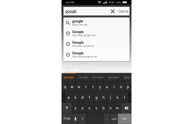
Click to EnlargeThe Fire's keyboard feels much like the iPhone's. The QWERTY layout was large enough for me to type comfortably, and I liked the gentle haptic feedback as well as the Swype-like tracing. Most likely owing to the smaller size of the display, numbers are on a secondary keyboard.
The Fire's email app uses the same three-panel approach as most other apps. The main screen displays your emails, while the left menu displays folders within your inbox (or inboxes, if you set up more than one account). If you're looking at the summary view of your inbox, swiping or flicking in from the right shows the most recent attachments. Select an individual message, and you'll see the sender's contact info, as well as recent emails from that person.
From the main window, if you press and hold an email, you can select multiple messages and delete, archive or move them to folders.
Maps
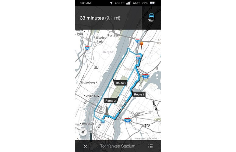
Click to EnlargePowered by Nokia Here maps but fleshed out by Amazon, the Fire's Map app looks great, provides voice-guided turn-by-turn directions and has some neat features. However, it falls short of the standard set by Google.
As mentioned previously, Fire's map app can take advantage of Dynamic Perspective by providing additional information about restaurants or points of interest merely by tilting the display. It's also fun to see 3D images of skyscrapers move, too. Cleverly, it will show reviews and photos from Yelp for restaurants. The Bookmark icon is misleading, however, as it will bookmark the location in the Maps app, and not Yelp.
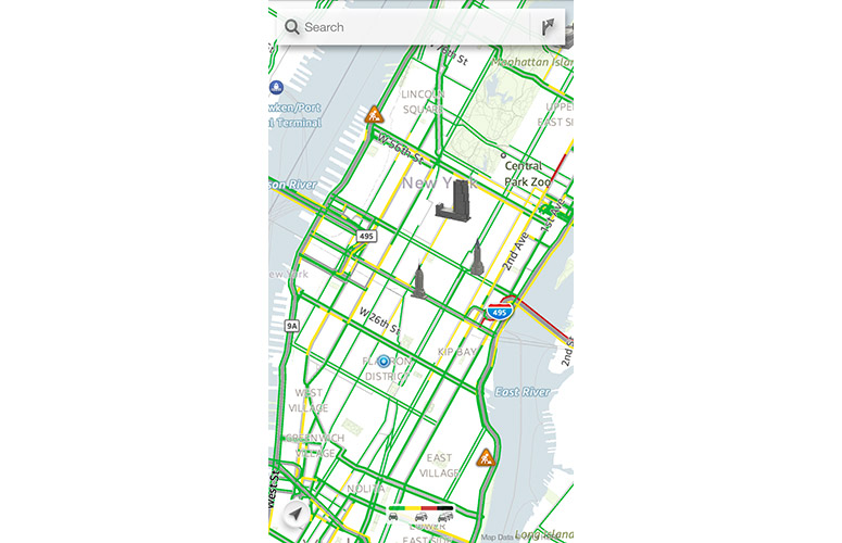
Click to EnlargeOn a more practical level, there are a few things missing. Train stations are shown on the map, and you can get directions via train or subway, but the app doesn't color-code or show the path the subway lines take, making it less than helpful.
Oddly, when you start navigating, the Dynamic Perspective feature in the app no longer works. Plus, traffic information no longer appears once you've started navigation, so you won't know to adjust your course midway if an accident suddenly snarls your route.
Camera
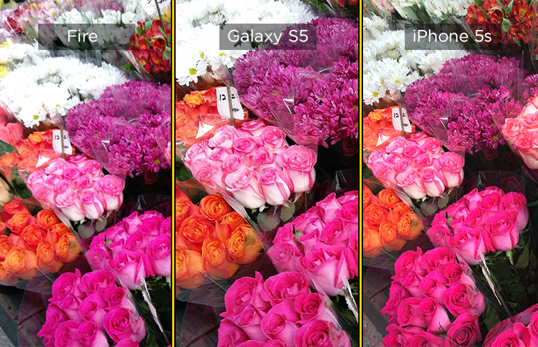
The Fire phone's 13-megapixel camera performed well, but it didn't decisively beat the cameras on the iPhone 5s or the Samsung Galaxy S5. In a shot of bunches of flowers, the Fire's image was vibrant, but it blew out white daisies toward the back of the photo.

Click to EnlargeTo test the Fire cameras' HDR capability, I took a shot of some women sitting in front of a fountain, directly facing the sun. The Fire did the best of the three phones, as it adequately illuminated the women, the buildings and the sky. The iPhone was the next best, showing more blue in the sky than the Fire. The Fire's image seemed a bit warmer, and the colors popped more than in the iPhone's photo.
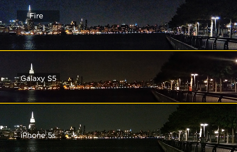
The Fire didn't fare as well at night. A shot of the New York skyline showed more grain and noise than either the iPhone or the S5, with much less detail in objects such as a metal railing.
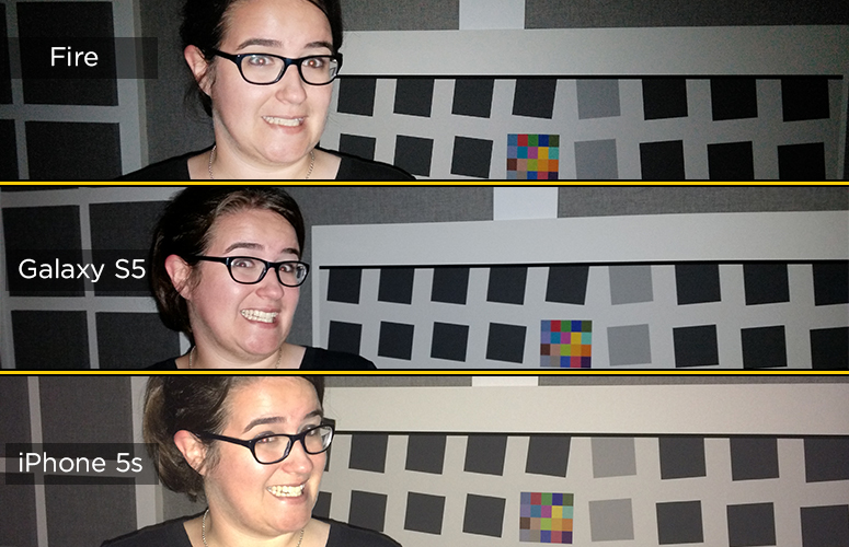
Click to EnlargeWhen we took a photo of a colleague in a darkened room, the Fire's flash did an effective job at illuminating her, but wasn't as wide as the iPhone or S5, which were able to light a larger portion of the scene. When we zoomed in to a color patch at the center, the Fire's image proved the sharpest and most colorful, but also the grainiest.
I found the location of the rear camera to be occasionally problematic. If you open the camera app, the on-screen shutter button is on the right side; because I'm right-handed, I prefer it on this side. However, this orientation places the rear camera in the lower-left corner, where I found myself covering it more than once with my left hand. If you flip the phone around, so the physical shutter button is on the top edge, you may cover the camera with your right hand.
MORE: Which Smartphones Have the Best Cameras?
Compared to the native camera apps on Android and iOS devices, Amazon's doesn't have nearly as many features, such as filters, selective focus or the ability to control the resolution and white balance. However, it does have Lenticular Mode, which lets you take up to 11 photos and then combine it into one image, animated GIF-style. When taking photos of friends, this proved to be a lot of fun. It's also nice that you can share the combined image as an animated GIF.
Considering the Fire phone lacks expandable storage, I really like the fact that Amazon includes unlimited cloud storage for photos. I hope it's not long before Google and Apple copy this feature.
A 1080p video I shot of a boat coming into a harbor was crisp, as I could make out every wave on the water. However, although the lighting conditions were fairly even -- it was an overcast day -- the Fire's camera was constantly adjusting the exposure, which made the video a little jarring to watch.
[sc:video id="c5ajFncTr-t_o-9WkiIy3ceenvpMfWTj" width="575" height="398"]
Performance
The 2.2-GHz quad-core Snapdragon 800 processor and 2GB of RAM in the Fire is slightly less powerful than the Snapdragon 801 CPUs found in the One M8 and the Galaxy S5, but Amazon's phone managed to keep up with or outperform its rivals on both synthetic and real-world tests.
On Geekbench 3, the Fire's score of 2,645 bested the One M8 (2,324) and the iPhone 5s (2,556), but fell behind the S5's 2,927.
The Fire transcoded a 203MB 1080p video to 480p in 4 minutes and 42 seconds using VidTrim; that's 18 seconds faster than the One M8 (4:42) and 25 seconds faster than the Galaxy S5 (5:07).
In everyday use, I found the Fire to be snappy and responsive. It opened the camera about 1 second after I pressed the shutter button, and took about the same amount of time as the iPhone to exit to the home screen from the camera app. Both were a hair faster than the S5 in completing this action. All of the on-screen animations, such as the constantly moving lock screen and icons, were smooth and didn't seem to suffer from lag.
The Fire phone has 802.11ac wireless and NFC, but because it runs an Android 4.2.2 kernel, the Fire phone does not currently support Bluetooth 4.0 LE devices, such as the Jawbone UP24 and other fitness bands. However, Amazon says that the Fire will be able to communicate with those devices with a future update.
Voice Control
Unlike Apple's Siri, Google Now and Cortana -- all of which provide fairly comprehensive hands-free controls for iOS, Android and Windows Phone devices, respectively -- Amazon's voice assistant is rudimentary. Its unnamed voice assistant will let you dictate emails and texts, and let you make calls and search the Web, but that's it. Any other request, such as "What's the weather like?" will be met with a "Sorry, I can't do that yet."
Customer Support
One of the killer customer-service features of the newest Amazon Fire tablets was the Mayday button, which connected you to a live customer support video call if you had any issues with the device. The Fire phone also has a Mayday button, which worked nearly as well.
After pressing the Mayday button, I was connected to an Amazon rep within 15 seconds. As I wasn't using Wi-Fi, I liked that the phone alerted me to the fact that I was using my mobile data plan. A cheerful Stephanie appeared in a small window, and expertly guided me through setting up parental controls on the phone. She was even able to draw on the screen to show me what settings to look for.
However, when I had a question about my AT&T data plan, Stephanie wasn't able to connect me directly to an AT&T service representative. Instead, she gave me a toll-free number to call. According to both Amazon and AT&T, the Amazon rep should be able to seamlessly transfer you to an AT&T representative once the phone starts shipping.
Battery Life
Unfortunately, the Fire's 2,400-mAh battery lasted only 6 hours and 59 minutes on the Laptop Mag Battery Test (Web surfing via LTE at 150 nits). That's 45 minutes less than the smartphone average, and well below the HTC One M8, which lasted 8:42, and the Galaxy S5, which lasted 9:42.
MORE: 10 Smartphones with the Longest Battery Life
Bottom Line
When is Amazon coming out with a phone? That question has been answered, but after having tested the phone, I have a new one: Why? The Fire phone has some clever innovations and a nice design, but at the moment, there's not much that would compel me to switch from either Android or iOS. The year of free Prime service is great, as is the unlimited storage for photos, but the Fire's two distinguishing features -- Dynamic Perspective and Firefly -- don't add enough value, even for compulsive shoppers.
On a more basic level, the Fire's short battery life and lower display resolution makes it less compelling than similarly priced flagship phones such as the Galaxy S5. Ultimately, Amazon's phone has a lot of good ideas, but they're more novel than practical.
Amazon Fire Phone Specs
| Bluetooth Type | Bluetooth 3.0 |
| Brand | Amazon |
| CPU | 2.2-GHz Qualcomm 800 Snapdragon |
| Camera Resolution | 13MP |
| Carrier | AT&T |
| Company Website | www.amazon.com |
| Data | GSM, UMTS, LTE, HSPA+, HSDPA |
| Display (main) | 4.7 inches/1280 x 720 |
| Display Resolution | 1280x720 |
| Form Factor | Candybar Touchscreen |
| Front Camera Resolution | 2.1MP |
| GPS | Yes |
| Internal Memory | 32GB |
| Memory Expansion Type | none |
| Networks | UMTS/HSPA+/DC-HSDPA (850, 900, 1700/2100, 1900, 2100 MHz), Quad-band GSM/EDGE (850, 900, 1800, 1900 MHz), 9 bands of 4G-LTE (Bands 1, 2, 3, 4, 5, 7, 8, 17, 20) |
| OS Family | Android |
| Operating System | Fire OS 3.5 |
| Phone Display Size | 4.7 |
| Ports | microUSB, microSIM, 3.5mm headphone |
| Processor Family | Qualcomm Snapdragon 800 |
| RAM | 2GB |
| Size | 5.5 x 2.6 x 0.35 inches |
| Weight | 5.6 ounces |
| Wi-Fi | 802.11 a/b/g/n/ac |
