Laptop Mag Verdict
The Galaxy Note Edge's curved display is an exciting innovation with loads of potential, but it will take time to maximize it.
Pros
- +
Innovative curved display
- +
Fantastically sharp and colorful QHD screen
- +
High-quality 16-MP camera
- +
Improved S Pen
Cons
- -
Edge display has crapware
- -
Not enough edge apps yet
- -
Pricey
Why you can trust Laptop Mag
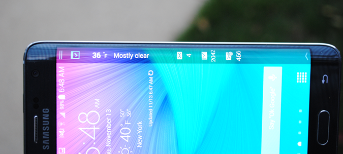
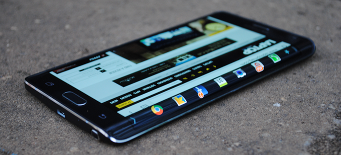
I can tell that smartphone innovation is stalling based on the reactions friends and family have to what I'm reviewing. "I guess the screen is nice," a buddy told me about the Note 4." "That slo-mo video is pretty neat," my aunt said about the iPhone 6 Plus. But where's the wow? Right here. The Galaxy Note Edge is truly different, because its curved screen points the way toward future smartphone design and functionality.
Samsung needs to work with more developers to make its innovation more compelling, and it costs a pretty penny for this taste of tomorrow ($870 or $36.25 per month on T-Mobile). But overall I'm excited about it, and you should be, too.
Design
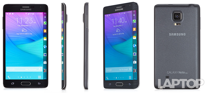
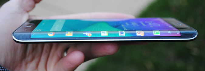
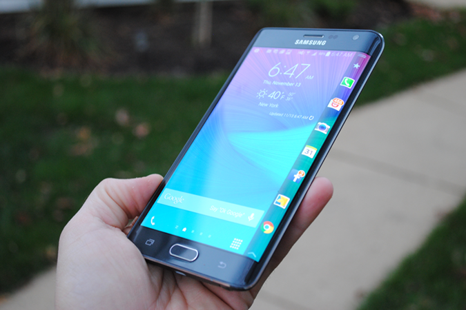
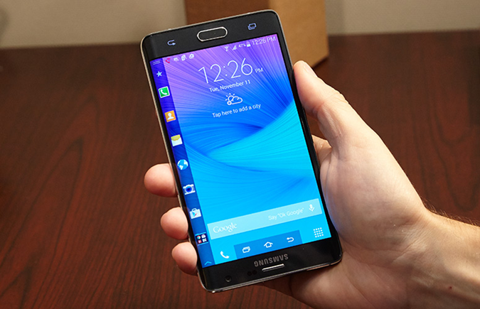
It's all about the curve. The right-sloped edge of the Note Edge looks downright sexy, and it's sure to grab attention. The edge of the device doesn't come to a sharp point, so it's fairly easy to hold with your thumb resting on the right side. Like the Note 4, the Note Edge has an aluminum frame that runs around the whole design, giving it a solid feel.
Too bad the curved screen forces some ergonomic trade-offs. Samsung moved the power button from the right side to the top, making it more difficult to reach (although you can use the Home/fingerprint sensor button to wake up the device). The volume rocker is on the left edge.
The back panel has the same luxurious soft-touch, leatherlike material as the Note 4, which provides a sure grip. It's also removable. The Note Edge comes in Charcoal Black and Frost White.
Measuring 5.9 x 3.2 x 0.32 inches and weighing 6.1 ounces, the Note Edge is slightly thinner and lighter than the Note 4 (6 x 3.1 x 0.33 inches, 6.2 ounces). The Nexus 6 is a heftier 6.5 ounces and 6.3 x 3.3 x 0.4 inches, while the iPhone 6 Plus is in the same ballpark as the Edge (6.1 ounces, 6.2 x 3.1 x 0.3 inches).
Sign up to receive The Snapshot, a free special dispatch from Laptop Mag, in your inbox.
Main Display
By packing the same quad-HD resolution into a smaller 5.6-inch space, the Galaxy Note Edge's Super AMOLED screen is even sharper than the Note 4's (540 pixels per inch versus 518 ppi). In a 4K trailer of The Hobbit: The Battle of the Five Armies, the smoky ruins left in Smaug's wake looked eerily beautiful. I could also make out individual strands of Legolas' bright blond locks.
Typical of AMOLED displays, the Note Edge can display a wide range of colors. In fact, it can produce 157.9 percent of the color gamut, compared with 165 percent for the Nexus 6's 6-inch AMOLED panel and 95 percent for the 5.5-inch iPhone 6 Plus. That higher number isn't necessarily a good thing, though, as the Edge's screen has a slight blue cast. On the Delta-E color accuracy test, the Edge scored 4.6 (0 is best), compared with 1.9 for the iPhone 6 Plus and 6.5 for the Nexus 6. The Note registered 4.2.
Although the Note Edge's screen kicked back some glare outdoors, it's more than bright enough to use in direct sunlight. The display registered a very high 503 nits on our tests, which is well above the category average (366 nits) and nearly double the Nexus 6 (273 nits). However, the iPhone 6 Plus hit an even higher 537 nits.
Curved Screen
With 160 lines of resolution, the Note Edge's curved display is a narrow strip, but it packs a surprising amount of capabilities. You can swipe between multiple panels that provide all sorts of info at a glance, from app shortcuts and quick tools (like a flashlight) to news tickers and mini apps. Cleverly, the Edge display can also be used as a mini alarm clock.
You can also activate just the Edge display when the main screen is off, an orientation Samsung calls Table Mode. You just run your finger back and forth along the edge, which made me feel like I was coaxing a genie out of its bottle. Then you can swipe through your panels.
Favorite Apps
I found the Edge's favorite applications panel most useful, because I could access e-mail, Spotify, Facebook and more without having to back out to the home screen. It's fairly easy to customize this panel by tapping the star at the top; from there you can drag and drop any app you want, as well as create folders.
Unfortunately, T-Mobile added its own panel of shortcuts that you can't customize or remove. You'll find icons for activating Hotspot, Visual Voicemail and Connection Assistant, plus an Amazon store shortcut. This was a bad move by Samsung and T-Mobile. When you're trying to get people excited about the "next big thing," crapware shouldn't be in the mix. Fortunately, you can remove this panel altogether.
Notifications
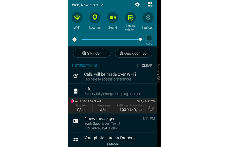
Here's a case where Samsung and Google seem at odds. It's nice that you can get incoming text messages, calls and other notifications on the Edge display without seeing them on the main screen, but after that the notification bar along the top of the screen still looks as busy as ever. I'd like to see a more unified approach.
For some reason, calls didn't come through to the Edge display on my review unit, which is a bug. Texts did, however.
Customization
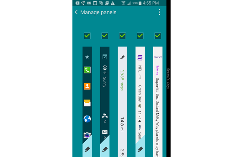
The Manage panels menu lets you decide what panels show up in which order, as well as edit what appears in some of them. For instance, for the Yahoo Sports information ticker I could select my favorite teams. I didn't find this ticker very useful, though, as it only displayed the latest scores and not news.
Speaking of customization, Samsung includes a mode (Rotate 180 degrees) that lets southpaws hold the phone upside down, so that they can use the edge with the thumb on their left hand.
In this mode, the Home button is above the display, but you get three on-screen buttons for Recent Apps, Home and Back at the (new) bottom.
Panel Options and Downloads
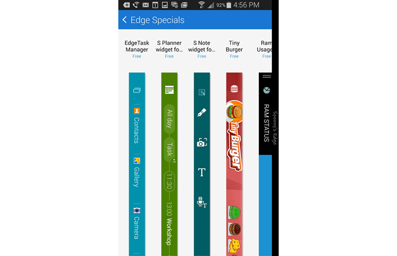
At the time of this review, there were 11 panels available on the Note Edge out of the box, with six more options available for download. Other info tickers include Twitter Trends, Yahoo Finance and News, S Health and Weather. The S Health ticker, for example, shows you how many steps you've taken, distance traveled and calories burned for the day at a glance.
Yahoo's tickers are entertaining but not smart enough. I clicked on an article to read it and it still showed up first in the feed, and the ticker scrolled too slowly. I wish I could control the speed.
I found myself using the media control panel fairly often when listening to Spotify. I could pause or skip to the next track without lighting up the whole screen.
Samsung makes some games available for the Edge display. Memory Match was a fun time killer (a memory recall game), but Tiny Burger (you build a burger to order) felt too complex for the small space.
App Controls
For certain apps, the Note Edge moves the controls to the edge of the display, which is supposed to leave more room for your content.
I appreciated this perk in Samsung's video player, which made for a more immersive experience, even if scrubbing forward and backward in a clip proved a bit challenging when I was using the curved edge.
I didn't like using the camera app, however, as the controls felt scrunched in that cramped space.
Night Clock
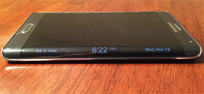
Here's a feature I would use every day. The Note Edge turns into an alarm clock at night (you set the 12-hour block of time this stays on), letting you quickly eye the time and temperature.
The edge display turns just bright enough to read it in a dim room, but I wish you could customize the brightness. I also wish you could set Night Clock to be on all the time, but Samsung says it decided against this because it uses up power. (Just be sure to turn off the blinking LED light for notifications; it annoyed me.)
Express Me
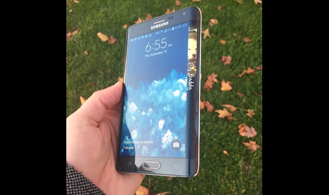
Samsung has done a good job with personalization on the Note Edge, as you can have the screen display your name on the right and create a fun Express Me panel that displays when the phone is locked.
I chose a photo of my golden retriever and used the S Pen to have "My Buddy" scroll down the screen. I know, "Awww... "
Audio
Loud but not very satisfying, the Note Edge's back-mounted speaker filled my medium-size office when streaming Chelsea Dagger from The Fratellis, but the clapping beat came across as tinny. The sonorous soundtrack on the latest The Hobbit trailer sounded fuller.
The Edge hit 81 decibels on our audio test, tying the category average. The iPhone 6 Plus was a quieter 78 dB and the Nexus 6 a thunderous 91 dB.
Interface
With the exception of the edge screen, the Note Edge sports the same interface as the Note 4. That means you get a robust Quick Settings menu with access to 20 options, a brightness slider and shortcuts for S Finder (search) and Quick Connect (for sending content to nearby devices).
The star of the show continues to be multitasking with Multi Window. With this feature turned on, you can run two apps side by side (like YouTube and email). It's a cinch to discover Multi Window-capable apps; just open the Recent Apps menu and find a thumbnail with two windows on top of each other in the right corner.
A handy pop-up view lets you resize compatible apps (like the dialer or calendar), move them around the screen and shrink them to icon size. The pop-up can then follow you from app to app.
S Pen
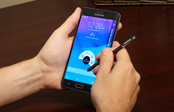
With all the swiping you'll be doing on the Edge's curved display, it's easy to forget that it has an improved S Pen experience. Don't, because it's a powerful little tool.
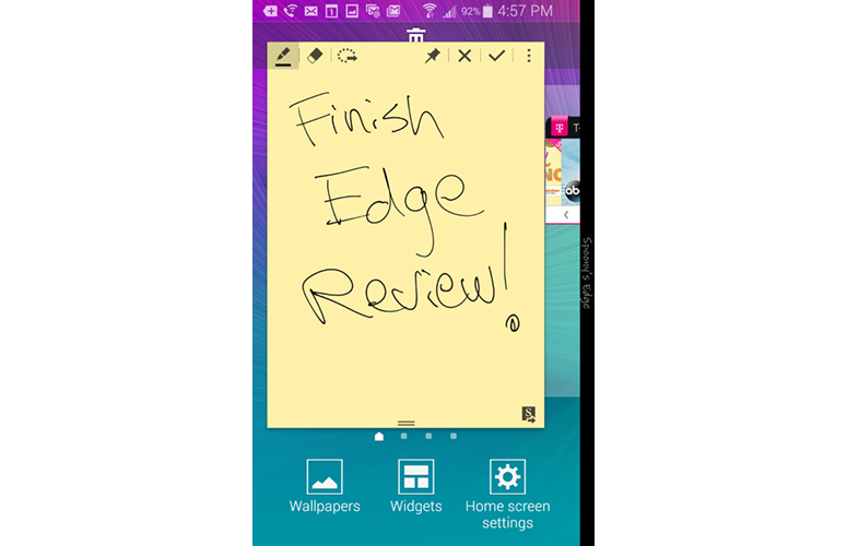
Like the Note 4, you get 2,000 levels of pressure sensitivity, which makes writing feel more natural. Plus, you can quickly pin Action Memos to the home screen. The S Pen also comes in handy for selecting text (just like a mouse) and selecting multiple items at once in the Gallery.
Performance
The Note Edge packs Qualcomm's fastest processor yet, the 2.7-GHz Snapdragon 805, along with 3GB of RAM. You can expand the 32GB of included storage with a 128GB microSD Card, but I wish this phone came with 64GB on board to better justify the premium over the Note 4.
On synthetic benchmarks, the Note Edge delivered strong performance that's comparable to the Note 4. The phablet hit 3,187 on Geekbench 3, which measures multicore performance. That's slightly higher than the Note 4 (3,124) and better than the iPhone 6 Plus (2,903), but not quite as good as the Nexus 6 with the same CPU (3,196).
The Note Edge fared even better on 3DMark Ice Storm Unlimited, notching 19,902. Although that's slightly lower than the Note 4's 20,126, it soundly beats the iPhone 6 Plus (16,965).
In real-world use, the Note Edge delivered mixed results. It took the handset only 4 minutes and 30 seconds to transcode a 1080p video in the VidTrim app, which is faster than the Nexus 6 (4:59) and even the Note 4 (5:15).
I noticed lag creeping in when I was performing everyday tasks. For example, the Note Edge was a titch slower to launch the Recent Apps menu than the Note 4 when I tested the two phones side by side. I also encountered a bug with the Gallery app; the camera photos didn't load for several seconds after I tapped the folder. It's also worth noting that the Edge display didn't always respond upon first swipe.
Camera
With a 16-megapixel sensor and optical image stabilization, the Note Edge is one of the most capable cameras in a smartphone -- just like the Note 4.
On an overcast day, the Note Edge snapped a colorful and sharp image of a group of yellow and purple pansies. I could easily make out the glistening drops of water on the leaves from the morning drizzle, as well as the browning on one of the wilting flowers toward the back.
The Note Edge had some trouble when capturing an American flag attached to my office building in Auto mode. Too much of the photo looked dark and drenched in shadow. However, when I engaged Live HDR, the photo brightened considerably.
Samsung's phablet should satisfy selfie enthusiasts with its 3.7-MP front camera, which has the ability to snap wide-angle shots with a dedicated Wide Selfie mode. I stuck to normal mode and liked the results anyway, especially since the Beauty Face smoothed out my wrinkles. I especially appreciate the ability to use the built-in heart rate monitor on the back of the phone as a shutter button.
For more on the Galaxy Edge's camera, see our full review of the Galaxy Note 4.
Apps
The Note Edge's most valuable bundled apps include Smart Remote for controlling your TV and S Health for keeping tabs on your heart rate, blood oxygen level, diet and even stress level and UV exposure. S Note is another goodie, as it lets you take full advantage of the pen.
I would ignore most of T-Mobile's apps, including T-Mobile TV and T-Mobile Name ID. But the My Account app is useful.
Battery Life and Charging
Despite sporting a lower-capacity battery than the Note 4 (3,000 mAh versus 3,200 mAh), the Note Edge lasted a bit longer on a charge -- albeit on a different carrier. The T-Mobile version of the Edge lasted 8 hours and 50 minutes on our battery test, which involves continuous 4G LTE Web surfing on 150 nits of brightness. That narrowly beats the Note 4 on AT&T (8:43) and is also longer than the Nexus 6 (7:05) and category average (8:30). However, the iPhone 6 Plus didn't conk out until the 10-hour mark.
MORE: Longest Lasting Smartphones
Like its Note 4 brother, the quick-charging capability of the Note Edge allowed the handset to get to 50 percent capacity in just 30 minutes. Don't have that much time? The included charger helped the Edge get to 25 percent in 15 minutes. That's even better than the Droid Turbo's 16 percent in the same amount of time.
Sprint Galaxy Note Edge
The Sprint version of the Galaxy Note Edge is available off-contract for 24 monthly installments of $35 (a total of $840), or $429 off-contract.
Sprint preloads its Edge with a ton of apps. Third-party options include 1Weather, Dropbox, eBay, Evernote, Facebook, Facebook Messenger, Flipboard, Hancom Office 2014, Instagram, Lookout, Messaging+, NASCAR Mobile 2014, NextRadio, NBA Game Time, Scout, Spotify and Uber. Even though several are very popular, I'd rather have the choice to install them myself.
MORE: Best Sprint Smartphones
Sprint's own apps are Sprint Music Plus, Sprint TV & Movies, Sprint Fun & Games, FamilyWall for Sprint, Sprint Zone and Sprint ID.
In Union Square, with five bars of service, the Sprint Galaxy Note Edge averaged download speeds of 10 Mbps, and upload speeds of 9.9 Mbps on Speedtest.net. However, Sprint's LTE network remains much smaller, and much spottier than the competition. A few blocks north, in Madison Square Park, the phone notched download speeds of only 400 Kbps and uploads of 200 Kbps.
On the Laptop Battery Test, the Sprint Galaxy Note Edge lasted 8 hours and 19 minutes (Web surfing via LTE). That's about half an hour less than the T-Mobile version, and about 10 minutes less than the current smartphone category average of 8:37.
Bottom Line
The Note Edge's curved display felt like a gimmick at first, but then I started to really appreciate having quick access to all my favorite apps, as well more room for content in apps like the Video player. I just wish there were more panel apps available, which will come with time. But it's not just about developers. Samsung should do more to take this entire concept to the next level.
Samsung Galaxy Note Edge Specs
| Alternate Carriers | Verizon, AT&T, Sprint, U.S. Cellular |
| Bluetooth Type | Bluetooth 4.0 LE |
| Brand | Samsung |
| CPU | 2.7-GHz Qualcomm Snapdragon 805 |
| Camera Resolution | 16MP |
| Carrier | T-Mobile |
| Display (main) | 5.6-inch/ 2560 x 1440 AMOLED |
| Display Resolution | 2560 x 1440 |
| Form Factor | Candybar Touchscreen |
| Front Camera Resolution | 3.7 |
| Memory Expansion Type | microSDHC |
| OS Family | Android |
| Operating System | Android 4.4 |
| Phone Display Size | 5.6 |
| Ports | microUSB, 3.5mm headphone |
| Processor Family | Qualcomm Snapdragon 805 |
| RAM | 3 GB |
| Size | 5.9 x 3.2 x 0.32 inches |
| Weight | 6.1 ounces |
| Wi-Fi | 802.11ac |

