How to Add Tables and Charts in Apple Keynote
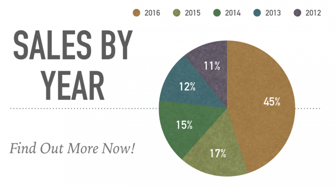
Apple Keynote Presentations dazzle with special effects and transitions, but they can also present data. If you're presenting information in a pie chart, for example, Keynote is willing to do the work of figuring out the percentages each part of your data makes up.
How to Add and Edit Tables in Keynote
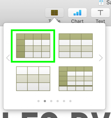
1. Click Table.

2. Select a kind of table. Swipe left and right to see a variety of options with different colors and patterns.
3. Click and drag the square box on the bottom right of your table to resize it. Keynote tends to place tables over existing content.

4. Click and drag the circle at the top left corner of the table to move it.

5. Double-click cells to edit the contents.
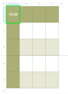
6. Click the equals sign at the bottom left or top right corner to change the number or rows or columns.
Stay in the know with Laptop Mag
Get our in-depth reviews, helpful tips, great deals, and the biggest news stories delivered to your inbox.
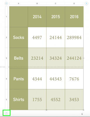
7. Select a different number.

You've created and edited a table in Keynote.

How to Add and Edit Charts in Keynote
1. Click Chart.

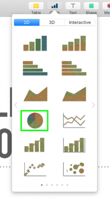
2. Select a kind of chart. Swipe left and right to see different colors, and click 3D and Interactive for even more options. We're going to choose a Pie Chart because Keynote will perform some simple math for us.
3. Click Edit Chart Data.

4. Edit the cells to quantify the data you're comparing and the juxtaposed information.

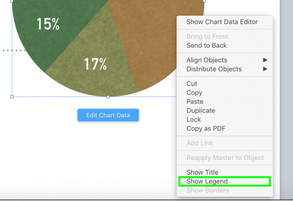
5. Right click on a space right outside of the chart.

6. Select Show Legend.
Henry was a contributing writer at Laptop Mag. He penned hundreds of articles, including helpful how-tos for Windows, Mac, and Gmail. Henry has also written about some of the best Chromebooks, and he has reviewed many Apple devices, including various MacBook Air laptops. He is now a managing editor at our sister site Tom's Guide, covering streaming media, laptops, and all things Apple.
