Apple iOS 7 vs. Samsung TouchWiz: Which Software Will Win?
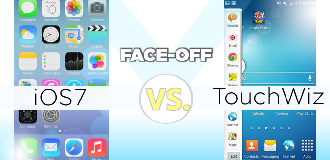
Just as Samsung reimagined Android with its TouchWiz overlay, Apple has given its own OS an extreme makeover with iOS 7. It’s not a skin, of course, but the new software (launching this fall) represents a fairly extreme revamp for a platform that hasn't changed its look and feel in several years.
On the other hand, Samsung’s TouchWiz software for phones such as the Galaxy S4 offers a ton of features, including motion gestures and a plethora of camera enhancements. In fact, Samsung is way ahead of Google when it comes to innovation. But is TouchWiz really better than what iOS 7 promises? Let’s go feature by feature to see how the two stack up.
Editors’ Note: iOS 7 is in beta and won’t be released until the fall. As such, this comparison only covers what Apple’s software update delivers in terms of design and features, not performance. We will revisit this comparison once iOS 7 is available to consumers.
Overall Look and Feel
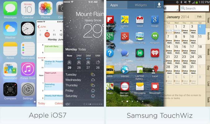
Apple has put skeuomorphic design out to pasture with iOS 7, which means you'll no longer see textures and other elements that remind you of old-school products. For instance, the Notes app doesn't use a faux-yellow pad motif. More important, Apple has minimized clutter, making more of your content visible. The revamped Calendar app is a great example of this.
iOS 7 uses a lot of translucency to give the software more breathing room (such as with Control Center) and animations to make the software feel more alive, whether it’s via transitions or falling rain in the weather app.
We don't love everything about the look and feel of iOS 7. Some of the icons just look odd, such as the four blobs that make up Game Center and the Photos app icon, which looks like an abstract flower.
Stay in the know with Laptop Mag
Get our in-depth reviews, helpful tips, great deals, and the biggest news stories delivered to your inbox.
Most of the app icons in TouchWiz have more depth than the flat tiles on iOS. Then again, TouchWiz can feel as subtle as a slot machine. In fact, some Samsung apps look downright ugly, such as the busy Calendar app. Some of the special effects are pretty neat, though, such as the optional light effect on the lock screen.
Although it’s not a feature of TouchWiz, Samsung’s support for widgets can make the interface feel more dynamic than iOS. Options include everything from Calendar and Exercise Mate to Flipboard.
Early Winner: iOS 7. Although it’s almost too flat, Apple’s new software feels more coherent and unified than Samsung's TouchWiz.
MORE: 11 Battery Tips for Your iPhone 5
Lock Screen
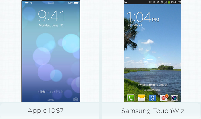
iOS 7 includes a new lock screen with a Slide to Unlock message at the bottom of the display that illuminates from left to right. This treatment looks elegant, but the text is harder to read. You’ll also find an up arrow at the bottom of the screen, but that’s for entering Control Center (more on that below). The bottom-right corner houses a camera icon for unlocking to the camera.
Samsung’s TouchWiz has an automatic edge over iOS 7 because you can unlock to any four applications you want. For example, you can go right to email, Facebook, the Chrome browser, or whatever you desire. Having this kind of convenience saves time. Not enough options for you? You can swipe from right to left to see a grid of 12 favorite apps — another menu you can customize.
Unlike iOS 7, Samsung’s TouchWiz also offers lock-screen widgets, such as a Google Now widget that shows you the weather, the score for your favorite baseball team and favorite stocks. Other options include Gmail, Yahoo News and Google Plus posts.
Early Winner: Samsung TouchWiz. While Samsung’s TouchWiz offers almost too many lock-screen options — complete with its own Settings submenu — we prefer it because you can unlock to the app of your choice.
MORE: 12 Worst Android Annoyances and How to Fix Them
Notifications
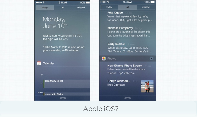
iOS 7’s Notification Center is now organized into three tabs going across the top of the screen. The default view is Today, which shows the current weather and forecast, and your next meeting. Below that you'll find the Calendar, Reminders and Stocks. The other two tabs are All (for all notifications) and Missed. The All tab would include things like your last five emails.
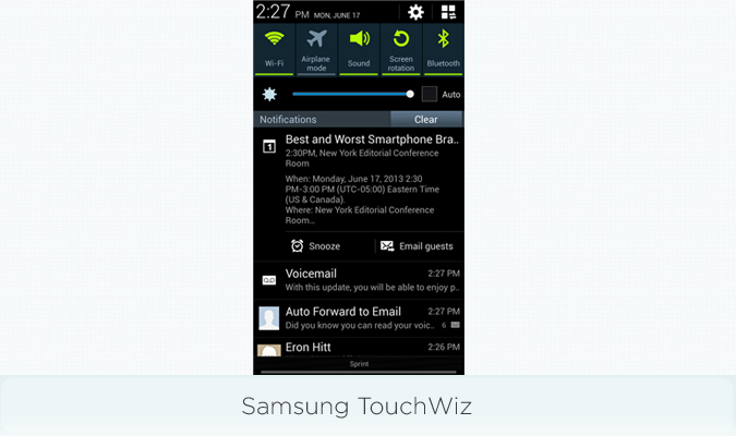
With Samsung’s TouchWiz interface on the Galaxy S4, the company combines its Notifications and Quick Settings option into one area. Swipe down from the top of the screen at any time to see all of your alerts.
TouchWiz benefits from Android Jelly Bean’s support for active notifications. Unlike on iOS 7, you can swipe to dismiss individual notifications, return missed calls from the notification drawer, change music tracks and email guests for a calendar entry if you’re running late.
Early Winner: Samsung TouchWiz. The ability to act on notifications without opening the corresponding app gives TouchWiz (by way of Google’s software) the win in this round. Plus, you don’t have to open a separate menu to tweak various settings.
Quick Settings
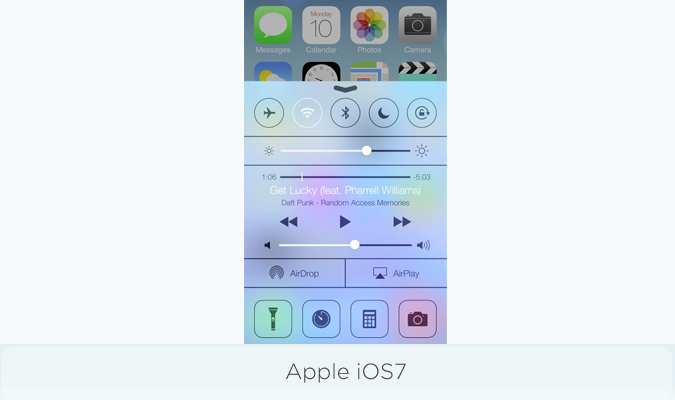
It’s about time. We’ve been complaining for ages that the iPhone doesn’t let you easily toggle settings like Wi-Fi, Bluetooth and Airplane mode.
With iOS 7’s new Control Center, swiping up from the bottom of the display reveals a menu that lets you toggle among Airplane Mode, Wi-Fi, Bluetooth, Do Not Disturb and Orientation Lock. You’ll also find a brightness slider for the display, playback controls and volume for music, and an AirPlay shortcut button for streaming content to devices like the Apple TV.
Last but not least, Control Center includes shortcuts to the Flashlight, Clock, Calculator and Camera. However, you can’t customize these options.
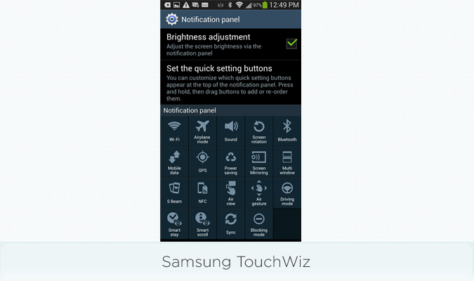
As mentioned previously, Samsung TouchWiz bakes its Quick Settings into the notification drawer. You’ll see five options displayed by default: Wi-Fi, Airplane Mode, Sound, Screen Rotation and Bluetooth. You’ll also see a brightness slider underneath these options. Long-pressing an option, like Wi-Fi, will take you into the Settings menu option for that feature — something iOS 7 doesn’t seem to offer.
Things get really interesting (and a little confusing) when you tap the grid button in the top-right corner. Doing this expands the list of quick settings to 19, including everything from Driving Mode and Multi Window to Power Saving and Air gesture.
What we love about this Quick Settings menu is that you can move around the icons as you see fit.
Early Winner: Samsung TouchWiz. While Apple’s Control Center is more elegant and intuitive, Samsung gives you more options with Quick Settings and the ability to rearrange them.
MORE: Best Smartphones 2013
Keyboard
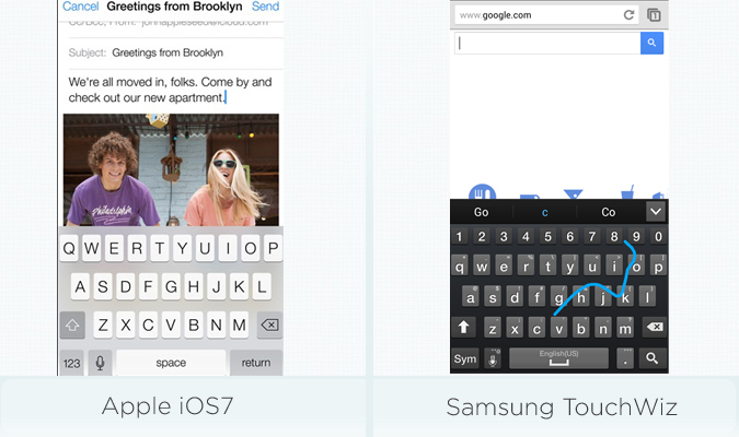
Other than a thinner font and a background that appears more translucent to blend in more with the app you’re using, iOS 7’s keyboard hasn’t really changed. Meanwhile, Samsung includes a much more robust keyboard with TouchWiz powered by SwiftKey. This layout offers next-word prediction, swipe typing (a la Swype) and a dedicated number row, which speeds up text entry. You also have the option for haptic feedback.
Early Winner: Samsung TouchWiz. Unless Apple makes some enhancements between now and the fall, Samsung TouchWiz offers a better typing experience.
MORE: 5 Best Keyboard Apps for Android
Multitasking
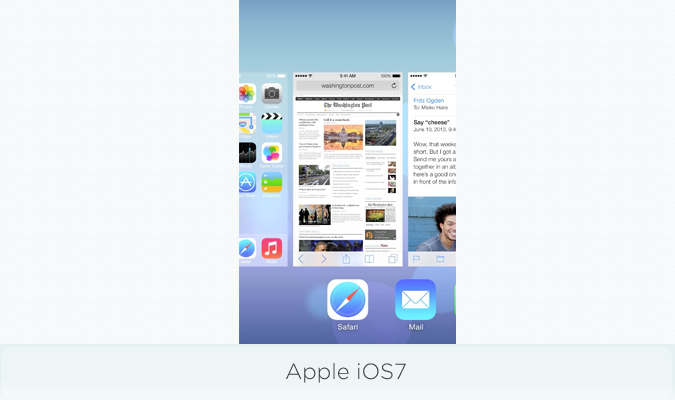
With iOS 7, Apple has definitely taken a page from webOS for its multitasking upgrade. Double tap the Home button to see large preview screens with icons underneath. To close an app, just swipe it upward off the screen. iOS 7 also makes multitasking more efficient by scheduling updates, which can save battery life.
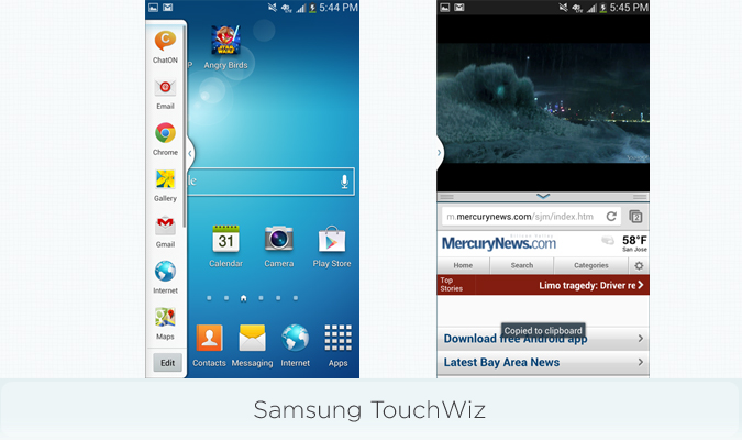
For its smartphones and tablets, Samsung sticks with Google’s Recent App menu, which presents smaller thumbnails than iOS 7 does. You can see more apps at once than in iOS 7, but Apple’s visual approach is more intuitive.
The "wow" feature of Samsung TouchWiz is Multi Window, which lets you run two applications at the same time. (It’s available on the Galaxy S4, Note II and Galaxy Note 8 tablet.) There are 12 options to choose from, including Chrome, Email, Twitter, Facebook and Gmail.
Early Winner: Draw. iOS 7 does a better job with switching apps and keeping them up-to-date in the background, but only TouchWiz lets you run two apps at the same time.
Camera App
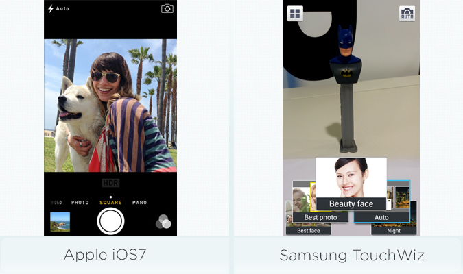
The Camera app in iOS 7 sports a sleeker look than the iOS 6 version, and provides the ability to change modes just by swiping sideways on the screen. A new Square mode makes your pics more Instagram-friendly. Speaking of Instagram, iOS 7 lets you apply multiple fun filters to your pics, including Mono, Instant, Tonal and Chrome. Although you can apply these filters to live and edited shots with the iPhone 5, the iPhone 4S is limited to the editing stage.
With TouchWiz on the Galaxy S4, Samsung makes it feel like you're using a cutting-edge point-and-shoot camera. Special modes abound, including the ability to shoot with the front and back cameras simultaneously and Eraser mode for eradicating would-be photobombers. Other impressive features include Animated Photo, which makes part of your image move, and Drama Shot, which stitches together multiple images.
Similar to iOS 7, TouchWiz lets you apply a variety of effects, such as Vignette, Sepia and Vintage. Add in Burst Shot, Face Detection and Auto night detection, and you have a lot of options at your fingertips.
Early Winner: Samsung TouchWiz. Although the number of options can be overwhelming, Samsung does a nice job of explaining what each mode does, right on screen.
MORE: Smartphone Camera Shootout 2013
Photo Apps
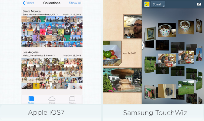
Both Apple and Samsung attempt to make it easier to enjoy your photos — but they take different approaches. iOS 7 focuses on organizing your images using time and location. So, for instance, if you just got a new puppy, the software will display all the images you took the day he arrived.
Those interested in seeing all the photos they've taken in a given year can pan out to the Years view. There's a nifty effect that lets you skim through shots by pressing and holding the screen and then scrolling left or right.
Samsung’s Gallery app provides several viewing options, including Albums, Time, Locations, People, Favorites and a fun but not very practical Spiral view. Once you open a photo, Samsung and Google give you a lot more sharing options than iOS 7, from Dropbox and Facebook to Flipboard and Google Plus.
Samsung's Story Album app makes working with photos a lot more fun, as it can automatically create digital albums for you. In addition to tweaking the theme, you can order photo books directly from your device.
Early Winner: iOS 7. Although Samsung provides more options, Apple's Photos app is more intuitive.
Sharing Files
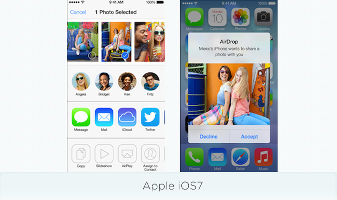
Apple’s new AirDrop feature allows iOS 7 users to share photos, videos, contacts and other files via a slick interface (complete with profile photos) and perform peer-to-peer file transfers. You can set AirDrop to only communicate with existing contacts or set it to Discover mode to let people who aren't in your address book share files with you.
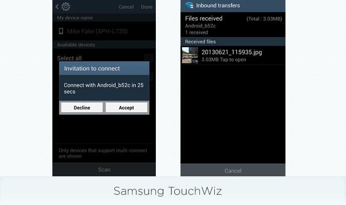
With Samsung’s TouchWiz, you have multiple options. You can touch the backs of the two devices together to establish a connection via NFC, and then tap to send the file via Wi-Fi Direct. Or, you can send to multiple contacts at once via Wi-Fi Direct. A separate Group Play feature allows you to share music, pictures, documents and even games with a group of Galaxy phones via a “leader” device.
Early Winner: Draw. The Galaxy S4 gives you more sharing options, but AirDrop is more elegant.
MORE: 10 Best Android Apps You're Not Using
Web Browser
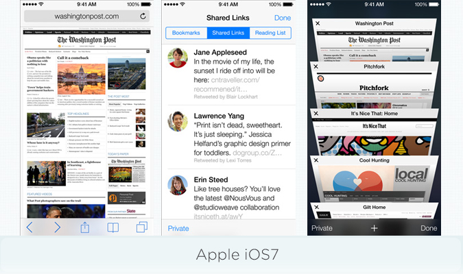
In iOS 7, the browser finally has a unified address and search bar (just like Chrome). There's also a sleek new tab view that shows open pages stacked on top of one another in a way that lets you see more pages at once than the TouchWiz browser allows.
If you want to surf privately, you can choose Private mode from within the tab menu. If you're feeling more social, you can browse Shared Links from Twitter contacts right from within the Bookmarks menu. Those looking to securely log in to websites and make purchases without having to remember complex passwords can try out iCloud Keychain.
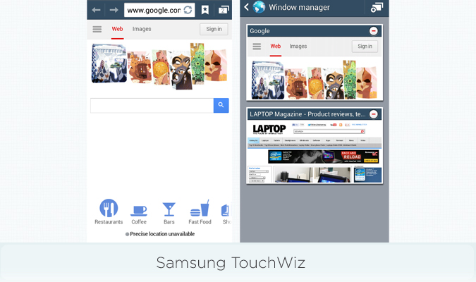
Samsung's default Android browser on the S4 and other devices is straightforward, with easily accessible bookmark and window manager options just to the right of the address bar. The Bookmarks menu, which uses small thumbnails for your favorite sites, is more appealing than Safari in iOS 7.
Unlike iOS 7, you can make any other browser your default option, such as Chrome.
Early Winner: iOS 7. Apple has simply done more to innovate in this area than Samsung.
Car Mode
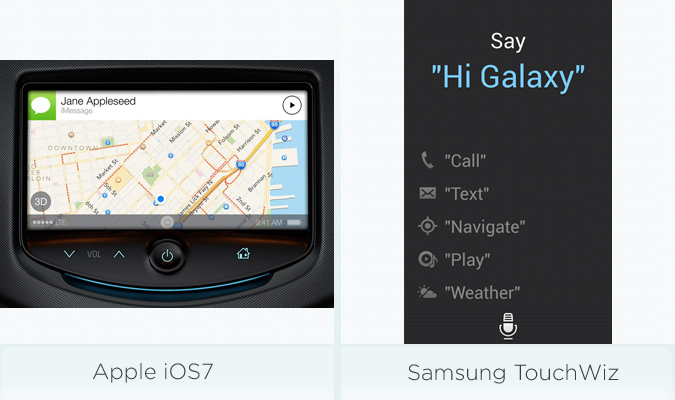
iOS in the Car isn't coming until 2014, but Apple has a leg up on Samsung because 11 brands — including Mercedes, Nissan, Kia, Hyundai and Chevrolet — have signed up to support it.
This integration feature in iOS 7 will allow users to connect their device to their vehicle and make calls, play music, get directions, and send and receive messages via Siri. iOS in the Car can also automatically display your ETA for home or work as well as traffic conditions.
Samsung TouchWiz on the Galaxy S4 offers a Driving Mode that can read incoming calls, texts and notifications aloud. Within S Voice, you can call, text, navigate to a destination, play music or get the weather using your voice.
Early Winner: iOS 7. Although users will have to wait until early next year, in-car integration with multiple big-name automakers gives iOS 7 the edge in this category.
MORE: 10 Best iPhone Apps You're Not Using
Special Features
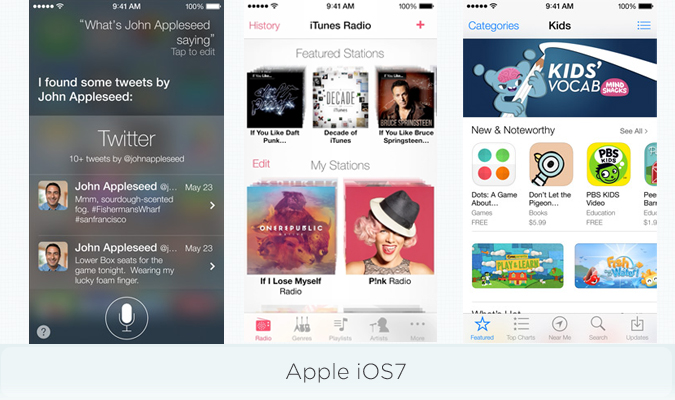
Apple's most unique feature continues to be Siri, which gets some upgrades in iOS 7. You can now take your pick between a more natural-sounding male or female voice, and Siri integrates with Bing and Wikipedia to deliver search results. You can also use Siri to change certain settings.
iTunes Radio lets you stream more than 200 stations and create your own stations (similar to the stations you can create on Pandora). Of course, you can easily download tracks to your device via iTunes, but Apple doesn't offer an all-you-can-eat subscription option like Spotify does.
Other new iOS 7 goodies include a redesigned App Store that includes both a kids section and the ability to search for apps based on your location (which can come in handy while traveling). Last but not least, Find My iPhone gets smarter because would-be thieves are forced to enter your Apple ID and password to reactivate your device.
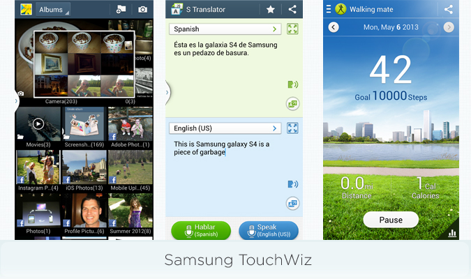
Samsung's TouchWiz is all about pouring on the extra features, including clever new ways to interact with your Galaxy phone. With Air Gesture, for example, you can wave your hand in front of a sensor to answer the phone or advance to the next music track or photo. Smart scroll lets you scroll up and down Web pages just by tilting your head (although we've found this to be awkward). Smart Pause lets you pause a video just by looking away from the screen, while Air View enables you to preview content (such as email) by merely hovering your finger above the screen.
Samsung’s WatchOn app works in tandem with an IR blaster to turn your phone into a remote control. Then there's S Translator, which can translate between languages on the fly. Those looking to get fit will appreciate S Health, which can track your activity and be paired with an optional Fitbit-like S Band, heart monitor and scale (coming soon).
Early Winner: Samsung TouchWiz. On balance, TouchWiz's special features are more compelling than iOS 7's.
MORE: 10 Best Android Smartphones
Bottom Line
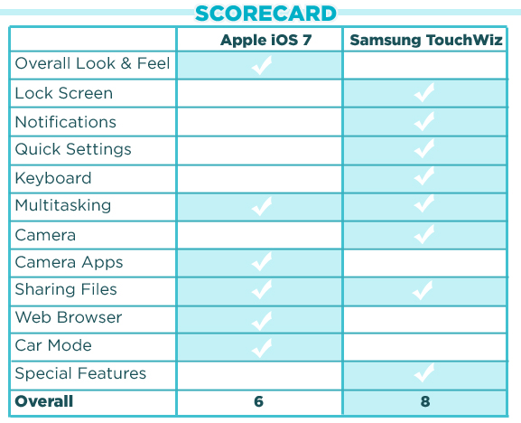
Overall, Apple has done a remarkable job of modernizing its platform while keeping it mostly familiar. And yet Samsung is still a step ahead of iOS 7 in terms of versatility and innovation.
iOS 7 delivers some missing features that previously gave iPhone owners Android envy, such as a Control Center and improved multitasking, but Apple's approach is much more focused and visually appealing than Samsung's. We also appreciate the way iOS 7's new Photo app better organizes your images and the new AirDrop feature for sharing files.
Samsung's TouchWiz throws a lot at the wall to see what sticks, which is the exact opposite of Apple's approach. But it's working, because we prefer Samsung's software when it comes to things like its customizable lock-screen shortcuts and its unified — and more robust — Notifications and Quick Settings menus. TouchWiz also boasts a more advanced keyboard and more compelling camera modes.
When you add in everything else that TouchWiz lets Samsung's phones do, from doubling as a TV remote to tracking your health, there's just more wow factor there. At least at this early stage, iOS 7 delights in many ways, but the wow features likely won't come until the next iPhone.

