10 Biggest Gadget Design Fails
There are good trends in gadget design, like thinner and lighter devices, bigger and sharper phone screens, and water-resistance. And then there are design fails that make us scratch our heads. When it comes to laptops, tablets and smartphones, I keep seeing many of the same annoying flaws over and over. There are also some new trends in gadget design that absolutely need to be nipped in the bud. Consider this list a polite, but forceful, intervention for clueless manufacturers.
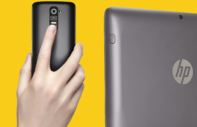
Power Button in the Back
If you can’t see something, logic dictates that it’s harder to locate and press. But this line of reasoning hasn’t stopped the likes of LG, Amazon, HP and others from creating devices with the power button and volume controls on the rear. In the case of the LG G2, the power and volume controls are stacked vertically, making it even harder to discern what’s what. The HP SlateBook x2 suffers from the same backward design thinking, though at least this tablet-laptop combo places the power and volume buttons on opposite sides of the slate’s back. Meanwhile, the keyboard portion of this hybrid lacks a power button, so you have to reach around the x2 to turn it on in notebook mode. Dumb.
More: Best Smartphones 2013
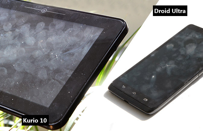
Grimy, Smudge-Prone Designs
There's nothing that looks cheaper than a tablet, laptop or phone that smudges up with fingerprints within a few minutes of picking it up. Typically, an overly glossy plastic surface is to blame. I recently got grossed out by the Kurio 10s kids tablet for this very reason, but it’s far from alone. The Motorola Droid Mini phone and HP Pavilion Touchsmart 15z notebook suffer from the same slimy faux pas. I'm encouraged by some of the latest unibody plastic designs, which not only resist fingerprints, but offer a pop of color. The Nokia Lumia 1020 and iPhone 5c are good examples. I'm also a fan of soft-touch finishes, found on the back of devices such as the Nexus 7.
More: 10 Most Stylish Smartphones
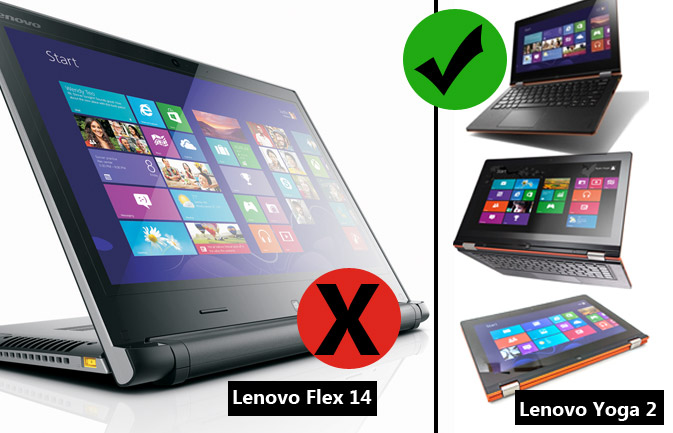
Flip Notebook Flops
Even after a year of experimentation, Windows 8 notebook makers are still struggling to combine touch screens with traditional laptop designs. Take the Lenovo Flex(starting at $569), which flips around from laptop to stand mode — and that’s it. If you want to use your hybrid as a tablet, you’d have to step up to the $849 Yoga 13. To us, the premium is worth it, because you can flip the display all the way around to use the device as a slate. Sony’s VAIO Flip (Fit 14A) is a better take on the convertible in that you can use the machine as a notebook or tablet, but the hinge mechanism is awkward. You have to unlock a latch before flipping the display. That’s not exactly seamless or intuitive.
More: Top 8 Windows 8 Tablet-Laptop Hybrids
Stay in the know with Laptop Mag
Get our in-depth reviews, helpful tips, great deals, and the biggest news stories delivered to your inbox.

Dim and Dingy Screens
You might not think of display quality when it comes to design, but it plays a critical role in determining the value of a mobile device. You could have the beefiest specs on the planet, but what good will that do if your photos look dim? By the same token, narrow viewing angles can mar the user experience. If you have to tilt the lid on a laptop way back just to see what’s on the display, don’t buy it. The good news is that we measure the brightness of every notebook, tablet and phone that comes through our labs and compare that number with the category average. But be sure to test-drive that screen in the store, too.
More: Best Tablets 2013
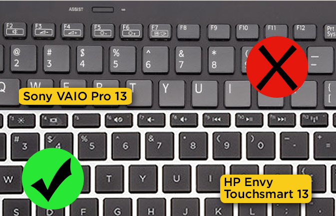
Time-Wasting Function Key Combos
I can count on one finger the number of people I know who actually use the Function keys on laptops as they were originally intended. So why do laptop makers continue to force people to perform annoying key combinations to do something as simple as adjust the volume or brightness? Apple has been doing this the right way for ages by offering direct action keys above the number row, and some on the Windows side of the aisle have finally gotten the message. But others haven’t. Sony’s VAIO Pro 13, for instance, needlessly goes the combo route, as do many Lenovo ThinkPads
More: Best & Worst Notebook Brands 2013
Phablets That Stretch Your Fingers
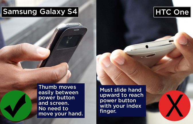
I have a problem with big-screen phones that force you to stretch your fingers to the point they’re nearly coming out of their sockets. The HTC One, an otherwise gorgeous aluminum device that has its power button on top, comes to mind. Cleverly, this button doubles as an IR blaster for controlling your TV, but I would have preferred that HTC split up these functions and put the power button the right side where your thumb rests. This is what Samsung does with its oversized handsets, including the Galaxy Mega and Note 3.
More: The Biggest Smartphones in The World
Bad or Missing Touchpad
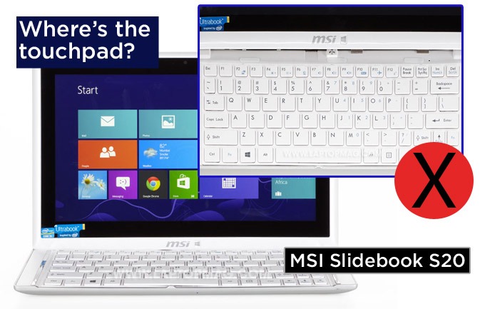
Just because your notebook or hybrid tablet has a touch screen does not excuse the lack of a touchpad. Your finger simply cannot replace the precision of a touchpad when it comes to manipulating the cursor. Acer’s Aspire P3 has an optional cover that doubles as a keyboard, but it lacks a pointing stick and touchpad. The MSI Slidebook S20 suffers from the same glaring omission. You’ll definitely want to plug in an external mouse — if you buy these devices at all. The VAIO Duo 13 is another offender for a different reason. The 3 x 1-inch touchpad on this slider design is so small we found ourselves constantly bumping up against its edges. The touchpad is something you shouldn’t even have to think about, and here, it’s a chore.
More: Top 10 Ultrabooks
Faux Metal Jackets
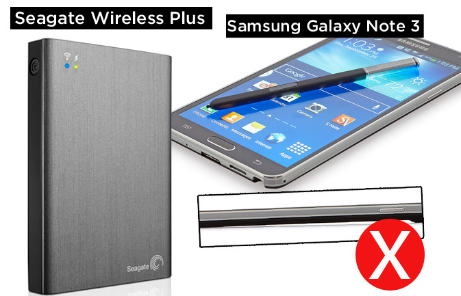
There’s something misleading and cheap about a gadget that pretends to have a metal body when it’s really made of plastic. It’s especially offensive when that treatment looks like brushed metal. The Seagate Wireless Plus portable hard drive makes this aesthetic error, but at least the sides and bottom have a more pleasant soft-touch finish. Samsung constantly attempts to make the sides of its phones appear chrome-like, going as far with the Galaxy Note 3 to include striations in the design that remind me of the "Star Wars" Landspeeder. But there’s no hiding the fact that it’s plastic.
More: 5 Ways to Supercharge Your Laptop For Under $100
That Chintzy Screen Ripple Effect
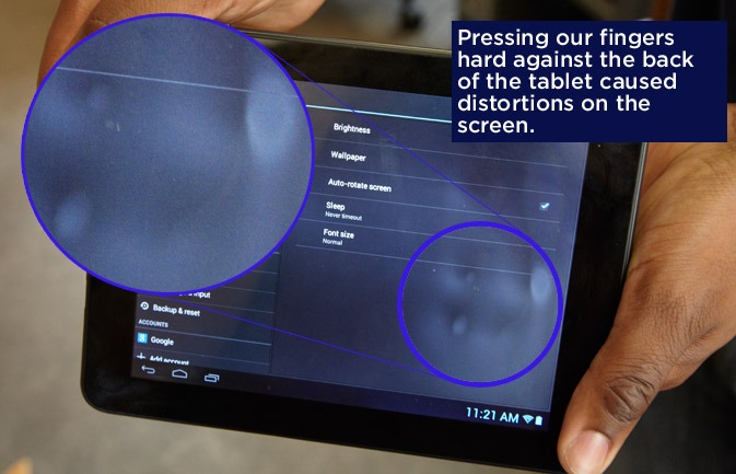
Here’s a surefire sign that the inexpensive tablet you’re shopping for should be left on the shelf. Press your fingers on the back of the chassis, and if you see a ripple effect on the display, the slate is too cheaply made to deserve your cash. We noticed this awful design flaw on the $99 eFun Nextbook 8HD. By the same token, you know that tablet screen won’t hold up under pressure if when you press it you see a similar effect.
Easily Muffled Speakers
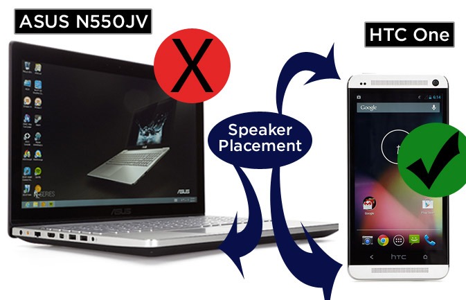
Nothing can spoil your listening pleasure more than poorly placed speakers. On notebooks, this often means bottom-mounted speakers that can easily be muffled when sitting in your lap. (It’s as if their makers forgot about the “lap” part of laptop.) The otherwise excellent ASUS N550JV and Acer Aspire S7 both exhibit this flaw. On the tablet front, the Galaxy Tab 3 8.0 has speakers along the bottom edge, which makes it all too easy to cover them up when holding the device in landscape mode. Same thing goes for the iPhone 5c and 5s. The solution is to try to place the speakers in a position that directs sound at the users, as the HTC One does with its dual front-facing speakers. Apple and others do a good job on the notebook front by putting the speakers behind the keyboard.
More: 12 Best Music Apps

