How to Create a Waterfall Chart in Excel 2016
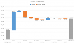
Microsoft added a new Excel chart type in Office 2016: the Waterfall chart, also known as a cascade chart or a bridge chart. This kind of chart illustrates how positive or negative values in a data series contribute to the total, such as how income and expenses result in a net balance in your bank account.
The steps below show you how to create a Waterfall chart, whether you want to visualize financial statements, analyze inventory or sales trends, or see how other values update through a period of time.
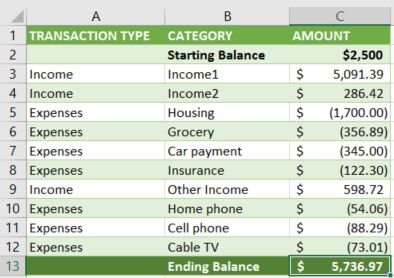
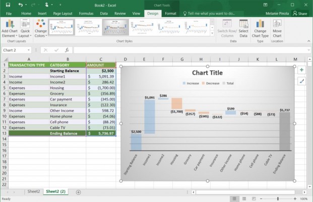
1. Select the data you want to create the waterfall chart from. In this example, we're using a simple expenses and income table.
2. Navigate to the Insert tab and click the Waterfall chart button (it's the one with the bars going both above and below the horizontal axis) and then the Waterfall chart type.
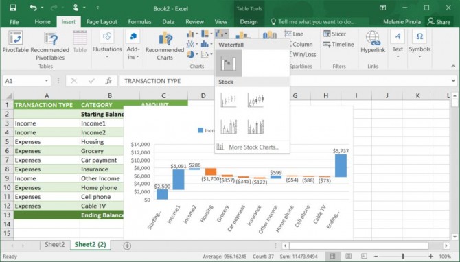
Excel will create the chart based on your data and put the chart in the middle of the spreadsheet.
3. Move or resize the chart as necessary by dragging it.
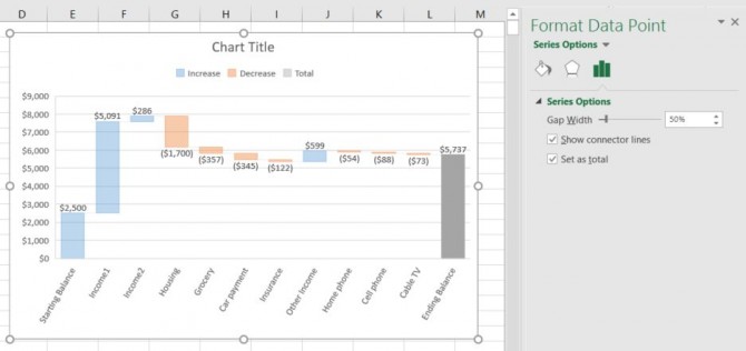
4. Separate subtotals or totals from the other values. If you have subtotals in your chart, Excel might incorrectly consider them additional values. To fix this, double-click on the data point that should be considered a total or subtotal (in this case, the ending balance) and in the Format Data Point pane, check the "Set as total" box.
Stay in the know with Laptop Mag
Get our in-depth reviews, helpful tips, great deals, and the biggest news stories delivered to your inbox.
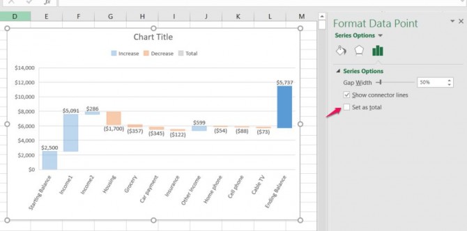
Now the chart will not add or subtract that value to the others, but display it as a total or subtotal.
5. Style and format the chart as you would other Excel charts. You can format the chart the same way you would other charts in Excel--editing the chart title, choosing a different font, and formatting the gridlines, for example. If you head to the Design tab, you can also quickly change the chart's style to one of the preformatted options.
Waterfall charts are a great way to see how individual pieces of data contribute to the whole. In previous versions of Excel, you couldn't automatically create Waterfall charts and had to jump through hoops to make them manually. This is a welcome addition to Excel.
Microsoft Excel Tips
- Use VLOOKUP in Excel
- Back Up Files Automatically in Excel
- Remove Duplicate Data in Excel
- Create a Waterfall Chart in Excel
- Lock Cells in Excel
- Freeze Rows and Columns in Excel
- Build a Forecast Chart in Excel
- Create a Funnel Chart in Excel
- Make a Treemap in Excel
- Convert Excel Sheets to Google Sheets
- Open Google Sheets in Excel
- Combine Data from Different Cells
- Merge Cells to Span Multiple Columns
- Use AutoFill for Repetitive Data
- Copy and Paste Repetitive Data the Easy Way
- Use Text to Columns
- Draw Diagonal Line in a Cell
- Create a New Shortcut Menu
- Transpose Columns Using Paste Special
