Face-Off: Nook Color vs. Galaxy Tab WiFi
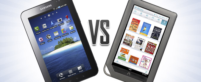
Now that Barnes & Noble has updated its popular Nook Color eReader to make it more like a tablet, consumers have a hard choice to make. With the tablet market full of offerings that cost $400 on up to $900, a $249 device consumers can use to browse the web, read e-mail, play games, and buy books is pretty attractive.
There are some notable differences between the Nook and pricier tablets—no cameras, Bluetooth, 3G, or docking connector—but with the introduction of apps, Barnes & Noble's “Reader's Tablet” will be good enough for a lot of buyers. However, the Nook Color has a new low-cost competitor in the Samsung Galaxy Tab WiFi ($349). For $100 more, this 7-incher provides dual cameras, a built-in video store, and access to more apps.
So which affordable slate is best? Let the face-off begin.
Design
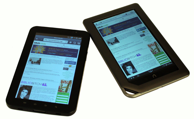
The Nook Color is longer and wider than the Tab (8.1 x 5 inches vs 7.5 x 4.7 inches), and they're about the same thickness (0.48 and 0.47 inches). However, the Nook Color feels better in the hand because its edges are rounded and tapered, while the Galaxy Tab's are more boxy and angular. However, we noticed the Tab's weight (13.6 ounces) much less than the Nook Color's (15.8 ounces) after a long reading session.

Aesthetically, the Nook Color looks more sophisticated than the Tab. We like the faux-metallic finish better than the latter tablet's glossy plastic treatment. Plus, the Nook's buttons sit flush with the rounded edges, making for a seamless look. There's only one button on the front: the stylized n that serves as Home button in most instances.
The Galaxy Tab's design has its own brand of elegance. We particularly like the capacitive buttons on the front and the smooth glass bezel. Overall, the Nook Color's design is meant to impress even when the screen is off, while the Galaxy Tab's is meant to put focus on the display and the content.
Stay in the know with Laptop Mag
Get our in-depth reviews, helpful tips, great deals, and the biggest news stories delivered to your inbox.
Winner: Nook Color
Although it's heavier, the Nook Color has a sleeker, more modern look and is more comfortable to hold.
Display
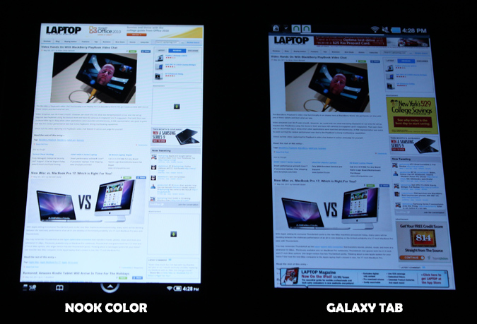
Both the Nook Color and the Galaxy Tab WiFi feature 7-inch displays with a resolution of 1024 x 600. However, the Nook Color's LCD has a slight edge over the Galaxy Tab for both indoor and outdoor viewing. The Nook Color's IPS display handles natural light better, allowing black text to stand out a bit more. On the Tab's TFT screen, text blended more with the background.
Indoors, the difference between the displays was quite noticeable when we viewed the tablets side by side. The Nook Color's VividView technology made images on the Tab look somewhat muted by comparison, especially from wider viewing angles. When the screen was turned down to just 20-percent brightness, text on the Nook was still crisp and clear.
Winner: Nook Color
Better outdoor readability and wider viewing angles helped the Nook Color take this round.
eReading Experience: Nook Color vs. Nook App
It's easy to assume that because the Tab has access to the full Android Market and eReader apps from most major eBook sellers—Google Books, Kindle, Kobo, Nook, and Sony, plus Aldiko for indie eBooks—it's the better choice. However, the Nook Color excels as an eReader in ways the Galaxy Tab does not. Comparing the Nook App for Android on the Galaxy Tab and the Nook's eBook reading interface reveals many similarities, but a few distinctive differences.
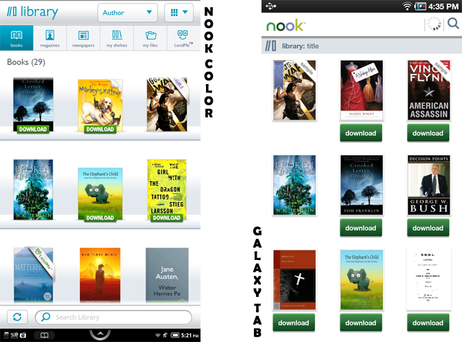
The library management tools on the Android app are very basic. Users see all the books in their account, with those not on the device marked with a Download button. That's it. You won't find the Nook Color's ability to create "My Shelves" (a.k.a. Collections), and you're limited to only two Sort options (compared to four for the Nook Color). We do like that the Nook app for the Galaxy Tab has a My Files feature, just like the Nook Color. This allows users to import non-Nook ePub files into the app so users can keep all their titles in one interface.
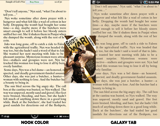
Inside books, both Nook app and Nook Color users can adjust the font face, text size, line spacing, margins, and color theme. Users can also choose to let the publisher's defaults override these choices. The Nook Color has six themes to the app's four. The app has one extra choice for line spacing and margins, but that's likely to accommodate for varying screen sizes and resolutions, which isn't a consideration on the Nook. Both platforms allow for notes and highlights. Only the Nook Color adds sharing to the mix; users can post quotes and passages to Facebook and Twitter from inside a book.

The actual reading experience is better on the Nook Color due to the display's quality. On the same theme settings, text was crisper and bolder than on the Tab, and we were able to get smaller font sizes and fit more on the screen. The only thing we wish the company would port from the app is the page turn animation.
Readers who want access to those beautiful color magazines or even their newspaper subscriptions from Barnes & Noble won't find them in the Nook Android app. Update: On May 13th Barnes & Noble updated the Nook app for Android to allow tablets with screens 7 inches and up to access magazines and newspapers. However, NOOKFriends, Barnes & Noble's Nook Color-based social network, is still only available on the eReader and not via the mobile apps.
In the book shopping department, the Nook Color wins again. Product pages have more information, and users can "like" or review the book right from the tablet.
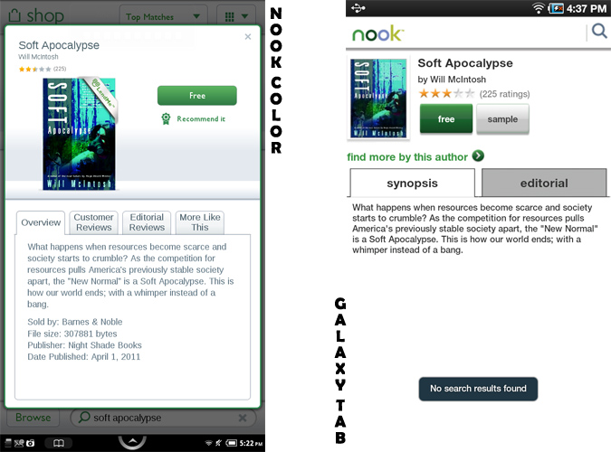
Barnes & Noble specifically designed a pleasant shopping experience for the Nook Color, so this isn't a big surprise.
As for eBooks from other stores, users can add them to the Nook Color as long as they're ePub using Adobe DRM or DRM-free. This excludes Kindle books, though. If you're looking for a device to read both Nook and Kindle books, the Galaxy Tab is the better choice of the two.
Winner: Nook Color
Exclusive features plus a better shopping and reading experience make the Nook Color the better eReader.
Interface
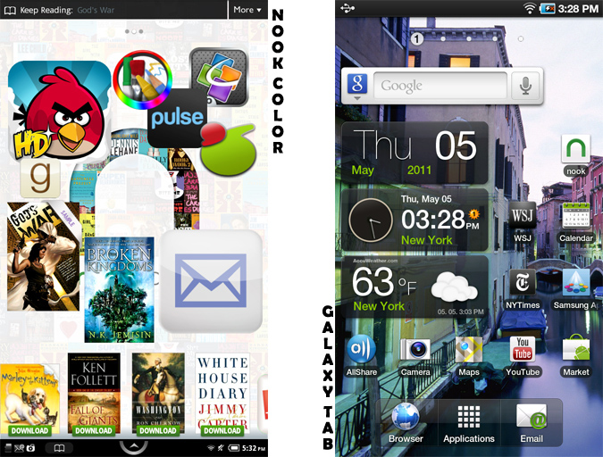
In April, Barnes & Noble updated the Nook Color's software, adding enhancements and app store capability. The underlying software is Google Android 2.2 (Froyo), just as on the Galaxy Tab. However, the interfaces on these devices are very different. B & N created a distinctive UI for the Nook when it was first released that has been tweaked to accommodate new features.
Now the n button on the Nook Color sometimes serves as Home, but within apps it acts as a Back button. Developers were given the ability to add Back and Menu soft buttons in the notifications area to accommodate apps that were designed for other Android devices. Overall, though, the interface remains fairly easy to navigate.

We like the reader-focused interface features on the Nook Color. For instance, users can add books, magazines, newspapers, and apps to one of three home screens. Unlike in stock Android, you're not limited to a predefined grid, and icons are resizable. The price for the Nook Color's level of customization is a high level of restriction. You can't side-load apps—unless you root the device—and you can't tweak the interface to your liking.
The Galaxy Tab's interface, like that of its 3G brethren before it, is the familiar Android we're used to seeing on phones and pre-Honeycomb tablets. Samsung's TouchWiz interface, custom widgets, and tweaks to certain stock apps (E-mail, Notes) to make them more tablet-friendly are much appreciated. The main difference here is that the interface is more customizable. Users can download new keyboards and browsers, add widgets to the Home screen, and load apps from multiple sources.
Winner: Galaxy Tab WiFi
The Galaxy Tab's interface is more customizable and less locked down than the Nook Color's.
Web Browsing
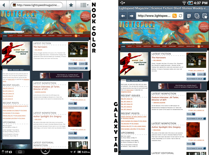
The browsing experience is about the same on both the Nook Color and Galaxy Tab WiFi using the stock Android browser. On the Nook Color this app has been modified to fit the platform's interface, but otherwise it has the same features and settings options. Websites rendered the same on both tablets as well.
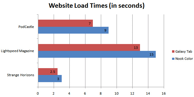
The Galaxy Tab loaded pages a little faster than the Nook Color. Plus, you can choose from multiple third-party browsers that offer more features such as Dolphin HD, which supports add-ons, unique gestures, and tabbed browsing.
Flash comes pre-loaded on the Nook Color and is easily added to the Galaxy Tab. However, watching Flash videos isn't usually a great experience on either device. We visited sites listed at m.flash.com—Epicurious, Kongregate Games, and National Geographic—and found that while videos played, the frame rates and quality weren't great. Simple games work well; complex ones not so much. Neither devices handled Bejeweled Blitz on Facebook well. The Flash experience on Android still leaves much to be desired overall. The Nook Color kept pace with the Tab, at least.
Winner: Galaxy Tab WiFi
Slightly faster performance and the ability to add third-party browsers make the Tab the better choice here.
Overall Performance and Battery Life
The Nook Color is powered by an 800-MHz TI ARM Cortex-A8 processor. Instead of Samsung's Hummingbird ARM-based chip, which powers the 3G versions, the Galaxy Tab WiFi runs an older 1-GHz Cortex A8 chip. Both devices performed about the same when executing similar tasks: turning pages, opening apps, returning to the home screen, playing Angry Birds, playing stored video, and streaming media.
We weren't able to run our usual battery test on the Nook Color. Anecdotally, we found that the eReader's 4010 mAh battery was able to last up to two days with intermittent use while downloading app data in the background. The Galaxy Tab's 4000 mAh batter still showed about 20 percent battery after the same period and roughly the same use.
Winner: Draw
Both of these 7-inch tablets offer speedy performance and can go the distance.
Apps
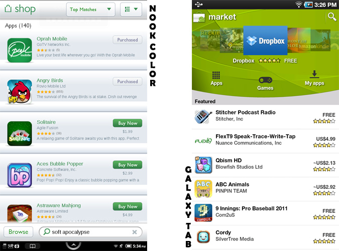
When Barnes & Noble updated the Nook Color's software, it also introduced Nook Apps, an alternate market for the eReader. The device still can't access Google's Android Market, and you can't side-load apps. There are about 140 apps in B & N's store right now, and more are coming. The bookseller's stated main criteria for including apps is that they fit into the Reader's Tablet theme. To that end, there are many books-as-apps (mainly children's titles and graphic novels), though there are plenty of games as well. We also noted several apps with an organizational/productivity bent—notes, to-do lists, tracking data, and an office suite.
Beyond kids' books, there are a number of apps obviously meant to entertain little ones, such as Drawing Pad. We were particularly pleased to see the Pulse newsreader, as much of what people spend time reading are blogs and online news. Barnes & Noble did a good job of including a few of the best apps from several categories, and we expect the selection to improve quickly.
The Nook App store has plenty of drawbacks when compared to the Tab, starting with the number of choices. The Android Market now has almost 300,000 apps, and Galaxy Tab owners can side-load apps from other sources should they choose. Only 63 of the Market's apps are designed specifically for tablets, but those are also optimized for Honeycomb devices. They scale to the Tab's resolution just fine, same as with most other apps designed for smartphones. Of the top 20 paid and top 20 free apps in the Android Market, only three are available for Nook: Angry Birds, Flash Player, and Pandora.
Another drawback for the Nook Color is a lack of free apps. About 20 percent of those available are free, compared to over 60 percent on the Tab's Android Market. Barnes & Noble gave developers the ability to allow for free trial periods. Unfortunately, not very many took advantage of this.
App browsing and discovery on the Nook could use some improvement as well. Currently it's very tedious, and there's no way to do this via a browser. Google's new online Android Market portal allows users to browse apps, comments, and screenshots, as well as purchase apps, then send them to a chosen device.
Winner: Galaxy Tab WiFi
We applaud the addition of apps to the Nook experience, but the Galaxy Tab offers a much broader selection.
Multimedia
Due to its status as a reader's tablet, the Nook Color is not as robust in the multimedia department as the Galaxy Tab. With Froyo running the show, the eReader can play the same video and audio files for the most part. However, the prize for breadth of content goes to the Tab.
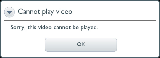
The first roadblock Nook Color owners may come across is that, even though it can handle the same video formats as other Android devices, it won't play files over a certain size. The Nook plays 3gp, 3g2, mp4, and m4v files, but they must be encoded as MPEG-4 Simple Profile up to 854 x 480, H.263 up to 352 x 288, or H.264 Baseline profile up to 854 x 480. When we tried to play a 720p MP4 episode of Doctor Who, an error popped up saying the file wasn't supported. We had to transcode it down to a lower resolution before it would play. We didn't have this problem with the Galaxy Tab.
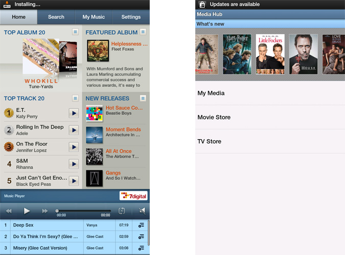
Aside from side-loading videos of your own, Galaxy Tab owners can buy movies and television episodes from Samsung's MediaHub service, pre-loaded on the Tab. These videos will play on any supported Samsung device, including televisions and Galaxy S phones.
We saw smooth frame rates and wide viewing angles on both tablets. The brighter screen on the Nook Color resulted in better contrast, but overall the experience was about the same.
We didn't encounter any issues with MP3s on the Nook Color; it played everything we loaded. The Tab's speakers pumped volume almost twice as loud as the Nook Color, which we strained to hear with medium background noise.
Nook users can listen to streaming music via Napster or Pandora or side-load their own tracks. Tab users have access to all the streaming music apps in the Android Market, plus the MusicHub from Samsung for sampling and buying tracks and albums.
Winner: Galaxy Tab WiFi
A built-in video and music store, access to more multimedia apps, and louder speakers make this round a rout.
Overall Winner: Samsung Galaxy Tab WiFi
Barnes & Noble calls it the Reader's Tablet for a reason. The Nook Color offers a superior experience when it comes to shopping for books and magazines, as well as enjoying and sharing content. We also prefer the Nook Color's display, and the addition of apps make this device a pretty sweet deal at $249.
Where the Samsung Galaxy Tab WiFi pulls ahead is with its more customizable interface, broader app selection, and better multimedia capabilities. Plus, the Tab offers front and rear cameras and Bluetooth. No, it doesn't run the latest and greatest Honeycomb software, but you simply get a more well-rounded tablet for $349.
| Round | Galaxy Tab | Nook Color |
| Design | Row 1 - Cell 1 | X |
| Display | Row 2 - Cell 1 | X |
| eReading | Row 3 - Cell 1 | X |
| Interface | X | Row 4 - Cell 2 |
| Web Browsing | X | Row 5 - Cell 2 |
| Performance | X | X |
| Apps | X | Row 7 - Cell 2 |
| Multimedia | X | Row 8 - Cell 2 |
You've read our opinion, now it's time to give yours. How would you weight the categories? Which of these tablets would you choose?
[polldaddy poll=5020146]
K. T. Bradford writes about laptops, apps, and ebook readers for Laptop Mag. She has written reviews of some of the most iconic laptops from the last decade and more, covering models such as the Acer Aspire One, the Samsung R580, and the Lenovo IdeaPad S205. Some of her other reviews include MSI, HP, Dell, and Asus notebooks.
