Office Touch Apps for Windows 10: Finger Friendly
Microsoft Office may be the leading productivity suite on the market, but it's not at all touch friendly. At last month's Windows 10 event, Microsoft showed off new versions of its core Office apps that are designed for finger input and run on phones, tablets or PCs. Today, the Word, Excel, and PowerPoint Previews became available for download. I got a chance to install the apps and was impressed with their powerful mix of features and touch-centric menus.
Though Microsoft touts these apps ability to run under Windows 10, Windows 8.1 users can also install the previews. When the apps launch officially, they will come free on small Windows tablets and phones. Microsoft is also working on a full-blown sequel to Office 2013 which will be made for non-touch computers, cost money and offer a slew of additional features.
Opening Screen
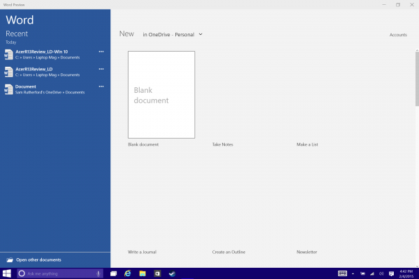
The initial screen that appears when you first launch all three preview apps has the same look and feel as in traditional Office, with a list of recently-opened opened documents in the left pane and available templates for creating a new document in the right pane. However, the editing screen looks quite different.
Word
When I opened a recent laptop review in Word, the first thing I noticed was the redesigned UI ribbon across the top. It's much sleeker than the thick cluttered bar in current versions of Office, and the app features larger tabs and buttons, which makes hitting them with your fingers a cinch.
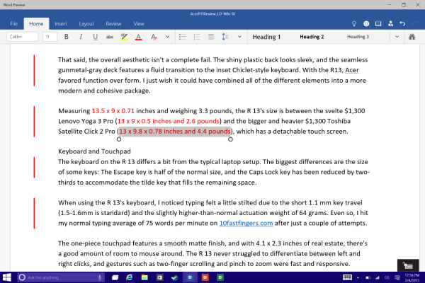
Tabs for File, Home, Insert, Layout, Review and View span the top row, and selecting an option changes the contextual menu below. I was able to access formatting options such as fonts, colors and alignment when I hit the Home button, and helpful editing tools such as commenting and markup when I tapped Review. The most common functions are never more than a few clicks or touches away, but to locate less-frequently-used features such as Word Count, I had to use the search bar in the top right.
A helpful new menu in the top right provides a one-button solution for converting the window to a tablet-friendly design, Undo and Redo buttons for correcting mistakes when working without a keyboard, and a dedicated button for sharing.
Excel
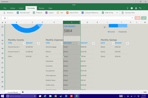
Excel has the same sleek, minimalist as Word, except that the Layout tab is replaced by one for formulas, making it easier to manipulate data without a keyboard. Creating a new row or column was as simple as touching on a cell, and selecting the desired option from the newly summoned menu.
Stay in the know with Laptop Mag
Get our in-depth reviews, helpful tips, great deals, and the biggest news stories delivered to your inbox.
PowerPoint
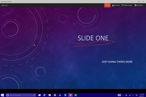
For presentations, PowerPoint swaps in Transition and Slide Show tabs, which make it much less frustrating to format on-the-go. I really like the dedicated slide show button in the top right and the Ink tool that appears in slideshow mode and lets you draw on slides or save the annotations for later.
While I’m still learning my way around Office, this is the first time I didn’t want to tear my hair out when using Word or Excel with touch input. Unfortunately, there’s no timetable for an official release, but Office for Windows 10 looks like an exciting addition to Microsoft's ecosystem.
Sam Rutherford is a writer at Laptop Mag, focusing on laptop reviews and all the gadgets that make using a notebook just that much easier (or more fun). Over the years, he reviewed some iconic laptops, including gaming beasts from Alienware, Asus, Acer, Gigabyte, and HP. Outside of gaming laptops, Sam has also reviewed notebooks oriented around productivity, such as the Lenovo IdeaPad or the Dell XPS.
