Opera's Coast Browser for iPad Hands-on: Pretty But Lame

Touting itself as "the browser that should have come with the iPad," Coast is Opera's made-for-iPad browser that offers touch-oriented navigation and visual search. When faced with the challenge of creating an innovative browser for a tablet, the team said it had to forget everything and start over. It started by removing standard Back and Refresh buttons for a full-screen experience and added security features for safer browsing. We went for a spin on Coast to find out if it lives up to the hype.
Setup and Installation
It was easy enough to download and install the free iPad browser, but it does require you to be 17 years or older to get it. Coast's information page in the app store highlights that the app has "Frequent/Intense Mature/Suggestive themes". However, that same warning is true of Chrome for iPad and Dolphin browser as well.
Once installed, we launched the browser quickly. We started with a short video tutorial of its functions that seemed more of a promotional commercial than helpful tips. But we appreciated the basic overview.
Interface
A plain white background with a search bar and some speed dial shortcuts? How blah. Coast's minimalistic look with its striking metropolitan wallpaper makes this the supermodel of the browser world. In the middle of a black and white skyscraper background sits a search or address bar. Below it are eight square tiles in a neat little grid and under the tiles sits the Coast logo. Beneath the logo are four tiny dots that indicate which of the four (at launch) possible home screens you're currently using.
You can customize these home pages by long tapping any of the tiles on the screen and dragging them off the screen to remove them. We added Laptopmag.com as a bookmarked site by dragging the tile from the recently viewed bar at the bottom to the grid on the first home screen. Coast supports unlimited home screens with up to 12 tiles each so you can have easy access to your favorite sites. However, this could lead to a lot of swiping to get to various bookmarks.
By default, the bottom section of the first home page is reserved for easy access to recently visited sites, which is populated with tiles once you start browsing. The four home screens are already pre-loaded with sites organized by type. The second home screen has shortcuts to news sites including Forbes, TheNextWeb and Polygon while the third home screen offers shortcuts to such services as Google Maps, MindBodyGreen.com and EveryTimeZone.com. The fourth home screen features nine artsy magazine sites, including 99U.com, Medium.com and theinspiration.com.
Tapping on the icon of three rectangles at the bottom right brings up currently open windows. Swiping up from the bottom of an open window closes a page. Long tapping an image on a site brings up options to download it to your library or set it as your Coast wallpaper.
Stay in the know with Laptop Mag
Get our in-depth reviews, helpful tips, great deals, and the biggest news stories delivered to your inbox.
MORE: 25 Best iPad Apps
Browsing and Navigation
Coast devotes its space to page content. There are no tabs, no buttons and no address bar at the top, as you would find on Safari or Chrome. To go back and forward, you must swipe right and left respectively. Pulling down the page reloads it. While we appreciate the simplicity of the layout and the full screen viewing, it feels like Coast forgot that users like to type in new URLs to change the page.
Coast doesn't use Tabs like other browsers do. Instead, each surfing experience is on its own page. To open a new page, or enter a specific URL, you have to tap the small white grid button at the bottom center of the page to bring up the home screen and type your search term or URL in the bar there. We found this unintuitive, and a needless extra step. That said, the Address bar feature in Coast is beautiful and takes advantage of the full screen. We especially like that it suggests words above the bar as you type. We only needed to type the letters L and A before Laptopmag.com showed up on the side, and we simply tapped the tile to open the page.
Unfortunately, Coast only supports up to seven open sites at a time. This means you can't have all the pages you want to leave open, and every time you want to visit a new page you're forced to open a new window.
Security Features
We liked what Coast calls its "under-the-hood" security features. It was nice to be able to quickly check how secure a site was before proceeding with sensitive transactions. We went to the list of open sites and swiped down on a page to pull up its security rating.
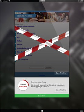
We opened BankofAmerica.com and were heartened to find that Coast deemed the site's safety level to be excellent. However, it was hard to find a site that Coast deemed unsafe, as most sites we opened -- including PirateBay and Torrents.to -- were labeled Normal. We opened Random.com (as suggested in a screenshot from Coast) and were greeted with warning tape snaking across the screen to prevent the page from loading. A warning from Coast suggested that we close the site, but we were also allowed the option to open the site anyway.

Tapping the I button at the bottom of the thumbnail is supposed to bring up details on the site's Encryption, Reputation and Trust ratings, but we weren't able to pull up that information during our trial of Coast.
Coast does not support private browsing, but you can clear cookies or browsing history of a particular site by closing it. You can set the app to clear browsing data on next launch, but accessing these settings was inconvenient. Since there are no buttons or options in Coast, we had to go to our iPad's settings and change Coast's options from there. On that page, you can also toggle the option for Coast to remember your passwords.
Last Thoughts
Designing an intuitive, touch browser for a tablet doesn't mean throwing sound basics out the window. In forgetting everything to create a brand new browser, Opera forgot that people don't like limited tabs or pages. Also, there's lots of swiping to get around, making for more steps than we would have liked. Still, the beauty of Coast and its security features make it a tempting download.

