Skype 4.0 Far from Ideal on a Mini-Notebook

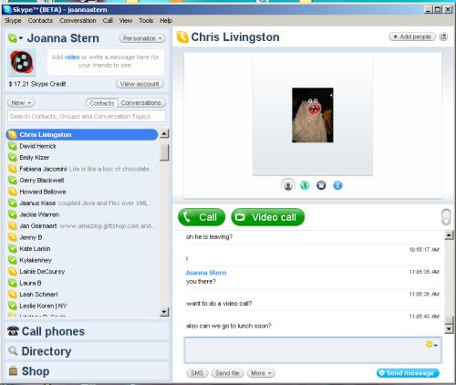
There isn't a mini-notebook that lands in my hands on which I don't run Skype. So to say I was excited when I read my friend Andy Abramson's post on the new release of Skype 4.0 (Beta) is an understatement. I was psyched to get it running on the latest mini-notebooks (including the Eee PC 901, 1000H, and the Acer Aspire one). Until I realized the software release is nowhere near appropriate for a mini-notebook. As I have been inseparable from the Eee PC 1000H for the past few days, I downloaded Skype 4.0 (Beta). The 1000H has a 10-inch screen, which is quite large compared with the others that sport 7- and 8.9-inch displays. After running through the initial installation and sign-in process, Skype takes over the entire screen with a initial start window that provides the user with the options to configure audio and add contacts. I was hoping that the full-screen interface would shrink back to the corner when I headed for my contact list to make calls and start chatting. Nope. How do you make the Skype window fit on the side of the screen as a column? In my hours of trying, I found that you simply can't.

The contacts list sits on the right side of the screen, but another window is attached to the right of the list that displays a contact's information, or your current chats or calls. You can separate chat or call windows out of the main window by selecting the small pop-out button in the upper right corner, but you are still left with this large window to the right of the contact list. I am impressed with the Eee PC 1000H's 10-inch screen; it provides a lot of real estate—but not with Skype 4.0. The program takes up 90 percent of screen space, leaving it almost impossible to have a chat on one side of the screen and look at a Web page in Firefox 3. The reason for the new interface, according to Skype, is to enhance video calling. I did like that the video window is much wider and taller than in previous versions of Skype and doesn't require you to stretch the corners of the window to make the image look larger on your screen. I was impressed with the video and audio call quality. A video call to my friend Ryan was extremely clear, and audio was void of any skips, pauses, or delay.

Initial thoughts: If you've got a laptop with a large screen or you are working on a desktop, Skype 4.0 works well and looks sleek. I wish it had a classic mode that could revert back to the settings that frequent Skype users are used to. But if you have a mini-notebook or even a notebook with a 13-inch screen or smaller, just say no to Skype 4.0.
Stay in the know with Laptop Mag
Get our in-depth reviews, helpful tips, great deals, and the biggest news stories delivered to your inbox.
Joanna Stern was a laptop reviewer and writer at Laptop Mag. She reviewed notebooks big and small, including models from MSI, Asus, Toshiba, and Lenovo. This was right at the beginning of her impressive career in journalism. Since then, she's become one of the most recognizable voices in consumer tech. Joanna now works with The Wall Street Journal, and was previously a founding editor at The Verge. After Laptop Mag, she worked at Engadget as a reviews editor. Joanna has won a News & Documentary Emmy Award as well as two Gerald Loeb Awards.
