Skype Beta for Windows Phone Hands-on: Worth the Wait?
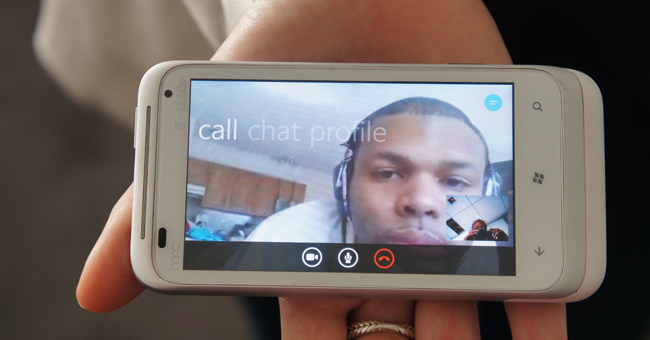
The wait is over for Skype/Windows Phone users. Previously, Windows Phone was one of the few devices on the market without a dedicated Skype app, which was more than a little ironic since Microsoft recently acquired Skype in a $8.5 billion deal. But that's been rectified now that Skype has rolled out its beta app for Windows Phones 7.5 and higher. The final version is expected to be released sometime in April. Read on to find out what happened when we got our hands on this video chat app using the HTC Radar 4G Windows Phone from T-Mobile.
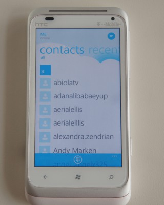
After a number of unsuccessful attempts, we were able to download and install Skype onto our HTC Radar 4G. We signed in and Skype quickly aggregated our existing Skype contacts along with our regular phone contacts. Clicking on the Contact tab gave us the option to view contacts that were currently online or in our phone book by going to that letter.
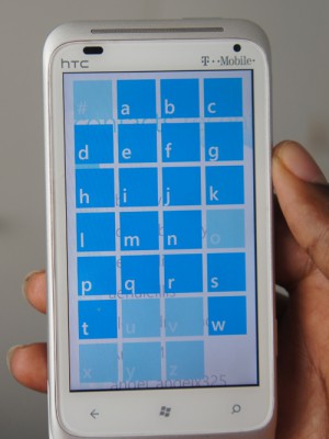
The overall interface has a clean, fresh look mixing traditional Skype with Windows Metro interface. Instead of scrolling through our long list of contacts, Skype uses alphabetical sorting. Similar to the Windows Phone app menu, clicking on a letter tile cues up an alphabet tile view. From there we selected the letter our contact’s name began with and were quickly taken that point in our contact list.
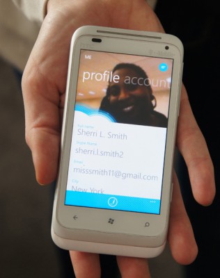
Our favorite feature is the Account page, where our profile photo was prominently displayed along the top, along with the rest of our pertinent contact info.
Menu navigation consists of a quick sweep to the left or right. Depending on the page, a few additional menu options can be found along the bottom navigation bar.
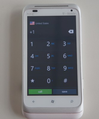
For example, pressing the small keypad button on the Contacts page brings up a large black keypad for quick dialing. Clicking on the three white dots in the bottom nav bar enabled us to access the Settings menu where could turn of Auto Sign In or send feedback to the Skype Team.
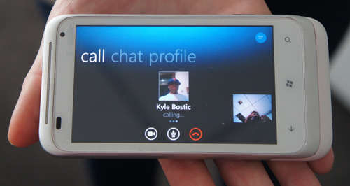
Making calls is pretty straightforward. After clicking on our chosen contact, we pressed the video icon in the bottom nav bar to start a video call. There’s an icon to have a non-video call and as an icon to add other people to the chat are easily accessible as well. We also had the option block or remove contacts when we pressed the three dots.
Stay in the know with Laptop Mag
Get our in-depth reviews, helpful tips, great deals, and the biggest news stories delivered to your inbox.
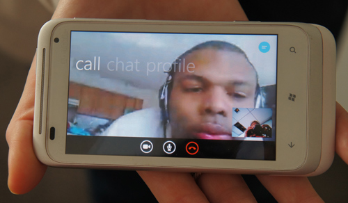
Although the image was slightly grainy, we could easily make out our caller’s bright blue plaid shirt. We didn’t notice a lag, however the image became extremely grainy when our subject began to move. Our caller reported seeing about a second of lag with hints of fuzziness. Audio on both ends of the chat were loud and clear. We noticed that video calls were only available in landscape as all attempts to switch to portrait mode were unsuccessful.
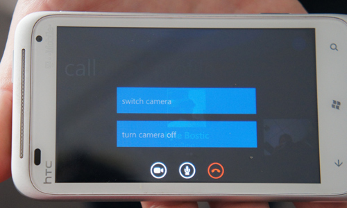
During the chat, we could view our caller’s profile, switch between the front and rear-facing cameras and mute the sound. We were also able to view our chat history and send instant messages.
Overall, Skype’s Windows Phone beta app is one of the better video chat apps we’ve used. The interface is snappy and intuitive with good audio and visual quality. It's a solid start for a beta launch and could potentially close the gap between Windows Phone and its competitors.

Sherri L. Smith has been cranking out product reviews for Laptopmag.com since 2011. In that time, she's reviewed more than her share of laptops, tablets, smartphones and everything in between. The resident gamer and audio junkie, Sherri was previously a managing editor for Black Web 2.0 and contributed to BET.Com and Popgadget.
