How to Use Sparklines to Create Mini Graphs in an Excel Workbook
Sign up to receive The Snapshot, a free special dispatch from Laptop Mag, in your inbox.
You are now subscribed
Your newsletter sign-up was successful
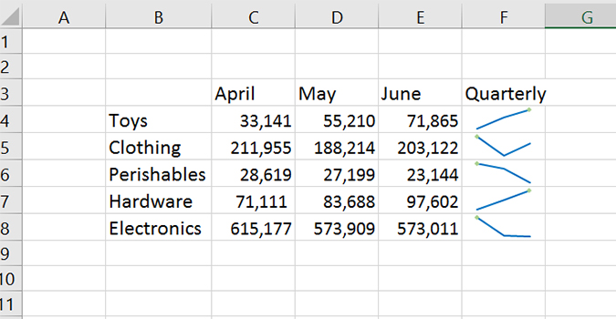
Using sparklines allows you to display data trends without going to the trouble of creating a full-blown chart or graph. It’s simple, on-demand information capable of showing trend data (whether something is trending up or down).
In just a few clicks, you now have a visual representation displaying which way data is trending -- whether it be tracking profits, inventory, or costs.
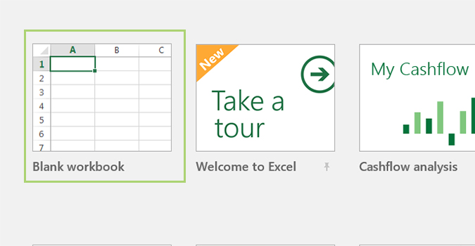
1. Open an Excel workbook, or create a new one. For the sake of this tutorial we’ll look at a fictional company’s quarterly sales.
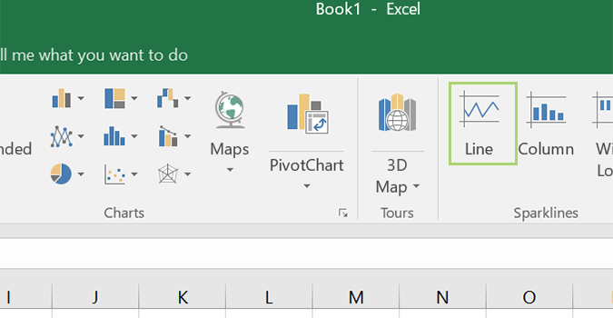
Article continues below2. Under the Insert tab, click the Line icon.
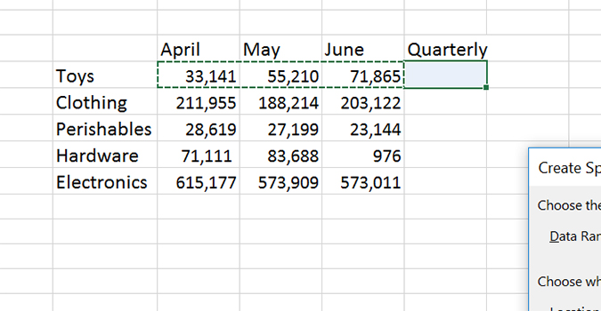
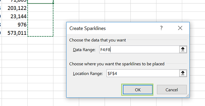
3. Left click and drag the data range you’d like to display with a sparkline. For this example, I’d click in column C, rob 4 and drag it to column E of the same row.
4. Press OK to insert the sparkline.
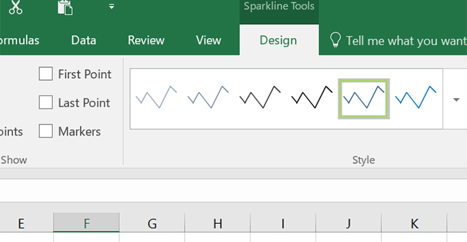
5. In the Ribbon, you’ll see the Design tab is now active. From there, simply choose the style of line you’d like to use, or you can stick with the default.
Sign up to receive The Snapshot, a free special dispatch from Laptop Mag, in your inbox.
- 10 Excel Business Tips You Need to Keep Your Job
- How to Use Microsoft Outlook Like a Pro
- 10 Microsoft Word Tips That Will Save Your Job
Bryan covers everything you need to know about Windows, social media, and the internet at large for Laptop Mag. Thanks to his extensive knowledge of operating systems and some of the most popular software out there, Bryan has written hundreds of helpful guides, including tips related to Windows 11 drivers, upgrading to a newer version of the OS, editing in Microsoft Photos, or rearranging pages in Google Docs.
