Spotify for iPad Hands-On: Worth the Long Wait
Trendy music darling Spotify gained devotees across Europe before finally opening its doors to users in the United States last July, and ever since then the streaming music service has only been building momentum. A month after its release – and before its official, open-to-all launch – the company amassed 175,000 paying customers, then began rolling out apps across various mobile OS platforms. iPhone and Android versions had been out for a while, but Spotify brought out, in succession: BlackBerry, Meego (inexplicably), and Windows Phone.
Last month, the company also made significant strides by releasing a revamped Android app with a much cleaner, slicker look. But one app in particular had always been conspicuously missing from the bunch: Spotify for iPad. Now, that’s changed. The native app for the king of the slates has finally been released – and compatible with the new iPad's Retina display to boot. We went through the trouble of doing a full hands-on with it, so you can decide for yourself whether this streaming music app is worth a download.
Design and User Interface
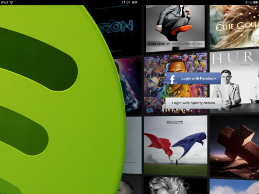
Upon first launch, the thoughtfulness that went into the design and UI of the app was immediately apparent. Spotify for iPad invited us to log in with Facebook or our Spotify details (in case we’d already created an account with them) against a beautiful backdrop of slowly scrolling album covers. After getting past that screen, we saw a pop-up notification that our free 48-hour trial with the service had started. Apparently, Spotify wants to let its audience get a taste of their glossy little app and all its features in the hopes of enticing users to sign up for a permanent premium account later on.
Within the app’s main interface, you’ll find an omnipresent left navigation bar with several icons running down it: Search, What’s New, Inbox, Playlists and People. The panels that take up the main spread of the app are familiar in their Twitter-esque, layered appearance, and you can also intuitively stack them up or swipe them away to uncover layers underneath. We tapped on a song within one of our playlists, and it immediately started up. A simple bar also appeared along the bottom edge of the app with controls for pause, play and forward, along with a slider to navigate to a particular part in the song we were listening to.
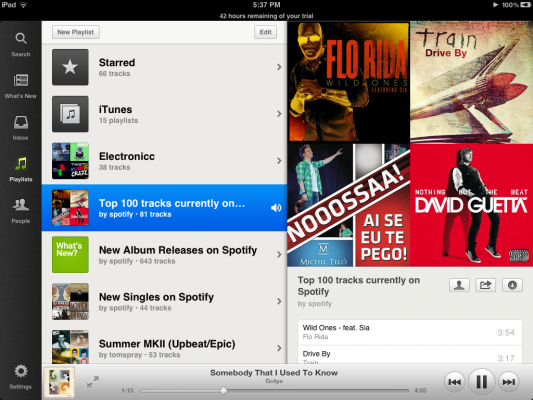
Of course, this iPad-optimized app still prominently features playlists, Spotify’s method of collecting and organizing tunes in one place. However, while you can create and delete full playlists, you unfortunately don’t have the option to rename or rearrange them like you can on the company’s desktop software. When we tapped on a playlist, a new pane slid out with all the songs we had gathered in it. When we tapped and held down on a song, a horizontal menu of icons appeared right under the title, letting us star the track, add it to a playlist, share it or queue it up. The last icon – which looked like silhouettes of figures – let us look up related artists in a new panel.
Features
Stay in the know with Laptop Mag
Get our in-depth reviews, helpful tips, great deals, and the biggest news stories delivered to your inbox.
One of the nicest design/UI elements in Spotify for iPad is the full-screen “Now Playing” interface. In this mode, the song that’s currently playing is beautifully stretched out across your iPad’s entire display – in full Retina display resolution, too, if you’re using the new iPad – vaunting the song’s album cover, and big touchable control buttons. We tapped the expandable arrows right beside the album art on the slider to enter this screen.

“Now Playing” works in both portrait and landscape orientations, and you can swipe through the huge, full-res covers to quickly skip to the next song. When we tapped once more on the screen, additional controls were displayed as an overlay, including the same mini-menu that appears when you long-press on a single track, and a Hide button to get back to the standard UI.
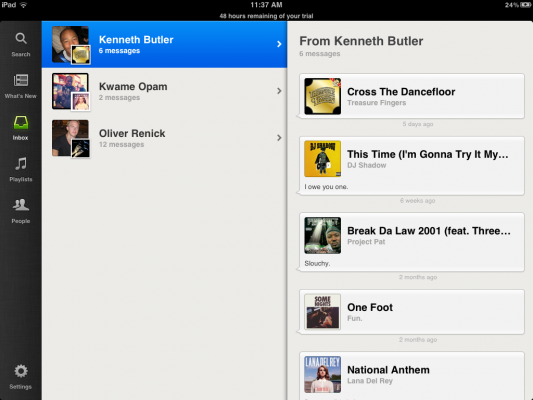
Apart from “Now Playing,” Spotify for iPad has also overhauled its user inbox, which now contains songs organized by sender instead of chronologically, as is the case with Spotify’s desktop app. Additionally, a universal Search bar (the first icon on the permanent left-hand nav bar) can dive into Spotify’s trove of 15 million tracks and live-update results as fast as you can tap out the characters to a song or album.
However, while the aforementioned features do comprise nice flourishes in the app (for the most part), it appears Spotify never seized this opportunity to improve upon the old “What’s New” section that it inherited from its desktop counterpart. We scrolled through a carousel of “Recommended” albums found right at the top of the section, but there were no reasons given for why we might like them, information about their genre, or a way to close out albums we didn’t like.
Aside from recommended albums, there were also sections for Trending Playlists, Top Tracks and New Releases. Spotify supposedly curates the latter, but we’re left in the dark as to the precise dates when these tracks were released or when Spotify last updated the list. We also sorely missed the live feed of what our friends were listening to, which was nowhere to be found within the app. All in all, the music discovery aspect in Spotify for iPad continues to leave much to be desired.
Value
Pricing plans remain the same for Spotify’s mobile apps: $9.99 a month for access to Spotify on your mobile devices, offline mode for playlists, no advertisements and unlimited streaming of music. This is the Premium plan – and the only plan you can consider if you’re looking to get Spotify on your iPad – but it’s worth noting that Rdio offers their own “Premium” service at the exact same price point. Plus, Spotify has outflanked Rdio in both catalog size (Spotify has a massive database of 15 million songs, while Rdio has the rights to 9 million tracks) and music quality (Spotify offers a bitrate of 320 Kbps; Rdio offers 256 Kbps).
Performance
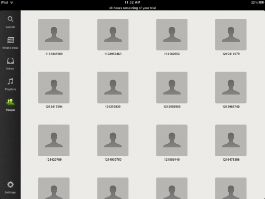
Spotify for iPad is fast, fluid and responsive. We appreciated the attention to minute details, like the scrolling wall of albums at first launch and the gorgeous full-screen “Now Playing” mode. We did run into some glitches while exploring the app, like when our Facebook friends had random strings of numbers listed instead of their names (this bug could usually be resolved by restarting the app). However, on the whole we fortunately didn’t experience any lag or misinterpretation to our taps on the app.
Bottom Line
If you already subscribe to Spotify Premium and you own an iPad, the decision to download Spotify for iPad should be a no-brainer. After all, the app itself is completely free through iTunes. On the other hand, if you’re on the fence about signing up for Spotify Premium, but you’re curious to see how Spotify for iPad holds up, you could take the free 48 hours on Premium (c/o Spotify's present promo) and thoroughly check it out yourself. Audiophiles may want to weigh this decision carefully, but if you're just a casual music hobbyist, perhaps Spotify's free desktop offering would be enough to slake your thirst.
