ThinkPad Design: Classic or Classless?

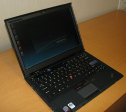
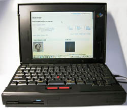
I'm going to spell out my personal biases right up front. I love the look and feel of ThinkPads and have for years. I love the sleek black chassis, accented by just a dot of color here and there on the blue enter key or the bright red TrackPoint. I have to admit I was really excited this morning when I was the first person at LAPTOP to lift the new ThinkPad X300 out of its box, touch its thin black shell, and revel in the sheer thinness of its design. I had no idea how it would perform, but I liked what I saw. I liked it so much that I actually drooled a little. Good thing none of my coworkers were there to see me and that my thick beard absorbed the spittle before it could fall on my shirt. True, the basic color scheme and shape of a ThinkPad is the same now as it was in its launch year of 1993, but why mess with a great thing? I think of ThinkPad as the Rolls Royce of laptop design, elegant and timeless. So today, I was surprised when I saw how many users say the ThinkPad design's time has come and gone. Just look at some of these negative comments. From our video hands-on with the X300, user Ben says:
Hey Lenovo, the 80’s called and they want their laptop back! Colour, shape, form, semantics and aesthetics. It seems Lenovo hasn’t thought about any of those aspects and made what in my opinion is possibly the ugliest laptop EVER!

User Glenn says:
You have got to be kidding me. That thing looks so cheap looking!
Meanwhile, a user who viewed our video on YouTube commented:
That thing is ugly. It looks like a thinkpad or whatever 1990's laptop where called
So who's right? Is ThinkPad the Rolls Royce or the Chevy Nova of notebooks? Tell it to me straight in the poll and comments sections below. I can take it. I'm the same person who listens to Kenny G., wears Velcro sneakers, and waits impatiently for thin ties to make a comeback. So I know I don't always have the best taste, but I'm pretty sure I'm on solid ground in saying the ThinkPad design is a timeless classic.
Stay in the know with Laptop Mag
Get our in-depth reviews, helpful tips, great deals, and the biggest news stories delivered to your inbox.

