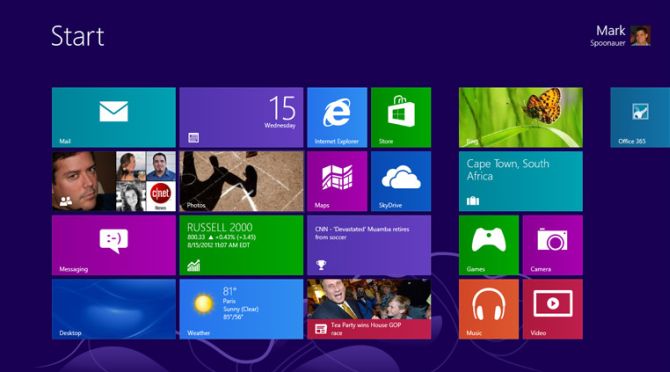
Usability Expert Says Windows 8's UI is 'Weak on Tablets, Terrible for PCs'
Stymied by the new tile-centric design of Windows 8? You aren't the only one. Noted usability expert Jakob Nielsen conducted a small-scale test of Microsoft's new-look operating system by dropping a dozen experienced PC jockeys in front of Windows 8 on a desktop and Windows RT on a Surface RT tablet. The conclusion: Live tiles may be pretty, but Windows 8's usability sure isn't.
Nielsen pulls no punches in the lengthy critique, with an opening salvo that calls the dual desktop and Modern UI modes a cognitive burden for users, echoing what usability expert Raluca Budiu -- who works at Nielsen's Nielsen Norman Group -- told LAPTOP earlier this year.
The hits only continue from there. "The main UI restricts users to a single window, so the product ought to be renamed 'Microsoft Window,'" Nielsen writes, arguing that that experience may work well on a mobile device, but it doesn't make sense on a desktop PC. Ouch! From there, he goes on to criticize the overly active design of Live Tiles, the way the "flat" Modern design fails to give visual clues where a user should click, the emphasis on big pictures as opposed to tight information density, error-prone touch gestures, and the out-of-sight, out-of-mind Charms bar.
The disease spawning all these symptoms, Nielsen contends, is Microsoft's decision to shoehorn a tablet experience onto the desktop interface, despite the gulf in hardware design between the two form factors:
Windows 8 on mobile devices and tablets is akin to Dr. Jekyll: a tortured soul hoping for redemption. On a regular PC, Windows 8 is Mr. Hyde: a monster that terrorizes poor office workers and strangles their productivity.
Nielsen expects Windows 9 to tighten up the tablet experience, citing Microsoft's willingness to learn from its mistakes. Desktop users, however, might be out of luck if Microsoft continues to push for "One Windows, Everywhere."
"(Microsoft) has now thrown the old customer base under the bus by designing an operating system that removes a powerful PC's benefits in order to work better on smaller devices," Nielsenwrites.
Sign up to receive The Snapshot, a free special dispatch from Laptop Mag, in your inbox.
CNET's Jay Greene, on the other hand, consulted with Tom Hobbs, another UI specialist, and while Hobbs agrees with some of Nielsen's specific critiques, he thinks Microsoft had no choice but to rip off the traditional UI Band-Aid in one fell swoop considering the monumental shift in direction Windows 8 represents.
"For Microsoft to support incremental change around a new paradigm would be suicide," Hobbs said.

