Usability Expert: Windows 8 on PCs is Confusing, a Cognitive Burden
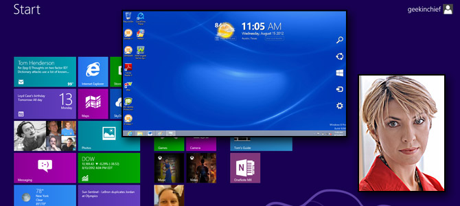
Though Windows 8 is winning rave reviews for its touch-friendly tablet experience, many feel that the operating system's "Modern-style" UI makes life more difficult for PC users. Count usability expert Raluca Budiu of the Nielsen Norman Group among these critics. Though she has not conducted any formal studies on Windows 8, the former Xerox PARC researcher and user experience specialist has used the new OS enough to conclude that, for productivity tasks on the PC at least, Windows 8 is less user friendly than its predecessors.
Budiu explained to us why the design principles Microsoft used don't make sense for PCs and have the potential to confuse desktop users and slow them down.
LAPTOP: Is Windows 8 more or less user-friendly for PCs than previous versions of Windows?
Budiu: It’s hard to say without doing an in-depth study, but at least for some tasks, the usability is worse. There are things that you can do more easily in Windows 8. For instance, it’s easy to share a news story through email or with friends on Facebook. But, I am not sure that these are the tasks that people do most often on a PC.
Windows 8 is optimized for content consumption rather than content production and multitasking. Whereas content consumption can easily be done on other media (tablets and phones), production and multitasking are still best suited for PCs. Windows 8 appears to ignore that.
LAPTOP: How will switching back and forth between different environments (Modern and Desktop) affect PC owners?
Budiu: Users will need to remember two different interfaces. They will learn Windows 8, but won’t be able to forget Windows 7. And they will need to keep track of which app goes with each framework. [It's] definitely a cognitive burden, but not an insurmountable one.
Stay in the know with Laptop Mag
Get our in-depth reviews, helpful tips, great deals, and the biggest news stories delivered to your inbox.
LAPTOP: Is it a mistake to force people to relearn an interface that has been popular for 20 years?
Budiu: So it seems, at least if we talk about desktop computers. There are several reasons:
- The learning curve is going to be steep.
- The duality of Desktop-Metro is likely to confuse at least some of the users.
- Most important, while Windows 8 embraces some important mobile design principles (such as giving priority to content), not all these principles are well suited for the larger non-touch screen of most PCs or laptops.
Many apps waste a lot of space for huge images and give little space to text. The idea of hiding the controls to give priority to content may make sense on mobile, where screen space is so limited, but it doesn’t make that much sense on a large screen, especially if users have to work harder to access hidden features. For instance, to expose the URL bar or the list of tabs in the browser you will need to click the right button of the mouse. The back button is not visible either, but if you hover on the left hand side of the screen, it becomes visible.
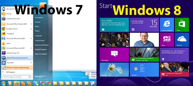
LAPTOP: If you are in Windows 8's desktop environment and want to launch a new desktop application, you must return to the tile-based Start screen to click a shortcut. One could argue that going to a different screen is no more time consuming that opening up a Start menu that overlays on top of the screen. Was Microsoft really wrong to remove the Start menu?
Budiu: The advantage of the overlaid menu is that it preserves context. Cognitively, there’s more of a burden when you have to switch context twice (desktop->start screen; start screen -> desktop). There are reasons to force users to switch contexts, especially in the tablet or phone environment, where screen real-estate is a lot more expensive and a menu is forced to use only part of the (already-small) screen. In that situation, a separate page makes better use of the small screen space.
There are fewer reasons for a separate page on a desktop – the start menu is a cheaper interaction than the start page. Microsoft probably does it for the sake of consistency – they want you to start an app in the same way, regardless of whether you are in the desktop environment on a PC or laptop, or in the Metro environment on a PC or on a tablet, or on a mobile phone.
For the PC case, I think that if you are going to have two environments, consistency is important, because otherwise people will always have to keep track of which action to use in which environment – which is an extra burden on their memory. So although the start menu is the cheaper solution (in terms of interaction cost), not using it in the desktop environment is probably the right thing to do, given the choices already made by the Metro interface.
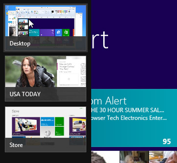
LAPTOP: The Windows 8 Switcher displays each Modern style app as its own thumbnail but folds all the desktop apps into a single thumbnail because it considers the desktop itself to be an app. Is this a usability problem?
Budiu: It is confusing, because users have to remember what they’re running in the desktop and go back to that app to resume editing a document in Word, for instance, or creating a chart in Excel. In general, switching between apps is costly for the users – you have to go to the start page, then select the app, and then, for those apps running in the desktop, go to desktop and select it from there. Compare that with older versions of Windows – just one click was needed to choose the running app from the task bar.
LAPTOP: When using Windows 8 with a mouse, you must hover for half a second over the upper left or right corners of the screen to bring up key menus (the Switcher, the Charms menu). Does hovering slow the user down?
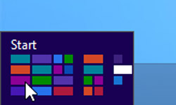
Hovering before using a menu does slow users down, but that’s not the major problem. The fact that the menus are hidden is primarily what slows users down – remember that what’s out of sight is out of mind. In our studies with mobile devices we found that whenever a menu was not in plain view, even users who knew about the existence of that menu (that is, they had discovered it in the past) didn’t use it as much or took a longer time to think to use it than if the menu options were all visible. So it’s not only the hovering that slows users down – it’s the lack of visibility that makes these menus less available.
These hidden menus also have zero affordances on the desktop, which makes them hard to discover for the first time. And even if you discovered where to click, being able to correctly remember which menu goes with location on the screen will require a fair amount of practice and continuous usage.
And yet another problem of these menus in the left and right corners is that they interfere with scroll arrows in some apps. The scroll arrows at the bottom of the screen are very close to the bottom corners of the screen, which are supposed to expose the menus. In general, it looks like the corners of the screen (the top, too, presumably, since this is how you close the app) are no longer good places to position controls.

