Windows 10 Hands-On: A Good Start
The real Windows is back. Today, Microsoft showed off the first preview build of Windows 10, which does away with the infamous Modern UI and brings back the Start menu, with a few new twists such as live tiles, scaleable apps and virtual desktops. I had the chance to spend a few moments with a demo PC running the new platform and was impressed with a UI that seemed both familiar and fresh at the same time.
MORE: Windows 10: Top 6 New Features
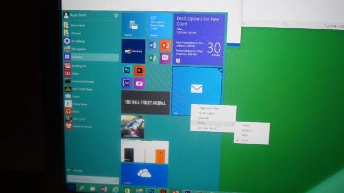
The Start Menu has all the basic features Windows 7 users have come to expect, including a translucent background, shortcuts to your favorite apps, library folders and a search box. However, Microsoft has added a second pane to the Start Menu which contains live tiles that update with information like the weather or sports scores. The second pane appeared to function very much like the Start screen itself, as I dragged a calendar icon over from the left pane and watched it become a tile on the right side. You can drag any app you want to onto the right pane, but if it's not live-tile enabled, it will just appear as a static shortcut tile. I was able to resize the tiles the same way you can in Windows 8, by right clicking them and choosing between small, medium, wide and large.
MORE: Top 25 Windows 8 Apps
You can also change the shape of the Start menu much like you resize a window. I put the mouse pointer on the border of the Start menu and was able to drag the entire box downward, watching it become shorter and then become wide and rectangular.
The Start menu search box has been improved slightly, adding web results to the apps and documents it returned in Windows 7 (Windows 8's search did this also). When I searched for CNN, I got the web address and the ability to click it to launch that page in IE.
At least on this preview build of Windows 10, all apps run in Windows as there is no Start screen (touch-based devices will have a Touch mode with a Windows 8-style Start menu). I saw how the Windows Mail program, which is a "Modern" app, runs in a window and scales its content to the appropriate size. When I had the window at a large size, it showed two panes: one with the inbox and one with the current message. However, when I made it smaller, the mail app only showed a single pane with the message.
Stay in the know with Laptop Mag
Get our in-depth reviews, helpful tips, great deals, and the biggest news stories delivered to your inbox.
Windows 10 is also smarter when it comes to snapping applications to the left and right sides of the desktop. A new feature called Snap Fill allows you to create an uneven split between two applications as you snap them to the left and right sides. After I snapped the Windows Mail window to the left side of the screen, I dragged its left side in so it was taking up only 25 percent of the horizontal space on the desktop. Then, when I snapped the Photos app to the right side of the desktop, it took up the remaining 75 percent.
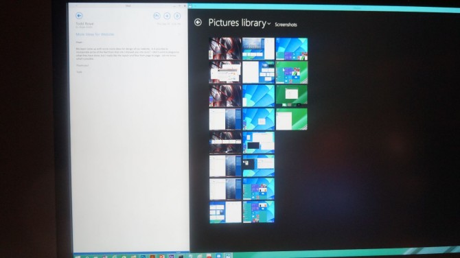
You can also snap windows to the corners, as I was able to snap Windows Paint to the upper right corner of the screen and watch it take over about a quarter of the space. I also snapped Windows Mail to the upper left side, but was unable to snap another app to the lower left, perhaps because the Start button is there.
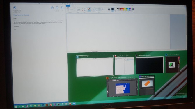
Another feature called Snap Assist makes it even easier to fill the screen with two apps at once. When I snapped one app to the left side of the desktop, the right side showed thumbnails for all of my other recent apps so that I could click on one to make it snap to the right side, no additional dragging required.
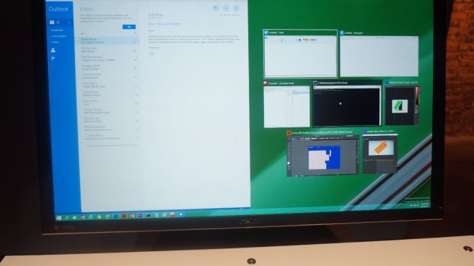
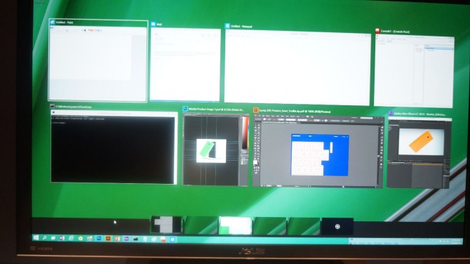
Even if you don't have more than one monitor, Microsoft allows you to have several desktops. When I hit the task button, which sits on the taskbar to the right of the Start button, a list of thumbnails for open apps appeared with thumbnails for different desktops below and a plus button for adding additional ones. As I clicked on the different thumbnails, I went to different screens, each with its own set of open windows. One desktop held a CAD program, while another had email. It's easy to see how power users could segment their workflow by switching between these work spaces.
A Microsoft rep told me that he's not currently aware of any limit on the number of virtual desktops you can create. There is no way to use different wallpapers on the different desktops in the current build, though it is always possible the company will add that feature in the future.
The new preview build will not feature the touch mode that Microsoft VP Joe Belfiore showed during an earlier demo, but it will have a few touch-friendly features. Modern apps will continue to feature large buttons that are easy to target, and users will be able to swipe in from the right for the Charms menu or in from the left to launch the tasks menu.
Users who want to have their own hands-on experiences with Windows 10 will be able to download the same preview build I saw starting tomorrow at preview.windows.com.

