Windows 8.1 vs OS X Mavericks: Which OS is Best?
The war between Windows and Mac has reached a new phase with Windows 8.1 and OS X Mavericks. While you could call the new Windows a course correction--with the re-introduction of a Start button and the ability to boot straight to the desktop--Microsoft is still very much on the path of converging laptops and tablets. Meanwhile, Apple largely stays the course with OS X Mavericks, embracing existing Mac owners and would-be switchers with time-saving features like Finder Tabs. At the same time, Mavericks continues to borrow features from iOS, including the new Maps and iBooks app.
Those in the market for a new laptop have two very distinct choices in Windows 8.1 and OS X Mavericks. So we decided to pit the two platforms against one another in 10 rounds of battle to crown a champ.
Editors’ Note: This face-off is based on the developer previews for both Windows 8.1 and OS X Mavericks. We will update this article in the fall of 2013 once both operating systems have shipped to consumers.
Interface
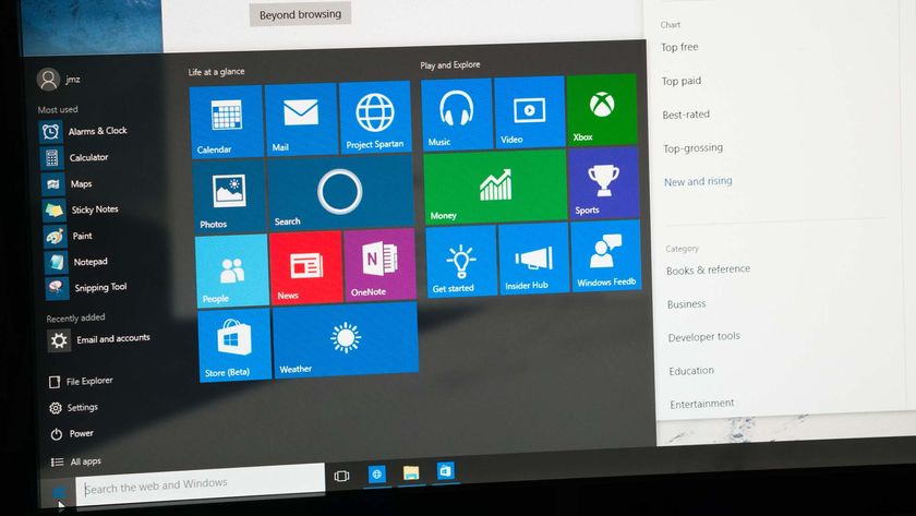
Windows 8.1 still features the same dynamic Live Tile interface as Windows 8, making it easy to see social updates, the latest weather conditions and news headlines at a glance. But now there are more tile size options at your disposal. You can also set the same background for both the Modern interface and desktop UI to provide a more seamless feel.
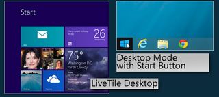
Still, the Modern UI and desktop remain very distinct computing environments. (Why are there still two IE browsers again?) Fortunately, you can boot directly to the desktop if you wish. A more robust Modern settings menu helps, but tweaking some options requires digging into the Control Panel. OS X Mavericks System Preferences are all in one place.
Microsoft wisely revived the Start button in Windows 8.1. However, this button merely returns you to the Start screen and its Live Tiles. It's actually kind of tease.
Stay in the know with Laptop Mag
Get our in-depth reviews, helpful tips, great deals, and the biggest news stories delivered to your inbox.
Microsoft could also do a better job of not hiding key information in Modern mode, such as your system’s battery life. And while Windows 8.1 surfaces more data at a glance, such as the search bar in the Mail app, other times you’re forced to swipe up to reveal the app bar before you know what options are at your disposal. Yes, Windows 8 has improved, but it still feels like work at times.
MORE: How to Download and Install Windows 8.1 Preview
OS X Mavericks offers a very similar interface to Mountain Lion, including an iOS-like Launchpad for the apps you download from the App Store, a Notification Center that shows your alerts and a dock for your favorite apps. It's not fancy, but it works.
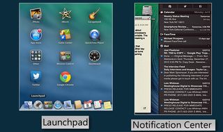
Apple has modernized the look and feel of some of its apps, including Calendar and Notes. Those old-school ripped page visual metaphors have a taken a back seat for a cleaner aesthetic.
Winner: OS X Mavericks. Last time we gave this round to Mountain Lion because it offers a more consistent and unified UI. While we appreciate the improvements in Windows 8.1, its two UIs still don’t mesh well.
Multitasking
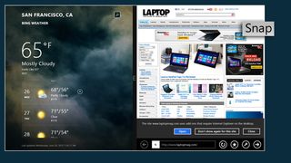
Microsoft extends its lead over OS X with 8.1 by allowing users to run up to four apps on the screen at once. You can't even snap two windows side by side on OS X Mavericks. Just as important, you can now snap two Modern apps side by side and have them both take up half of the screen. Before it head to be a 70/30 percent split. In desktop mode you can still peek at open programs by hovering your cursor over the app icon, something OS X doesn’t do.
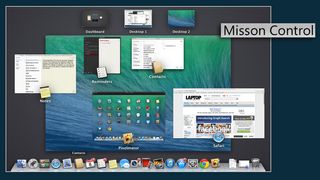
Multitasking on OS X Mavericks hasn't improved much, which is a shame. Mission Control provides only a dashboard as to what's open. You can't close any apps from this view. Why not let users swipe up on an app to close it, as you can on the upcoming iOS 7? For the most part, OS X is best for unitasking because of its ability to run many apps at full screen. However, we like the improved multiple display support, which lets you see the dock and menu bar across screens.
Winner: Windows 8.1. An improved Snap function makes Microsoft's OS the better bet for multitaskers.
Notifications
Windows 8.1 sticks with Toaster notifications that pop up on your screen for incoming alerts, relying mostly on Live Tiles to keep users up to speed. Our issue with Live Tiles is that you don't land on a specific message or news story that you see flashing in the tile, just the start page for the related app. On the plus side, a new Quiet Hours feature gives users more control over alerts, letting them schedule when notifications should be inactive.
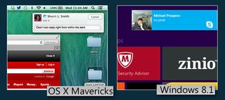
Apple has built on Notification Center in Mountain Lion with enhanced notifications in OS X Mavericks. You can reply to a message or email directly from within the alert, which helps save time and keeps you more focused on the task at hand. You can also accept FaceTime invites on the fly. Mavericks will also support notifications from some of your favorites websites, such as CNN.
Winner: OS X Mavericks. While Live Tiles are more engaging, keeping track of notifications in Windows 8.1 feels more unruly than Apple's one-stop notification shop.
Search
Microsoft has stepped up its search game in Windows 8.1. Unlike Windows 8, you’re no longer forced to choose between sources like your hard drive, the web and your list of apps. Just fire up the Charms menu, click the search icon and you’ll see apps, documents and more show up in results. However, you can’t preview results here as you can with Mavericks.

A new Search Heroes feature delivers sleek results pages with interactive multimedia content. For example, searching a city returns a map, the current weather conditions and attractions. (It’s a lot like searching Bing). Search Heroes also applies to music artists, offering sample tracks and videos via Xbox Music. When we searched for our name, Windows 8.1 returned relevant webpages with thumbnails in the middle of the screen and files on the left.
MORE: Windows 8.1 Tips and Tutorials
OS X Mavericks makes it easier to find your files by introducing a new Tags feature, which lets you apply tag names with their own colors. You can apply multiple tags to the same file, such as Family Budget or Big Project. Within the Finder you’ll see a list of tags along the left sidebar for quick access. Or just use the search field to find files based on tags or their color.
OS X Mavericks supercharges your searching in another way with Finder Tabs. Similar to a web browsing experience, you can open multiple tabs within the Finder to reduce window clutter. You can also easily drag and drop files from one tab to another.
MORE: Top 10 Features of OS X Mavericks
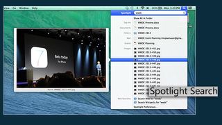
Spotlight Search continues to be a great feature in OS X, returning results almost instantly in multiple categories (Documents, Folders, Events, Web pages, Music, Web, etc.). Plus, you can preview your results by hovering over them. You can even drag and drop items out of the results view into an app, such as a photo into an outgoing email.
Winner: OS X Mavericks. Windows 8.1 offers better looking results and has made its search universal, but Apple’s Spotlight offers previews and Finder has pulled ahead with features power users will appreciate.
Cloud
We found it downright odd that Microsoft highlighted SkyDrive in the Modern-style interface in Windows 8 but didn’t even include it on the desktop. That changes in Windows 8.1, as it’s integrated right into Explorer. It’s clear that Microsoft would prefer that you would use its service, which includes 7GB of free storage.
The beauty of SkyDrive in Windows 8.1 is that your files appear as though they’re stored locally (complete with thumbnails) but take up very little hard drive space. Only when you open a file does SkyDrive retrieve it from the cloud. However, you can right-click files to make them available offline.
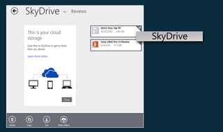
Microsoft also updated the Modern-style SkyDrive app to let you access files that are both stored locally and in the cloud. Moving files could be easier, though. After copying a bunch of screenshots and entering a new folder, a message at the bottom of the screen said “3 items ready to paste.” Tapping that message did nothing; instead, we had to swipe up from the bottom of the screen to open the app bar, then tap Paste.
Unlike Apple’s iCloud, Microsoft’s SkyDrive Cloud service lets you access your files on Windows 8, Windows Phone 8, iOS and Android devices. With Apple, you’re pretty much stuck with iOS, though you can access files via the web.
Apple hasn’t made many changes to iCloud within OS Mavericks itself, but it does integrate with the new Tags feature, making it easier to find your files when you log into another Mac.
Another welcome new feature is iCloud Keychain, which stores everything from usernames and passwords to credit card info and Wi-Fi credentials stored in the cloud. Everything gets encrypted and pushed to your iPhone, iPad or iPod touch. By the same token, the new Books apps in Mavericks syncs your progress and notes in books.
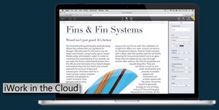
Things will get more interesting once Apple launches iWork in the Cloud (in limited beta now). The service will bring Pages, Numbers and Keynote to both OS X and Windows users via the web, but it doesn’t look as though it will be as robust as Office 365 or Google Drive.
Winner: Windows 8.1 The ability to access your files from more types of devices and improved desktop integration help Microsoft win this round.
Sharing and Social Integration
The What’s New area of the People app continues to make it easy to see what your friends and other contacts are up to on Facebook and Twitter. We also like that you can write directly on someone’s Facebook wall from within a contact in the People app.
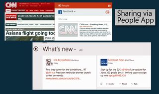
The omnipresent Charms menu lets you share everything from web articles to photos with a swipe in from the right, but the social networks are an extra tap away via the People option. And even then only Facebook and Twitter were an option in the drop-down menu, not LinkedIn. Worse, you can only share via the People app if you use the Modern version of IE 11, not the desktop browser.
Apple has added some social mojo to OS X Mavericks, including LinkedIn integration. This applies to sharing articles from Safari, checking out Shared Links from within the browser’s bookmark view and contacts. LinkedIn updates can also show up as notifications. OS X continues to support Facebook and Twitter integration as well.
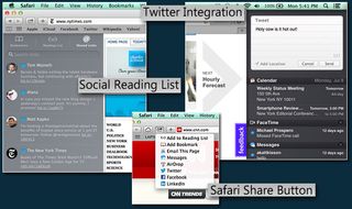
It’s a minor enhancement, but we like that events that your Facebook friends invite you to automatically appear in the Calendar app. If you want to post directly to Facebook or Twitter, you can do so at any time right from the Notification Center. With Windows 8.1, you have to launch the People app first, then click Me.
Neither Windows 8.1 nor Mavericks support Google+.
Winner: OS X Mavericks. Although Windows 8.1 offers a sleeker People app, Apple’s OS makes it easier to share content.
Built-in Apps
Windows 8.1 includes some enhanced apps and brand-new choices to help users get more out of the touch-friendly OS. We continue to like appreciate the Bing News, Travel, Finance and Sports apps, with their sleek panoramic designs and customizable interfaces. You can also pin favorite items to your Start screen, as we did with the New York Yankees.
Creative types will dig the new Fresh Paint app for Windows 8, which includes oil paints, graphic pencils and watercolors and lets you paint via touch, stylus or dedicated drawing tablet. And foodies will salivate over the new Bing Food & Drink app, which includes tasty recipes, a shopping list and meal planner. The hands-free mode lets you wave your hand through recipe steps (a smart idea) but on our Yoga 11s the gestures were inconsistent.

The Bing Health & Fitness app is even more robust, offering videos (like The Hotel Room Workout), diet, exercise and health trackers, and a symptom checker with a 3D model of the human body. You can literally point to where it hurts.
MORE: Top 25 Windows 8 Apps
Although it was not available on our preview build, a new Mail app borrows liberally (in a good way) from Outlook.com. A power pane on the left side lets you filter mail by important contacts, while separate newsletter and social update views minimize clutter. We also like the ability to view image attachments in split-screen mode with the Photo app.
Speaking of the Photos app, you can now auto-fix and fine tune photos with a few taps. However, the iPhoto app in OS X Mavericks has many more options and integrates well with Shared Photo Streams, making it easy to import images from your iOS device.
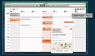
With OS X Mavericks, Apple has given some its Calendar app a major makeover while adding Maps and iBooks. In addition to a cleaner design, the Calendar app now offers an Event Inspector feature that will autocomplete meeting locations as you type; the app will show the cross-street on a mini map and even the weather forecast for that appointment time. The Windows 8.1 Calendar app is much more barebones.
Maps for OS X Mavericks is similar to the iOS version (except on a bigger canvas), complete with 3D flyovers for cities. We also like that points of interest include Yelp ratings and photos. However, while Apple's Maps app looks better and is easier to use, only the Bing Maps app includes transit directions.
iBooks isn’t included in the developer preview, but it promises access 1.8 million books right from the iBooks Store, and iCloud keeps your current page in sync across multiple Apple devices. Windows 8.1 users will have to opt for a third-party option like Amazon.
Winner: Windows 8.1. Although we prefer Apple's Calendar app to Microsoft's, Windows 8.1's selection of Bing apps provides a more well-rounded experience, especially if you invest in a touchscreen device.
App Stores
From Microsoft: Microsoft recently passed the 100,000 app milestone for the Windows Store, and the company claims that the majority of top iPad and Android apps will be available for Windows 8.1 by the time Windows 8.1 ships. Those will include Facebook and Flipboard.
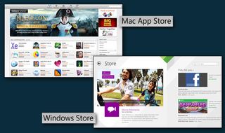
The Windows Store in Windows 8.1 sports a redesign that presents personalized recommendations based on previous downloads, as well as staff picks, deals and apps rising in popularity. Microsoft also cut down on the need to scroll by letting you see all categories by right-clicking or swiping in from the top of the screen.
However, the Windows Store continues to stock only Modern-style apps and not desktop apps, which results in a fragmented downloading and shopping experience. For now, the Store is missing some key apps you'll find on the iPad, such as Pandora, Draw Something and Words with Friends. But this face-off is between Windows 8.1 and OS X Mavericks, and in that regard Windows has a huge lead over Apple in the number of desktop apps you can find outside of the Windows Store.
The Mac App Store stocks thousands of choices, ranging from photo editing apps and social networking tools to games. Apple's store also presents more information on the screen at once, making it easier to find what you're looking for. We appreciate the easy access to Top Charts and Categories at the top of the screen. The Mac App Store can now update your apps automatically, similar to Windows 8.1. However, only the Mac App Store stocks apps optimized for Retina Displays (260 at last count).
Winner: OS X Mavericks. Yes, the Windows Store looks better than before, but the Mac App Store is still more intuitive.
Web Browsing
Apple’s Safari browser gets faster and more social with OS X Mavericks. A revamped sidebar (accessed via the Bookmark button near the top-left corner of the screen) includes not just your bookmarks and Reading List, but also a new Shared Links feature that shows what your Twitter and LinkedIn contacts are posting.
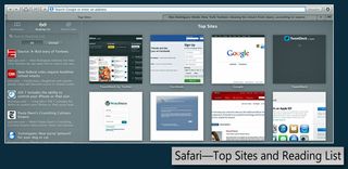
The new Top Sites page displays all the sites you visit most in a neat grid, and you can reorder them with a drag and drop. Those who like to add articles to their reading list will be pleased to learn that you can now keep scrolling through the pages when you reach the end of a story.
In Windows 8.1, the Modern-style IE 11 browser gets the most attention. You now have unlimited tabs (before it was 10) and you can now snap two webpages side by side. If a given website supports the feature, you can pin your favorite sites to your Start screen as a Live Tile, which updates with new photos and headlines.

We still find it jarring that IE 11 has separate desktop and Modern (touch friendly) versions with their own interfaces, but at least bookmarks stay in sync. Open tabs do not sync though.
To test Safari’s performance versus IE 11 in Windows 8 .1, we compared it against both the Modern and desktop versions of the browser using a few benchmarks. For these tests we used a 13-inch MacBook Pro with Retina Display and a Lenovo ThinkPad Helix.
On Sunspider (a JavaScript benchmark), Safari scored 199 ms, while the desktop version of IE 11 notched a faster 146.7 ms. (Lower numbers are better.) The Modern version of the browser was slower than Safari, registering 206 ms.
We also ran Rightware’s Browsermark 2.0, which measures everything from 2D and 3D performance to resize and page load times. In this test Safari scored 6,090, compared to 2,467 for IE 11. Lastly, OS X Mavericks smoked Windows 8.1 on the V8 Benchmark, which also tests JavaScript performance (13,718 vs. 8,015 Windows 8.1 Modern vs 9,912 Windows 8 desktop).
Winner: OS X Mavericks. As far as native browsers go, we give the edge to Safari for its social integration and faster performance.
Gaming
This round will be very quick because the hottest games simply don’t find their way to Macs fast enough—if at all. “World of Tanks,” “Tomb Raider,” “Far Cry 3,” “Call of Duty Modern Warfare 3.” None of these top-tier Windows titles are available for Macs.

The Mac App Store does stock some decent games, such as “Batman: Arkham City,” “Doom 3” and the earlier “Call of Duty: Modern Warfare,” but hardcore gamers are still better off with Windows.
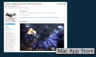
The good news is that casual gamers will find plenty to like in the Mac App Store, from “Real Racing 2” and “Angry Birds Star Wars” to Bejeweled 3.
Winner: Windows 8.1. We wish Microsoft put its best games in the Windows Store, but overall this round is no contest.
Hardware Options
Just as there has always been, there are still huge differences in hardware variety for OS X and Windows. With Windows 8.1, most of the excitement is around touch-based hybrids that combine laptop and tablet functionality in a single device. Examples include the IdeaPad Yoga ($1,099), Dell XPS 12 ($1,099) and ASUS Transformer Book ($1,499). Cheaper Atom-powered convertibles such as the Samsung ATIV Smart PC 500T cost $579, while touch-enabled notebooks (that don’t flip or convert) start as low as $399.
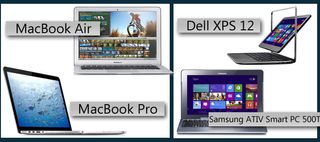
If you plan on using the Live Tile interface often, we highly recommend a Windows 8 notebook with touch. Just keep in mind that the desktop environment isn’t nearly as touch friendly as the Modern UI and Windows 8-optimized apps.
MORE: Best Laptops 2014
With a starting price of $999, Apple’s MacBook lineup isn’t ideal for those on a budget, but its machines are very good values compared to similarly configured Windows 8 notebooks. For instance, the $1,099 MacBook Air lasted more than 11 hours on our battery test, which beats the pants off of all Windows-powered Ultrabooks. And while the MacBook Pro with Retina Display starts at a relatively steep $1,499, Apple actually offers apps that are optimized for is higher-resolution screens.
Winner: Windows 8.1 Microsoft wins in terms of sheer variety and for having many compelling options priced lower than Apple.
Verdict
The choice between OS X and Windows has always been fairly simple for those on a tight budget. If you don’t want to spend $999 or more on a new notebook, a Mac isn’t the right choice for you. But when it comes to the overall experience on comparable hardware, the choice becomes more difficult.
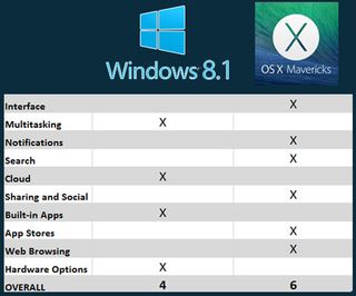
Windows 8.1 builds upon the touch-friendly strengths of Windows 8 while better catering to desktop users. This OS is better at multitasking than OS X Mavericks, and SkyDrive is more robust than iCloud. If you don’t like the Live Tile interface, you can mostly ignore it. However, even though you can find Windows 8 touch-based laptops and tablets on the cheap, the desktop environment in Windows 8.1 continues to be much better with a mouse and keyboard.
OS X Mavericks isn’t all that ambitious a release compared to the upcoming iOS 7, but it does beat Windows 8.1 in many key categories. While not as dynamic, Mavericks’ interface is easier to use because there aren’t two competing environments (desktop and tablet). Mavericks also does a better job with notifications and search, as well as social sharing.
Do we wish Apple would offer touch support in its Macs? At times, yes, but overall we prefer OS X Mavericks to Windows 8.1 because it offers plenty of enhancements without trying to do too much.

