Windows 8's Competing Interfaces Will Double Your Effort, Halve Your Fun

Like a Miley Cyrus / Hannah Montana concert, Microsoft's new operating system promises the best of both worlds. Unfortunately, after manically switching back and forth between Windows 8's new tablet-inspired Metro UI and traditional desktop mode, users will feel like they've accompanied the teen star on a bad Salvia trip. Microsoft is making the right move by offering a touch-friendly interface for tablets without abandoning its long-standing windowed desktop, but users should be able to run all their programs in the single environment of their choice.
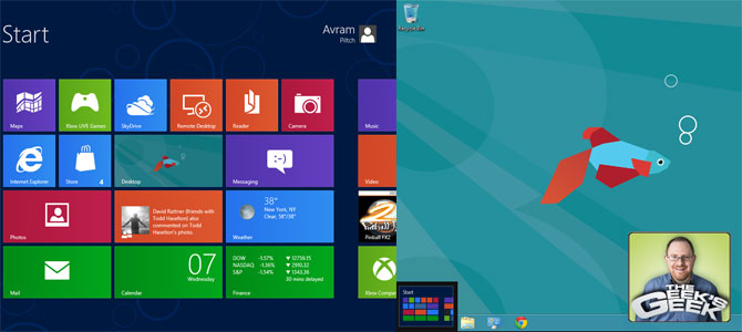
Using the Consumer Preview of Windows 8 is an exercise in frustration because there's no way to live exclusively either in desktop or Metro modes. When I installed the OS on my dual-screen PC, the Metro UI only appeared on my primary display with the traditional desktop on my second monitor. Apparently, there's no way to extend Metro across more than one screen. In fact, every time I clicked on my second monitor's desktop, Metro disappeared from the primary screen, leaving the desktop in its place.
Clearly, if Metro were meant to be used as your only environment, you'd not only be able to run it on multiple displays at once, with different apps open on each screen, you'd also be able to run all of your software in it. However, as of today, a lot of the most essential apps kick you over to desktop mode the minute you tap on their tiles. Whether you want to browse your hard drive with Windows Explorer or scribble in Windows Paint -- both programs that come with the OS -- you're sent over to the desktop where these applications run in their own windows.
If you want to change operating system settings, there are two different control panels. The Metro "PC Settings" application lets you control some basics like which wireless network you use, what home groups you join, what peripherals you have attached and what your lock screen looks like. However, if you want to play with the big boys and control your Windows services, schedule tasks, resize your paging file, add fonts, uninstall software or repartition your hard drive, you'll get kicked back to the desktop and its more robust control panel.
Just as you can't live in Metro all the time, you can't avoid it and just use the desktop. When you first boot the Windows 8, Metro's tiled UI is staring you in the face and you have to click a tile to get to the desktop. When you're on the desktop and want to launch a new application, there's no more Start Menu orb. To see a list of all your installed applications and click one, you have to leave the desktop and go to Metro, your new full-screen start menu.
Sebastian Anthony of ExtremeTech sees this move to Metro as a positive trend, writing that "we should view the Start Screen as an improvement on the Start Menu. Icons can be dragged around and grouped, and live tiles are a much-needed overhaul to the system tray, an element that has gone virtually unchanged since Windows 95." But finding an application shortcut should be a quick process that doesn't require you to switch UIs.
Using Metro to launch desktop applications is like renewing your license at the DMV, a seemingly simple process that has plenty of extra steps thrown in for the heck of it. Imagine that you're using Word and want to launch Excel so you can see your spreadsheet right next to your quarterly report document. With the old-school Windows Start Menu, you could see a hierarchical menu of all your applications, without hiding work area. Now, unless you've placed an Excel shortcut icon on your desktop or taskbar, you have to leave Word, cover over your document windows with the Metro UI screen, and then locate the Excel shortcut by scrolling through the tiles or typing "excel" into the search box. Talk about placing tile over substance!
Stay in the know with Laptop Mag
Get our in-depth reviews, helpful tips, great deals, and the biggest news stories delivered to your inbox.
Most frustrating of all is that the two environments don't talk to each other. If you're in Metro and you get an instant message on the desktop version of Google Talk, you won't see a flashing alert on the screen, though you will hear the beep if you have sound enabled. If you're in Metro, and you open the list of thumbnails that shows all your open tasks, the entire desktop is presented as a single task, even if you have a million different applications running on it.
It almost goes without saying that, right now, 99.9% of software is designed for the traditional windowed environment, but that's no reason for Microsoft to prevent them from running in Metro. Back in the early 1990s, most applications were written for MS-DOS and its command-prompt UI. Nevertheless, early versions of Windows made it easy to run these otherwise full-screen programs in their own windows. I have fond memories of running the old blue-and-white WordPerfect 5.1 in one window while I ran a DOS game in another.
There's no good reason why Windows 8 could not run so-called "desktop" apps in Metro mode. Yes, a lot of these apps won't look perfect in Metro as their menu bars aren't touch-friendly and some, like Photoshop, contain daughter windows and tool bars that are tough to drag around with fat fingers. However, making the user switch environments won't solve a problem which has more to do with the apps themselves than the UI which surrounds them.
By the same token, Windows 8 should allow users to run its new class of HTML 5 "Metro" apps in their own windows on the desktop. Right now, there's no way to use new HTML 5 programs like the USA Today or Bing Maps app from Windows 8's desktop mode; you can't even create shortcuts to the apps and place them on the desktop. However, Microsoft has no good reason to stop you. If I want to look at the new People app in a resizable, draggable window, I should be able to.
Windows' greatest strength has always been its flexibility, the flexibility to run thousands of different apps in an environment that's open to unlimited customization. Microsoft needs to continue this rich tradition by giving Windows 8 users the ability to choose between either desktop or Metro UIs, with the ability to run any app in either UI and a full, old-school Start menu for those who choose desktop mode. Forcing us to use two disparate environments at the same time is a recipe for confusion and lost productivity.

