Go Directly to Fail: Worst Tech Product Ideas Ever
Spray-on hair. New Coke. Pat Boone’s heavy metal album. Some products are such bad ideas that some executive must have been snorting canned air before letting them out the door. Unfortunately, hardware and software vendors are some of the worst offenders, releasing half-baked gadgets and fatally flawed operating systems while turning a deaf ear to anyone who informs them that the emperor has no clothes. These are 10 of the worst tech ideas of all time.
Android laptops
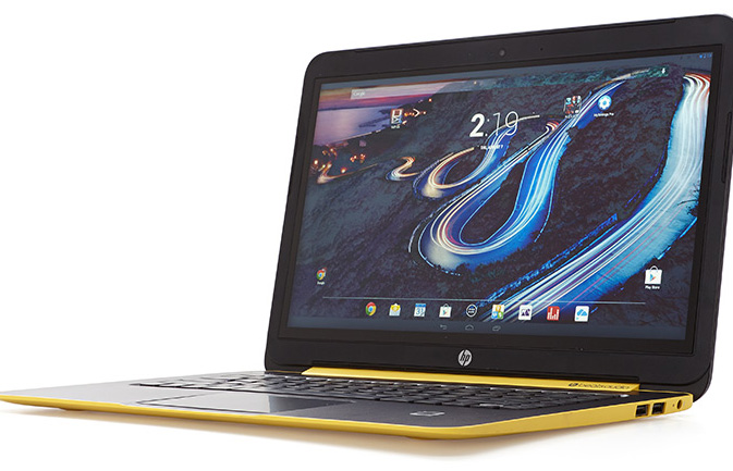
Android and clamshell computing go together like black licorice and mayonnaise. That hasn't stopped HP from releasing the sorrySlateBook 14, which puts Google's operating system on a laptop that cannot fold or detach into a tablet. What users really need on a laptop or desktop is a user interface that works really well with a keyboard and touchpad or mouse and provides plenty of windows for multitasking.
Unfortunately, stock Android doesn't support multiple windows or any kind of split-screen viewing. Though Samsung and LG have added that functionality in their custom skins, HP goes with unaltered, no-Window Android. Even worse, most Android apps aren't made to take advantage of a large-screen tablet, let alone a 14-inch notebook. Try staring across the keyboard at the slim, single-pane Facebook app.
More: 25 Best Android Apps
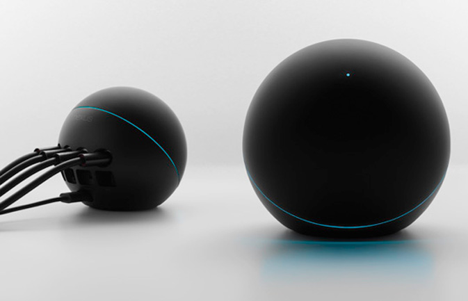
Google's $299 stylish streamer was designed to solve a problem no one has. A heavy, black orb that looks like it belongs next to the plasma globes at Spencer's gift stores, the Nexus Q allowed multiple users to stream music and videos to the same home theater at the same time, but not from Netflix, Hulu, Amazon or most other media services. Google's brain trust apparently thought young people typically go to parties and argue about whose Google Play music list they should beam to the stereo. After some negative user feedback, the company came to its senses and pulled the product from the market, giving away its leftover inventory without charging a single consumer for it.
More: Best Streaming Media Players
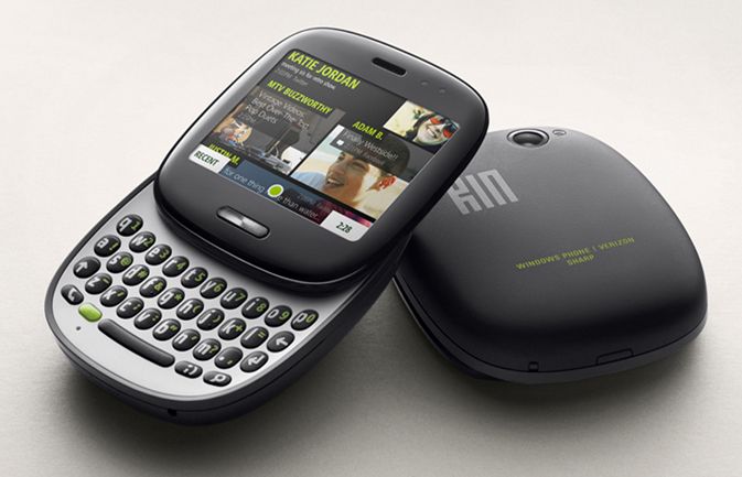
A house divided cannot stand, particularly if it's an office building on Microsoft's Redmond, Washington, campus. Back in 2010, Microsoft was developing two different phone platforms by two different teams at the same time: Windows Phone, which was to become its mainstream mobile operating system, and Kin, one of the worst ideas of all time.
Stay in the know with Laptop Mag
Get our in-depth reviews, helpful tips, great deals, and the biggest news stories delivered to your inbox.
Launched in spring 2010, the Kin platform was designed for the five people on Earth who were tech-savvy enough to do social networking and listen to music and email, but too dumb to use a full-fledged smartphone. Unfortunately, the phones were just as expensive as real smartphones, and Verizon required consumers to buy full-priced data plans for them. Even worse, it turns out that people who know how to post to Facebook also like to install apps and use a real Web browser. Within two months, Microsoft was forced to convert the product to a feature phone and later pull it from the market.
More: Best Smartphones 2014
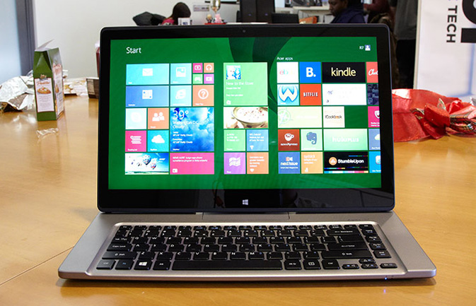
Like a reverse mullet, the Acer Aspire R7 laptop is party in front, business in the back, with a touchpad that sits behind the keyboard. Acer apparently felt that Windows users didn't need to move the mouse pointer anymore and didn't want to reach that extra 1.5 inches over the touchpad to poke at the touch screen — so the company designed the display to flip forward so it hides the touchpad entirely. If you hate the touchpad so much, why not do the full monty and remove it entirely, rather than hide it in an awkward place?
More: Best Laptops
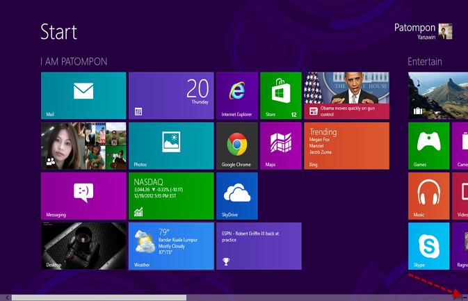
Windows 8's Modern UI and Start Screen
Unless Windows 8's confusing and inefficient Modern UI is part of a secret strategy to boost sales of the company's next operating system (Windows 9), it's one of the worst ideas in computing history — the New Coke of software. In addition to eliminating the Start menu and making the entire desktop environment into an app, Windows 8 takes familiar UI elements and buries them. For example, before a recent software update, the Shutdown button was three or four clicks removed from the Start screen.
Even as a tablet OS, Windows 8 leaves much to be desired. Basic pieces of information — like the battery level, time and Wi -Fi status — remain buried, while many of the key settings menus and applications still require touch-screen users to navigate around the desktop. No wonder Windows 8 is growing even slower than Windows Vista was at this point in its life cycle.
More: How to Make Windows 8 or 8.1 Look and Feel Like Windows 7
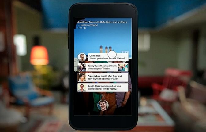
6. Facebook Home / HTC First
More than 1.2 billion users visit Facebook each month, but the number who want to turn their entire phones into Facebook machines is much closer to zero. After releasing the unsuccessful Facebook-centric Status phone in 2011, HTC should have learned its lesson. However, the company came back in 2013 with the HTC First, the inaugural and only phone to run the Facebook Home launcher. The First replaces the regular Android home and lock screens with social feeds. The handful of people who wanted Facebook Home were able to get it as a free download from Google Play, making this underpowered , one-trick pony a total failure.
More: How to Block Someone With Extreme Prejudice
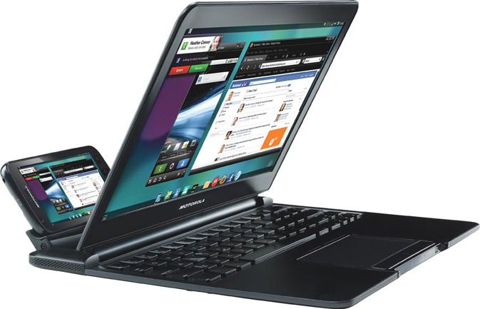
7. Motorola Lapdock
The smartphone you carry in your pocket has more processing power than PCs of yesteryear, so why not turn your handset into a laptop? That was the logic behind Motorola's lame Lapdock, a $499 accessory that turned the company's Atrix 4G phone into something less functional than a $299 netbook . Worse than the laptop dock's hefty price, or even its cramped keyboard, was its nearly useless operating system. Rather than the Android operating system that was on the phone, the dock booted into Motorola's custom webtop interface, which was little more than a Firefox Web browser with a few additional features.
More: Top 8 Windows 8.1 Tablets and Hybrids
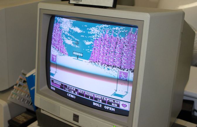
8. IBM PCjr
In 1981, IBM released the PC 5150, which began a revolution in computing that continues with today's Windows computers and tablets. Unfortunately, just three years later, Big Blue unveiled the hobbled PCjr, a scaled-back clone that claimed to be compatible with the growing universe of DOS software. It couldn't run 60 percent of 1984's most important applications, including Flight Simulator, WordStar and Lotus 1-2-3. Even worse, IBM cheaped out on the PCjr's keyboard, replacing the industry-leading buckling-spring keyboard from the regular PC with an uncomfortable wireless Chiclet-style keyboard that didn't always stay connected to the computer.
More: 10 Biggest Gadget Design Fails
9. Microsoft Bob
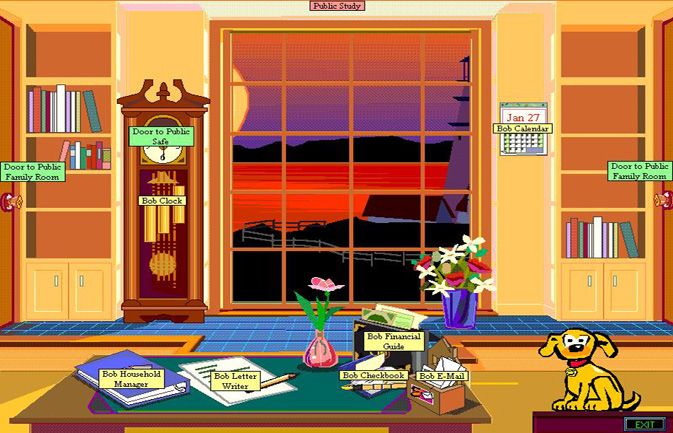
Treating users like toddlers who need a ton of hand-holding is rarely a good product strategy. Back in 1995, Microsoft decided that its Windows operating system was too complicated for some grown adults to understand, so it released "Bob," a UI that covered over the desktop with what looked like a low-res child's video game. Bob featured a virtual house with different rooms, each of which was decorated with objects that launched basic apps. For example, clicking a pen and paper in a room launched the built-in word processor.
Unfortunately, even in 1995, computer-illiterate adults didn't need this level of hand-holding, and Bob soon disappeared. If you're going to give your customers training wheels, make sure they help them learn to ride a big-boy bike.
More: Best Windows 8.1 Browser - Firefox vs. Chrome vs. Internet Explorer
10. BlackBerry PlayBook's remote email
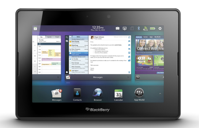
You can't blame BlackBerry for trying its hand in what was an emerging tablet market in 2011, and at first glance, the 7-inch PlayBook looks quite spiffy, with a colorful display and attractive UI. However, after months of hype, the product launched without an email client. Instead, users who wanted access to their inboxes had to run BlackBerry Bridge, a program that paired the slate with existing BlackBerry phones and read the email that remained stored on the handset.
At the time, BlackBerry reps claimed that leaving email on the phone was more "secure," because users could lose their tablets (but apparently not lose their phones). Yet even before the first unit shipped, the company promised to add a native mail application, which it did through a later update.

