Best games with Ray Tracing in 2025
Here are the best games to play with ray tracing on
Ray tracing is the most hyped up technological advancement throughout the last few years in gaming. Players are desperate to see their favorite titles updated with RTX capabilities, and it’s the key selling point for Nvidia’s 20, 30 and 40-series graphics cards. When utilized correctly, ray tracing can offer an unmatched quality in realistic lighting, shadows cast in real time, and accurate reflections.
As of this writing, Nvidia has over 400 games that have gotten Nvidia's ray tracing technology with nearly 200 titles for AMD. The list continues to grow for both companies as more popular titles are getting that ray tracing treatment at a faster rate.
So, which games utilize ray tracing best? If you’re someone who’s looking to be convinced by the power of this technology, there are plenty of great games out there that utilize it well. However, the hardware performance cost is extreme. After all, this technology can present something close to photorealism, so this list of recommendations comes with the assumption that you harbor the power to handle it.
Here’s a list of the best games to play with ray tracing on, along with a couple of dishonorable mentions for the sake of it.
1. Control
Control is the best ray tracing game you can play thanks to how the game’s setting lends itself perfectly to what the technology does best. Ray tracing isn’t easily noticeable when exploring most environments; the difference between “off” and “on” is often intangible when riding a horse through fields of grass or surrounded by stone castle walls.
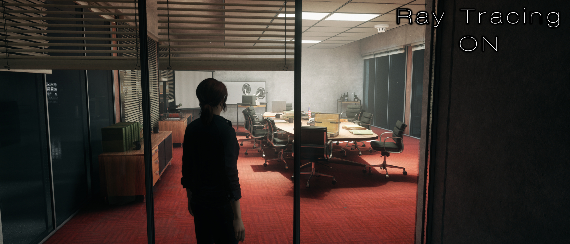
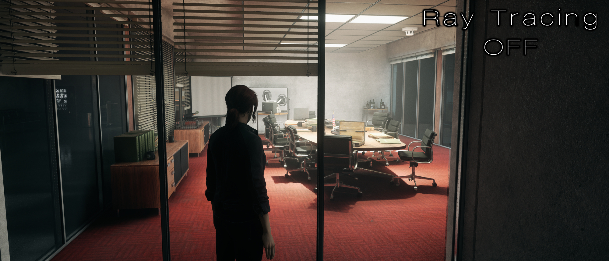
But when playing something as eerie as control, in an endless facility overwhelmed by concrete walls, shiny marble floors, an abundance of windows and surreal lighting techniques, it all meshes perfectly together to make a great coincidental showpiece of what ray tracing can accomplish.
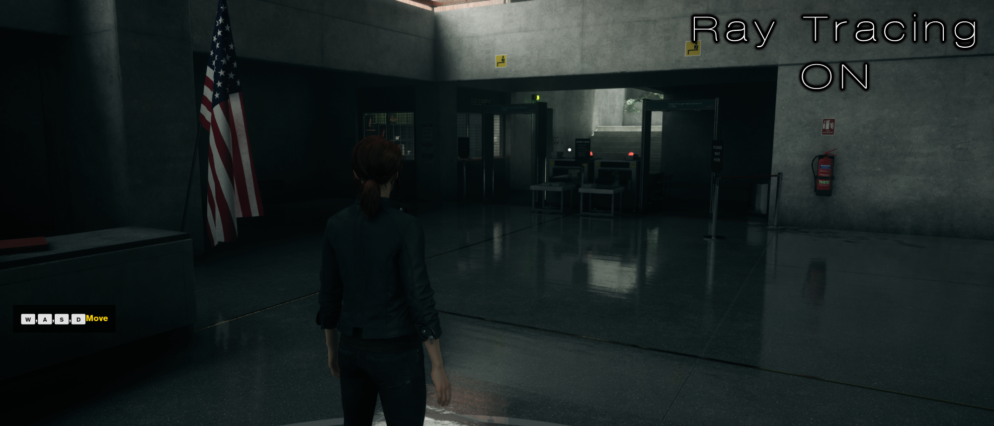
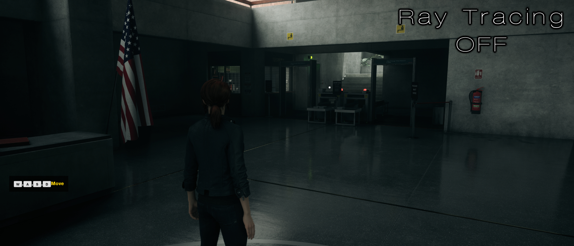
This is obvious as soon as you launch the game. I haven’t even left the starting area in the image above, and you can immediately see how the organic reflections on the floor make for a far more gripping scene. Control presents a world that looks creepily sanitary, and that is best shown through ray tracing. These floors are freshly shined, allowing you to perfectly see the reflection of the light coming from the staircase ahead.
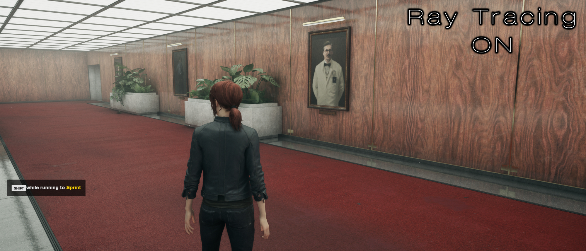
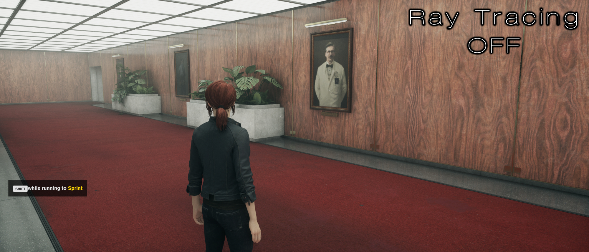
It’s more than just reflections though; Control’s shading is completely different with ray tracing on. Most games I’ve done ray tracing testing with offer minimal improvements, and in some cases, it’s so minor that it’s often a subjective preference rather than a clear enhancement. But Control completely shifts this; the way the game handles its lighting is superb with ray-tracing on.
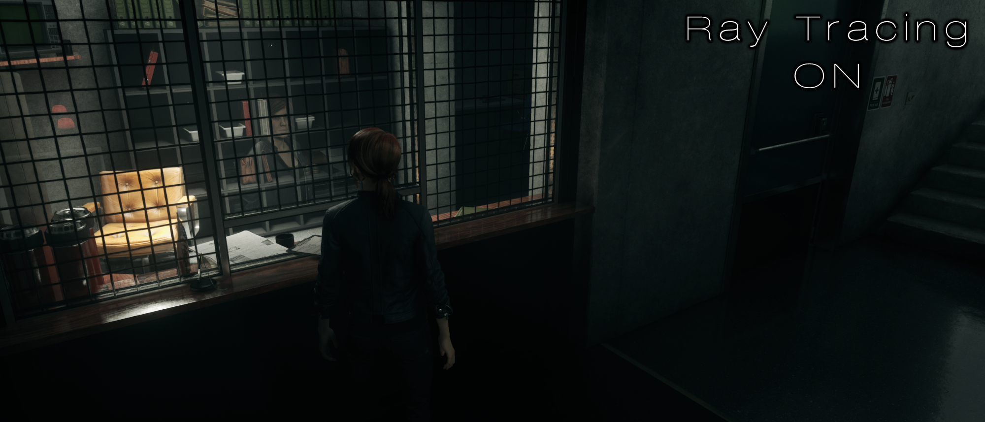
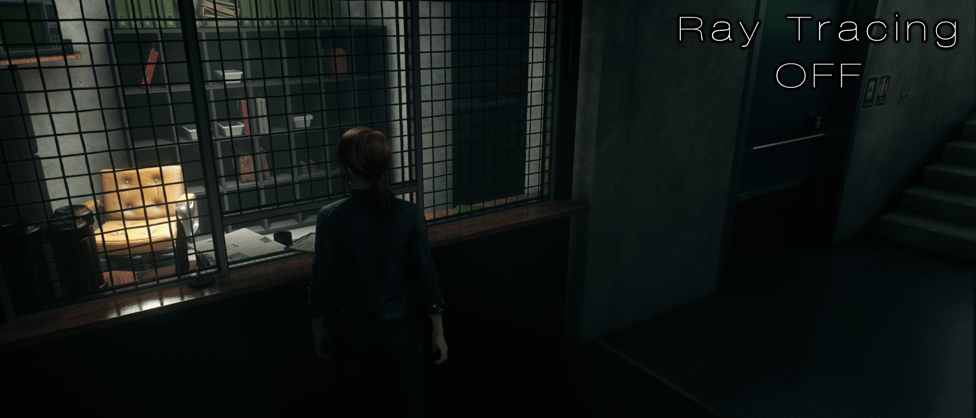
The image above showcases how everything in the room is casting shadows with far more depth than it was with ray tracing off. The canisters, the American flag, the wall behind the shelf, and the array of binders at the top pop out in a more convincing way than they do without it Many non-ray tracing games suffer from certain objects being far more luminescent than appears natural, and that is very clearly visible in the comparison images above. Additionally, the glass looks strange, as if it’s not even there when looking into the room. But as soon as you turn ray-tracing on, the subtle reflection of everything on the opposite side makes it clear what you’re looking at, alongside the character herself.
2. Cyberpunk 2077
Cyberpunk 2077 is graphically demanding in ways few other games could dream of, and that is turned up to its limit with ray tracing on. If you have the hardware capable of playing the game with ray tracing, it is absolutely worth it. The game looks far more tangible, features realistic lighting, meaty shadows, and most importantly, Night City looks like it's properly glowing when the sun comes down.
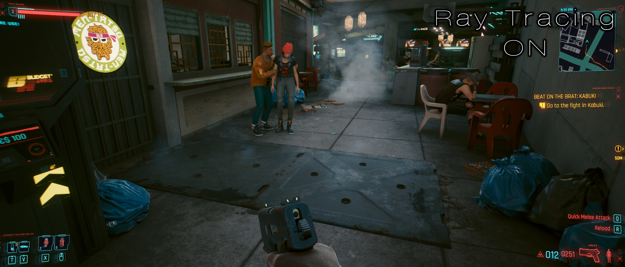
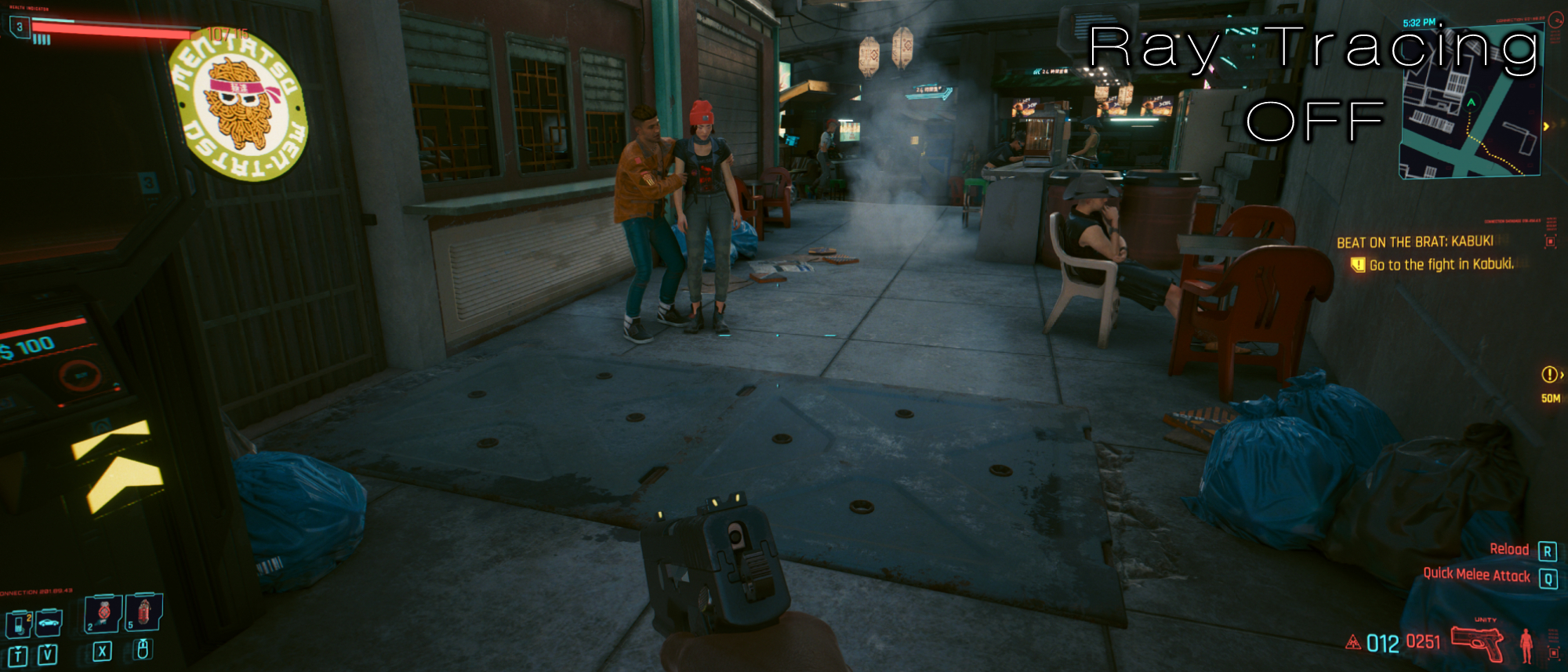
These differences are most blatant when areas are basked in sunlight. Without ray tracing on, there’s little to no depth in shadows that hit the concrete streets. In the screenshot above, the alleyway is almost entirely submerged in darkness without ray tracing, but afterwards, you can see major differences between where the light is shining from above compared to how the shadows are developing in the corners. You can also see how two dimensional the vent and garbage bags appear without ray tracing on. I mean, just look at those chairs to the right; the difference is staggering.
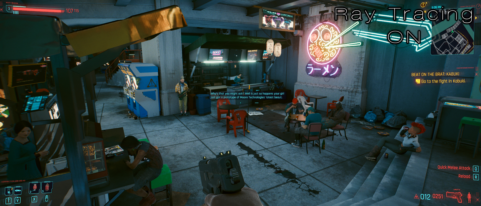
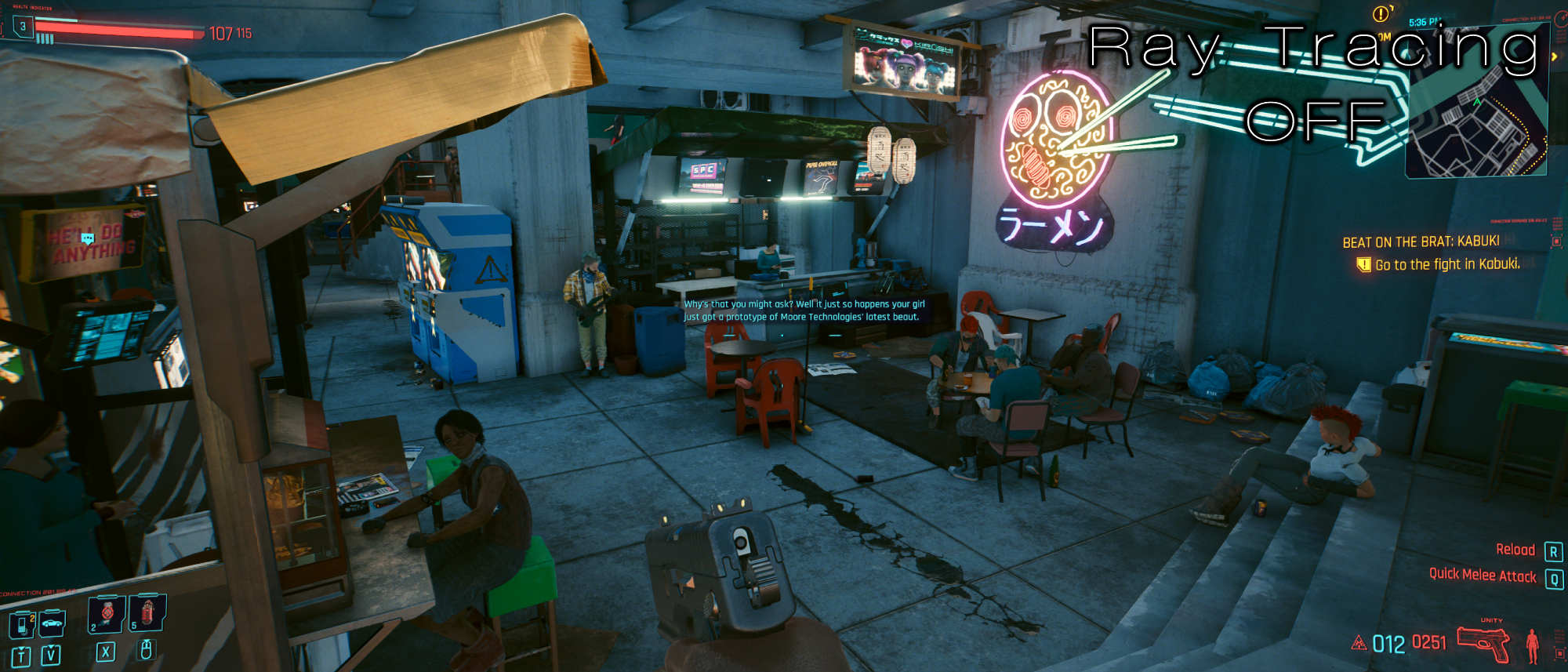
The shadows being cast in this dimly lit underpass are homogenous without ray tracing. It all blends together, and certain textures appear far too vibrant for the light setting (look at the top of the stall on the left). With ray tracing on, the atmosphere is kept intact yet enhanced with more realistic shading; the neon sign genuinely appears to be glowing, the tables and chair seamlessly appear as though they’re part of the scene, and the shadows behind the counter offer far more depth.
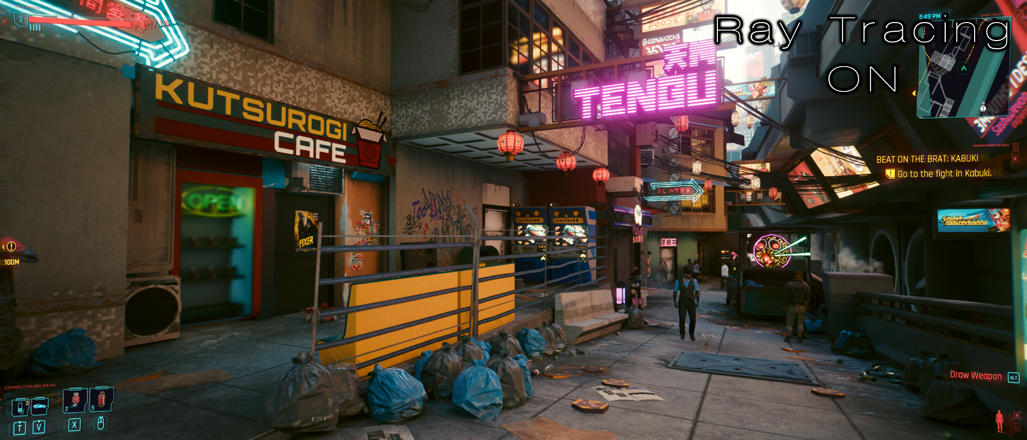
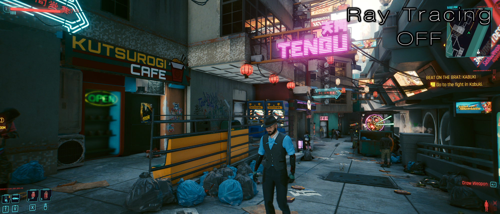
The image above is one of the more convincing visualizations for what ray tracing is capable of in Cyberpunk 2077. It’s currently 6pm in-game, and as it hits that time, the sun is beginning to set, giving the world a subtle orange glow. Beyond how beautifully ray tracing handles reflections and shadows, the color of this scene is vastly shifted. Without ray tracing, it’s not remotely obvious that the sun is setting; this area is as coolly lit as it would be during a bright day, yet as soon as you turn ray tracing on, the entire area is basked in the glow of dusk.
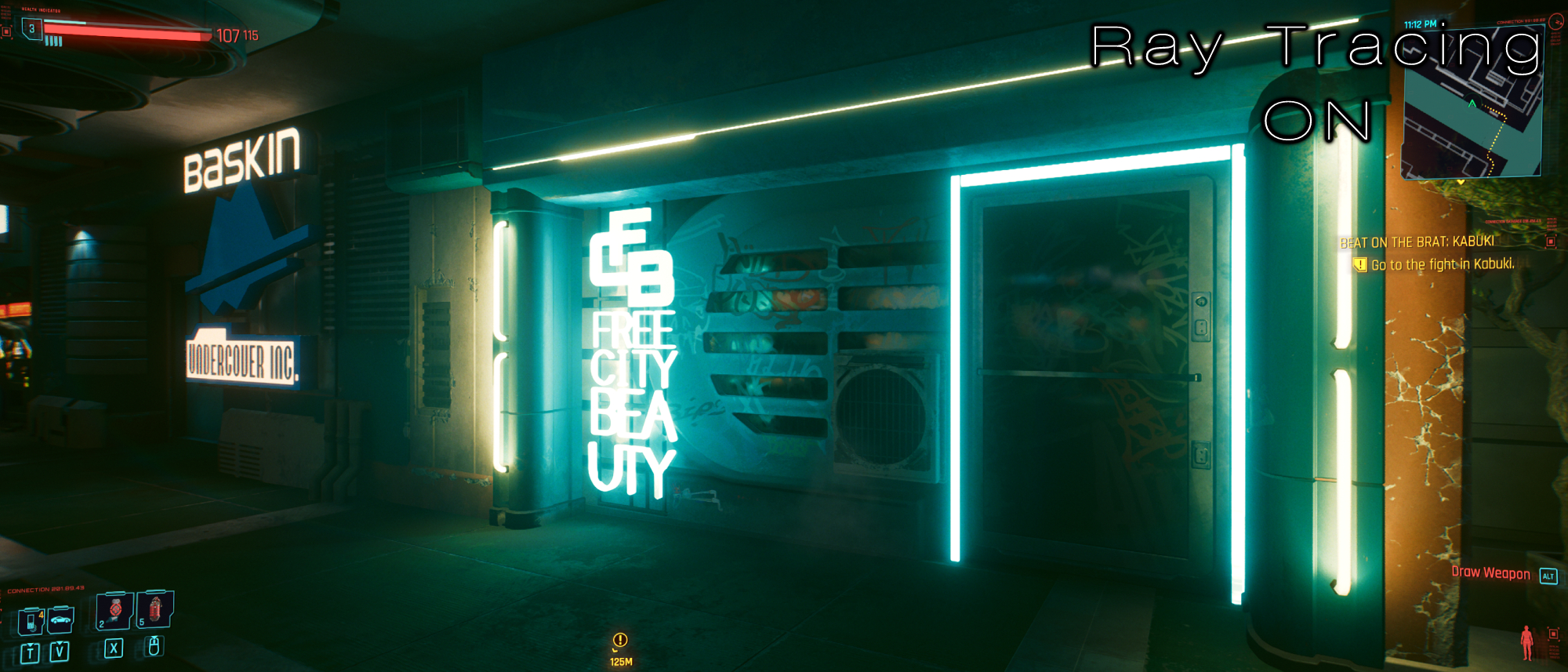
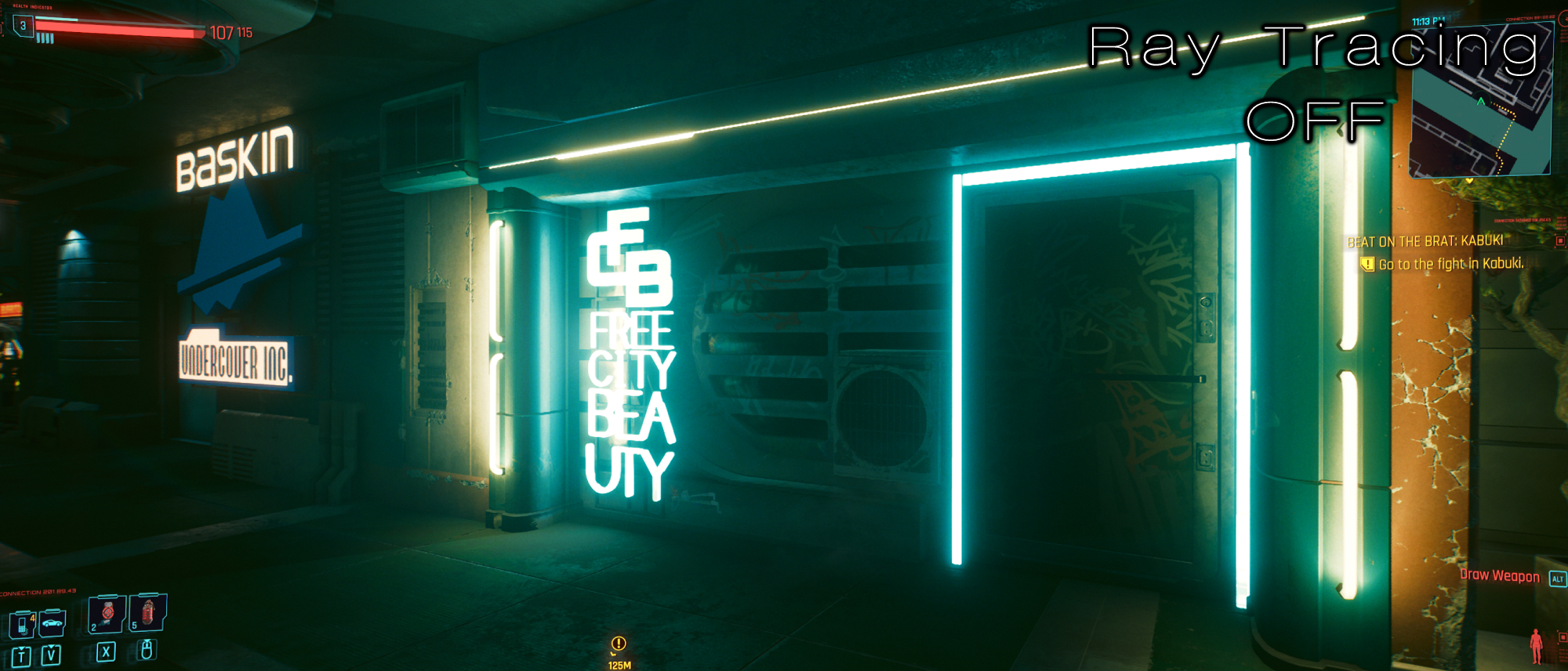
The case for Cyberpunk 2077’s raytracing is a bit harder to notice during nighttime. At most, you’ll see that glowing signs offer a more potent brightness. In the image above, you can see how the “Free City Beauty” neon light is so powerful that it makes the graffiti spray painted onto the store visible. With ray tracing off, it’s dark and neutered, making the specifics difficult to catch.
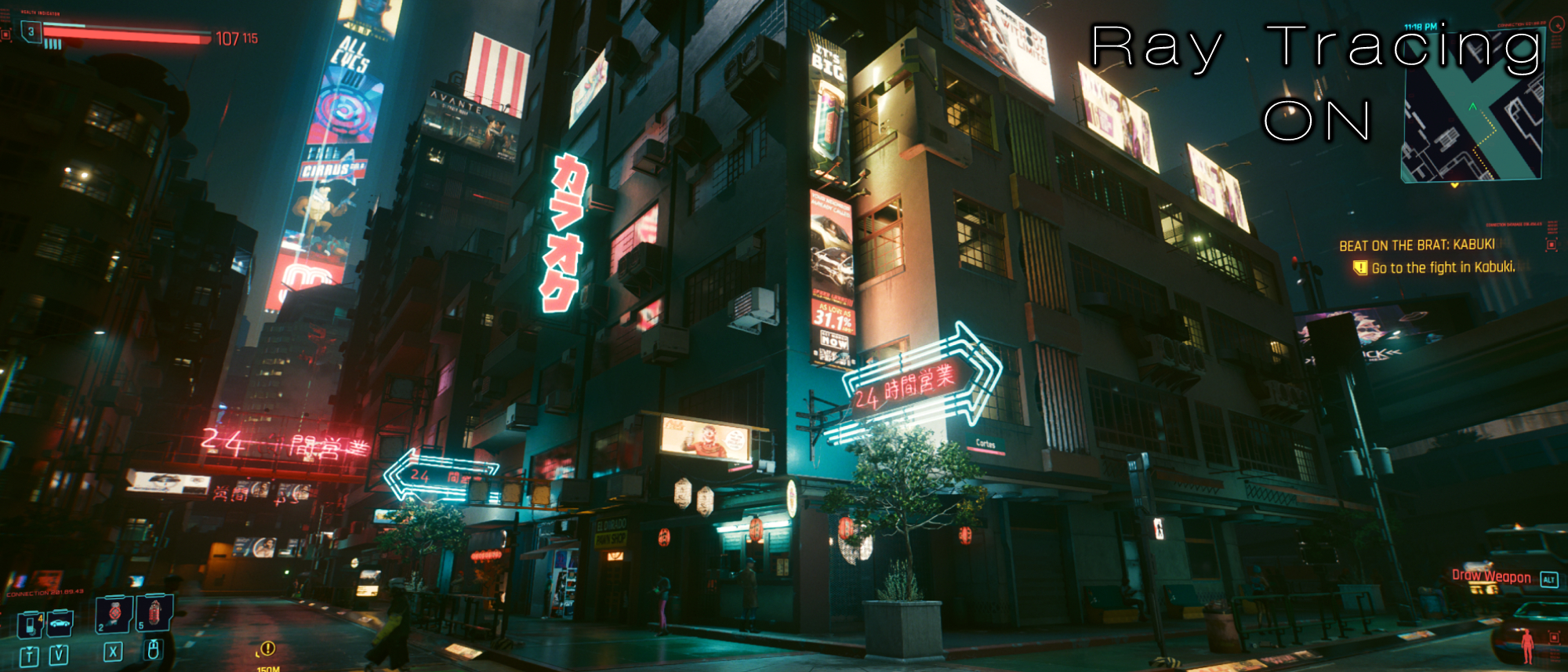
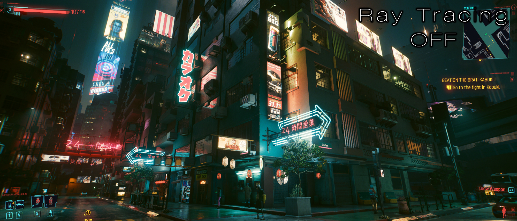
In general, ray tracing makes everything look tangible. It’s harder to see at night, but the way the shadows are cast onto this building makes it pop out more. With ray tracing off, there’s a weird disparity between the building itself and the objects that are lined across its surface. The air conditioning units, the power lines, and even the windows seem like they’re not actually a part of the building. Them being “assets” is made more clear due to how the shadows cast. But with ray tracing, that is undone and looks far more realistic.
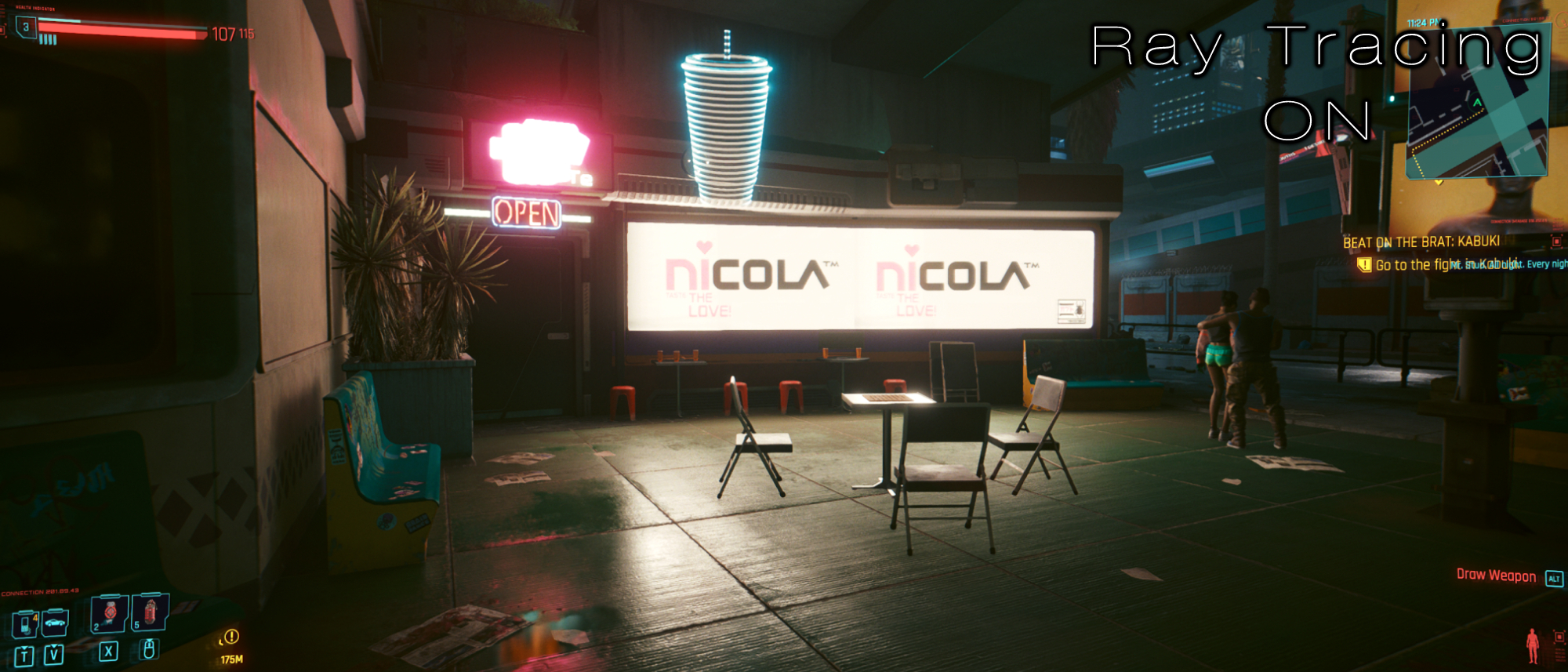
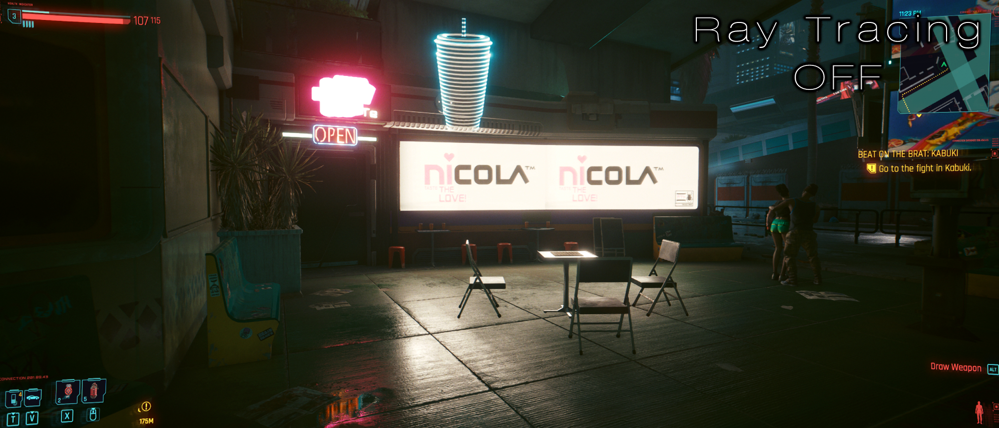
The brightness of city lights is most evident in the image above. This Nicola sign is luminescent with ray tracing off, but it’s only offering a reflection in the floor and the chairs. With ray tracing on, the entire area lights up; the source is far more potent and even though it’s nighttime, it’s clear that this light is unnatural. It’s a harsh, bright white, providing a really potent atmosphere to represent the freakishness of Night City.
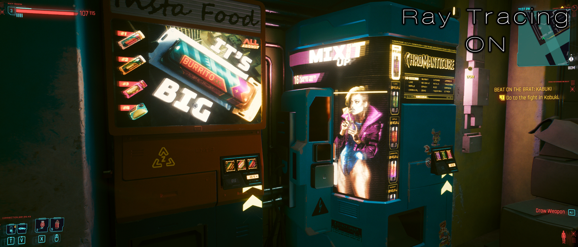
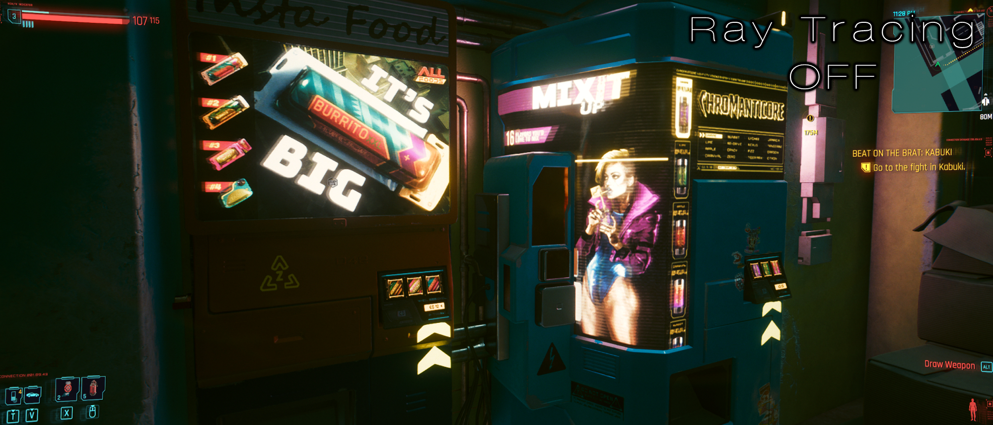
When stepping up close to objects, it’s apparent just how important these improved shadows can be. This vending machine is improperly lit, the vent at the bottom left seems strangely out of place, the rust harboring its edges are barely visible, the disparity between its lighter front and its darker side is barely noticeable, and the shadows behind the machines lack depth. With ray tracing on, all of this is fixed. The differences in color between the chipped paint and the blue bit protruding outwards is evident. Not only that, the vending machines themselves offer a stark difference in the light at the front compared to the darkness occupying the space in between it and the wall. It’s genuinely staggering how much better Night City looks with ray tracing on.
3. Doom Eternal
Doom Eternal is one of my favorite examples of ray tracing, as id Software turned that setting up to the extreme and it results in a drastically different experience. Rather than just having “improved reflections,” Doom Eternal’s approach to ray tracing is the difference between metal platforms being completely matte versus them being as reflective as a mirror.
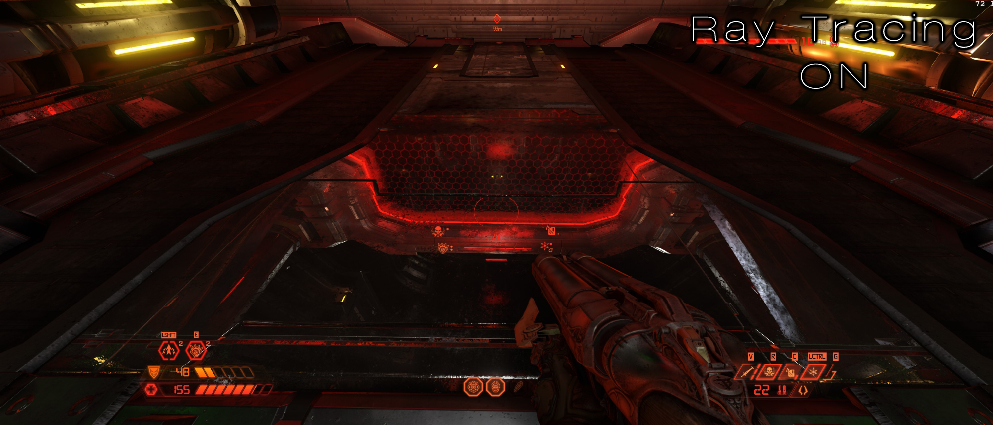
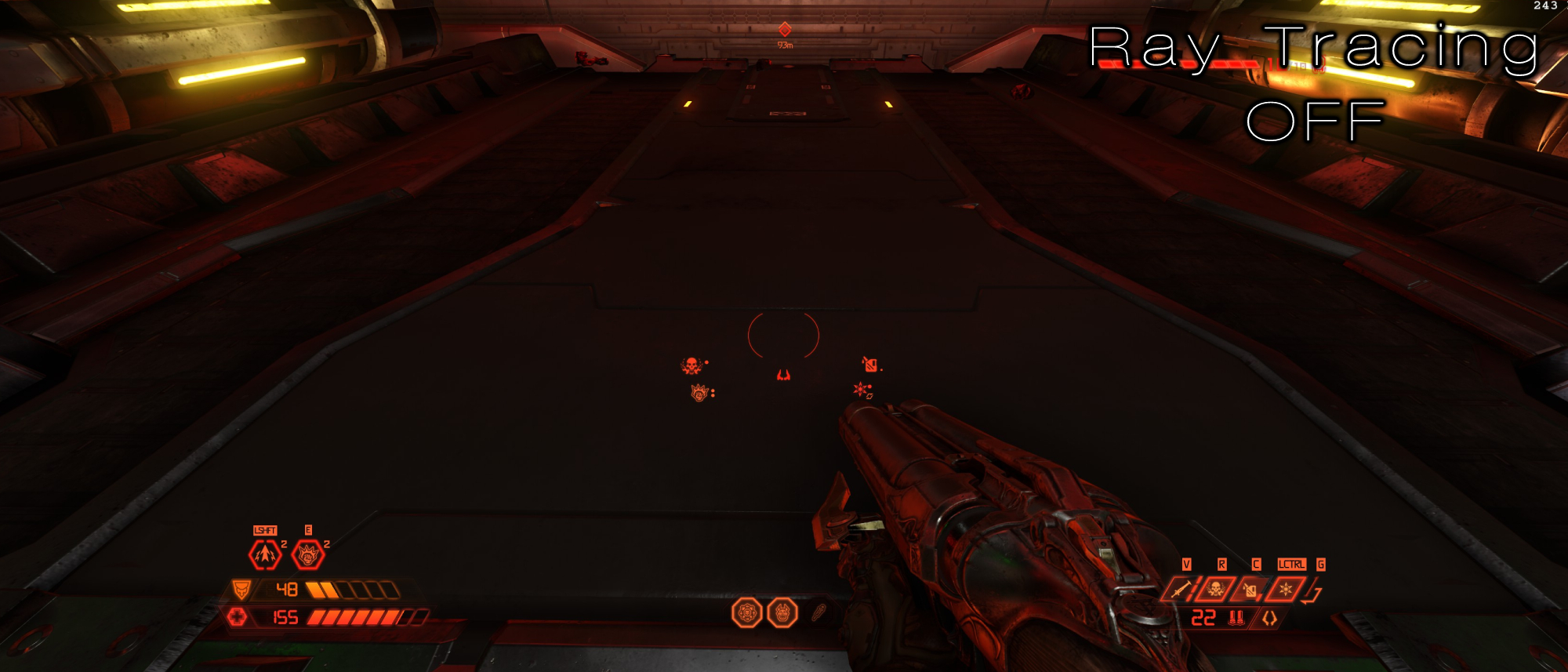
To be blunt, not everyone will enjoy how this looks. I recommend jumping in and swapping between either setting to get a taste of both before you commit to it. Everything being overly shiny and reflective will not appeal to some, and especially in the case of Doom Eternal, it might seem like overkill.
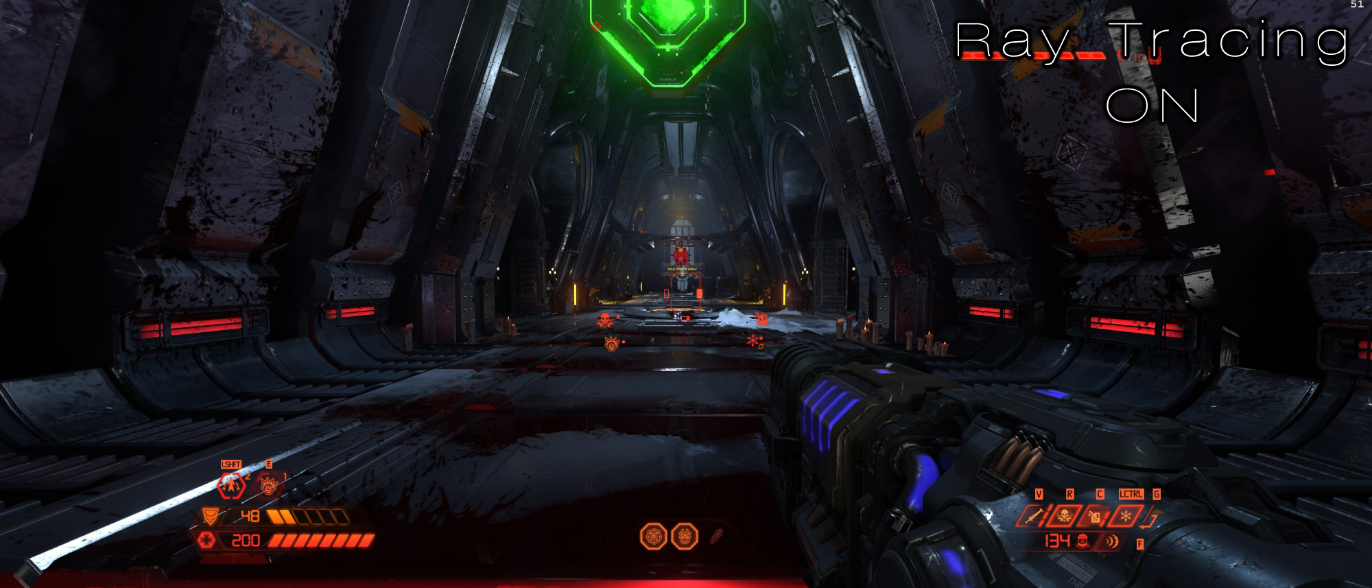
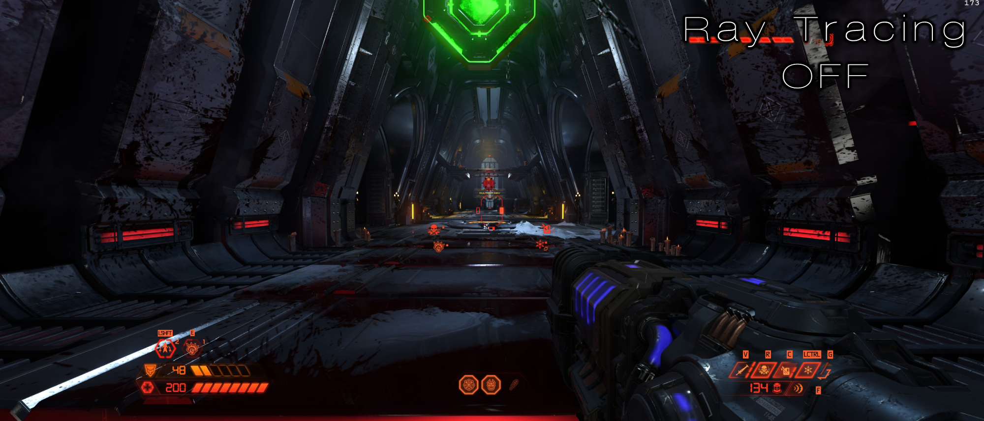
But in case you’re still unsure, let me try to convince you: The images above show this quite well, as during moments where there’s tons of metal in a complex scene, ray tracing helps give the environments more depth. While it may seem like a small detail, the lighting inside of that vending machine is far more jarring without ray tracing. Why are those metal bits sticking out so bright? This is no longer an issue with ray tracing on.
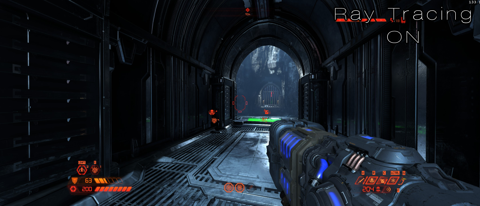
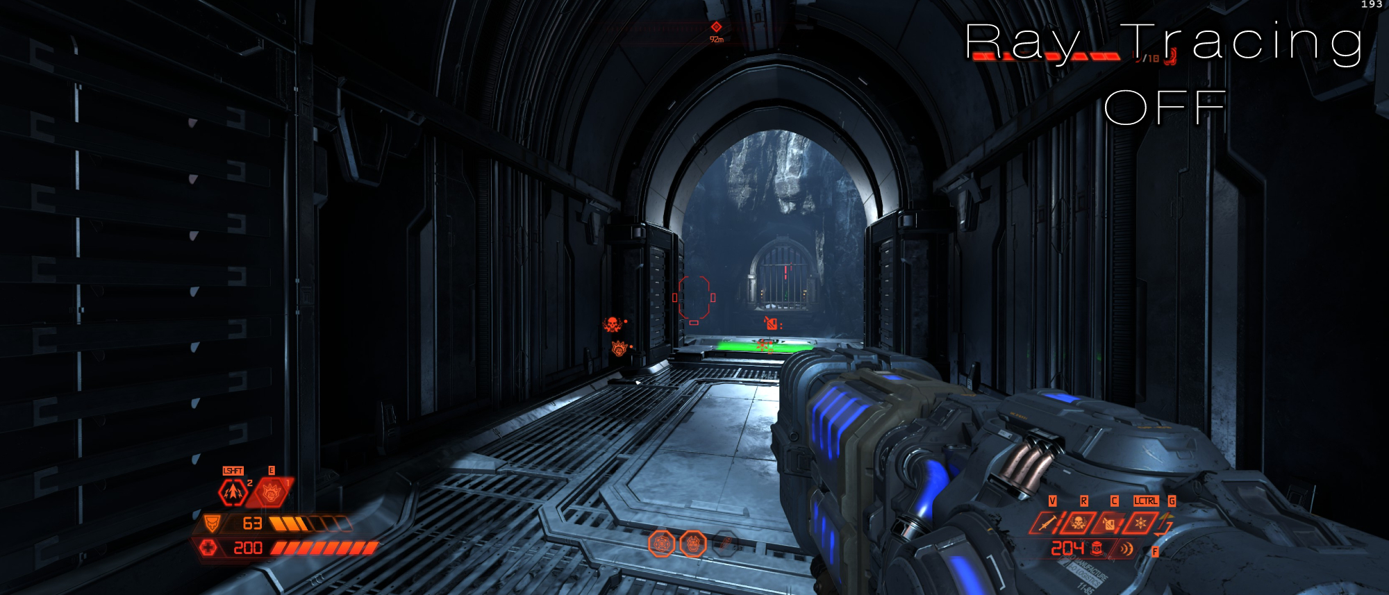
In this image, it also makes clear the massive difference in how archways behave. With ray tracing on, it looks completely natural and blends in well with the scenery. Part of it is reflecting the spots of sunlight coming in from the chasm it’s parallel to, but most of it is shrouded by the darkness of the hallway. Yet with ray tracing off, it becomes completely flat. Where is that light coming from?
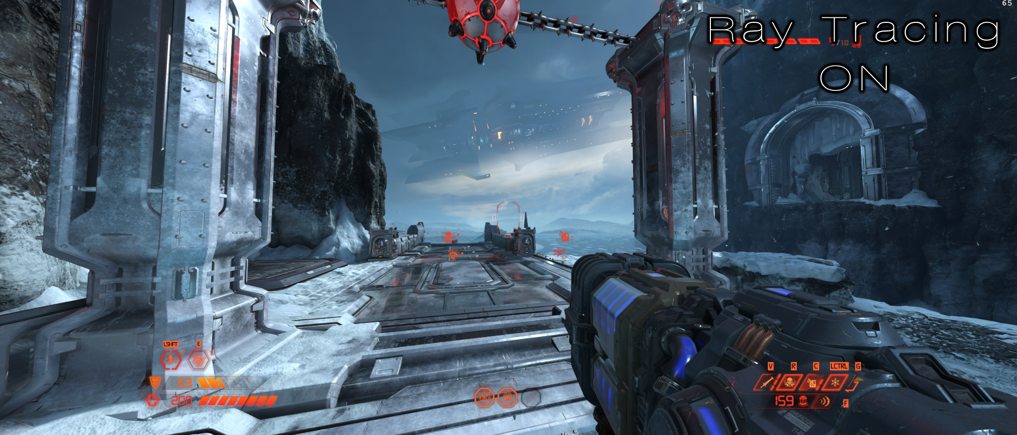
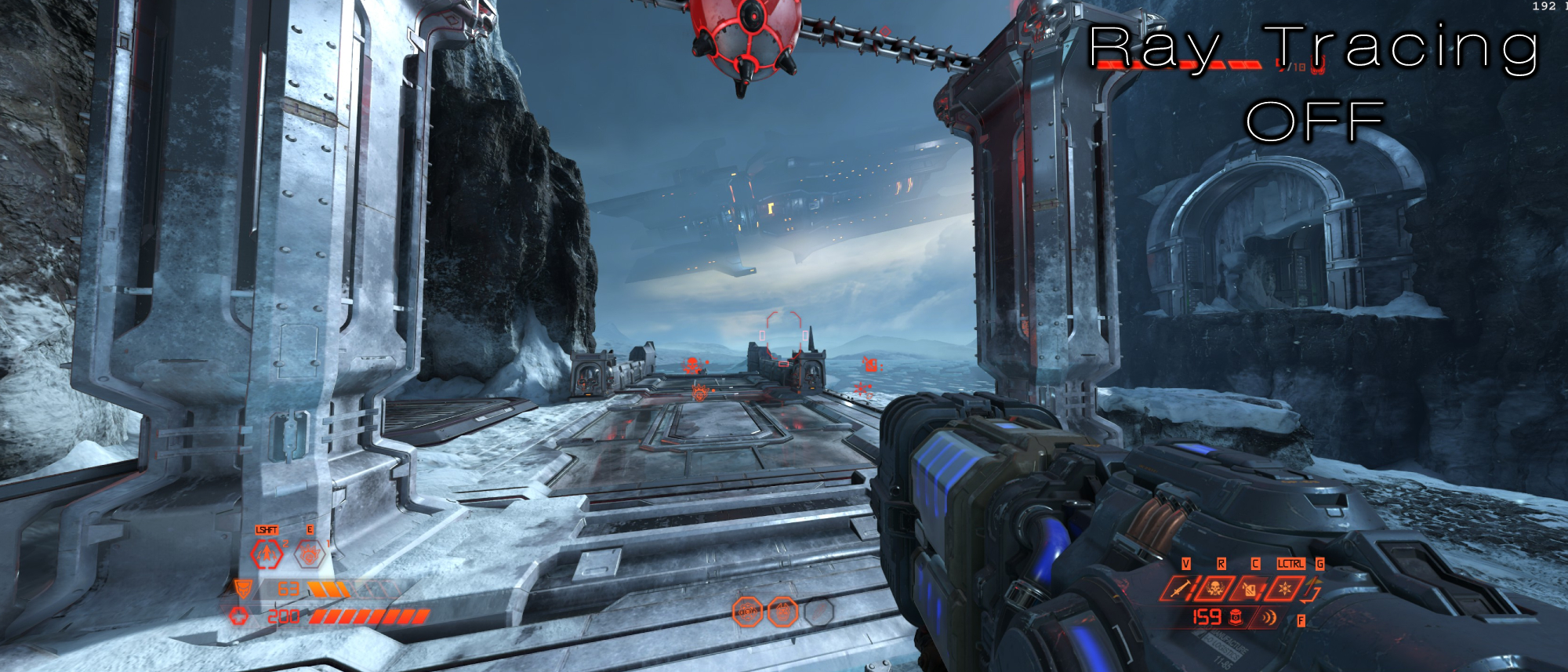
However, you won’t notice much of a difference between either setting throughout most areas in the game. After all, Doom Eternal’s world isn’t entirely made of metal. There’s plenty of flesh, concrete, wood, and stone strewn across its environments, but when you’re trapped in a hellish tunnel with metal walls on every side, having your rockets reflected perfectly within each surface as they blow demons to bits is a sight to behold.
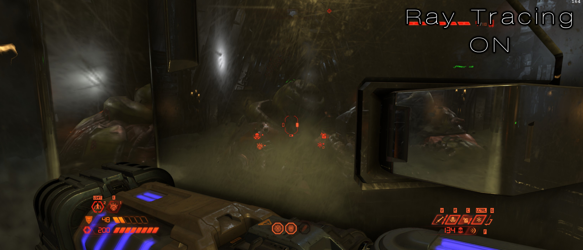
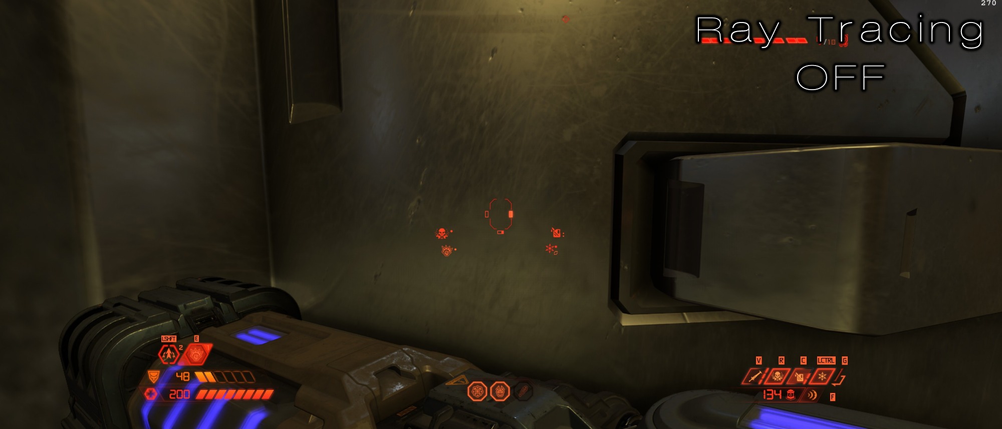
It also benefits from Doom Slayer’s reflection appearing with ray tracing on. It’s normally not present at all, but if you’re close enough to any reflective surface, you’ll quickly catch a glimpse of the man himself.
4. Marvel’s Spider-Man: Remastered
Marvel’s Spider-Man: Remastered needed a little time to iron out its performance issues, but after a series of updates, it’s a game that solidly utilizes RTX to its advantage. New York City springs to life in a way that just wasn’t possible on the PS4, and even if you’re playing on PS5, the experience is brought down by lesser framerate or lower graphical fidelity.
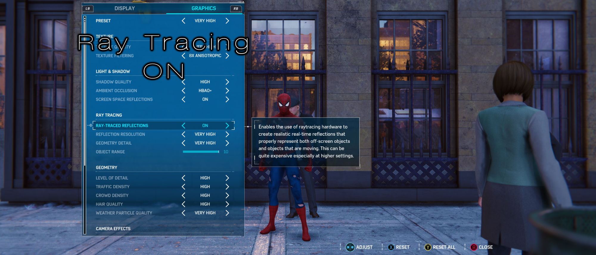
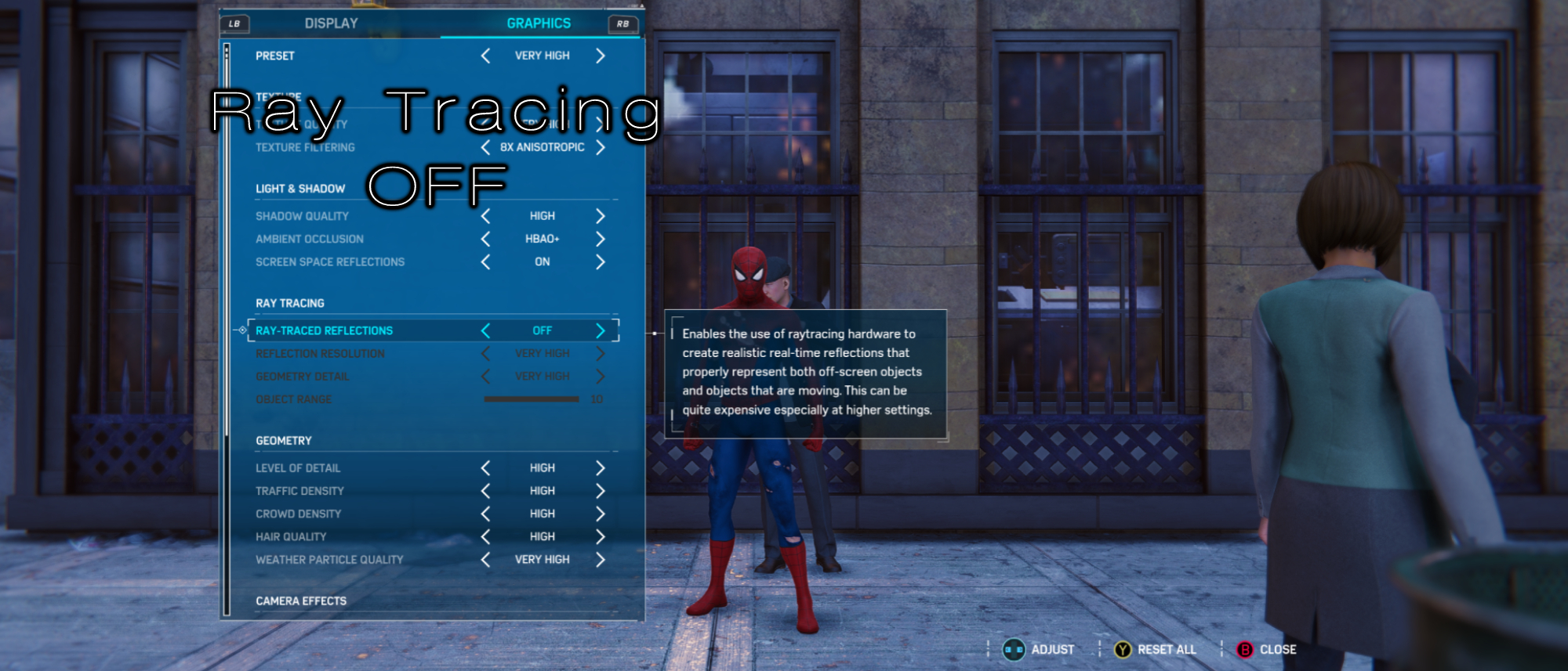
When I first launched Spider-Man: Remastered on PC, I was perplexed by New York City’s indescribable flatness. I had trouble putting my finger on what the issue was, as something about it struck me as “fabricated,” which is the opposite of what I remember when playing it on PS4. Toggling ray tracing completely changed this; beforehand, I noticed the lack of depth in every tree’s shadow, skyscraper window, and street puddle. And then, it was like the world went from unshaded to properly so.
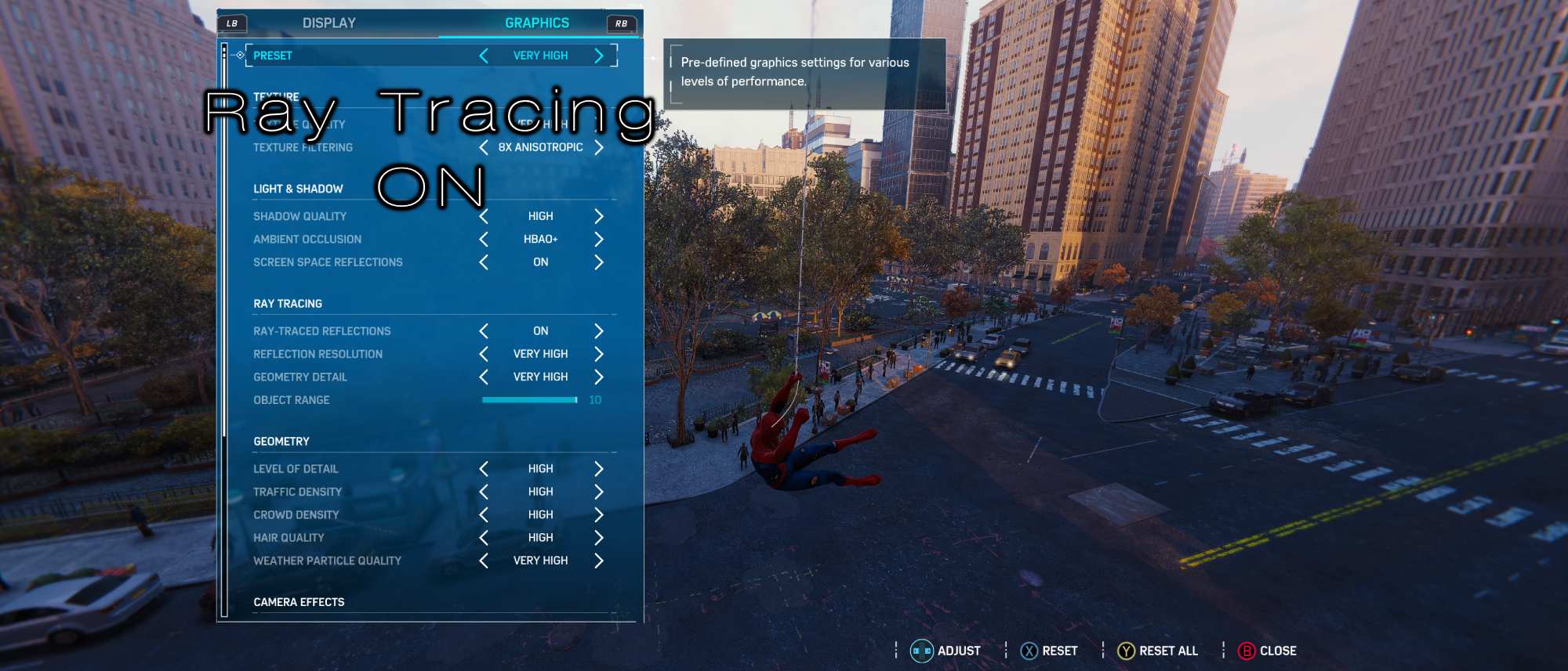
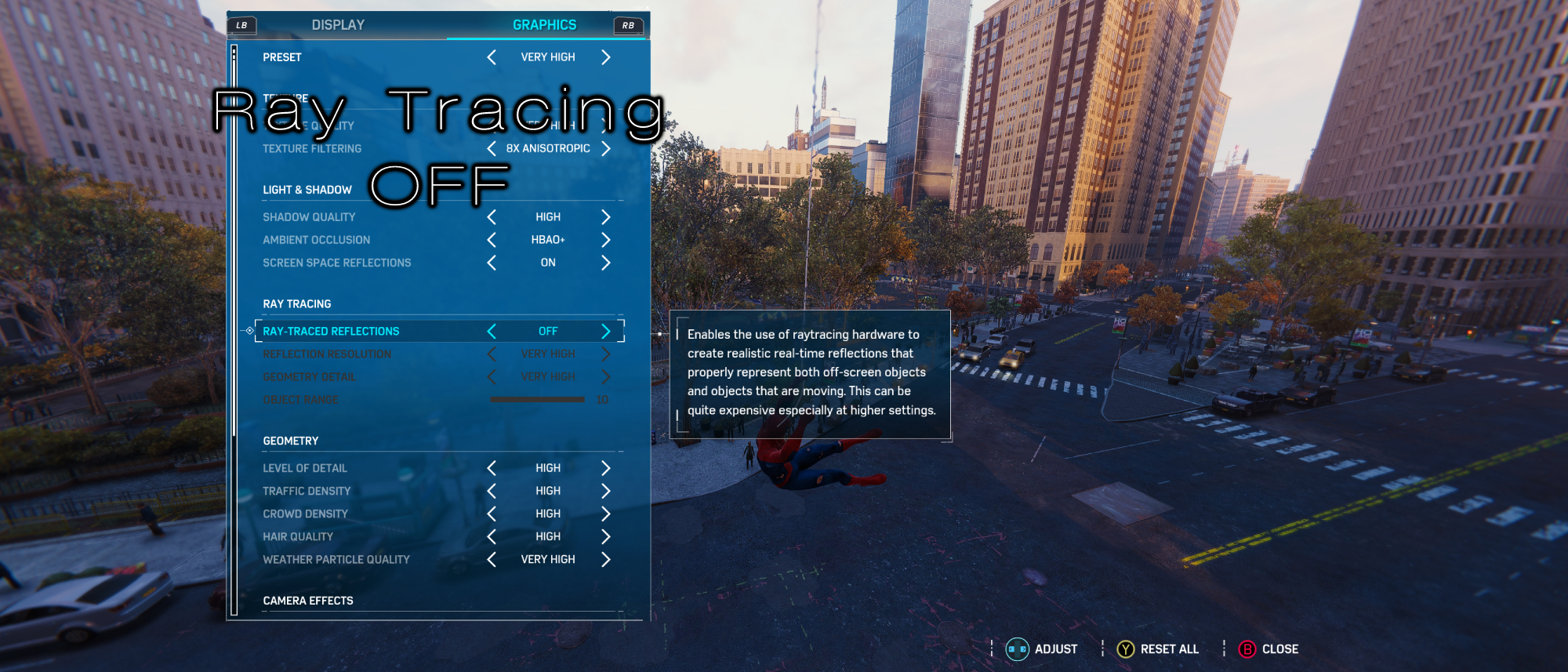
In the above image we see Spider-Man swinging through the city, and with ray tracing on, every window takes on a different hue that changes depending on what’s around it (the power of reflections, duh). But with ray tracing off, it’s often homogenous. You can see this clearly at the right-most section of the image: With ray tracing off, every window and door is black, but with it on, you can see parts of it inhabit the golden hue of the sun and the light blue color of the sky.
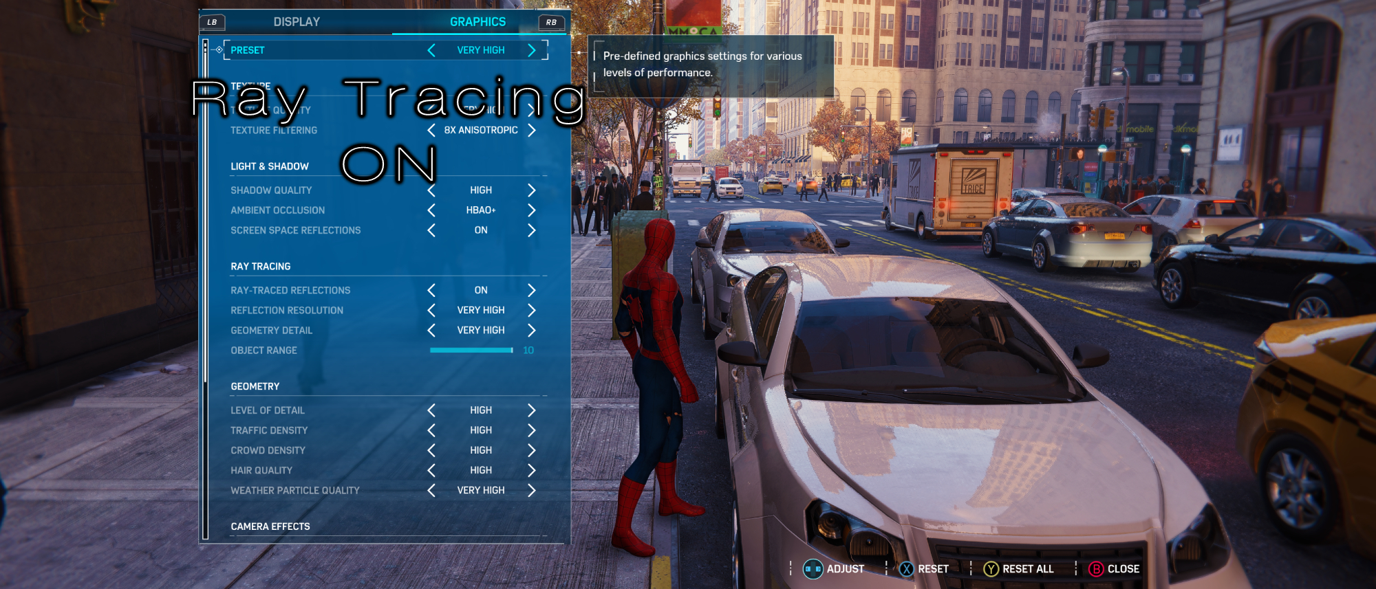
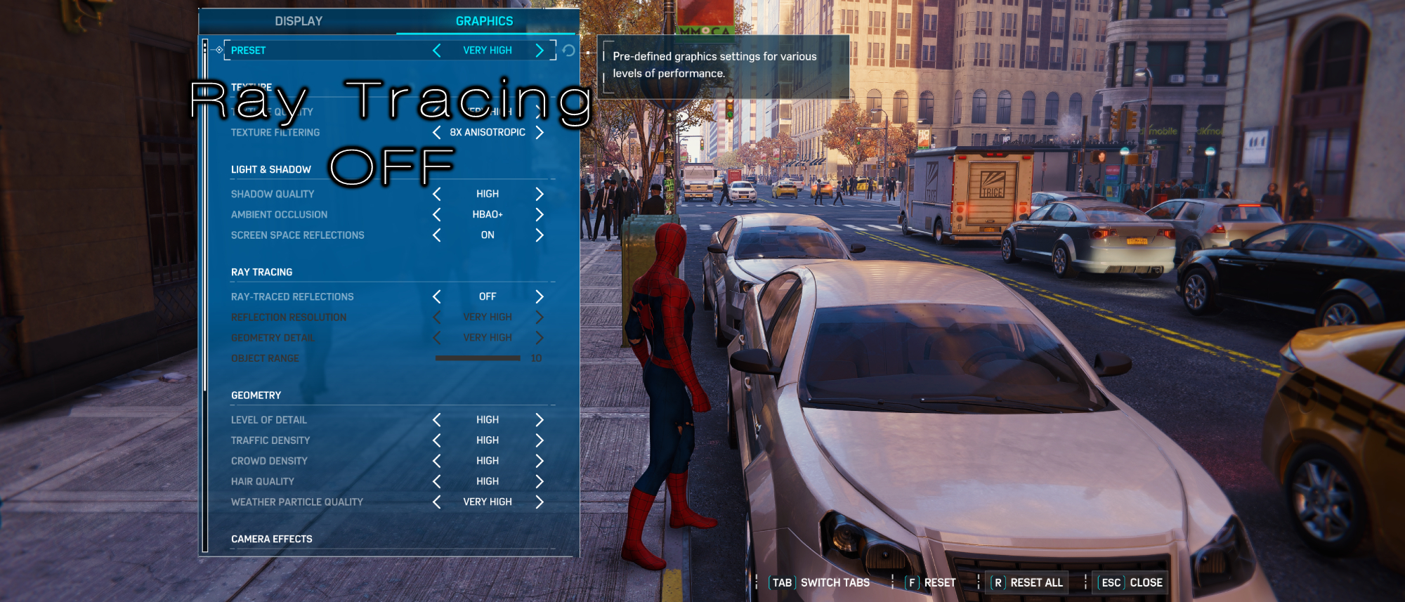
Cars are no different, although the change won’t be as noticeable. The image above shows how the reflections on the hood, top and front-window of this glossy white car are more defined with ray tracing on. With ray tracing off, the reflections are still there, but they clearly look a little less organic.
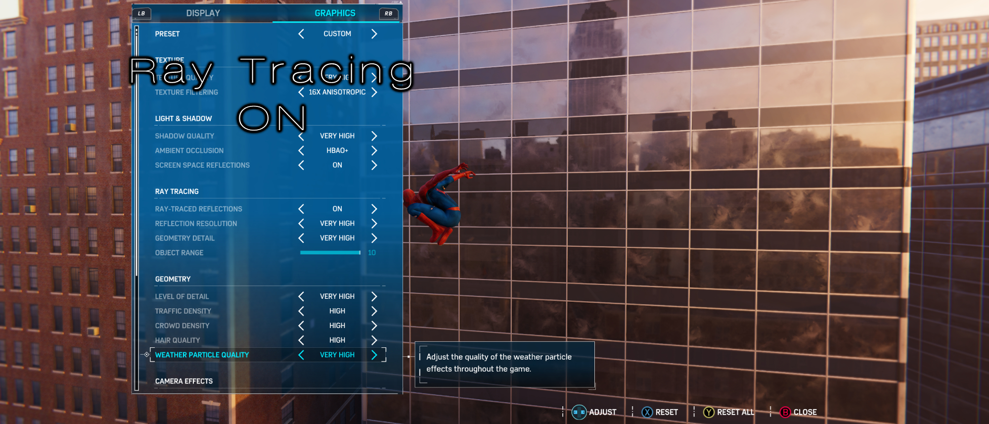
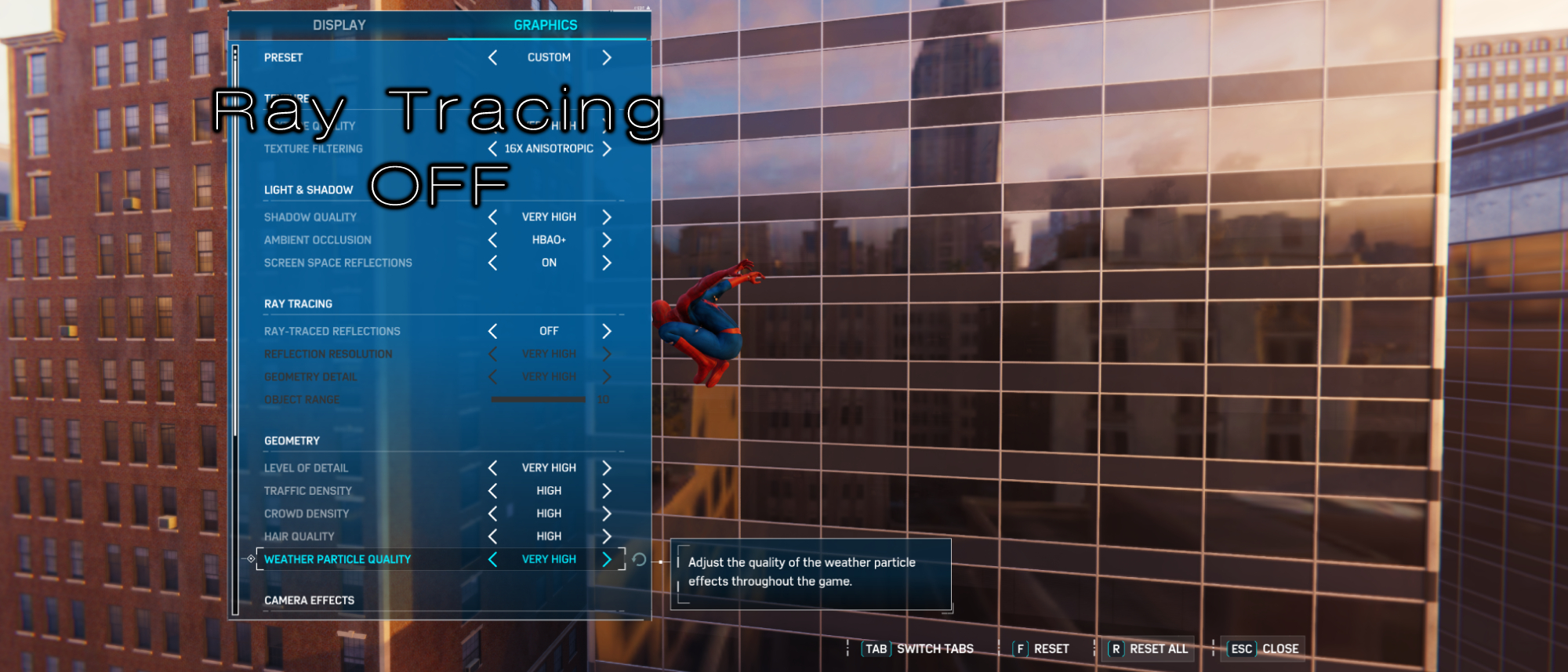
Spider-Man swinging by a large series of skyscraper windows also makes this massive difference clear. Without ray tracing on, the reflections on this building seem like a flat image pasted along its surface. Ray tracing gives it far more personality, showing that every building being reflected in it is meant to be a three-dimensional object.
Honorable Mention: Portal
Portal with RTX is not here yet, so we can’t offer our own tests to showcase how cool of an idea it is. We’ll finally be able to experience it ourselves sometime in November. For now, its short trailer showcases why you should be excited. You might dislike how the game looks with ray tracing on, but disregard aesthetics for a second and let's inspect how impressive this technology can be when applied to a game like Portal.
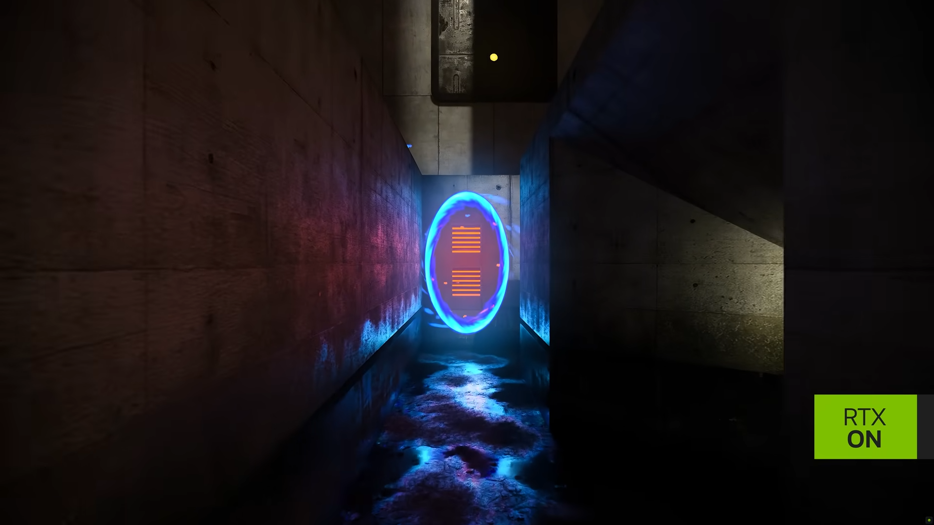
In the image above, the blue portal has been placed in a spot of the player's choice. The other portal is across from something emitting an intense orange glow, causing that light to appear through the blue portal itself, reflecting on the wall to its left. Essentially, Portal with RTX will make a brilliant playground for players to experiment with the power of ray tracing and how it casts shadows and renders reflections in real time.
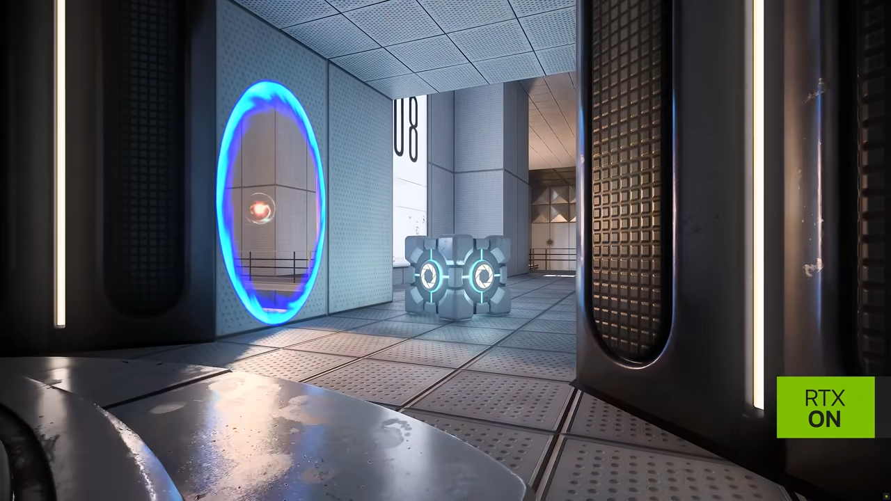
The trailer also showcases a floating light source traveling through these portals while casting shadows across every object it comes across. It keeps its light properties even while its beaming through the Portal itself, which makes for an excellent showpiece on what RTX can do. Not so dissimilar from what Portal did when it initially launched, which showed us how far someone could go with physics experimentation, the RTX version displays how powerful ray tracing can be in real-time.
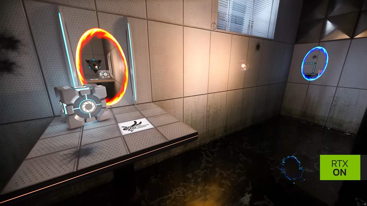
Portal with RTX is made possible through the power of RTX Remix, a new system supported by Nvidia itself that allows modders to apply ray tracing, AI-texture enhancement and DLSS 3 to modify in-game environments. It’s mostly targeted towards old games, but it seems like it could push the modding industry forward in some exciting ways.
Honorable mention: Resident Evil Village
Resident Evil Village looks fantastic without ray tracing, so it’s not a must play with the setting on. But what ray tracing adds is absolutely worth it if you have the hardware capabilities. If you want the game to feature slightly warmer, more natural lighting, you should definitely turn it on.
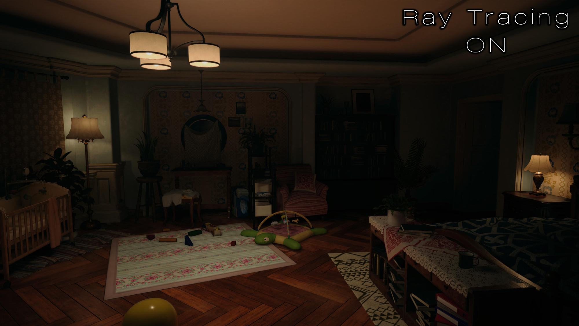
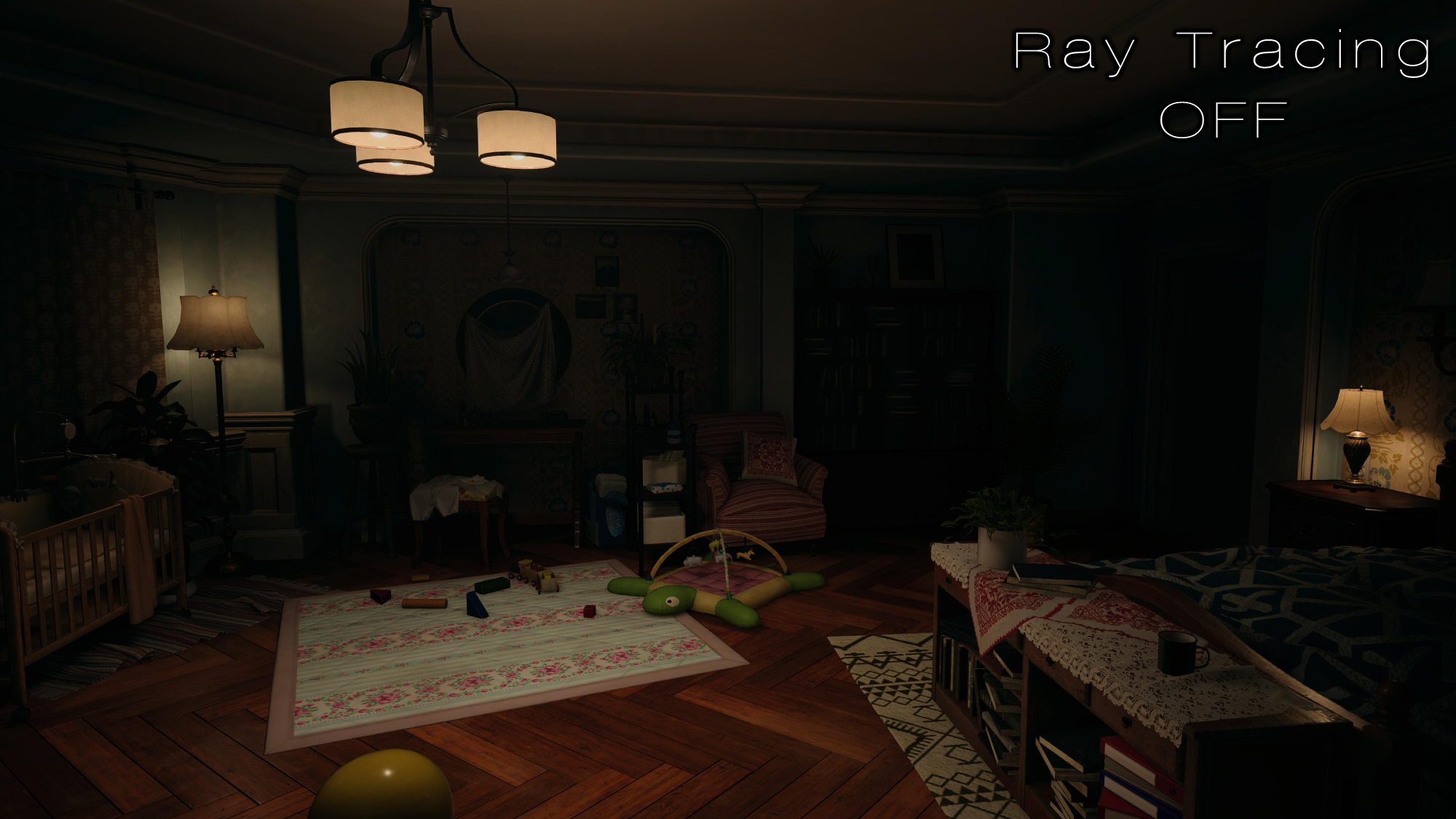
The image above showcases this beautifully. There’s no denying that both images look fantastic, but if you look close at the ceiling and the little nooks and crannies of Rose’s room, the ray tracing keeps this space consistently well-lit. Without ray tracing, the corners are far too dark, and even the crib itself feels like it's absorbing light rather than reflecting it.
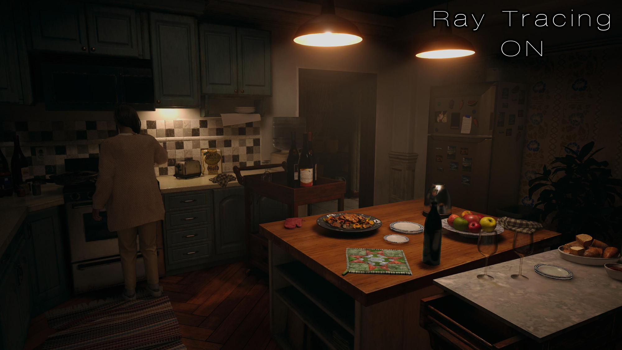
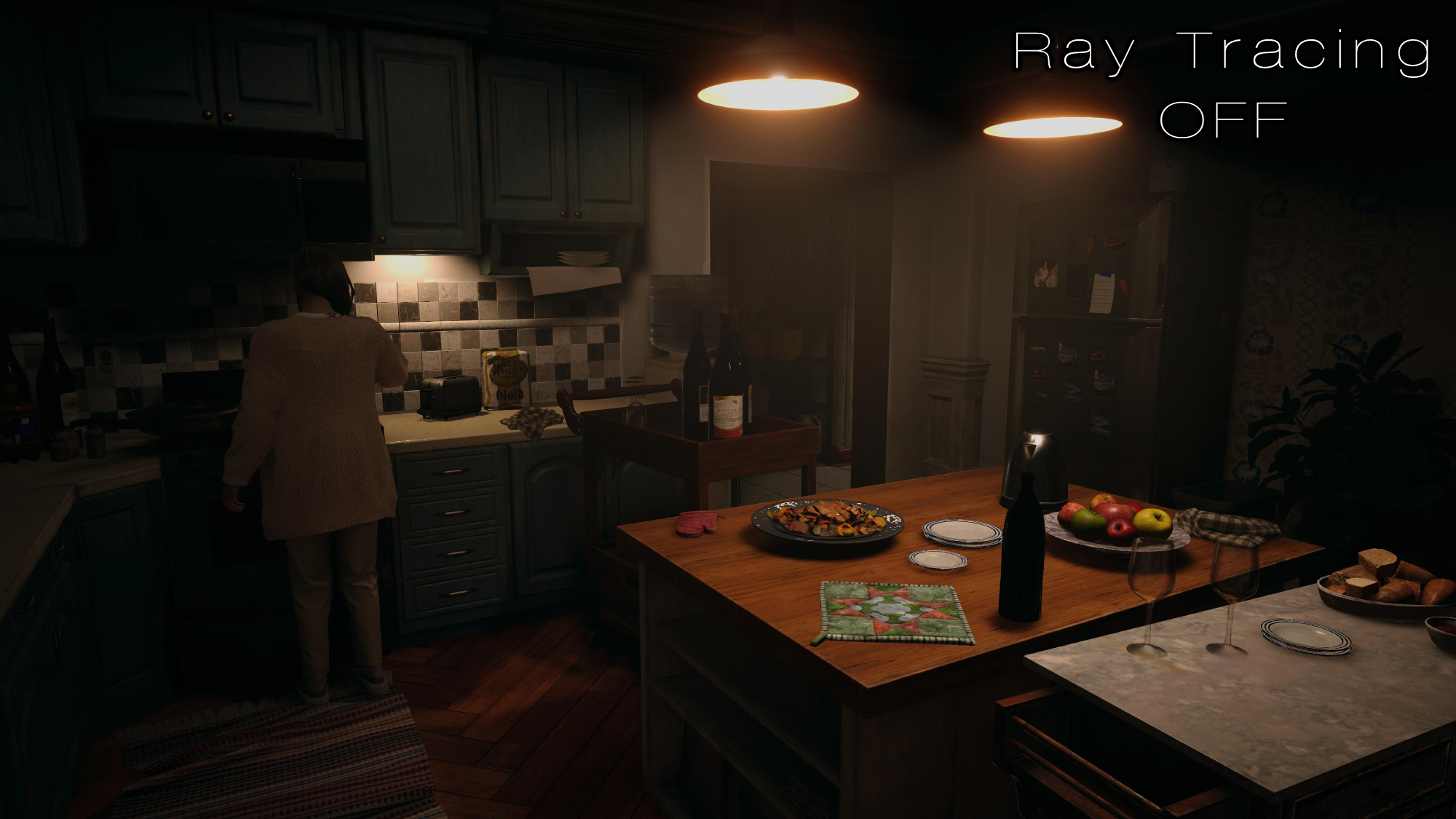
You can also see this in the kitchen. Without ray tracing, the stove is barely visible: It’s completely shrouded in darkness, and the fridge looks far too polished to be a real object. The toaster and bag of flour are also difficult to see, while the kitchen island at the bottom has a jarring glow surrounding it. Ray tracing fixes all of this, and although the differences aren’t huge, it’s still worth playing this way.
Dishonorable mentions
Not every game that is “enhanced” with ray tracing comes out of the other side looking better than it did before. Sometimes, realistic lighting can cause a game, especially if it’s an older one, to turn into a jarring monstrosity. Additionally, remaking a game with RTX can often result in the new version taking artistic liberties, ones that sacrifice key design elements that made the original stand out.
Another common issue has to do with overturning RTX settings to make them appear more blatant for the sake of a tech demonstration. For example, the more reflective a piece of metal is, the easier it is to see the differences with RTX. The brighter a light source is, shadows will appear more clearly in a scene. If you keep these settings at mild levels, it’ll be difficult for users to see the difference between turning RTX on or off.
But that’s not what we want: We don’t want games artificially boosting the reflectiveness of materials, the brightness of light sources, or the intensity of shadows just to show us that RTX is working. Ray tracing should compliment the intentions of the environment, not overpower it. Here are some games that poorly handle this and end up looking worse as a result.
1. Quake II RTX
Quake II RTX is a mixed bag: After testing its RTX version for an hour, I found certain scenes looked significantly worse and wholly destroyed the atmosphere, disregarded key elements of the original’s aesthetic, or just looked like an entirely different game. On the other hand, some scenes were beautifully lit, and others even boasted a unique atmosphere that wasn’t present in the original.
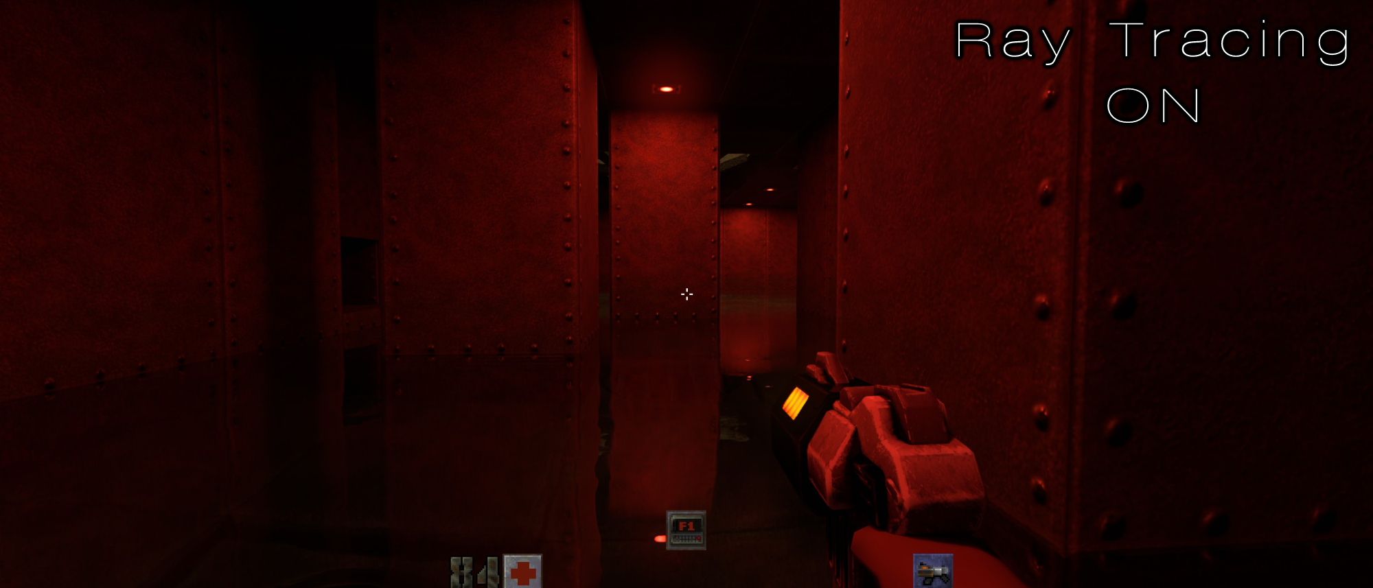
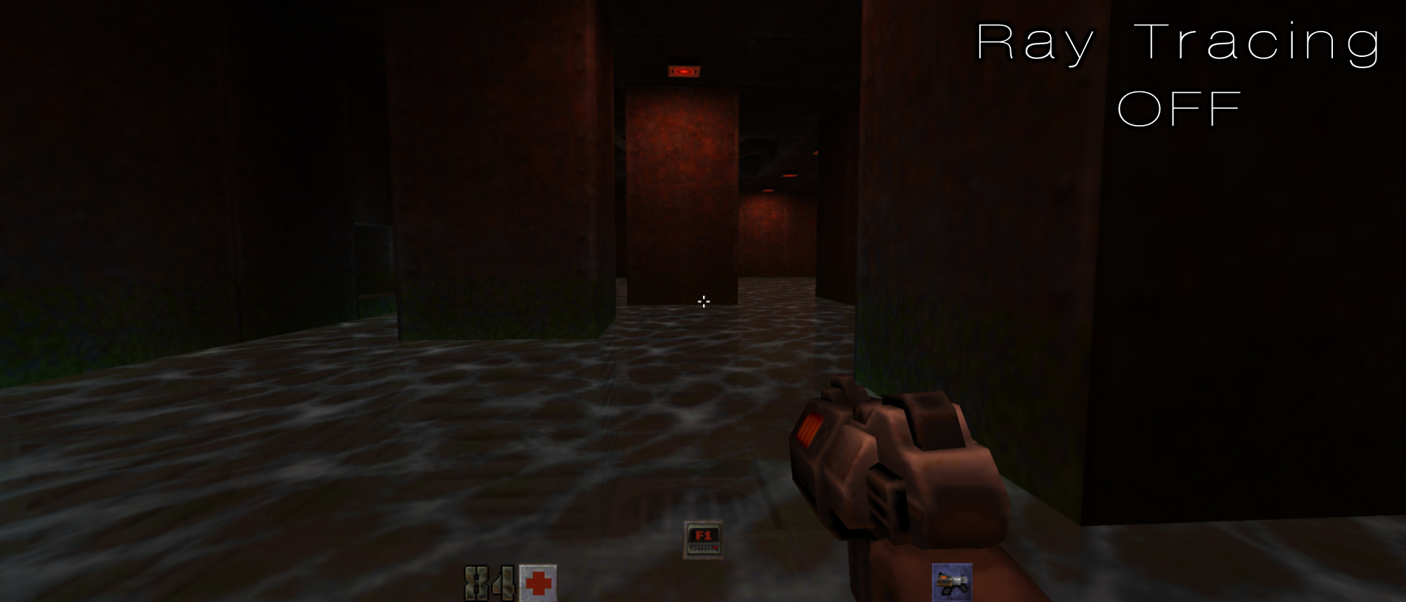
The image above showcases a moment where Quake II RTX is at its best. The overpowering red lights give this area a harsh atmosphere, and the perfect reflection on the water is almost surreal to look at. The way each shadow winds around the metal plated pillars is straight out of a horror game and it looks absolutely awesome.
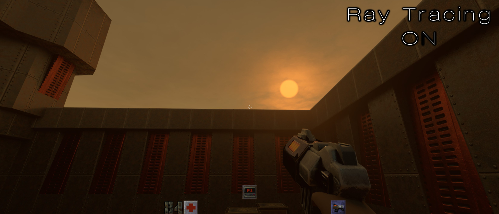
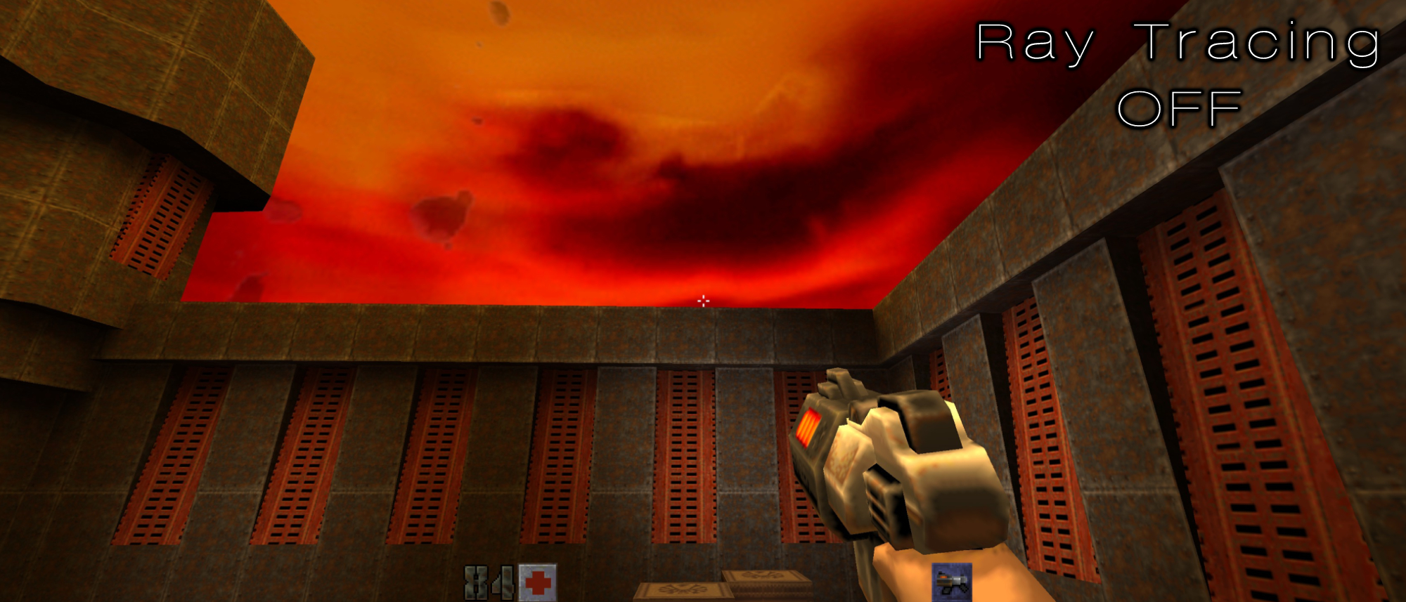
But at its worst, there are plenty of questionable design choices here. Quake II RTX, for some reason, ignores a significant set piece present in the original: The dreary, nightmarish, crimson sky. Instead, the RTX version has a generic sandy skybox and a set of brown rocky mountains in its place. This is probably to ensure that the lighting of the level isn’t overwhelmingly red, but frankly, these are the type of issues that come up when dealing with realistic lighting: the artistic choice to keep that sky hellish would conjure up an entirely different scene with different lighting when using ray tracing. If your light source is a dark but bright red, then the environment would have probably been overwhelmed with that crimson glow. This probably wasn’t worth the trade-off for the developers (even though I would’ve loved to see how that looks) so it resulted in the far more neutered iteration.
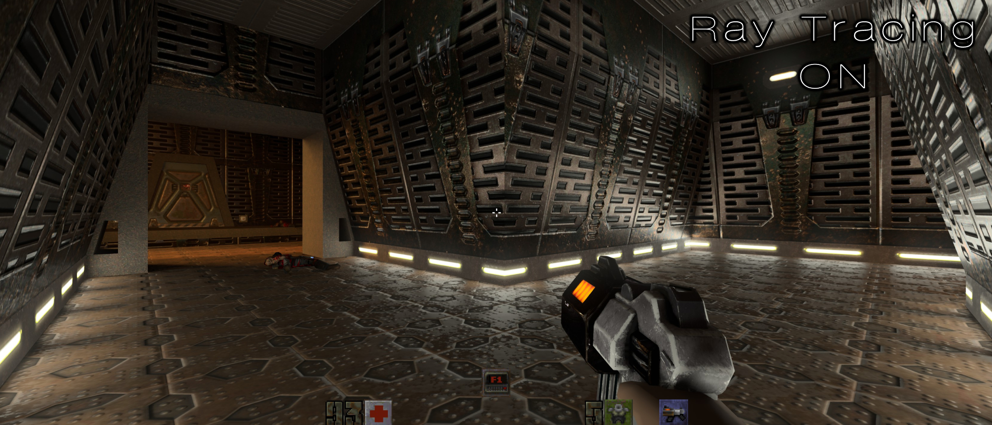
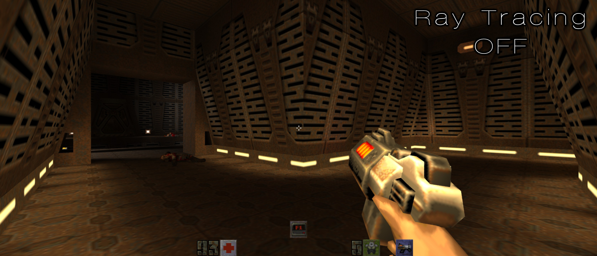
In the image above, every wall looks like hyperreflective chrome. Why are these walls so shiny? They’re meant to be rusted and dingy in the original, yet for some reason, they’re beautified and look freshly polished with RTX on. It’s clear that design choices like this are made as a push to show off the reflectiveness of ray tracing. While it certainly does that just fine, it still looks like utter crap.
2. Minecraft
Minecraft is a tough one to push against. On one hand, the reception for its ray tracing implementation has been widely positive, and it's hard to deny the technology can look cool in certain moments. However, I strongly believe the way ray tracing is utilized here severely clashes with Minecraft’s aesthetic and results in a world that looks overexposed, awkward and artificial. It boasts one of my least favorite examples of ray tracing.
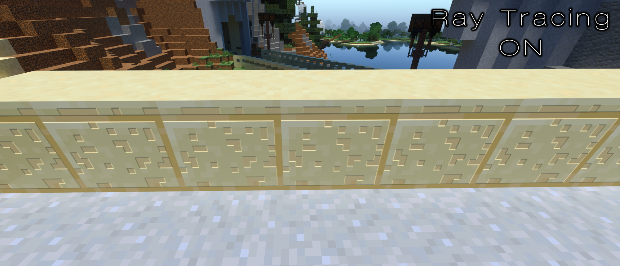
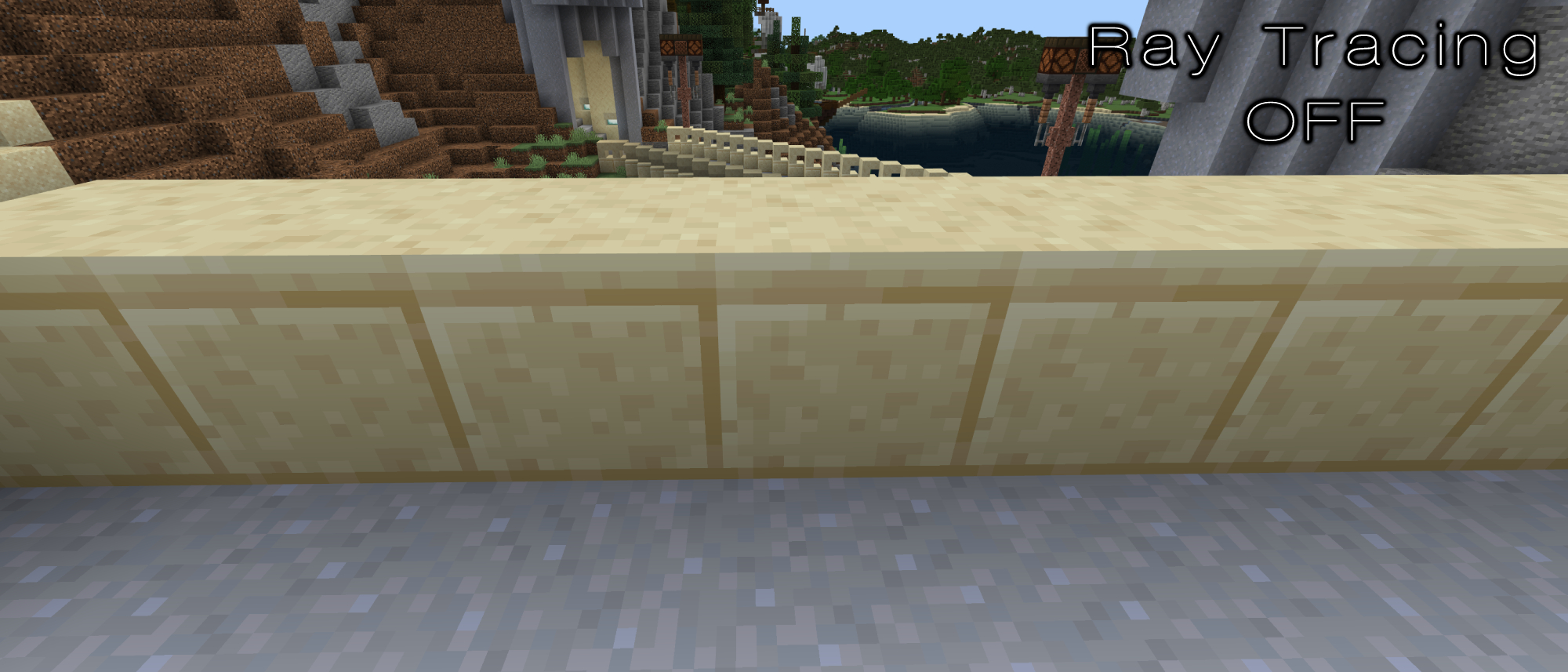
Certain textures suffer the most with ray tracing on, as the tiniest nooks and crannies within the textures mapped to that block are given “realistic” shadows. It looks absolutely ungodly, as it attempts to give them a bizarre 3D effect. It’s hard to imagine how applying such advanced lighting technology to a blocky world with tons of flat textures would end up looking good.
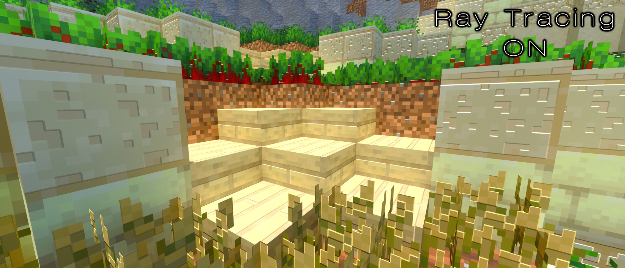
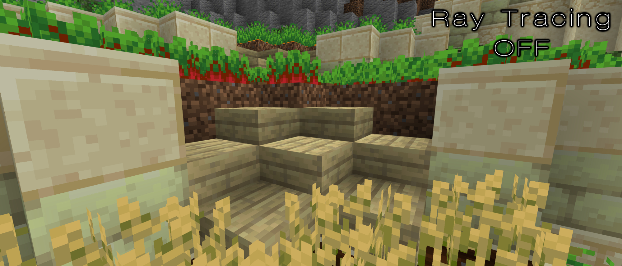
Overexposure is Minecraft RTX’s other biggest problem. In direct sunlight, blocks boast blinding luminescence. Light sources in general are significantly stronger than they appear normally. Shadows are rarely cast due to how flat Minecraft is (unless you’ve built a beautiful, complex city), and even when they are, they don’t feel right.
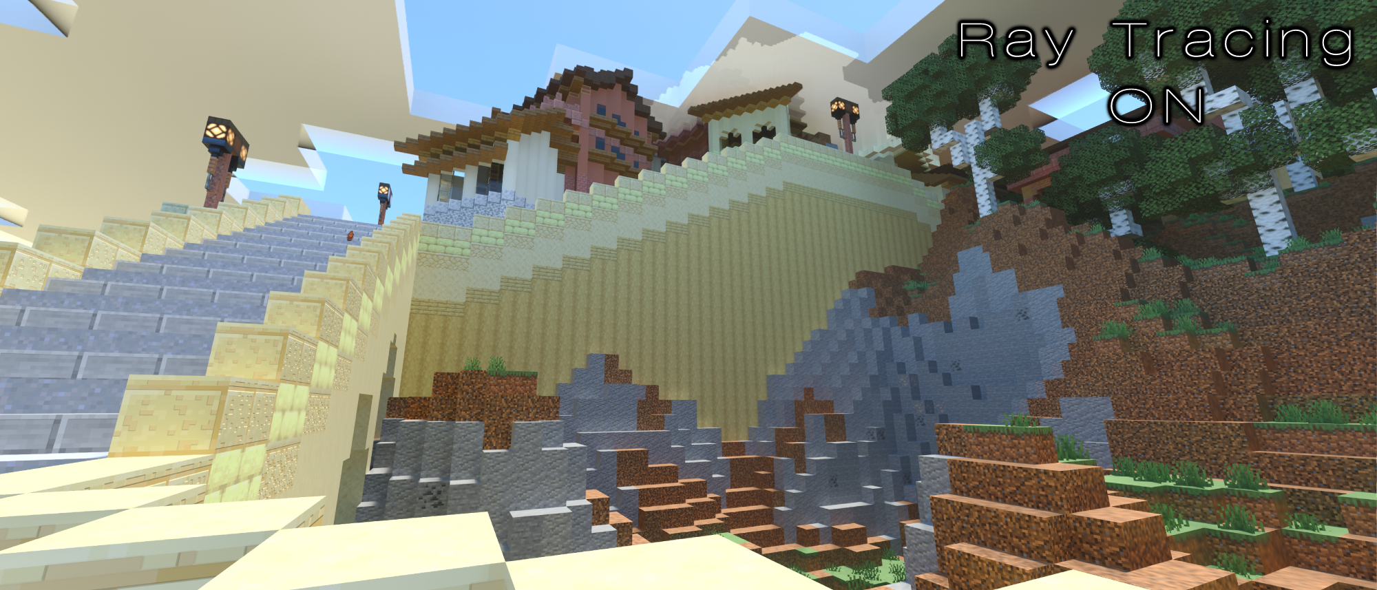
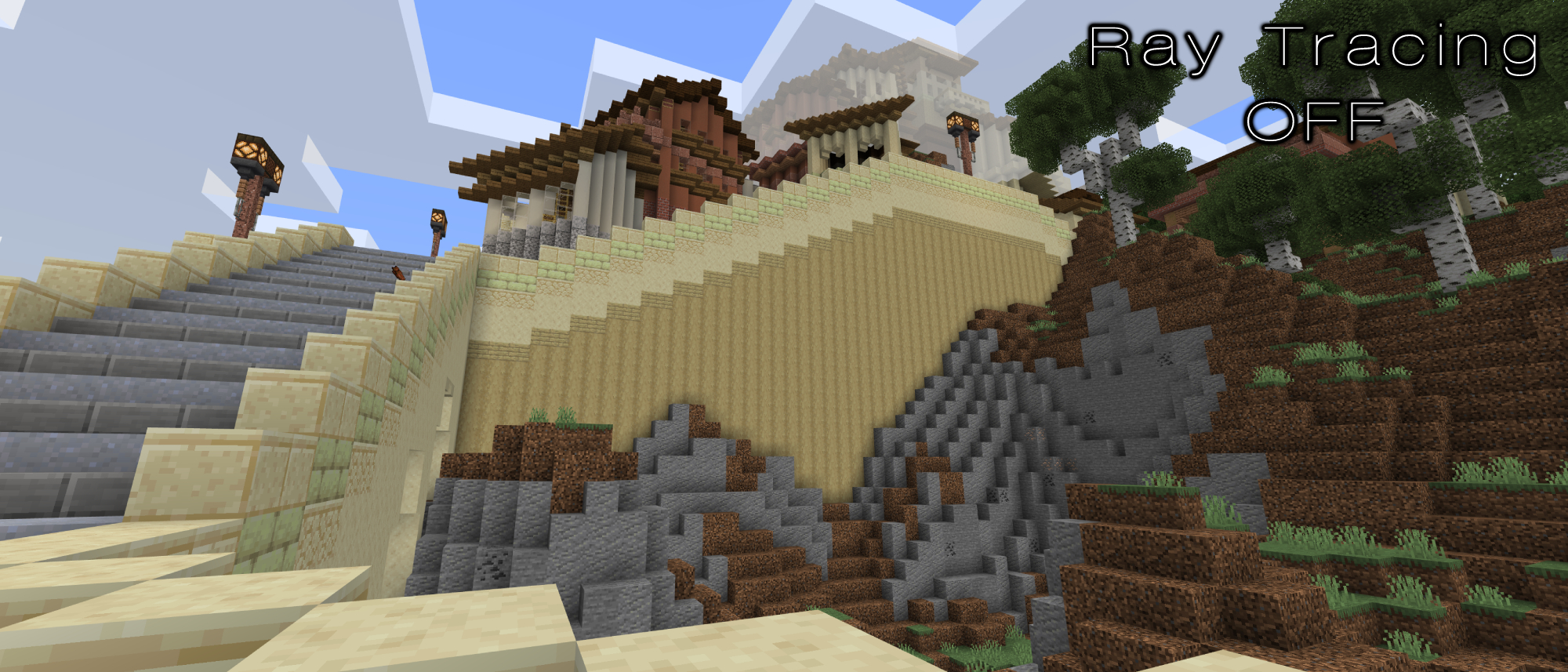
It’s rather uncanny staring at a flat staircase, completely brightened by sunlight. It doesn’t appear real. Even the stairs in the above image come across as flat more than anything else. Sure, perhaps the shading in regular Minecraft is unrealistic, but its style is appealing. It’s not overwhelming to look at.
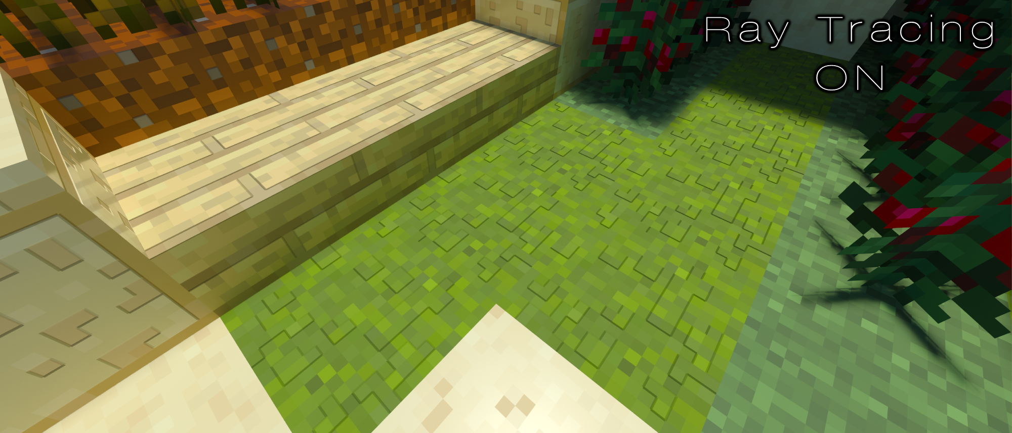
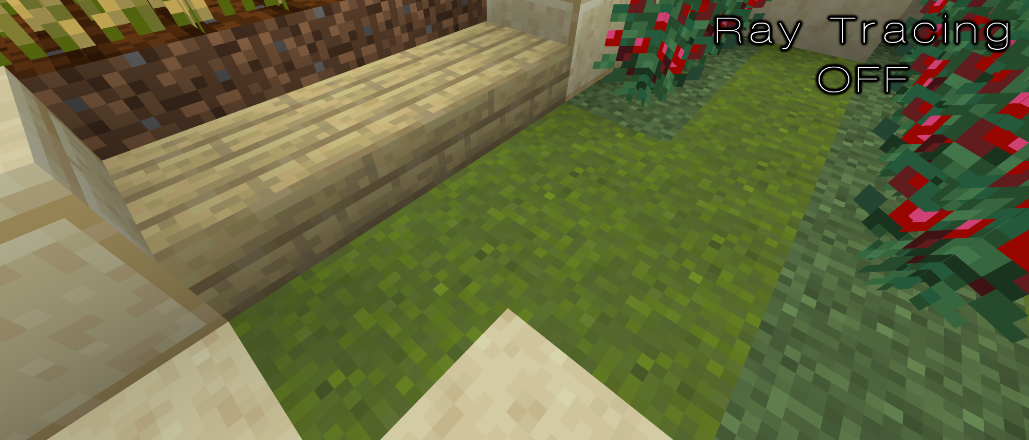
Minecraft has always been a game that has boasted this inexplicable loneliness. You can create a gorgeous city, yet the lack of people, the quiet wilderness, and the relaxing soundtrack contribute to the sense that you’re the world’s sole occupant. I’m not necessarily saying it’s wrong for Minecraft RTX to strive for a different vibe; it’s more that what it sacrifices to gain ray tracing isn’t remotely worth it. Applying realistic lighting to every game isn’t going to work.
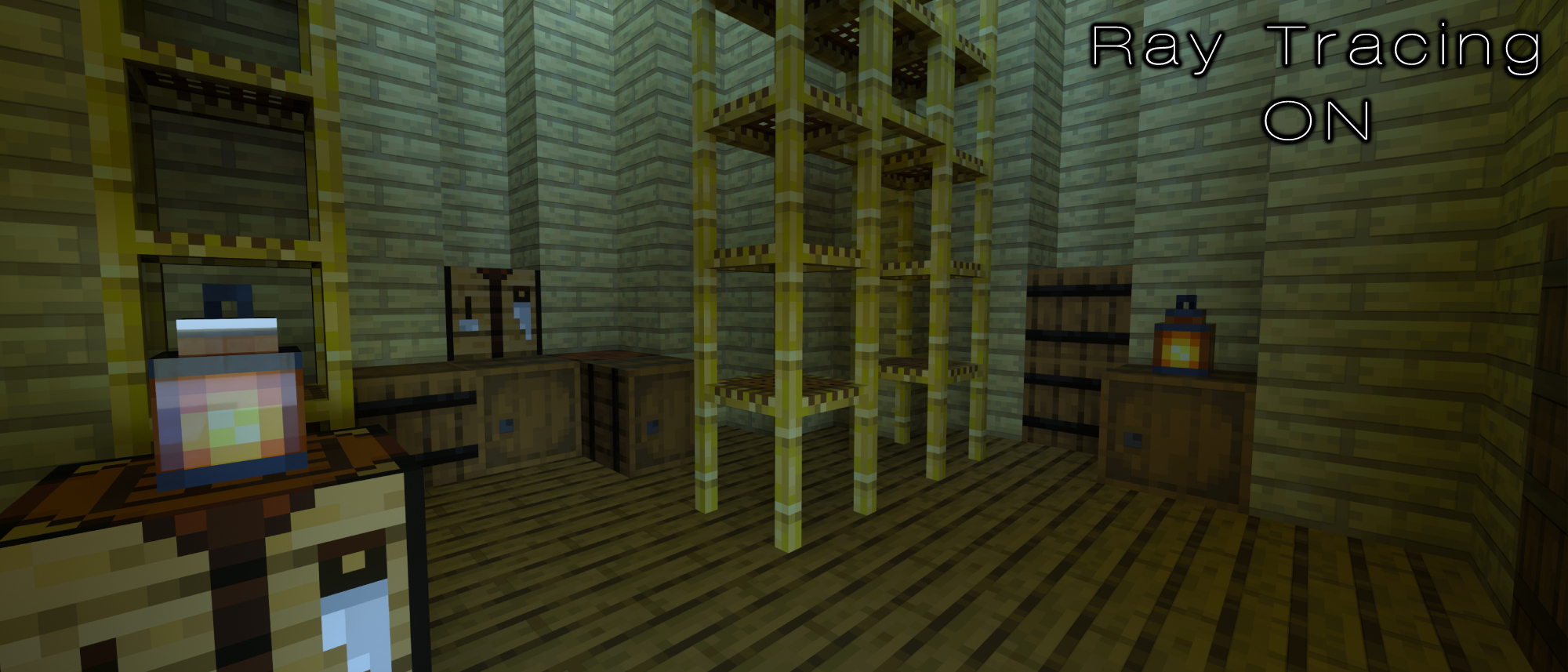
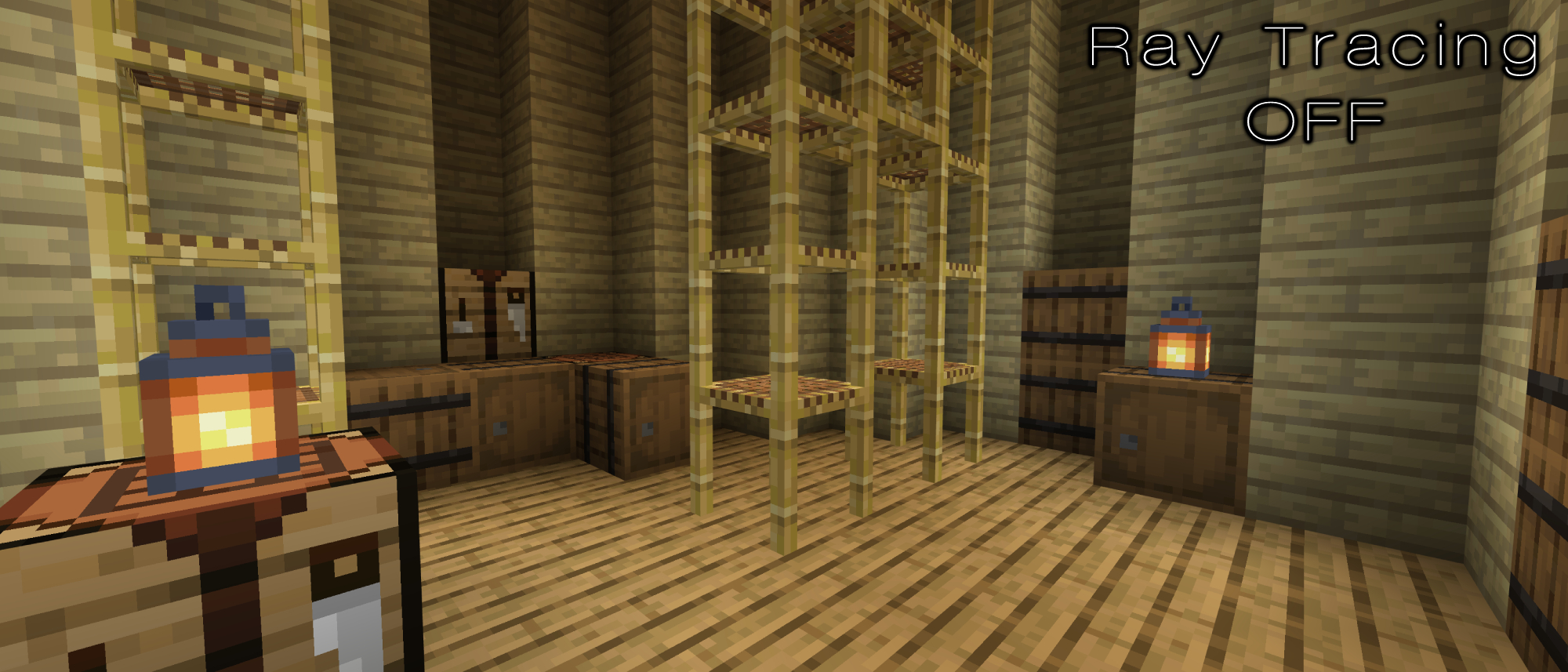
The above image showcases the stylistic differences quite well. The RTX version showcases a small room lit solely by a small streak of sunlight in the corner. Yet, the exact same image shows how these two lanterns are acting as a light source. The one spot which was previously lit by the sun is now engulfed in shadow, but it looks far warmer. Minecraft’s reliance on soft lighting is really important for its atmosphere, and that’s something the RTX version gets completely wrong.
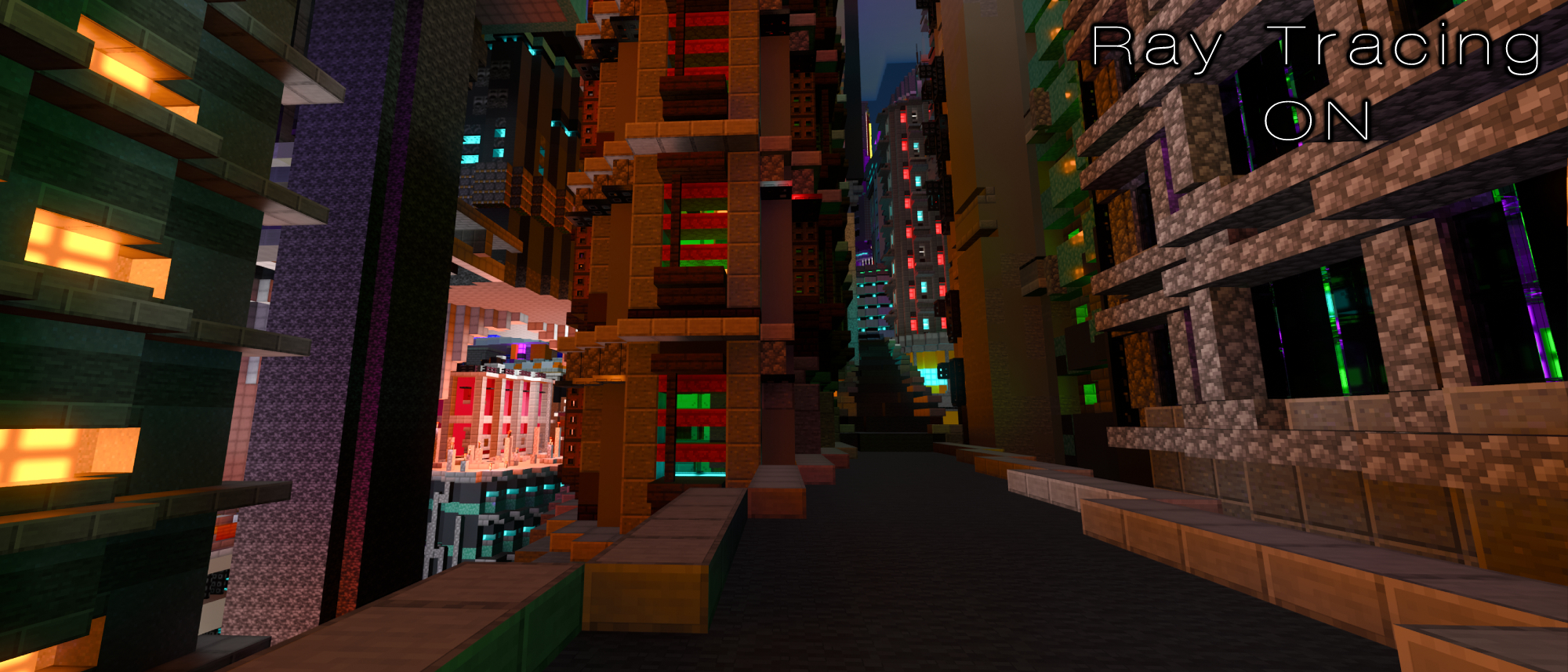
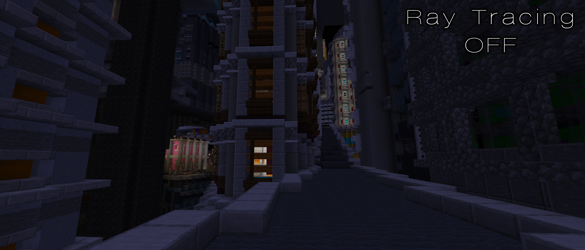
I didn’t fully hate Minecraft RTX throughout my testing, though. While exploring the streets of a cyberpunk city, I found myself looking out at a collection of buildings reflecting a unique set of hues that weren’t there previously. The image above still looks like Minecraft, just with more atmospheric lighting winding between each building’s side. Turning ray tracing off made it duller. Moments like these showcase when Minecraft RTX is useful: If you’re planning on building a futuristic city, you’ll probably enjoy the brighter lights.
Stay in the know with Laptop Mag
Get our in-depth reviews, helpful tips, great deals, and the biggest news stories delivered to your inbox.

Self-described art critic and unabashedly pretentious, Claire finds joy in impassioned ramblings about her closeness to video games. She has a bachelor’s degree in Journalism & Media Studies from Brooklyn College and five years of experience in entertainment journalism. Claire is a stalwart defender of the importance found in subjectivity and spends most days overwhelmed with excitement for the past, present and future of gaming. When she isn't writing or playing Dark Souls, she can be found eating chicken fettuccine alfredo and watching anime.
- Shamar WashingtonContributing Writer
