Android 14: 5 new features we can’t wait to try
Here’s what we’re looking forward to with Android 14
Android 14 got an in-depth breakdown at Google I/O, giving us a look at what we can expect from the operating system’s latest updates. While it doesn’t seem to boast the most monumental changes, there are several things we’re looking forward to in the vein of security, privacy, accessibility and other quality of life enhancements.
Android 14 has been in beta for a few weeks now and we’ve found that its changes are hard to live without, nestling us in a relative state of convenience and comfort. So without further ado, here are five Android 14 features that we cannot wait to try.
1. Bolder back arrow
While Android 13’s back arrow does adapt to its background partially (shifting between black and white depending on what’s behind it), it’s often barely noticeable. In fact, until writing this article, I almost never consciously recognized its existence when performing the return gesture. Android 14 is set to change that with the inclusion of a bolder symbol.
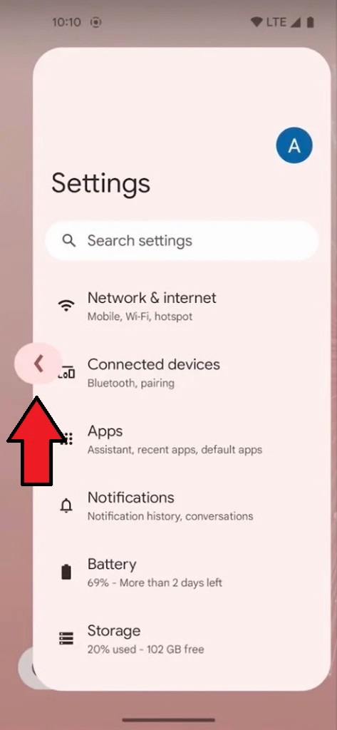
Not only will its lines appear thicker with this new update, but there will be a “Material You” background surrounding it that changes its color depending on the rest of the screen. It’ll be a lot clearer when you’re performing the back action as you will see the arrow prop up within its bold enclosure.
2. Transparent navigation bar
Android 13’s navigation bar at the bottom offers a thin white strip which often blends in seamlessly with the background of whatever app you’re using. However, a lot of apps don’t support this, meaning you’ll see it surrounded by blackness. Android 14 is changing this by making the navigation bar transparent regardless of what you’re using.
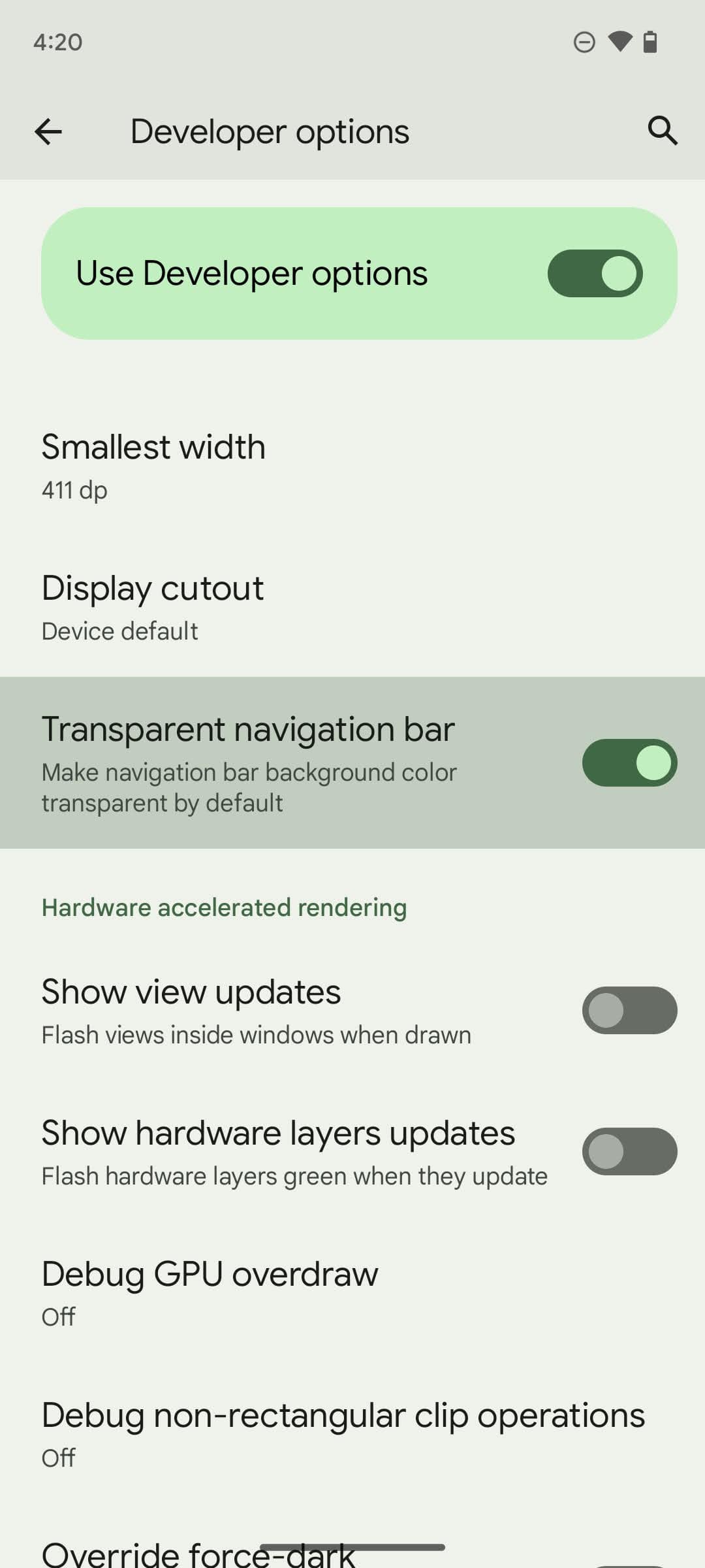
While this never took up all that much screen space, it’s still a nice change to have (albeit it’s something most users won’t ever notice). This isn’t automatically enabled, however, as you need to go into your Developer options and turn on “transparent navigation bar.”
3. Predictive back gesture
On Android 13, the back gesture has one primary function: Taking the user back to where they were before their latest tap. But that splits off into two actual uses in practice. One takes the user back a page within the app they're using, while the other closes the app and brings them back to their home screen.
Stay in the know with Laptop Mag
Get our in-depth reviews, helpful tips, great deals, and the biggest news stories delivered to your inbox.
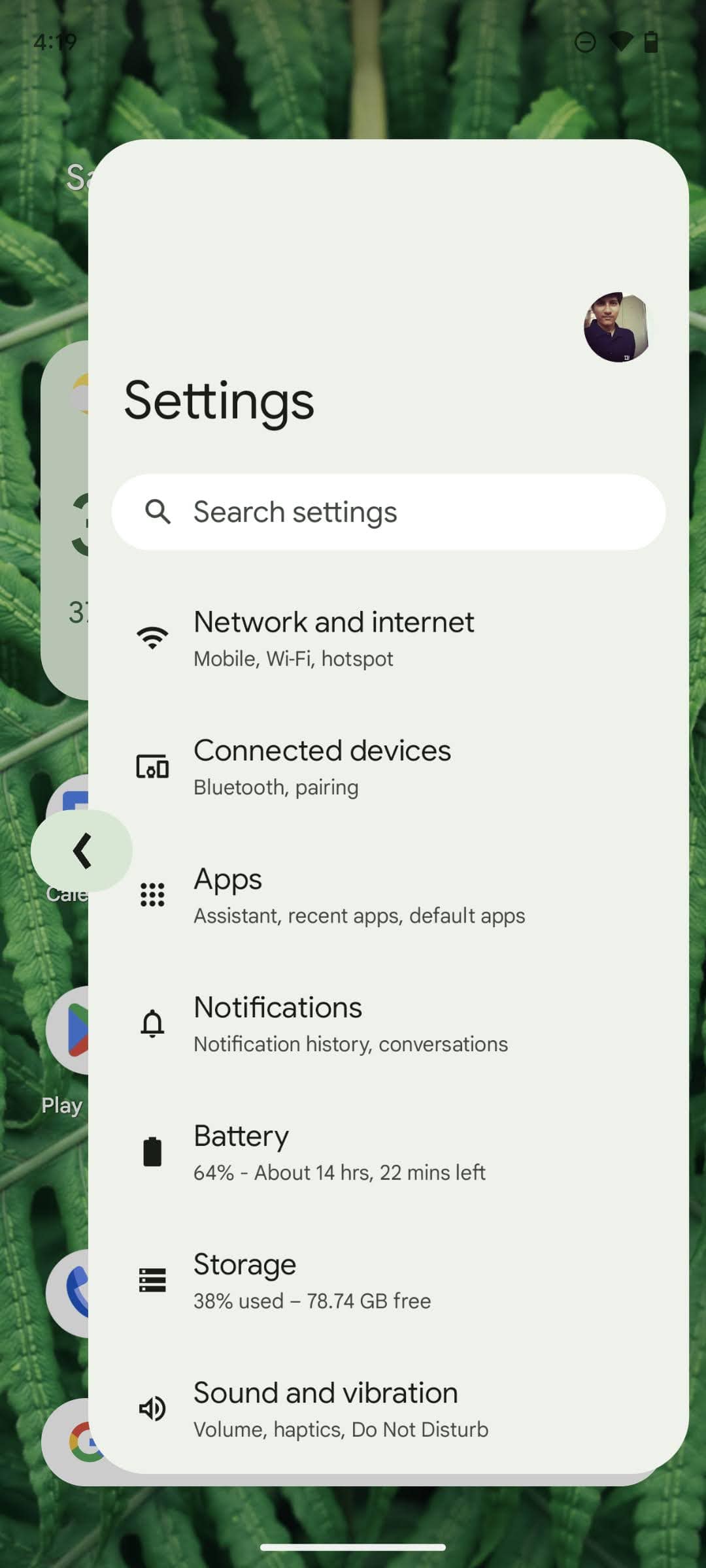
If I tap Google Chrome and perform the back gesture, I will be sent to my home screen. But if I tap on a page and then use the back arrow, I will remain in Google Chrome. Android 14 sets to remedy this issue with a predictive back gesture that can show you where you’re going if you keep the gesture held for a second. This should prevent users from accidentally closing apps when they simply meant to go back a page and vice versa.
4. Sharing no longer stinks
Sharing on Android 13 is a pain in the butt. Oftentimes I look for an app’s built-in method of sharing links or images before resorting to that accursed share option built into the phone overall, as it usually results in me scrolling aimlessly through menus to find the one thing I’m looking for.
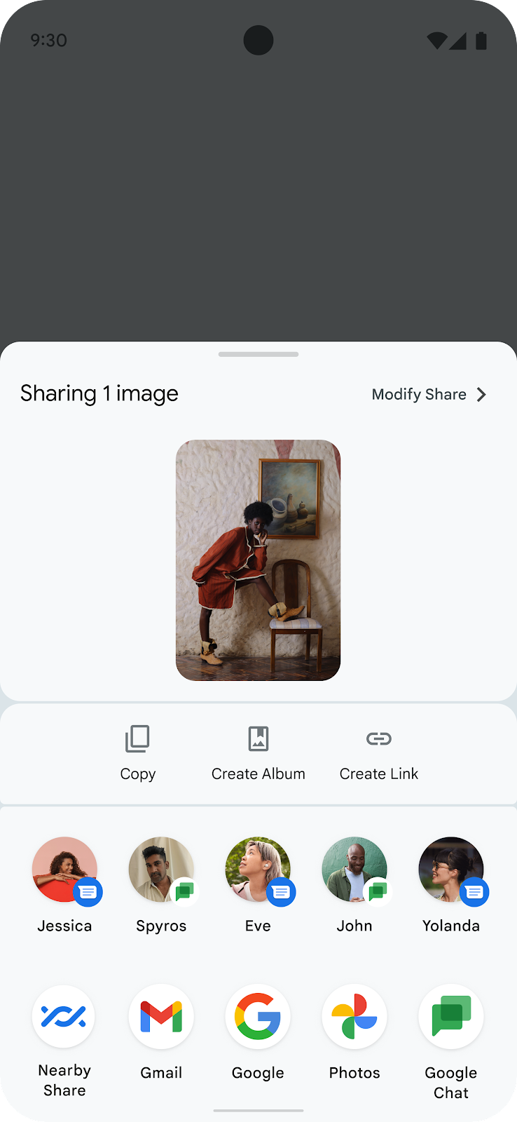
Android 14 aims to fix this with a superior share sheet, allowing developers to personalize it depending on what’s most convenient for that app’s purpose. Additionally, the grid beneath it will be streamlined with what you would need most during that time. We’re hoping this makes the share feature more convenient all around.
5. Security enhancements
Applications can often get a little too up close and personal with your sensitive data, but Android 14 sets to remedy this. Google is planning on restricting sensitive data acquired through the accessibility permission only to applications Google has vetted.
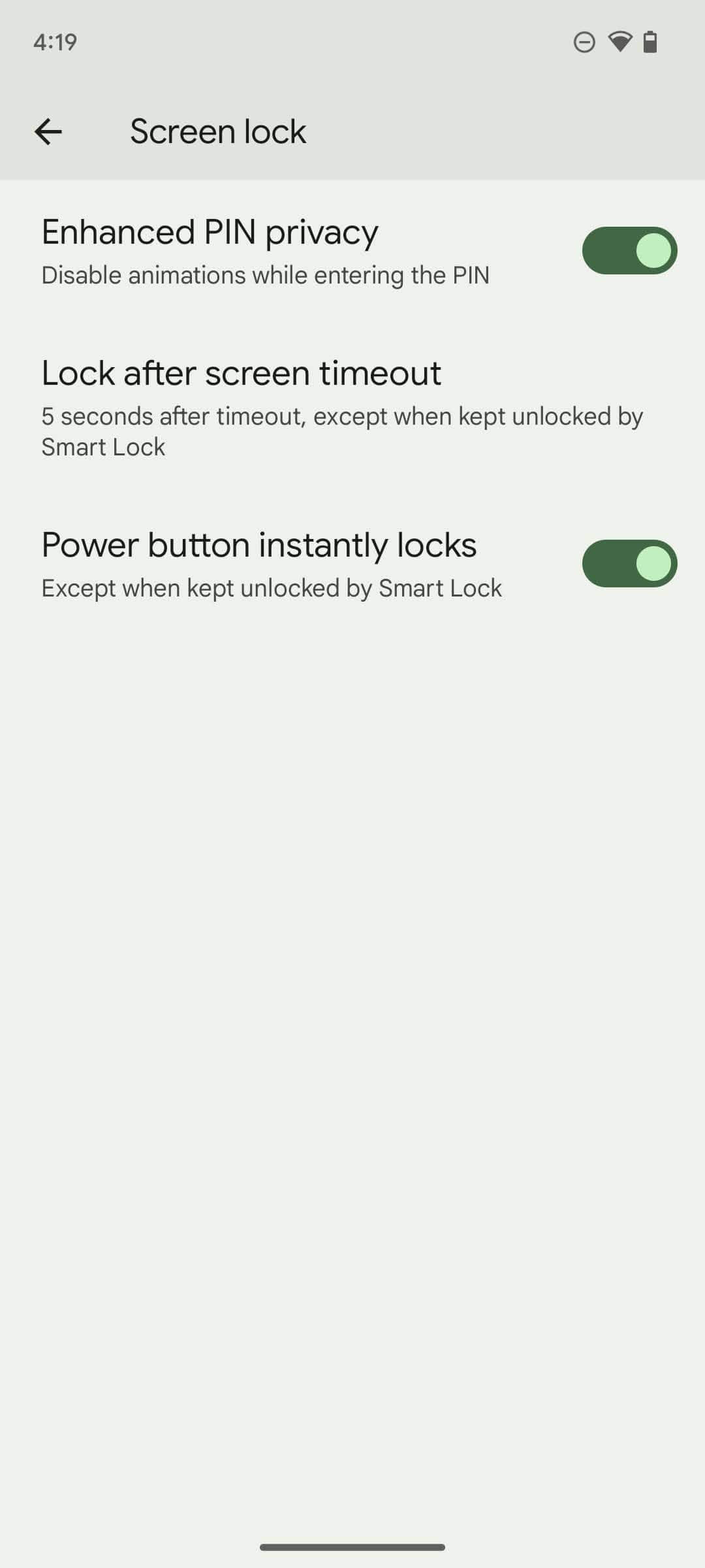
Another feature allows the user to disable animations while entering your pin, making it just a little harder for anyone to spy on your code in public places. Android 14 is also forcing applications to utilize Android’s photo picker, which allows the user to give apps access to only certain photos rather than their entire gallery.
Bottom line
Android 14 isn’t shaping to be too earth shattering, but the changes it does make are more than welcome. We anticipate those changes will pave the way for safer and more convenient smartphone usage, although it might take some time to iron out those kinks and make them perfect.
With enhanced sharing functionality, a bolder back arrow, plenty of security enhancements, a transparent navigation bar and a predictive back gesture that will make it easier to know what you’re doing before you do it, we’re very excited to get our hands on Android 14.

Self-described art critic and unabashedly pretentious, Claire finds joy in impassioned ramblings about her closeness to video games. She has a bachelor’s degree in Journalism & Media Studies from Brooklyn College and five years of experience in entertainment journalism. Claire is a stalwart defender of the importance found in subjectivity and spends most days overwhelmed with excitement for the past, present and future of gaming. When she isn't writing or playing Dark Souls, she can be found eating chicken fettuccine alfredo and watching anime.
