I want the Nothing Laptop (1) - here’s why
Please, Carl Pei. Give me a see-through laptop
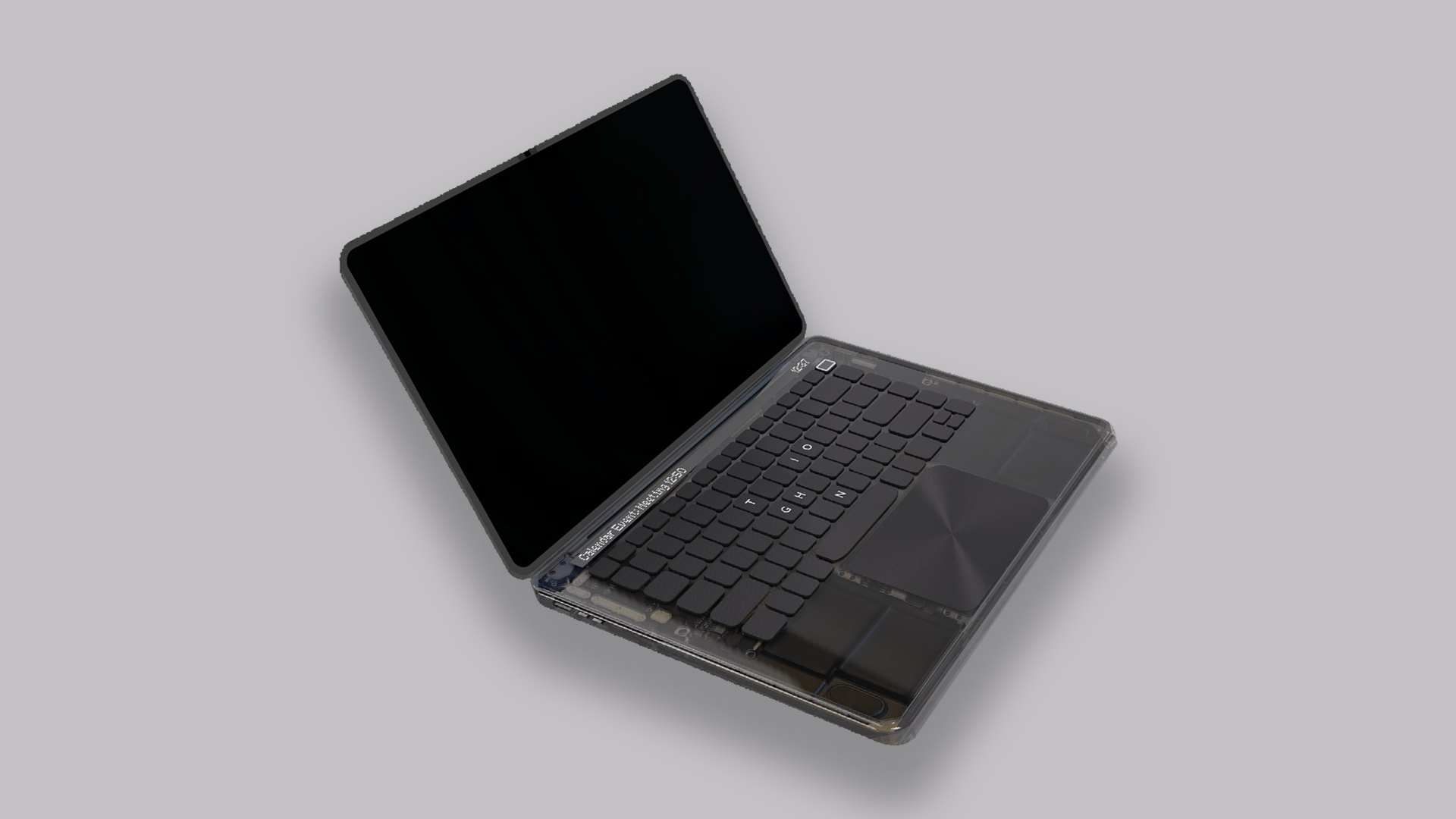
Nothing should really make a laptop. I know it, you know it, and everyone else knows it. Laptop design could really do with a transparent shake-up.
It all started with a concept created by one of the company’s community members, and followed up by Nothing CEO Carl Pei confirming the team looked at some concepts. I get that Pei highlighted the company should focus on its current categories, but hopefully he listens to me when I say “please make a notebook” at the top of my voice.
Think about what this machine could look like, and what implications it could have in shaking up the rather standardized world of laptop design.
Transparency is my aesthetic
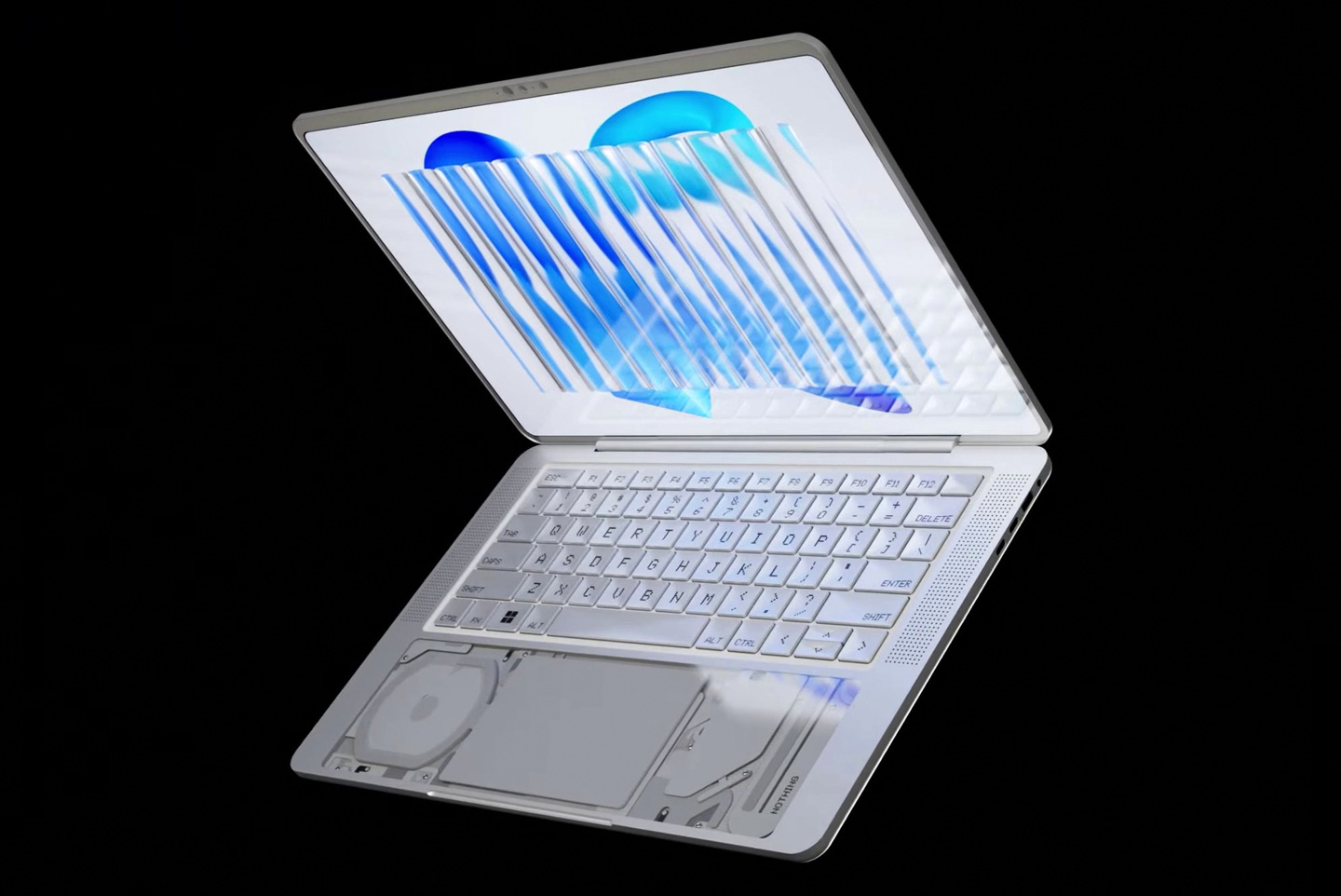
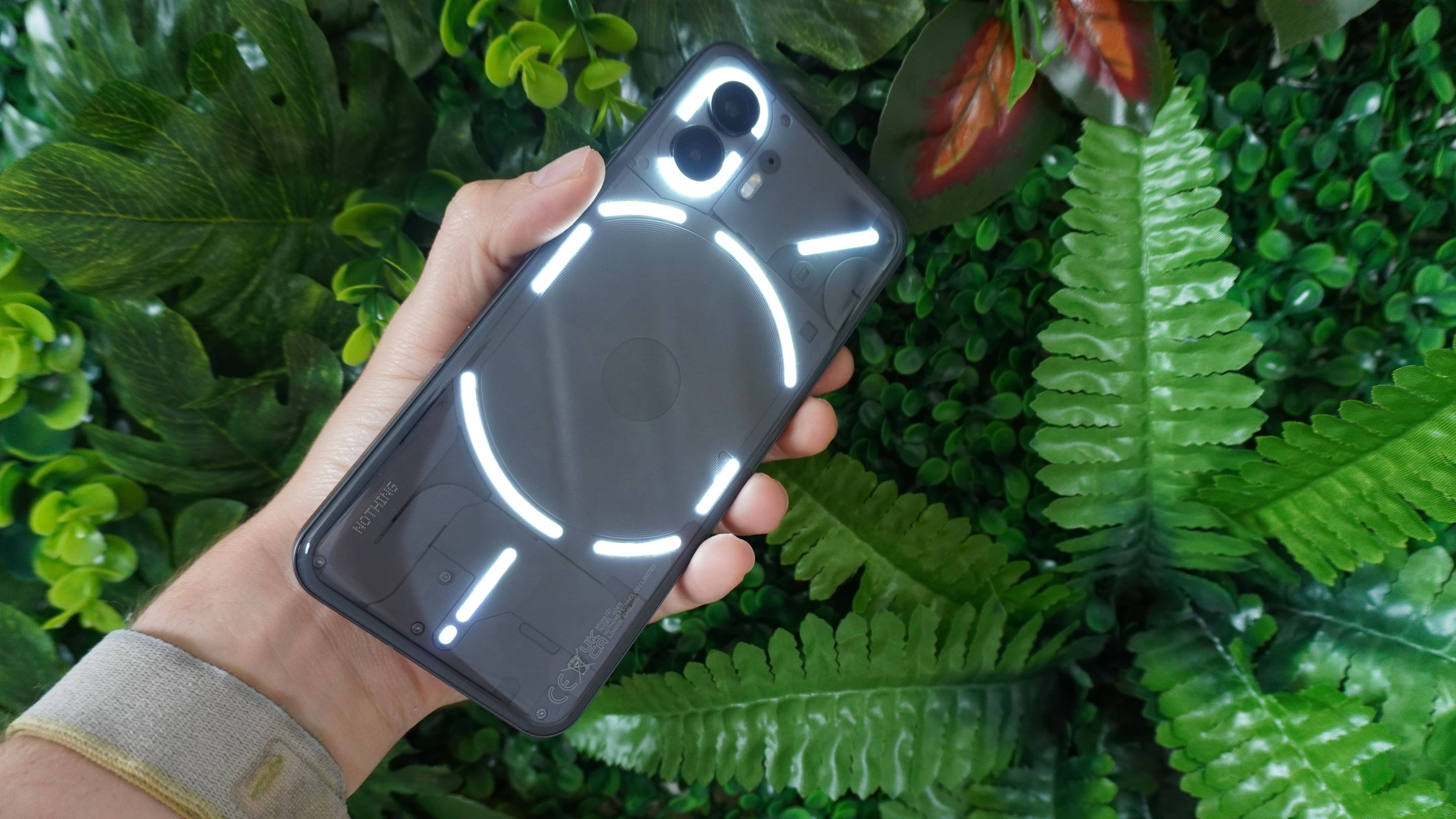
Whether you love or hate the transparent look that Nothing has used across all its gadgets, you can’t deny it’s an eyecatcher. To a tech nerd like me, it takes me back to the days of my Game Boy Color, while also feeling fresh and futuristic in the process. Seeing the inner workings like lifting the bonnet on a roaring V8 engine is quite the rush.
Now, imagine if the company did this to a laptop. The render sums this up perfectly with an almost voyeuristic glimpse at all the components that goes into making hardware this sophisticated. Because while the inside of a smartphone and a pair of earbuds look rather minimal (and the phone’s internals are largely covered), there is a ton of tech inside a laptop that I’d love to see.
Glyphs on a laptop
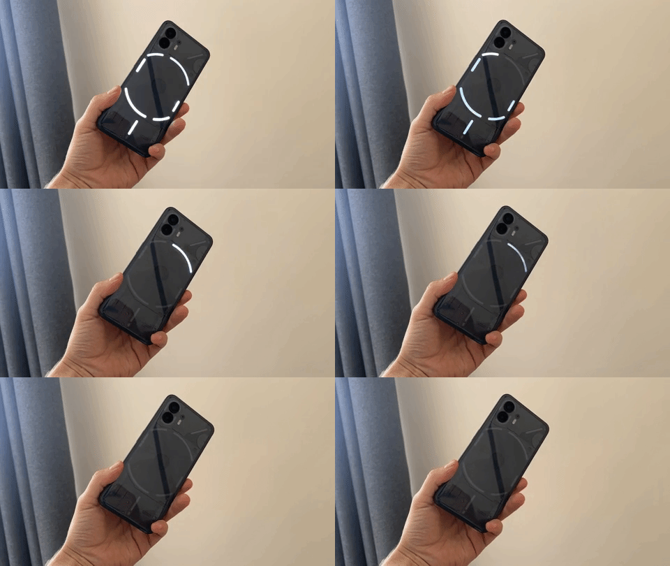
Now I know that the Nothing Laptop concept here pitches an almost MacBook Touch Bar-esque notification screen with the dot matrix font atop the keyboard — something that gives me PTSD flashbacks to my 13-inch MacBook Pro. But imagine a Glyph-esque interface to this thing!
Tie it in with key apps/websites that you may have open in the background, such as Gmail notifications or a countdown timer to when your Deliveroo order arrives, and this could be a fun gimmick with some usability (much like on the Nothing phone (2)).
Stay in the know with Laptop Mag
Get our in-depth reviews, helpful tips, great deals, and the biggest news stories delivered to your inbox.
Could you use it for anything else? I went into two different design concepts in my mind, which don’t necessarily add valid usability, but would look damn cool.
- A work focus mode indicator — the ring that is being used as a timer on the Nothing phone currently could be utilized as a focus mode-esque countdown. Whether you end up procrastinating more by watching the timer go down rather than doing work, that’s on you.
- A whole Glyph-inspired touchpad — this is just unnecessarily glitzy, but I’d love the idea of an LED light following your finger around as you move the cursor.
Nothing OS for Windows?
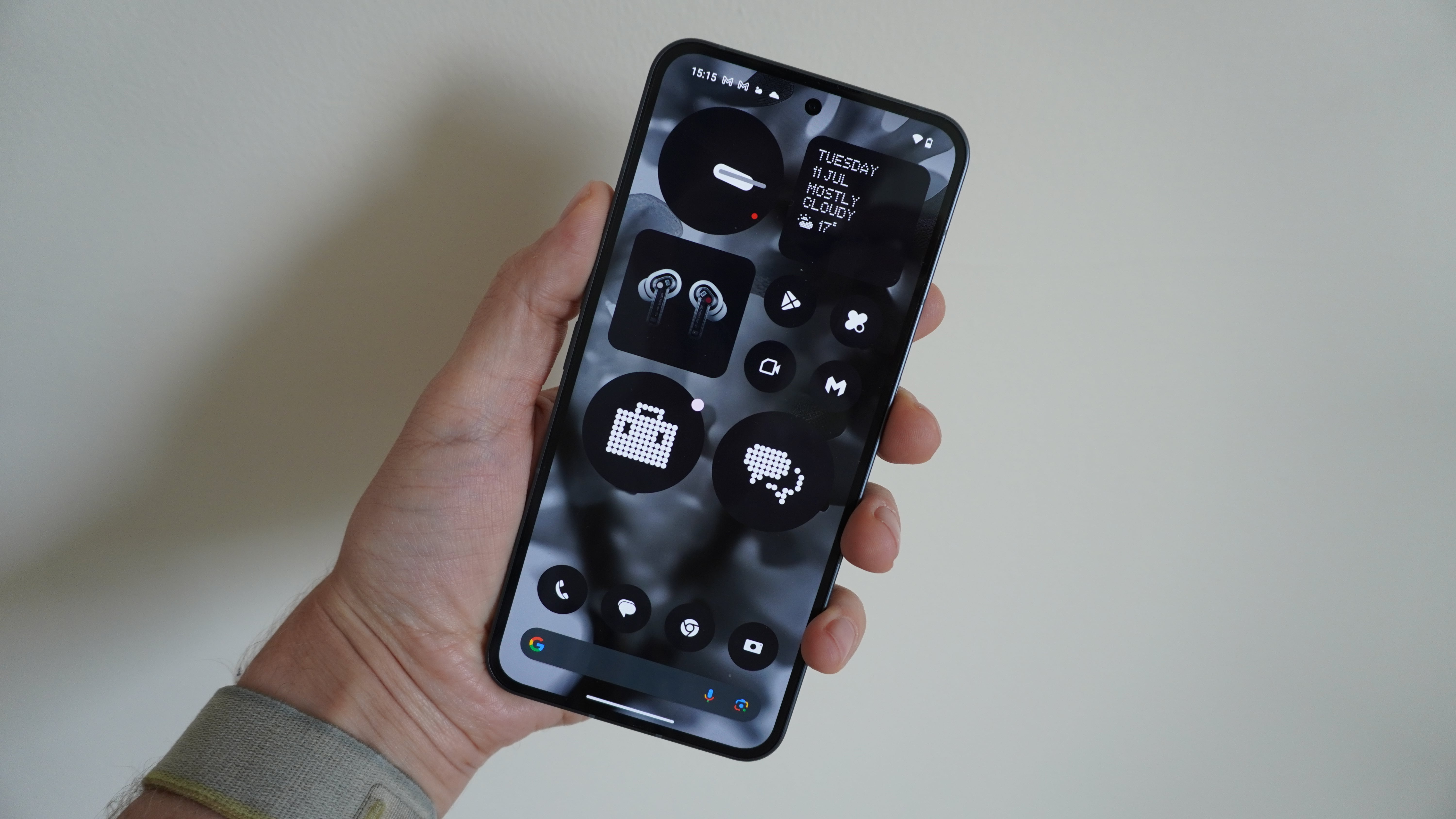
While it is technically possible to skin Windows, not many OEMs do it. The end results have always looked a little tacky, but with Nothing’s software design and aesthetic, the company could create something mightily interesting when it comes to the monochrome color palette and dot matrix typography.
Don’t get me wrong, I’m not expecting every element of Windows to look like it’s been printed on a receipt. That would 100% be the worst way to tackle this. I mean potentially taking the approach the company did to Android:
- Wallpapers that match the theme
- App icons that overwrite standard colorful clickables with a more monochromatic affair
- Headings at the top of settings windows and the windows themselves with new typography
- Nothing-designed widgets in the sidebar
The changes only need to be small, but they can still be impactful nonetheless!
Nothing at all (for now)
The basic truth is this — we don’t know whether Nothing will even go for this market. Outside of smartphones, earbuds, and the smartwatch launched under its new budget brand CMF, Pei has kept the cards close to his chest.
But if anyone in the company’s team has looked at the conceptual render, and thought “that could be a good idea,” please consider it. Laptop design (while consistently sleek and portable) has turned into a rather dull visual affair of gunmetal grays and aluminum. We need something new. Sooner rather than later.

Jason brought a decade of tech and gaming journalism experience to his role as a writer at Laptop Mag, and he is now the Managing Editor of Computing at Tom's Guide. He takes a particular interest in writing articles and creating videos about laptops, headphones and games. He has previously written for Kotaku, Stuff and BBC Science Focus. In his spare time, you'll find Jason looking for good dogs to pet or thinking about eating pizza if he isn't already.
