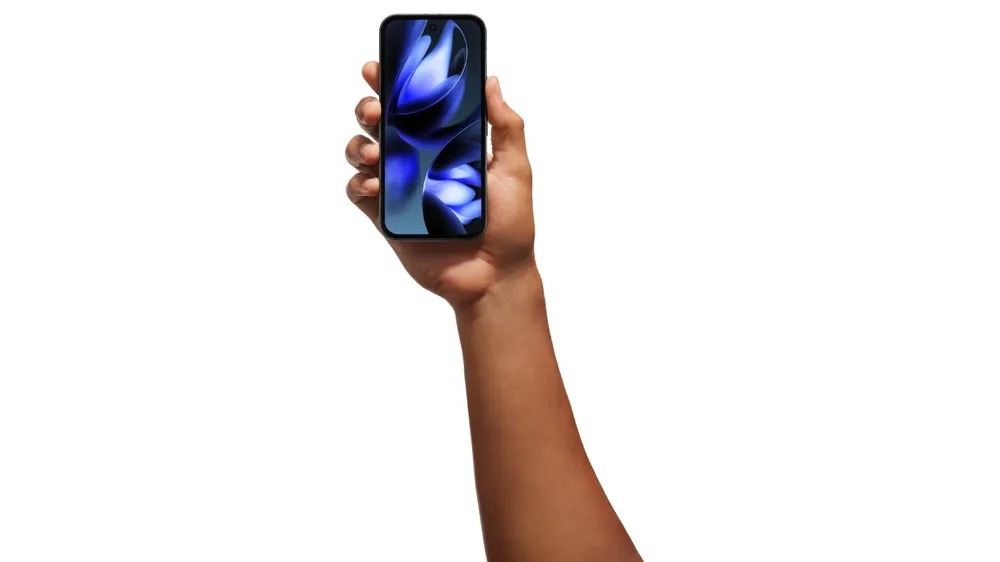
iPhone 14 Pro finally embraces the notch — Welcome to 'Dynamic Island'
Apple learned to stop worrying and love the notch
For years, phone makers have dealt with the notch or hole-punch — the cutout housing the selfie camera and other sensors on an otherwise edge-to-edge screen — as if it were a mark of shame. An impediment in their quest for bezel-less phones or depending on how you look at it, a constant indicator of the engineering work needed to accomplish phones that look right out of sci-fi flicks.
Apple is no different. Since the iPhone X launched in 2017, the company has tried hiding the notch in promotions by slapping a dark wallpaper on its phones and letting it disappear on the vibrant OLED screens. Five years later, however, Apple seems to have finally listened to its advice to developers, which was to embrace the notch and not mask or attempt to hide it.
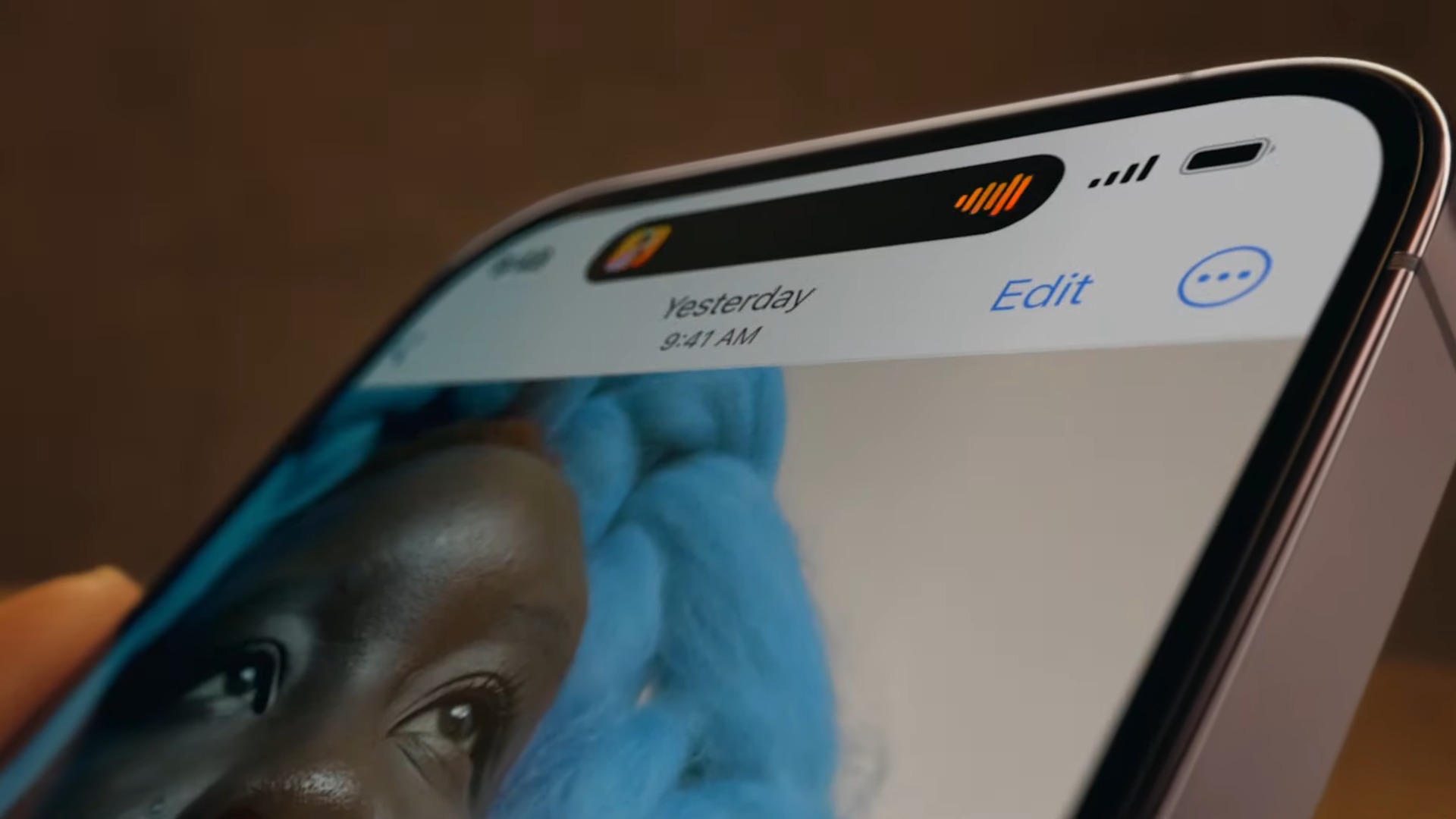
The latest iPhone 14 Pro and iPhone 14 Pro Max got a smaller, aesthetically pleasing pill-shaped notch that Apple calls the “Dynamic Island.” Don’t laugh, it’s much better than Apple’s chuckle-inducing “Jiggly Mode.”
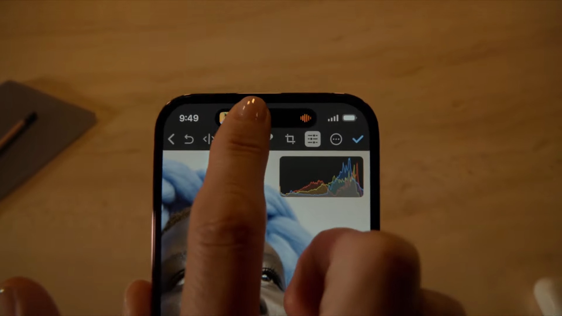
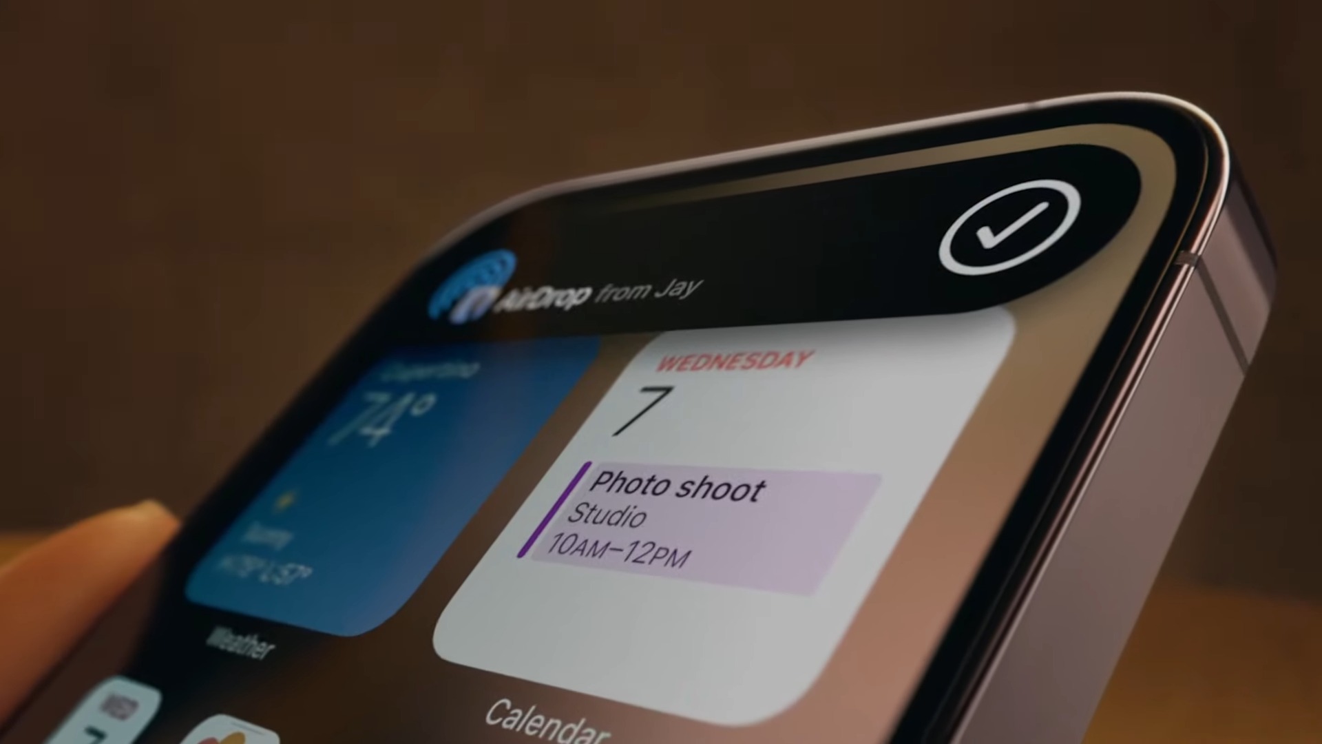
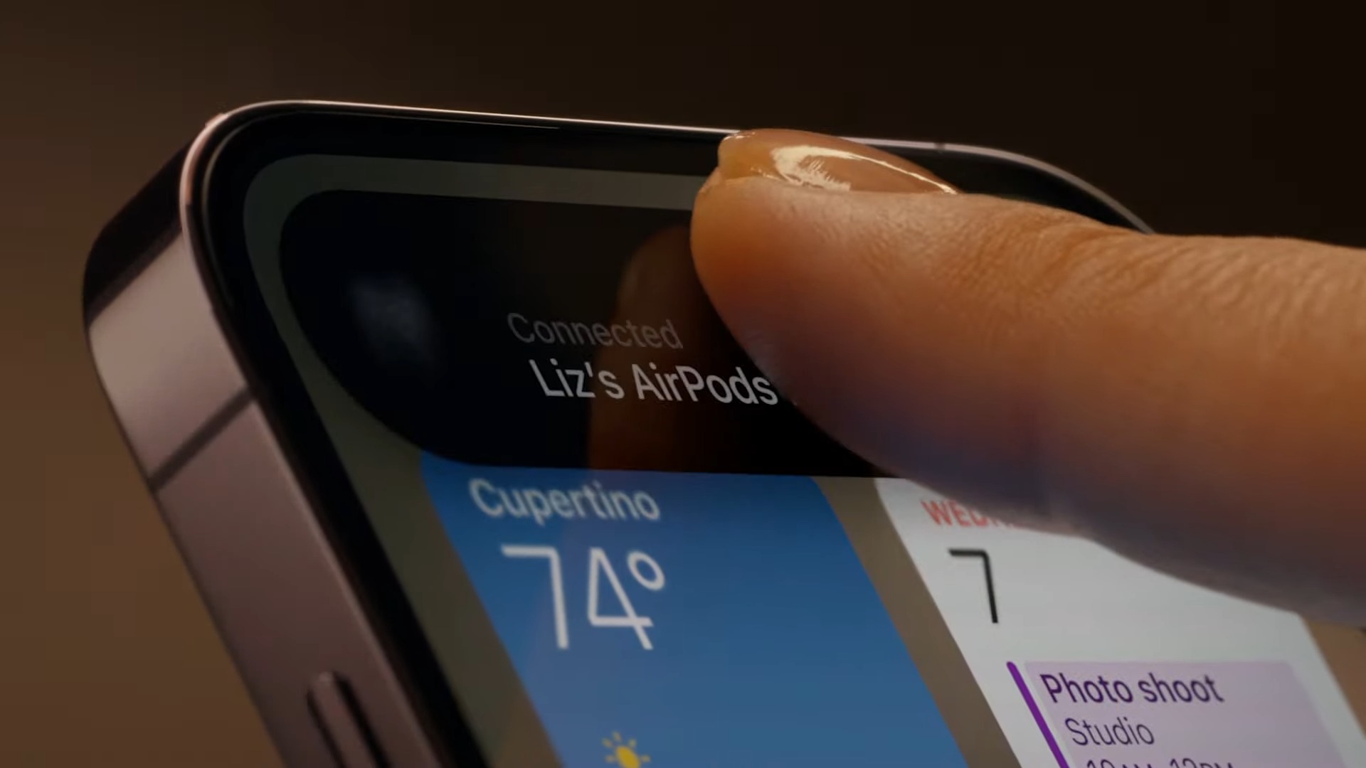
Dynamic Island is an exclusive new software feature for the iPhone 14 Pro models that repurposes the space around the notch, which usually goes to waste, to show you a host of live activities, such as timers and music playback. The black pill expands into an interactive contextual widget that automatically adapts to your most recent activity.
So for example, if you send someone files over AirDrop, Dynamic Island will morph into a progress bar for it. When you get a call, it will expand and shake a little to let you know someone’s ringing you. Called for a Lyft? You’ll see the time till the driver arrives. You can check sports scores, your AirPods’ battery life, turn-by-turn directions; the list goes on.
What’s more impressive is that you can tap and hold these real-time notifications and they’ll enlarge into a mini app. Say you’re playing music. Dynamic Island will display the album art and track name on an elongated pill. But once you interact, it will reveal playback controls and a search bar. It’s also capable of handling two activities at once: in its keynote, Apple demoed a timer running simultaneously with music playback. The former will live on one corner of the Dynamic Island, while the ongoing track takes up the rest.
Although Apple didn’t specify whether users can customize which activities can plug into the Dynamic Island to cut down interruptions or whether they can scroll through many concurrent ones to pick which one stays on top, it did say that the Dynamic Island “maintains an active state to allow users easier access to controls.” So it may be possible for people to personalize some aspects of Dynamic Island’s behavior since it will always be on the lookout for live notifications.
Stay in the know with Laptop Mag
Get our in-depth reviews, helpful tips, great deals, and the biggest news stories delivered to your inbox.
However, it’s the way Apple has designed the Dynamic Island interface that’s drawing the most awe. The pill delightfully expands and collapses into widgets with sleek animations. It only appears when it’s needed, or else disappears into the pill. The OLED screen’s deep blacks, the shrunken cutout, and a recent iOS addition called Live Activities function seamlessly in tandem to blur the lines between hardware and software.
Live Activities is the difference maker between Dynamic Island ending up as a party trick and becoming an essential element of the iPhone experience. Starting with iOS 16, developers can build live notifications to show you real-time updates right on your lockscreen. It’s a feature that’s been long overdue and I’m glad Apple is making the most of it.
Apple’s software has never quite played well with the notch. In the iPhone X era, the status area barely had any space left. Not only did people lose access to a bunch of quick information like VPN and headphone status, but Apple never added controls to customize the space flanking the notch either.
In comparison, Android makers, such as Google kept showing more notification badges and information as front-facing cameras narrowed. Some like Samsung have even figured out how to relocate the selfie camera entirely under the screen.
However, Apple has refused to address the notch in recent software updates, starving people of precious screen space. But with Dynamic Island, it has finally found an Apple-esque way to utilize the notch and until under-display cameras and sensors go mainstream, this solution seems like it will be enough to prevent people from revolting and questioning Apple’s allegiance to Face ID.
Shubham Agarwal is a freelance technology journalist from Ahmedabad, India. His work has previously appeared in Business Insider, Fast Company, HuffPost, and more. You can reach out to him on Twitter.
