Well, I’ll say it — the Apple Vision Pro is uglier than a buck-toothed monkfish
The real beauty is on the inside
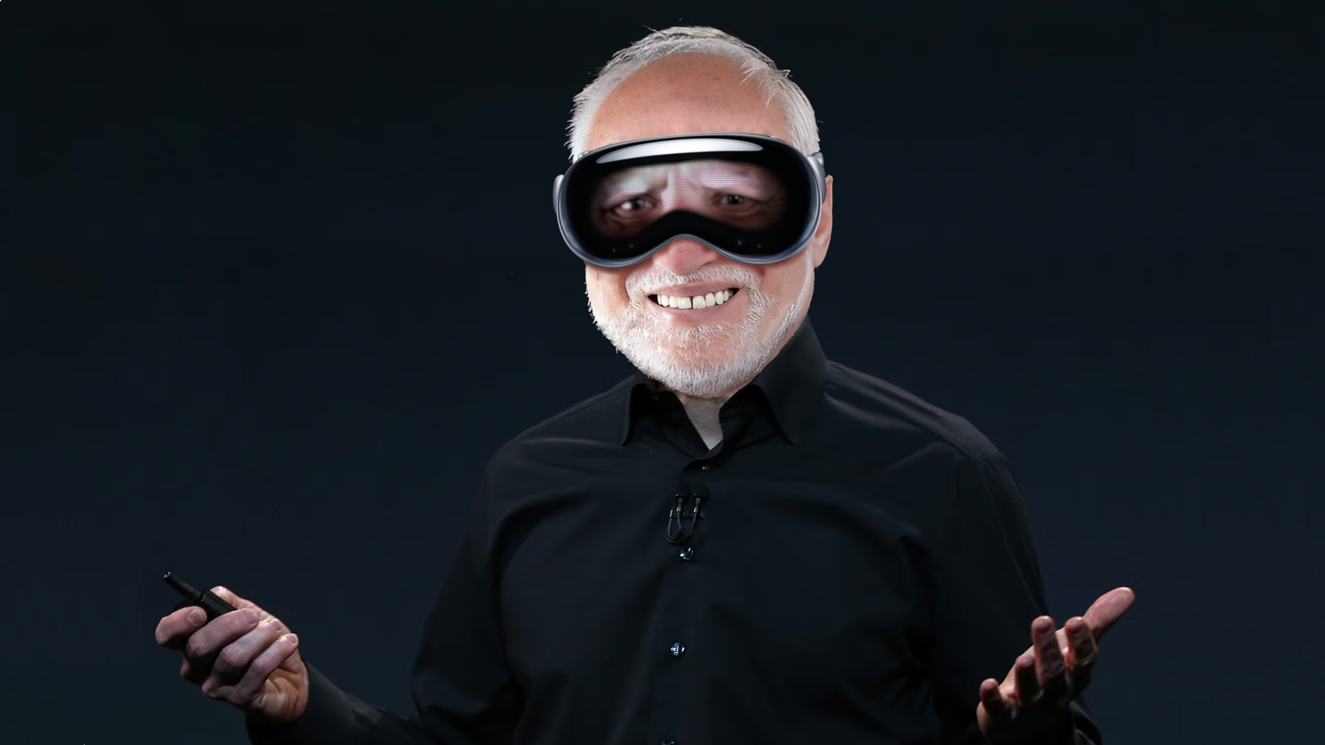
The moment we’ve all been waiting for finally arrived this week, it swooped in at the end of Apple’s opening WWDC keynote talk, ready to steal the hearts of Apple aficionados the world over. Pulses reached tachycardic levels as Tim Cook’s wry smile announced that there was just “one more thing” left in store for the day. And then he did it, the madman actually did it. He unveiled the next groundbreaking step in consumer tech — the Apple Vision Pro.
Oh, bugger. It’s revolting.
You can take us on a virtual rollercoaster tour of this monstrosity all you like. I see your clever games here, but I’m well aware of the powerful visual effects of close-up, tilt-shift photography. Everything looks good when shot like that, you could show me a 30-second slow-motion orbital swing of cat sick and as long as it had a shallow depth of field my stomach would rumble with hunger by the time it was over.
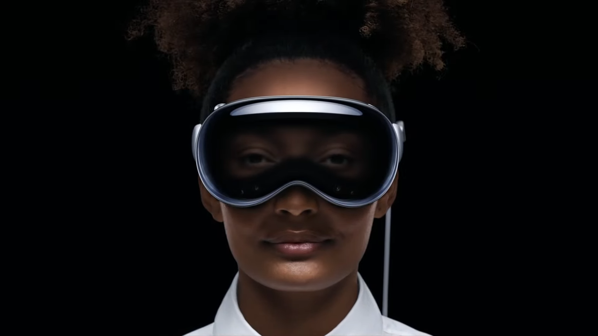
Once this pre-rendered fly-by had concluded we got our first look at the Vision Pro in action. I’ve no doubt at all that the woman modeling the headset was at least attempting to smile, though its bulky presence pushed down her cheeks and deformed her whimsical gaze. What resulted was someone looking almost sarcastically smug, if not bored — if not incredibly stoned. The poor woman had to start mouth-breathing seconds into her appearance, likely to survive the crushing of her sinuses by this bubble-fronted behemoth.
My god, what happened to those ultra-svelte ski goggles we’d been looking at in renders for the past three months? I thought all that design information was harvested by those in the know. What the hell is this thing? These wouldn’t be suitable for hitting the slopes. Not unless you plan on hucking your way down the Cydonian mountains of Mars. It’s outright atrocious. How is the man that crapped on Google Glass ten years ago so giddy to unveil a machine whose silhouette looks let a set of glass buttox?
Oh how the mighty have fallen
Good old Steve Jobs once said that Tim Cook isn’t a product person, and I’m pretty sure he was onto something. Tim Cook has done a great many things, but he hasn’t shown the type of innovation that Jobs managed to squeeze out of Apple while he’s been at the helm. Tim Cook has however turned Apple into a trillion-dollar company with a health and eco-friendly focus that can only be applauded.
But I have to say, after seeing the Vision Pro with my own two eyes (on a screen, on a website, from a pre-recorded video), I’m not sure if Cook’s master plan was to release an AR headset at all. If I had to put money on it, my best guess would be this was just the first step in furthering his own green agenda by harnessing the incredible power of Steve Jobs rolling in his grave at speeds so fast you’d think God was pressing the down button and frantically tapping jump — that’s a Sonic joke, that is.
I don’t say this to be inflammatory to Jobs, on the contrary. I say it because if parallel universes do exist, I guarantee there’s not a single one out there where Steve Jobs would allow a product that looks like this to be revealed to the public. I’m not even entirely convinced he would let the cold light of day land upon its bubbled exterior.
Stay in the know with Laptop Mag
Get our in-depth reviews, helpful tips, great deals, and the biggest news stories delivered to your inbox.
Apple is one of the few companies out there that take the design of their products incredibly seriously — or at least, they used to. “Apple cannot ship trash,” is something Steve Jobs was stated to have said once during a conference call, and it’s that mentality that has given Apple the edge to this day.
You may not like the brand or its cultural idolization, and you may not like the products for their inflated prices or vainglorious presentation. However, whether you’re ready to admit it or not, Apple doesn’t ship trash.
Apple doesn't ship trash*
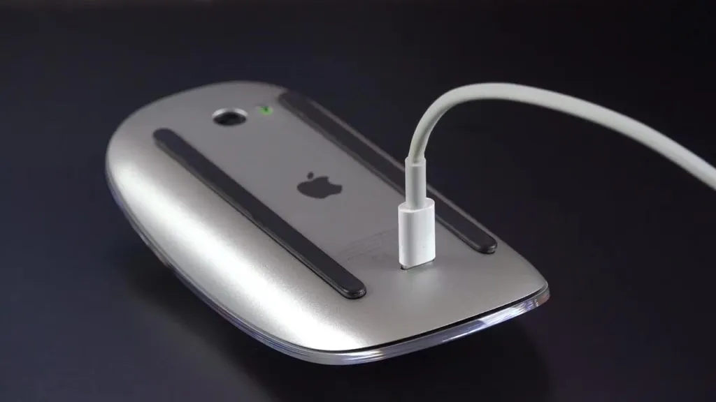
Well, Apple didn’t ship trash anyway. There have been some fascinatingly poor design choices made ever since Job’s passing, take for example the second-generation unveiling of Apple’s Magic Mouse. The Magic Mouse was initially a battery-operated, multi-touch peripheral allowing mouse users to make use of gestures and inertia scrolling on Mac and MacBook devices. It was sleek, it was stylish — the Magic Mouse was a masterclass in minimalist design.
When the second iteration of the product rolled around in 2015, Apple had done away with the battery component — innovation! Just one slight problem, they placed the charging port on the bottom of the mouse — rendering the mouse completely useless to anyone needing to charge it.
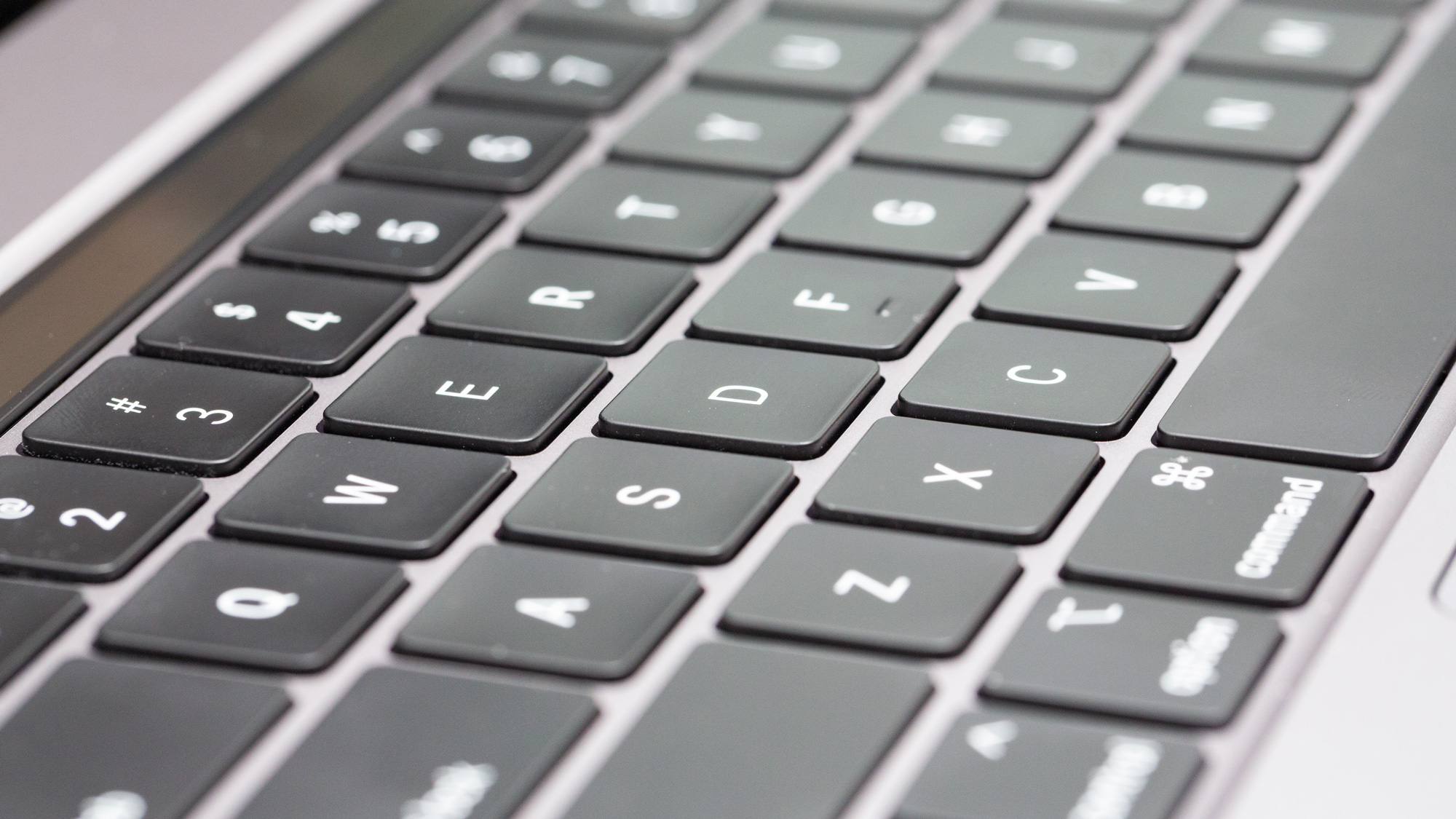
How about 2016’s Touch Bar MacBook Pro with its revolutionary butterfly keyboard? The new keyboard design was hailed as “four times more stable” than the previous, a claim that became almost immediately invalidated when McBook usrs wre lft typng lke ths. It wuld sm tht th kybord hd n ncrdibl succptblity to dust nd dbris gttng undr th kycps — rndrng th thng lmst ntrly unusbl fr som.
The biggest travesty Apple has made in terms of design came from another point in time entirely, when the brand was left without Jobs at the helm — the ripe old year of 1986. Jobs had been pushed overboard from the company the previous year for his outlandish, and frankly unreasonable, desire to keep making personal computers.
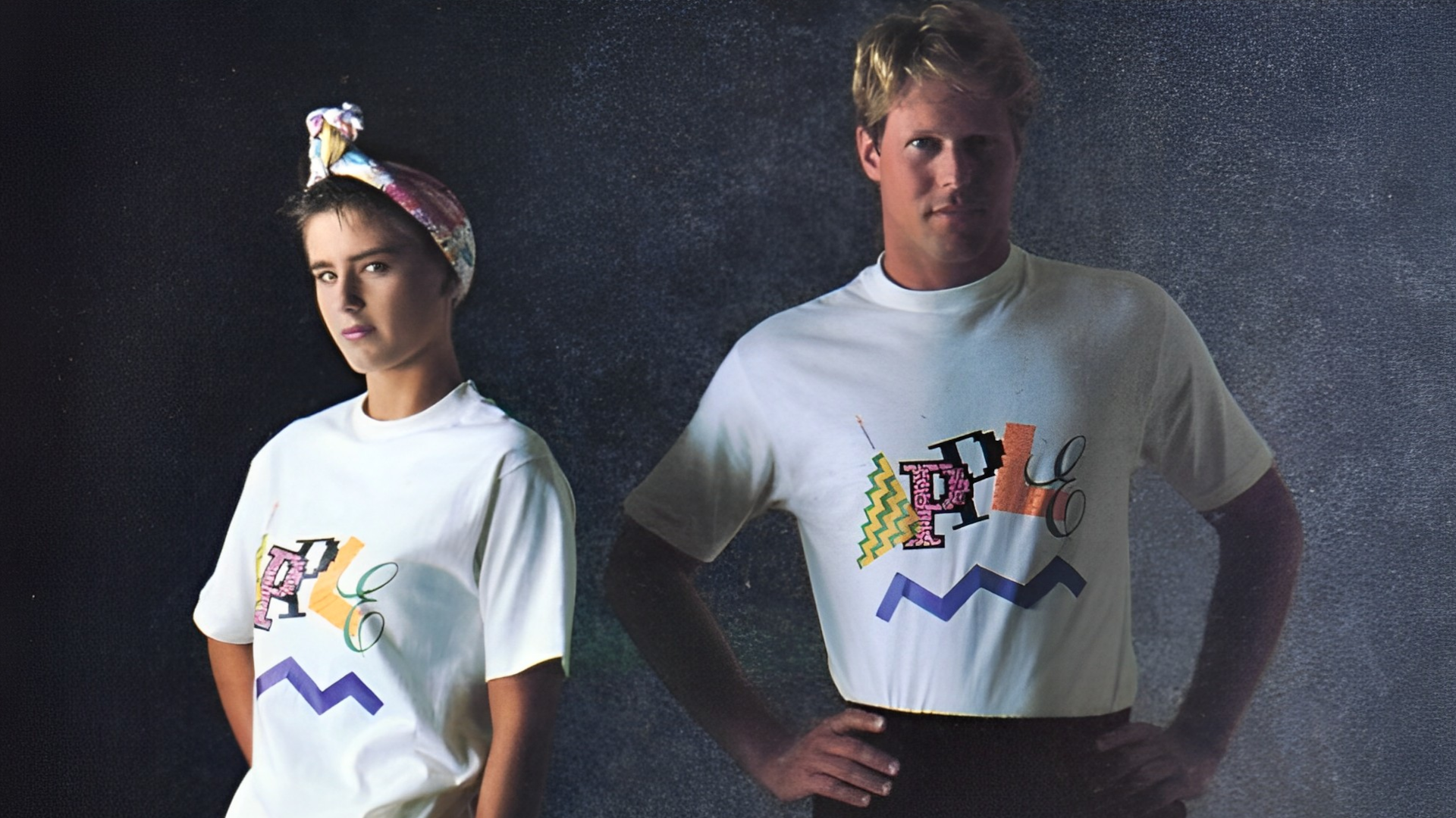
Apple was heading in a new direction now, in fact, Apple was heading in multiple new directions now. One of those directions? How about an Apple clothing line featuring all your favorite highlighter hues and neon tones? It was like the title credits for Saved By The Bell had vomited all over an otherwise perfectly functional white T-shirt.
Outlook
During Apple’s keynote, Cook referred to the Vision Pro as the first Apple product we will look through, and not at. Maybe this is why it seems so acceptable to drop Apple’s standards for design on this one.
For what it’s worth, the Vision Pro doesn’t exactly look like cheap tat — and for $3500 you’d hope so. It does look like a premium product, just not an Apple product. It lacks that Apple flair and the brand’s unique sense of class.
However, this is entirely subjective and all my own opinion, what with beauty being in the eye of the beholder and all that jazz. Maybe I’ve just been a victim of buying into the leaks surrounding the Vision Pro’s design — all supposedly sourced from those in the know. Or maybe Apple is simply a victim of its own past stylistic successes.
Or maybe, just maybe, the brand we’ve been funneling money into for decades for its quality, beauty, and distinct aesthetic is beginning to rest on its laurels. Maybe a ‘product person’ would’ve listened to their engineering teams pleas for a delayed launch until the product could match the initial vision.
While the Vision Pro is Apple’s first steps into a post-iPhone world, the incredible tech behind it ensures you’ll be able to bring plenty of what’s familiar along for the ride. However, Jobs’ perfectionism, eye-for-detail, and captivating design standards might be left behind this time. At least for now.

Rael Hornby, potentially influenced by far too many LucasArts titles at an early age, once thought he’d grow up to be a mighty pirate. However, after several interventions with close friends and family members, you’re now much more likely to see his name attached to the bylines of tech articles. While not maintaining a double life as an aspiring writer by day and indie game dev by night, you’ll find him sat in a corner somewhere muttering to himself about microtransactions or hunting down promising indie games on Twitter.
