Apple finally explained the Mac Mini's weird power button — but the answer won't satisfy you
The M4 Mac Mini has a design problem... or does it?

Sign up to receive The Snapshot, a free special dispatch from Laptop Mag, in your inbox.
You are now subscribed
Your newsletter sign-up was successful
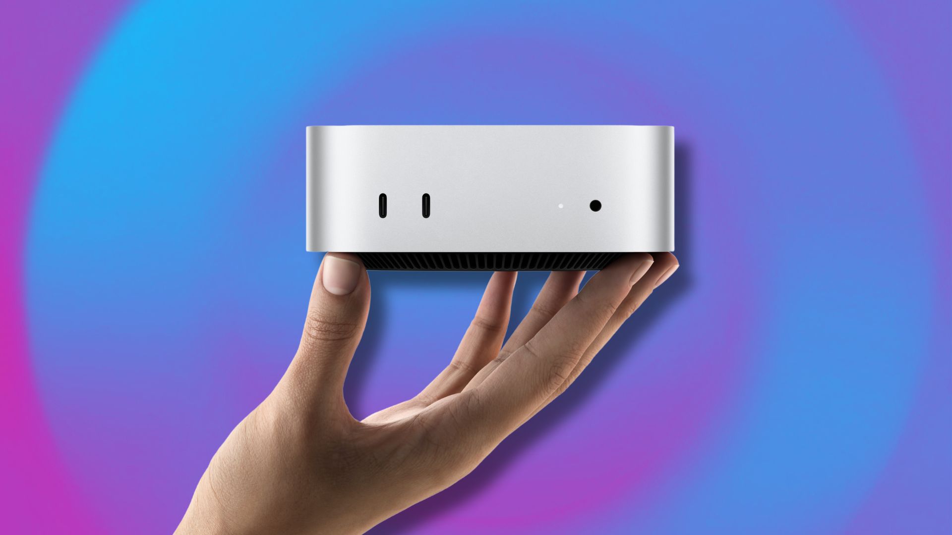
The M4 Mac Mini's new scaled-down design was supposed to be the highlight of its launch during Apple's M4 Mac week, but one design flaw has been stealing the show.
The Mac Mini's power button is on the bottom, leading some users to devise creative workarounds, such as 3D-printed power button extenders.
It's a little thing (literally), but the placement of the power button on the redesigned Mac Mini has been the topic of all Mac fans' conversations since it was announced. Apple finally responded in an interview last week, but users might not want to hear their take on the power button controversy.
Article continues below"You pretty much never use the power button on your Mac"

Apple executives John Ternus, VP of Hardware Engineering, and Greg "Joz" Joswiak, VP of Worldwide Marketing, finally broke Apple's silence on the Mac Mini power button controversy in an interview posted to Bilibili, a Chinese video-sharing platform, on November 7. The interview is in Chinese, but English transcripts reveal Apple's take on the power button.
When asked about it, one of the Apple executives commented, "The most important thing is, you pretty much never use the power button on your Mac."
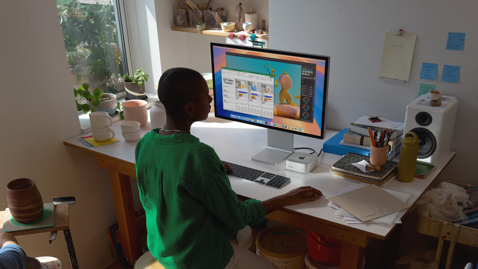
Ternus and Joswiak also emphasized that the M4 Mac Mini's ultra-compact design forced Apple to put the power button on the bottom. This may also be an attempt to steer the narrative around the M4 Mac mini back to its snack-sized redesign, but is it a fair way of shaking off users' complaints about the design? That depends on how you see the Mac Mini. It's designed to be a desktop PC, and people who use it that way might agree with Ternus and Joswiak's point about rarely needing to use the power button. After all, it's easier to shut down your Mac through the shutdown menu in macOS rather than using the physical button.
However, this simplified take ignores the unique position of the new Mac Mini. It's so tiny that users can quickly unplug it and travel with it like a laptop. Of course, you need to plug it into a monitor at the office or school to use it away from home, but it's still worth considering, given how small the new Mac mini is. People who bring their Mac mini on the go are much more likely to use the physical power button since they must turn their Mac on and off much more often.
Sign up to receive The Snapshot, a free special dispatch from Laptop Mag, in your inbox.
Ultimately, the Mac Mini's power button placement is not a deal breaker, much like the inconvenient placement of the charging port on the Magic Mouse. However, it's disappointing to see design oversights like this from a brand that prides itself on great design.
I would have preferred a power button on the top or side disguised with the same metallic finish as the other Mac Mini chassis. Even so, it's still impressive just how small the new Mini is. It came close to design perfection this time, so maybe Apple will relocate that pesky power button next time around.
More from Laptop Mag

Stevie Bonifield is a freelance tech journalist who has written for PC Gamer, Tom's Guide, and Laptop Mag on everything from gaming to smartwatches. Outside of writing, Stevie loves indie games, TTRPGs, and building way too many custom keyboards.
