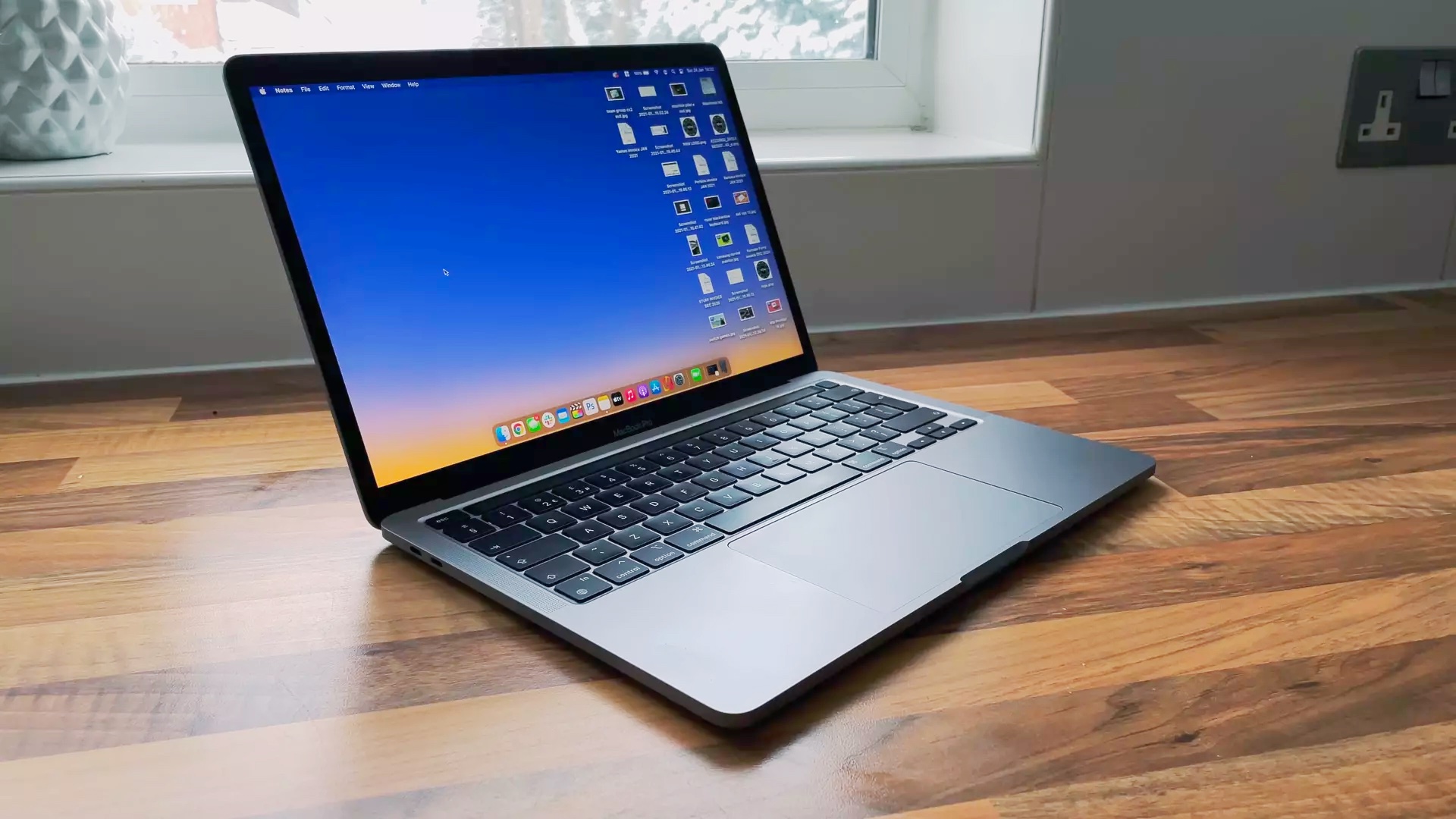
The death of the MacBook Pro 13 marks the end of the worst era of MacBook design
Good riddance
I got my first MacBook in 2006, it was the 13-inch white polycarbonate model, and it was by far my favorite laptop that I had ever owned at the time. Over the years it was first replaced by the black polycarbonate MacBook (the current Space Black wishes it could achieve that level of cool) and then with a string of MacBook Pros starting around 2011 when I started my career as a freelance journalist that ultimately landed me at Laptop Mag.
I’m not so narcissistic as to think you care about the timeline of my laptop ownership; I’m merely telling you all of this to say that I was an unwaveringly loyal MacBook owner for a decade. Then in 2016, Apple introduced the MacBook Pros with the TouchBar and over the next two years, my faith in Apple laptops was so badly eroded that I haven’t owned another MacBook in the proceeding 5 years.
It should come as no surprise then that while some are mourning the loss of the MacBook Pro 13, I am celebrating the demise of the worst era of MacBook design.
The Butterfly effect
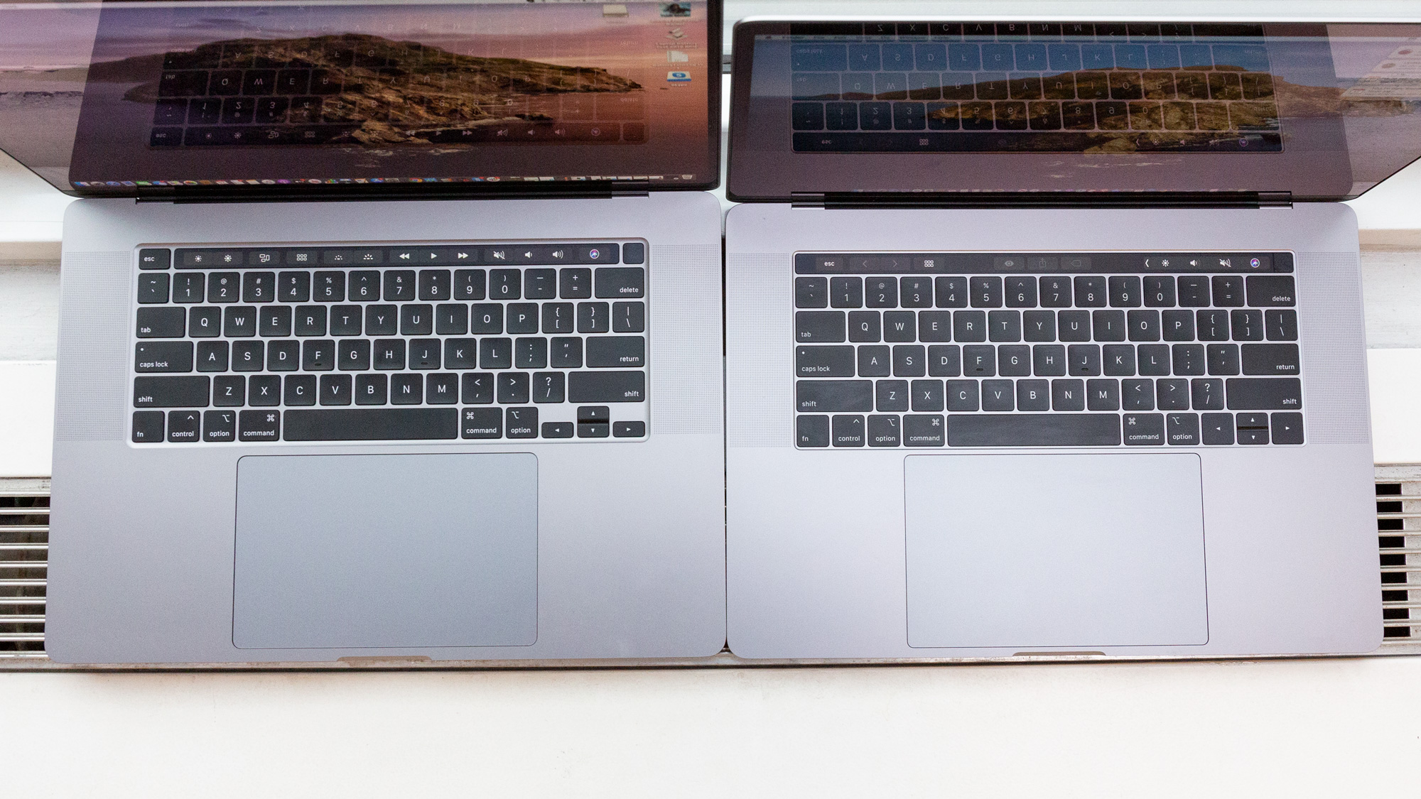
I’ll make this quick, as the Butterfly keyboard thankfully left us in 2020, but it’s part of the tale of Apple’s questionable design decisions during this period. Introduced in 2015, the Butterfly keyboard was terrible from day one, and yet Apple just kept stubbornly trying to make it work. The Butterfly keyboard broke from the traditional scissor-style laptop keyboard and just broke with a regularity that suggested it was by design. Apple had to create a keyboard repair and replacement program for every laptop it released during this period guaranteeing they would be fixed for free for four years.
Two of my MacBook Pros were completely replaced as a result of that program due to keyboard issues alone. Let it never be said that Apple didn’t have excellent customer service, it was the engineering and design that let them down.
The frequent failures should have been enough to kill it, but what made matters worse was that a large percentage of users didn’t like the feel of the Butterfly keyboard compared to the old scissor style. At the end of 2019, Apple finally waved the white flag and moved back to a scissor-style design on the MacBook Pro 16, so Laptop Mag did a MacBook scissor-style vs. butterfly keyboard face-off among the staff and the scissor-style took home a unanimous 5-0 victory.
However, while the Butterfly keyboard died in 2020, the other failed and flawed MacBook design of the time lived on to haunt prospective MacBook Pro owners until last week.
Stay in the know with Laptop Mag
Get our in-depth reviews, helpful tips, great deals, and the biggest news stories delivered to your inbox.
The trouble with TouchBars
Now unlike the Butterfly keyboard, I will concede that the concept behind the TouchBar had promise, Apple just failed to deliver on it. The Butterfly keyboard opened the door to my questioning Apple’s design choices and then the TouchBar ran up and pushed me through that doorway with both hands.
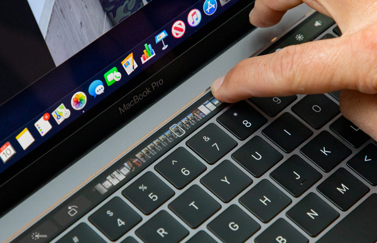
The pitch for the TouchBar was great. You know those function row keys that you may not use or aren’t entirely sure what they do? Well, now you have a little touchscreen replacing them that can change contextually as individual buttons or can be grouped together for handy features like scrubbing through your timeline in Final Cut. Even writing that now I think it sounds like a good idea, so where did it go wrong?
The first problem, and the one that ultimately was the kiss of death for my MacBook ownership, was that the TouchBar was incredibly unreliable. I already covered the two MacBook Pros I had replaced due to Butterfly keyboard issues, but I had two more replaced due to TouchBar problems. Across all four of those MacBooks, I consistently had issues with the TouchBar.
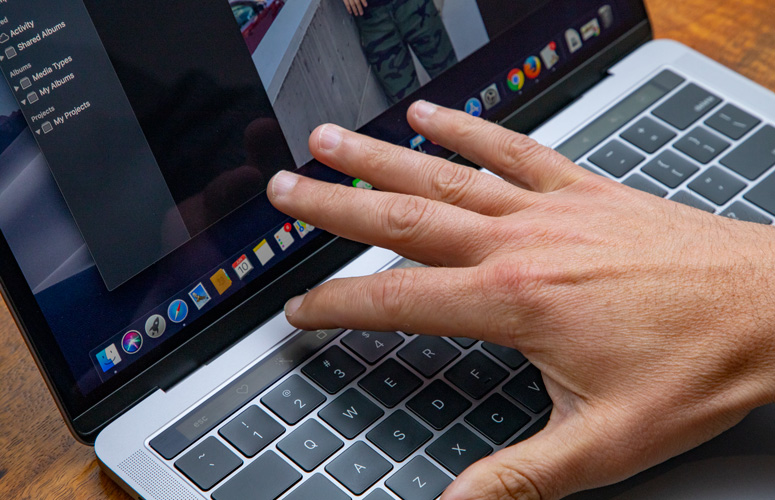
The most basic of these problems was that the TouchBar would simply crash and disappear, which isn’t great when it was responsible for several system settings and, of course, the escape key. Other times it would be present, but simply wouldn’t respond to any touch input. There was no solution to either problem beyond restarting the MacBook and hoping that this time your TouchBar would light up and respond again.
That probably would have been enough by itself, but what compounded the problem with the TouchBar was the fact that almost no software made use of it. We’ve seen this play out again somewhat with the Dyanamic Island on the iPhone, although there are signs of life following the release of iOS 17. There were never any signs of life for the TouchBar after the initial excitement very quickly wore off. Beyond those that immediately adopted it, like Adobe, there was almost no enthusiasm or adoption for the TouchBar by software developers.
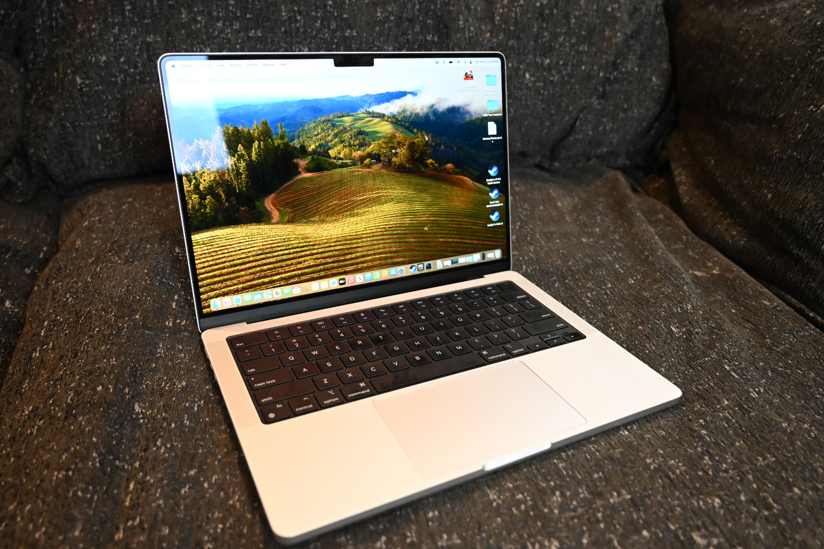
Despite all that, the TouchBar outlasted the Butterfly keyboard by another year, the 2021 MacBook Pros finally ditched the TouchBar in favor of a traditional function row, with one lone exception: the MacBook Pro 13. For two more generations, it carried on the now basically vestigial TouchBar, because Apple didn’t want to have to redesign that laptop.
Bottom line
After receiving my 4th replacement (so 5th MacBook Pro 15 with TouchBar), I sold it without ever opening it as I decided I’d had enough. I’ve been using Windows laptops for the last 5 years, with only occasional forays into MacBook land when I needed to test something specific on macOS. Just this month I have finally dipped my toe back in with a MacBook Air 15 joining the Windows laptop on my desk.
While I have had the occasional quibble with MacBook design in recent years, the reintroduction of MagSafe, HDMI, and an SD card slot on the MacBook Pros was a great sign that the company was once again listening to its customers. Coupled with the absolutely game-changing move to Apple Silicon, it was time for me to let my frustration with those past MacBooks go and give Apple another shot.
However, I’m petty enough to still happily celebrate the demise of the TouchBar MacBook and bid farewell to Apple’s terrible design instincts of the previous decade.
Sean Riley has been covering tech professionally for over a decade now. Most of that time was as a freelancer covering varied topics including phones, wearables, tablets, smart home devices, laptops, AR, VR, mobile payments, fintech, and more. Sean is the resident mobile expert at Laptop Mag, specializing in phones and wearables, you'll find plenty of news, reviews, how-to, and opinion pieces on these subjects from him here. But Laptop Mag has also proven a perfect fit for that broad range of interests with reviews and news on the latest laptops, VR games, and computer accessories along with coverage on everything from NFTs to cybersecurity and more.

