6 Signs Your Gadget’s Screen Sucks
As much as I'm a sucker for quad-core processors, slick interfaces and killer apps, none of that matters if the screen on a gadget I’m buying isn't up to snuff. Whether we're shopping for a laptop, smartphone or tablet, all of us should be spending less time pouring over the specs and more time looking at the display.
Is it sharp enough? Do the colors wash out? Can you actually use that gadget outside? These are just some of the questions you need to ask yourself before you buy. Here are six surefire signs that display just won't cut it.
1. Pitifully low resolution
It's truly sad to see $1,400 razor-thin Ultrabooks hit our labs with the same 1366 x 768 pixel count as $500 laptops. At least Vizio gets it. The company's new $899 14-inch Thin + Light offers a 1600 x 900 panel, which fits more information on the screen. In other words, less scrolling for you. ASUS gives you a full 1920 x 1080 pixels for its $1,149 Zenbook Prime. It's time for everyone else to step it up.
For tablets, a minimum of 1280 x 800 pixels is the new standard for 7 inches, thanks to the $199 Nexus 7. (We gave the Kindle Fire's 1024 x 600 a pass at launch because of its low price.) For 10-inch tablets, the iPad's Retina Display (2048 x 1536 pixels) is the gold standard, and there are now two full HD Android slates in the $499 Asus Transformer Pad Infinity and Acer Iconia Tab A700. Yes, you can get the Lenovo IdeaPad S2 for $150 less, but that 1024 x 768 screen makes the device instantly obsolete.
If you're in the market for a smartphone, shoot for a resolution of at least 960 x 540 (also called qHD), but 1280 x 720 pixels is better. Stay away from phones with resolutions of 480 x 320 pixels. You'll get fuzzy text and images and spend way too much of your time zooming in to see content.
2. Can’t be seen in the sun (or way too dim)
Stay in the know with Laptop Mag
Get our in-depth reviews, helpful tips, great deals, and the biggest news stories delivered to your inbox.
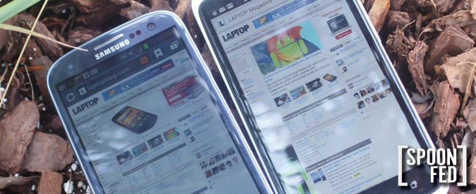
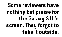
I was actually shocked to see that most reviewers of the Samsung Galaxy S III had nothing but praise for its Super AMOLED screen. I guess those folks didn't bother to take the phone outside. While the panel offers excellent contrast and popping colors, it’s just too dim to comfortably see content in direct sunlight.
Using our light meter, the S III registered only 210 lux, compared with 302 for the category average. Other AMOLED-equipped phones also disappointed, including the Samsung Focus 2 (203 lux) and Nokia Lumia 900 (262 lux). The HTC One X notched a sky-high 525 lux, and the iPhone 4S got 549, making them easy to see outdoors.
We also measure the brightness for tablets and phones in our reviews, so you can easily compare results.
3. Poor viewing angles
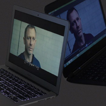
If you have to push back a laptop’s screen 30 degrees to make out the image, don’t buy it. What happens when you get on the plane and the person in front of you jams his seat all the way back? We’re forgiving of narrow viewing angles on 15-inch budget laptops that likely won’t leave the living room, but not on notebooks that are designed to be used in tight quarters.
With smartphones and tablets, you’d think that limited viewing angles would be less of an issue because we tend to view the device head-on. Wrong. Yesterday I tested the Droid Incredible 4G LTE’s GPS feature in the car, and I had trouble reading the directions from my seat to the dashboard. Narrow viewing angles can also spoil an otherwise good tablet; you want the person next to you to see that movie, too.
4. Whites aren’t white
I don’t mean to keep picking on AMOLED screens (sorry, Galaxy S III) but I’ve noticed that many of them tend to have a blue cast when displaying a white background. Not having a white that’s really white doesn’t necessarily ruin the user experience, but it’s just annoying. A good way to test this out is to open the browser and enter “about:blank” and compare devices side by side.
5. Glare, glare and more glare
The industry calls them glossy screens, but I call them glare screens. If you’re looking at a laptop display and you can see more stuff going on behind you than what’s on that webpage, that’s a problem. That’s why it’s important to pick a notebook that offers good contrast and black levels but doesn’t go overboard with the glossy. The 13-inch MacBook Air is a great example.
If you want to avoid glare altogether, look for notebooks with matte screens, such as the 15-inch Samsung Series 9. Business notebooks from Lenovo, HP and others also come with matte panels.
All tablets and phones suffer from at least some glare. I simply haven’t seen a viable color matte option for mobile devices. But a bright screen can help minimize distracting reflections.
Still, if you want to a glare-free experience I recommend an E Ink e-reader like the Barnes & Noble Nook Touch with GlowLight.
6. You can see gridlines on the touch screen
I was shocked to discover that Toshiba is charging $30 more than the iPad for its Excite 10 LE tablet. And that shock turned to horror when we got this device in the lab. What good is it to have the world’s thinnest tablet when the display is marred by crisscrossing gridlines? This proved very distracting when watching video or reading. The same weakness plagued the $179 Archos 70b. Being cheaper is no excuse. We’d much rather pay $20 more for the Kindle Fire than suffer with this poorly made screen.
Editor-in-chief Mark Spoonauer directs LAPTOP’s online and print editorial content and has been covering mobile and wireless technology for over a decade. Each week Mark’s SpoonFed column provides his insights and analysis of the biggest mobile trends and news. You can also follow him on twitter.

