Android’s New Problem: Not Enough Fragmentation!

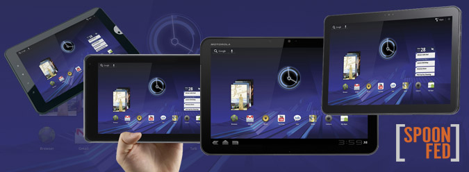
Honeycomb tablets aren’t being sold yet, but apparently they’re already in a whole lot of trouble. You see, the slates being powered by Android 3.0 are all quite similar. You won’t find any skins or many homegrown apps tacked on. It’s just a pure “Google Experience.” Plus, most of these devices are powered by the same Nvidia Tegra 2 processor and have the same 1280 x 800 resolution. Where’s the differentiation? How is one to tell a Motorola Xoom from an LG G-Slate or a Samsung Galaxy Tab 10.1?
Oh, the horror!
When it comes to phones, differentiation has been a hallmark of the Android operating system. Everyone from HTC and Motorola to Samsung have put their unique spin on the OS, with varying degrees of success. But differentiation also has a dark side. The ability for Google’s partners to customize its software has caused a backlash among consumers who have had to wait months for the latest version of Android to become available for their phones—if it comes at all. The Android ecosystem is apparently so fragmented that one colleague wrote with a straight face this week that the OS had jumped the shark (yes, the same OS being activated on 300,000 devices per day).
Let’s take a step back for a moment. Google never said that Android 3.0 couldn’t be customized. It’s just that the OS was recently finished, and I’m pretty sure those companies bringing Honeycomb tablets to market are trying to beat a certain sequel to store shelves (cough, iPad 2). So I don’t necessarily blame Motorola or LG or anyone else for not messing with 3.0.
More important, this is an OS that was built from the ground up with tablets in mind, led by Matias Duarte, the person who helped bring the slick webOS to life. From what I’ve seen so far, Honeycomb is a powerful effort that will stand on its own. The enhanced task switching, more interactive widgets, improved notification system, and other features prove that a lot of thought went into the platform.

Differentiation on Honeycomb tablets will initially come in the form of design, wireless carrier choice (or no carrier at all), camera quality, and in some cases screen size and resolution. And assuming the foundation is solid—and I think it is—that’s enough differentiation for me when you’re launching an entirely new OS.
One could argue that Windows Phone 7 suffered from a similar lack of differentiation at launch. The software really does look identical from device to device, with the exception of a few Live Tiles here and there. But that’s the least of Microsoft’s problems. If features such as copy and paste, third-party multitasking, and Twitter integration were there at launch, sales would have been much more brisk (though I think the marketing also missed the mark). Oh, and by the way, Microsoft has sold more than 300 million licenses for Windows 7, and I don’t see a lot of people complaining about the lack of software differentiation from one laptop to the next.
Stay in the know with Laptop Mag
Get our in-depth reviews, helpful tips, great deals, and the biggest news stories delivered to your inbox.
If you want true differentiation in an Android tablet, that’s coming too. This week HTC unveiled the Flyer, a 7-inch Android 2.4 tablet that supports pen input for taking notes and annotating pretty much anything. Based on our hands-on time at Mobile World Congress, professionals and students will probably like what this slate has to offer. HTC is also integrating the OnLive gaming service and a movie store. The trade-off: an upgrade to Android 3.0 won’t come until later.
So is there a sense of sameness invading the Honeycomb hive? To a certain degree, yes. But if there’s anything people should be complaining about, it’s the high price of these slates. The 4G-capable Motorola Xoom, for example, will cost $799 without a contract. Another real cause for concern is apps. Apple has more than 50,000 programs tailor-made for the iPad, a huge head start. A lack of differentiation for Android 3.0 isn’t even on my radar. I’d much prefer a strong, uniform look and feel to the Honeycomb user experience—especially on day one—than fragmentation.

