HTC’s Sense Guru: Stock Android 4.0 Just Not Good Enough
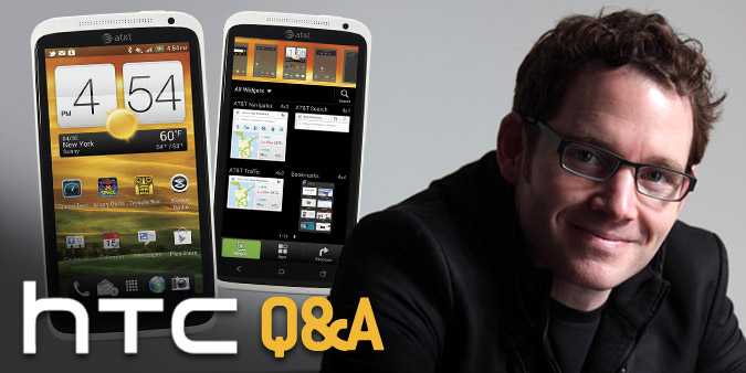
If there’s one thing HTC can’t be accused of, it’s a lack of an attention to detail. In the latest version of Sense 4.0, HTC’s software for Android Ice Cream Sandwich phones, the iconic weather clock went from having three flippers for the time to two. And HTC toned down the glossy graphics in favor of matte visuals, taking cues from the latest BMWs and Mercedes. According to Drew Bamford, HTC’s AVP of user experience, these are just two of the dozens of changes his team made to streamline Sense, which he admits had become “overwrought.”
But now that Android has matured both visually and otherwise, do overlays like Sense 4.0 still make sense on flagship devices like the HTC One S and One X? In our in-depth interview, Bamford outlines why he believes Sense 4.0 is better than stock ICS. But he also shares where there’s room for improvement as HTC attempts to stand out against surging juggernauts such as Samsung.
LAPTOP: What were you trying to accomplish with Sense 4.0?
Drew Bamford: What we were trying to do with Sense was thoughtfully reduce it to what we feel is its essence. It had become a little bit overwrought – a little heavy. And that was a lot of the feedback we got from the market and reviewers like yourself. So we started by saying, ‘What can we take out of Sense but still maintain its essential character?’
L: So how did you dial things down?
B: We took inspiration from matte finishes that have become very popular in high-end automobiles. We also took a warmer approach to the color palette to make it feel more inviting and friendly. And on the graphics side, we simplified all of our icons, basically single color, so you spend less time looking at what some people call the Chrome of the application and more time looking at your content.
L: What was really important for you to keep intact?
Stay in the know with Laptop Mag
Get our in-depth reviews, helpful tips, great deals, and the biggest news stories delivered to your inbox.
B: We have things like our customizable lock screen (pictured below) that allow you to reach for the content you want immediately on the lock screen and get instant access to your favorite applications. And even further you can choose different scenes for the whole HTC Sense experience to get a completely different visual look. So we feel we have the most customizable, most personal designs for an experience on a mobile phone.
B: We continued to refine our design to make it easier to learn and easier to use on a daily basis. We do things like label all of our controls, which most of the other manufacturers are not doing but we feel it’s very important for novice users, first-time users, people coming from feature phones to feel comfortable with the experience. Because we found through a lot of usability testing that people don’t like to press on buttons that they can’t identify. It makes them nervous. It makes them apprehensive.
L: But you also got rid of some animations and effects, like the 3D carousel for the home screens.
B: Exactly. We felt that in the end that was counterproductive. It was a bit disorienting.
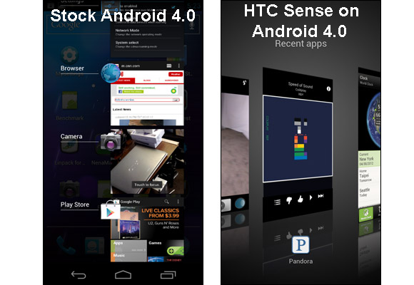
L: There’s been mixed reaction to the way Sense 4.0 handles multitasking (pictured above). Your 3D presentation looks better but it also requires a bit more effort to use.
B: There have been a lot of reviews on this particular feature, and I think that the functional differences are a little bit overstated. We have a 3D interaction model that helps people to understand what’s going on when they switch apps. They’re navigating these apps in a three-dimensional space, and when you zoom out of one app, you zoom into another app. We also think functionally it’s nice to have the bigger thumbnails; it’s easier to recognize the apps.
In practice, in ICS you get maybe four items in the list and in Sense, you get one big item and the edges of two other items, so effectively you have three items. So you get one more item with ICS, and with ours you get the more immersive, bigger thumbnails. So I think actually functionally they’re relatively similar.
There are some subtleties to our design that I think make an improvement over the ICS design. For example, when you press that recent apps button, the current app zooms out and then moves over to the right so that the one that’s in the center was the previous app. And then probably 80 percent of the cases, at least, you’re switching to the most recent app, the previous app, and in that case you just press right in the center and there you are. So it actually optimizes for that most common case of going to the most recent application.
L: How long did you really have to play with Ice Cream Sandwich before rolling out Sense 4.0?
B: There was not a lot of time between when we saw Ice Cream Sandwich and when we released our Sense 4. In fact, we were designing things like our recent apps UI well in advance of when Ice Cream Sandwich came out. So really this represents our spacing on the best way to do it; it’s not an intentional rebuttal of the Ice Cream Sandwich design. It’s just a different approach that we eventually came up with.
L: How else do you think that HTC improves on the stock Ice Cream Sandwich experience?
B: I think one of them that I already mentioned is in the area of personalization. I think between our widget sets, our customizable lock screen and our skins, we offer a much more personal experience overall.
A couple that you’ve probably heard a lot about because they’re our kind of key feature on the HTC One are the camera and authentic sound. I think in both of those areas we use design and technology to really offer a vastly improved experience over not just Ice Cream Sandwich but over any mobile phone.
The quick startup on our camera, the 4 frames-per-second continuous shooting, the ability to catch your photos during video capture. Those are all things that add up to an incredibly improved experience in capturing that moment, so you never miss the moment that you’re trying to capture. So that’s really our goal there.
L: Why do you continue to offer your own mail client, web browser and dialer?
B: We think we have the industry-leading mail client, especially on Android. Not only because we have this great new thread view on Sense 4, but actually for several releases we’ve had the best Exchange support.
Also, our browser for Sense 4 has some cool features like the ability to add items to a list to read later.
L: Are there areas where you think Google did a good job with Ice Cream Sandwich that you didn’t need to tweak?
B: I think there are core features to Ice Cream Sandwich that are great and that we’ve integrated more or less as they are with some minor modifications. I think a great example that people really like are the new folders on the home screen. So ICS released its kind of drag-and-drop folder creation model, and we more or less adopted it with a slightly different visual representation on the folder. But we have also made some further improvements on the folder design. So in our version, in Sense 4, you can not only create a folder by dragging and dropping icons on top of each other, but you can quickly add a whole bunch of items by pressing that plus button in the upper right corner of the folder window.
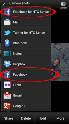
L: While Sense makes it easy to set up social accounts I noticed that there’s Twitter and Facebook for HTC Sense and regular Twitter and Facebook (pictured above). Won’t that confuse users?
B: So you will still see, unfortunately, in Sense 4, this is something we’ve been working on fixing for a couple of releases. In Sense 4 you will still see two different sharing methods, when you try to share an image for example, you can choose Facebook or you can choose Facebook for HTC’s Sense. And the reason for that is that Facebook has its own sharing intent for generic Android devices. We have our own custom Facebook sharing method that actually has more functionality than the Facebook version, which is why we added it. But getting the out-of-box experience, the Setup Wizard, there should only be one Facebook account now, because we worked closely with Facebook to unify our logins and account management on the device.
What we’d like to do is work with Twitter to have one Twitter account, but it’s – we just haven’t gotten that to work yet.
L: There’s also been some complaints about the arrow keys on the bottom of your keyboard. They take up a fair amount of space.
B: Yeah, there was a lot of internal debate on that one. And what it came down to was some people felt that it’s difficult to place the cursor using your finger if you’re trying to place it near the edge of the display. So what we felt was, on a screen this large, it’s OK to have those arrow keys at the bottom, because there’s so much space as it is. Now in hindsight, it’s clear that there are certain users who want to get rid of those arrow keys. What we’re working on for the next release is to make it an option to turn them off.
L: What would you say to critics that say you haven’t toned down Sense enough?
B: Fundamentally, I would say what HTC is trying to do is to create a unique, branded HTC experience on a phone, because our goal is that you walk into a store, whether it’s a carrier store or an independent retailer, and you say ‘I want an HTC.’ You don’t say, ‘I want an Android phone, which one should I get?’ We’re trying to create that continuity of experience and that bridge of an identifiable HTC experience across our products, whether it’s a phone or some other product. If we just adopt ICS as it is, we can’t get that advantage, and it just doesn’t work for us as a business to do that.

