Laptop Mag Verdict
The Surface Duo 2 proves that Microsoft can make a decent foldable after its failed predecessor, but there’s still room for improvement.
Pros
- +
Fun app juggling
- +
Triple-lens camera setup
- +
New Glance Bar
- +
Ultra-thin, portable form factor
Cons
- -
Pricey
- -
Buggy camera app
Why you can trust Laptop Mag
Price: $1,599
CPU: Qualcomm Snapdragon 888
RAM: 8GB
Storage: 256GB
Display: 5.8-inch dual-screen, AMOLED
Battery: 7 hours and 38 minutes
Size: 5.7 x 7.2 x 0.2 inches
Weight: 10 ounces
The Surface Duo 2 is Microsoft’s chance for redemption. The first-generation Surface Duo was quite the disaster — it was insufferably buggy, comically fragile and ridiculously expensive ($1,500). However, I was willing to overlook its eye-watering price tag because I was well aware of the great, innovative lengths Microsoft took to make its first foldable phone.
I praised the Redmond-based tech giant for the Surface Duo’s ultra-thin device (it’s no wider than a USB-C connector!). I applauded the engineers for the cleverly placed internals that powered two independent displays. And I marveled at the custom-made hinge that is fluid and effortless to open, but maintains enough friction and stability for stopping at any desired posture (e.g. book mode). The Surface Duo’s hardware is commendable, but the wonky software is gnarly. As such, I couldn’t recommend Microsoft’s foldable.
- Phones with the longest battery life in 2021
- Samsung Galaxy Z Fold 3 review
Now that the Surface Duo 2 is here, Microsoft is boasting about its new triple-lens camera, brighter displays and new 5G support, but I want to know two things — can I actually use it without experiencing device rage this time? And is it more solid than its fragile predecessor, which malfunctions after merely breathing on it?
Without further ado, let’s see if the Surface Duo 2 can atone for the original Duo’s mistakes.
Microsoft Surface Duo 2 price and configuration options
Microsoft increased the starting price of the second-generation Surface Duo by $100 to $1,499, but there’s more RAM, bigger displays and better cameras. It’s equipped with a Qualcomm Snapdragon 888 processor, 8GB of RAM, 128GB of storage and dual 5.8-inch, 1344 x 1892-pixel displays.
Our review unit costs $1,599, which bumps up the storage to 256GB. There’s also a new, maxed-out 512GB variant that will set you back $1,799.
The Surface Duo comes in two colors: Obsidian and Glacier.
Microsoft Surface Duo 2 design
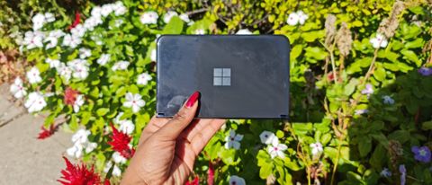
If you’re attending a black-tie event, leave your clutch at home and take the Surface Duo 2 instead — guests would be none the wiser. Like the original Surface Duo, the Surface Duo 2 looks like a petite purse. The Surface Duo 2 doesn’t look too different from its predecessor — it has the same clean-cut, minimalist design that mimics the Surface family aesthetic.
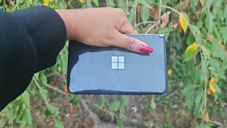
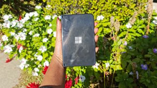
You’ll still find Microsoft’s lustrous logo glimmering under the light on the Duo 2’s front cover, and the foldable continues to open up — like a book — to reveal two displays attached with two sturdy hinges. If you tore down the second-gen Surface Duo, you’d find that these two hinges do more than just conjoin two screens and facilitate mode transformations. They also help route ultra-slim wires (I’m talkin’ hairlike thinness!) that carry power, data and control signals between both sides.
The dual screens are also slightly larger on the Surface Duo 2: the predecessor has 5.6-inch displays while the successor has 5.8-inch panels. On the side of the right display, you’ll find a volume rocker and a power button.
One stark difference I should point out is the new Glance Bar Microsoft added to the Surface Duo 2. And let me tell you — the Surface Duo needed this because there was no quick-and-efficient way to check notifications. As such, the new spine keeps you “in the know” with color indicators, icons and more. For calls, a dancing blue line appears. A stationary blue line shows up for texts. After pressing the power button, the Glance Bar shows you the time as well as how many texts and calls you’ve received.
Another new addition worth noting is the triple-lens rear camera module placed on the upper-left corner of the back cover (more on the cameras later).
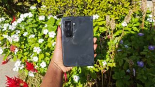
I wish the glossy Surface Duo 2 body came in different colors besides black and stone-white, but you can always slap on a cover to add some personality and — for goodness sakes — life to its mundane, business-esque design.
The shockingly thin Surface Duo 2 has dimensions of 5.7 x 7.2 x 0.2 inches (when opened) and weighs 10 ounces. The original Duo is slimmer (5.7 x 7.4 x 0.18 inches), but weighs the same. The Surface Duo 2’s rival, the Galaxy Z Fold 3, is slightly thicker (6.2 x 5 x 0.25, 9.55 ounces), but lighter.
Microsoft Surface Duo 2 ports
The Surface Duo 2 sports a lone USB Type-C port — that’s it. After all, Microsoft is determined to keep the phablet thin, so that’s all the Redmond-based tech giant is willing to offer in terms of ports.
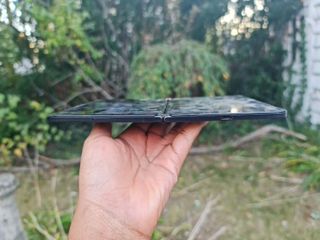
If you’re concerned about the missing headset jack, don’t worry. You can snag wireless earbuds (e.g. Surface Earbuds) or get USB-C headphones.
Microsoft Surface Duo 2 modes
I love a device that can stand on its own two feet, and the Surface Duo 2 is one of them. As with the Surface Duo, I loved propping it on my nightstand in book mode to watch Netflix’s You before drifting off to sleep.

Book mode is also useful for jugging several apps at once. You can launch a YouTube video on the left panel while scrolling through a Microsoft Word document on the right. You can look up lyrics on the right screen while launching Spotify on the left. The app combos are endless; the double-app experience has always been the Duo’s best selling point.
Tablet mode maximizes your screen real estate. This is ideal for reading long-form news articles. You can take advantage of this feature by “spanning” apps across both screens. Just drag-and-drop the app to the divider. It’s worth noting that the divider does get in the way, but it’s like the iPhone 13 notch — it's a nuisance, but you may get used to it. I tested tablet mode on LaptopMag.com, and the Duo 2 captured more reading territory as I read an exhaustive review of the iPhone 13 Pro Max (I didn’t need to scroll too often).
I also experimented with compose mode, which is best for texting and typing on the Duo 2. Like its predecessor, texting on this device isn’t the most comfortable, especially if you have small hands like I do. My fingers often needed to stretch beyond the point of comfort to hit characters in the middle of the keyboard. However, its haptic feedback is still satisfying, letting you know all the digital keys you’ve pressed have been registered.
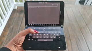
Other modes include tent mode and peek mode. I don’t use the former much, but it’s useful for transforming your Duo 2 into a hands-free entertainment center for watching videos. The latter lets you open your device ever so slightly — marginally ajar, if you will — to see who’s calling. If you don’t like the caller, or you don’t have the time to speak at the moment, you can slam the Duo 2 shut without picking up the call.
Microsoft Surface Duo 2 display
Now, let’s talk about the stars of the show: the Duo 2’s twin, 5.8-inch, 1344 x 1892-pixel AMOLED screens. They can expand into an 8.1-inch, 2688 x 1892-pixel tablet.
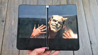
The bezels on the Duo 2’s displays are just as thick as the frames on the original Duo, so you’ll get that letterboxing look, which you may or may not like. While I’d prefer slim bezels, I suspect some engineering limitations thwart the Duo 2 from reaching edge-to-edge screen nirvana.
I watched The Black Phone trailer on YouTube with the app spanning across the dual displays. They’re decent, satisfactory displays, but they won’t win any awards. Making me want to cleanse my eyes with bleach, I was able to spot Ethan Hawke’s gross, yellowing teeth as he played the role of a creepy child abductor. The displays accurately captured the porous, decaying, rusty walls of an abducted child’s prison, adding to the trailer’s spine-tingling vibes. The screens could be more vivid; the yellow raincoat of a young actress should’ve been richer and brighter.

It’s also worth noting that the play and pause buttons are annoyingly positioned where the divider is, but fortunately, I could use them despite the interruptive gap.
The Duo 2’s dual displays actually fared worse than the original Duo’s, according to our colorimeter. The screens covered 88% of the DCI-P3 color gamut, which falls short of the category average (93%), while its predecessor covered a whopping 141%. Fortunately for the Duo 2, the Galaxy Z Fold 3 exists. It covers only 77% of the DCI-P3 color gamut, saving the Duo 2 from falling into third and last place.
The original Surface Duo’s color accuracy is the best with a Delta-E score of 0.16 (closer to 0 is better). The Surface Duo 2 and Galaxy Z Fold 3 have similar Delta-E scores at 0.25 and 0.24, respectively.
Now, let’s talk about brightness. Microsoft claims that the Surface Duo 2 offers 800 nits of brightness, but according to our testing, it climbed to only 672 nits. Still, this is much better than the average smartphone (595 nits) and the original Duo (458 nits). However, the Galaxy Z Fold 3 is the most brilliant at 740 nits.
Microsoft Surface Duo 2 performance
The Surface Duo 2 is packed with a Qualcomm Snapdragon 888 processor and 8GB of RAM. With more than enough power underneath its hood, the Surface Duo 2 ate my multitasking challenge like a snarling beast chomping on flesh. Even as I swarmed the left panel with 12 Google Chrome tabs, and the right panel with 17 Microsoft Edge tabs, the Surface Duo 2 juggled them like a champ — just like this dual-display device is designed to do.

The Surface Duo served up great performance scores on our synthetic tests. On Geekbench 5, which tests overall performance, the Surface Duo 2 achieved a score of 3,384, beating the average smartphone (3,178). The Galaxy Z Fold 3 has the same processor, but bested the Duo 2 (3,418). The Surface Duo 2, sporting a Qualcomm Snapdragon 855, couldn’t measure up to the modern foldables (2.862).
On the Jetstream benchmark, which tests how quickly Web pages load, the Surface Duo 2 achieved a score of 93, much better than the Surface Duo’s measly score of 69. However, the Galaxy Z Fold 3 is faster (99).
Microsoft Surface Duo 2 battery life
The Surface Duo 2 comes with two 4449mAh batteries (one for each display). Microsoft claims that the phablet can last 15 hours and 30 minutes (video playback), but our test is more representative of real-world usage, so as expected, the runtime is much shorter.
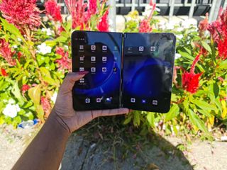
The second-gen Duo lasted 7 hours and 38 seconds. This is shorter than the average smartphone (9:27), but slightly longer than the original Surface Duo (7:19). The Surface Duo 2 also beat the Galaxy Z Fold 3, which lasted 6 hours and 36 seconds.
Microsoft Surface Duo 2 audio
I launched the Spotify app and bobbed my head to Lil Nas X’s “Industry Baby” at max volume. It sounded spectacular.
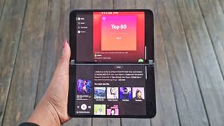
The bombastic, majestic song blasted from the Duo 2’s speaker — located on the bottom of the right hemisphere — and took over my medium-sized testing room with a loud-and-proud presence. Even with high amplification, the song remained crisp and clear without any distortion.
Microsoft Surface Duo 2 camera
Now let’s talk about the Surface Duo 2’s best upgrade: the triple-lens, rear-facing camera. The predecessor only came with one 11-megapixel, front-facing camera, located on the right panel’s top bezel.

The camera was good, but didn’t have industry-leading specs. And many people spending nearly $2,000 on a phone want to have a sweet set of cameras. Microsoft stepped the Duo 2’s camera game up a notch, bumping the front-facing camera to a 12MP, f/2.0, 1.0µm lens. On top of that, the Duo 2 now has wide, ultra-wide and telephoto lenses, making it more attractive than some other flagships.
Wide
The 12MP, 1.4µm, f/1.7 wide camera has the best aperture of the three lenses (the lower the number the better), meaning it lets in more light than the other two. If you want to capture clear, crisp and colorful photos, the wide lens is your best bet.
I snapped a few photos of a Long Island residential neighborhood with the wide camera, and I was pleasantly surprised at how well the lens captured different textures and colors — everything looked detailed.

For example, I took a photo of a kids’ playground and the trees populating the background appeared sharp with their crisp leaves standing out in the photo. You can also spot a small tree — far in the distance — that is beginning to lose its verdant color as autumn takes over.
You can accurately make out the material of the playset’s staircase, which is made of cheap plastic. The gritty, gravelly pavement beneath the jungle gym caught my eye, too.
A wide-lens photo of a church showcased the many different shades of orange and red bricks that added to its visual appeal. You could also make out the many shades of green from the freshly manicured lawn.

A photo of six Canada geese showed the waterfowls relaxing underneath the warm sun in Valley Stream State Park.

You can get a detailed look at the ripples wrinkling the pond and mirroring the majestic trees in the distance. If you look closely, you can find some goose feathers sprinkled across the ground.
Ultra-wide
The 16MP, 1.0µm ultra-wide camera, packed with an f/2.2 aperture lens with a 110-degree field of view, is best for moments when you want to capture as much scenery as possible without needing to move backward.
For comparison purposes, here’s the same photo of the kids’ playground, but I used the ultra-wide camera instead.

You can see that the photo grabs far more scenic detail, capturing a nearby bench and miniature tree that wasn’t featured in the wide-lens photo. The ultra-wide lens is ideal for sweeping landscape shots, but it’s not as crisp and detailed as its wide-lens counterpart.
Here we have the same church showcased in the last section, but you can actually see its towering, cross-topped spire (which was cut off in the wide-lens photo).

The ultra-wide lens also captures the gorgeous backdrop of the cloudless blue sky, a stunning feature the wide lens couldn’t memorialize. Again, the details aren’t as sharp in this photo — the different brick shades aren’t as striking in the ultra-wide picture — but it does a satisfactory job of rendering a sweeping, all-encompassing image while capturing accurate information on color and texture.
With the wide lens, I could only take a snapshot of six geese. Thanks to the ultra-wide lens, I captured two more without needing to move a muscle.

The photo also captured additional waterfowl splashing about in the pond in the distance. However, you wouldn’t know they were geese. The more you zoom into far-away objects, the blurrier they get; they look like white balls floating in the water. The ultra-wide lens was also able to capture the verdant trees in the background that show hints of orangey-brown hues as the leaves prepare for their inevitable fate.
Telephoto
The 12MP, f/2.4 aperture, 1.0µm telephoto lens is best for zooming in on subjects and cutting out distracting, superfluous surroundings.
With the telephoto lens, which offers 2x optical zoom, I was able to make out the sign placed on the kids’ playset, which was illegible on the wide and ultra-wide photos.

The colors are still striking, capturing the cerulean blue, tunnel-like slide and the faux, electric-green trees that topped the jungle gym.
Captured with the telephoto lens, you could see more of the intricate details that wrap around the church’s colonial columns. Like the playset, I could now make out a bulletin board placed on the left side of the building, revealing the church’s name (Grace United Methodist Church) as well as its service times.

The telephoto photo of the Valley Stream geese is the most beautiful of the three, zooming in on just two waterfowl having a blast on the grass.

One goose stood up on one leg like a flamingo while the other was seemingly footless, resting its whole body on the grass. You can also get a closer look at their bodies, from their mocha-and-white features to their long, onyx necks.
Selfie camera
The 12MP selfie camera (f/2.0, 1.0µm) worked well, capturing the subtle blush I placed on my chubby cheeks and the wayward hair strands in my eyebrows. I like that it’s not too detailed in that it doesn’t capture every pore and skin cell (ahem, iPhone 13), but it also picks up on wisps of hair blowing in the wind and other nitty-gritty elements.

Some downsides are that the software isn’t alluring. For example, the iPhone 13 features cool effects that appear in the viewfinder before you take snapshots, including bokeh, photographic styles and other filters to add some stylistic flair to your photos. The Surface Duo 2 doesn’t have that. However, you can edit the photos after you take them. You can crop them, add filters, and adjust the brightness, exposure, contrast, highlights and shadows.
As for video, the Surface Duo 2 features 1080p and 4K video recording at up to 60 frames per second. There’s also slow-motion video at up to 240fps. After testing out a few recordings at 1080p, I found the video to be OK — nothing to write home about. I captured a goose flapping its wings around in the water, and while the details were crisp, the video could stand to be more vivid and colorful.
Microsoft Surface Duo 2 interface
The Surface Duo 2’s UI is a lot more responsive than the original Duo, which was inconsistent with its responsiveness and fluidity. For example, there are icons located on the bottom taskbar, which you can swipe over from the left screen to the right (and vice versa). I remembered struggling with executing this action; the original Duo was unresponsive to my swipes for some inexplicable reason.
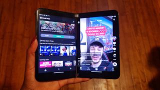
Fortunately, this time around, I can swipe the icons back and forth — from the left screen to the right and vice versa — without a hitch.
The most alluring selling point of the Surface Duo 2, juggling two apps at the same time, continues to be a breeze. I experimented with tons of app combinations — TikTok and Google Chrome, Microsoft Edge and OneNote, and YouTube and Microsoft Word, and more — and could use them all simultaneously without any issues.
I also love how I can still create App Groups for pairing two apps together into one folder. Clicking on it launches both apps together, at the same time. For example, I’ve paired TikTok and Gmail together, so I could get some laughs from my favorite social media creators while sifting through work emails. My only gripe with App Groups is that you can’t edit them. If I no longer want Gmail paired with TikTok, and I want to swap it for Twitter, there’s no efficient way to do that. There is an edit feature, but it only allows you to change which display the apps launch on.
Spanning continues to work like a charm, allowing me to drag-and-drop apps into the divide and maximize their screen real estate.
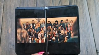
However, there is one issue that continues to persist, and that’s not being able to comfortably take notes while another app is running. For example, with compose mode (the best position for typing and texting), I ran YouTube on the top screen and OneNote on the bottom. Unfortunately, after tapping the keyboard in OneNote, the app takes up the whole screen (top and bottom), making the YouTube app disappear. So you still cannot take notes while another app is stationed on the screen (while in compose mode). You can try to take notes in book mode, but it's awkward.
I also detected some unresponsiveness while using the camera app. For example, when the scream timed out (while the camera app was open), the Duo 2’s icons would disappear after waking the device, making it impossible to interact with the device. Fortunately, I fixed this by restarting the device.
Microsoft Surface Duo 2 software and warranty
The Surface Duo 2 runs Android 11. At setup, I was prompted to input my Microsoft account credentials, so it was nice to see some synced apps appear on the homepage, including Sticky Notes.
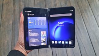
You’ll see a melange of both Microsoft and Google apps. From the Redmond-based tech giant, you’ll see Office, OneDrive, Xbox GamePass, Microsoft Teams, OneNote, Edge, Bing, LinkedIn and Edge. From the search-engine giant are pre-installed apps such as Gmail, Chrome, Maps and Gmail.
I loved the Tips app on the original Duo and I still enjoy it now. It features animations and GIFs on how to navigate the Surface Duo 2 with ease, and I learned some new tips and tricks by exploring the app.
The Surface Duo comes with a one-year limited warranty. See how Microsoft did on our Best and Worst Brands and Tech Support Showdown special reports.
Microsoft Surface Duo 2 bottom line
Alright, I’ll give Microsoft some credit. The Surface Duo 2 is certainly much better than its predecessor, offering a triple-lens, rear-facing camera, a smoother UI experience and a cool new Glance Bar. However, there are still some bothersome aspects that Microsoft should fix, including how difficult it is to take notes while simultaneously using another app. I’m also not convinced about the camera app; it doesn’t seem stable, especially when the screen times out.
I always like to reflect on which consumers would benefit from the products I review, and in this case, the Surface Duo 2 is suitable for on-the-go, Microsoft 365 users who are tired of not being able to view two apps at the same time on their devices. For those who often need to cross-reference between two documents on different apps, the Surface Duo 2 is a dream come true and an excellent solution for those who despise the limitations of non-foldable phones.
While the Surface Duo 2 is decent, I can’t help but feel as if I must sleep with one eye open. Things are mostly fine for now, but I need more time with the Surface Duo 2 to determine whether it has longevity. If you’re interested in a foldable, check out the Galaxy Z Fold 3, which has better performance, improved durability and a brighter display.
Kimberly Gedeon, holding a Master's degree in International Journalism, launched her career as a journalist for MadameNoire's business beat in 2013. She loved translating stuffy stories about the economy, personal finance and investing into digestible, easy-to-understand, entertaining stories for young women of color. During her time on the business beat, she discovered her passion for tech as she dove into articles about tech entrepreneurship, the Consumer Electronics Show (CES) and the latest tablets. After eight years of freelancing, dabbling in a myriad of beats, she's finally found a home at Laptop Mag that accepts her as the crypto-addicted, virtual reality-loving, investing-focused, tech-fascinated nerd she is. Woot!
