New Windows 10 Start Menu unveiled — here are the biggest changes
The redesign comes alongside a handful of new features

Microsoft revealed major changes coming to the Windows 10 Start Menu along with a new multitasking feature that will make it easier to switch between web browser tabs.
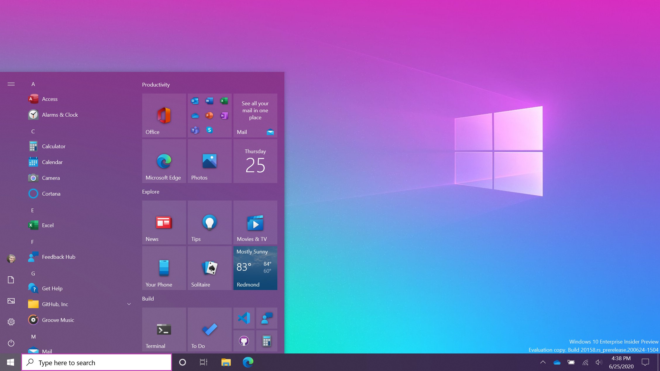
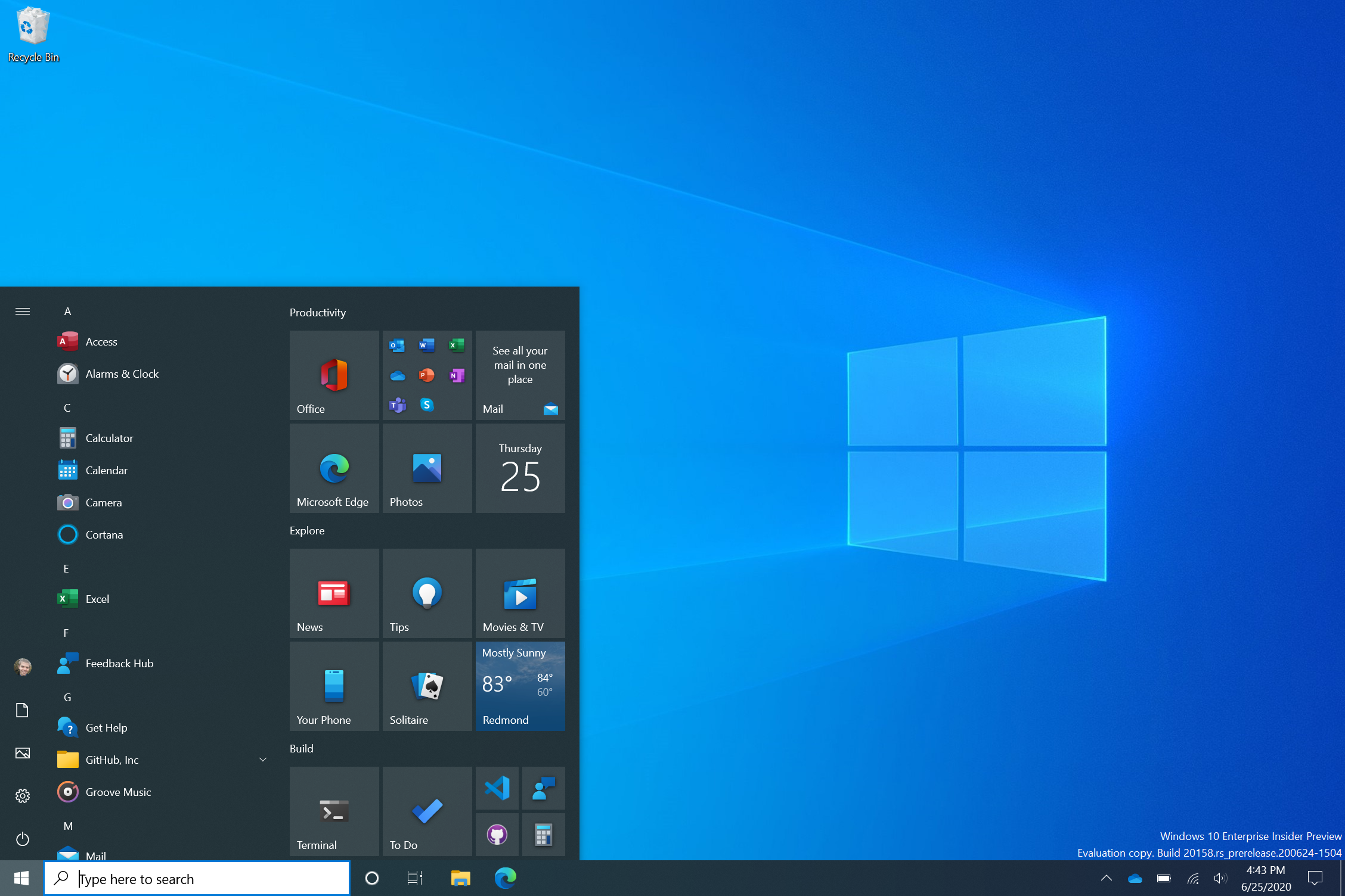
We got our first look at the redesigned Start Menu in March in a brief video highlighting the changes. Since then, Microsoft has teasingly sprinkled the new design throughout its press materials and on social media. The redesign will seem subtle at first glance but a handful of UI tweaks are poised to give Windows 10 a more cohesive look.
- How to Use Windows 10
- Best laptops 2020
- Windows 10 Start Menu redesign looks beautiful: What to expect
“We are freshening up the Start menu with a more streamlined design that removes the solid color backplates behind the logos in the apps list and applies a uniform, partially transparent background to the tiles,” Microsoft wrote in a blog post.
Windows 10 Start Menu redesign
Live Tiles will be stripped of their background color and use either a transparent light or dark "backplate" depending on which theme is enabled.

It's a simple change but one that will emphasize the Fluent Design language seen throughout the OS. The change should also make scanning for apps easier as icons should stand out more than before.

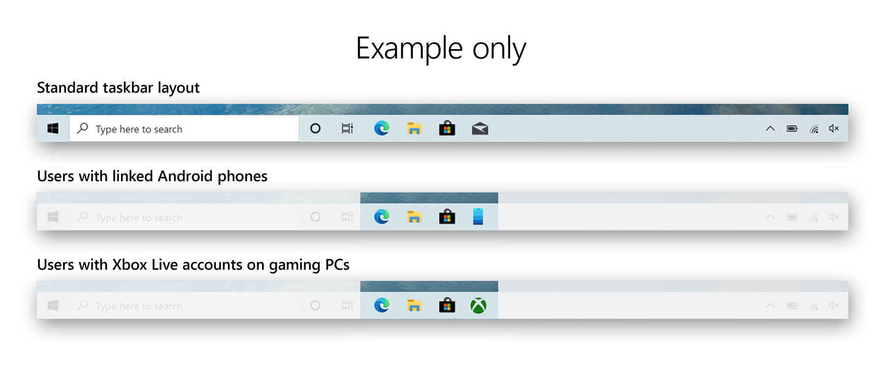
The taskbar is also getting revamped to make it more personalized. Xbox users will now see an Xbox app pinned to the taskbar while the Your Phone app will be pinned for Android users. Taskbar layouts won't change for existing Windows 10 users, only those who created a new account or are logging in for the first time.
Windows 10 new features
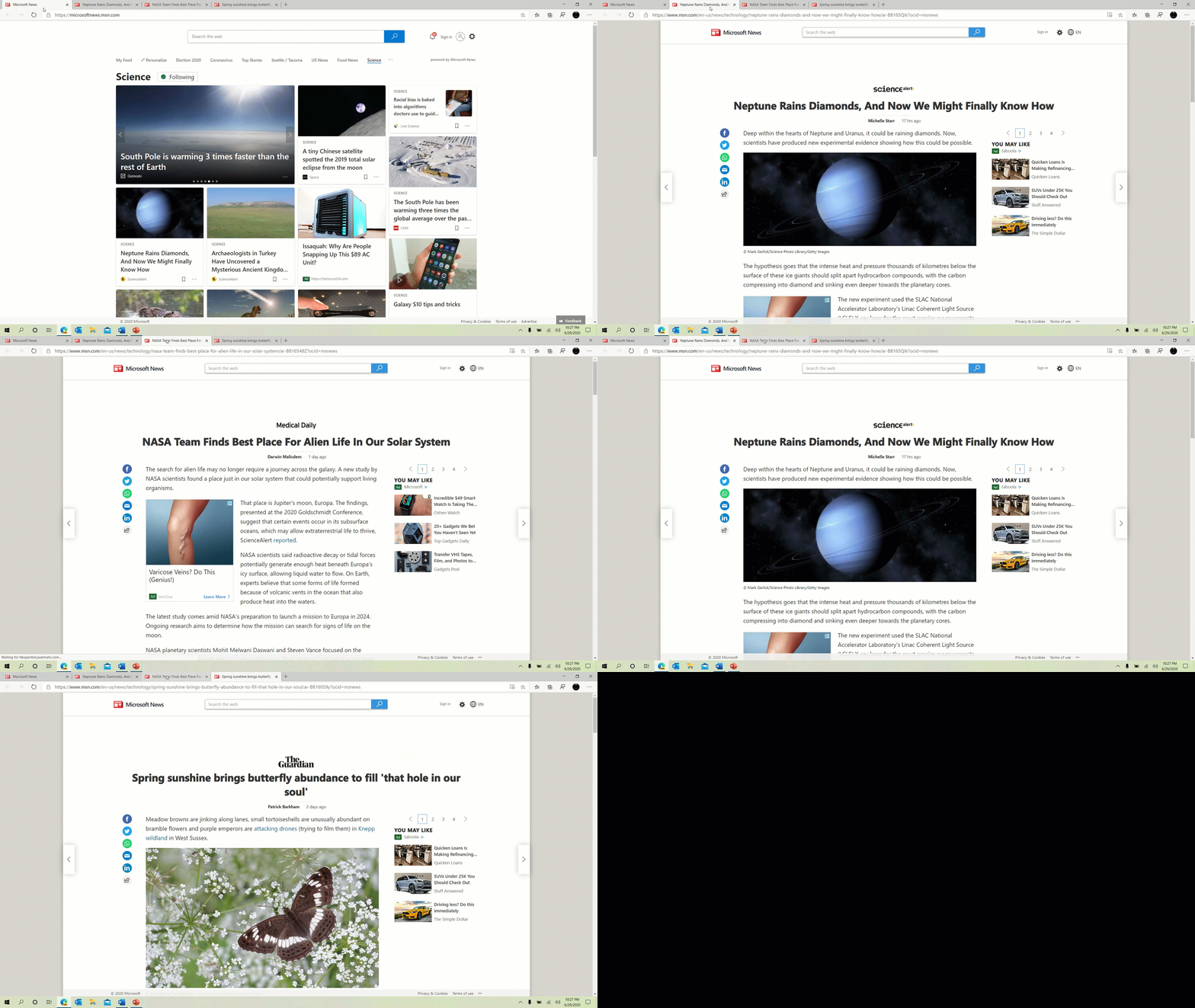
Multitaskers who navigate Windows 10 using hotkeys and shortcuts will appreciate a new ALT + Tab function. In the new build, pressing ALT + Tab will open all tabs in Microsoft Edge, not just the active one in each browser window. This means you can flip between tabs from multiple browser windows and even other programs, like Microsoft Word or PowerPoint, as long as they are open in the background.
Stay in the know with Laptop Mag
Get our in-depth reviews, helpful tips, great deals, and the biggest news stories delivered to your inbox.

If seeing every available tab is too overwhelming, you can revert back to the previous experience by adjusting your settings. You can even make Alt + Tab show only your last three or five tabs.

Notifications are also getting refined; an app logo will soon appear in the top-left corner showing where the notification came from. On the opposite corner is an "X" you can click to dismiss the pop-up.
And finally, Microsoft is working to bring over features and information from the Control Panel to the Settings page. To that end, links that would open the System page in the Control Panel will now take you to About in Settings. Here, you'll see more information than before, and those details (like device info) will be copyable.
Phillip Tracy is the assistant managing editor at Laptop Mag where he reviews laptops, phones and other gadgets while covering the latest industry news. After graduating with a journalism degree from the University of Texas at Austin, Phillip became a tech reporter at the Daily Dot. There, he wrote reviews for a range of gadgets and covered everything from social media trends to cybersecurity. Prior to that, he wrote for RCR Wireless News covering 5G and IoT. When he's not tinkering with devices, you can find Phillip playing video games, reading, traveling or watching soccer.

