Nothing phone (2) design revealed in these stunning renders — how does it compare?
Something, something, nothing pun
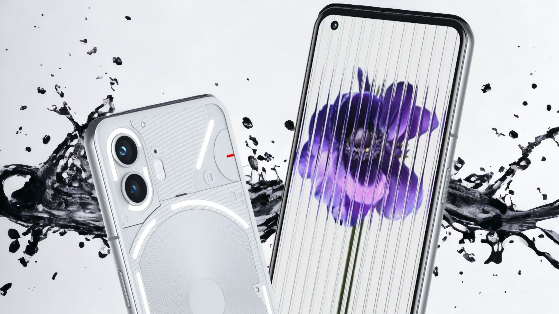
For a brand called "Nothing," there sure is a lot going on when it comes to its products. Alongside the highly-lauded Nothing ear (1) and ear (2), the Nothing phone (1) was a smash hit that the brand claims has caused the "highest percentage of users switching from an iPhone across quite a few markets." Its successor, the Nothing phone (2), looks set for a global release in July and the hype surrounding this super-stylish smartphone series is showing no signs of stagnating.
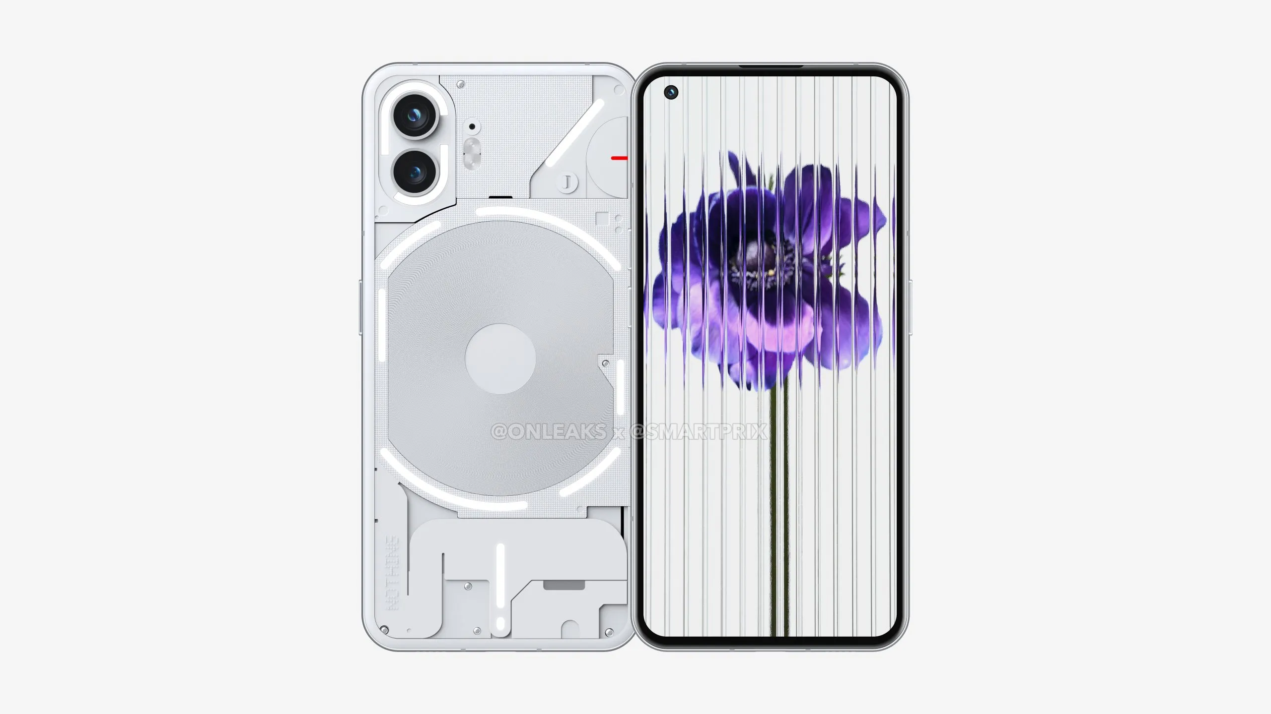
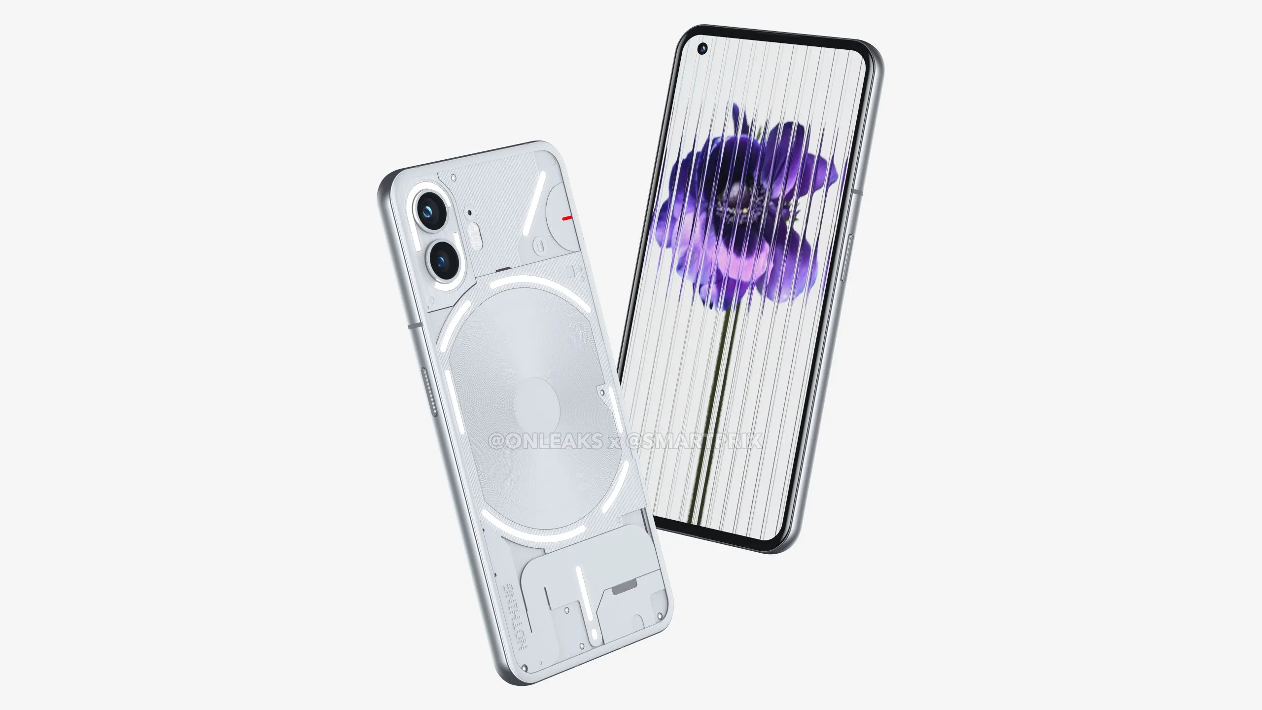
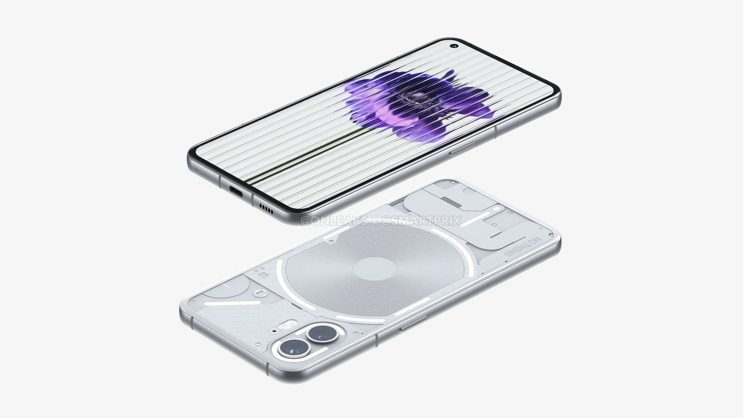
Today, we can steal our first look at the Nothing phone (2) thanks to a collaboration from @OnLeaks and @SmartPrix. Both of which have a solid history of providing accurate renders of products based on leaked information and specifications.
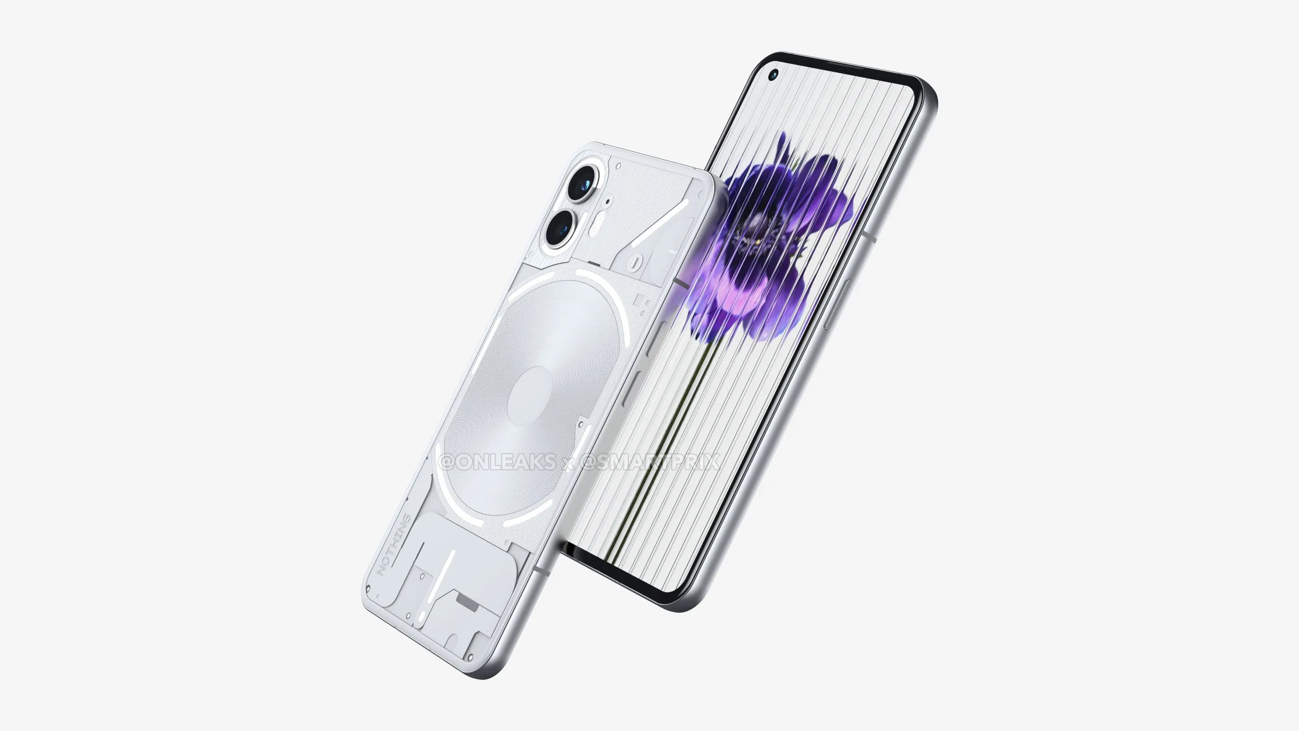
What's new with the Nothing phone (2)?
The futuristic, near-cyber-punkish design of the Nothing phone has evolved with several changes immediately apparent to the eye, and a number of smaller changes to no doubt cause those who love a device with real style to swoon.
Not every change is just for aesthetics however, as a few tweaks could lead to further functionality and greater customization. Let's get into what's new courtesy of information supplied alongside the renders:
- Updated lighting design: One of the Nothing phone (1)'s cooler features was its rear-facing light array, the phone (2) looks to expand on this design by breaking up the lighting elements to offer more variation and a fresher look with even more visual "wow."
- More curves: The Nothing phone (2)'s frame has been adjusted to accommodate some stylish sloping, with a curved front and back and a rounded frame to maximize the device's premium aesthetic appeal.
- Dual LED Flash: A notable upgrade from the Nothing phone (1) is the Nothing phone (2)'s new dual LED configuration. The new addition will be ideal for those with an eye for an image — providing a huge boost for lighting, and a fantastic feature to combat low-light conditions.
- New wireless charging lights: The single strip that encompassed the Nothing phone (1)'s wireless charging coil have been broken up into smaller strips for the nothing phone (2). Not only does this add some extra flair to the phone, but it will no doubt make for even more customization options when it comes to personalized lighting.
Outlook
The Nothing phone (1) was one of the most unique Android phones to come to the market in a good number of years. It's incredible design was a real eye-catcher and its clear aesthetic-focus has made it an attractive option for the tech-trendy.
The Nothing phone (2) continues down the same path of innovation, retaining the overall style but refining what was there and applying a futuristic facelift to the device. The results are crisp, classy, and completely in line with what you'd come to expect from the nothing brand.
Set to make its arrival world-wide in July, keep your eyes peeled to Laptop Mag for the latest on the nothing phone (2), alongside news, reviews, and features from across the tech world.
Stay in the know with Laptop Mag
Get our in-depth reviews, helpful tips, great deals, and the biggest news stories delivered to your inbox.

Rael Hornby, potentially influenced by far too many LucasArts titles at an early age, once thought he’d grow up to be a mighty pirate. However, after several interventions with close friends and family members, you’re now much more likely to see his name attached to the bylines of tech articles. While not maintaining a double life as an aspiring writer by day and indie game dev by night, you’ll find him sat in a corner somewhere muttering to himself about microtransactions or hunting down promising indie games on Twitter.
