Windows 11 gets revamped UI — see how the design changed from Windows 10
Windows 11 uses rounded corners, updated icons and more transparency
Sign up to receive The Snapshot, a free special dispatch from Laptop Mag, in your inbox.
You are now subscribed
Your newsletter sign-up was successful
Windows 11 was revealed today, beginning a new generation for the most popular desktop and laptop operating system.
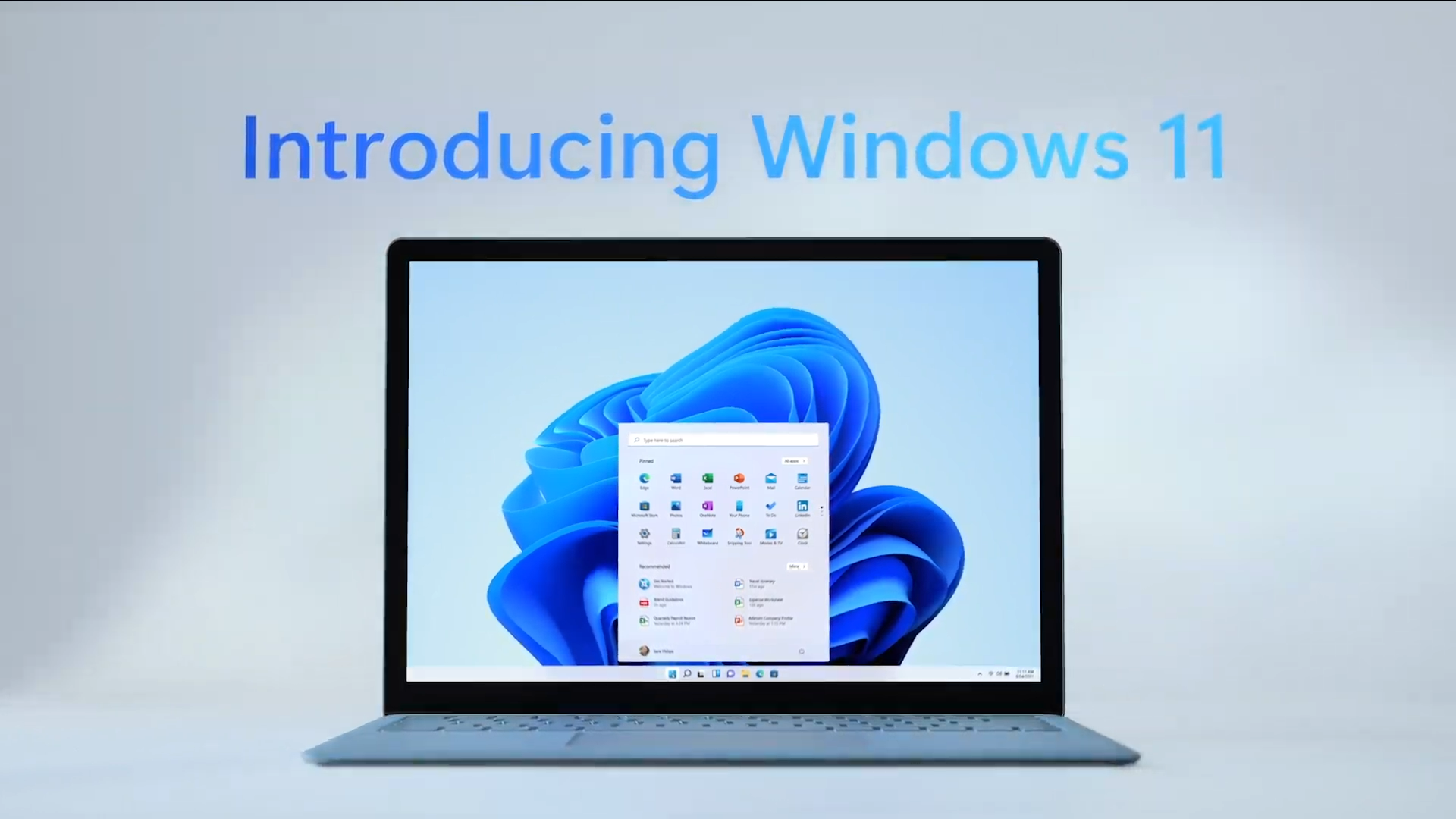
The successor to Windows 10, Windows 11 brings a refreshed UI with a new Start Menu, Taskbar, Widgets and more. There are visual similarities to Windows 10 but Windows 11 modernizes the OS with Microsoft's Fluent design language.
One of the more noticeable changes was made by swapping sharp corners for rounded ones. This gives the OS a softer, less aggressive aesthetic. The design choice may not be embraced by all users, but to us, it gives Windows 11 a welcoming appearance.
Article continues belowMicrosoft also updated the animations so side panels look like a sheet of glass sliding across the screen. Extending the transparency effect to more interfaces makes colors pop more in Windows 11, and to that end, Microsoft updated legacy icons to be more playful.
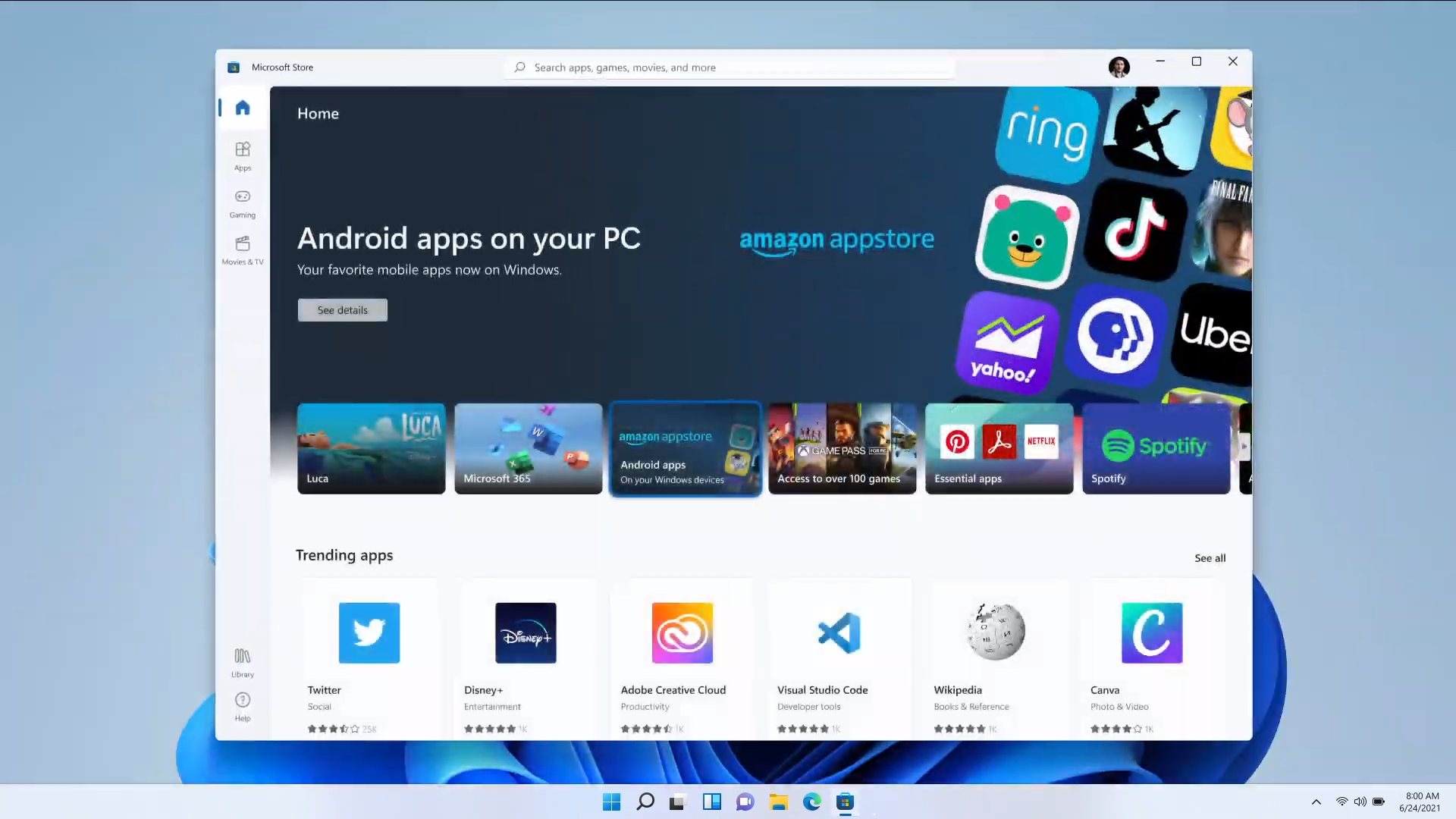
The Taskbar was revamped and is now center-aligned instead of being on the left edge. Press on the Start Menu icon and you'll notice a few changes. For one, the menu appears in the center of the screen in a floating dialogue box. It also ditches Live Tiles for a uniform transparent background with static icons in the foreground.
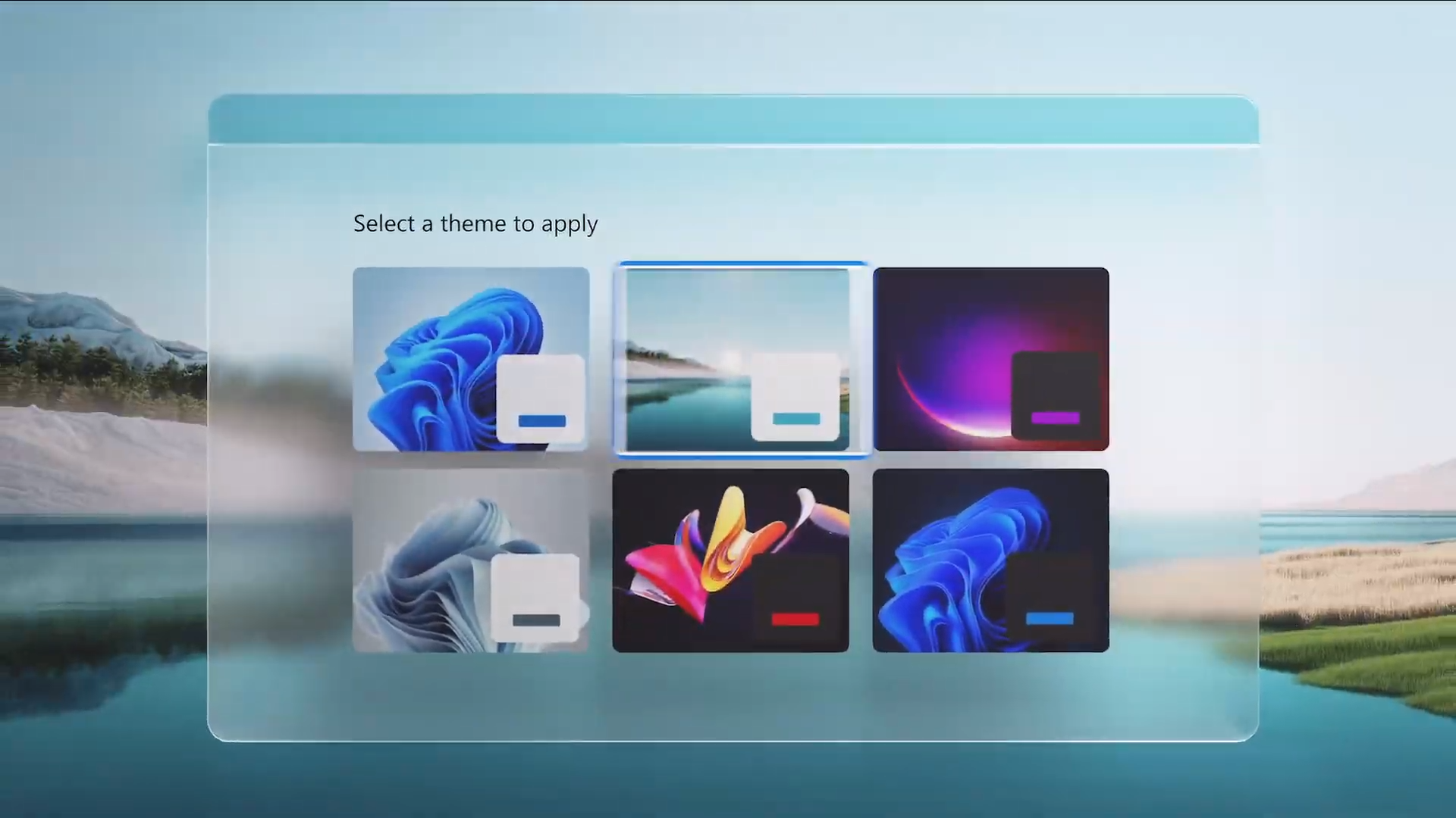
Dark Mode and Light Mode make a return on Windows 11 and look much better on the OS. You can choose from different themes and switch accent colors that follow you throughout the interfaces. A new Widgets tool on the Taskbar brings up a personalized feed showing you news, weather, and other information that is important to you.
Windows 11 also includes a new Settings UI, and it looks way better than before https://t.co/F8n1w25tP1 pic.twitter.com/YKyB6BAjPyJune 24, 2021
We know the File Explorer is receiving an overhaul thanks to a clip showing a brief glimpse of the overhauled file management app, however, the outdated Control Panel was absent from Microsoft's Windows 11 reveal. The Settings menu also looks much better than it did before having adopted Fluent Design elements including a transparent background, colorful graphics and a simple, clean interface.
Sign up to receive The Snapshot, a free special dispatch from Laptop Mag, in your inbox.
For more Windows 11 coverage, visit the links below.
Windows 11 news and updates
- Windows 11: Your guide to Microsoft's next Windows OS
- Windows 11 release date — when is Microsoft's new OS arriving?
- Windows 11 revamped the touch keyboard — it now features GIFs, voice typing and more
- Windows 11 new startup sound got leaked — and it sounds like Minecraft music
- Windows 11 Search Bar: What changed and what didn't
- Windows 11 gets revamped UI — see how the design changed from Windows 10
- Windows 11 promises longer battery life for laptops, 40% smaller updates
- Microsoft Teams to be integrated into Windows 11 — What that means
- Windows 11 makes multitasking a breeze — how it works
Phillip Tracy is the assistant managing editor at Laptop Mag where he reviews laptops, phones and other gadgets while covering the latest industry news. After graduating with a journalism degree from the University of Texas at Austin, Phillip became a tech reporter at the Daily Dot. There, he wrote reviews for a range of gadgets and covered everything from social media trends to cybersecurity. Prior to that, he wrote for RCR Wireless News covering 5G and IoT. When he's not tinkering with devices, you can find Phillip playing video games, reading, traveling or watching soccer.

