Laptop Mag Verdict
iOS 17 adds a bunch of exciting features to the iPhone including a new Standby Mode that turns it into a smart display, and interactive widgets. But is that enough for you to update?
Pros
- +
StandBy Mode gets more out of your iPhone when it’s idle
- +
Apps are more modular with interactive widgets
- +
Clever new accessibility tools
Cons
- -
Missing custom Control Center Multitasking for Plus models still lacking
- -
Updates for Apple’s in-house apps consume most of the download fileStandBy Mode needs refinements
Why you can trust Laptop Mag
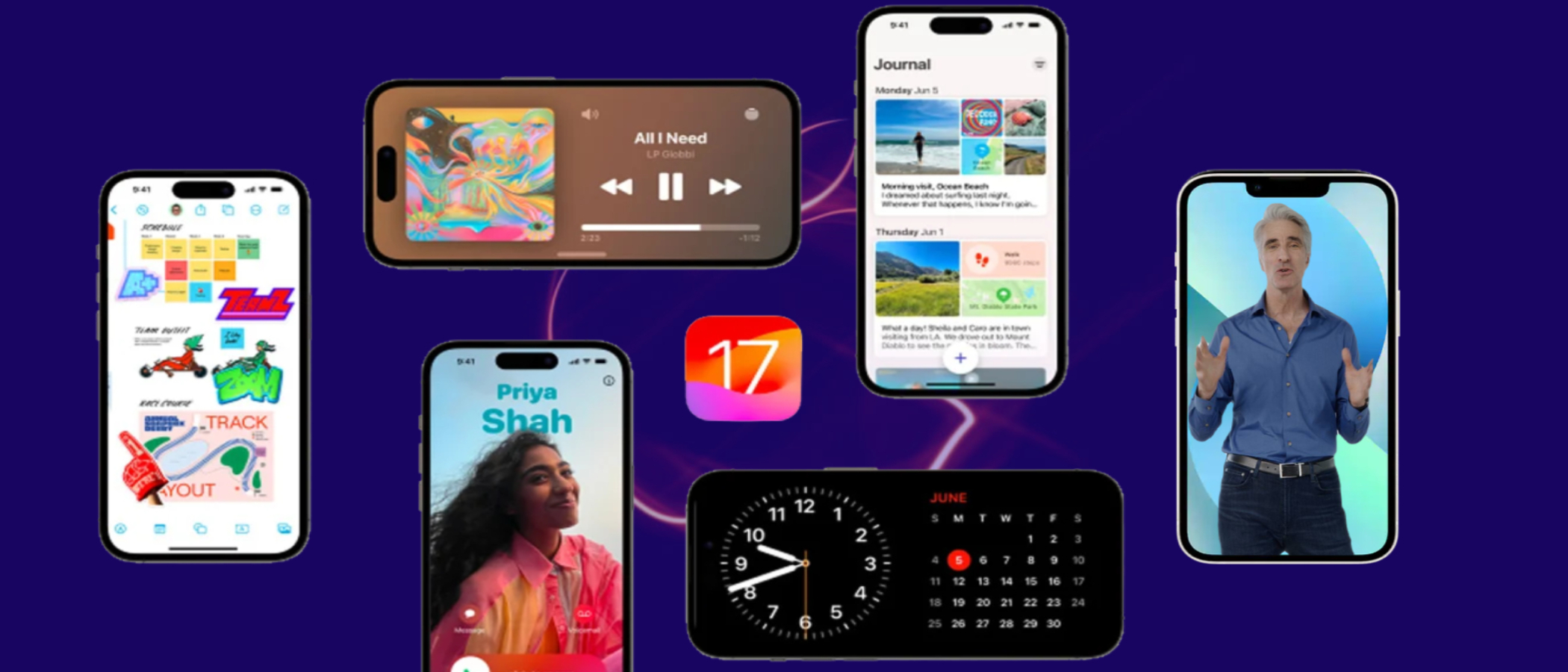
When Apple introduced iOS 17, it appeared like a functional update built to patch the rough edges its predecessor left behind. There were no particular headlining additions like last year’s lockscreen personalization or iOS 15’s notification overhaul; iOS 17 instead seemed to offer a laundry list of smaller changes that won’t matter to most people. Yet, since I’ve installed it, it has affected my day-to-day use more than the last couple of updates combined.
The new Standby Mode has rewired how I operate my iPhone when it’s not on me. App shortcuts inside Spotlight search results and interactive widgets have eliminated the need for me to open most of my installed apps. Contact Posters have made a mundane, yet essential phone task a bit more joyful. One-time codes no longer drown out your personal conversations, thanks to the Messages app’s new ability to automatically discard them. And, thank God, you can finally set multiple timers.
At the same time, none of these will feel like groundbreaking additions to your iPhone experience. So should you bother updating? After putting the iPhone’s 17th major update through its paces for months, here’s what we found.
Standby me
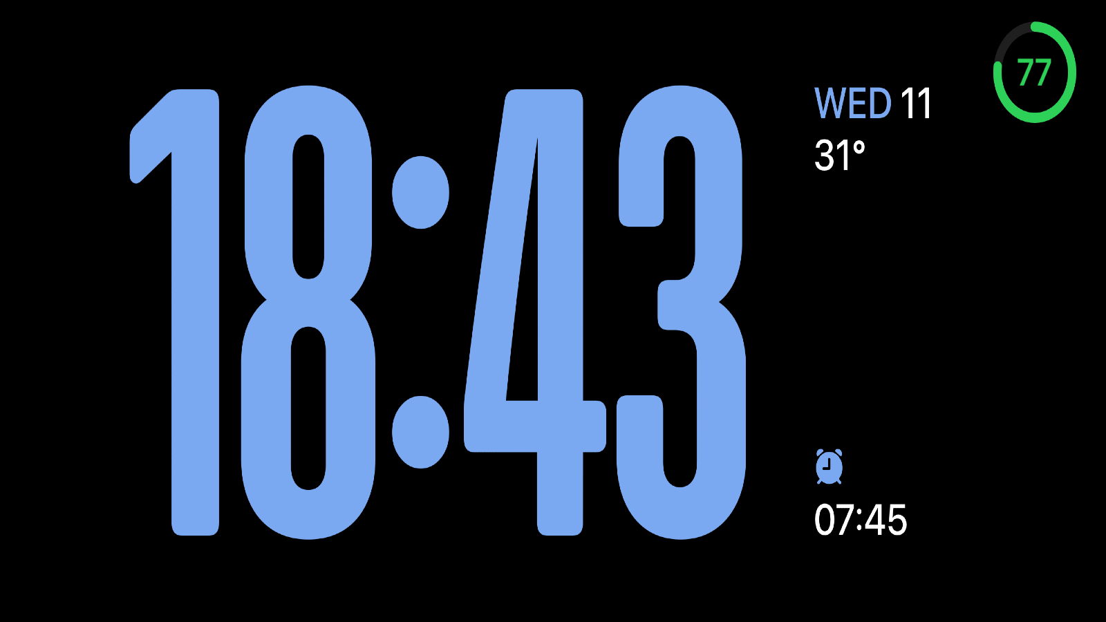
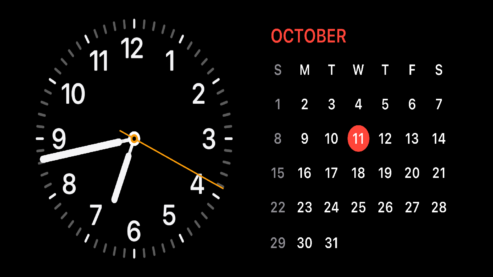
The most eye-catching feature of iOS 17 is the Standby Mode. It’s a whole new way to interact with your iPhone when it’s sitting idle plugged in on your bedside table or work desk and turns it into a smart display. It comes to life as soon as you position your iPhone in landscape mode, whether that’s on a charging stand, or just propped up against another object. In the Standby Mode, your iPhone can run through a slideshow of your photos, display your calendar, or just act as a bedside clock while receiving incoming notifications.
Standby Mode is made up of three sections you can swipe through: widgets, photos, and clock. You can customize it to your choices and select which photo collections, widgets, or even clock styles it uses. I haven’t turned off the Standby Mode ever since I updated to iOS 17. It’s a no-brainer for me as most of the time my phone is idle while I work or stream movies on my computer and I’ve found little utility in dedicated smart home displays. The widgets section has proved especially handy and I’ve added the apps I typically unlock my iPhone for such as the to-do manager, and check off items right from the Standby Mode.
Since it takes advantage of the iPhone’s OLED screen, it doesn’t burn through the battery either. However, I do worry about whether over time it will damage the display panel.
There’s also a setting that allows Standby Mode to automatically choose and rotate widgets based on your past activities. It can, for example, bring up the Calendar in the morning if you regularly use it before work. But for me, it hasn’t been particularly accurate yet. What did work was the Standby Mode’s location awareness. If you’ve got MagSafe docks throughout your home, it can remember which widgets you access the most in each room like Reminders in your office space and Podcasts in your bedroom and sort them accordingly.
It’s not perfect, though. On non-Pro iPhones specifically, the Standby Mode doesn’t offer always-on functionality and therefore, you’ll need to tap the screen or nudge the phone to wake it up, which defeats the purpose. There’s no space to scroll through all your unread alerts either, so I often have to reposition my iPhone back into Portrait mode to see them. At the moment, it’s a tad buggy and often fails to load widgets for me altogether.
The Little Things
iOS 17 also makes apps more modular and saves you the trouble of navigating through countless menus for one, little function. Inside Spotlight search, your iPhone can now pull up shortcuts from third-party apps right to the top. When I look up Clock, say, the “Top Hit” features shortcuts to start a new timer or alarm. Plus, Apple’s on-device intelligence is smarter at pre-fetching the shortcuts it thinks you’ll soon need. Around the time I go to bed, for example, my iPhone shows me a toggle for the next morning’s alarm as soon as I pull down on the homescreen for Spotlight search.
In addition, widgets are interactive on iOS 17, which means you can not only glance at an app’s latest information from your homescreen, but you can also execute some actions from it without ever launching the app. This was long overdue and I was surprised Apple didn’t include this when it debuted widgets. It had been especially frustrating for me as after years of living with Android, I had grown used to interactive widgets, and their absence on iOS had always seemed like a major, obvious miss.
It works as you’d expect: Though your iOS widgets look the same, a few of their elements are actionable. On the To-Do app’s widget, for instance, you can tap the checkbox next to an item, and have it disappear from the list on your homescreen itself. You can, similarly, access the playback controls of a music app from its widget.
Widgets are, for me, the biggest quality-of-life upgrade iOS 17 enables. I found it cumbersome that I had to launch an app for a small task despite having its widget on my homescreen. Developers have been quick to adapt as well: most of the apps I rely on daily like TickTick and Halide have already rolled out iOS 17 updates.
The Year We Make Contact (Posters)
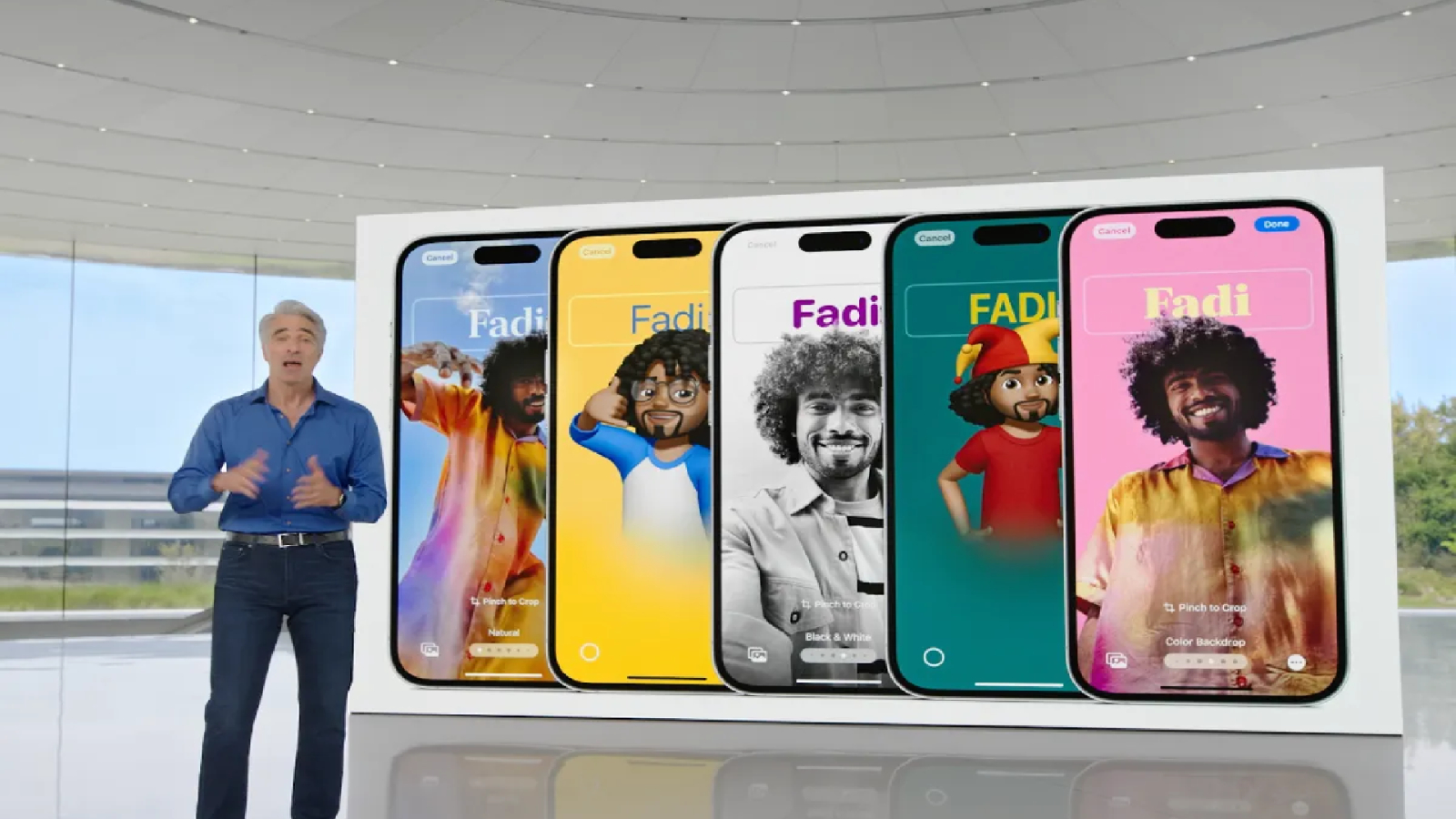
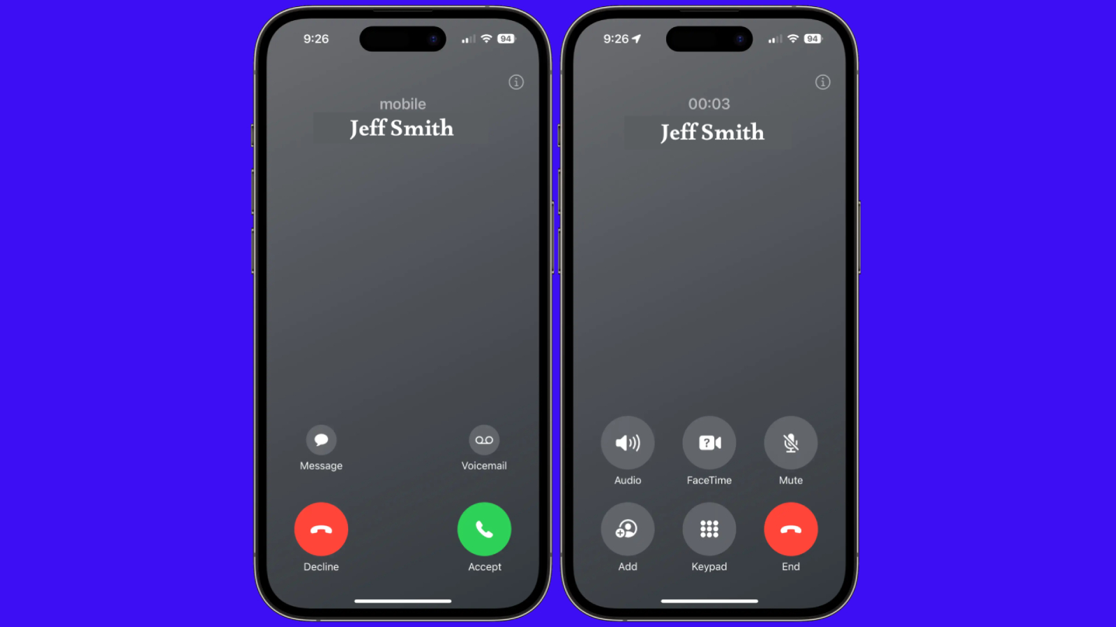
Another highlight of iOS 17 is what Apple calls Contact Posters. It allows you to personalize how you appear on other people’s call screen when you ring them. It swaps out the avatar thumbnail with a full-screen poster and let’s you style your name’s text, background, and photo -- similar to how you would customize your iPhone’s lockscreen. The Contact Poster editor can even automatically crop out your subject’s outline, and replace the background with a more solid color or gradient.
It’s a fun little party trick, which restores some joy into the otherwise dull phone experience. Adding to that is the return of call screening. On iOS 17, your iPhone will transcribe a voicemail as it’s being recorded so that you can decide right then whether to pick up the call.
The Drop
The call screen is not the only relic Apple is refreshing with a modern twist: With iOS 17, it’s also looking to revamp how people exchange contacts. The latest update leverages your iPhone’s AirDrop tech to offer “NameDrop,” a way for you to exchange your contact information with another iPhone simply by holding the top of your iPhone near the top of someone else’s -- no more handing your phone for them to feed their number. A spurt of a snazzy glowing animation confirms the exchange.
NameDrop works as intended and can feel like it’s straight out of a sci-fi flick, but I couldn’t get myself to use it much. The whole action can be a bit too intimate to prompt with a stranger. Especially when I didn’t know if the other person knew their tech, I didn’t want to ask them if they were familiar with NameDrop or explain it to them if they weren’t or even awkwardly position my iPhone in front of them hoping it would just kick off. Perhaps once it’s popular, I’d feel more comfortable invoking NameDrop.
You can also use the NameDrop gesture to share files, and in subsequent iOS 17 builds, an AirDrop transfer will continue to take place over the internet even when both iPhones move out of range.
A Disability Revolution
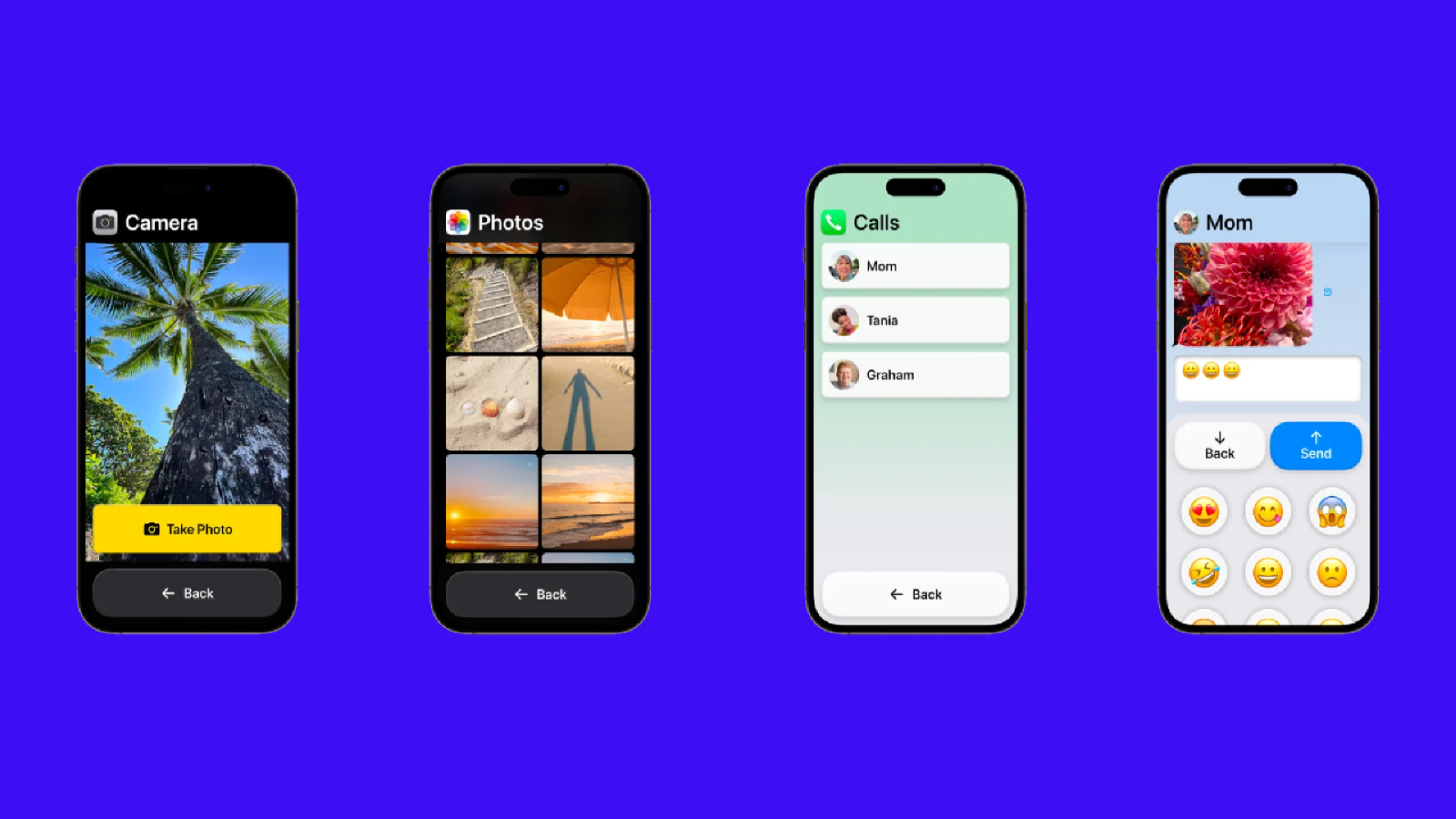
Accessibility is the one category where iOS 17 is a significant step forward for the iPhone. It adds two key tools for users with disabilities. First is Assistive Access, which simplifies the iOS interface down to its essentials for those who have trouble navigating it like your grandparents. It swaps out your typical apps with their “focused editions,” enlarges their icons and text, and switches to a basic, grid homescreen. On the Assistive Access mode’s camera app, for example, there can be just a single button: “Take Photo.” (Although you can add more like “Selfie” if you wish to)
The second is “Personal Voice.” It creates a digital clown of the user’s voice, which they can then use on phone calls. It’s ideal for those at the risk of losing their ability to speak and is remarkably accurate. These new accessibility features will be huge for millions of users who previously faced challenges in their iPhone experience, and hopefully, will soon make their way onto other operating systems as well.
Security
iOS 17 isn’t big on security and privacy features but there are a handful of notable additions. You no longer have to wipe your iPhone in case you forget a new passcode; You can get in with your old one if you do so within 48 hours after you change it. Plus, a new permission lets you grant third-party apps the ability to add events to your calendar but not read the entire existing ones.
House Party
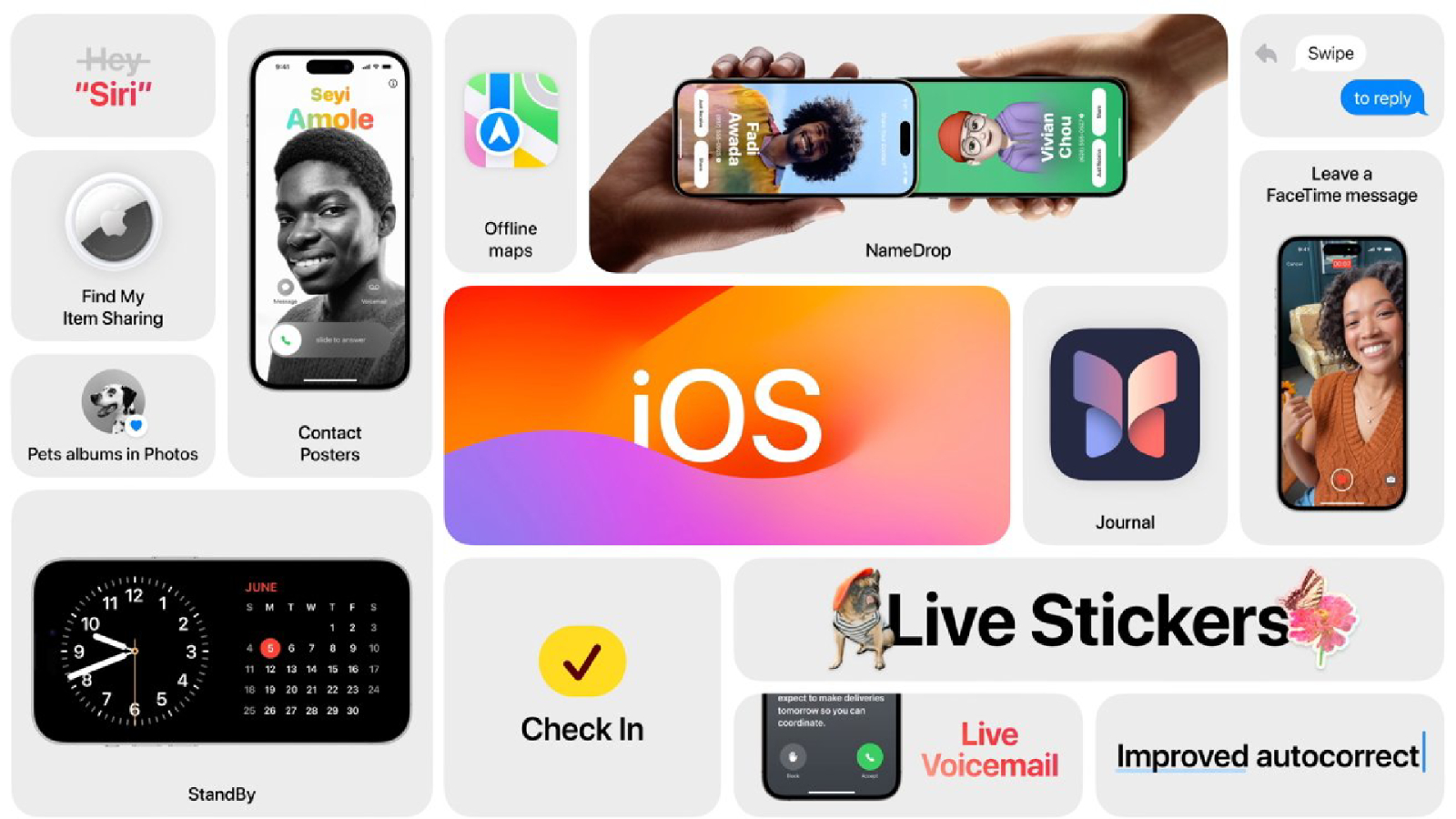
The rest of iOS 17 is made up of updates for Apple’s in-house apps, and those who rely on them will find many of those new perks worthwhile. On FaceTime, you can fill the frame with 3D effects via hand gestures. Two-thumbs-up, for example, will make fireworks go off in your background. The default keyboard is far better at autocorrecting and learning your vocabulary, though I still find Gboard’s predictions more reliable.
Apple has further expanded its Google Lens-like service to more of your iPhone’s corners. You can freeze a frame inside a wildlife video to look up which animal is featured on the screen; View a picture of a laundry tag and the Photos app can tell you what each symbol means. Messages also got some long-awaited features: you can swipe to quote and reply to a specific message, a new “Check In” option lets your loved ones know when you’ve arrived at a location like your home, and you now also have the option to blur photos and videos containing nudity by default and decide whether you want to see them.
Though these app updates are nice to have, it continues to seem ridiculous to wait for a yearly update for a feature as simple as swipe-to-reply. It’s high time Apple rolls these out instead from the App Store so that, more importantly, users can skip an annual release to save storage, and still access specific app updates.
Bottom line
While the iOS 17 has helped me with my productivity, I wish Apple would address the myriad of functional gaps in its mobile OS such as the lack of additional multitasking modes on Plus series phones, custom app shortcuts in Control Center, customized actions for the power as well as the lock screen buttons, and the Android-esque ability to mute specific notifications from an app.
iOS 17 is not a must-have update per se, but anyone who does install it will come across at least a couple of ways it improves how they use their iPhone. There have been reports of it tanking battery life, but I’ve not faced those on my iPhone 15 and iPhone 13 yet. So if you’ve got the space for it, give it a shot.
Shubham Agarwal is a freelance technology journalist from Ahmedabad, India. His work has previously appeared in Business Insider, Fast Company, HuffPost, and more. You can reach out to him on Twitter.
