Wild Windows 12 Mobile concept has me longing for the Lumia
What if Microsoft never gave up on its smartphone dream?
If you own a smartphone, it's pretty much a certainty that you're running on Android or iOS. Sure, a handful of sporadic alternatives might exist but when it comes to mobile operating systems, it's a two-horse race: Google or Apple.
But it wasn't always like that, at one point in time Microsoft's Windows Mobile OS brought a unique "Metro" tiled interface to the smartphone that I will unashamedly say is one of my favorite phone UI designs to date (and I don't care how alone I am in that judgment).
However, 'unique' doesn't necessarily mean 'great' and Microsoft's efforts were met with a mixed response. Windows Mobile could have been special, but it never quite found its footing.
The last iteration of this OS was Windows 10 Mobile, released in March 2016. It was the final true outing for Windows on mobile (if you discount Windows 10X, primarily designed to work with dual-screen devices, anyway), and it doesn't look as if Microsoft is making any efforts to revive its mobile OS goals any time soon.
But, what if it was? That's something Indonesian concept graphic enthusiast AR 4789 posed when they recently revealed their take on a modern Windows Mobile OS design: Windows 12 Mobile.
Windows 12 Mobile: A concept leaving me longing for Lumia
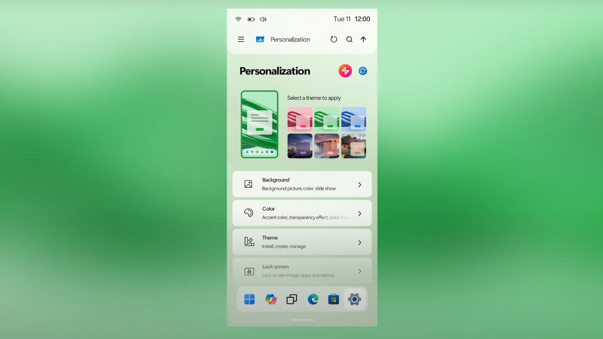
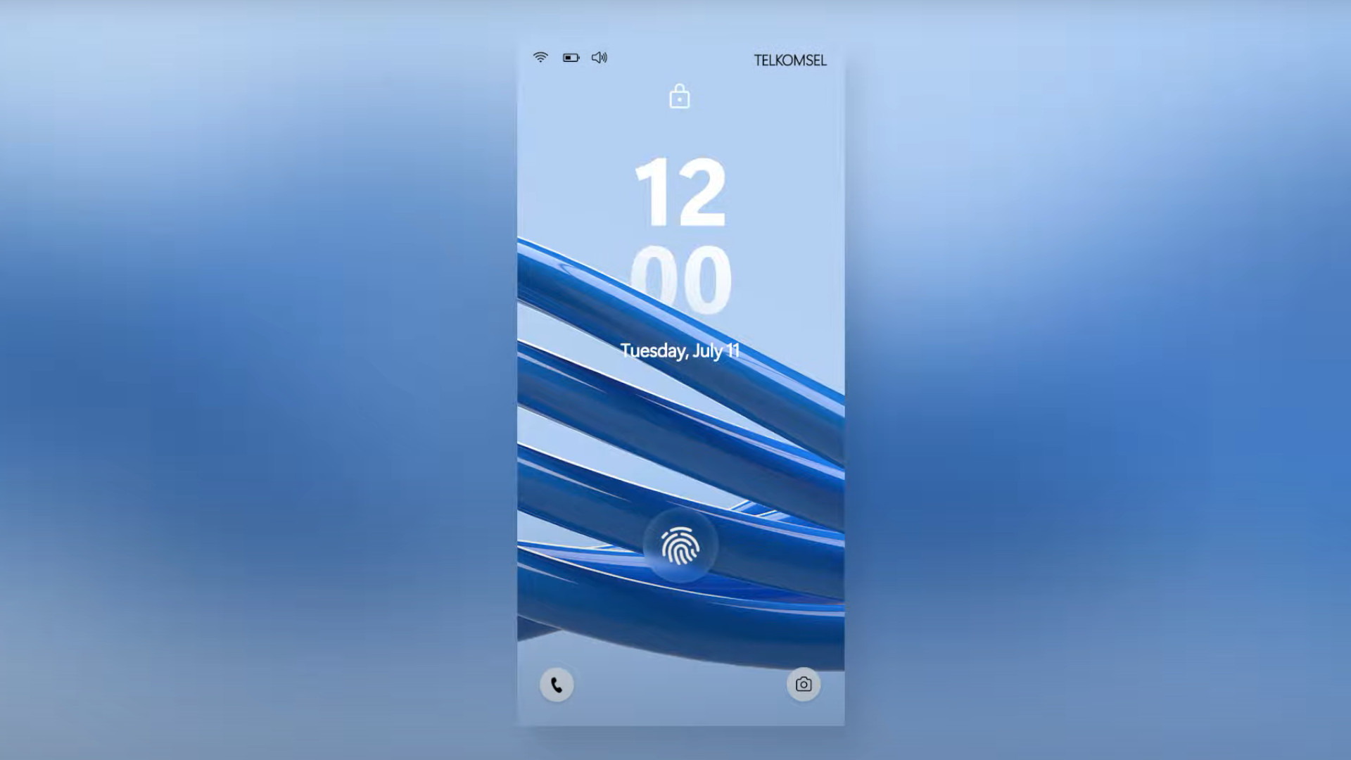
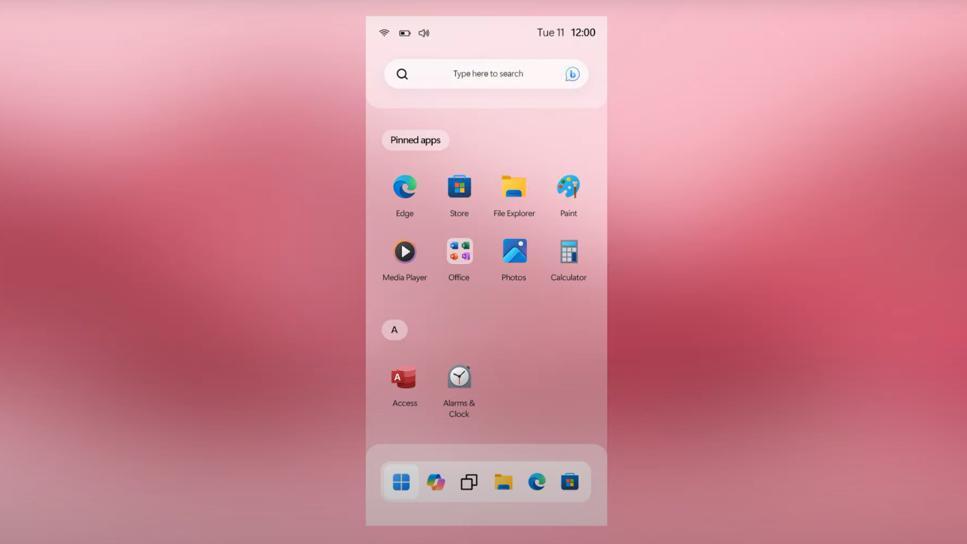
While it doesn't feature the same "Metro" design as its predecessors, I can't help but marvel at how well this concept manages to pack the familiar Windows 11 interface into the frame of a smaller device.
The concept generally adheres to Windows 11's current aesthetic, including a quick start icon for Copilot. However, it also imports some widely tipped features of Windows 12 including the floating taskbar.
Stay in the know with Laptop Mag
Get our in-depth reviews, helpful tips, great deals, and the biggest news stories delivered to your inbox.
It's an impressively faithful rendition of Microsoft's operating system, condensed into mobile form. The results of this propose a highly intuitive design that allows Windows users to effortlessly imagine all of the things not shown in the artist's near-three-minute concept reel.
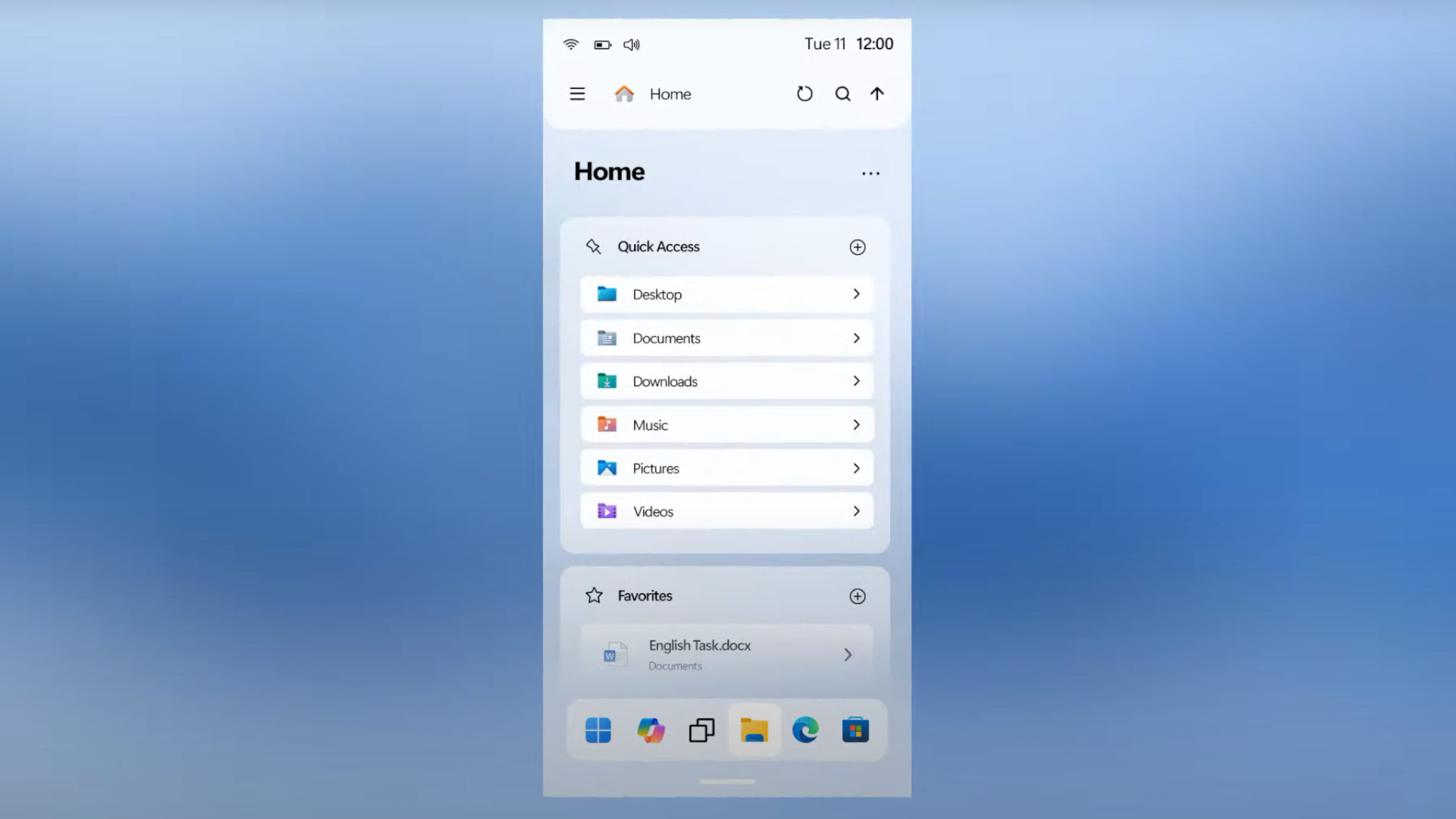

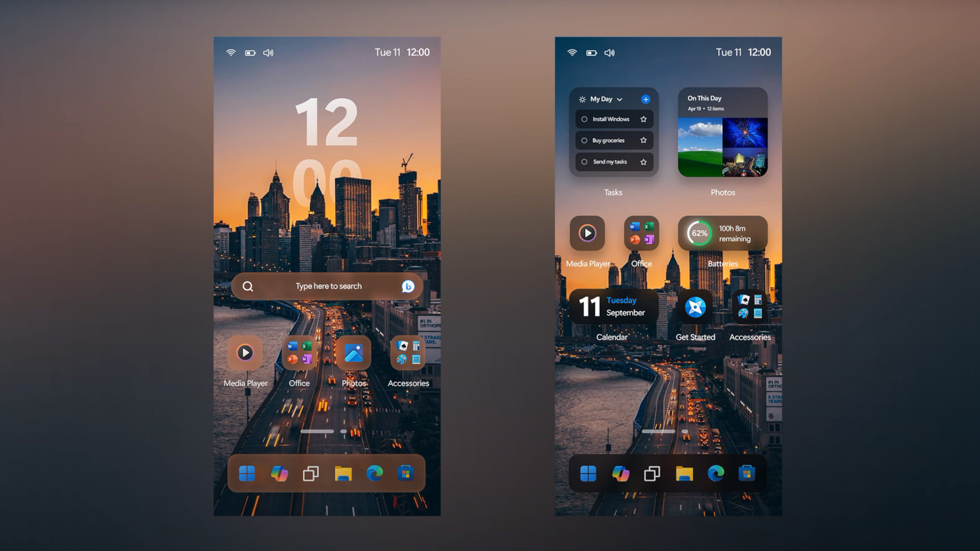
As much as I love my Pixel daily driver, seeing the Windows 12 Mobile concept leaves me very nostalgic for the Lumia 950 XL — one of Nokia and Microsoft's best offerings for Windows Mobile users, featuring a solid trifecta of impressive performance, solid camera work, and a brilliant screen.
Sadly, much like other Windows phones, Windows 10 Mobile's lack of adoption by developers and buggy implementation left the Lumia hanging out to dry (not helped by its middling battery life, I'll admit).
AR 4789's concept does leave me wondering what the smartphone landscape might look like today if Microsoft had never abandoned its Windows Mobile goals, maybe now all we need is a concept of the Lumia smartphone that Windows 12 Mobile could run on to really activate the almonds as to what could have been.
More from Laptop Mag

Rael Hornby, potentially influenced by far too many LucasArts titles at an early age, once thought he’d grow up to be a mighty pirate. However, after several interventions with close friends and family members, you’re now much more likely to see his name attached to the bylines of tech articles. While not maintaining a double life as an aspiring writer by day and indie game dev by night, you’ll find him sat in a corner somewhere muttering to himself about microtransactions or hunting down promising indie games on Twitter.
