Laptop Mag Verdict
Microsoft's Office Mobile for Office 365 Subscribers app brings the Office experience to Android, but don't expect to do much more than light editing and quick tweaking.
Pros
- +
Clean Design
- +
SkyDrive and SharePoint integration
- +
Useful editing tools
- +
Commenting feature for adding notes
Cons
- -
Doesn't support all Office 365 apps
- -
Requires Office 365 subscription
- -
No Track Changes in Word Mobile
- -
Can't create PowerPoint files within the app
Why you can trust Laptop Mag
Office Mobile for Office 365 Subscribers has landed on Android devices, bringing Microsoft's Word, Excel and PowerPoint programs to a wider mobile audience. Following the launch of the iOS edition, the three core Office apps have been brought together into one 50MB package for Office 365 subscribers on Google's platform. The mobile-optimized version is worth the download, but there are some drawbacks.
Installation
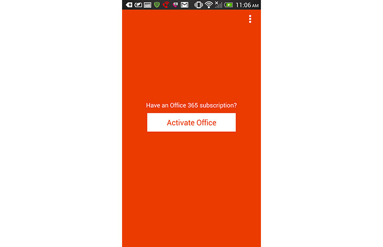
Click to EnlargeSetting up Office Mobile for Office 365 Subscribers on Android is just as simple on iOS. If you already have an Office 365 subscription ($99), you can download the mobile app via the Google Play Store for free on an Android phone running Ice Cream Sandwich (4.0) or higher. Unfortunately, this app is not optimized for tablets, and didn't even show up in the Google Play store on the Nexus 7.
Microsoft notes that Office Mobile for Android doesn't count toward your five-device install limit, so you're free to download Office 365 on five other PCs, Macs or Windows tablets.
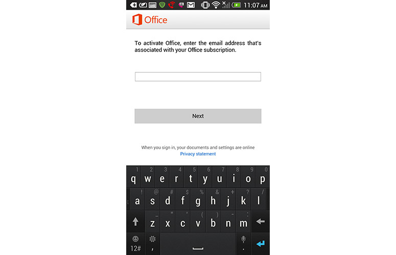
Click to EnlargeWhen opening the app, Microsoft prompts you to enter the email address associated with your Office 365 subscription. Once that's done, simply enter your Microsoft account email and password, and you'll be ready to start editing and managing documents through your phone.
Unlike the iOS version, Microsoft doesn't include a link to register for an Office 365 account if you haven't already done so. You'll have to head over to Office.com to get started if you haven't purchased a subscription.
MORE: Best Apps 2013
Interface
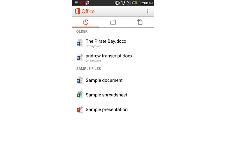
Click to EnlargeLike its iPhone counterpart, Office Mobile on Android comes with a neat and simplistic user interface. Upon opening the app, we were greeted with a recent documents page that displays the last documents we edited in SkyDrive. Underneath is a Sample Files header that provides a preview of how spreadsheets, documents and presentations will look in the mobile app.
The interface for the iOS and Android versions of Office Mobile is similar but not identical. For instance, the main toolbar is located on the top of the screen in Android as opposed to the bottom in iOS. The Android version includes icons for recently edited files, opening files and creating new files, while the iOS version lists these buttons along with a Settings option. Android users will find their Settings button in a separate mini-menu that can be accessed by tapping the three boxes at the top of the screen just above the main toolbar.
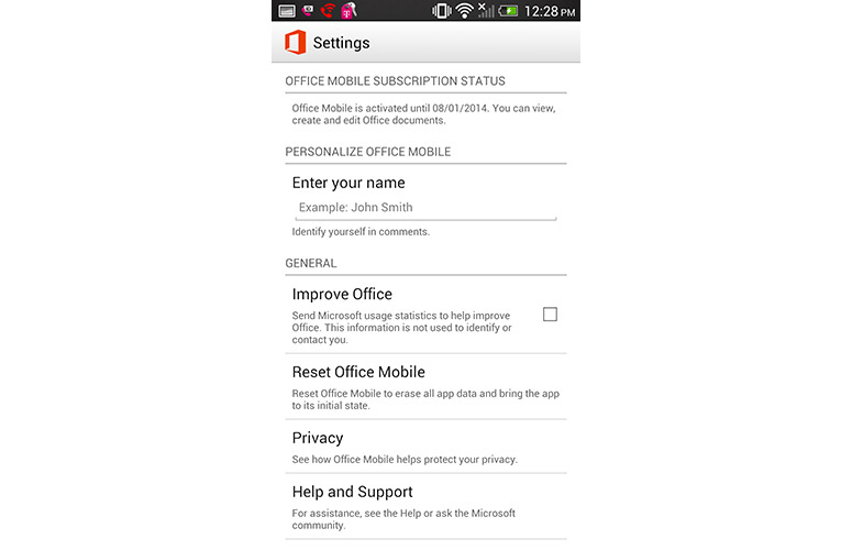
Click to EnlargeThis difference doesn't really affect the user experience in any way, but we prefer the Android app's cleaner and sleeker look. Menu icons are separated from the recent files list by a thin orange line that becomes bolded underneath the symbol for whichever tab is active.
In addition to the recent documents tab, you'll find a page dedicated to opening files and creating new documents as well. The Open tab allows you to launch documents based on where they're located and automatically lists SkyDrive as an option. You can also add your SharePoint address for quick access to your library if you have a subscription. After uploading a Word document to our SkyDrive account via the desktop version, it showed up on our phone instantly.
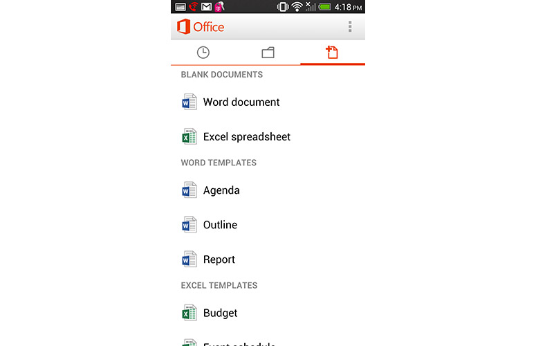
Click to EnlargeThe New tab, which looks like a folded page with a + sign next to it, lets you create Word and Excel files or choose from a selection of templates for either document types. These templates include Outline, Agenda and Report for Word and Budget, Event Schedule and Mileage Tracker for Excel.
In general, the user interface is clean and slick, but we wish Microsoft included more gesture-based controls. For example, when viewing or editing a document, you must tap the Back button to return to the main menu. This is simple enough, but we feel swiping to the left or right to navigate between documents or return to the menu would be more intuitive.
MORE: Best Smartphones 2013
Word Mobile
Click to EnlargeThe Word section of Office Mobile is pretty barebones. You won't find any advanced features such as complex file view layouts, but the basic tools for editing and creating documents on the go are there.
Similar to the iOS version, you'll find a blue toolbar with several icons across the top of the screen. However, the two apps differ slightly when it comes to editing and viewing documents. While the iPhone edition comes with icons for viewing File Options, Format and Viewing Options, the Android app provides an icon that takes you directly to Outline view, a Search button and an icon for a submenu that lets you share the document, save it and launch a format menu for editing text and changing fonts.
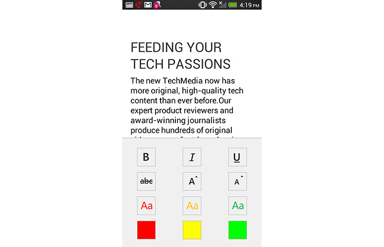
Click to EnlargeThe format section offers options such as bold, italics, underline, strikethrough and colored text -- the same basic tweaks you'll find in the iOS app. This also means you can choose from only yellow, green or red, rather than Microsoft Word's full range of font colors. Tapping the document automatically dismisses any menus and returns the Word file to full screen mode, while the iPhone version has arrows for getting rid of menus.
If you open a document you created on the desktop version of Office that already has Track Changes enabled, those updates will automatically appear in the document when you view it on your phone. Any words or phrases with accompanying comments will appear highlighted in blue, just like in the iOS version. You can comment on words and phrases throughout the text with the Comments feature, but there's no Track Changes mode that shows your edits in real time like in the desktop version.
Overall, we found the Track Changes mode to be limiting and would have preferred to see a more touch-optimized interface. For instance, a scrollable sidebar displaying comments in Track Changes seems much more practical than dedicating half the screen to comments. Still, we appreciated the handy font-sizing tool in the format section that let us press up or down arrows to increase or decrease font size.
MORE: Microsoft Office 365 Review
Click to EnlargeThe Outline button makes it easy to skim a lengthy document in a hurry by displaying the first words of the document and then the beginning of various paragraphs. Pressing these words will bring you to that section of the document, which we found to be helpful when breezing through content. This is slightly different than the Outline view in the iOS edition, which displays the first and last words of the document instead of each paragraph.
If you attempt to exit a document without saving, Microsoft will prompt you to do so before closing the file. Although smartphones aren't the ideal device for creating lengthy reports or documents, Word Mobile will suffice for quick edits. Double-tapping text to highlight words was a breeze, and we navigated through our sample document easily by placing the cursor in various spots. You can also use voice dictation through Google Voice, which makes it easy to quickly jot down notes or create files even when working offline.
Excel Mobile
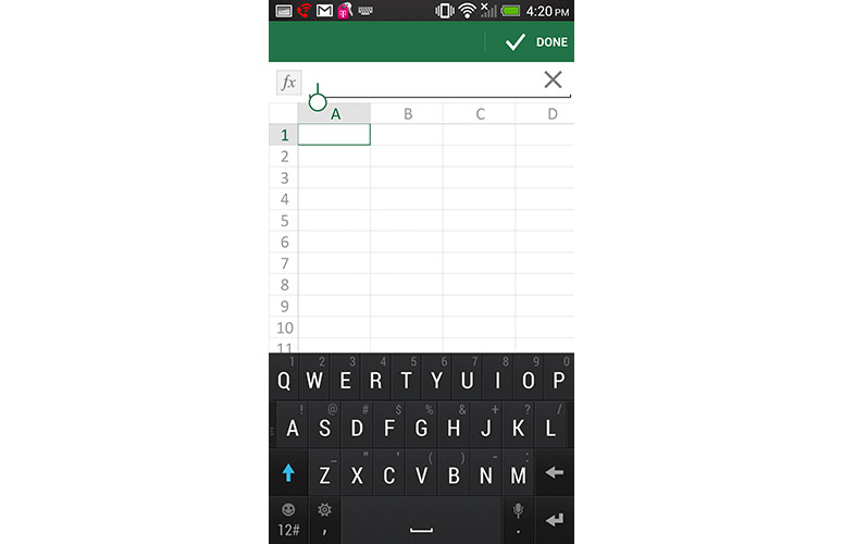
Click to EnlargeOffice Mobile makes it easy to create, view and edit Excel spreadsheets in a hurry. When creating a new document, you'll notice the familiar column and row format you're accustomed to on the desktop version. The app displays columns A through D and rows 1 through 19 in standard view, but you can scroll left or right and pinch-to-zoom to show more cells.
Office Mobile's function toolbar for inputting formulas is just above the rows and columns of cells, and a green toolbar across the top of the screen displays icons with menu options. There's a page symbol that lets you switch between sheets within your book, a search function, a symbol that launches shortcut commands such as Sum and Average, and a submenu icon for formatting cells, clearing content, sorting and adding comments.
The iOS app's toolbar is slightly different, as it lists only three icons for file options, editing tools and viewing tools. Essentially, both apps offer the same tools, but display them in different areas within the main toolbar.
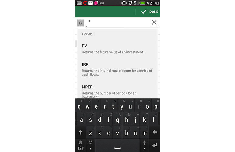
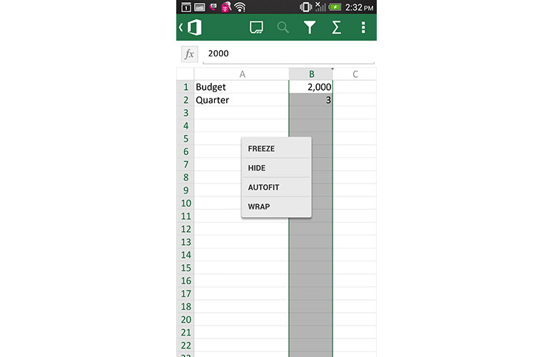
Click to EnlargeWe were impressed with the touch-optimized customization features built into Excel Mobile. Simply tapping a column to select it and then dragging it lets you format the column width in a snap. Excel Mobile also comes with the full list of formulas you'll find on the desktop software.
However, we were disappointed to find that when highlighting text within a cell the only option that appeared was Copy. In the iOS version, highlighting text automatically pulls up commands such as Word Wrap and Comment in addition to Copy. In order to reveal more menu options, you'll have to hold your finger on the cell you wish to edit, which then pulls up Word Wrap, Freeze and Autofit options. To insert a chart, you'll have to highlight the data you wish to include and press the menu icon in the top right corner. The option for "Insert Chart" won't appear in the menu until you select the designated data.
MORE: 12 Worst Android Annoyances and How to Fix Them
PowerPoint Mobile
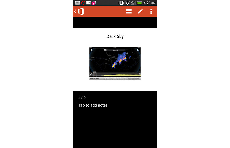
Click to EnlargeOf the three Microsoft Office programs available in the mobile app, PowerPoint is the most scaled-down. You can't create fresh presentations via the app, but you can edit existing slideshows that have been uploaded to SkyDrive or SharePoint. The app doesn't allow for heavy editing, but it's ideal for patching quick typos or adding last-minute details.
After opening a PowerPoint file, the app will divide your screens into two sections. The slide itself occupies the top portion of your screen while the bottom section is dedicated to adding notes. If you wish to view a slide in full-screen view, flip your device to landscape mode.
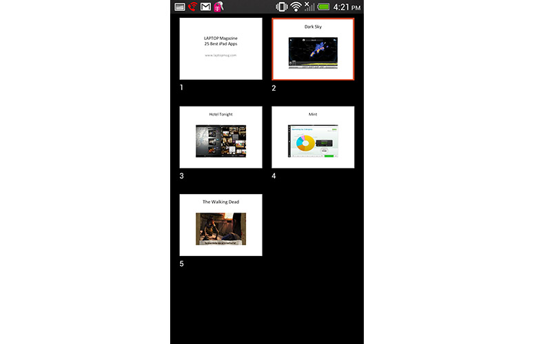
Click to EnlargeTo add notes to a slide, simply tap the black area underneath the slide and a cursor will appear. You can navigate between slides by swiping to the left and right just like in the iOS version, which provides a fluid and natural feel.
Following suit with Word and Excel, PowerPoint comes with a toolbar at the top with options for editing slides, switching between individual and thumbnail views of slides, and a submenu that lets you save your changes or create a custom show. Unlike the Word and Excel sections, this PowerPoint toolbar is essentially the same between iOS and Android.
Comments

Click to EnlargeAlthough Office Mobile doesn't come with the full Track Changes experience, it does offer another Office feature known as Comments. In both Word and Excel, you can select specific data or text and mark them with commentary to view later.
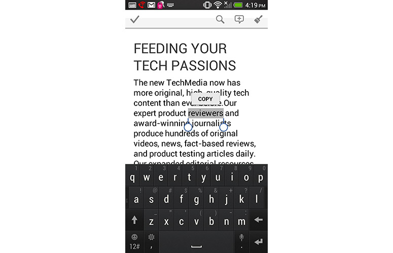
After double-tapping a word or phrase in Word, press the speech bubble icon in the upper right corner of the screen to add a comment. We prefer this to the Comment process in iOS, which requires that you drag the cursor to highlight text and then tap the Comment button to add text. After adding a comment, that word or phrase will appear in a blue speech bubble within the document. You can tap this bubble to read the comment, and press it again to dismiss it.
In Excel, select the cell with the text or data you'd like to comment on and then press the menu icon at the top. Tapping the New Comment option will pull up a cursor at the bottom of the screen for adding notes.
When viewing the desktop version of the document you added comments to, you'll see tiny speech bubbles alongside your document. Clicking these icons will pull up a sidebar where you can view all comments in the document.
MORE: 5 Ways to Speed Up Your Android Phone in Under 5 Minutes
Verdict
Click to EnlargeOffice Mobile for Office 365 Subscribers succeeds in bringing Microsoft's productivity suite to Android devices. Just don't expect the full-fledged functionality of the desktop version. Rather, this app is ideal for Office subscribers to make quick edits and changes on the go. The experience is largely the same across Android and iOS, but you'll notice some slight tweaks in the user interface. We were impressed with the touch-optimized features in Excel and snappy SkyDrive integration, although it would have been helpful to see more gesture-friendly features within the app.
Other apps in the Google Play Store offer similar tools such as Kingsoft Office, which lets you create documents, spreadsheets and presentations for free. It also lets you insert tables and photos, encrypt documents and perform other tasks that Microsoft's app can't do. However, since Office Mobile comes free for Office 365 users, the app is sure to prove useful for those who need to make quick edits and are actively using SkyDrive to back up their work.
Office Mobile for Office 365 Subscribers (Android) Specs
| Company Website | http://office.microsoft.com/en-us/mobile/ |
| Platforms | Android |

