Laptop Mag Verdict
Pulse offers a well-designed interface and easy access to compelling content from multiple news sources.
Pros
- +
Attractive interface
- +
Intuitive navigation
- +
Can share content via Facebook and Twitter
- +
Pulse.me feature lets you save content to personal account
Cons
- -
No Twitter feed
- -
Doesn't pull content from Facebook links
- -
Poor offline support
Why you can trust Laptop Mag
More than a month before Flipboard hit the iPad, there was another well-designed news reading app that had everyone (including Steve Jobs) excited. Pulse and Flipboard share a similar idea: to present news items from the web and social networks in a visually appealing format. But Pulse tacks more toward the traditional news reader interface model, which has benefits and drawbacks.
Interface
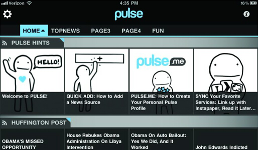
Pulse's interface is very similar to Taptu--a mosaic of uniformly sized cards (news items) arranged in rows (news sources). Scroll up and down to see all the sources on a page; scroll left and right within rows to see the different posts and updates. We like the overall design, and the interface is fairly intuitive. The combination of text and images makes it easy to browse posts and offers an enticement to click and read. Still, Pulse lacks the visual flair of Flipboard and Zite.

Click to enlarge
Pulse's animations are minimal, but smooth and visually appealing. We like that in landscape mode the full text reader opens on the right while the rows of unread feeds stay put on the left for easy navigation. In portrait mode, the reader opens on top and the source row stays on the bottom until you scroll down, then the reader goes full screen. The source row comes back once you reach the end. The styling within individual posts is minimal, putting the focus on reading.
News Sources

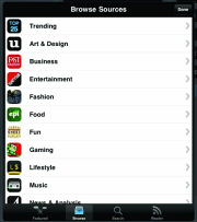
Click to enlargePulse arranges feeds in five different "pages," two of which are pre-populated. We like this concept, since users can group feeds by theme. Adding and managing feeds is straightforward; just tap the + bar at the bottom of a Pulse page or the gear icon in the upper-left corner. Users can choose from featured feeds, browse for individual feeds within 17 categories, search for or add RSS feeds individually, and import subscriptions from a Google Reader account. Pulse will also pull in data from Facebook--links shared by friends, status updates, and your own wall--but it doesn't import content from Twitter.
While we like that the Pulse app offers a feed for Facebook links, we think it would be more useful to show an excerpt from the destination article as Flipboard does. Pulse just shows the text and image from the status update. This hinders offline reading, as the app doesn't cache the web page or even a decent excerpt of the content behind the link.
We like Pulse's ability to import from Google Reader, but wish that we didn't have to add each feed individually by tapping the + icon over and over. A "Select All" option would make things much easier. So would adding feeds by Reader folder.
Pulse restricts users to a maximum of 60 feeds (12 feeds per page). While that may sound like a lot, and is twice the number offered by Taptu, hardcore users who browse a large number of news sites will run out of slots fast. There are no restrictions on the number of feeds in Flipboard and Zite.
Saving and Sharing Content
A new feature called Pulse.me lets users star stories and save them to their personal profile created on the iPad. You can then view the stories you save on your iPad, iPhone, or Android device on the web when you go to http://pulse.me

Click to enlarge
Sharing buttons sit on the bottom right corner of the Pulse ap's reader area. Users can quickly tap and post to Facebook or Twitter, or share the story via other available apps, Instapaper, and e-mail. In Facebook updates, users can like or comment on items. However, users can't star or share items from Google Reader feeds like they can in Flipboard.
Offline Use
Like Flipboard, Pulse will cache text from the items it loads that users can access offline, but won't cache images. Users have no control over how many items the app caches at one time--each feed will load 20 to 24 items by default. Even basic news readers such as NewsRob have these options.
Verdict
Pulse should appeal to voracious news junkies. Though Taptu has a similar visual style and better offline support, we like that we can add twice as many feeds with Pulse. Overall, we prefer Flipboard for its magazine-like user interface and more robust feature set, but Pulse is a close second and is definitely worth the download.
Pulse Specs
| Company Website | http://www.alphonsolabs.com/ |
| Platforms | Android, iOS |
