Laptop Mag Verdict
Bluepoint Games’ Demon’s Souls may be lacking the original game’s subtlety, but makes up for it with an excellent use of color, astounding attention to detail and an unprecedented level of graphical fidelity.
Pros
- +
Phenomenal visuals
- +
Creative world
- +
Unique boss battles
- +
Few checkpoints adds intensity
- +
Rewarding combat system
Cons
- -
Lacks the original’s subtlety
- -
Some enemy redesigns
Why you can trust Laptop Mag
It would be dishonest of me to claim that Bluepoint's Demon's Souls is everything I wanted it to be. Don’t get me wrong, it’s a fantastic game, but FromSoftware's 2009 masterpiece presents a world so gritty and striking that many of its moments have haunted me since I first played it. It's quiet, subtle and far more contemplative than any other Soulsborne title in the series.
Demon's Souls on the PS5 evokes something far different. Bluepoint has turned this dark, deranged world into a visual and aural spectacle. It's stunning and awesome, but sacrifices much of its atmospheric terror to achieve these wondrous qualities.
This vision is surprisingly different from what I wanted, but regardless, I adored it. Bluepoint has crafted a breathtaking spectacle at a level I’ve only experienced in a miniscule number of games. Both possess shockingly different visions, so I specifically want to highlight how Bluepoint has shifted what Demon’s Souls is about, and why it still works.
How Bluepoint changed the world of Demon’s Souls
Bluepoint Games took every area in Demon’s Souls and injected them with an elevated level of detail. After all, this is the game that’s meant to show off the power of the PS5. You can’t do this successfully with flat environments, regardless of how effective that subtlety can be.
It also seems like Bluepoint’s Demon’s Souls was made to appeal more to Bloodborne and Dark Souls 3 players, which makes sense considering a large chunk of those fans are the ones jumping into this game for the first time. This new vision of Demon’s Souls elevates every hue, turning what was originally a muted color palette into something bright and extravagant.
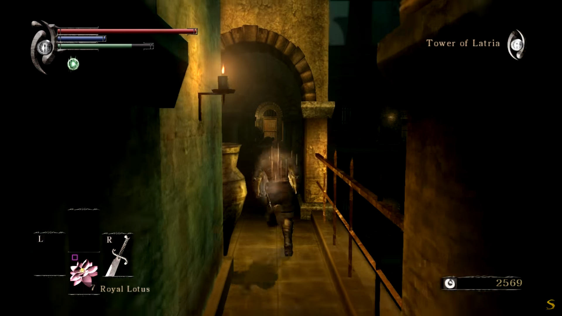
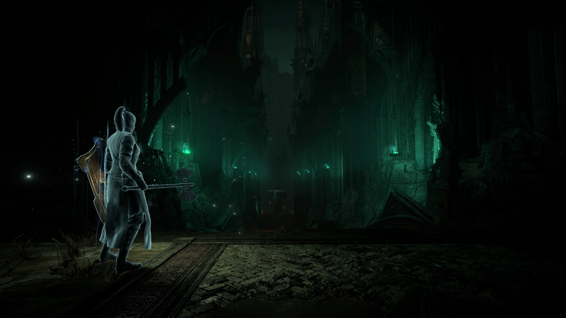
The drastic shift in aesthetic between Bluepoint’s Demon’s Souls and FromSoftware’s Demon’s Souls can be seen in the Tower of Latria. In the original, this environment served as a disgusting and abhorrent prison for tortured souls. Its bars are rusted and its bricks are dirty. The rooms are stained with blood splatter, adding to the feeling of hopelessness and unease. It successfully emulates a realistic medieval prison, which contrasts creepily against the Mind Flayers and their paralyzing magics.
Bluepoint’s vision of the Tower of Latria takes gothic inspiration, removing the simple, rusted bars, instead replacing them with elegant Victorian designs. This aesthetic is even present in the placement of curved and squared pillars alongside the walls, with a majority sporting some sort of complex engraving. The lighting is also more distinct and colorful, with green hues enveloping the area and the glow of a bright orange moon obscured by a cloudy sky.
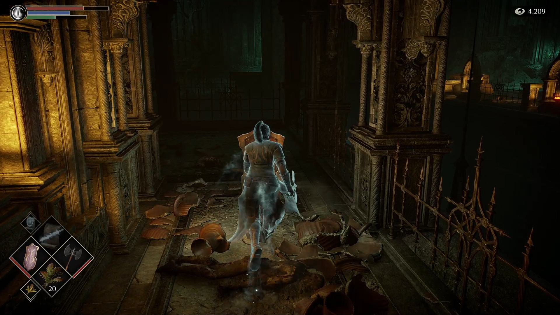
Bluepoint Games took the Tower of Latria, an area that was initially repulsive, and turned it into something tasteful. Exploring 2009’s Tower of Latria instills a sense of dread and disgust. Exploring 2020’s Tower of Latria instills a sense of wonder and excitement. Both of these feelings are valuable, but very different.
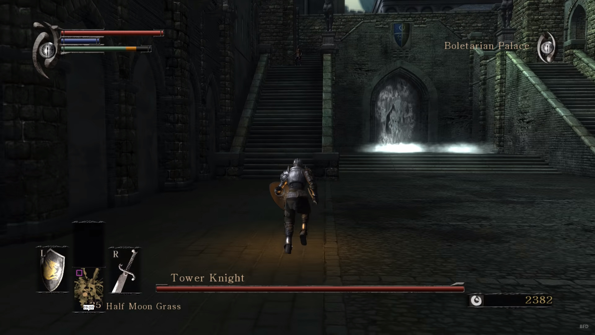
Similar discrepancies can be seen in Boletarian Palace. When players enter the Tower Knight boss arena in 2009’s Demon’s Souls, they’re greeted by a flat-looking military base. The stones look mostly well-kept, and if anything had been destroyed previously, it must have quickly been repaired. This is an outpost for soldiers, where they’re stationed to protect the kingdom from invaders. This castle isn’t aesthetically pleasing either, instead meant to serve its exclusively practical purpose.
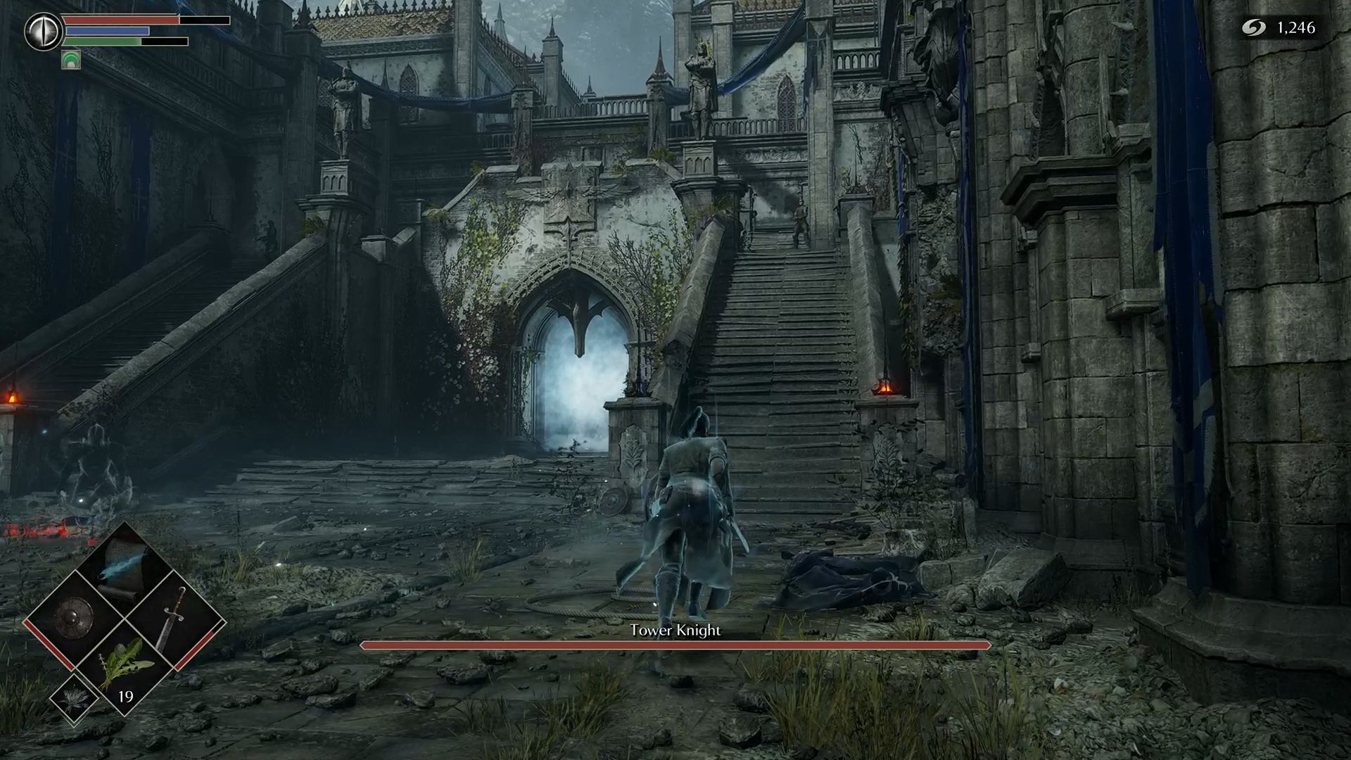
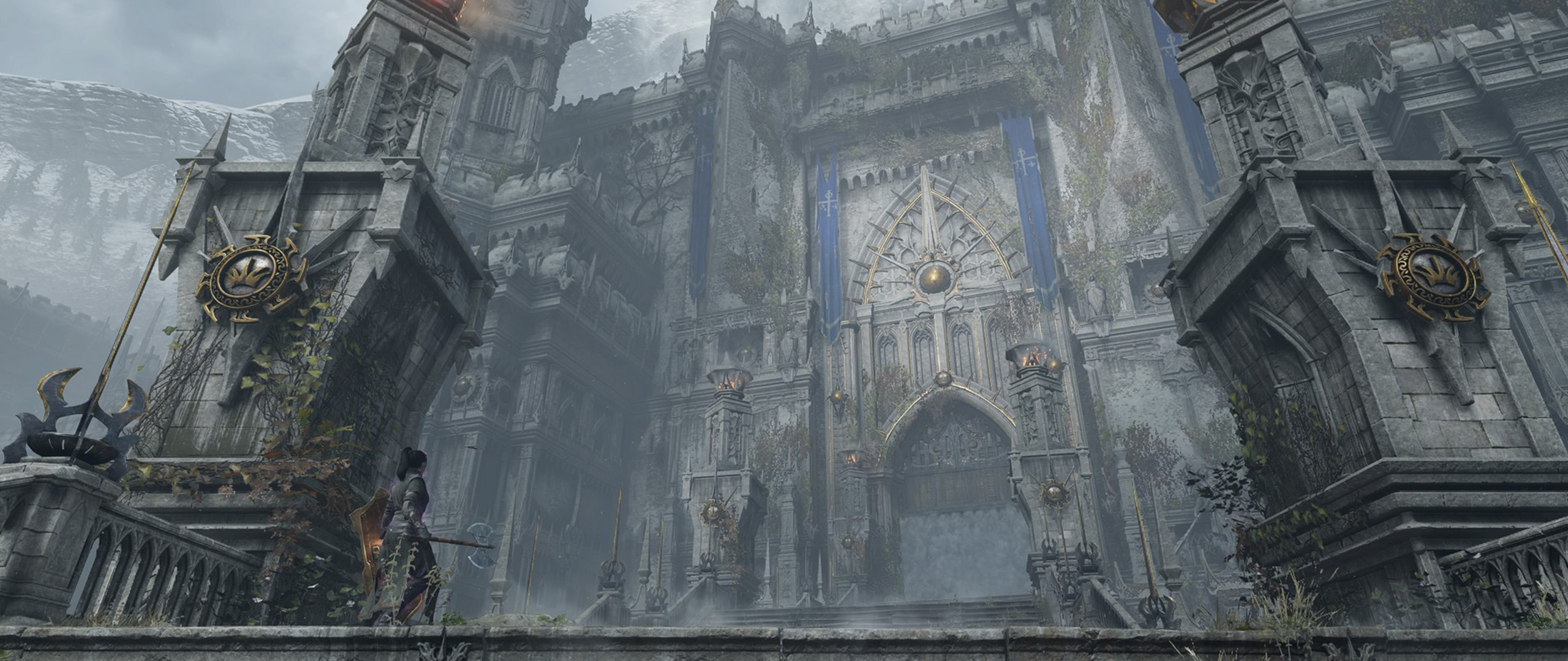
Bluepoint’s vision of Boletarian Palace is a notable departure from the original game. The area is overgrown and unkempt, as if it’s been uninhabited for years. You can see grass rising between the stones and moss growing along the walls. Some of the bricks that make up the pillars have collapsed and the stairs look crooked. The implication is that the inhabitants (and soldiers) have long since lost their humanity. It’s gorgeous, but it’s not the tactical military base I remember. The presence of statues protruding alongside the walls, colorful kingdom banners and spire towers also make it clear the architectural foundation was far more concerned with aesthetics.
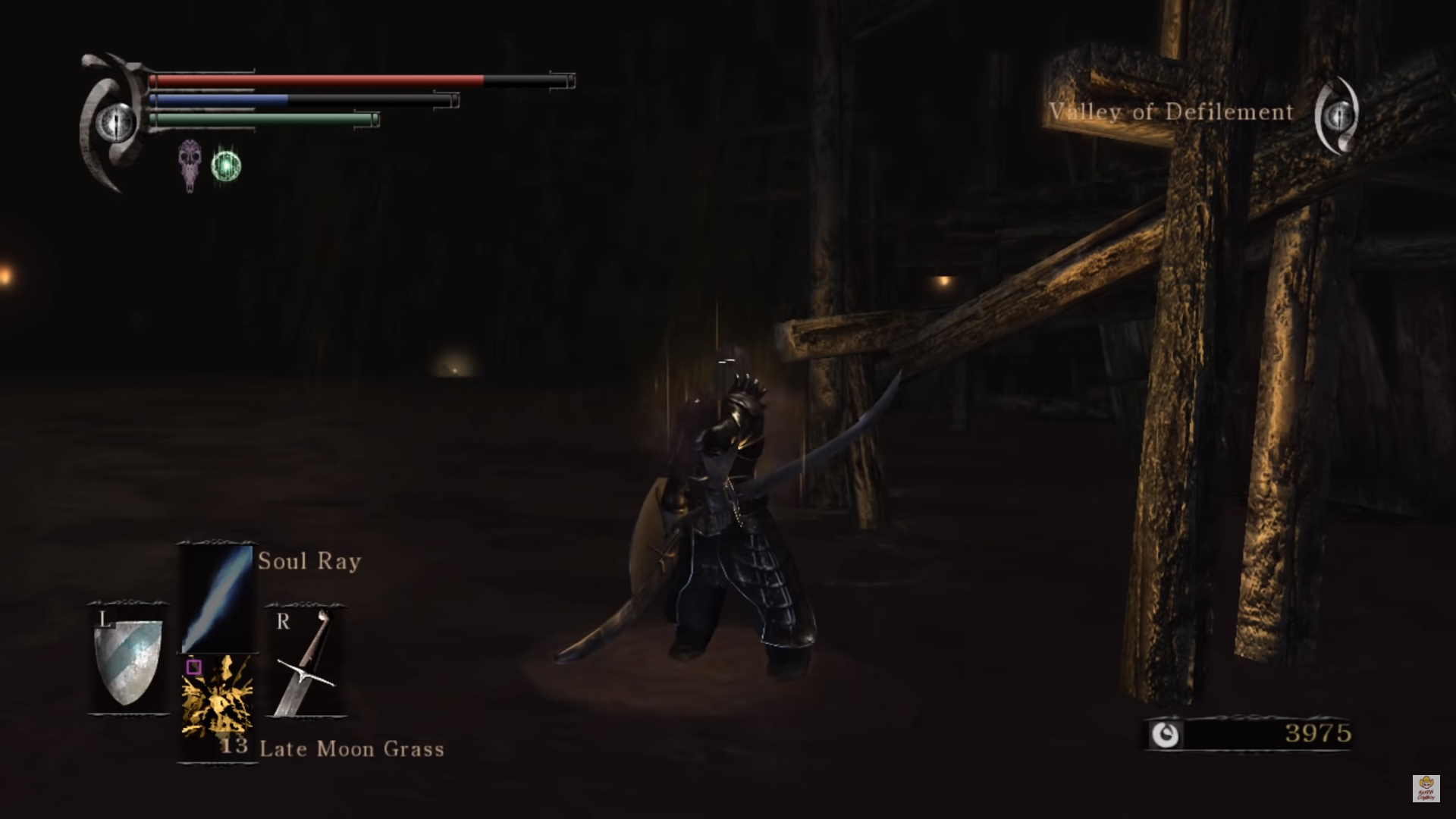
When the player visits the Swamp of Sorrow in the original Demon’s Souls, there’s a thick coat of darkness overwhelming the area. It’s difficult to see ten or so meters from your character, with faint globes of light being the only visible thing in the distance. This makes each step forward terrifying, as relentless undead, disgusting slugs and giant mosquitoes could be lying beyond the shadows.
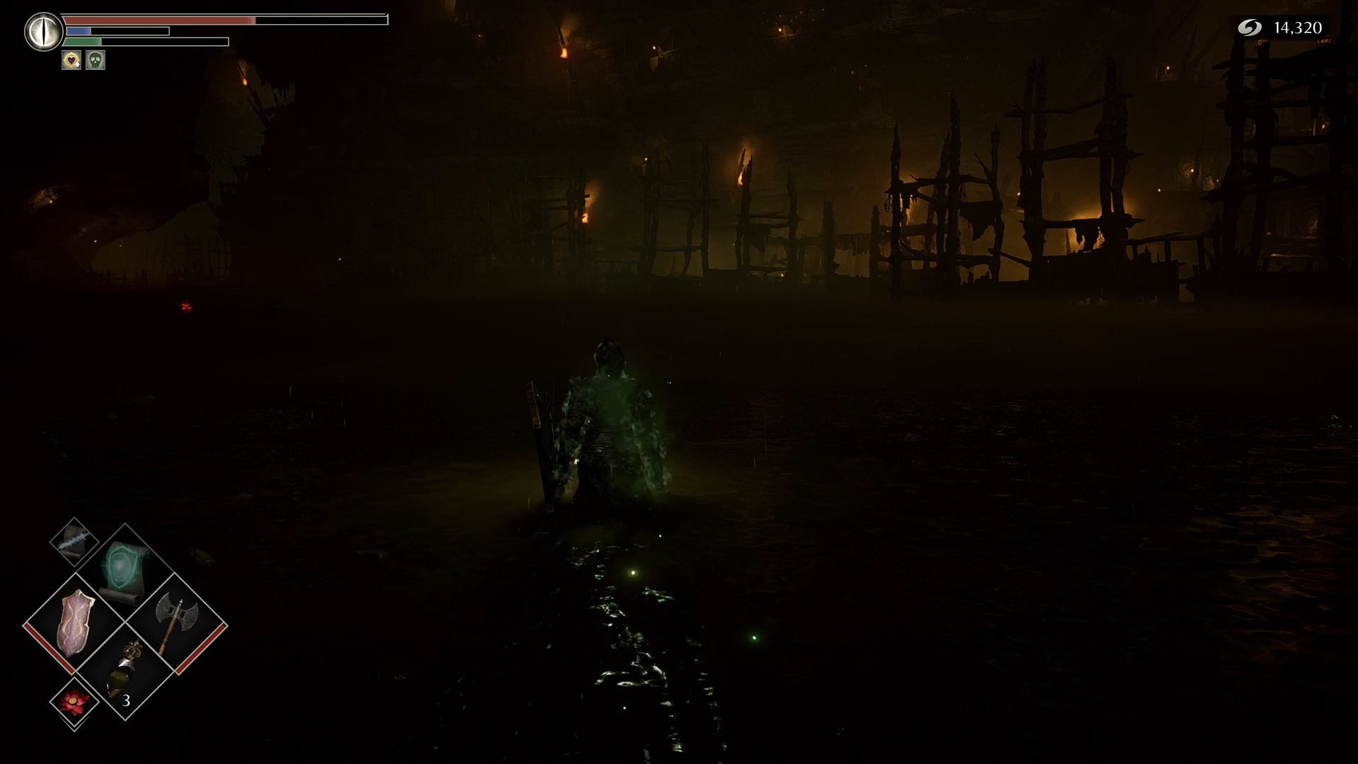
Bluepoint’s vision for the Swamp of Sorrows is a bit different, as the overwhelming darkness is no longer present. It’s still poorly lit and quite revolting, but it’s reassuring to know that nothing can hide from you in these open pools of sludge water. As I explored this swamp, I was able to mentally map the design of the level. This was not easy in the original, causing me to aimlessly wander until I reached my destination.
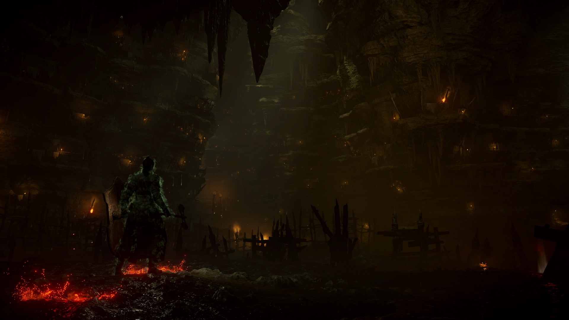
FromSoftware intended to keep the player in a constant state of fear, while Bluepoint’s interpretation bewilders us with a greater attention to detail. The haphazardly built wooden structures lining the cavern walls and the specs of hopeful sunlight plunging through the cracks of the ceiling were not visible in the original.
How Bluepoint changed the sound of Demon’s Souls
Bluepoint didn’t just shift the aesthetic of Demon’s Souls — the soundtrack sounds quite different as well. The original Fool’s Idol theme is a simple piano arrangement involving some dissonant keys. It added an element of creepiness to the fight, which stood out in a game full of intense compositions.
In the 2020 version, the track begins with a choir, light strings and escalates with the slam of a loud drum and the ringing of bells. The strings grow louder, which is when the iconic tune comes in, but the opening note is played on a harp and a noisy choir overwhelms the sound of that beloved melody. Both versions are good, but it’s disappointing that the new soundtrack drowns out the unique sombreness of the original with unnecessary extravagance. Most of the tracks have received this treatment, and it works better in some places than it does in others.
The original Tower Knight track starts with its choir providing a distinct laugh, one that remains present throughout the entirety of the song. It’s meant to be a clever play on the Official character, who happens to be a bit of a madman, laughing while he hinders the player at every turn. He traps you in with the Tower Knight before the boss fight begins, and the existence of that laugh within the track is iconic and meaningful.
That laugh is missing in the 2020 version of the Tower Knight theme. Bluepoint’s interpretation of the theme sounds more appropriate as it fits the epic scale of battling a colossal knight wielding a gigantic shield, but it’s still pretty bold to remove such an important part of the original. I’ll always love both themes, but the new version speaks to me more thanks to its compelling Bloodborne-esque pacing and payoff, regardless of how iconic that original laugh might be.
Storm King’s new theme also sounds different, and I think this one in particular is a testament to what each game is trying to accomplish. The original theme is dark and uncomfortable, as its instruments are played at a low volume with little enthusiasm. This creates a clear atmosphere that immediately puts the player on guard and makes this battle feel more discomforting than it does epic.
The new Storm King’s theme is anything but discomforting, it’s just awesome. It takes the original melody and infuses it with a surge of energy, giving the drums and choir a far greater prominence than before. The sound design has a completely different atmosphere, which helps the player get immersed in running through the pouring rain, strikes of lighting and waves crashing against the cliffside. Both of these themes are great, but once again, it’s clear that they’re accomplishing far different things.
Maiden Astraea’s theme is easily my favorite from the original soundtrack due to its narrative implications. As a result, I couldn’t help but worry about how Bluepoint would handle its re-imagining. While the new rendition sounds great, it doesn’t come close to the original’s sad and evocative nature, with a consistent melancholic string playing behind a striking harpsichord’s melody. It sounds unlike anything found within the game, let alone the rest of the Soulsborne series.
Bluepoint took this theme and added a choir, drums and additional strings to make it grandiose. While the new track is still melancholic, the overall sound doesn’t fit as well with the scene at hand. It has too many highs and lows, jumping between a handful of different sounds, whereas the original kept its striking melody playing at a consistent pace. This is meant to be the most heart-breaking moment in the game, yet it’s far less intense thanks to this discrepancy.
Certain tracks miss the mark tonally, but other times, the re-imagined sound surpasses what the original accomplished. If you’re hoping to hear music reminiscent of the classic Demon’s Souls soundtrack, you might be disappointed, but if you keep an open mind and embrace the elevated nature of these new compositions, you’ll love what you hear.
How Bluepoint changed the foes of Demon’s Souls
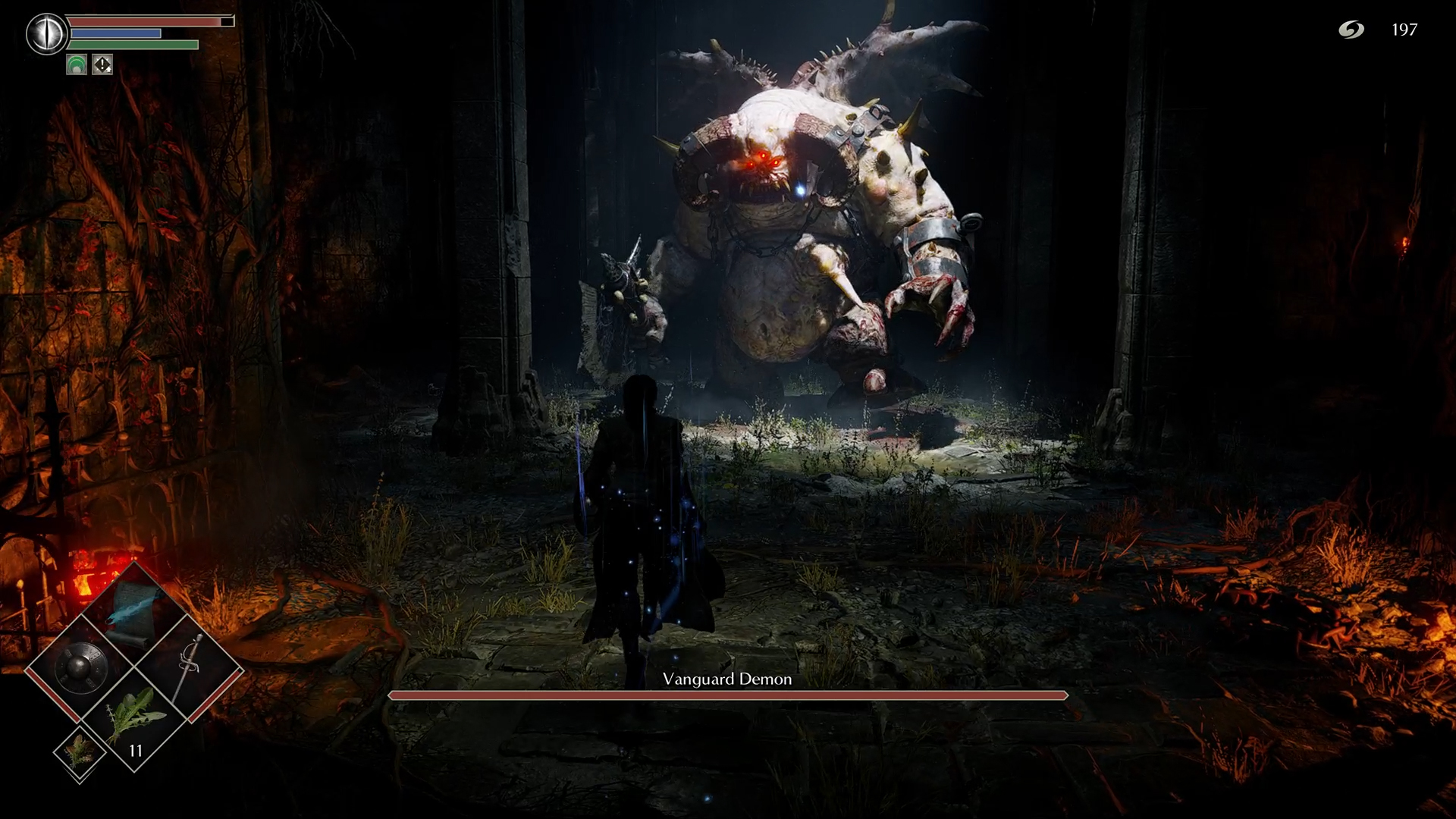
As I made my way through the game, I noticed severe changes to certain enemies, with the Vanguard being the most drastic shift by far. In the original, his textures and shades of gray made him look like living wet cement. This stood out in combination with his bright, yellow eyes, which don’t even seem to actually be socketed in his head. The monster’s teeth are easily the most memorable thing about him as they’re far too long to fit in his mouth, protruding out at almost half the length of his chin.
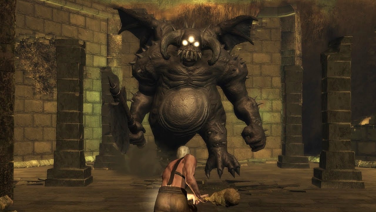
None of those traits are visible in Bluepoint’s interpretation of the Vanguard. His body looks somewhat beige and those unforgettable eyes are not as bright, now glowing red rather than yellow. The menacing teeth are also gone in favor of short, rotten fangs. Bluepoint's vision for this monster also boasts a new trait: arm shackles. This adds a meaning not previously obvious, implying that this demon was a prisoner. Perhaps Boletaria wanted to siphon the Vanguard’s power (by taking its soul) and failed at keeping it chained up?
Another important enemy, the Official, has undergone a few noticeable changes. In the original (on the right), a sturdy figure holds a bloodied axe, with a creepy mask on his face forcing the illusion of a smile. I believe FromSoftware was trying to translate mental corruption, showcasing how deranged the character has become without actually revealing who he is. His sense of self is no longer present. Instead, he always appears to be smiling as he chops his victims to bits.
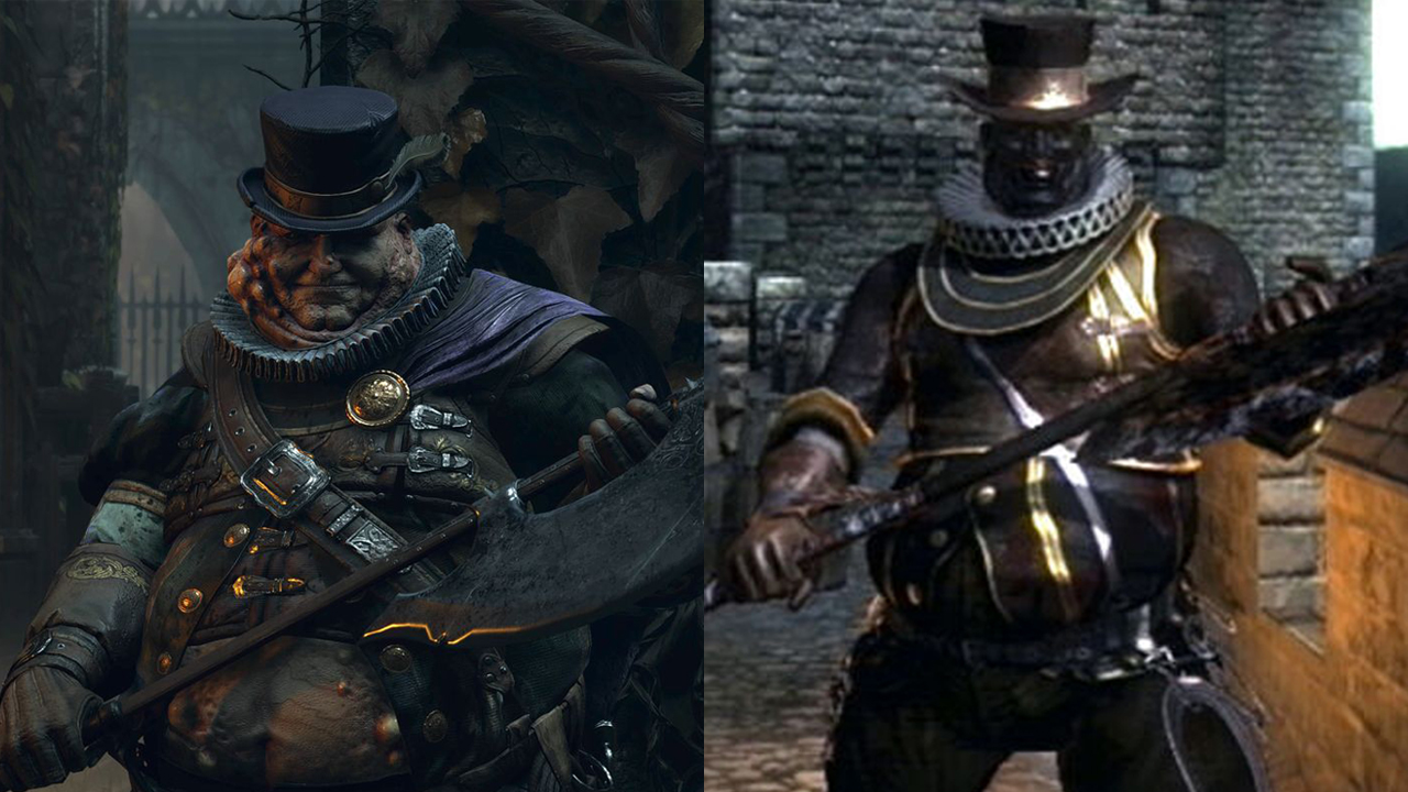
In Bluepoint’s Demon’s Souls, he’s not wearing a mask and his axe is no longer bloodied. Instead, he seems to actually be smiling and his face is overwhelmed by boils and blisters. I believe this represents a corruption of the body rather than the mind. He has physically taken on the shape of a demonic creature, rather than those demonic tendencies invading his psyche.
Out of all of Bluepoint’s changes, some of these enemy designs are nowhere near as memorable as their classic counterparts. While I do like the new Vanguard and Official designs, FromSoftware’s vision for them was far more striking, mostly thanks to their distinct features.
How Bluepoint changed the mechanics of Demon’s Souls
Perhaps the most faithful aspect of Bluepoint’s Demon’s Souls is how it plays. Not much has changed, but it’s worth mentioning the few things that have. Most importantly, the game now has omni-directional rolling. This means that the player can roll in more complex directions (and more accurately to where they’re pointing their stick) than in the original title.
Another change involves the item burden system, which initially provided a limit on the weight of things the player could carry. Bluepoint has implemented a system where you can send items in your inventory back to storage without having to travel to the Nexus. Additionally, if you have materials inside your storage and go to a blacksmith, those upgrade materials will automatically be accessible for upgrading weapons.
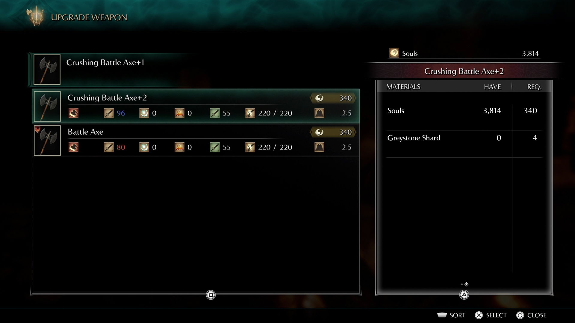
While these quality of life improvements are great, it’s bizarre that Bluepoint Games didn’t amend Demon’s Souls’ gendered armor system. There are certain equipment sets the player can only wear if they’re playing a male or female character. This shouldn’t have been okay back then and it’s certainly not okay in 2020, and I’m genuinely appalled that it wasn’t fixed. Even from a gameplay perspective, it’s frustrating to strive for a specific suit of armor only for an arbitrary system to deny you from wearing it because of your gender.
However, Bluepoint added a new system that slightly helps with this. If you approach the statue in the middle of the Nexus and offer 25,000 souls, you can activate Fractured Mode (flips the world horizontally), absolve your sins (stops NPCs from hating you if you accidentally attack them), and completely change the look of your character, even their body type. This means that if you really wanted an armor set that is locked behind the gendered equipment system, you can change your body type mid-game, even though you shouldn’t have to go that far to wear a piece of armor.
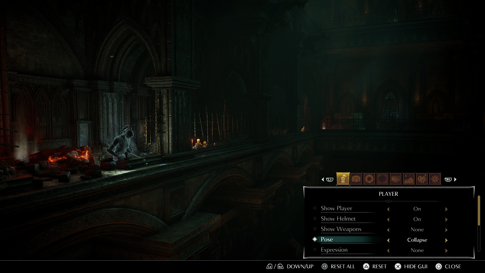
But my favorite feature by far is Photo Mode, which allows the player to capture some of the game’s most stunning moments. It would have been a shame if a game as astonishing as this didn’t give players the chance to take detailed photos, and honestly, I had a blast snapping shots every ten minutes. This also pauses the game, which is a nice feature to have in a Soulsborne title. However, it won’t pause if you’re being invaded, making it a useful way to detect if that’s happening.
A breathtaking world
Bluepoint may have changed the game aesthetically and tonally, but it doesn’t detract from how gorgeous these worlds are. Every rock, patch of grass and tree has been carefully crafted and placed to evoke a sense of amazement, bewildering the player at every turn with its unbelievable level of graphical fidelity. Bluepoint treats each moment as if it were a painting, imbuing as much detail into the scene as possible.
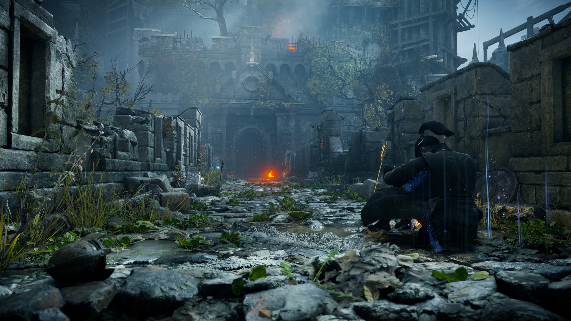
Every corner gets an overwhelming amount of love, whether it be in the form of engravings, complex shapes, making certain stones look more worn than other ones, or placing the occasional forlorn helmet on the ground for elevated immersion.
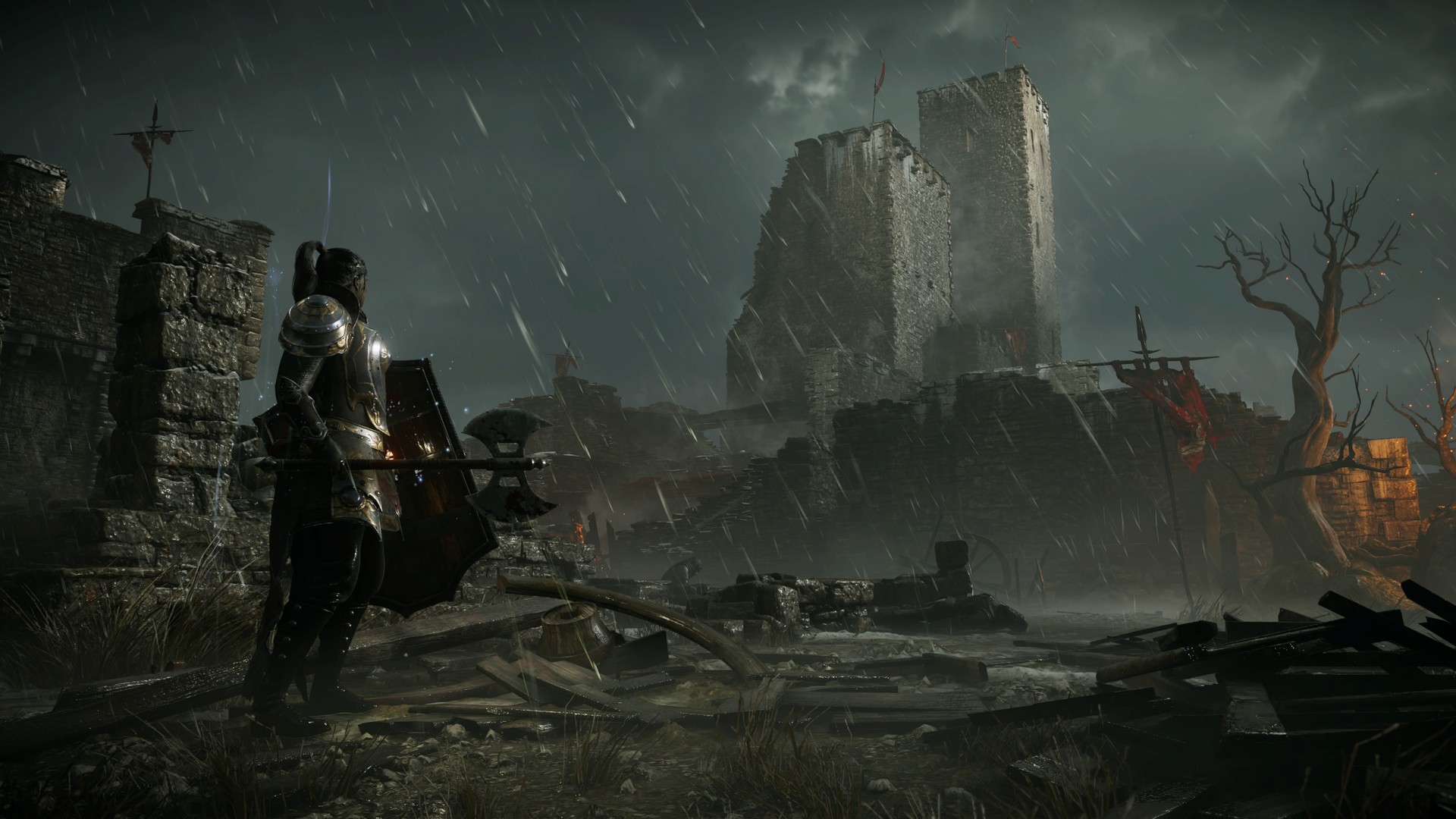
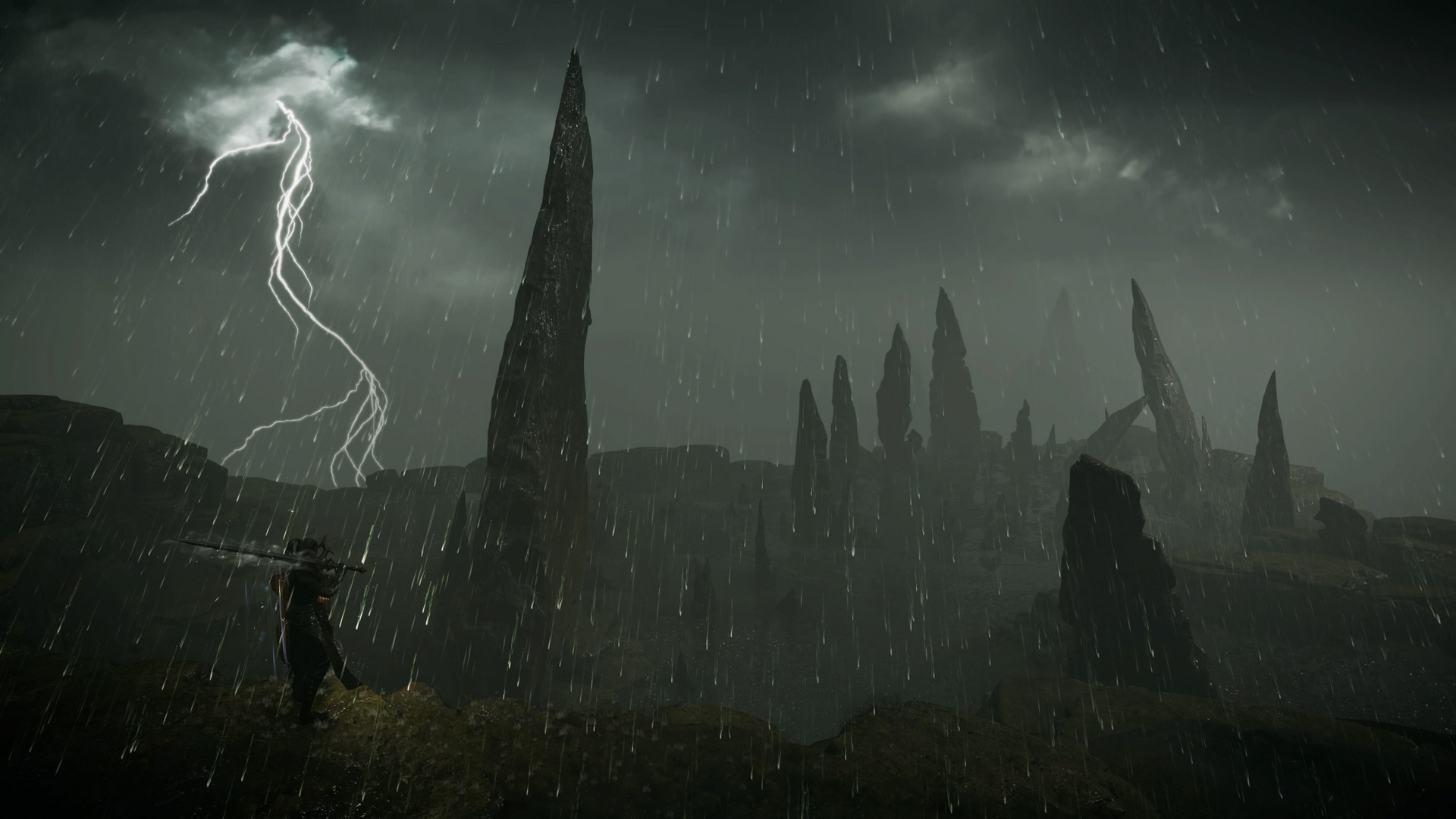
Areas like the Shrine of Storms stand out thanks to the scale of the two towers in the background, the wrecked stones bordering the shot, and the broken pieces of wood strewn about. It looks as if a tremendously powerful storm has wreaked havoc, and the mud, pouring rain and cloudy skies greatly add to this effect.
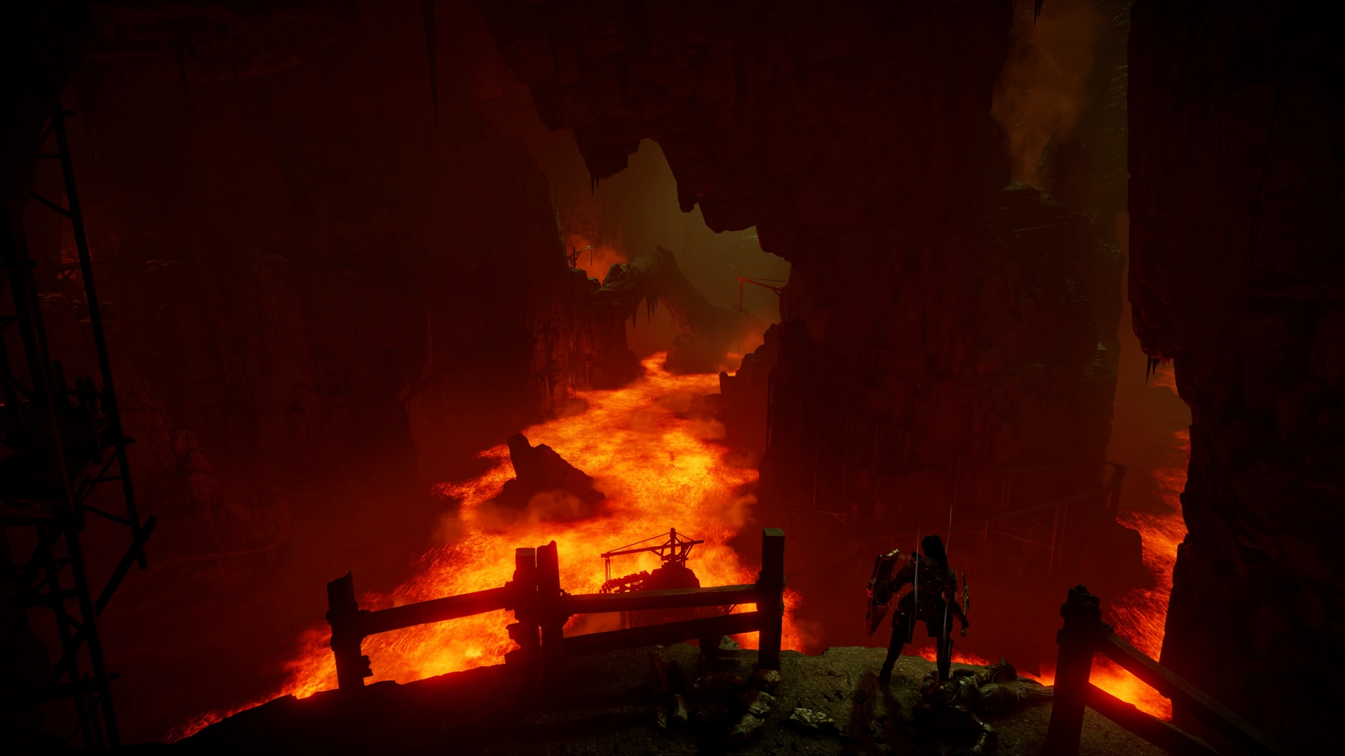
And in the second portion of the Stonefang Mines, as you push through to the other end of a worm-infested tunnel, you’re greeted by an ocean of searing lava. The way the bright red magma offsets the excessive darkness of this gigantic cavern is astounding. Although none of this is explorable, Bluepoint ensured that every set piece looks unique, contributing to Demon’s Souls’ memorable world.
Patient strikes
As Demon’s Souls is the progenitor to the Soulsborne games, its novel approach to third-person action combat is widely celebrated. It boasts all the traits you’d expect: each level-up only increases stats marginally, fights require well-timed dodges and strikes to emerge victorious, and there are a variety of builds the player can work towards that completely shift their playstyle.
These elements contribute to the unforgiving nature of the game, and if you’re a new player, its one-of-a-kind brutality takes some time to get used to. A number of enemies can remove a majority of your health in one shot. And if it’s not going to kill you quickly, it’ll come at you in large groups, whether that be in the form of a pack of rabid dogs, poisonous rats, or mindless undead.
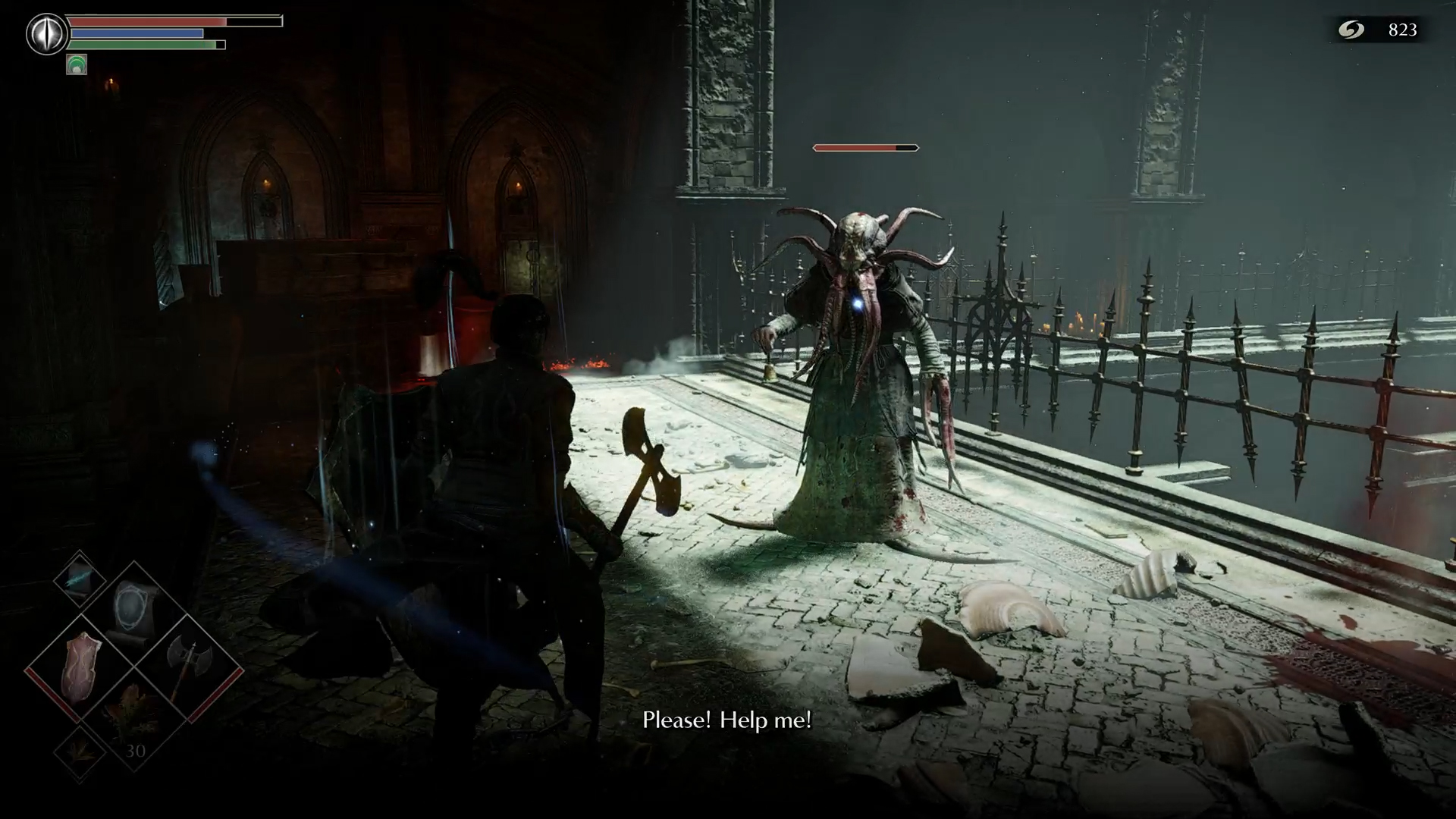
Not only does Demon’s Souls require patience, but you need to find a solid balance between careful and quick. If you’re too careful, fast and powerful enemies will overwhelm you. If you’re too fast, you’ll fall prey to an obvious trap. Thankfully, Demon’s Souls is also the most exploitable game in the Soulsborne series. Shields are incredibly effective and magic is overpowered, with spells that can revive the player from death and others that provide 70% physical damage resistance. There’s always an alternative to dealing with its brutality, which is reassuring as much as it is rewarding.
Unique bosses
Every time a player steps through a fog gate, Demon’s Souls harps on their fear of the unknown. Unlike its successors, which typically focus on well-timed dodges against humanoid enemies, every new boss you face will largely feel different than the last.
For example, the first actual boss encounter of the game (besides from the tutorial boss) occurs against the Phalanx, which is a black sludge monster with dozens of other black sludge monsters morphed into it. Every single abomination has its shield up and is throwing spears at you. It’s immediately obvious that just attacking this boss with your sword isn’t going to work.
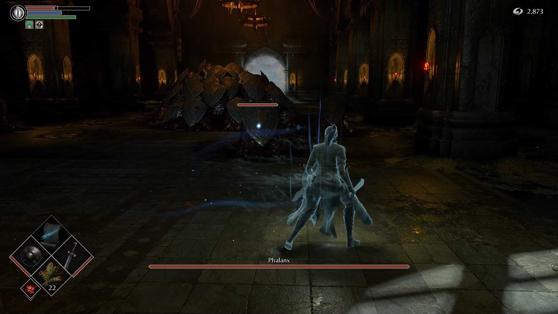
FromSoftware is presenting a puzzle, and based on context clues, you need to discern an answer. The first part of Boletarian Palace yielded dozens of Firebomb items. Not only have enemies been tossing these at you during every moment throughout, but there’s a theme of explosive fire present in the area. Undead pierce you with burning pikes, explosive barrels are hidden inside tight corridors, and certain sections are patrolled by a fire-breathing dragon. Put this knowledge to use, throw your firebombs at the Phalanx, and it quickly becomes a walk in the park.
To avoid spoilers, I won’t go into any of the other puzzle-based bosses, but this mindset can be applied to nearly all of them. FromSoftware is usually presenting a unique gimmick, and it makes those encounters memorable, rather than having the same systems at play during every fight.
Unforgiving checkpoint system
Demon’s Souls is horrifying, not just because the world is creepy, but because the game is unforgiving. Players are typically expected to travel through rather large areas to reach a boss, and in a number of the game’s levels, there are few to no shortcuts to get to those points quickly.
This design philosophy is visible in the second portion of Boletarian Palace, where players are expected to traverse a gigantic bridge with a fire-breathing dragon raining hell upon it. You could choose to go underneath the bridge, but the rabid dogs are arguably worse. And even if you manage to make it to the other side, two intimidating Blue Eye Knights and three archers are waiting to halt your progress. Once you’ve done all that, you’re ready to face the Tower Knight. And if he manages to kill you, you’re going to have to repeat that entire process.
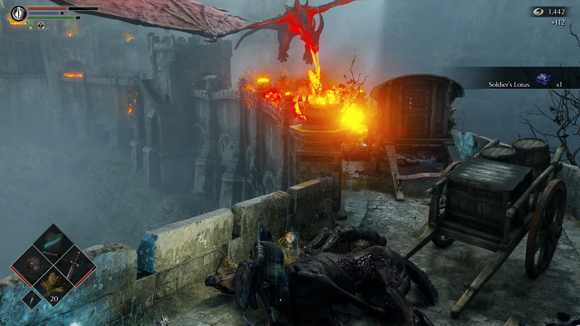
Demon’s Souls inflicts a sense of dread into the player by making it clear that their first encounter with a boss needs to count. If you perish at that moment, much of the progress you’ve made was for nothing. This sense of dread is furthered by the World Tendency system, which causes the Archstone you die in to tip further towards Black if you’re in Body Form. With a Black World Tendency, the game only gets harder, as enemies take more hits to kill and deal more damage. Additionally, certain events can only trigger depending on your World Tendency, meaning there’s a ton of stuff you can miss if you completely ignore the existence of this mechanic.
Bottom Line
Bluepoint’s vision of Demon’s Souls involves colorful worlds, grandiose battles and bombastic music compositions. It boasts some of the most breathtaking environments I’ve explored in a video game, with a level of graphical fidelity and detail I’ve never experienced before. The original Demon’s Souls is quite different, rooted in atmospheric horror and contemplative visuals coupled with subtle sound design and a muted color palette.
If you’re a fan of Bloodborne and Dark Souls 3, you’ll love what Bluepoint’s vision of Demon’s Souls has to offer, as they’re similarly magnificent. However, if you’re a diehard fan of the original Demon’s Souls and have found that some of the latest Soulsborne entries don’t particularly suit your tastes, you’ll be disappointed in how drastically Bluepoint has changed this world.
Both games need to be treated as their own beasts, which gives credence to Bluepoint previously deeming this project a “re-imagining” rather than a “remake” or “remaster.” In the end, both FromSoftware’s Demon’s Souls and Bluepoint’s Demon’s Souls are excellent, albeit for very different reasons.

Self-described art critic and unabashedly pretentious, Claire finds joy in impassioned ramblings about her closeness to video games. She has a bachelor’s degree in Journalism & Media Studies from Brooklyn College and five years of experience in entertainment journalism. Claire is a stalwart defender of the importance found in subjectivity and spends most days overwhelmed with excitement for the past, present and future of gaming. When she isn't writing or playing Dark Souls, she can be found eating chicken fettuccine alfredo and watching anime.
