Laptop Mag Verdict
macOS Sonoma adds a bunch of exciting features to the Mac including, a new, modern lockscreen experience, and desktop widgets.
Pros
- +
Stunning new screen savers
- +
Better, modern lockscreen experience
- +
Cleverly-executed desktop widgets
- +
Handy video-conferencing tools
Cons
- -
Fails to address some long-overdue, missing features
- -
Apple's apps should be available via App Store
- -
Unreliable video call reactions
Why you can trust Laptop Mag
When I reviewed macOS Ventura last year, I remarked how you’d be hard-pressed to tell the difference right away. Apple’s latest annual update for Macs -- 14th if you’re still keeping count and named after the California wine country, Sonoma -- is pretty much the opposite of that.
The last couple of macOS updates have had a soft, recurring theme — they’ve all offered a functional, incremental set of changes, most of them tailored for people who live inside Apple’s ecosystem. But none were a must-update release.
The new macOS Sonoma continues along these lines, but it has more for everyone else too. It won’t radically redefine your day-to-day Mac experience. What it does is restore a bit of charm that’s been missing from macOS lately and breathes new life into long-forgotten elements like screen savers.
Not just a fresh coat of paint
The new login look, for example, delightfully blurs the lines between the lockscreen, home, and screen savers. Widgets have come full circle and are back on your desktop.
With Sonoma, Apple has also, at long last, addressed a handful of missing features such as the ability to add websites as apps to your dock from Safari. I’ve been tinkering with macOS Sonoma for weeks ever since it was in beta. Here’s whether you should update.
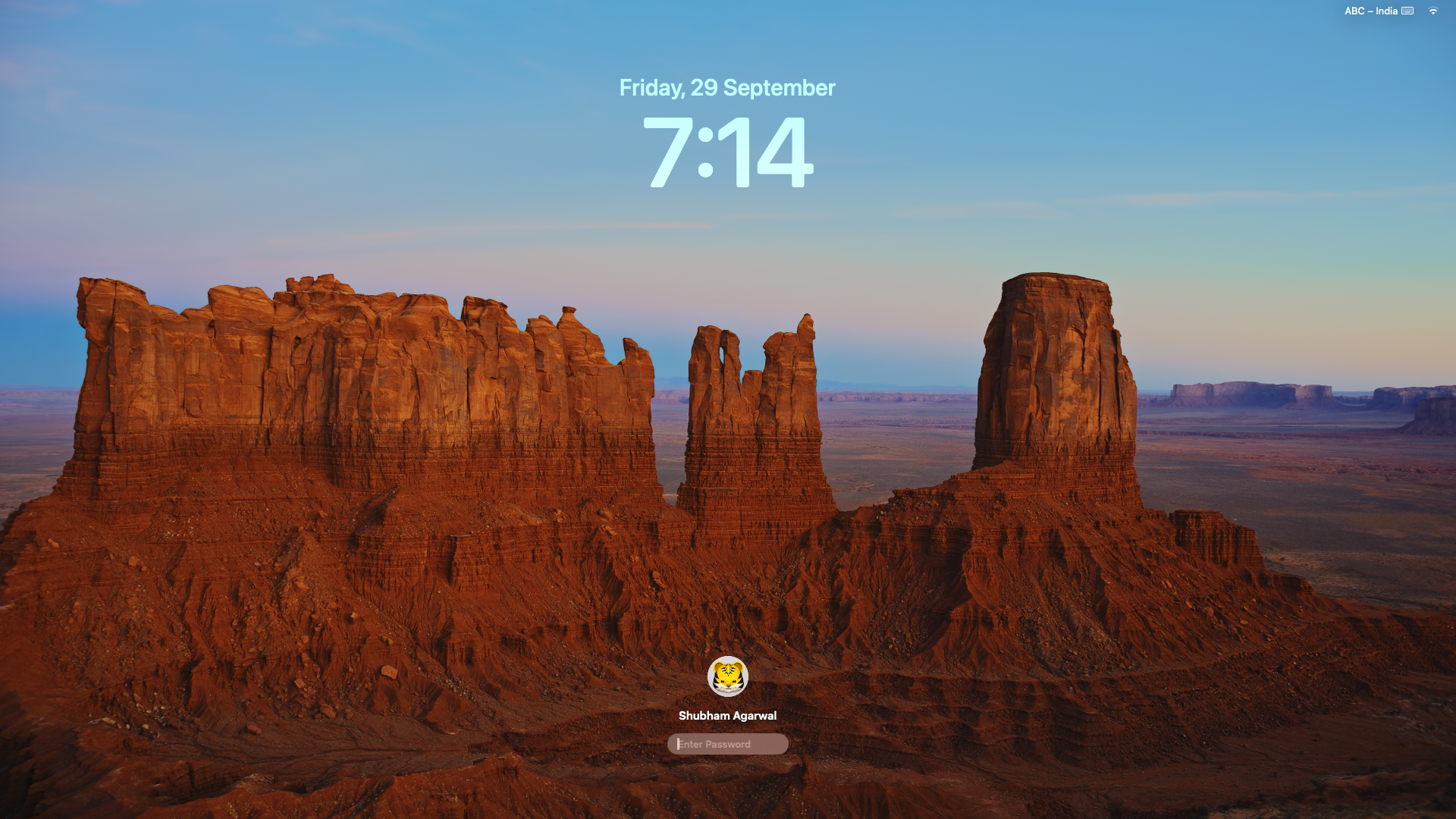
The Sonoma update makes its presence known as soon as you boot into it. Apple has swapped out macOS’s archaic lockscreen with a cleaner, iPad-like design with a big, bold clock and date taking centerstage, pushing down the password field and your avatar to the bottom center.
The buttons to cancel the login and switch to the guest mode are now tucked away behind that avatar, and the rest of the profiles fan in and out when you cycle through them. I rarely accessed these options, so I’m glad they’re now hidden in favor of a far more modern lockscreen. It also brings it on par with a similar-looking Windows 11 lockscreen, which has wowed any Mac user I’ve shown it to, thanks to the wallpaper’s 3D parallax effect.
Another Windows-esque detail Apple has borrowed is the handful of smooth transitions that make signing into your computer feel a lot less abrupt. On Sonoma, once you log in, your lockscreen fades out and the desktop smoothly comes into focus instead of suddenly flickering on.
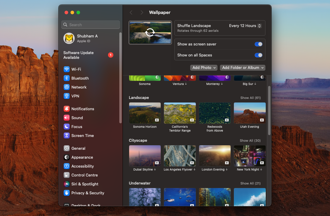
Tying together these bunch of new experiences are macOS Sonoma’s video screen savers; Apple has added over 100 of them and they work in conjunction to make the lockscreen, home, and screen savers act like one instead of disparate sections.
The high-res live wallpapers pan over some of the world’s most breathtaking sights, from the Hawaii coastlines to Costa Rica’s dolphin pods, when they’re on your lockscreen or in the screen saver mode, and when you return to your desktop, the aerial cam decelerates to a halt and settles into a still backdrop.
Such attention to detail may seem unnecessary on paper. But as I said, they add a playful touch to an OS that was always considered the more vibrant one with its genie effects and swoosh sounds but has lately lost a little bit of it in favor of stability. I’ve set my Mac Mini to shuffle all of these daily and being greeted by a new video wallpaper every time I log on is sublime.
Welcome to the widget life
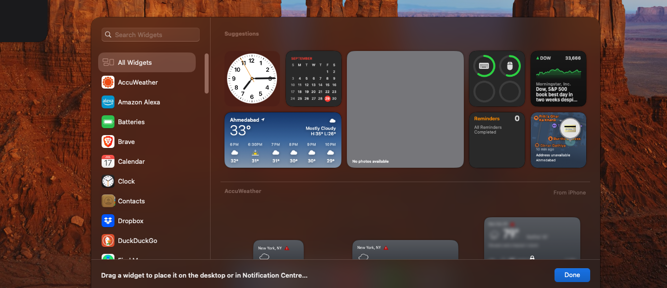
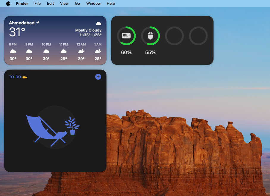
When you are done admiring the scenic wallpaper and arrive on your desktop, you’ll find the next, significant Sonoma change: widgets. Yes, Apple still isn’t done figuring them out, and after relocating them from the extinct “Dashboard” screen to the Notification Center, they’re now front and center on your desktop and I think this might be the best execution. Not only can you place widgets on your Mac desktop now, but they’re also interactive like the ones on iOS and iPadOS.
There are numerous little apps on Mac that I launch to do small tasks, and often when I have an endless pile of windows already. Widgets eliminate that problem. Now, I can just use the new shortcut that lets me click an empty space on my screen to hide all the open windows and take advantage of the desktop widgets to, say, check off an item on my to-do list, or take a note.
What’s more impressive is you don’t need corresponding programs installed on your Mac to access their widgets either -- macOS Sonoma can stream widgets from your iPhone as long as it’s close to your computer and allows you to put them on your computer’s desktop.
Big Zoom Energy
With Sonoma, Apple has continued its pandemic-spurred tradition of baking video conferencing tools natively into macOS that people previously used to download third-party apps for.
Most importantly, the video feed controls are no longer located inside the Control Centre. hey live under their own dropdown on the menu bar, and hence, are much easier to access. Plus, Apple’s effective Studio Lighting filters that can better illuminate your face now work across a host of apps like Zoom, and are not anymore limited to when your iPhone doubles as a webcam.
If you are using your Mac’s built-in webcam or Continuity Camera, you can fill the frame with new 3D effects too. Forming a heart with your two hands, for instance, will make red heart emojis appear in the camera feed; Fireworks will go off in your background when you do a two-thumbs-up gesture.
These reactions are kind of a hit or miss, and didn’t always recognize my actions, which could be partially due to the lighting but either way, I ended up switching them off. Speaking of which, here’s a pro tip: reactions are enabled by default, and if you don’t want your balloons to show up inadvertently on an important video call when you flash the peace sign, you may want to turn them off too.
The new screen-sharing tools, on the other hand, have come in quite handy to me. During screen-sharing and presenting, your (Apple silicon) Mac can shrink your face into a small, movable bubble or the shared screen can go behind you while you speak with a nice, bokeh effect. I had to resort to third-party extensions for these options before, and they can be clunky and bog down my computer’s performance. I’m glad I can do this without an app now and it works well even on non-Apple apps such as Zoom.
Small, but welcome changes
There are several other macOS Sonoma additions you’ll come across as you explore it, but I haven’t yet found a use for them. Predictive text, for example, is now available on your Mac, and irrespective of the app you’re in, you’ll see the software suggest words while you type. Plus, dictation can now work in parallel with text input so that you don’t have to switch back and forth between them.
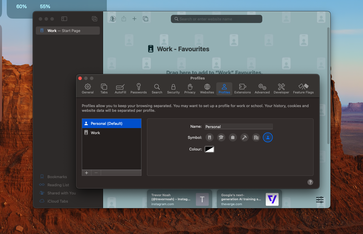
In case you’re someone who spends time inside Apple’s in-house apps, you’ll appreciate the many updates they’ve received with Sonoma. On Safari, you can now create profiles to separate, say, your work and personal accounts. With Apple’s password manager, you can share passwordless logins called passkeys. Notes now lets you import PDFs and scanned documents inline. iMessage can automatically warn you if someone sends you sensitive content and blur photos and videos containing nudity.
Apple also soon hopes to revive gaming on Macs and has been making some strides with its own silicon to take on Windows. To further push gaming performance, macOS Sonoma houses an automatic “Game Mode” which springs into action when you launch a game and prioritizes resources for smoother frame rates as well as lowers audio and input latency if you’ve connected AirPods or wireless controllers.
Apart from that, I haven’t come across any deal-breaking bugs on macOS Sonoma either. There are some threads on official Apple forums that suggest it can take a hit on battery life for MacBook Pros, and a couple of VPN providers like Mullvad don’t work on it yet. However, none of the apps I use, including ExpressVPN, have run into any issues.
Bottom line
MacOS Sonoma is the first time since I switched to a Mac that updating to an annual release hasn’t just felt like a waste of space and data.
Though it still fails to address the absence of a few pragmatic features I’ve grown used to on Windows like insufficient multitasking tools and a clipboard manager, it adds a couple of refreshing quality-of-life features that have made my Mac exciting to boot.
I’d recommend updating to macOS Sonoma as long as there are no critical programs you rely on daily and your Mac is recent enough to handle it.
Shubham Agarwal is a freelance technology journalist from Ahmedabad, India. His work has previously appeared in Business Insider, Fast Company, HuffPost, and more. You can reach out to him on Twitter.
