Laptop Mag Verdict
The Nothing phone (1) stands out from the mid-range pack with a unique aesthetic and some impressive features but it drops the ball in a couple more key areas than you would expect given the hype behind it.
Pros
- +
Gorgeous display
- +
Decent cameras
- +
Value for money from £399
- +
Unique aesthetic…
Cons
- -
…but Glyph lights can be a gimmick at times
- -
Problems for people with epilepsy
- -
Below average battery life
- -
Nothing OS is a bit basic right now
Why you can trust Laptop Mag
Price: from £399
OS: Android 12
Display: 6.55 inches OLED display (2400 x 1080)
CPU: Snapdragon 778G+
RAM: 8/12GB
Rear cameras: 50MP wide (f/1.88), 150MP ultrawide (f/2.2)
Front camera: 16MP (f/2.5)
Storage: 128/256GB
Battery: 4,500mAh
Size: 6.27 x 2.98 x 0.33 inches
Weight: 6.8 ounces
The Nothing phone (1) is easily the most hyped phone launch of 2022, but can it match up to those lofty expectations?
Following the playbook established by the ear (1), this brings a unique visual aesthetic to the smartphone space, which rides on a wave of pomp and circumstance, thanks to odd marketing phrases like “designed with instinct, to bring joy back to the everyday.”
Contrary to what you may have expected, this is not a flagship. With mid-range specs and a mid-range price, Nothing is doing something very different here. Let’s take a look.
Your questions answered
The Nothing phone (1) is arriving on a tidal wave of hype, but there are some real questions that need to be answered about what this phone is like in general day-to-day use.
So we took to Twitter and Instagram to ask you what you’d like to know about.
“Other than flashy lights, why would I get this over an iPhone?”
Honestly, not that much. Let me be clear — if you have the budget to buy an iPhone, buy the iPhone.
You’re right to draw that comparison, as outside of its unique Glyph Interface that makes phone (1) a more interesting-looking phone, the shape and aesthetic of the front and sides do seem to draw inspiration from the iPhone 13.
Whereas Apple’s phone packs the latest internals and a fantastic camera system, the Nothing phone (1) is a great mid-ranger that may have the advantage in some areas (the 120Hz display for example), but isn’t really able to hang.
“Does the unit have any quality issues such as a green tint, dead pixels, etc?”
Now this is an important question. Personally, I’ve not experienced any issues with quality control across the display or Glyph lights on the back.
But it’s hard to ignore the increasing number of tweets with photos of problems, from the dead pixels around the camera hole and some dead LEDs in the back lighting to the alarming amount of dust that seems to be appearing underneath the rear glass.
Hey @nothingsupport,I reached out to your customer care with a green tint issue on my screen. I am being told to wait for 24 hours after every call I make 48 hours later. Request you to address this issue and help me with it asap.@buildingnothing @getpeid @nothing pic.twitter.com/OrqYz9t73BJuly 24, 2022
I haven’t experienced any of this personally, but after reaching out to Nothing for comment, the company responded with this about the display:
"All OLED screens are susceptible to green tinting when the brightness level is set too low - this is not exclusive to Phone (1). We're aware that some customers are impacted, the scale of which is very low.”
“Our standards are very high and this is not the experience we want any user to have. We are working hard to improve this issue and recalibrate the display effect in an upcoming software update. In the meantime, we encourage affected users to contact our Customer Support team and request a replacement."
I am baffled to see the amount of grim and dust getting collected underneath the back glass panel of the Nothing Phone (1). @nothing @getpeid, any explanations for this? #NothingPhone1 #Nothing pic.twitter.com/ItIovZZYysJuly 20, 2022
"A small number of units experienced this issue. It was caused by a cleaning operation which has been immediately fixed and no other displays should be impacted moving forward. Customers with affected devices are kindly asked to get in touch with our Customer Support team for a replacement. We apologize for any inconvenience caused."
Nothing phone (1) price and configurations
The Nothing phone (1) comes in either white or black with three different configurations:
- 8GB RAM/128GB storage: £399
- 8GB/256GB: £449
- 12GB/256GB: £499
This puts the phone in close competition with the likes of the Google Pixel 6a and the iPhone SE, alongside what is becoming an increasingly competitive mid-range tier.
Sorry America, the Nothing phone (1) is not officially launching in the US. It supports some GSM bands, but there is no proper availability outside of some unofficial international shipping back channels.
Nothing phone (1) design
In some ways, the Nothing phone (1)’s design is a good lesson in just how much you can innovate on the typical slab design. Smartphones are appliances now, and you can’t really change too much about it.
In fact, there’s a lot about this frame that seems reminiscent of an iPhone 13/iPhone XR hybrid, as I mentioned before. The aluminum band wraps around the outside of a flat display with minimal bezels. Sound familiar?
Going into the technical specs before we weigh into the aesthetic, the phone (1) measures in at 6.3 x 3 x 0.3 inches with a weight of 6.8 ounces. That’s a sweet spot for most phones packing a display over 6.5 inches, but does outsize and outweigh the Pixel 6a (5.9 x 2.8 x 0.34 inches, 6.3 ounces) for its use of premium materials over the plastic back Google opted for. As you might have guessed, the iPhone SE (5.2 x 2.5 x 0.3 inches, 5.02 ounces) is the smallest of the lot.
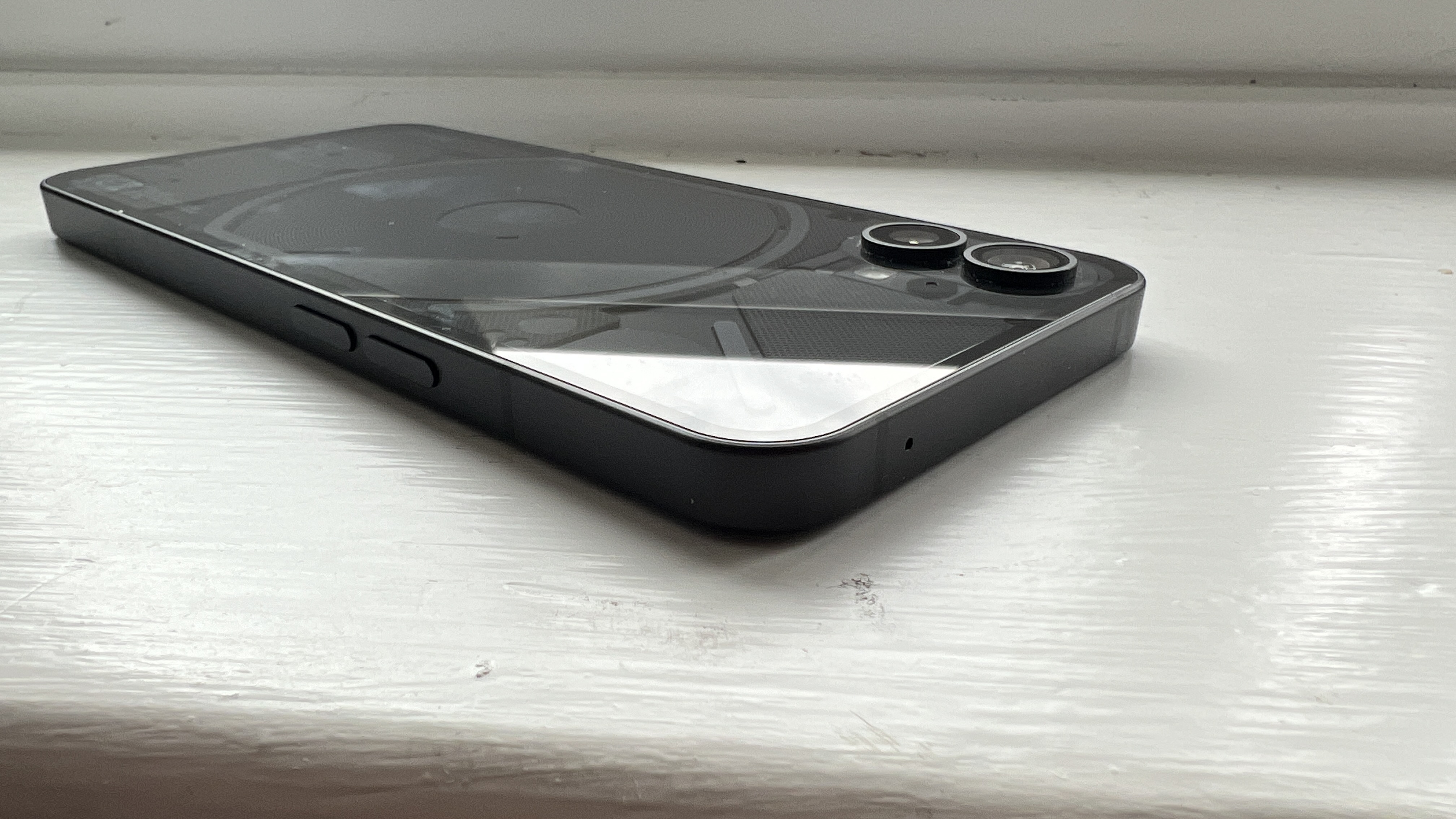
According to Nothing, the phone (1) has been “designed with intention. Full of warmth. And joy.” This top notch work from the product marketing team translates into the brand’s trademark transparency, giving you a behind-the-scenes look of the rear through its durable gorilla glass construction.
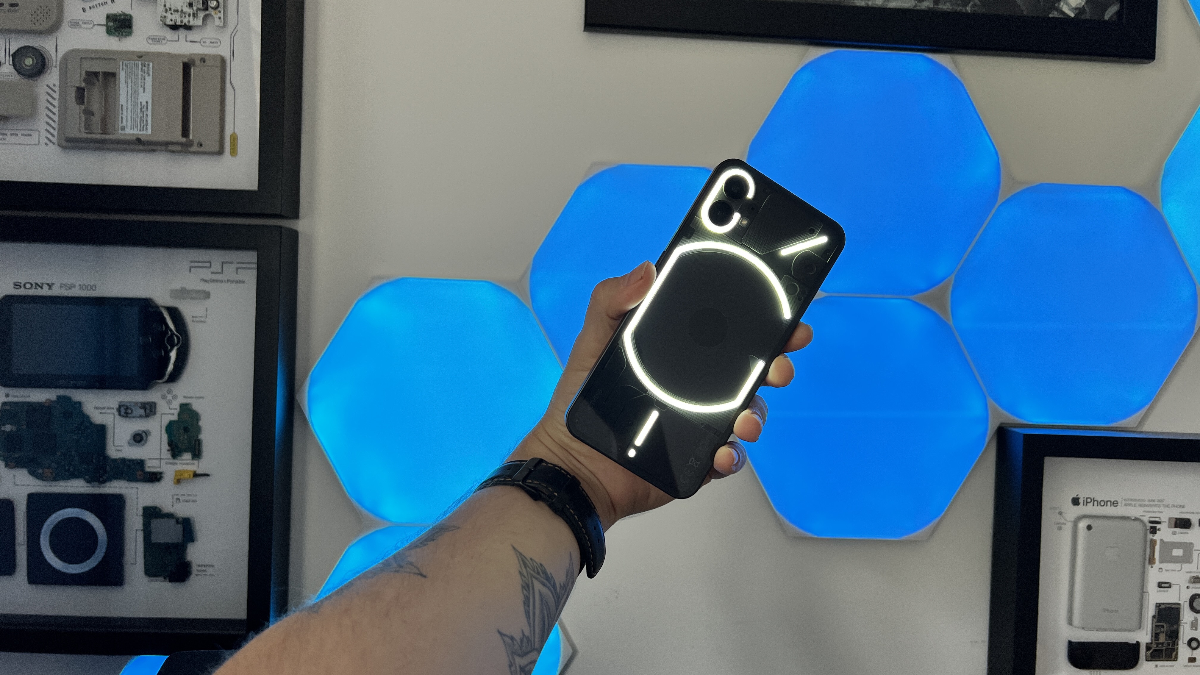
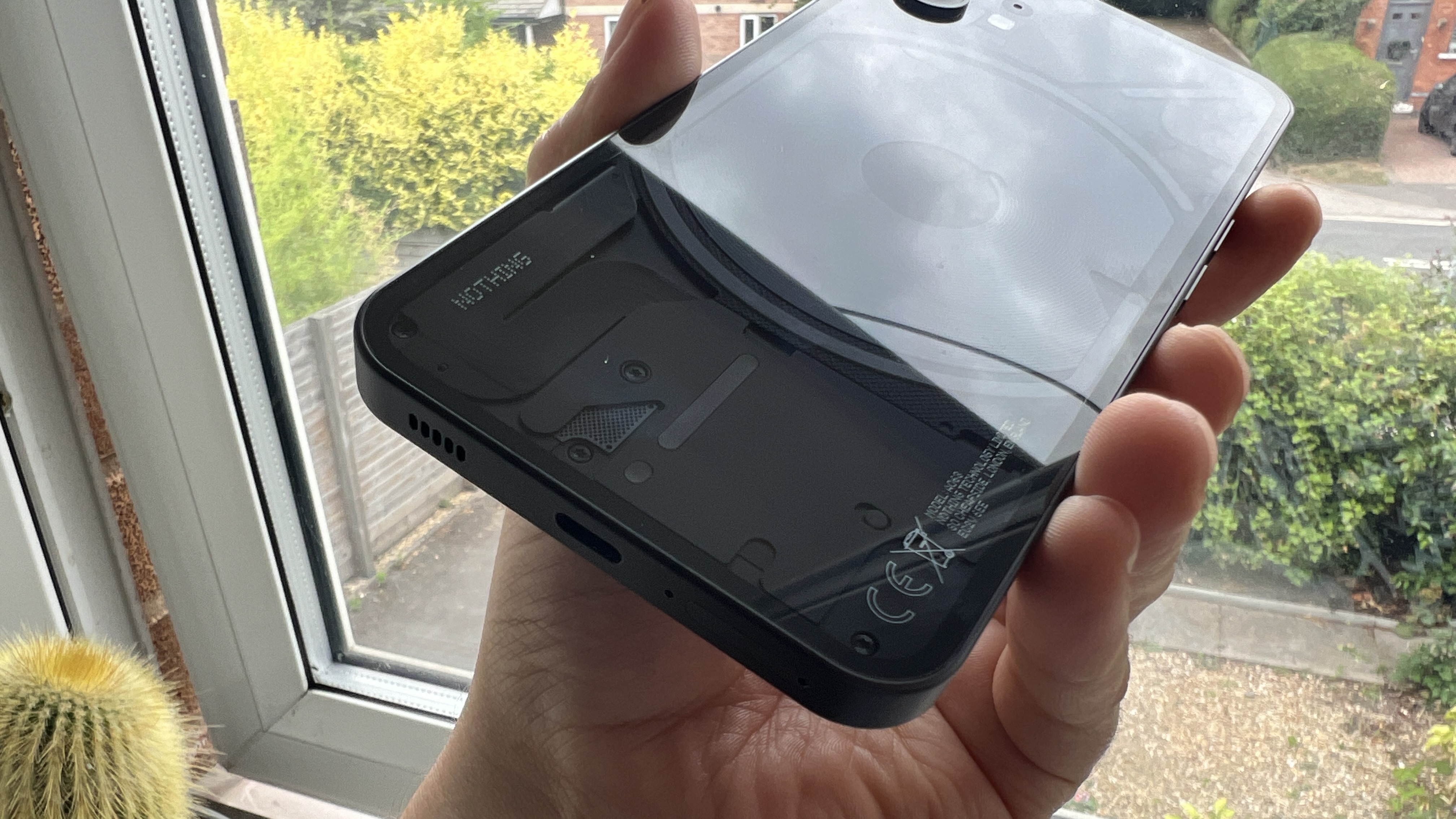
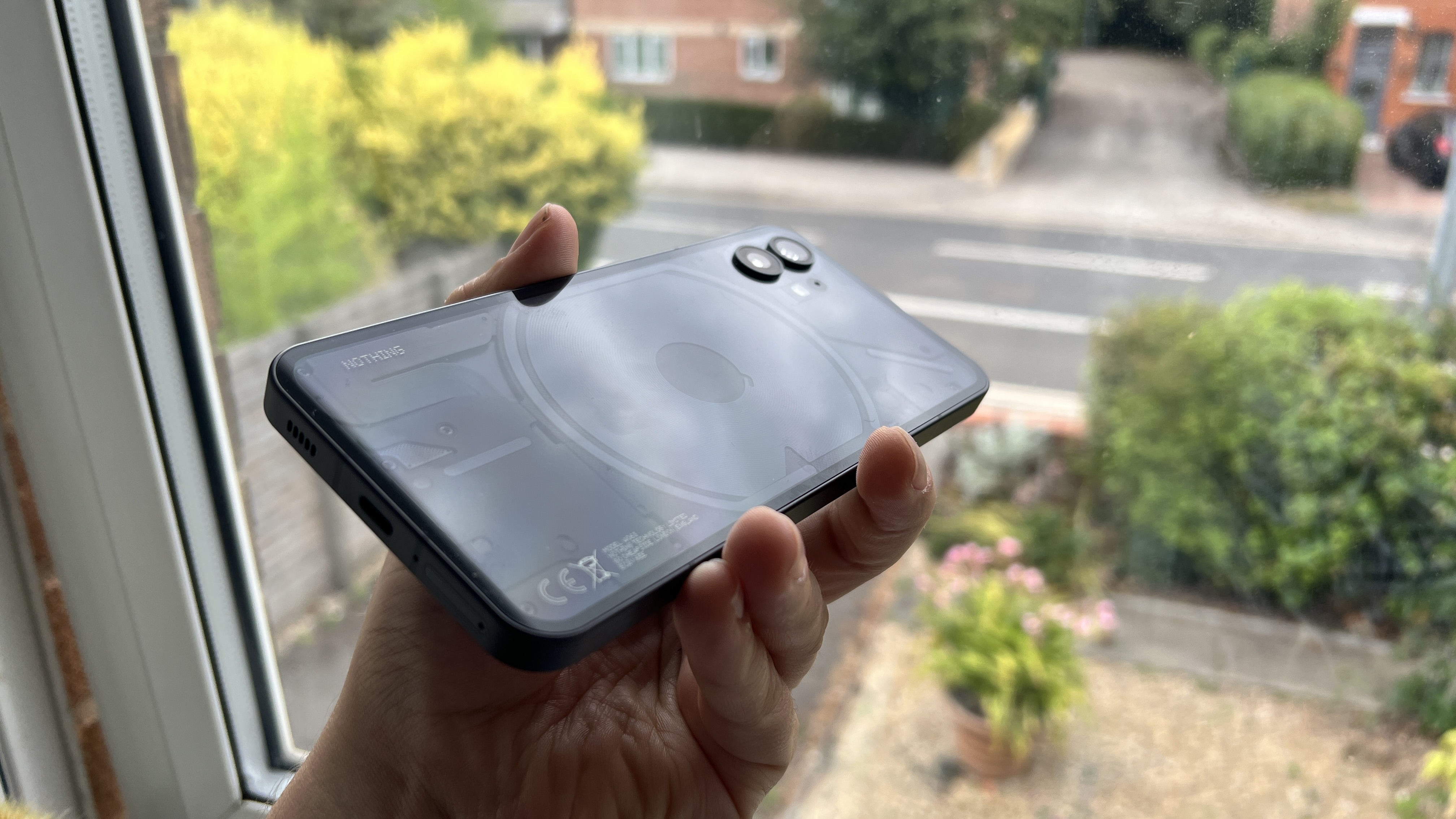
In there, as hinted to by the odd hieroglyphics in Nothing’s March event, you’ll find the big selling point of the phone (1): the Glyph Interface, which is a pattern of 900 LEDs that surround the camera bump, and the wireless charging coil, which reaches out to both the top right corner and the USB-C charging port.
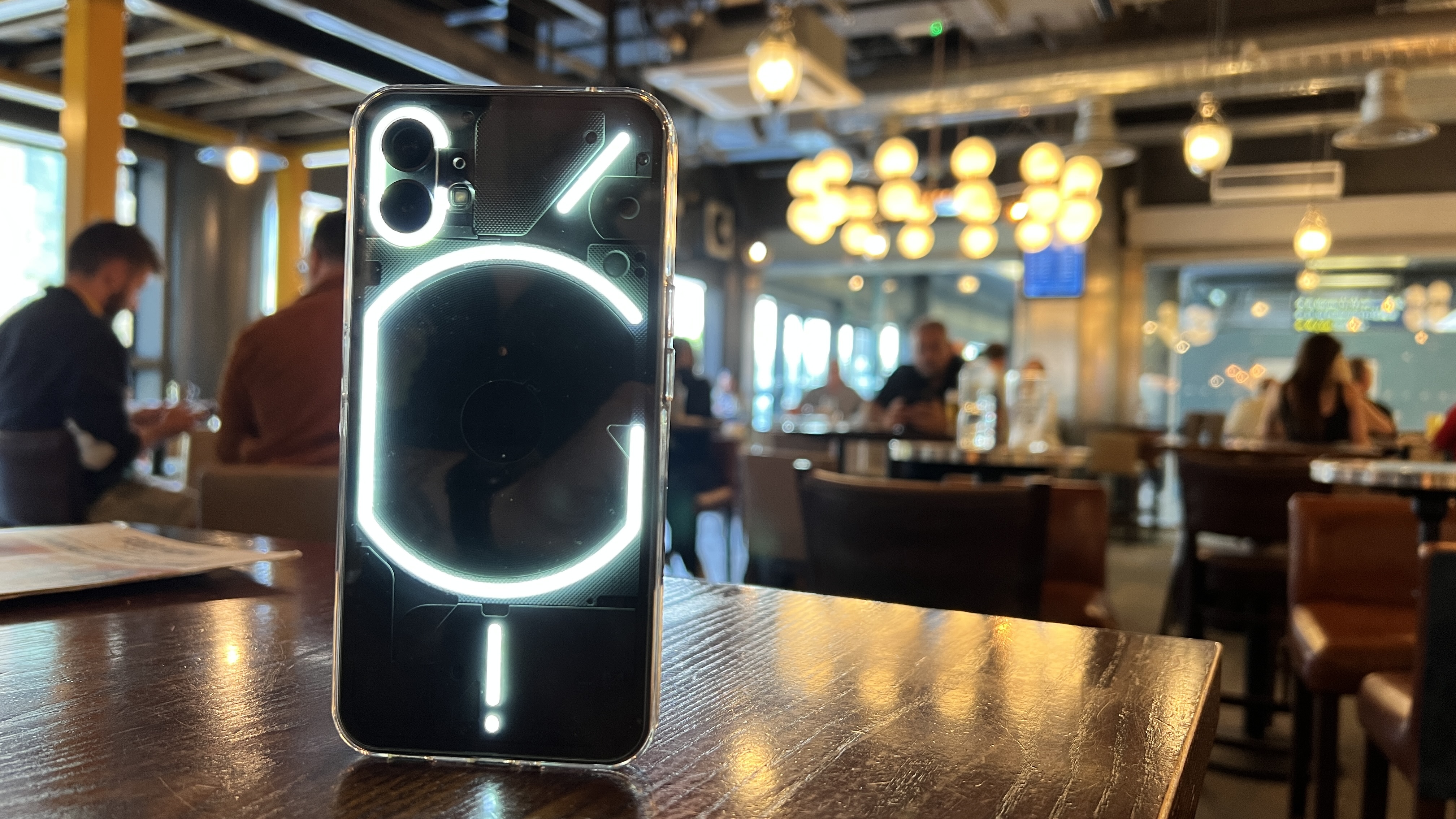
Visually, the end result is divisive. I personally love the retro futurism of it all, which culminates with the subtle dot matrix signature of the brand’s logo. However, when showing this to my not-so-nerdy friends, they viewed it as just a strange bit of over-engineering.
I went into using it with a shade of skepticism — fearing it could be a bit of a gimmick, and I left feeling a little more mixed about it.
You see, there are some genuinely neat implementations here, from the bar of lights at the bottom filling up as the phone charges to the whole interface creating a nice fill light for photography in darker conditions (more on that later).
But for notifications and general use, the Glyph is a little half-baked. The visual ringtones are cool (particular shout-out to the music visualizer easter egg), but right now, you options are to use Nothing's own ringtones for any of your contacts or mapping them to third party app notifications.
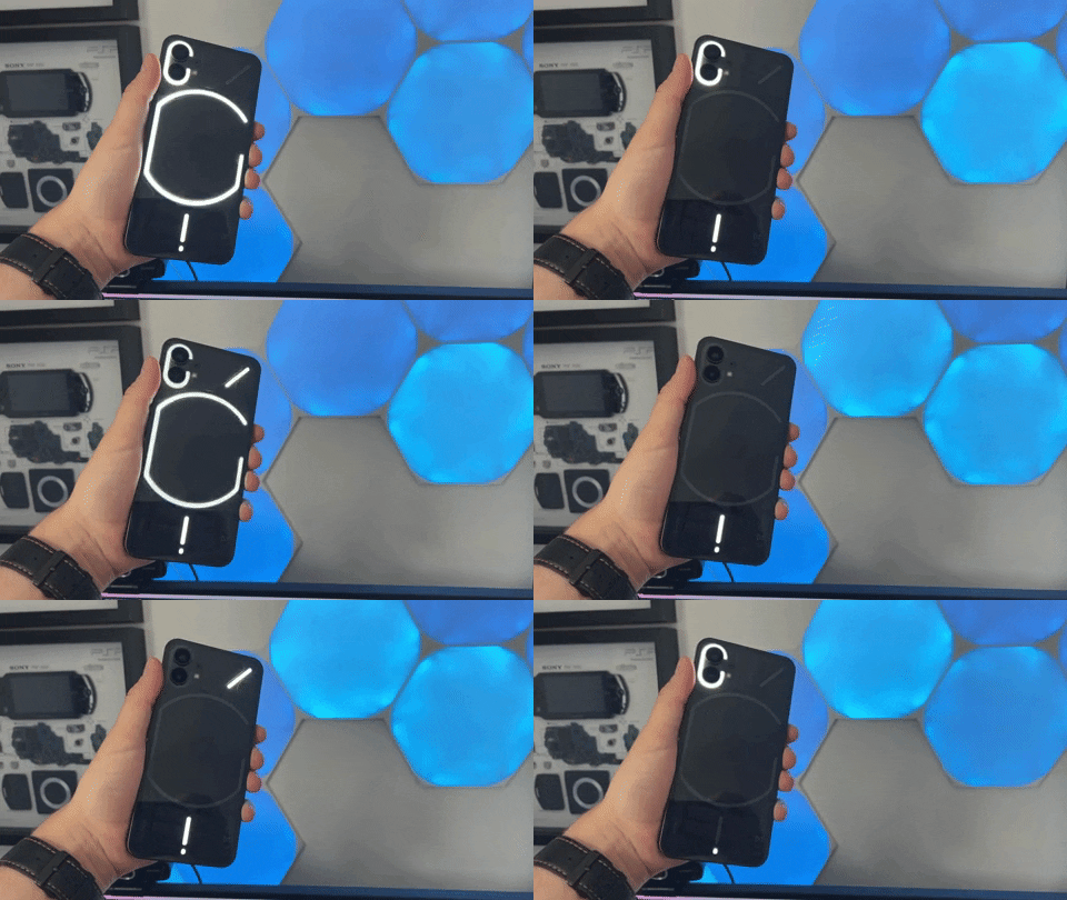
I'm sure Nothing is working on more ways to utilize these lights, maybe some sort of slow pulse when an important notification has arrived to remind you to address it? But even if the team does so, the lack of multiple colors means this won’t be quite as useful as something like a simple multi-color notification light.
And, chances are when you’ve watched these lights in action, you may have noticed just how sharp that strobe can be. This could be a real problem for people with epilepsy and while Nothing’s response so far has been to instruct people to turn the brightness down, a feature update that gives users the ability to smooth out those flashes into pulsing patterns would be far better.
These problems are all symbolic of a company making its first-ever phone. There are always problems that get smoothed out in new models, so I’m left with mixed emotions paired with optimism for the future, as I gaze upon the interesting visual presence of the Nothing phone (1).
Nothing phone (1) display
This is an area that Nothing manages to excel beyond its main competition in the Pixel 6a and the iPhone SE. In the phone (1), you’re getting a 6.55-inch OLED screen with 10-bit color depth, HDR10+, a 2400 x 1080-pixel resolution, 1,200 nits of peak brightness, and a 120Hz refresh rate.
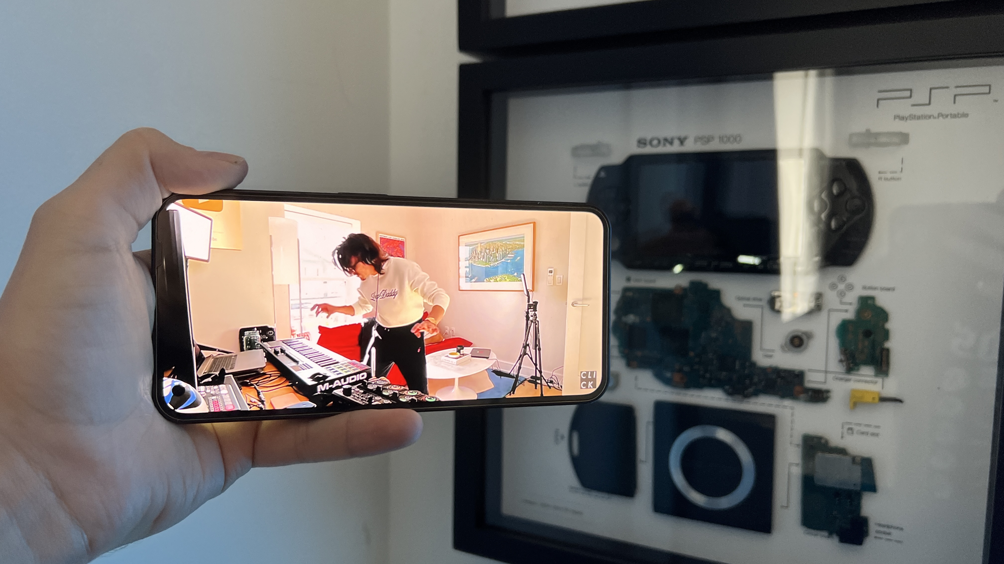
There is one added bonus that you probably wouldn’t even notice. Nothing has opted for a flexible OLED panel here. Why? Well, it’s the reason why the bezels are perfectly symmetrical all around the the display. You’ll notice certain phones with non-flexible screens require a chin to hide all the connectors. Going flexible means Nothing is able to keep the borders equal and fold all the wiring behind. You gotta love that attention to detail!
The end result is a gorgeously vivid, bright display that is viewable in all lighting conditions. Taking advantage of the display’s OLED benefits, the trailer for Spider-Man: No Way Home emanated depth in darker scenes, making the brighter effects of Doctor Strange’s spells really glow.
Overall, the display makes for a lovely viewing experience across everything you do, and the fingerprint reader is well-placed with an impressive speed to it, too.
Nothing phone (1) audio
A strong screen needs strong sound for listening on-the-go with no earbuds, and the stereo speakers provide a decent social listening experience, if a little imbalanced.
Sure, they are a little tinny, but there is no distortion whatsoever at higher volumes. When put under intense pressure with bass-heavy, intense metalcore such as Avoid’s EP “The Burner”, everything is clear and finer details can be picked out.
There is no sign of a 3.5mm headphone jack, but the Bluetooth 5.2 connectivity in here does enable this to support a few hi res audio files over wireless playback. That means you can make use of the best wireless headphones on the market.
Nothing Phone (1) performance
In the run up to the Nothing phone (1)’s launch, given the ever-building hype machine, many of us expected to see the latest Snapdragon monster in here. But as the price suggests, the company has taken a different tact with a Snapdragon 778+ 5G chipset — the “+” part of that chip unlocks 5G and support for wireless charging, which is unique to the phone (1).
Why did Nothing go with a slower chipset? Founder Carl Pei explained that the reason behind this decision comes down to performance, power consumption, and cost. The company believes this offers a better balance of sheer horsepower and power efficiency, to do the day-to-day tasks fast enough while preserving more battery life.
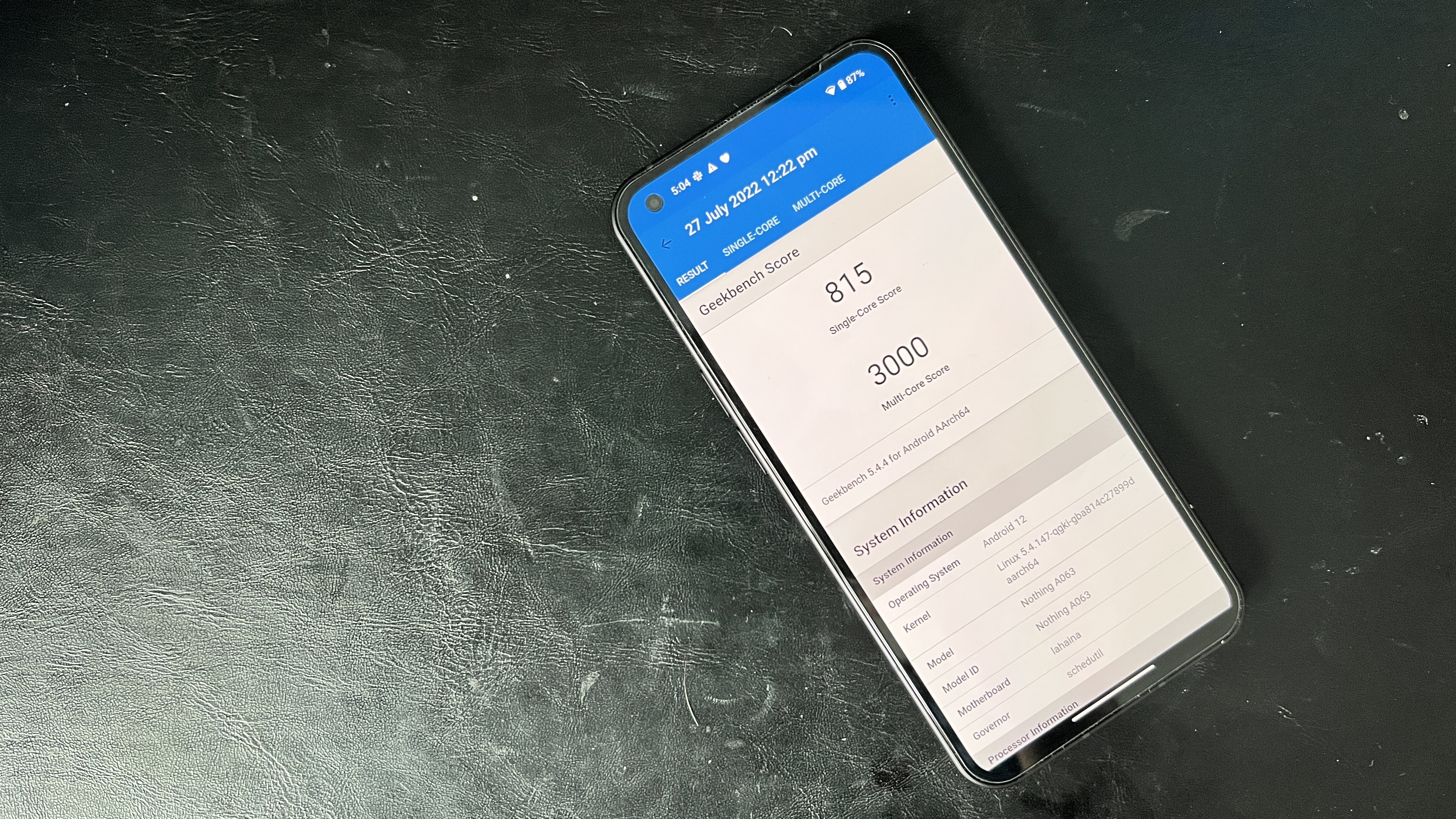
In reality, Pei’s gamble comes close, but doesn’t quite cross the line. Looking at the numbers, the phone (1) achieved a Geekbench 5 multi-core score of 3,000, which pips the Pixel 6A to the post (2,918), but is oceans away from the iPhone SE (4,482).
As for gaming performance, Nothing’s phone hit an average frame rate of 17.2 fps in the 3DMark WIld Life benchmark, which is miles off the Pixel 6a (42 fps) and the iPhone SE (50 fps).
This formula makes it a good phone for a rather limited set of tasks. You won’t come across any hitches when you abide by Nothing’s vision for the phone — namely, casual gaming and normal app usage with some light multitasking.
If you try to push it with the likes of Call of Duty Mobile and more processor-intensive apps like Photoshop Express or Premiere Rush video editor, that’s when you start to see the cracks. The UI starts to slow down and input lag becomes apparent.
So, this comes down to a question of what you actually use your phone for. Realistically, this amount of power potential is more than enough for most people. We may need to test by numbers as tech journalists, but when you really think about what you do on your small slab, Nothing has struck a decent balance for the vast majority of potential users.
If you’re the kind of person that likes to squeeze every drop of performance out of a chip to do some pretty intensive tasks, look elsewhere.
Nothing phone (1) Battery Life & Charging
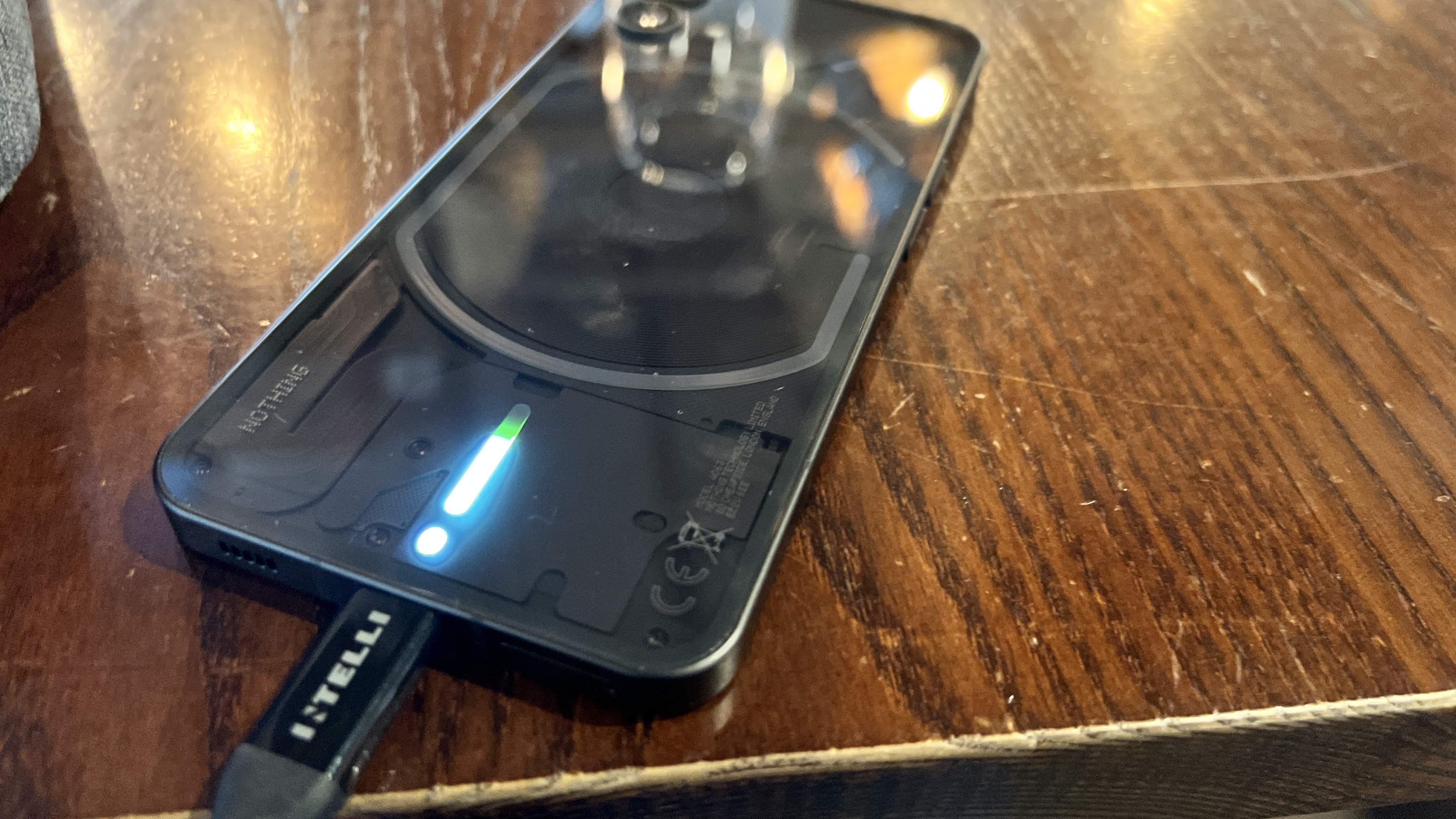
By using an old chip, Nothing is relying on a lower power draw from the 4,500mAh battery inside the phone (1), with support for 33W fast wired charging and 15W wireless. The reality comes close, but the capacity of this power cell is the phone’s downfall.
Waking up at 8 a.m., I went through an entire day to 8 p.m. with the usual work/entertainment (emails, calls, social media, taking some quick pictures, Spotify by day, gaming and YouTube in my own time) before needing to plug it in with 5% of the battery remaining.
You can charge to 80% in roughly 30 minutes, which helps stave off any battery life woes, but the longevity could be a lot better — especially when you see other phones at this price pack bigger batteries.
Nothing phone (1) cameras
While many companies pack their phones with more cameras and more features, Nothing keeps it simple with a bare bones camera app and a refined setup.
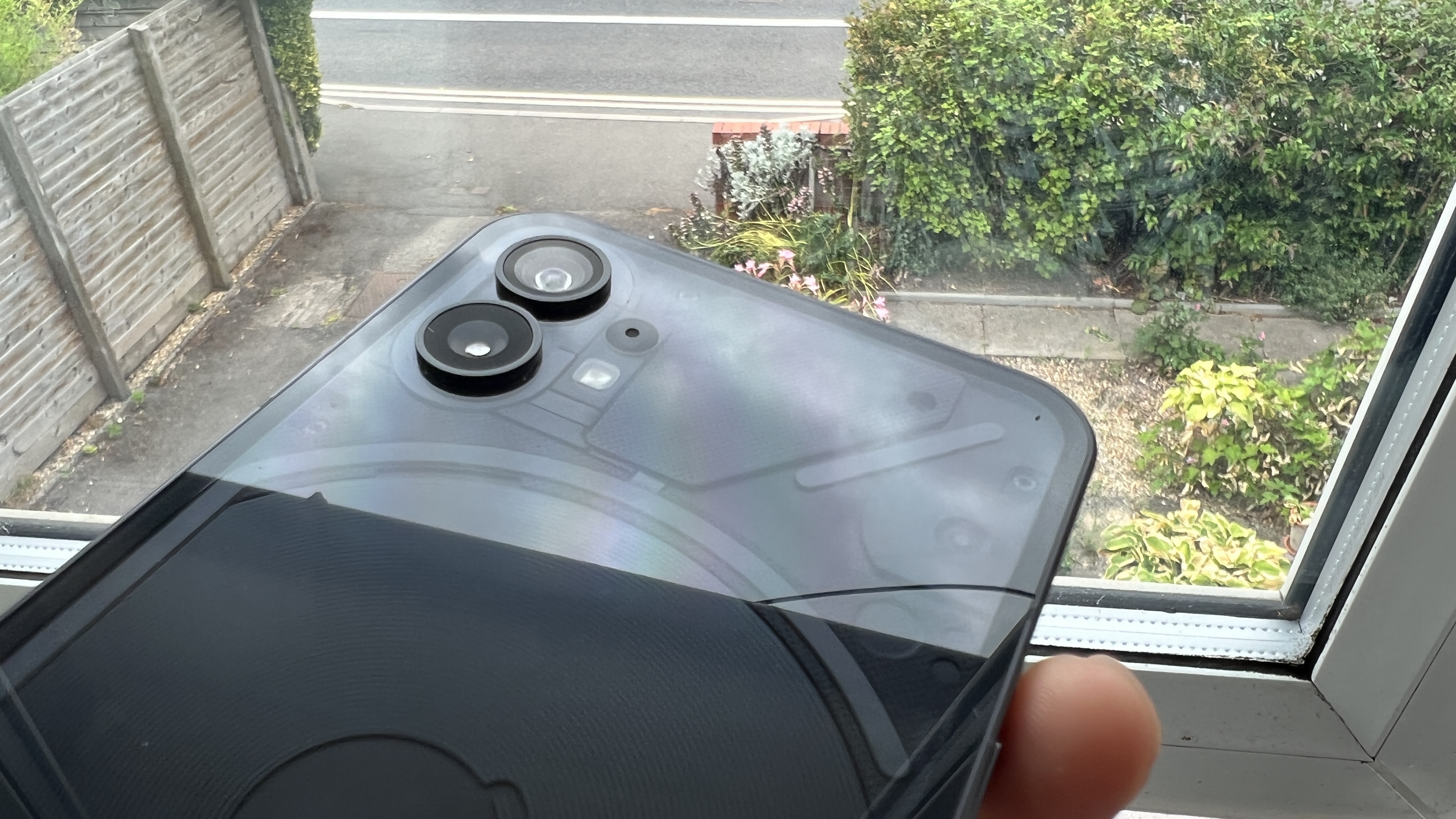
On the back, you have a dual-camera setup consisting of a 50MP Sony IMX766 main sensor with f/1.88 aperture, alongside a 50MP ultra wide Samsung JN1 sensor with an f/2.2 aperture and a 114-degree lens.
Up front, there’s a 16MP selfie snapper with an f/2.45 aperture and to sum up this camera system in a few words, the Nothing phone (1) is good enough in all circumstances.
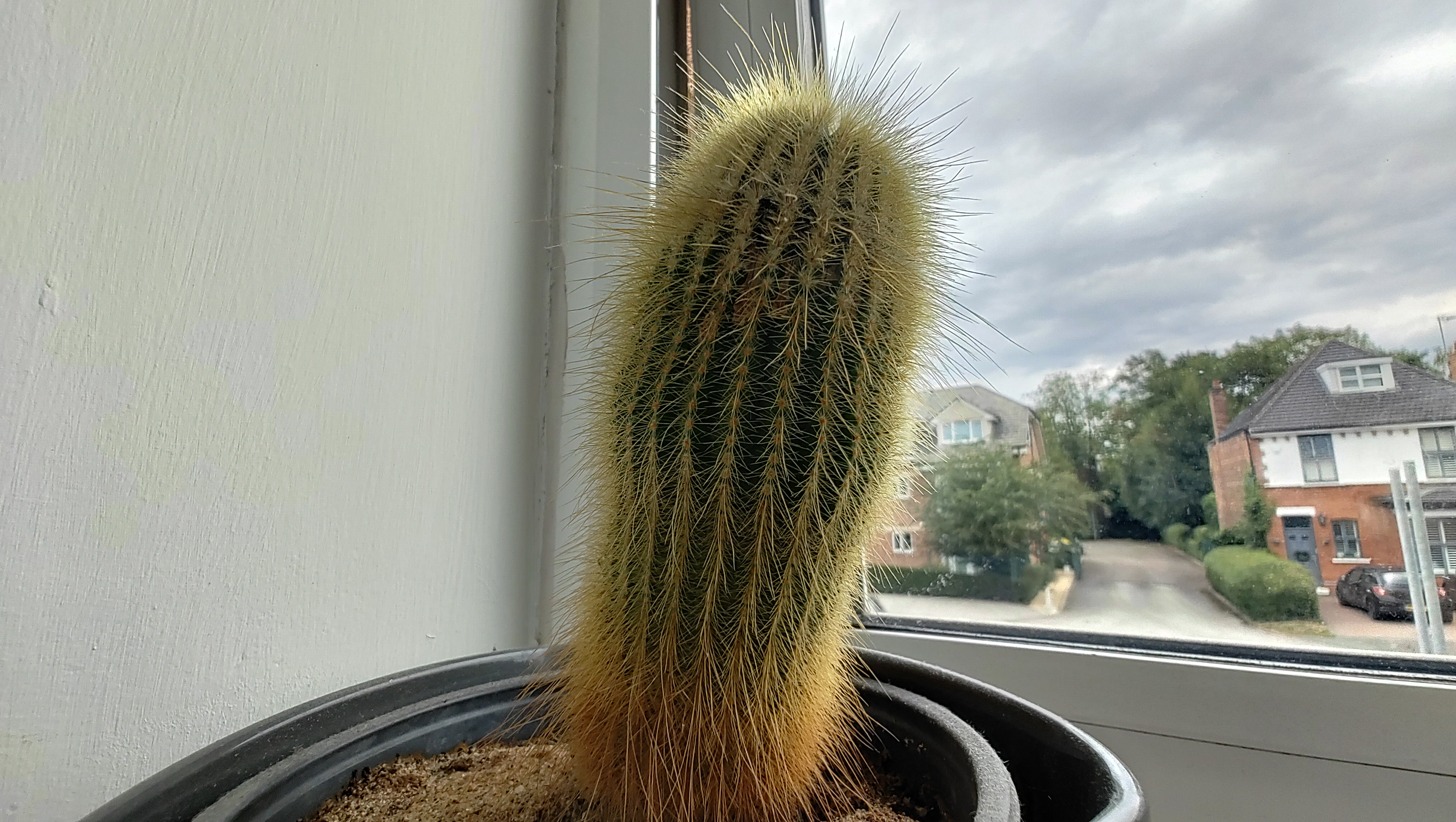
Details are crisp from the main rear camera and the color science offers a nice balanced picture, paired with an expressive contrast that makes each image really punchy in most lighting conditions.


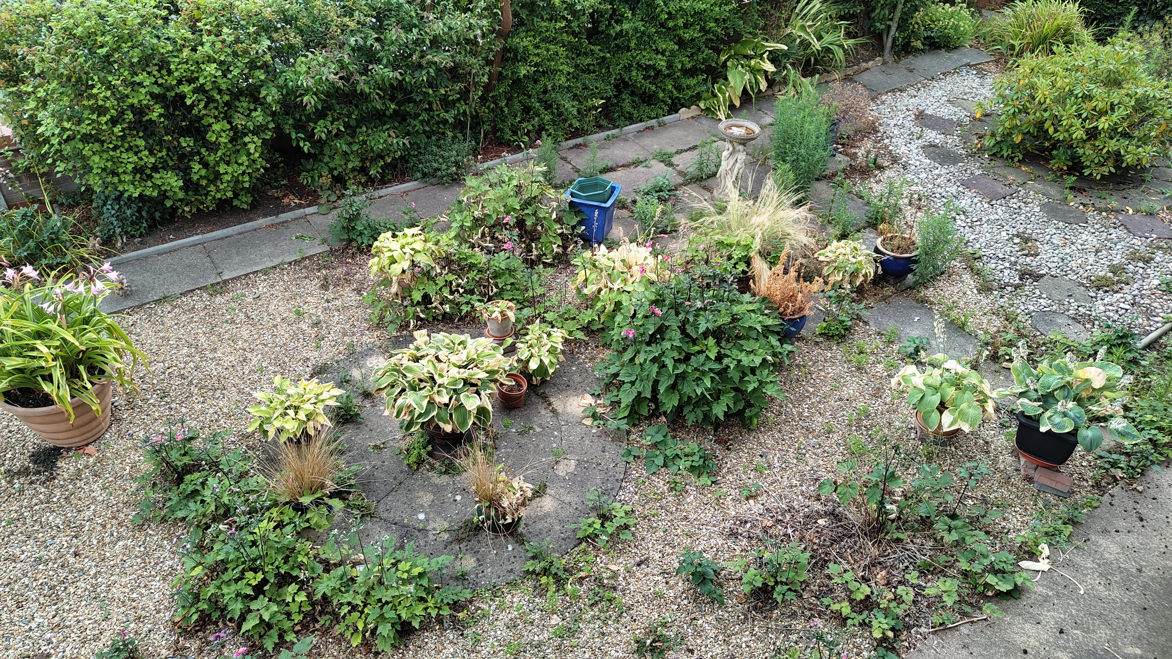
The optical image stabilization (OIS) also helps to make this a decent shooter in low light conditions, too. There does seem to be a lack of post-processing of evening pictures though, which leads to a loss of detail and a fair bit of ISO noise, but that (much like any other phone company) is something that is eliminated with time and experience. The more Nothing learns, the more it can apply into future phones.
The ultra wide benefits from some of this computation too, but there is a noticeable drop in image quality when moving over to the JN1 sensor, as the edges of the picture can start to look a little mushy. And without the benefit of OIS, photos by night are very blurry, which demonstrates the importance of a wider aperture and having some sort of stabilization on every lens.

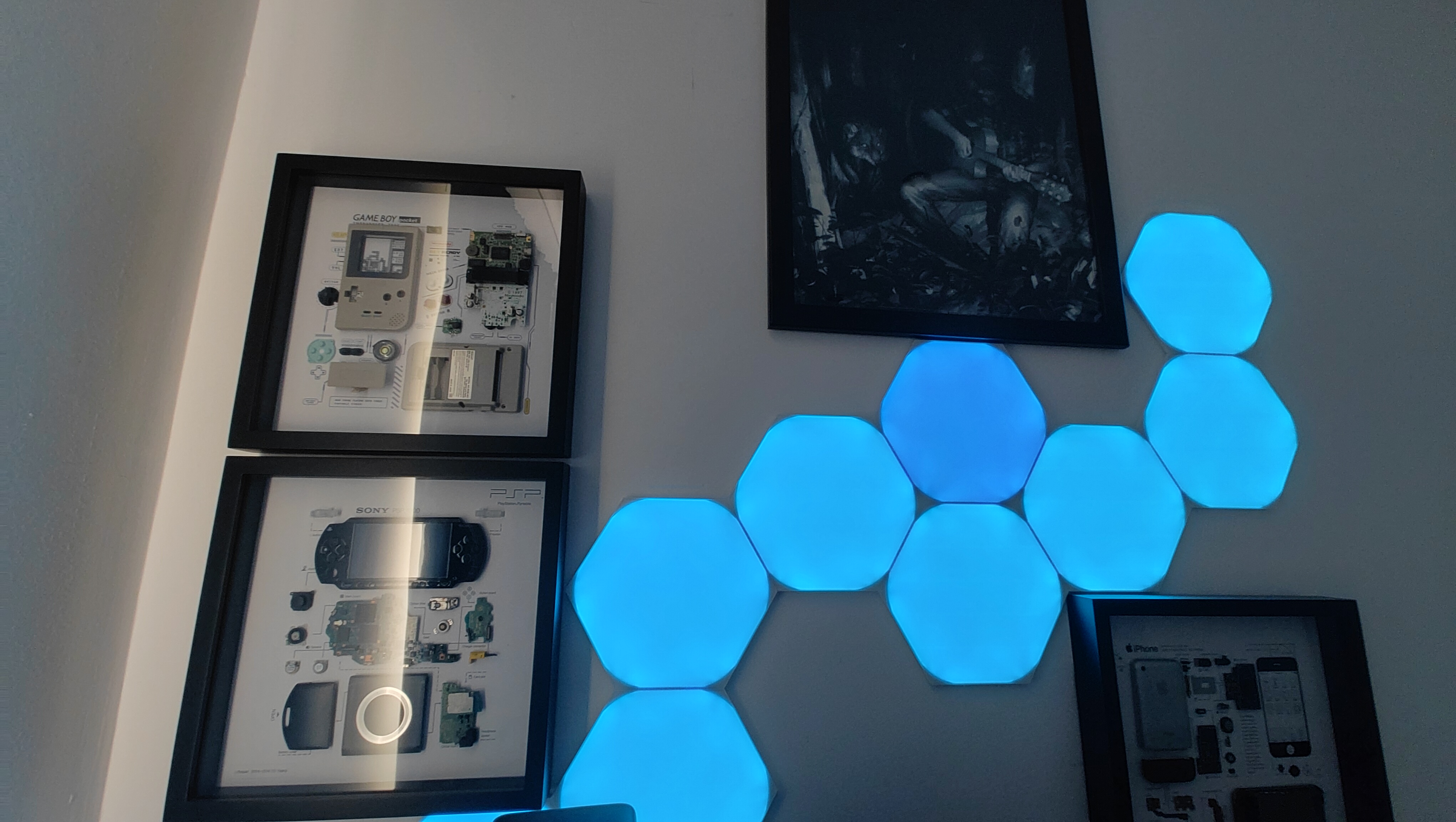
There is a slight saving grace for both of these cameras in difficult lighting conditions, which comes courtesy of that Glyph Interface. Rather than using the standard flash and turning every picture into a naff tourist photo, you can use the 900 LEDs as a softer fill light, which does a great job of illuminating the subject without that sharpness you get from the flash.
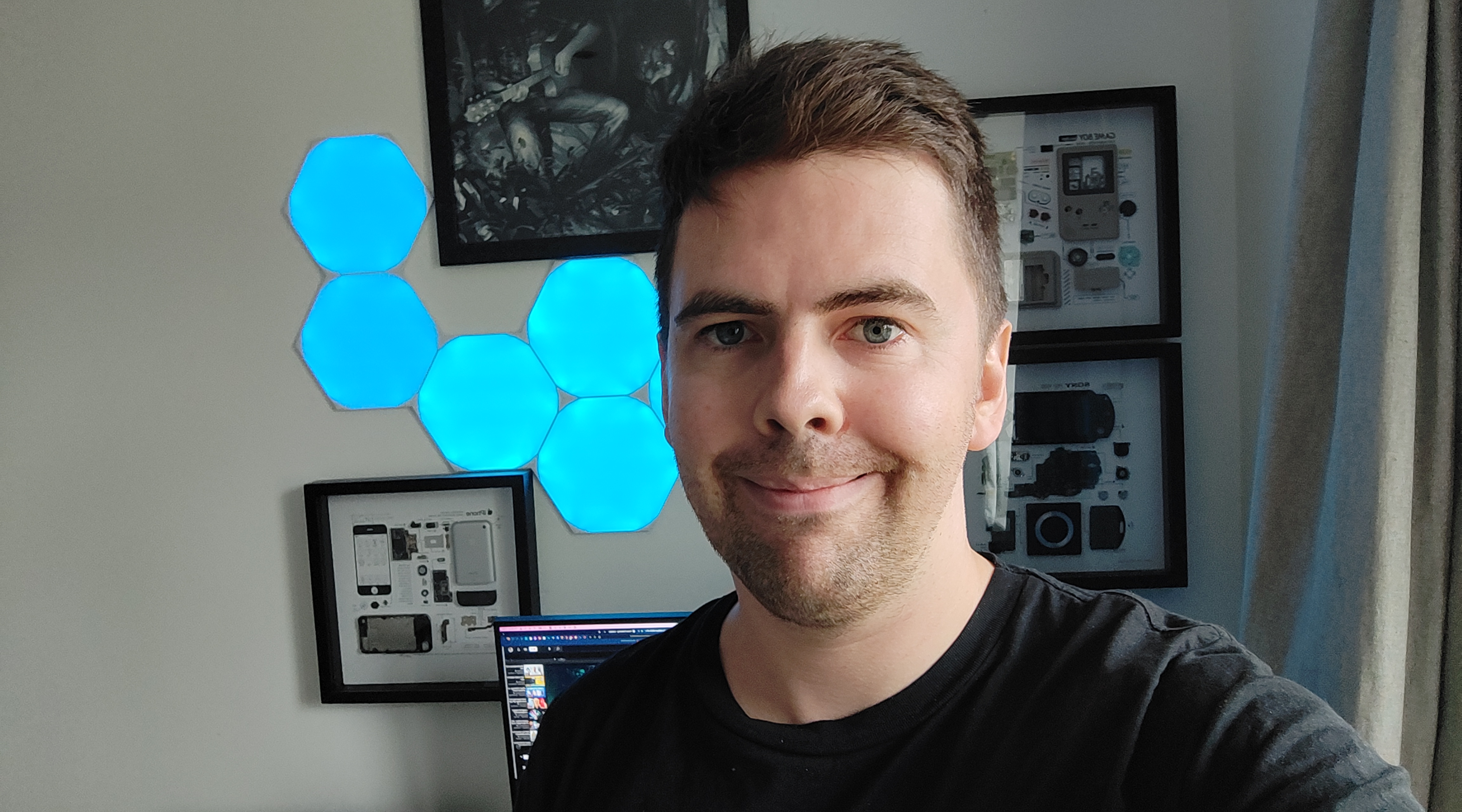
Finally, the front-facing camera creates detailed and colorful pictures with a thankful lack of AI beautification features. It produces honest pictures through and through, which is a rarity amongst many Android phones at this pricepoint.
As for video, you can shoot up to 4K 30 fps footage or for the smoother frame rate, you can do 1080p 60 fps. It works fine for quick captures of friends and family, but the auto-focus is just too damn slow for any serious filming needs.
As for video, you can shoot up to 4K 30 fps footage or for the smoother frame rate, you can do 1080p 60 fps. It works fine for quick captures of friends and family, but the auto-focus is just too damn slow for any serious filming needs.
Saying that, though, this is the first Android phone I’ve seen to address the camera definition inequality between the native app and in-app camera modes. The likes of shooting TikToks and Instagram reels within their respective apps are hampered by Android APIs that try to cover compatibility with every phone on the market, which results in a limited feature set.
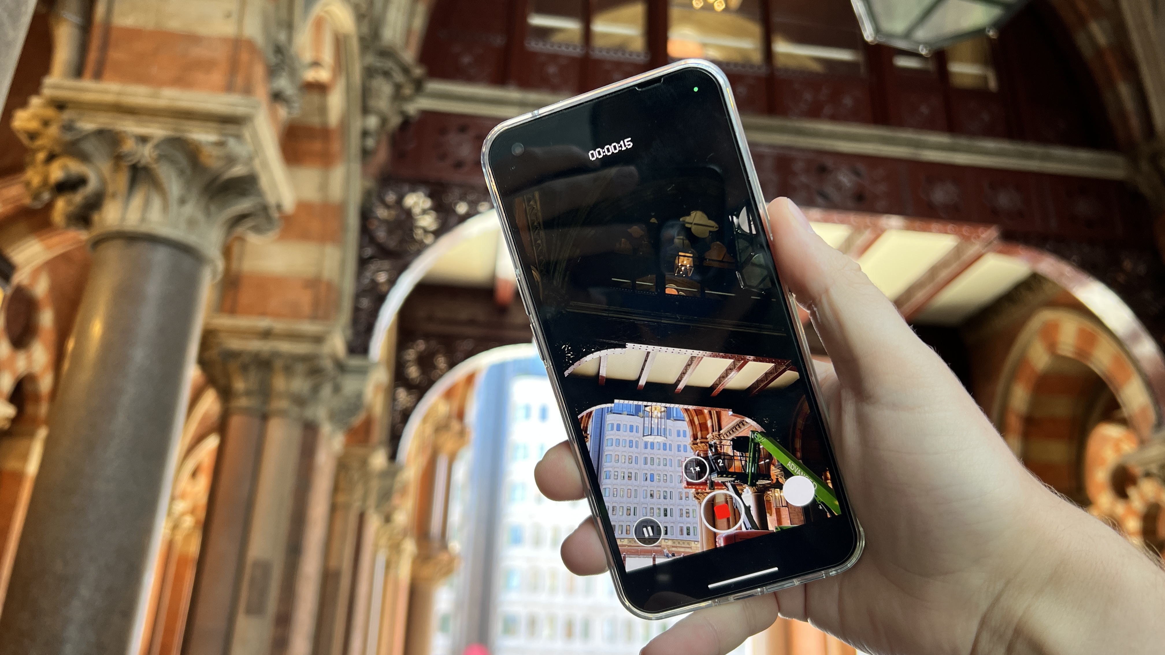
In the camera app, you can opt to pause recording, to move to a different angle or location and start recording again, which combines all the footage into one clip. It’s an admirable effort to bypass this core problem to Android’s core problem with video capture.
Put simply, warts and all, this is a decent setup for all.
Nothing phone (1) software
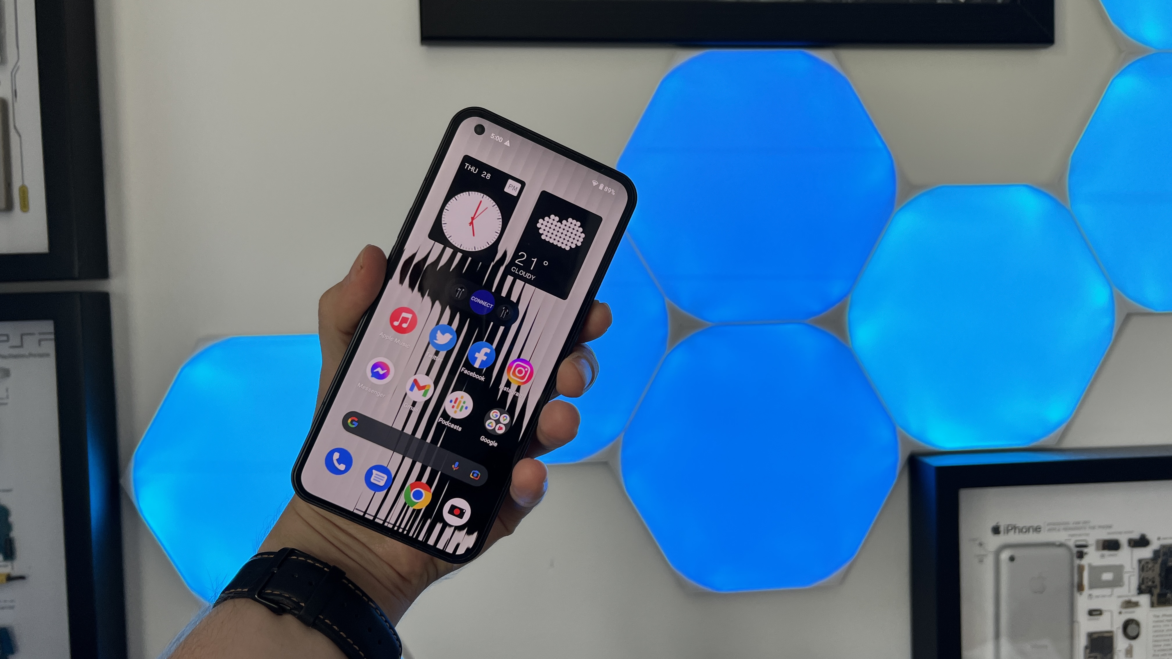
Let’s talk about what Nothing OS over Android 12 does right: it’s a clean OS for sure — like, Google Pixel levels of cleanliness. No bloatware and no unnecessary over-engineering of the experience with pointless proprietary apps.
It’s just Android with a little smattering of OS features, a whole lot of attention to animation that gives this an iOS-esque fluidity and motion, along with that dot matrix typography and interestingly reskinned apps like the voice recorder.
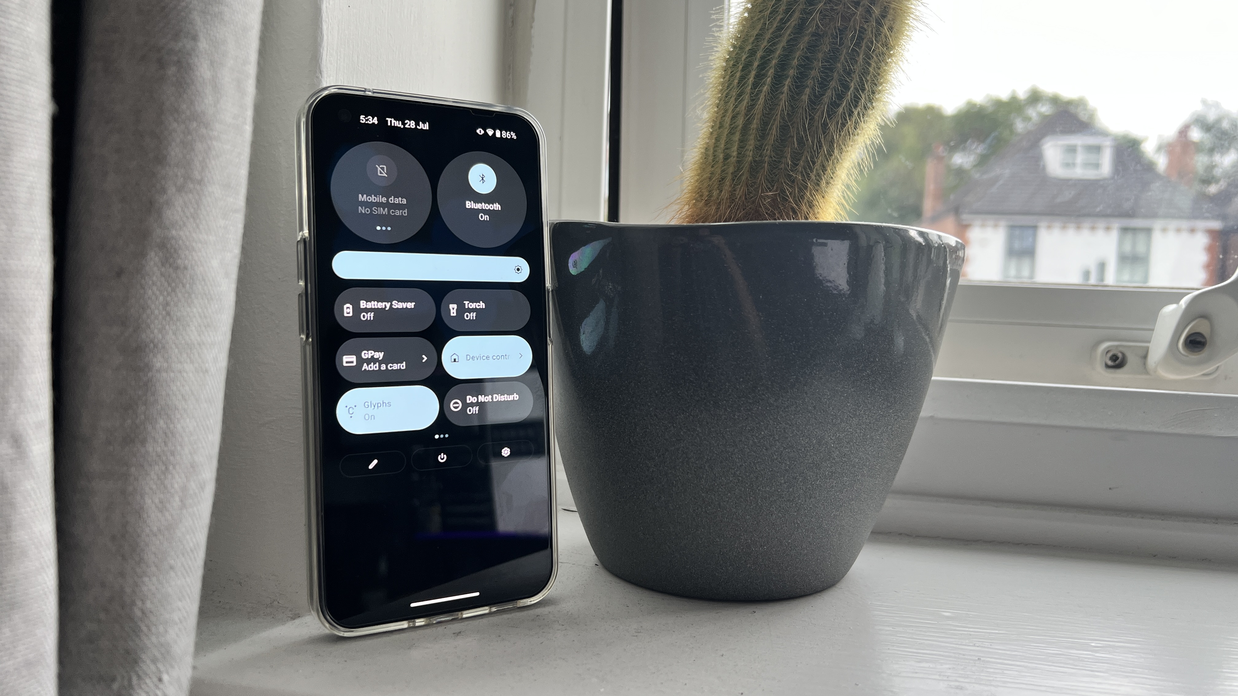
Particular props to the expanded (and customizable) settings in the pull down notification shade, which has to view your connected networks and connected devices.
But through this simplification, there are some missing items that I’d really love to see make its way back onto here. The widget selection (and sizes) are pretty basic, which makes the options to resize them and customize your home screens quite cumbersome. And given it’s a first-generation OS, there are some stability issues — namely in some of the quick settings and fluidity across certain sections.
As for the future, Nothing has committed to three years of OS updates and four years of security updates, which leaves a lot of time for the team to smooth out any wrinkles.
Bottom line
The Nothing phone (1), much like the company’s earbuds last year, is a first-generation product for better and for worse. Unlike the buds, there’s just one too many rough edges to recommend this to everyone.
That’s not to say it’s a bad phone — the cameras are good, the performance is OK for the price, and the unique attention to design makes for that retro-futuristic look that many will love.
Pei’s hype machine is driving people to expect the second coming of Jesus, but in an increasingly competitive mid-range smartphone market, this is a diamond in the rough. Nothing is on to something here and I look forward to seeing what the company pulls off with the phone (2).

Jason brought a decade of tech and gaming journalism experience to his role as a writer at Laptop Mag, and he is now the Managing Editor of Computing at Tom's Guide. He takes a particular interest in writing articles and creating videos about laptops, headphones and games. He has previously written for Kotaku, Stuff and BBC Science Focus. In his spare time, you'll find Jason looking for good dogs to pet or thinking about eating pizza if he isn't already.
