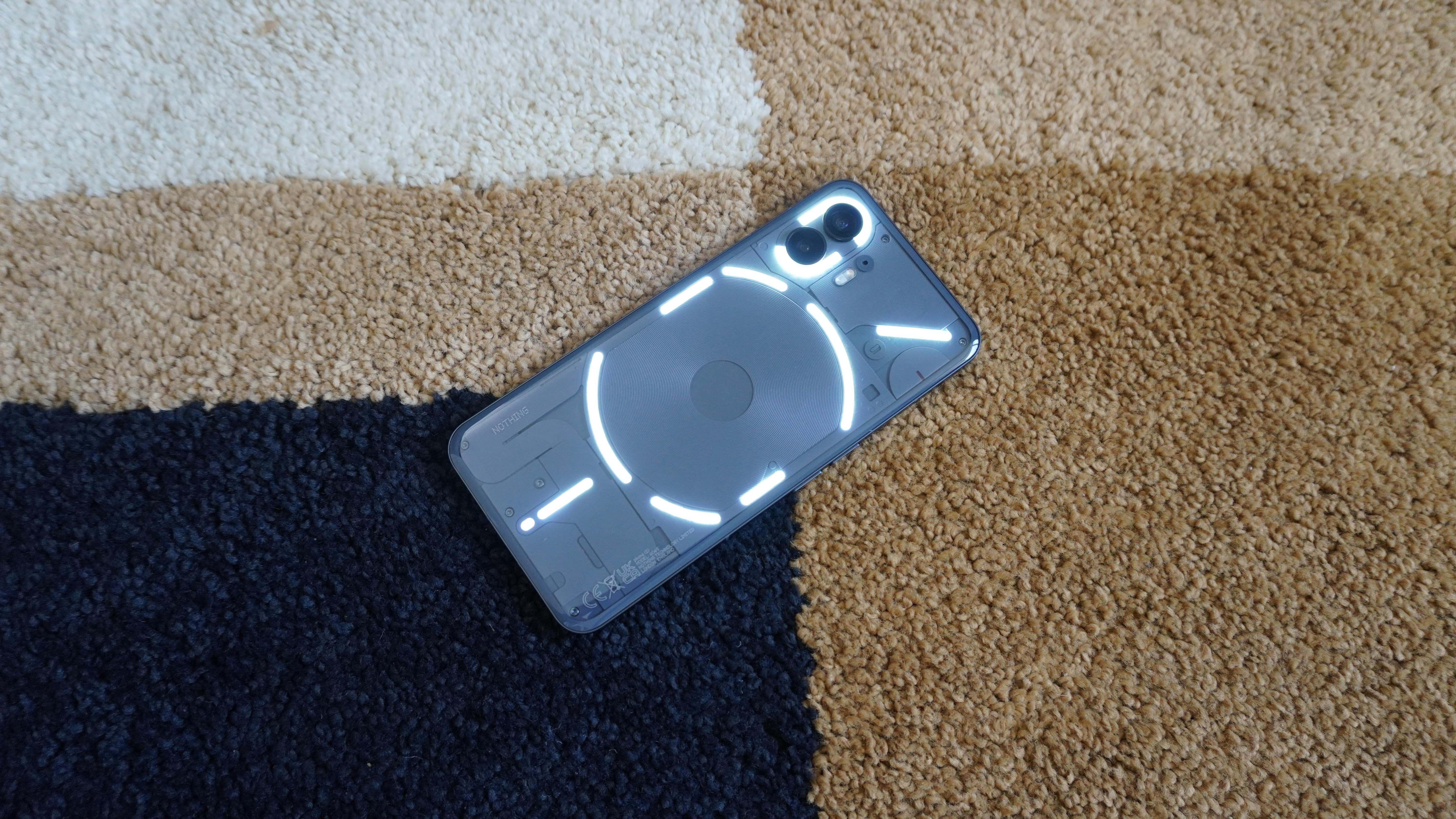
Laptop Mag Verdict
The Nothing phone (2) is the true standout flagship phone I’ve been looking for. While the performance may not reach the lofty highs of the bleeding edge, you will love the retro-futuristic aesthetic across both hardware and software, the zippy speed, and the stellar camera system — all at a decent price.
Pros
- +
Refined unique aesthetic
- +
Premium feel in the hand
- +
Nothing OS 2.0 is gorgeously productive
- +
Glyph lights are actually useful…
Cons
- -
…but may still feel a little gimmicky to some
- -
Raw power doesn’t match its competition
- -
Possible problems for people with epilepsy
- -
Glass back is a fingerprint and scratch magnet
Why you can trust Laptop Mag
Just like last year’s phone (1), the Nothing phone (2) is easily the most hyped phone launch of 2023. While sequels are usually more of the same, this one is far bigger than that.
Because sure, it follows the same Nothing playbook: a unique transparent aesthetic that’s as much “power nerd” as it is “hipster,” a huge marketing campaign that seems to be tying the phone to potentially releasing a kraken, and odd marketing phrases like bringing you “new ways of interacting with a smartphone.”
But two big things are happening with this particular entry into Nothing’s family: it is the first true flagship phone from the company, and it is the first phone to (officially) release in the US. And while there are a couple of issues we need to talk about, I’m pretty confident that you’re going to love it. Let me explain.
Nothing phone (2) price and configurations
Carl and the gang have gone pretty aggressive on the Nothing phone (2) pricing:
- 8GB/128GB: $599/£579
- 12GB/256GB: $699/£629
- 12GB/512GB: $799/£699
That is $200 less than the Samsung Galaxy S23 and iPhone 14, and $100 cheaper than the Google Pixel 7. With a cost like that, this could very well be the next big summer blockbuster.
Nothing phone (2) design
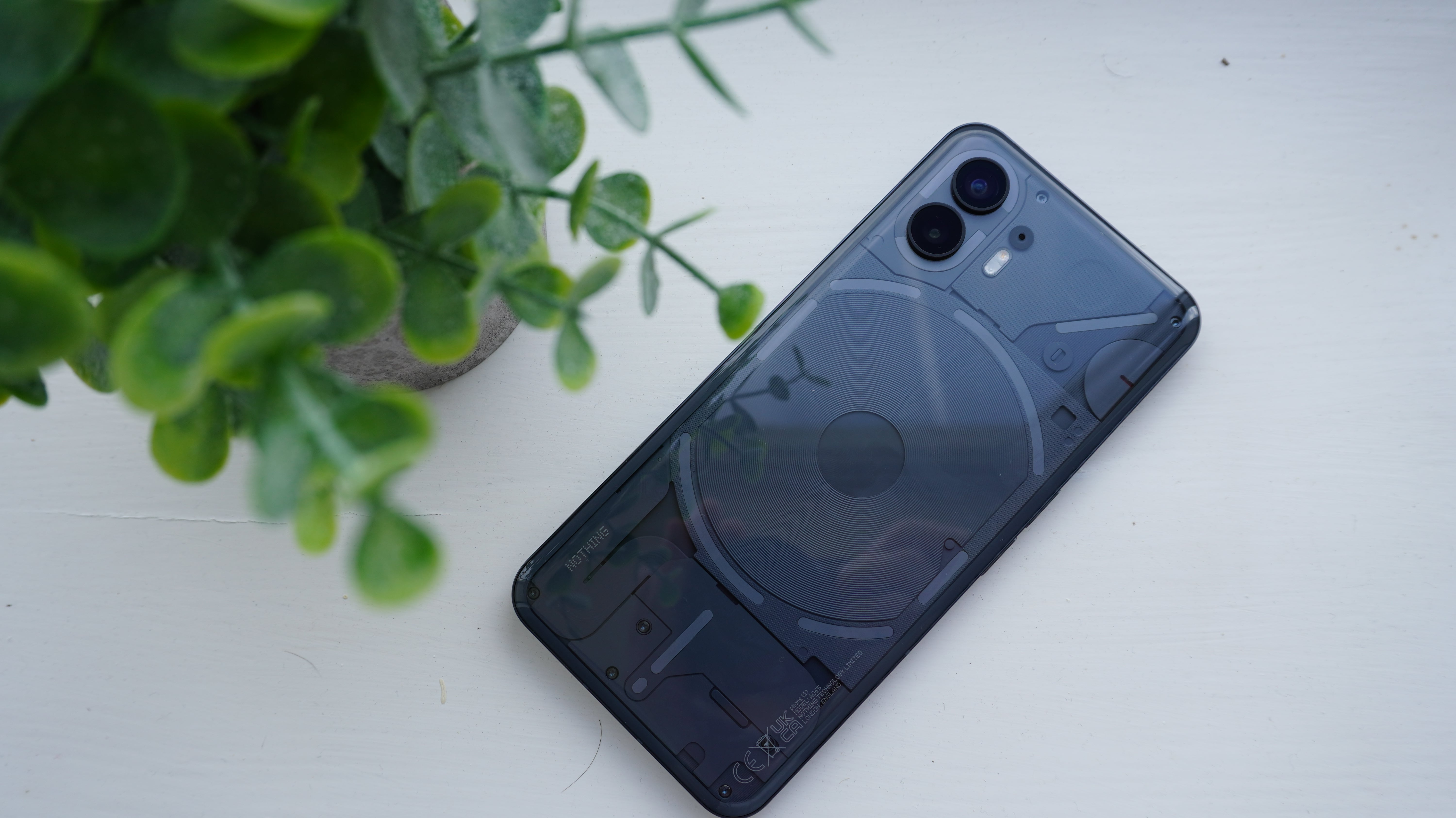
When compared with the phone (1), nothing of note has really changed from an aesthetic point of view — bar an upgrade in the materials and a curved glass back. But in a time when all other smartphones are pretty stale, the phone (2) stands head and shoulders above as one of the most interesting and (in my opinion) best looking phones out there.
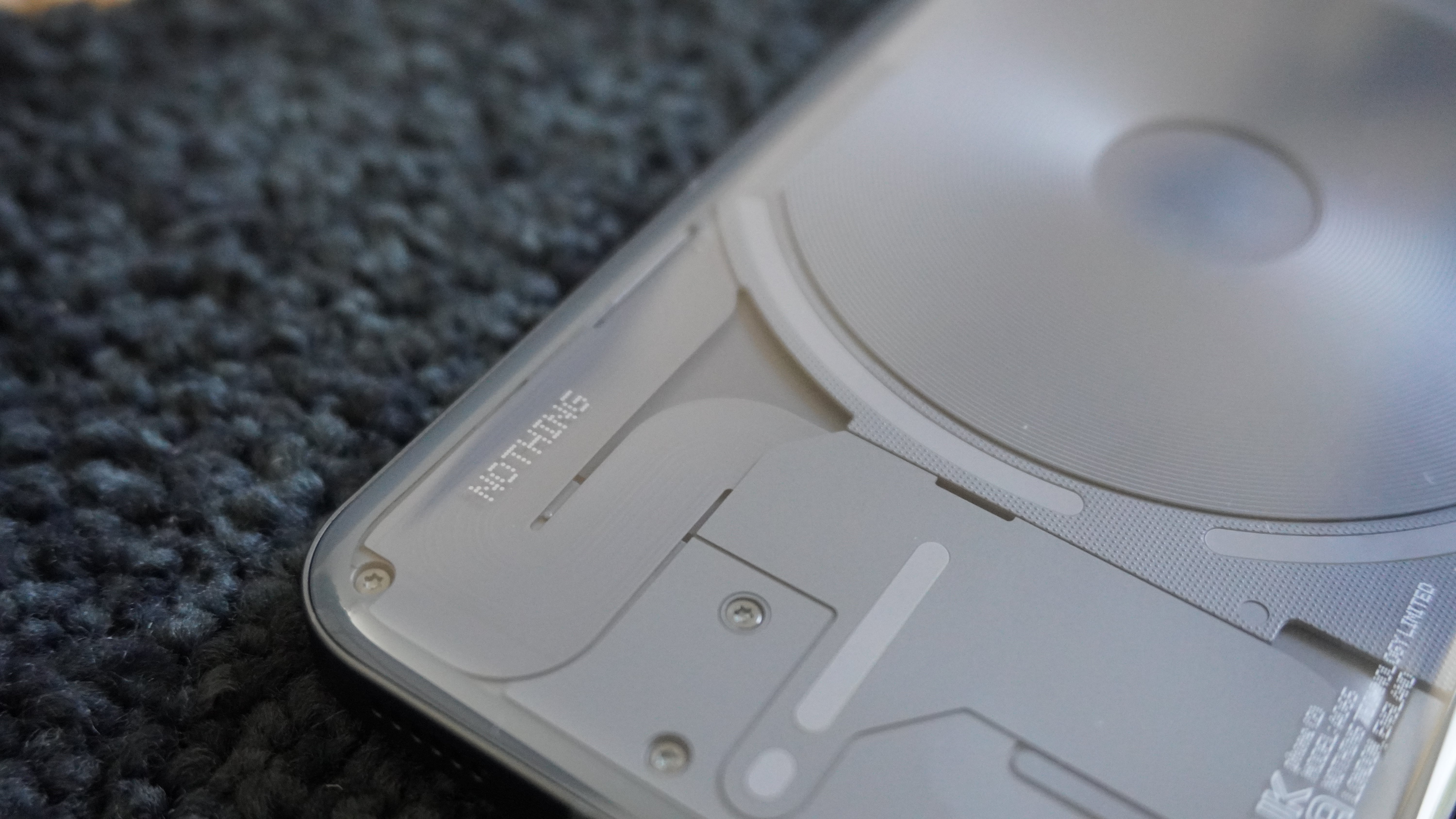
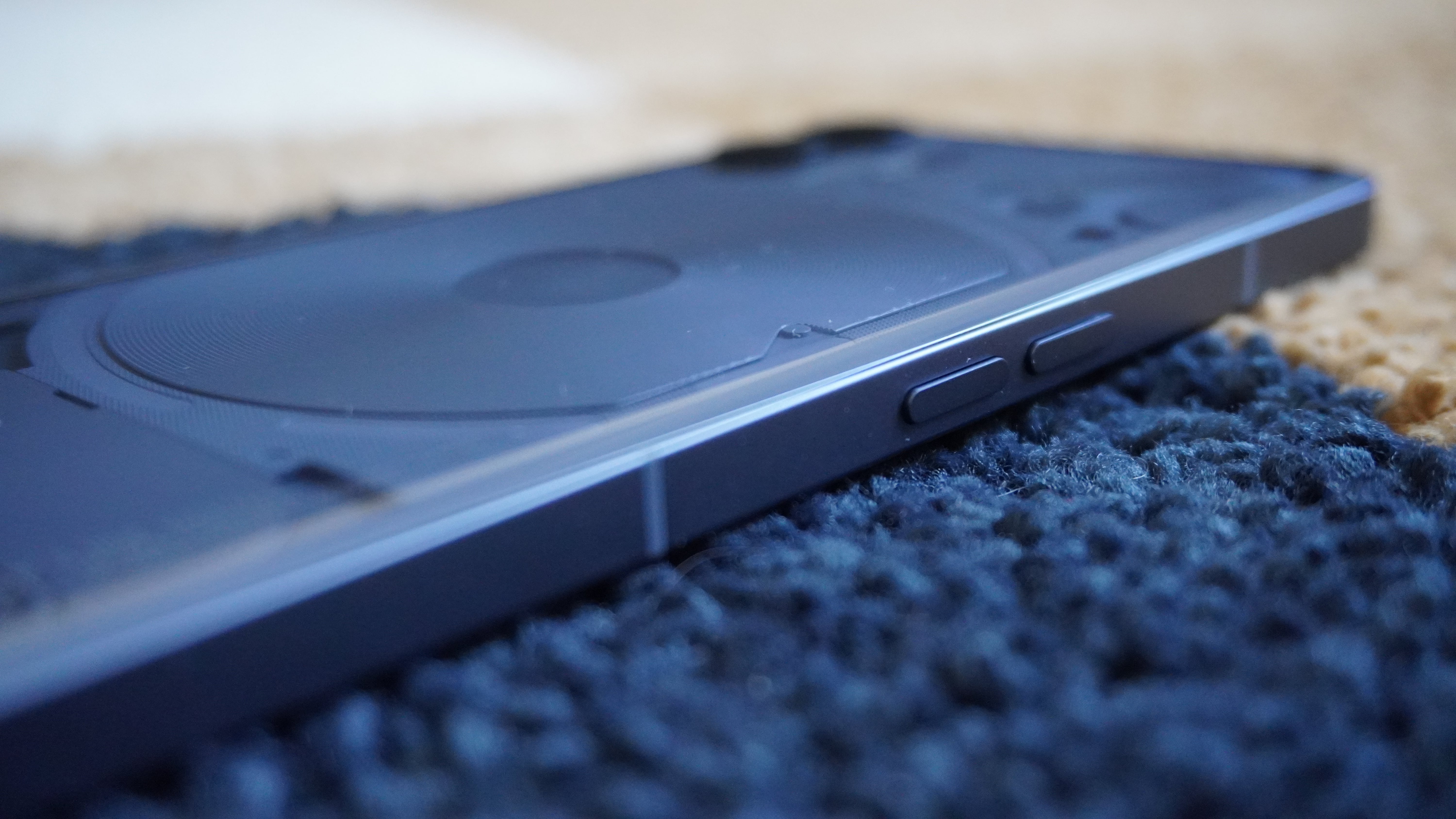
The transparent design round the back gives you an unfiltered view of the electronics, and gives everything a raw retro futurism that I love. Add to that the improved feel of the 100% recycled aluminum frame (alongside a far tighter design with minimal gaps across all the components on the back. This looks and feels far more refined than the phone (1) and rightfully claims its place in the flagship category.
The commitment to sticking out like this may not be for everyone. For every geek’s appreciation (like me) of the subtleties of the dot matrix branding and the utilitarian persona of seeing the phone’s innards, will be another person’s view of it looking a bit over-engineered.
Plus, there are key things that the leaks got wrong that I’m very happy about. The display glass is flat — only the back glass is slightly curved around the edges to make your hand grasp around it more comfortably, and the aluminum band around the outside is flat too with chamfered edges.
| Phone | Size | Weight |
|---|---|---|
| Nothing phone (2) | 6.38 x 3.01 x 0.34 inches | 7.1 ounces |
| iPhone 14 | 5.78 x 2.81 x 0.31 inches | 6.1 ounces |
| Samsung Galaxy S23 | 5.76 x 2.79 x 0.30 inches | 5.9 ounces |
| Google Pixel 7 | 6.13 x 2.88 x 0.34 inches | 7 ounces |
But while the design feels fresh, the dimensions are rather ordinary when it comes to flagship devices. While it is a little taller and heavier than the iPhone 14, this slots nicely into the mix at the top of the pile.
Nothing phone (2) Glyph interface
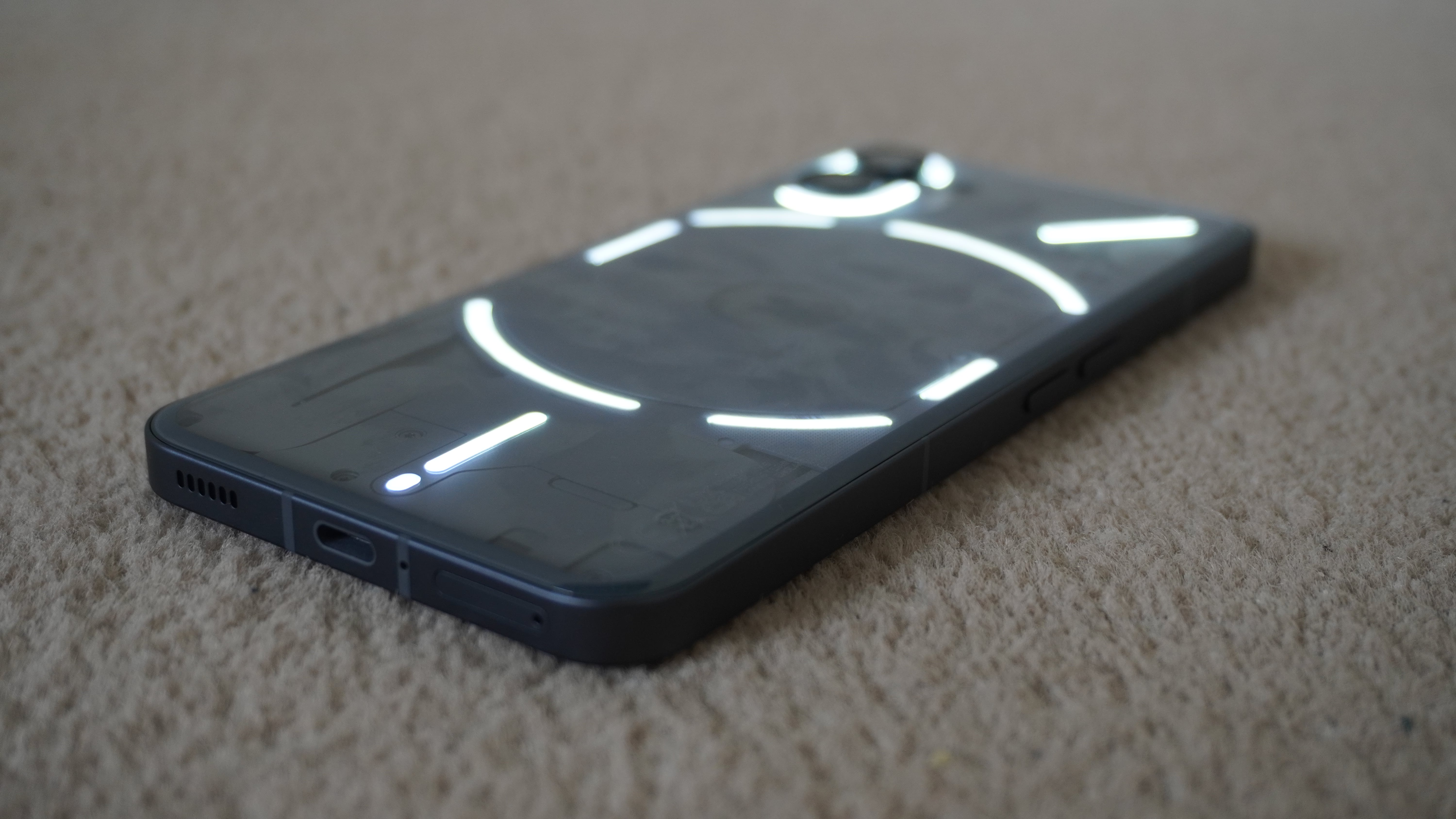
And of course, we must turn our attention to the second iteration of the Glyph interface, which now has 33 individually addressable zones. First thing you’ll notice is that there are some new gaps placed in between the continuous curves of the LED lighting around the charging coil and cameras, which I think adds to the utilitarianism of the phone’s look.
I left my time with the phone (1) thinking this all felt a little like a gimmick — something that was there to bring an additional cool factor without much use (besides being a really nice fill light for low light photography).
This time round, Nothing has thrown the kitchen sink at it to deliver on its mission to reduce the time you need to look at the screen. Previous features are still here like Flip to Glyph, the battery level indicator and volume checker. But the company added more everyday functionality like watching a light bar slowly trickle down instead of watching a countdown timer on your screen.
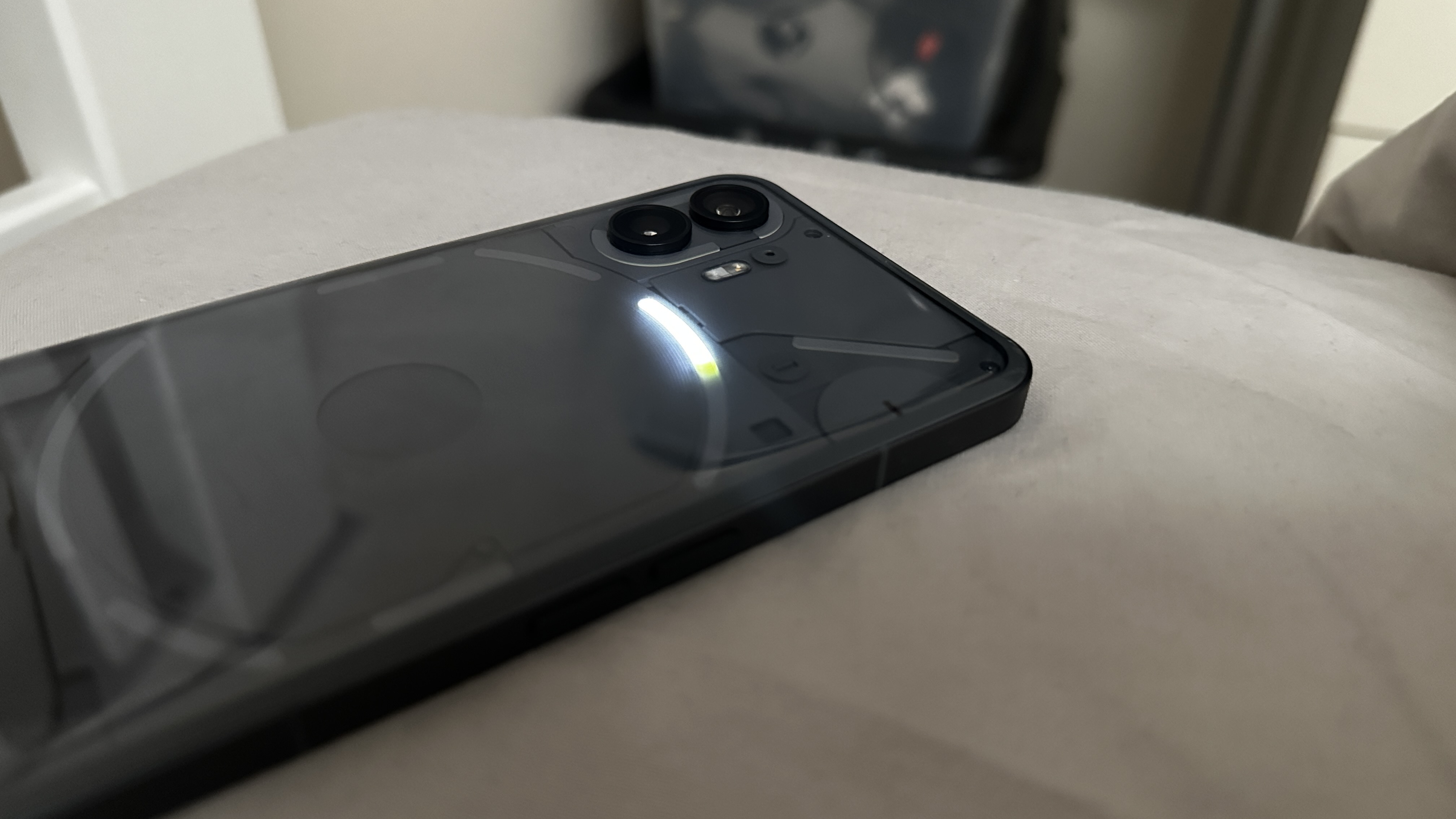
On top of that, third-party integrations are making the most of this too, such as the light bar draining away based on how far away your Uber ride is or your delivery order. It’s small, intentional implementations like this that will tell the story of how the Glyph is a genuinely useful addition to the whole phone’s experience. Hopefully more developers jump on board.
You can also have a little fun with it too, thanks to the Glyph composer enabling you to create your own ringtones with the lighting system. All of this adds to a mightily interesting visual presence that is sure to make your phone a talking point of any trip to the pub with mates.
But there is a problem, and that comes down to the possible risk of triggering photosensitive epilepsy. Lights that flash anywhere between 3 - 60 times per second can be a trigger for anyone with this condition, and there’s no way to alter the severity of these flashes. The Advice and Information team from Epilepsy Action has weighed in further — saying that reducing the brightness of the lights would not eliminate the possible risk.
That is why at this moment, I can’t recommend this phone to anyone with this health condition. Of course, if Nothing does update the software to address this (maybe giving the lights a far softer, more gradual illumination pattern), then I’ll revisit this section.
Nothing phone (2) display
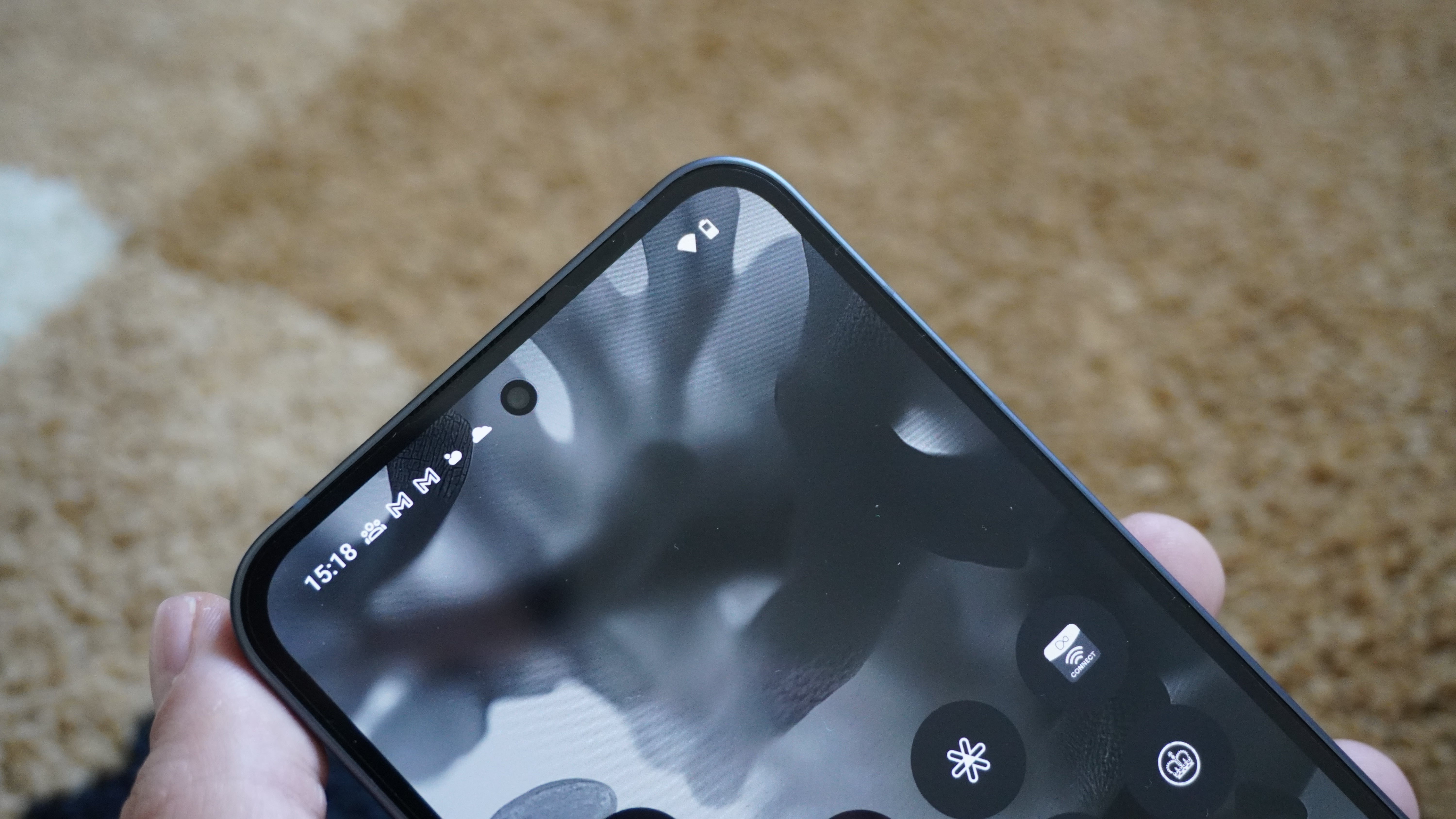
We are still running our lab tests on the display — finding out the DCI-P3 color gamut percentage and brightness. This review will be updated once the results are in.
The Nothing phone (2) packs a stunner of a display: a 6.7-inch OLED panel with LTPO, HDR10+, a claimed 1,600-nit peak brightness, a sharp 2412x1080-pixel resolution, and an adaptive refresh rate up to 120Hz.
While I adore the monochrome, refined look of Nothing OS 2.0 (more on that later), once you put something with color on the screen, you really start to see it come to life with vividity and depth.
I can say that watching (and crying at) the likes of the Ted Lasso finale really shows the explosion of vibrant color across the green pitch and team shirts, while highlighting the impressive HDR contrast in darker scenes. Not only that, but without lab testing numbers, I’m still feeling confident in the color accuracy of this panel too.
Add to that a well-placed fingerprint reader with a simple circle UI (none of this over the top magic spell-esque reader animation of other phones), and this is a stellar screen.
Nothing phone (2) audio
The stereo speakers in the phone (2) are basically identical to what you get in the phone (1), which means a nicely detailed, but predictably tinny experience.
Distortion is non-existent, even when throwing some metal at it like Bring Me The Horizon’s classic album Suicide Season. Everything in this ferocious composition is clearly defined, from the thrashing guitars to Oli Sykes’ guttural screams.
There is no 3.5mm headphone jack, but the Bluetooth 5.3 connectivity in here does enable this to support a few hi res audio files over wireless playback. That means you can make use of the best wireless headphones on the market.
Nothing phone (2) performance
The Nothing phone (2) guns for a flagship experience, but stops just short of the bleeding edge. That is not a bad thing when it comes to what’s inside: a Snapdragon 8+ Gen 1 chipset, up to 12GB of RAM and 512GB of storage.
Thanks to a litany of software updates, the mid-range Snapdragon 778+ 5G in the phone (1) continued to feel super smooth in most situations (provided you don’t try to push it). The difference here, however, is night and day in terms of snappiness of app opening, multitasking, and performance across processor-intensive apps.
However, there’s no two ways around it. Outside of the Tensor G2 in the Pixel 7 and the A15 Bionic in the iPhone, the phone (2) is simply outperformed by the competition around it.
| Benchmark | Nothing phone (2) | iPhone 14 | Samsung Galaxy S23 | Google Pixel 7 |
|---|---|---|---|---|
| Geekbench 6 single-core | 1381 | n/a | 1881 | n/a |
| Geekbench 6 multicore | 4004 | n/a | 4972 | n/a |
| Geekbench 5 single-core | 1749 | 1727 | 1522 | 1054 |
| Geekbench 5 multicore | 4603 | 4553 | 4876 | 3021 |
| 3D Mark Wild Life | Maxed Out! | Maxed Out! | Maxed Out! | 6574 |
| 3D Mark Wild Life Extreme | 2465 | 2939 | 3849 | 1847 |
But in use, the speed differences are hard to spot outside of extreme use cases like playing Call of Duty: Mobile at its highest settings. Everything runs smoothly, and it really helps bring the Nothing OS experience to life as not just a cool-looking UI, but one that gets out of the way for you to get things done rapidly.
Nothing phone (2) battery life & charging
We are in the process of running our battery life tests. Once these are done, we will update this section with official results.
Inside, the battery capacity has improved to 4,700 mAh — up by 200 from the phone (1), while also upping the fast wired charging speed to 45W. Here’s how these specs compare to its competition.
| Phone | Battery capacity | Wired charging speed | Wireless charging speed |
|---|---|---|---|
| Nothing phone (2) | 4,700 mAh | 45W | 15W |
| iPhone 14 | 3,279 mAh | 25W | 15W |
| Samsung Galaxy S23 | 3,900 mAh | 25W | 15W |
| Google Pixel 7 | 4,355 mAh | 20W | 20W |
Waking up at 8 am, I went through an entire day to 11 pm with about 20% remaining. This includes throwing all my usual work/entertainment at it (emails, calls, social media, taking some quick pictures, Spotify by day, gaming and YouTube in my own time).
Comparatively, the Pixel 7 and iPhone 14 struggled to make it this far on this same amount of regular use. The only phone that came close to it is the Galaxy S23, which shows the benefits of the tight integration between the higher battery capacity and software efficiency.
Plus, in any moment where I did do some battery-intensive tasks, the speed of that charging meant I could get back to around 85% in the space of me enjoying a pint.
Nothing phone (2) cameras
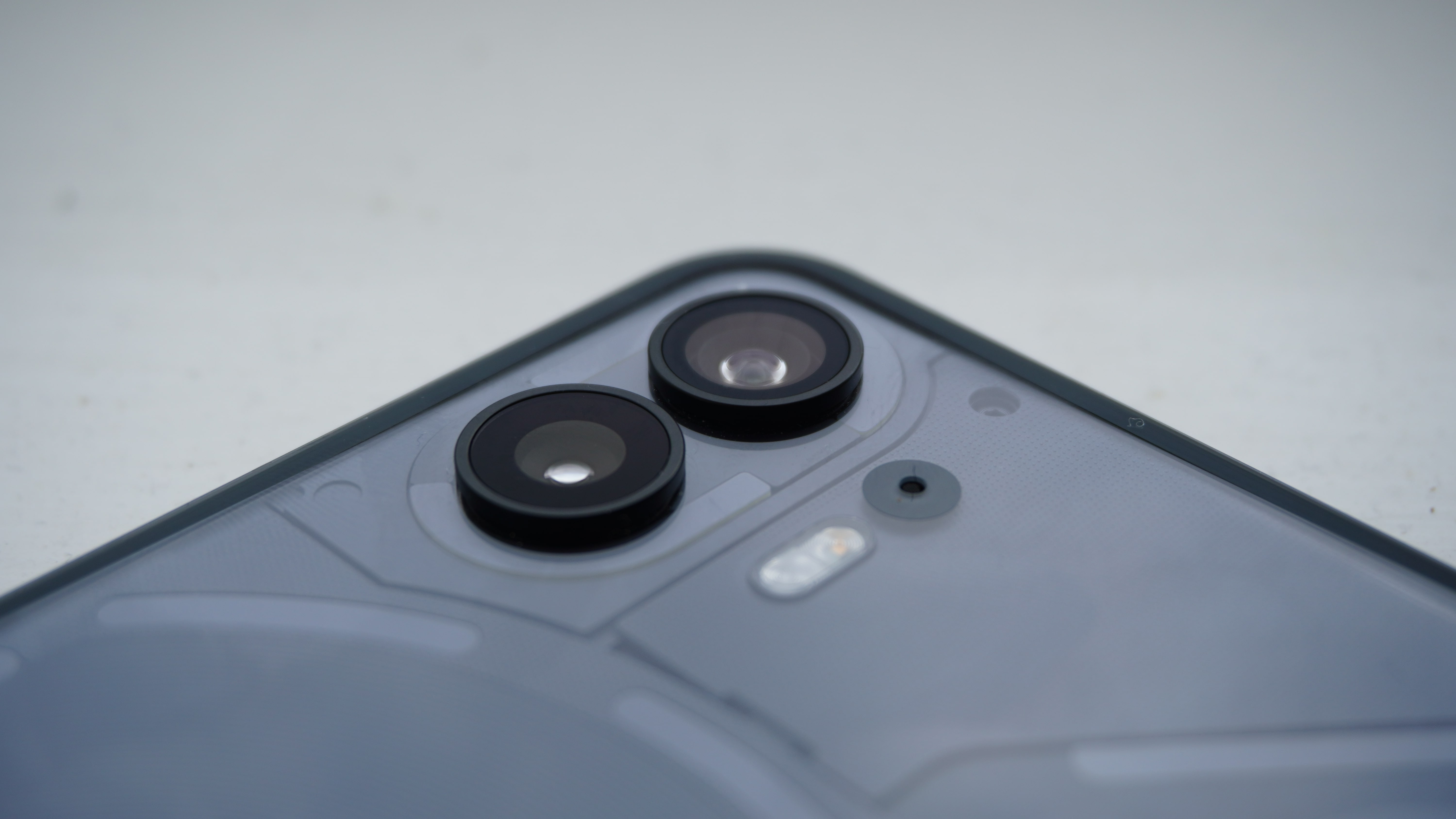
The Nothing phone (2)’s camera system is a story of two parts: hardware and software.
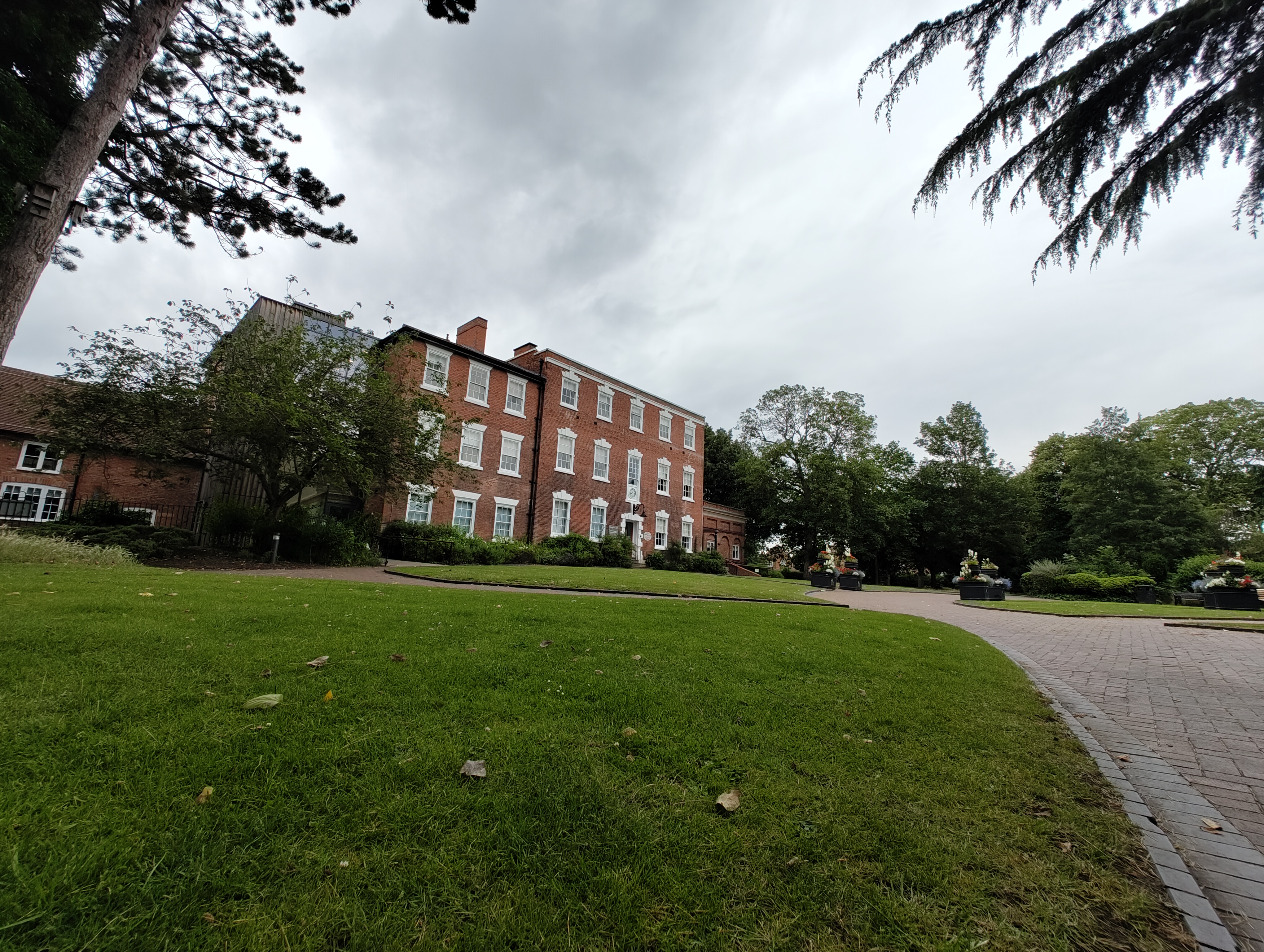
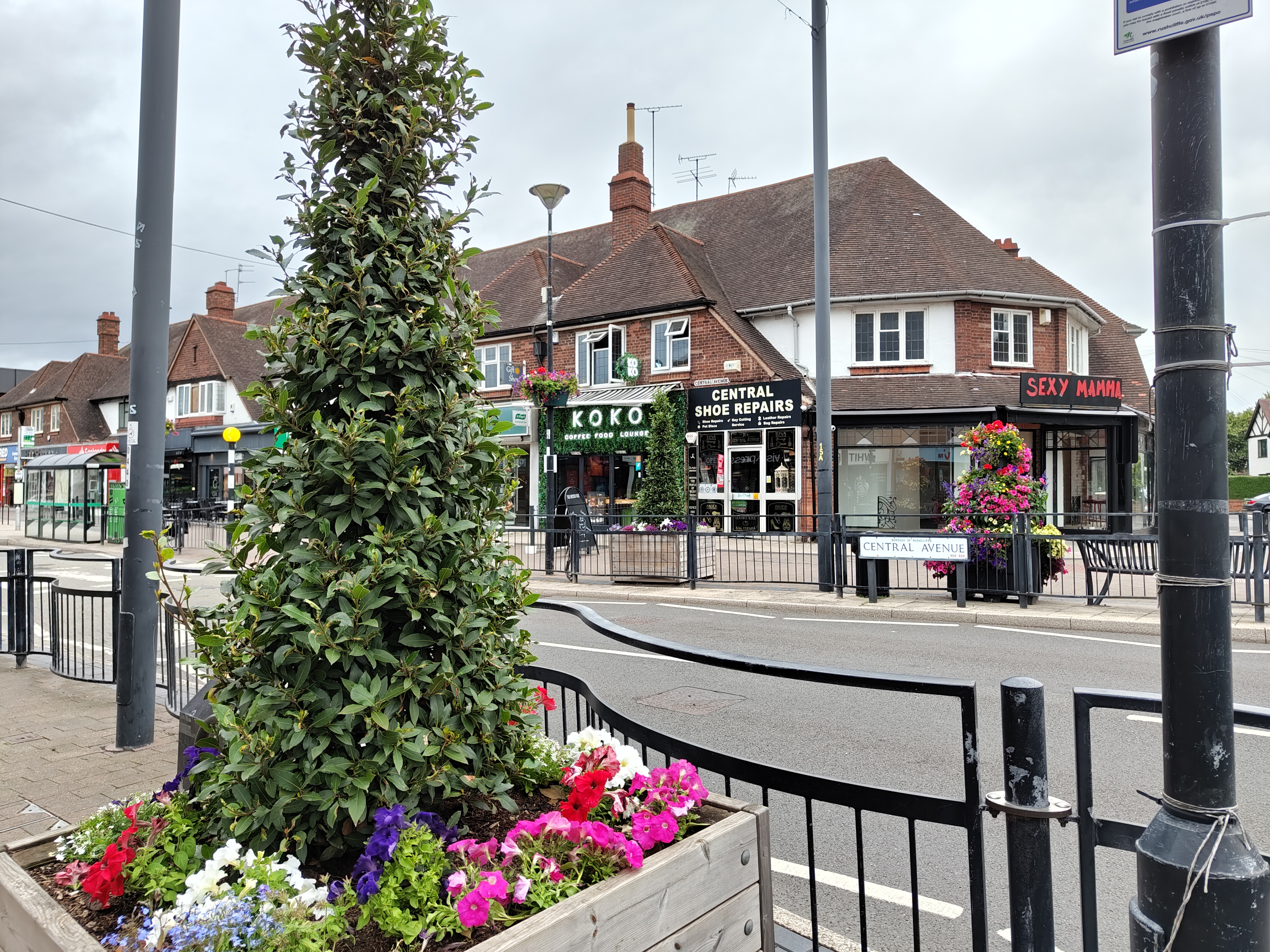
On the hardware front, the 50MP main camera has been upgraded to the Sony IMX890 sensor that is found in the OnePlus 11, which is paired with the same great 50MP ultrawide found in the phone (1), and an updated 32MP selfie shooter (double the resolution of phone (1)). There is also a new 18-bit Image Signal Processor in here that is able to capture 4,000 times more camera data than Nothing’s first phone.
That enables a lot on the software front, which combines the knowledge of a year’s worth of camera tweaks the company implemented on the phone (1) (i.e. a dramatic, contrasty look) with a new Advanced HDR, which captures the same scene eight times at all different levels of exposure.
You can see the results for yourself just below — results that I personally prefer far more to the super saturated feel of Samsung’s phones, and a little closer to what you get from the iPhone 14 and Google Pixel 7.




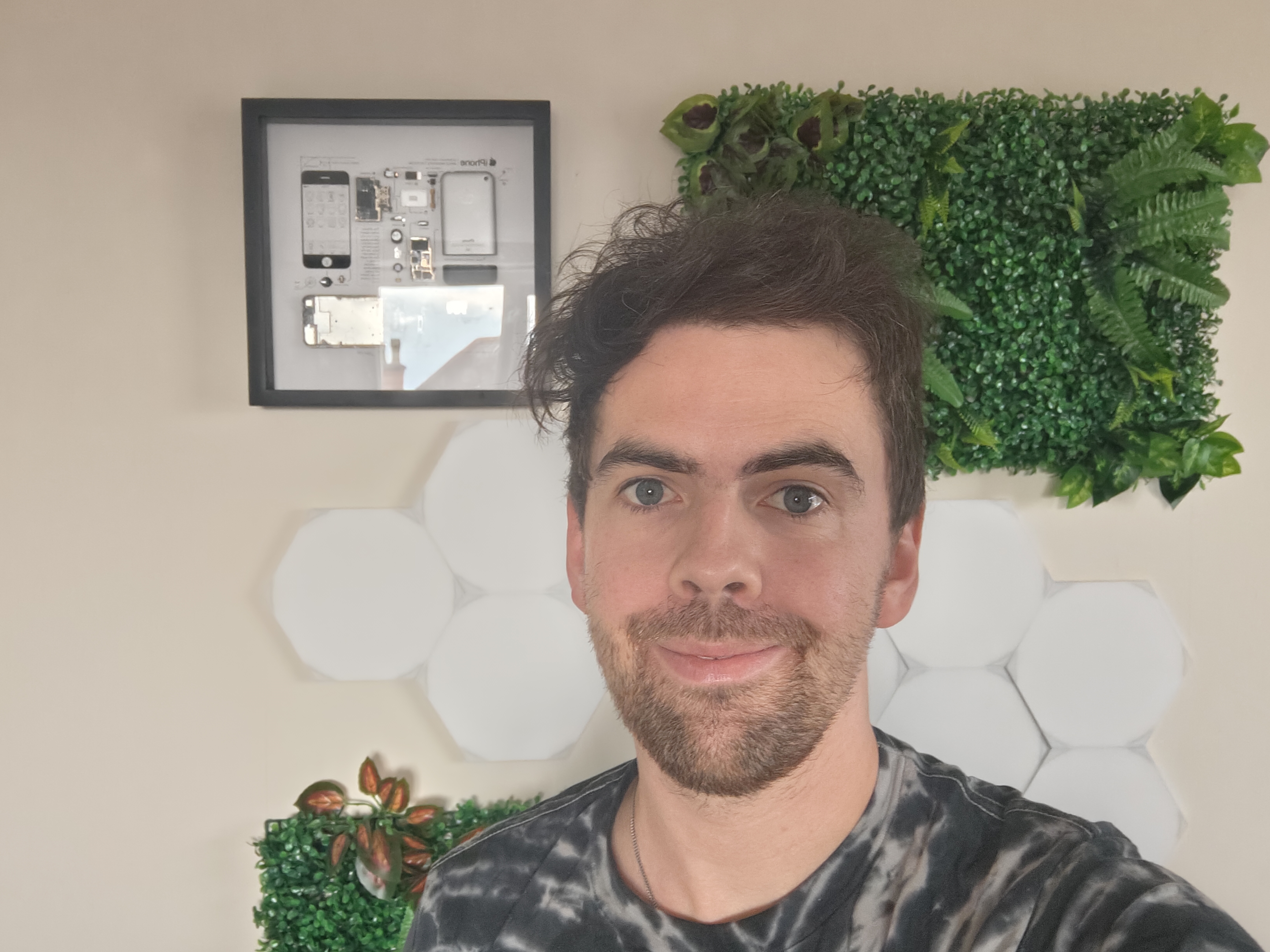
On top of that, selfie cameras with a megapixel count that high always make me a little nervous, due to reducing the amount of light going into the lens. However, pictures are crisp and clear, even in difficult situations.
As for video, you can shoot up to 4K 60 fps footage, or even crank on HDR at the sacrifice of that frame rate for 4K30. Optical image stabilization does a great job of keeping the footage nice and stable, with autofocus keeping everything crisp without too much visible refocusing, and good color accuracy. While the iPhone remains the undisputed champ of video capture, Nothing’s new slab is one of the best when it comes to Android blowers.
Nothing phone (2) software
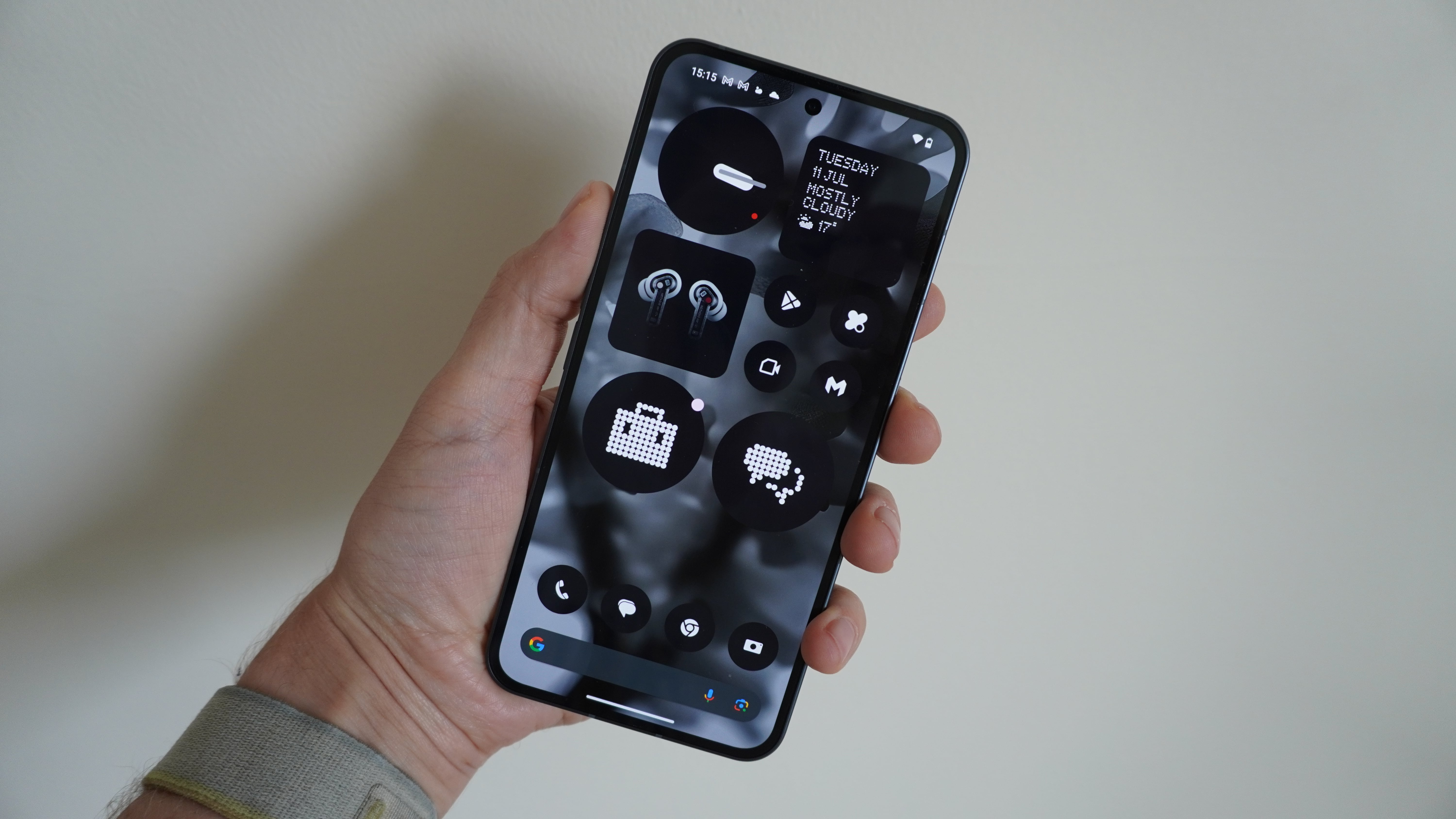
Nothing OS 2.0 overlays Android 13 with a complete transformation, but does so with Google Pixel levels of cleanliness. No bloatware and no unnecessary over-engineering of the experience with pointless proprietary apps.
I love that the OS feels super smooth with its animations and transitions, along with that dot matrix typography and commitment to keeping everything uniform with a feature that makes all app iconography fit to the monochrome style. You’ll discover more nifty implementations as you go along, such as customizable folders with icons to not look so busy, more Nothing-created widgets, and
As for the future, Nothing has committed to three years of OS updates and four years of security updates, which leaves a lot of time for the team to smooth out any wrinkles.
Outlook
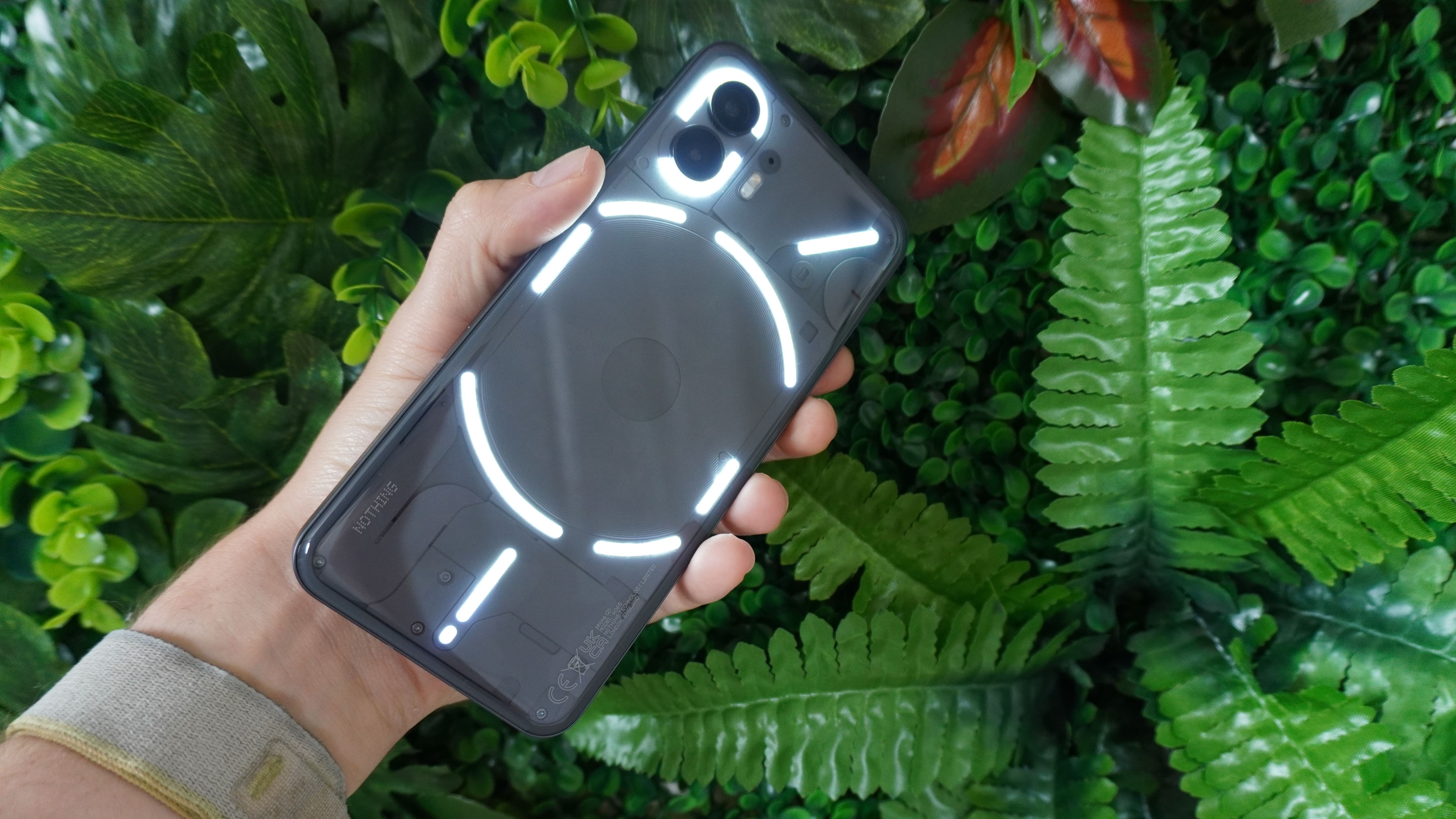
The Nothing phone (2) is nothing (2) f**k with. It’s a stellar phone through and through.
It looks great, feels great to use, and truly stands out from the flagship crowd with its unique aesthetic, great cameras, zippy performance, and decent battery life.
There are a couple of rough edges, though, such as the use of last year’s chipset and the potential visual epilepsy risk of those strobes of the Glyph interface.
But this time around, Carl Pei’s hype machine may be just about backed up by a true summer blockbuster of a device.

Jason brought a decade of tech and gaming journalism experience to his role as a writer at Laptop Mag, and he is now the Managing Editor of Computing at Tom's Guide. He takes a particular interest in writing articles and creating videos about laptops, headphones and games. He has previously written for Kotaku, Stuff and BBC Science Focus. In his spare time, you'll find Jason looking for good dogs to pet or thinking about eating pizza if he isn't already.
