Laptop Mag Verdict
An incredibly smooth note-taking device that offers no extra distractions to your already chaotic life.
Pros
- +
Incredibly low latency
- +
Slick design
- +
Long battery life
- +
PDF editing
Cons
- -
Marker not included
- -
No backlight
- -
Difficult to search documents
- -
Expensive
Why you can trust Laptop Mag
Has this ever happened to you? You’re paying rapt attention to that Zoom or Google Meet call, taking notes, and BAM!, an errant notification pops up and you’ve lost track of what was being said?
Enter the reMarkable 2. The singular, driving purpose behind this tablet is to create a calm and focused note-taking device. There are no downloadable apps and no social media to check up on. It’s just you, and your 100,000 page notebook. Cool, right? Putting aside how hard it is to buy a notebook these days , you can save time, money, and space by condensing all those would-be notebooks into one reMarkable 2 tablet!
This tablet is not without faults, but for a device that serves one purpose, it does so with its metaphorical head held high.
reMarkable 2 Price and Configuration
The reMarkable 2 is currently only available on the company website. The tablet costs $399 and comes with a 1.2-GHz dual-core ARM processor, 1GB of RAM, 8GB of storage and a 10.3-inch, 1872 x 1404-pixel display.
The marker, which you need to use the device, is sold separately. There are a few different marker options; one with an eraser for $99 or one without for $49. The exclusion of the marker from the base package is one of my biggest complaints with the reMarkable 2.
If you’re willing to shell out a little bit more cash, there are several folio options. A grey polymer sleeve with a loop to secure your marker goes for $69. There are also three different book folios that attach magnetically to the reMarkable and give it that genuine notebook feel. There is a polymer gray folio for $99, while the other two options are premium leather — in either black or brown — for $149.
reMarkable 2 Design
What first stood out to me when I unboxed the reMarkable 2 was how incredibly thin it is. At 0.19 inches thick, it’s classified as the world’s thinnest tablet. For the sake of comparison, the newest iPad Pro models are 0.23 inches thick, and the difference is pretty significant. The tablet measures 9.7 x 7.4 inches, which is close to the dimensions of the average composition notebook of 9.8 x 7.5 inches. This means the reMarkable 2 simulates the feel of writing on an actual notebook, which means you get incredible mobility for daily use.
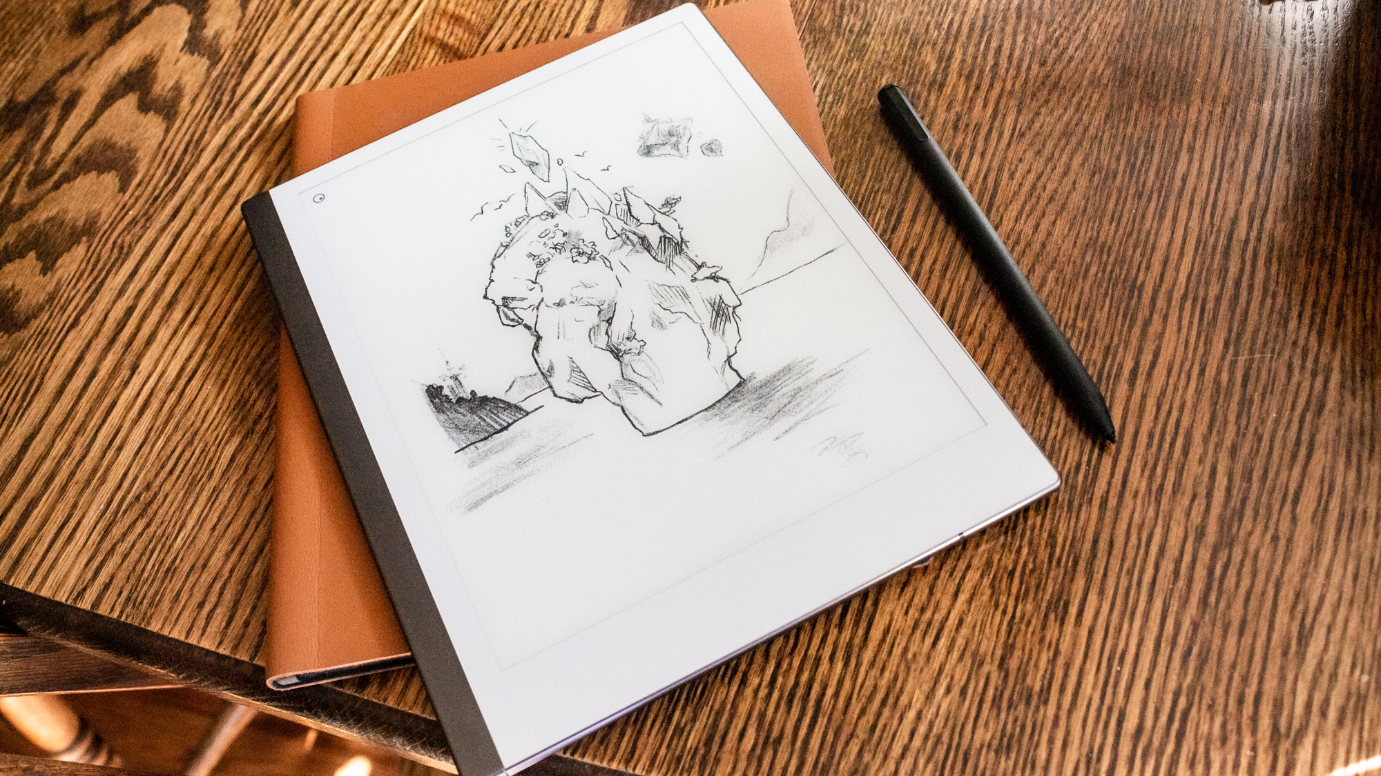
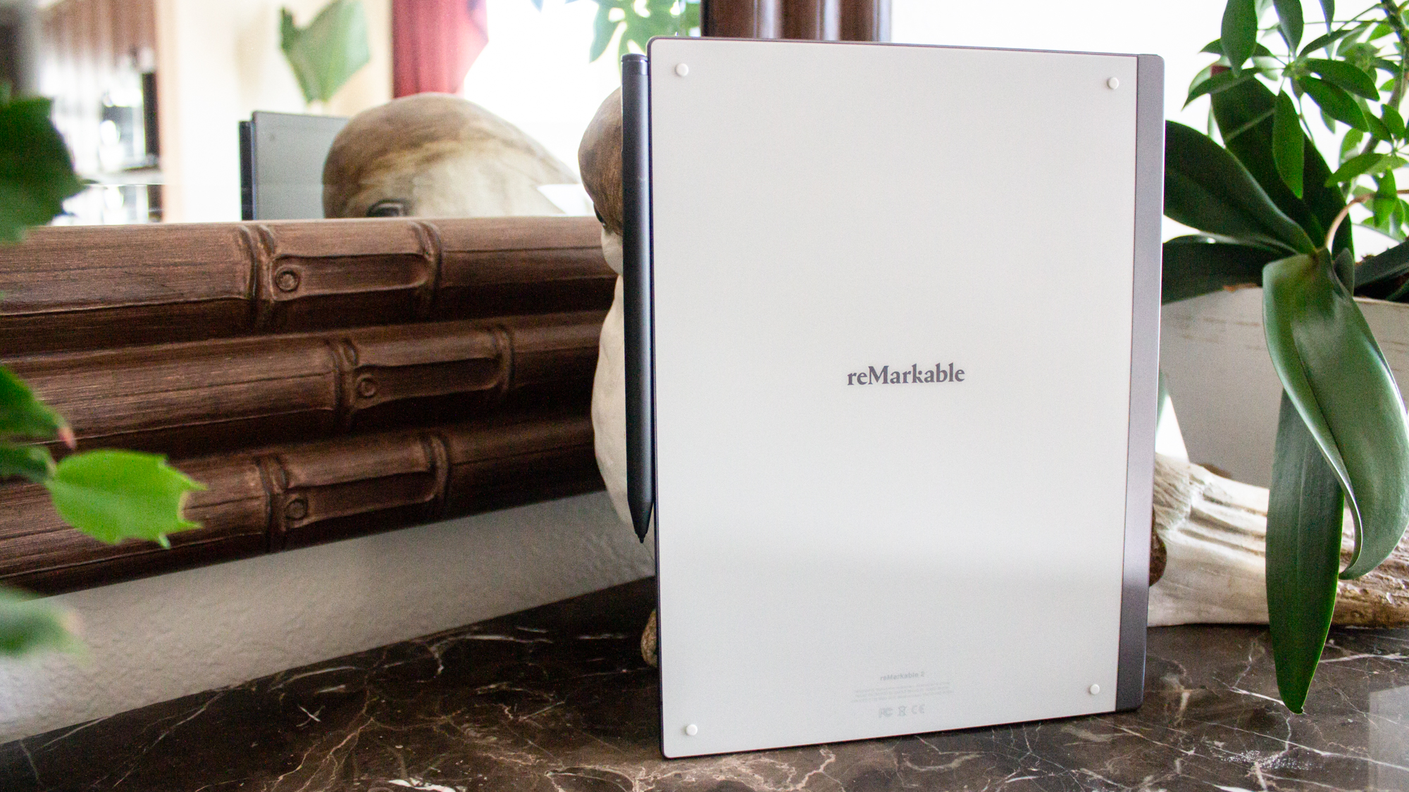
The 10.3-inch screen is surrounded on all sides by thin, light-gray bezels, with the bezel on the bottom being about twice as thick as the rest. There is a thin, black strip on the left side where you'll find the lock/power button, while a USB-C port is on the bottom. The back of the device is the same light gray color as the bezels on the front with the reMarkable logo centered in black. There are also four small rubber dots on each corner which keeps the device from sliding around on slick surfaces, and also secures it to the folio cases.
reMarkable 2 Ports
There is a single USB-C port located on the bottom-left side of the device for both charging and connecting to PC for file transfers.
reMarkable 2 Display
I was taken aback by the 10.3-inch display, which will look familiar to anyone who has used an eReader. If you had asked me a month ago if I could imagine a writing tablet which uses the E Ink display, I would have told you “absolutely not.” After all, those displays are known to be slow, so how could you simulate handwriting on such a surface? Somehow, the reMarkable 2 pulls it off.
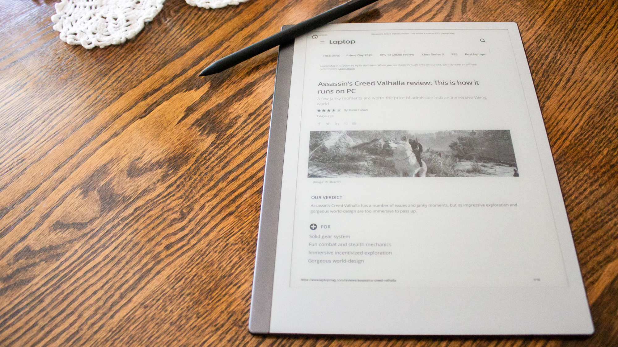
With a resolution of 1872 x 1404-pixels and a 226 DPI (dots per inch), the display is surprisingly crisp and smooth. While viewing PDFs with both text and images, I couldn’t discern any obvious pixelation. The anti-glare properties of the display only help to enhance the feeling of writing on paper. However, there is no backlight on this device. This isn’t a problem when using the device in bright daylight, or in a well-lit room, once I faced inconsistent lighting, it seemed like my eyes were constantly having to adjust or even strain to see the display. This makes taking notes in a dark room difficult, or editing documents late into the night nearly impossible.
reMarkable 2 Markers
Both the Marker and Marker Plus have a heft to them that makes them comfortable to hold. The standard Marker is white and while it weighs 48 ounces, it’s about the same size as a standard ballpoint pen. On the other hand, the Marker Plus is black and has an eraser on one end. The eraser doesn’t change the height too much, and it’s only 16 ounces heavier than the standard Marker.
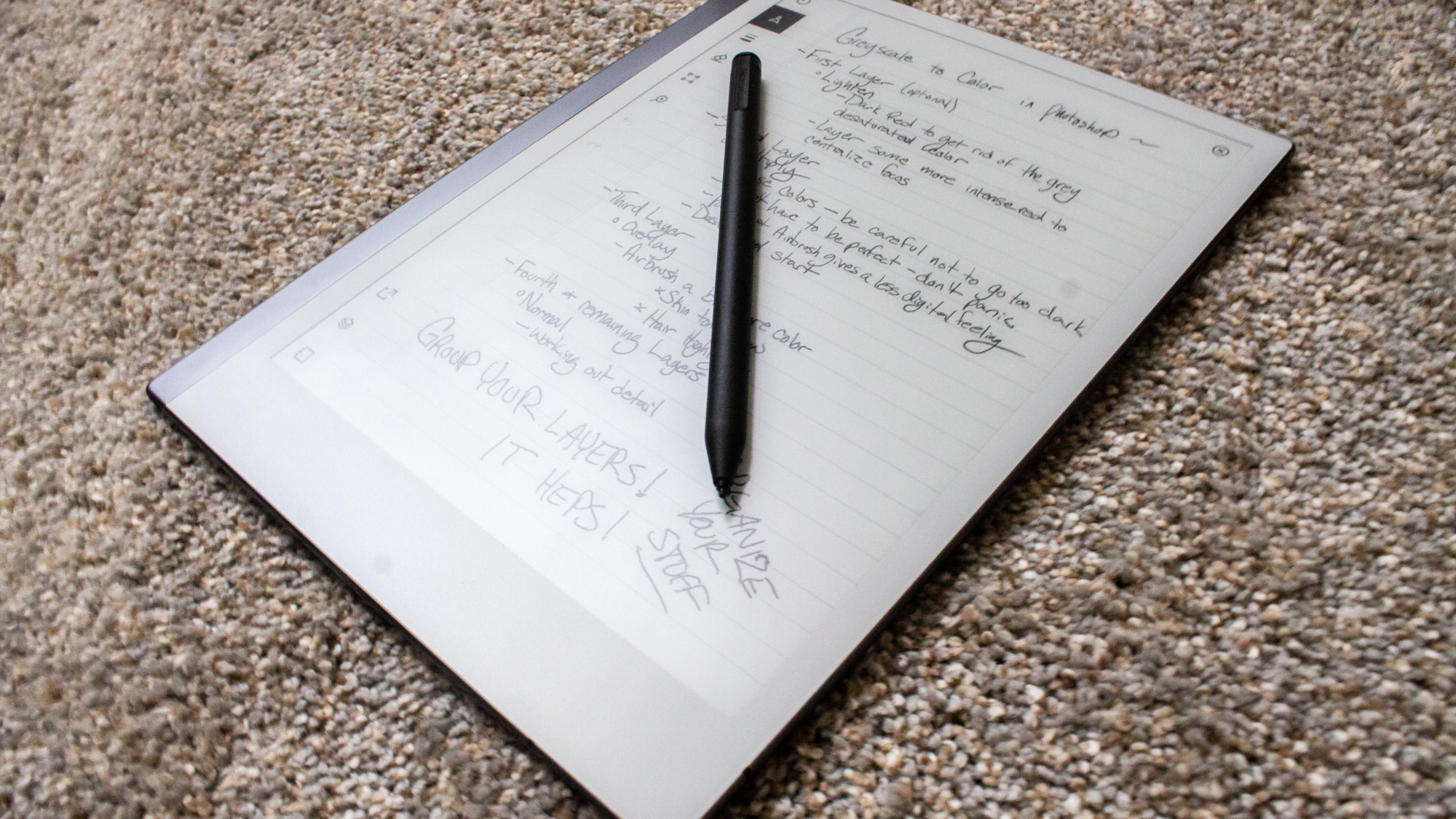
Aside from the colors and eraser on the Marker Plus, there is no difference between the standard Marker and the Marker Plus. They both use the same marker tips and are designed to emulate the friction of a pen or pencil writing on paper. Both accomplish that goal.
Combined with the texture of the display, using the marker feels neither too scratchy nor too smooth. And with 4,096 levels of pressure sensitivity, not to mention 50 degrees of tilt, any stroke you make will taper from thin to thick as a normal pen or pencil would.
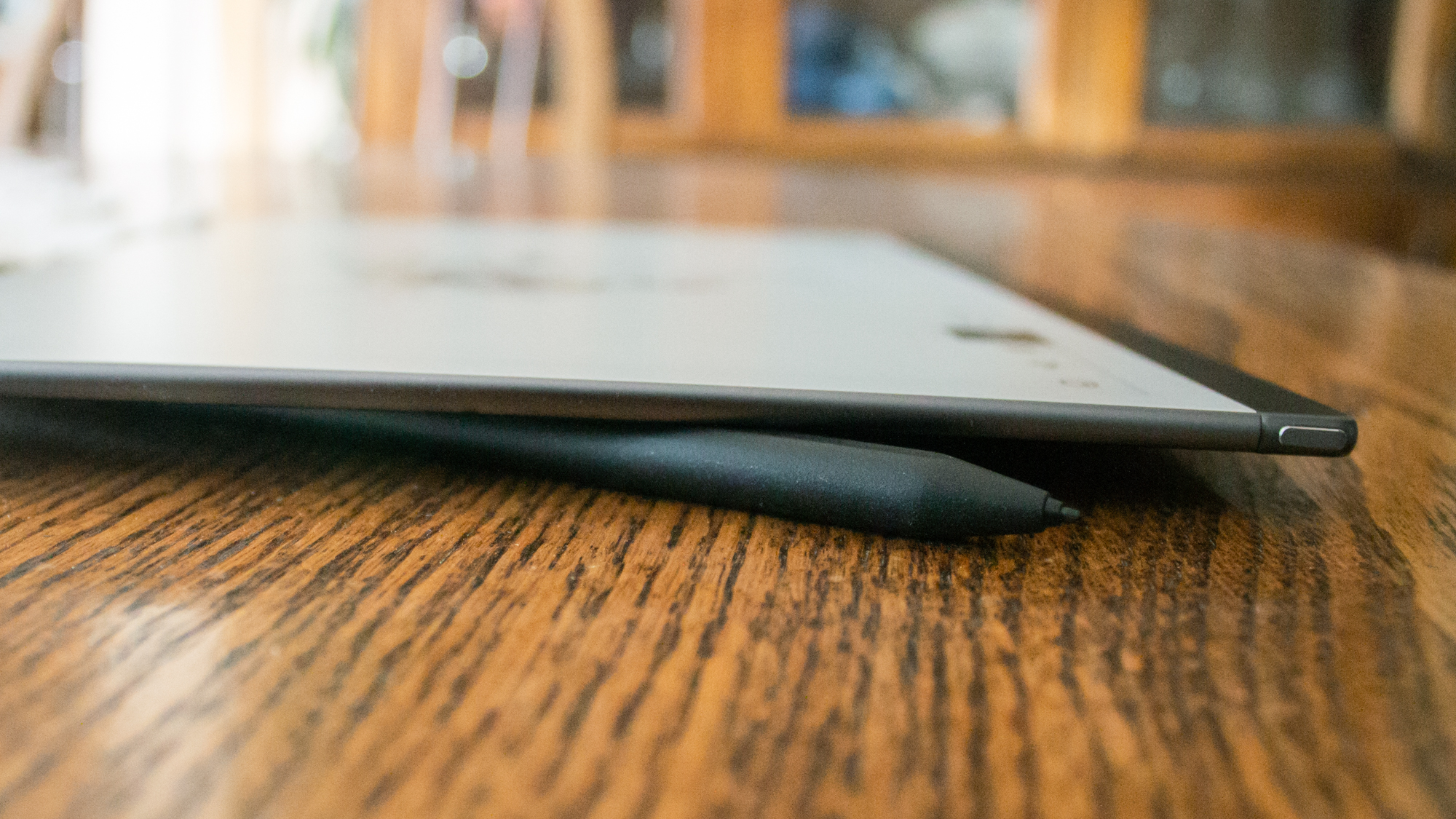
Over time, depending on your usage, the tip of the markers does wear down, but not to worry! No matter which marker you order, they both come with nine extra replacement tips. Going off of an average 2-month lifespan per tip, this means you get about 1.5 years supply of tips included in the packaging. Extra tips are available on the reMarkable store at $12 for a pack of eight.
Performance
With a 1.2-GHz ARM processor, you wouldn’t expect top-tier performance out of this device, and yet I never noticed any lag. Documents loaded fairly quickly, and while turning pages wasn’t a snappy experience, it was pretty close to what I would expect from an eReader.
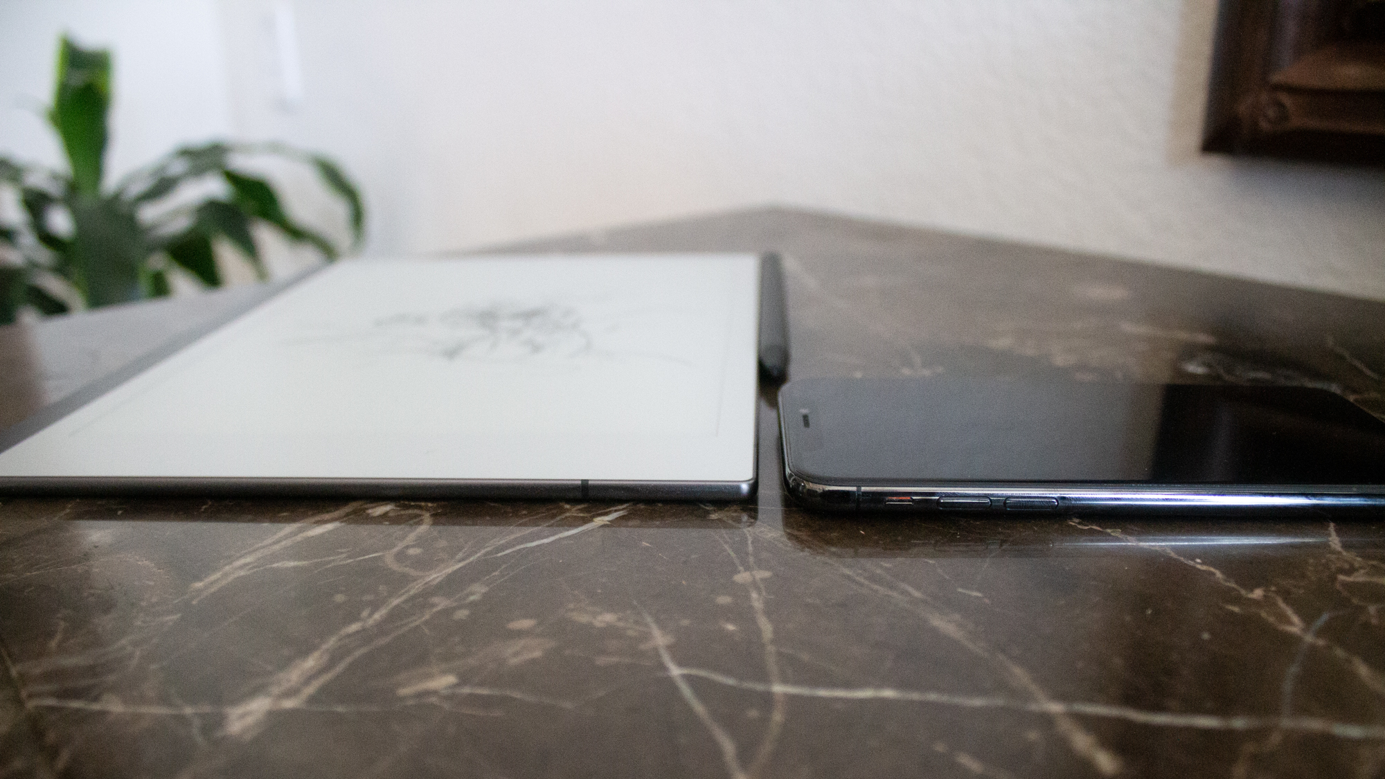
Thanks to its custom-built OS, Codex, the reMarkable 2 avoids the latency issues people had with the first device. The original slate had a latency of 45 to 50 milliseconds, meaning it was easy to watch the lines on the page follow behind the physical pen. With the reMarkable 2, latency was reduced to 21 milliseconds, which is about the same as professional drawing tablets like the Wacom Cintiq. Every mark you make appears as your pen touches the paper with absolutely no hesitation.
Battery Life
The reMarkable 2 has a long battery life, which can last up to 3 weeks depending on individual usage. Those who use the tablet more than 3 hours a day may notice a bit shorter battery life, but the digital notebook can still stretch past a week even under heavy workloads. It also has a standby time of 90 days, which means you can let the device sleep for up to 3 months before it powers down.
User Interface
The user interface on the reMarkable 2 is fairly straightforward in appearance. Most features can be found on either the Home page or the journal page interface. But while it is simple in appearance, some features aren’t very easy to find.

Starting from the home page, there is a drop-down menu at the top that gives you the option to view your files, filtered by notebook, PDF, Ebooks, or favorited files. You can also change whether you want to view your files in a list or grid view. Immediately next to this drop-down menu is a quick, easy way to create a new folder, notebook, or just a “quick sheet” to get started on your writing. There is also a search option in the top bar, however, this only searches file names, not their contents or page numbers.
Once you select a file from the main menu, you're taken to the last page you were working on in that “notebook.” From here, the user interface changes completely. While your file takes up most of the page, there is a thin menu on the left-hand side of icons. Listed from top to bottom, these are full screen, brushes, stroke and color, eraser, select, zoom, undo, redo, share, layers and templates, and notebook settings. Most of these are pretty self explanatory, but the last three have their own special options inside.
In the share submenu are three available options. LiveView is currently in its beta stage, but this gives you the ability to broadcast the page you’re writing into the reMarkable desktop app. The other two options are send by email, convert to text, and send. These last two also give you the option to select multiple pages before sending out an email.
The Layer menu has only a few options. You can add or delete a layer for up to a maximum of five layers, and apply a template to the document. There are currently 47 different templates to choose from, ranging from your standard college-ruled notebook or daily planners, to more creative templates such as storyboards and music sheets. Of course, you always start with a blank page, but after that, the possibilities are endless.

Last, but not least, are the notebook settings. From here, you can view what page number you’re on, make a new page, and change the title of the notebook. You can also flip the page between portrait and landscape modes. You'll also find the current notebook’s page overview if you don’t want to keep flipping through pages to find the one you wanted. Unfortunately, there isn’t a way to change the individual page names in notebooks, so you can't search for the page you need outside of searching through the entire notebook.
Writing Experience
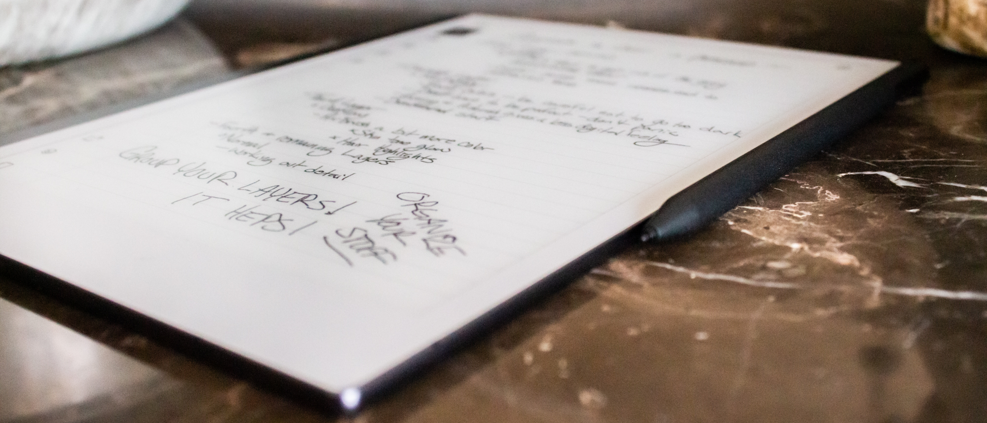
I’m sure you have a favorite brand of pen or pencil. One that fits perfectly in your hand and just glides across the page so beautifully you wonder how you managed to even write before this particular utensil came into your life. That’s what it feels like to write on this device. The highly sensitive pen, the E ink display, and the incredible, low latency all add up to an experience that is so smooth and comfortable that even taking notes for hours never caused any cramping in my hand.
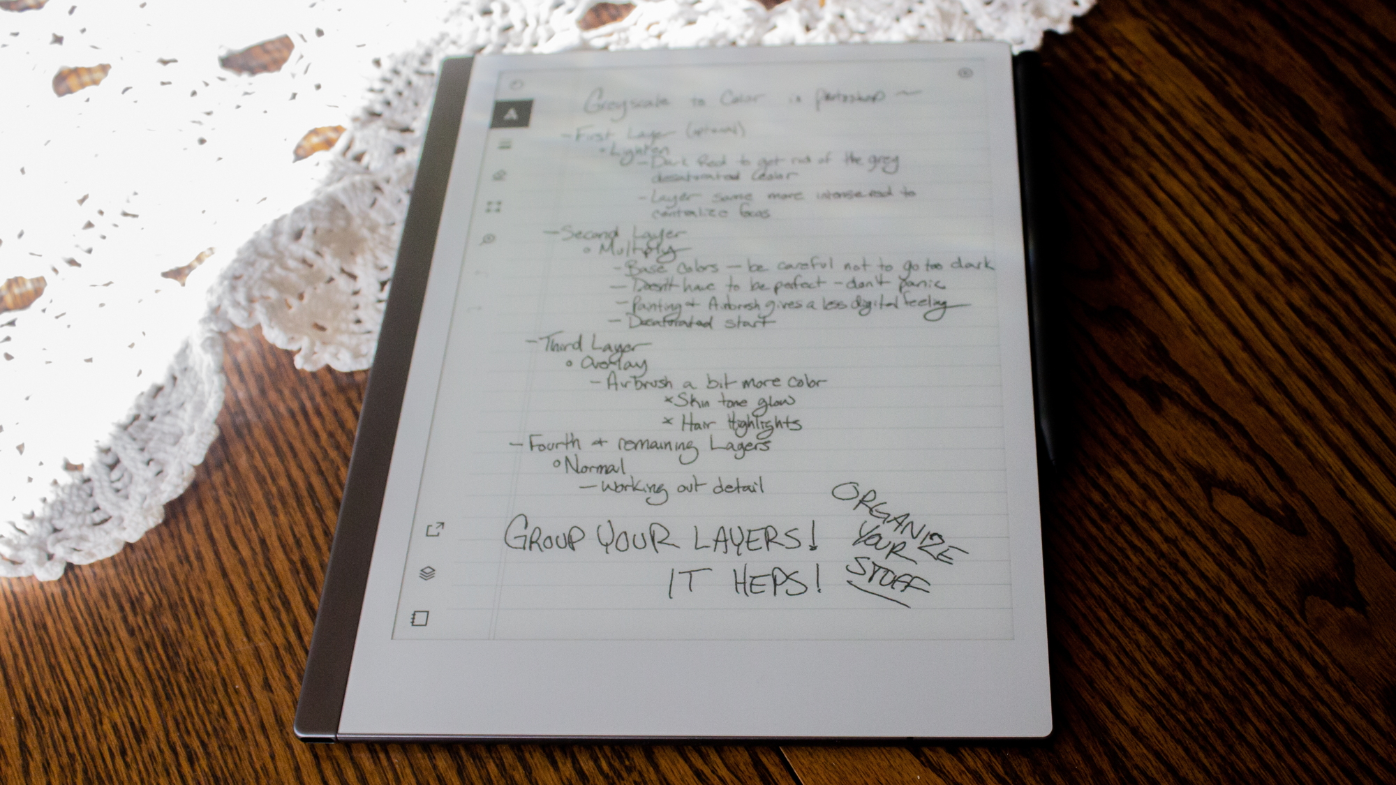
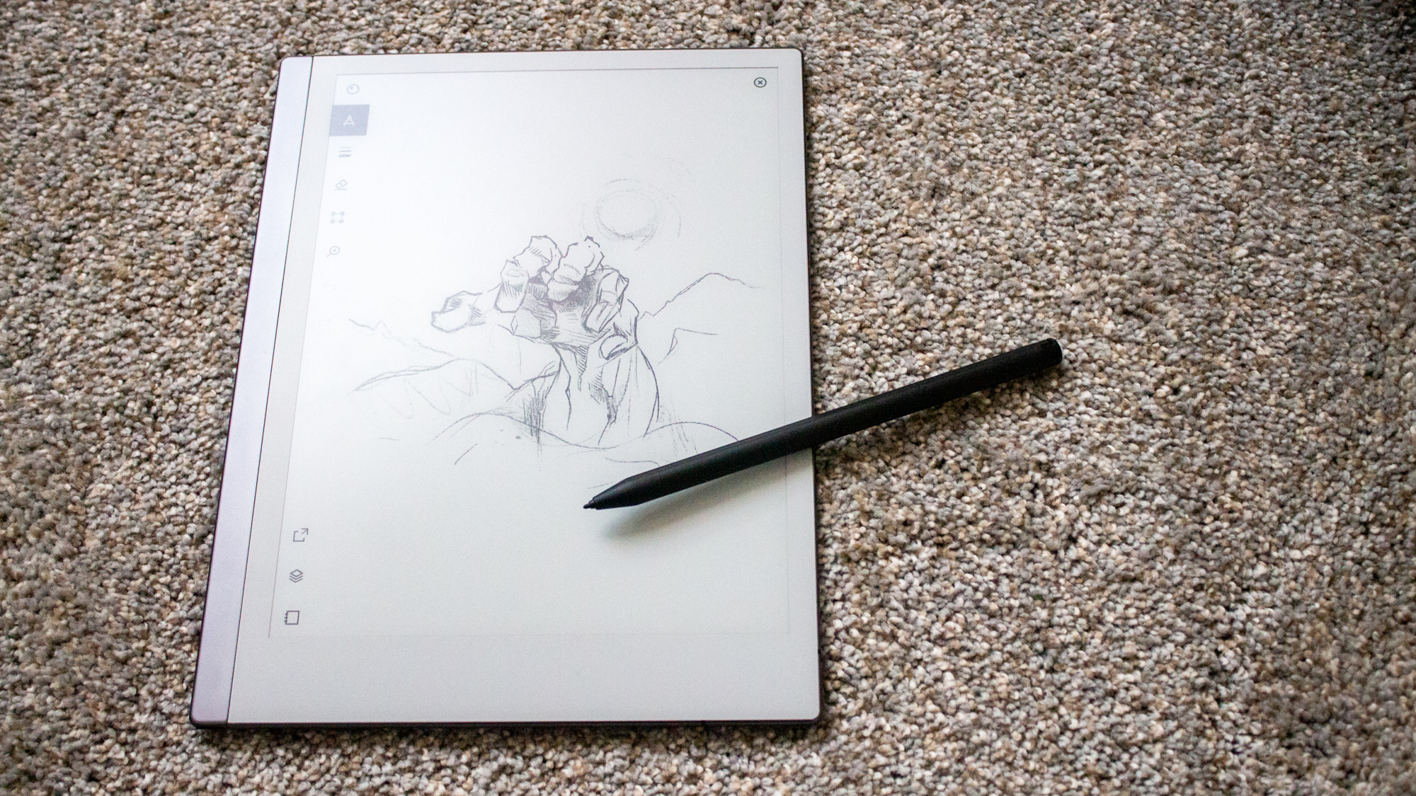
There are seven different brush options that all offer different grain and flow experiences. For example, the pencil brush looks and feels so similar to a standard HB pencil that you could easily pass off a sketch as simply “something I drew and then scanned in.” In addition, there are options such as Ballpoint Pen, Marker, Paintbrush and Highlighter. Each brush has its own submenu of settings. The thickness of the stroke is present on all of them, while some offer color (shade, really) options as well.
And while there is an eraser, it doesn’t work the way it should. Because it doesn’t use pressure sensitivity, I sometimes ended up erasing things I didn’t mean to. The white paintbrush tool suited me better. But when in doubt, there is always the undo button which can go a long way. And I mean a long way. Curious about how many undos the reMarkable 2 could handle, I filled a page with little dashes (540 of them, to be specific), and though it took a while, I was able to undo every last one of them! Keep in mind, this only works until you’ve exited the document. You can only undo whatever marks have been made during the current writing session.
Software and Warranty
The reMarkable 2 runs on its very own OS, called Codex, based upon Linux. It is built in order to offer the smoothest writing experience possible and is regularly updated to introduce more features and keep latency as low as possible. reMarkable also has its own cloud software, which makes it easy to send your notes and documents directly to your computer.
If you’re interested in writing directly on PDFs, or annotating ebooks, or even full webpages, there is an extension available for Google Chrome that lets you send documents directly to your reMarkable 2. This process is fairly quick; once you’ve navigated to the webpage or PDF that you want to transfer, you simply have to go to the print options, and rather than send to an actual printer the extension adds a “Read on reMarkable” option. All you have to do is select that, hit print, and the document will immediately upload to your device.
There is also a one-year limited warranty for the reMarkable 2, which coverage varies from country to country.
Verdict
These days, the value of a device tends to lie in how many things it can do. While the reMarkable 2 isn’t multifunctional, sticking to what it does best has paid off. The lack of distractions in its UI and the excellent performance as a writing tablet makes this device a pleasure to use. And while I may not be the most dedicated notetaker, as an artist, I can say that this would be added to my daily devices.
The ability to import PDFs and e-books is also a boon to those who are looking for a device to take to class with them. It is easy to add notes and scribble in the margins, however, because the zoom feature isn’t the smoothest, it may be difficult for people who are farsighted. Plus the lack of a backlight makes it difficult to see what’s on the screen in some settings. A pinch-to-zoom option might help to circumvent these issues.
And while it does have these few issues, I cannot stress enough how great it was, as an artist, to use the reMarkable 2. The writing was as smooth as butter and the simple UI never got in my way. There are no ads to click, or updates to make. It’s just you, your notebook, and all the ideas in your head making their way to the page as seamlessly as they can. It truly was a pleasure to use this device.
Ally Thomas writes about Samsung, Apple, Lenovo, and Asus for Laptop Mag. She digs into the latest deals to make sure that you're getting the best bang for your buck. With a keen eye for a good bargain, she reports on discounts on tablets, laptops, AirPods, and wearables.
