Laptop Mag Verdict
Palm's breakthrough device is the first smart phone that truly gives the iPhone a run for its money.
Pros
- +
Slick and fun user interface
- +
Synergy links contacts and unifies calendars
- +
Very good Web browser
- +
Elegant notification system
- +
Fast, responsive accelerometer
- +
Loud speaker
Cons
- -
Short battery life
- -
Cramped keyboard
- -
Apps load slowly
- -
Can't search e-mail
- -
Lacks video recording
Why you can trust Laptop Mag
It's the smart phone you can't help but root for. Not because Palm (not to mention Sprint) is on the ropes, and needs a hit. It's because the company's new webOS out-innovates the competition in many ways. The eagerly anticipated Pre ($199 after contract and $100 rebate) beats the iPhone, Android, and BlackBerry when it comes to multitasking, and especially in how it seamlessly unifies your contact and calendar information across multiple Web services. Plus, the Pre's slick Activity Card-based interface is downright addictive.
Of course, the Pre has its share of flaws--some of them glaring. Apps can be slow to open; the device has mediocre battery life; and you can't search your e-mail. The bottom line: the Pre isn't necessarily worth ditching your current (or future) iPhone or BlackBerry for. But it is, by far, the best smart phone on Sprint's network, and a very strong first showing for the webOS, especially given that the company started from scratch.
Design
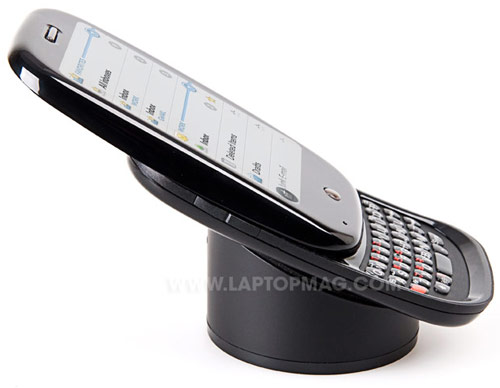
With its pebble-like shape and arc slider mechanism (which reveals a clever mirror) on the back, the Pre looks like a smart phone from the future. Its glossy black finish exudes cool, even though it makes sliding the display upward to reveal the keyboard a challenge. The Pre feels a bit slippery, but it certainly doesn't feel cheap, although the plastic body lacks the metallic accents found on other premium smart phones.
Click to enlarge
Given that the Pre includes a full QWERTY keyboard, the fact that it weighs just a bit more than the iPhone is an accomplishment (4.8 ounces versus 4.7). The Pre is understandably thicker, but also shorter than theiPhone, measuring 3.9 x 0.7 x 2.3 inches (compared to 4.5 x 2.4 x 0.5). This makes the Pre easily pocketable, much like a typicalBlackBerry Curve, only smaller.
Click to enlargeTo be this compact, however, Palm had to make a couple of trade-offs. First, even though it's positively brilliant, the Pre's 3.1-inch touchscreen is noticeably smaller than the iPhone's (3.5 inches), or theT-Mobile G1(3.2 inches). You'll be zooming in often to read Web pages. The other caveat is the Pre's cramped keyboard (more on that later).
There's no question that Palm took a minimalist approach to the Pre's design. The single center button beneath the display minimizes open applications or brings you back to the main dashboard screen (called Card View) at any time. This button also glows when you have incoming notifications.
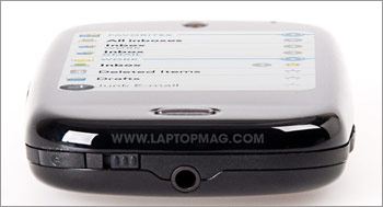
The left side of the Pre houses two narrow volume buttons. Up top, you'll find a 3.5mm headphone jack, Palm's trademark ringer on/off switch, and a tiny, raised Power button. You'll also need to press this button when the display turns off after a period of inactivity (which you can set). We would prefer that Palm let Pre owners use the larger and easier to access Center button for this purpose.

Click to enlarge

Click to enlarge
A power/USB jack populates the right side of the phone, behind a small plastic door, and the bottom of the Pre houses a back panel release button to access the battery.
So what's missing? Nothing is particularly wrong with the design, but, in some respects, we think Palm left too much on the cutting room floor from its Treo line. Specifically, we would have liked to see a dedicated camera launch button (for grabbing a quick shot), or at least a user-customizable shortcut button.
[flq:c3021202dd384d408d766bca561b3027]
User Interface and Gestures
Click to enlarge
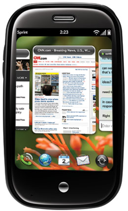
Palm takes a new approach to multitasking with the Pre, and it all starts with Activity Cards. When you press the Center button, all of your open apps line up from left to right like cards. You can swipe to the left or right to see what's open, press and hold a card to rearrange the order, or swipe up on an app to close it (called throw).
The throw gesture is important, because if you have too many open cards--10 max, typically, but it also depends on how much memory each app eats up--you won't be able to open any more programs. In some cases, the Pre told us to discard unused cards with as few as two to four apps open, which was annoying.
On the main screen, in Card View, five shortcuts are displayed at the bottom, by default the phone, Contacts, E-mail, Calendar, and Launcher. Tapping Launcher brings up a list of apps laid out in a grid, similar to the iPhone and T-Mobile G1, and you can swipe to the left to get to more apps. Or, you can perform a launch gesture to find the same menu by swiping upward from the black area just beneath the display.
Quick Launch is another handy gesture. By swiping up without lifting your finger from the screen, the same five icons listed above appear in a wave, so you can quickly access the most frequently used ones without going back to the main menu. You can customize the apps for Quick Launch by dragging their icons on or off the grid.
Palm makes good use of the gesture area in other ways. Swiping to the left, starting from the Center button, takes you back to any application. And a small light illuminates in the gesture area to confirm your move. If you're reading an e-mail, for instance, you can go back to your inbox with a quick swipe.
There's yet another advanced gesture Palm turned off by default (to minimize confusion). Once activated under Preferences, you'll be able switch among open apps with a longer swipe to the left or right in the gesture area. Although this is marginally useful, because in most cases you won't remember the order of open activity cards.
While the above actions will seem a bit foreign to Pre owners at first, we adjusted to them within a few hours. Plus, the Pre does everything the iPhone does in the multitouch arena, including double-tapping, pinching in and out (for zooming), and flicking (for moving up or down though a long list). In most cases, the Pre was very responsive; we found ourselves repeating the back gesture only a few times for the phone to recognize it.
[flq:fa5f586ad14143fdb0194f53db299de9]
Notifications
Click to enlarge
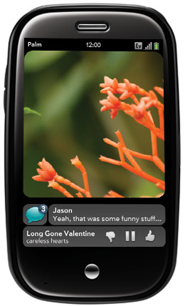
With most smart phones, appointment notifications, and other alerts can feel like roadblocks. Not with the Pre. It handles notifications discretely and elegantly, displaying them at the bottom of the screen, whether for calendar entries or incoming messages.
You can whisk these subtle bars away at any time with a sideways swipe. If you ignore them, they turn into even smaller icons that sit at the bottom right corner of the screen. When you have new e-mail, for example, you'll see a tiny envelope icon. When you touch it, you'll see the title, sender, and subject; and when you touch it again, you open the message.
Cut and Paste
The Pre's cut-and-paste functionality is half-baked. Its webOS allows for cut, copy, and paste functions for editable text fields, such as Web forms, composing e-mail, and memos, but not in Web pages, or with e-mail you receive. Plus, the action itself feels a bit clumsy; you have to press the Shift key while dragging your finger over the desired text. Next time around, we'd like Palm to give the Center button scrolling capability (as on most BlackBerrys), which makes finer movements easier to perform with the cursor, and cuts and pastes text with less effort. (You can also place the cursor on the text you wish to highlight and then press the orange key, which makes the cursor function like a trackball, allowing you to highlight text with your finger.)
Display and Accelerometer
Although the Pre's display is on the small side at 3.1 inches, it's still one of the most impressive screens we've ever seen on a mobile phone. It boasts the same resolution as the iPhone (480 x 320 pixels), and presents an incredibly crisp and colorful picture. Viewing angles are generous, and we had no trouble seeing the Pre in direct sunlight, thanks to the ambient light sensor that automatically adjusts the brightness.
In terms of accuracy, the Pre holds its own versus other smart phones with capacitive touchscreens, such as the iPhone and T-Mobile G1. In some cases, however, you'll need to zoom in to get the best results. Palm helps with a neat little circular graphic and a ripple effect to make sure you clicked on the correct selection.
Hands-down, the Pre sports one of the fastest accelerometers in the business. In most cases, the phone's screen changed from portrait to landscape mode--and back again--instantly. Want to impress your friends? When you turn the device to minimize an app, the accelerometer still works in this mode. Sometimes, however, the Pre either couldn't keep up with our movements, or got stuck in one position.
Keyboard
Click to enlarge
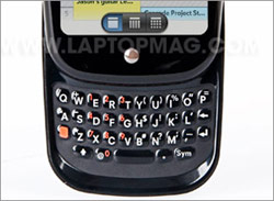
While the Pre's QWERTY keyboard isn't as good as a BlackBerry's, it is better than a touchscreen. Its layout is cramped, and it has the same gummy feel as the Palm Centro. After a few days of use, however, we were typing e-mail, instant messages, and Web addresses at a pretty fast clip. You just need to learn to type with the tips of your thumbs. We like the backlit keyboard, although the lighting on our unit was uneven. As much as we prefer physical keyboards to touchscreens for typing, we would like to see Palm add a touchscreen keyboard in landscape mode. This would make it easy to enter Web addresses without having to swing the Pre around, and slide out the keyboard.
Synergy with Contacts and Calendar
Palm's Synergy technology makes it easy to sync your contacts and calendar in the cloud with services such as Google, Microsoft Exchange, and Facebook. Once you enter your account information, the Pre takes care of the rest, and syncs in the background. Plus, if you set up a Google calendar on the Pre, for
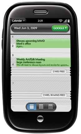
Click to enlargeexample, you won't have to set up a separate e-mail account. This smart phone automatically brings down your existing e-mail account and messages. Very clever, indeed.
It's important to note that while the free Google Calendar Sync integrates your calendar with Outlook on the desktop, you'll need another program like CompanionLink for Google ($29.99) to sync contacts and tasks. If you prefer to sync with Outlook directly over Wi-Fi, Palm offers the Chapura PocketMirror application, available in the Pre App Catalog (more on that later).
The Pre does an even better job presenting PIM data than it does getting it on your phone. The Synergy feature enables linked contacts, which means that the phone is smart enough to combine information about a single contact across multiple services, and give it to you as a single listing. Your address book is also live, which means if someone you know is signed on to, say, Google Talk, you'll see their availability status, and you can launch into a conversation right from the contacts menu.
Layered calendars is another perk. You can see them in a single view (from Google, Outlook, and Facebook, for example) or one at a time. Our problem with the Calendar was that it updated Google calendar information slowly. "Polling" takes place only about once every two hours, although you do have the option to tap on the Sync Now button in Preferences. You can also set your e-mail, calendar, etc. to push at specific times.
[flq:378bb4fce68c44caa89f5bbb63fb49bc]
E-mail and Messaging
Click to enlarge
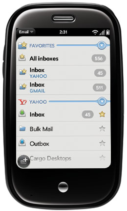
As an e-mail device, the Pre is satisfactory, but it's missing a key ingredient--for now, at least. Setting up accounts is simple, especially if you use a common provider such as AOL, Gmail, or Yahoo. The same goes for Microsoft Exchange ActiveSync. All you'll need to do is enter your e-mail address and password. In other cases, you'll need to manually enter POP or IMAP settings, which is straightforward enough. Push e-mail is supported for Gmail, Hotmail, Exchange, and Yahoo Mail, but you'll need to customize how often you want the Pre to retrieve new messages for other types of accounts.
The Pre offers stellar attachment support, thanks to the included Doc View application from DataViz. We had no problem opening Word, Excel, and PowerPoint files, but you can't edit these documents or create new ones. (A premium app with this capability will come later.) Palm also includes a PDF viewer. Not only were all of these docs easy to read, complete with native formatting, it was easy to zoom in using
Click to enlargethe Pre's multitouch display.
Palm Synergy technology lets you combine multiple inboxes into one view, but we imagine most users will want to keep their business and personal e-mail separate. If you decide to go this route, however, it's nice to know that you can respond to messages from your account of choice.
Our biggest beef with the Pre's e-mail app is that it doesn't let you search your inbox, despite this smart phone's comprehensive Universal Search feature, which searches everything from applications and contacts to Google and Twitter. Also, you can't rearrange your inbox views, as you can with the BlackBerry Storm, so that you see messages only from a single contact.
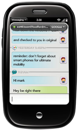
On the plus side, the Pre enables users to seamlessly switch between instant messages and text message conversations with a given contact, and shows it all in a single threaded view. The Pre supports Google Talk and AIM natively, but, unfortunately, not Yahoo or Windows Live Messenger.
Web Browsing
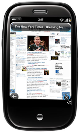
Click to enlargeLike the iPhone and T-Mobile G1, the Pre's browser is based on WebKit engine. In other words, the Web surfing experience looks nearly identical to what you're used to seeing on the desktop (minus full Flash support). Pages loaded especially fast over Wi-Fi; image-heavy sites such as NYTimes.com and CNN.com popped up on the Pre's screen within 5 seconds. On average, pages loaded completely in 15 to 20 seconds.
Over Sprint's EV-DO Rev. A, network speeds were also impressive, with the same sites appearing within 10 seconds and completely loading within 25 to 30 seconds. In most cases, zooming in on pages was smooth (using either a double tap or pinch gesture), and the accelerometer worked well. To test the Pre versus the iPhone, we loaded CNN.com over 3G at the same time on both devices. The Pre was faster, with the page appearing on-screen in 6 seconds and downloading completely in 26 seconds. The iPhone took 8 and 32 seconds, respectively.
As we mentioned before, though, the Pre's smaller display means you'll likely have to zoom in to surf the Web, or use landscape mode. In this mode, you'll still see the touch Back and Refresh buttons, but you won't see the Web options button on the top of the display that appears in portrait mode. Why not let Pre owners do things such as add and access bookmarks when in landscape mode, too?
[flq:8c99bca327f04e5cb869980d0921180f]
Universal Search
This unique feature of the Palm Pre means you don't need to go to Google to search for something. Just start typing, and the Pre offers you a variety of options, whether it's an application on the phone (such as the camera), a contact, or a more specific search query. If you are looking for something on the Web, you'll be able to choose from Google, Google Maps, Wikipedia, or Twitter. Palm has done an excellent job with this feature, but we'd like to see Universal Search include e-mail messages, as well.
[flq:8605b6c92f224951b24340f538fa6dec]
Apps
It's easy to knock the Pre for the shallow pool of apps available in its App Catalog at launch (18 and counting), but don't overlook how well integrated many of these programs are with the rest of the phone.
Take Pandora, for instance. Not only can you listen to your personalized Internet radio stations while you're performing other tasks (unlike the iPhone), but you can also see what's playing at the bottom of the screen, pause playback, and vote a track up or down. No other smart phone offers this kind of experience, and Palm will extend this type of functionality to many other webOS developers.
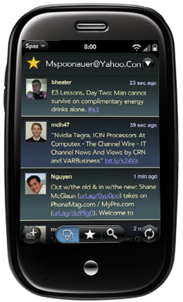
Click to enlargeOther apps that impressed us include Accuweather (which automatically recognizes your location), Fandango (which adds the time of the movie you just purchased tickets for to your calendar), and AP News (which lets you share stories via e-mail, SMS, and Twitter). It's just the sort of intelligence that will make the Pre stand out not only to users, but also to developers.
Twitter users can take their pick of two apps (for now): Tweed and Spaz. The former is less buggy, and automatically updates your location, but we liked the TweetDeck-like interface of Spaz (right), which lets you review replies quickly.
Shopping for apps is a cinch. You can view Featured and Popular by scrolling through choices from left to right on the App Catalog main page, search by name (up top), or browse by category, including Most Recent, Top Rated, Entertainment, Lifestyle, and more. The interface is as clean and friendly as the iPhone's App Store, and it's easier to navigate than BlackBerry App World, or the Android Market.
At the time of our review, the Catalog had only free apps. Palm will release more details about pricing and payment method(s) once the company announces the public SDK for the webOS.
Maps and GPS
Click to enlarge
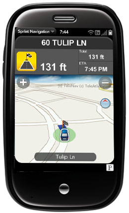
Sprint Navigation, powered by TeleNav, and included in the standard unlimited data plan, is a stellar GPS app. It acquired our position in central New Jersey almost immediately; we love the large turn signs, and easily legible distance-to-turn indicator. Amazingly, this app is even smart enough to temporarily lower music playback in Pandora to provide spoken turn-by-turn directions.
The preloaded Google Maps provides the same basic functionality found on other smart phones, such as directions, traffic, and local search. But, it lacks the Street View feature found on the iPhone and T-Mobile G1, as well as the Latitude feature that allows buddies to know your whereabouts. Another unique feature of the Pre finds points of interest when you type in a search term on the main screen, thanks to Universal Search.
Camera and Photos
The lack of video recording is a definite bummer, but there's a lot to like in the Pre's 3.2-MP camera. First, this smart phone shoots fast; we noticed barely any shutter delay. An outdoor shot of a friend at a park looked positively stunning on the Pre's display, richly saturated and sharp. Indoors, the Pre's flash acted relatively quickly without blowing out photos. Just don't count on taking action shots; we had to delete several photos that were blurry as a result of our subjects' movements.
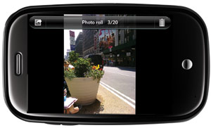
Click to enlargeOnce snapped, it's easy to assign your photos to a contact, or share them via e-mail or MMS. We especially like the ability to upload photos to Facebook or Photobucket, which we did over Wi-Fi in fewer than 10 seconds. Our only complaint was that the application took a few seconds--longer than theiPhone--to fully render each photo when you swipe from one to the next in the Photo Roll.
Music and Video
Apple's lawyers probably don't like it, but you will. The Palm Pre Media Sync technology fools iTunes into thinking this smart phone is just another iPod. On the other hand, you can't transfer DRM-protected content to your device (such as iTunes, TV shows, or movies), but you can easily move non-DRM music, photos, and videos to the Pre. We easily synced a Fall Out Boy album (complete with album art), and a few MPEG-4 videos; everything played flawlessly. Also, you can sideload content via USB, in which case, the Pre shows up as a storage drive on your PC or Mac.

Click to enlargeLooking to purchase some tunes? The Pre kicks the Sprint Music Store to the curb in favor of the Amazon.com MP3 store. Once you sign in with your account, you'll be able to buy albums or songs with a single click, but only over Wi-Fi. When we purchased Green Day's latest album, individual songs took anywhere from 30 to 45 seconds to download.
The Music Player is simple and attractive, presenting decent-size album art and touch-friendly playback controls. We also like that you can access these controls (and peek at the album art) at the bottom of the Pre's screen while you use other apps. Just press the music note icon in the bottom right corner of the screen.
Like most smart phones these days, the Pre ships with a YouTube app, although the selection is fairly limited. You can watch only the Popular and Most Viewed videos, and you can't search, for example. Videos automatically default to landscape mode, and playback of the Diversity dancers from Britain's Got Talent over EV-DO started within a few seconds. Playback was smooth and clear for the most part, even at full screen, although we did encounter a few buffering delays. We noticed more cut-outs when using Sprint TV, but playback was generally good.
Phone and Call Quality
Click to enlarge
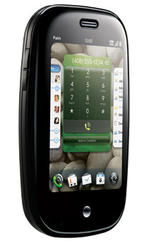
As far as Sprint phones go, the Pre's call quality is top-notch. During conversations, other callers said we sounded nearly as good as when we dialed from a landline. And we easily heard an answering machine message that we typically had trouble deciphering on a Verizon Wireless BlackBerry Curve 8330.
The phone app itself is refreshingly simple. While iPhone fans will lament the lack of a visual voicemail feature, we liked how easy it was to activate the speaker and conference in another another caller with a quick touch.
We were quite impressed with just how well the speaker on the Pre boomed; it's second only to the BlackBerry Bold, and we easily carried on conversations (and heard music) from across the room.
Battery Life and Charging
If the Pre has an Achilles Heel, it's the short battery life. For example, we took the device home at 6 p.m. on a full charge, and used it periodically until about 10:30 p.m. At that point, 40 percent of its battery life remained. By the morning, there was less than 15 percent juice, and the device conked out after 45 minutes of periodic data usage on our ride into work.
You'll need to recharge the Pre daily. In our experience, its endurance is less than what the iPhone 3G delivers; and
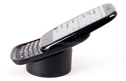
Click to enlargedevices such as the BlackBerry Curve can go two days without being plugged in.
The good news is that there are ways to improve battery life, especially when you're not using the Pre. These tips include changing the Sync settings in e-mail, so that the phone checks for new messages less often, and logging out of instant messaging.
If you like being able to charge wirelessly, pick up the optional $69.99 Touchstone charging dock, which recharges the phone using inductive technology. A special battery cover with a magnet, latches the phone to the dock, and automatically activates the speaker phone when a call comes in. Unfortunately, the Pre gets hot when charged this way. We measured temperatures as high as 120 degrees Fahrenheit.
Verdict
We've seen many smart phones come and go since the original iPhone, and the $199 Palm Pre is the first device we've tested whose user interface not only matches up well to Apple's offering, but also beats it in some areas. The Pre isn't just cool and fun to use; its highly integrated approach to calendars, contacts, and messaging, the way it elegantly multitasks, and makes apps and notifications accessible across the device change the game. Plus, Sprint's $69.99 plan includes unlimited data and text messaging, whereas AT&T charges extra for text messaging.
However much the Pre does for you without your lifting a finger, managing the number of open apps (so you don't hit the limit) can feel like work; and we wish the phone lasted longer between charges. Nevertheless, Palm and Sprint have a hit on their hands with the Pre, and the webOS is a smart phone platform to be reckoned with.
[flq:24bc7e0fb4064f09a18422b9ce80cba9]
Palm Pre Specs
| Bluetooth Type | Bluetooth Stereo |
| Brand | Palm |
| CPU | TI OMAP 3430 |
| Camera Resolution | 3 MP |
| Carrier | Sprint |
| Company Website | http://www.sprint.com |
| Data | EV-DO Rev. A |
| Display (main) | 3.1 inches (480 x 320) |
| Form Factor | Slider |
| GPS | Yes |
| Internal Memory | 8GB |
| Operating System | WebOS (Palm) |
| Size | 3.9 x 0.7 x 2.3 inches |
| Talk / Standby Time | Up to 5 hours/up to 12.5 days |
| Weight | 4.8 ounces |

