Laptop Mag Verdict
Microsoft's latest version of its productivity suite is better than ever, incorporating a number of powerful social-networking tools and a new subscription plan.
Pros
- +
Clean interface
- +
Enhanced sharing features
- +
Integrates with Facebook and LinkedIn
- +
SharePoints adds useful collaboration tools
Cons
- -
Separate screen to save and share documents is jarring
- -
Not as touch-friendly as we'd like
- -
Can't view others' edits in real-time
- -
Separate Desktop and Modern versions of same app
Why you can trust Laptop Mag
In the 22 years since it was launched, Microsoft Office, much like its parent company, has become synonymous with computing. But over the past few years, a number of free competitors, from OpenOffice to Google Docs, have challenged its hegemony, not only in terms of price, but social features as well. Office 365, Microsoft's answer to these competitors, not only has a number of new sharing features, but is offered as a yearly $99 subscription as well. Are these new changes enough to keep Office as the go-to productivity suite?
Interface
In general, Office has a cleaner, more spartan look than before. Instead of gray or blue menu bars, everything is white with gray text. We wish it were black, because we associate the gray color with an application that's running in the background. We had to click on the menu bar just to make sure we were in the active window.
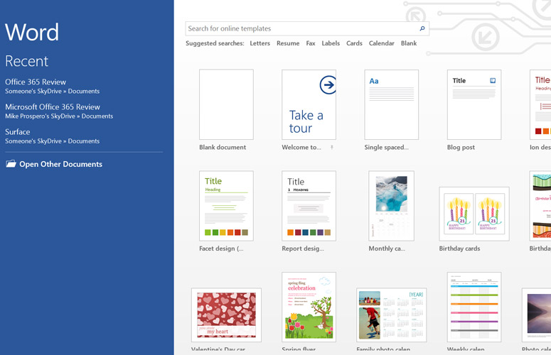
When you first open an app, you're presented with a page showing a number of templates ranging from a blog post to a calendar in Word, to family budgets and currency converters in Excel. Considering all the different ways these apps are used, these templates are helpful starting points for the uninitiated. Of course, you can also open a blank document.
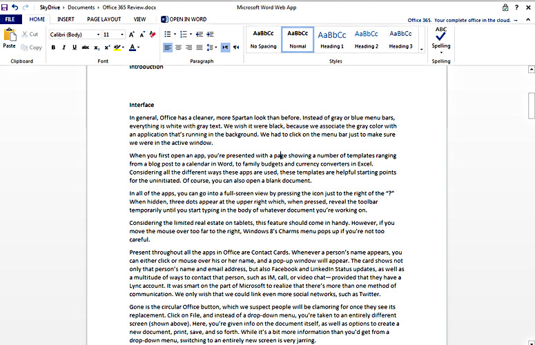
Click to EnlargeIn all of the apps, you can enter a full-screen view by pressing the icon just to the right of the "?" When hidden, three dots appear at the upper right which, when pressed, reveal the toolbar temporarily until you start typing in the body of whatever document you're working on.
Considering the limited real estate on tablets, this feature should come in handy. However, if you move the mouse over too far to the right, Windows 8's Charms menu pops up if you're not too careful.
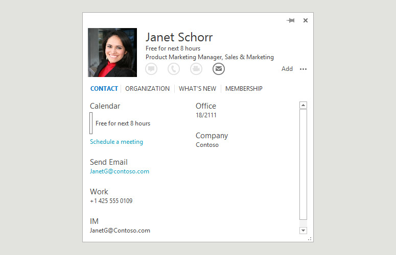
Click to EnlargePresent throughout all the apps in Office are Contact Cards. Whenever a person's name appears, you can either click or mouse over the contact, and a pop-up window will appear. The card shows not only that person's name and email address, but also Facebook and LinkedIn Status updates, as well as a multitude of ways to contact that person, such as IM, call or video chat--provided that they have a Lync account. It was smart of Microsoft to realize that there's more than one method of communication. We only wish that we could link even more social networks, such as Twitter.
Sign up to receive The Snapshot, a free special dispatch from Laptop Mag, in your inbox.
Gone is the circular Office button, which we suspect people will be clamoring for once they see its replacement. Click on File, and instead of a drop-down menu, you're taken to an entirely different screen. Here, you're given info on the document itself, as well as options to create a new document, print, save and so forth. While it's a bit more information than you'd get from a drop-down menu, switching to an entirely new screen is jarring.
By default, documents are saved to SkyDrive, so you can access them anywhere, but even saving a document is a little counterintuitive. Instead of a pop-up window, you first have to choose where you want the file to be saved, either on SkyDrive or locally.
Throughout Office, you'll see a smiley face icon, usually in the upper right-hand corner. Click this and you can send feedback to Microsoft on a particular feature or bug.
One subtle change from previous versions of Office is the way the cursor moves while you're typing. Now, it sort of glides from one letter to the next, instead of the more staccato movement of Office 2010. A similar sort of animation occurs when selecting text, too.
Touch features
One of the central tenets of Windows 8 is that it merges a traditional desktop environment with one that's more touch-friendly. To that end, Office 365 boasts some features designed to appeal to tablet users, though we're not about to ditch our keyboard and mouse just yet.
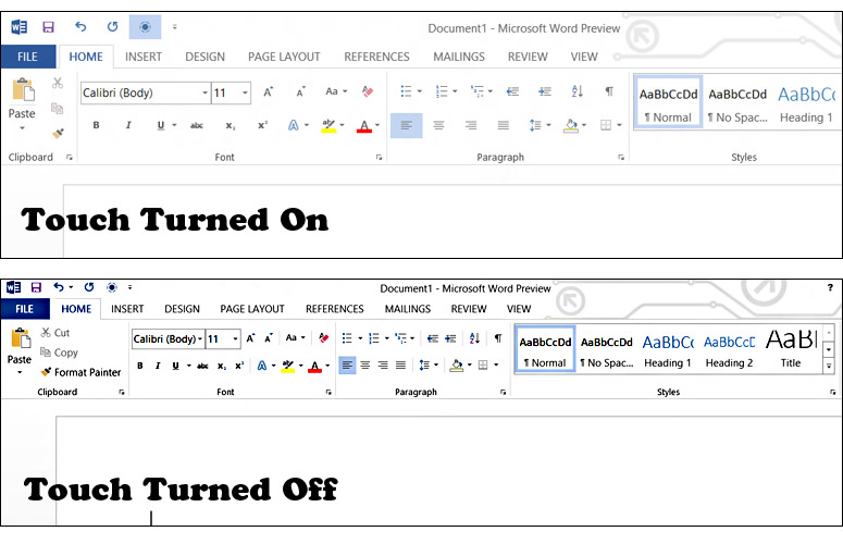
Click to EnlargeActivating the touch mode (a small blue circle icon at the top of the screen) makes icons and menu items slightly larger, so that it was somewhat easier for us to select things from the ribbon. It's such a mild difference in size that it feels like lip service. Even in touch mode, it was still difficult to resize windows using just a finger.
If you touch on a word in Word, a small circle appears just below it; press and hold the circle, and you can select a block of text, which you can then edit or re-format. All in all, we didn't mis-touch anything, but the resolution on the tablet we were using was 1366 x 768. On the Microsoft Surface Pro, which has a screen resolution of 1920 x 1080, this sort of maneuvering was more difficult.
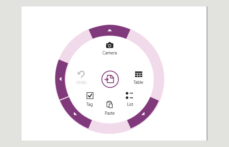
Click to EnlargeOneNote has a feature called Radial menus. These circular menus-which are somewhat reminiscent of Acer's Ring Interface-appear to let you adjust settings using just your thumb. However, Radial menus only appear in the Modern version of OneNote, not the desktop version. We hope that Microsoft fixes this inconsistency and implements this feature into the other Office apps as well.
We were worried that using our finger on a right-hand scroll bar would accidentally open the Charms menu, but fortunately, that didn't happen once while we were using Office. However, when using Read Mode in Word, our natural inclination to swipe from the right-hand bezel did launch the Charms menu instead of advancing the page.
When using a mouse, moving the cursor to the upper right or upper left corner of the screen to close windows would sometimes result in us opening the Windows 8 menus, which was also slightly annoying.
Cleverly, an "Ink Tools" Pen tab appears in the top menu bar of any app when you hover an active stylus over a Windows 8 touch-screen display. This lets you select the color, style and thickness of the stylus, as well as other options.
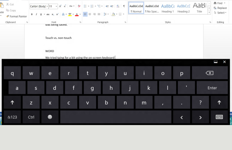
Click to EnlargeThe Windows 8 on-screen keyboard on the Microsoft Surface Pro is plenty large. Just like any on-screen keyboard, it's fine for banging out quick memos or emails, but you'll want a physical keyboard for anything longer.
SkyDrive lets you view documents and create or edit them. By default, Office opens the Web-based version of the apps, but you can choose to use the desktop version. In some respects, we prefer the Web version, if only for the fact that clicking File merely opens a drop-down menu, and doesn't bring you to an entirely new page.
Those who purchase the buisness version of Office 365 will also get access to SharePoint, which offers several other options, including People, Newsfeed and Sites.
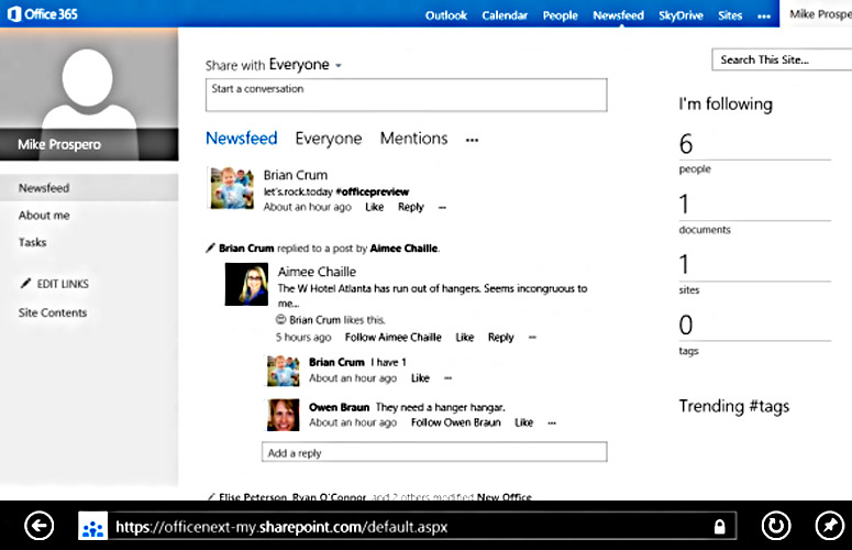
Click to EnlargeNewsfeed feels a little like Microsoft's mashup of Facebook and Twitter. In the center of the screen is a feed of the people, documents and sites you're following. Here, you can also make comments, and Like and post replies. It's laid out very cleanly, and when you click on a person's name, their Contact Card appears, as with the other apps in Office. To the right of the news feed is a column showing how many people, documents, sites and tags you're following. It's a nice quick summary, but the font used for the numbers is so thin, these items can be hard to select with a mouse.
Teams collaborating on a particular document or project can create a Site, where they can gather all the pertinent documents in one place. We especially like that, when you mouse over an image, a gray translucent box appears showing the size and resolution of the image. Three small dots at the bottom of the box opens a pop-up window with an extended description as well as a URL for the image and options to Share or Download it. You can also receive alerts when a particular document is modified.
SkyDrive and Shared Documents
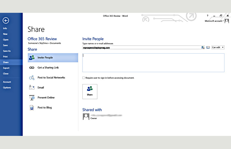
Click to EnlargeAll documents by default are stored in SkyDrive, Microsoft's answer to Google Docs. However, it operates a bit differently. When you open the SkyDrive app, it shows you the files you have stored in the cloud, divided into three categories: Documents, Pictures and Public. Like the rest of Office, the desktop app is very spartan, especially if you only have a few documents. Right-clicking a document lets you share it via email. If you open the document in its native desktop app, you get more sharing options, such as posting to a social network, IM, or as a blog post.
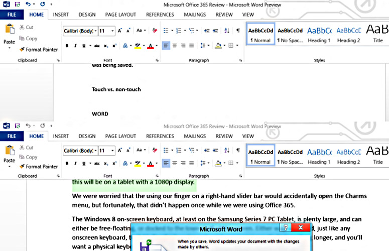
Click to EnlargeIf you have Office installed locally, you can edit documents using native apps such as Word or Excel. However, if you're away from your home computer, you can also use Web apps, which provide much of the same functionality as the desktop versions. While you will get a small warning when you first open a document that others are editing it, it won't show their edits in real-time; they must save first. And, in order to see others' changes, you must save your version, as well. We much prefer the real-time editing process in Google Docs. Edits made by others show up as highlighted text until you start typing, at which point the highlighting disappears.
Even if someone doesn't have Office, you can still share documents in SkyDrive by sending them a link via email. Doing this opens a page in their Web browser, from which they can follow along. Now, you no longer need a Microsoft account to view or edit those files. In order to do so, though, you can't simply invite people, a la Google Docs. You must use the "Get a Sharing Link" and send it to those whom you want to access the file.
Remote Access
One of the neat tricks offered by Office 365 is the ability to stream any of its apps to a remote PC running Windows 7 or Windows 8. After signing into Office 365 through a Web browser, at the bottom of the page, under "Office On Demand" are links to the various Office apps. Simply click one app, and after a plugin automatically installs on the notebook, that app will open with all the options and features available to the full desktop version.
Oddly, once we were in Word, we had to re-sign into SkyDrive to access our documents. It seems redundant, since we had to sign into our Office account to get Word to stream to the computer in the first place.
Still, for those who have notebooks with limited space or small SSDs-or are using someone else's computer-this is a very clever feature that takes remote access a whole step further.
Word 2013
Click to EnlargeAside from the look, no major changes have been made to Word, but some welcome tweaks improve its overall use. Read mode will especially appeal to tablet users who are interested in reading, rather than editing, a document. This setting presents documents in a full-screen view, with a minimized toolbar at the top, and two arrow keys on either side to move forward or back through a document. Don't try swiping from the right side, though, on a Windows 8 tablet, or you'll activate the Charms menu.
A Tools drop-down menu lets you search through documents quickly, as well as perform a Bing search.
Click to EnlargeWe especially like the Comments tool, which lets you leave notes in the margins for others to read, and comment themselves. When you create a comment, it shows up as a small dialogue box in the right margin, and the section of text you're commenting on is highlighted. Click on the box, and you can read the full comment, or answer it as a threaded conversation. We like that you can communicate with the person who left a comment in a variety of ways, such as emailing, calling or video chat, provided that info is in their contact card.
Microsoft also made it much easier to insert photos and multimedia into Word, even going so far as to include options for adding online sources. Sadly, while you can insert video from YouTube and images from Flickr, you can't pull in multimedia from Facebook, a curious oversight given its integration in many other facets of Office.
Once added to a document, dragging multimedia elements around re-flows text in real-time, making it much easier to see what the final product will look like. Even better, you can play the videos, too, although you can't edit the document while the video is playing.
Outlook 2013
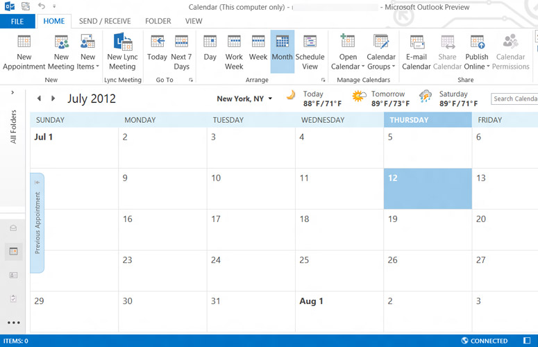
Click to EnlargeWe especially like Outlook's streamlined interface. By default, the left third of the screen shows the header and subject line of your emails, and to the right, the full text of the email selected. Along the left edge is a minimized folder view, and icons for Mail, Calendar, People and Tasks.
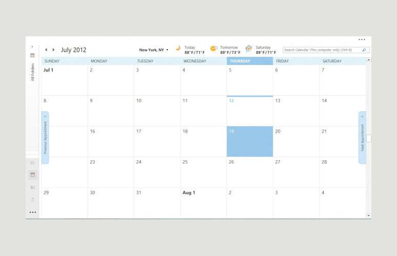
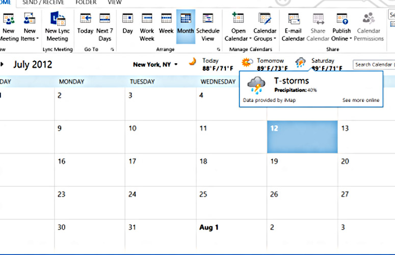
Mousing over Calendar launches a small window showing the month, with the current day highlighted, and a summary of any events scheduled for that day. It's very easy to customize the view to your liking, too. A nice addition in the calendar is the local weather for the next three days. Mousing over the day's forecast provides greater detail, and a link to view even more info online.
Another perk is that you can now sync several email accounts to Outlook, so you don't have to go back and forth from Google to check your personal and work email.
Click to EnlargeYou can also link Outlook to other social networks, such as Facebook and LinkedIn, so that contacts' information from those networks--including their profile photo- appears below the email. It's a neat way to see updates at a glance, and will presumably keep workers from going to Facebook constantly on their Web browsers. However, you can only see friends' updates, not comment on them. And clicking on a name will open up the Facebook Web page, where, annoyingly, you have to sign in again. Hopefully, Twitter will be integrated soon.
Right above the pane showing email headers is a small search box. When we searched for the word "marathon," Office 365 quickly brought up all the emails with that word in it, and highlighted the term in each.
One of the greatest annoyances is having to re-send an email if you forgot to include an attachment the first time. A new feature, called MailTips, alerts you to goofs such as this, as well as if you're emailing someone who's out of the office or outside your organization. Sure enough, when we tried to send an email that, to Outlook, should have had an attachment--we wrote "see attached" in the body of the email--a warning message appeared on screen.
Excel 2013
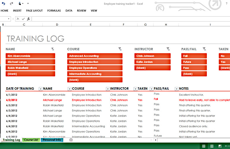
Click to EnlargeMicrosoft's venerable spreadsheet app gains a few new tricks designed to tease out greater insights from your mounds of data, and save you time in the process.
Flash Fill makes the job of entering data much less tedious, as Excel learns your input patterns and automatically fills out the text boxes with the correct info.
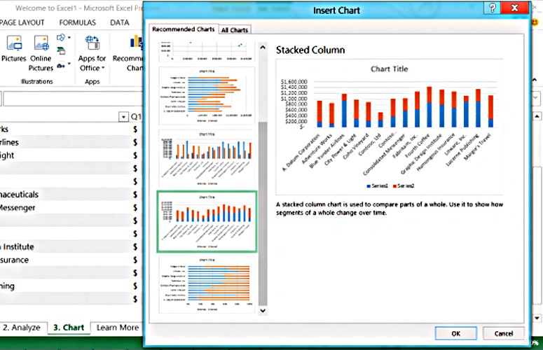
Click to EnlargeWhen you select data from a table, the Quick Analysis icon appears on the lower right; press the icon, and you can automatically create any number of charts or illustrate your data sets. It's much faster than going up to the Insert menu and selecting a chart there. However, even here, Microsoft has added another timesaver: Select Recommended Charts, and Excel will show you several chart types it thinks will best represent your data.
With Office Professional Plus comes other built-in efficiencies, including Spreadsheet Inquire & Compare, which scans spreadsheets for errors, broken links and the like; and Quick Trend, which can show trends based on historical data.
Regardless of which version of Excel you use, you'll want to keep the keyboard handy. When we clicked on a cell with the stylus, nothing happened. The on-screen keyboard didn't appear, or even a box to write something using the stylus. By comparison, in Word, whenever we touched the screen with our finger or the stylus, the on-screen keyboard would appear. This inconsistency between apps proved frustrating.
One nice collaboration feature in Excel lets you share a workbook via a Lync conversation or meeting, even letting others take control of the workbook to make edits.
PowerPoint 2013
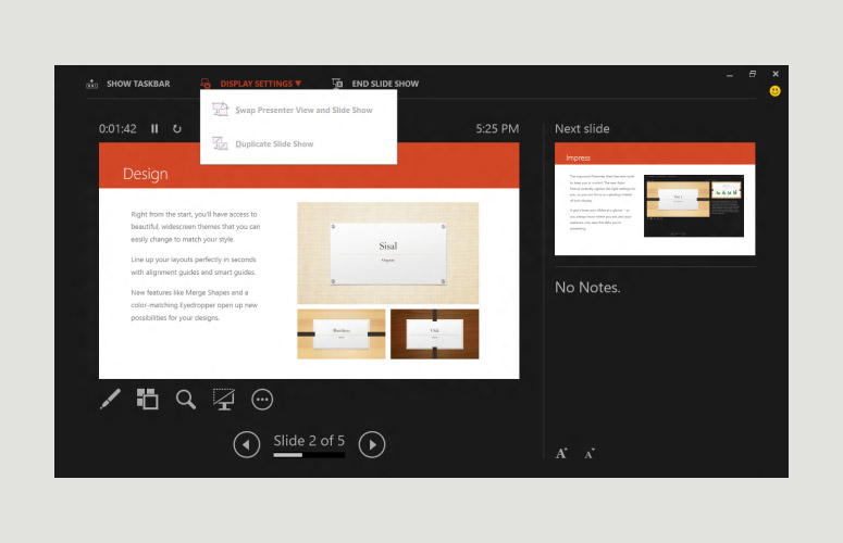
Click to EnlargeLike Word, this ubiquitous presentation tool has some new features that make it easier to create multimedia-rich documents, and show them in a more dynamic format.
You can add photos and video from online sources such as YouTube and photos from Flickr, or from the Internet in general via a Bing search. Also, like Word, you can create threaded comments among collaborators, and respond either in the presentation itself, or via email, IM, etc.
In the Presenter View, you can see all of your slides to one side, while the audience sees just the one slide you're showing. This makes it a lot easier to skip ahead, or jump back to an earlier slide without having to scroll through all of them.
We also like that you can give your presentations the Rick Burns' treatment by zooming in on a particular item in any slide. You can swipe forward and back by dragging your finger across the screen. Here again, though, you have to watch for the bezel if you're using a tablet or notebook with a touch screen, lest you activate the Windows 8 menus.
OneNote 2013
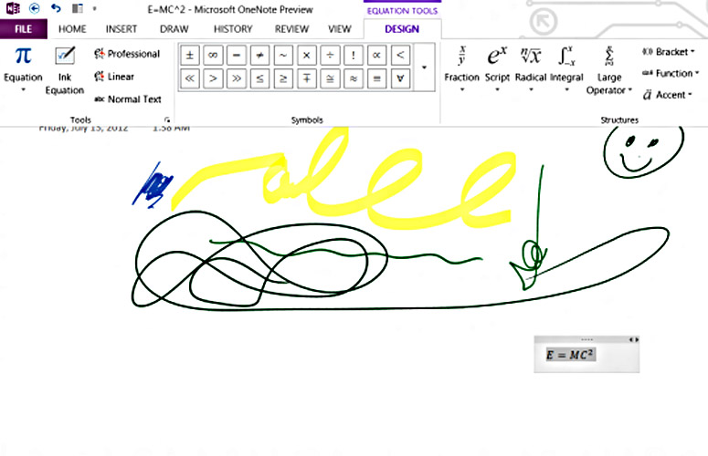
Click to EnlargeOneNote seems to be the most touch-friendly of all the Office apps, in that it's designed to be used primarily with your finger or stylus. Still, it's a work in progress. OneNote is good for jotting down notes (natch) or for exploring your more creative side, by letting you draw and sketch.
When we clicked on the Plus sign to add a new tab, the app gave us the option to change the tab's name. Annoyingly, if you click on the text ("New Section") with the stylus, it becomes highlighted, waiting for you to change it, but the on-screen keyboard doesn't pop up.
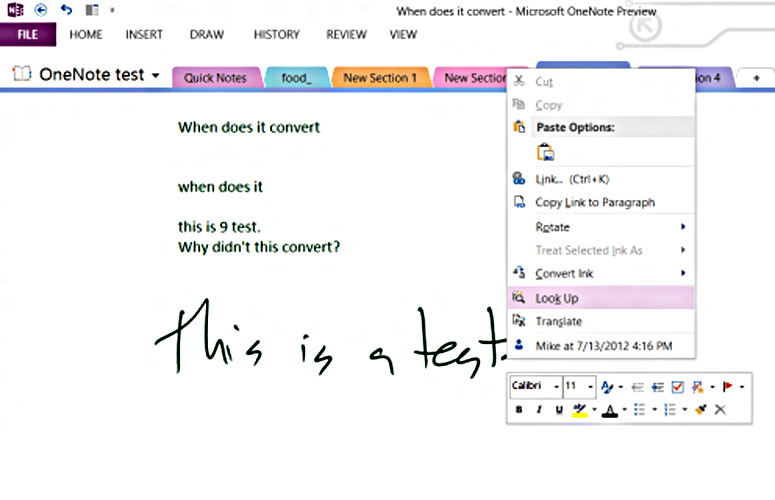
Click to EnlargeOneNote was good at translating our chicken scratch into text, which appeared in a column along the right-hand side of the page. However, it didn't automatically convert all of our writing. Sometimes it would, and sometimes it wouldn't. If we pressed and held the button on the stylus while pressing it against the screen, a contextual menu popped up, giving us the option to convert Ink to text, but we wish the automatic conversion was more consistent.
When we clicked Draw at the top, the Ribbon appeared to let us choose different brush sizes and colors, among other things. As soon as we starting drawing, though, it would disappear. We wish the Ribbon would remain on-screen until we deselected it.
As with Word, the new OneNote lets you insert pictures and record video and audio (useful if you're in a presentation), but there's no mechanism for inserting a video from another source. The video recording we made showed up as a black-and-white icon, a bit of a letdown considering the much richer multimedia integration in Word.
The potential for sharing these documents is even greater, considering that there are OneNote apps for Android, iOS and Windows Phone devices.
Publisher
Somewhere between Word and Adobe InDesign is Microsoft Publisher, which lets you create everything from leaflets to calendars. As with the other Office apps, you can start from a template or a blank document, import pictures directly from Facebook or Flickr, and edit them using effects filters.
In addition to the sharing features, you can also save your projects as PDFs or other photo formats, which can make printing easier.
Versions
Office 365 is offered as a subscription service and takes the most advantage of the cloud. In addition to the full-fledged desktop versions of Office apps (Word, PowerPoint, Excel, Outlook, OneNote, Access and Publisher), users' preferences-such as Ribbon configuration, settings and the like-follow them from computer to computer. With this version, users can also stream Office to another Windows 7 or Windows 8 machine. Additionally, it will automatically be updated with any improvements Microsoft rolls out.
Microsoft offers five different subscription plans for Office 365:
Home Premium costs $99 per year, and comes with five licenses, which is good for Macs and PCs, and gets an additional 20GB of SkyDrive storage (for a total of 27GB).
A University version for students and teachers will cost $79.99 for two licences for four years.
Small Business Premium costs $149 per year, and also includes 10 licenses, InfoPath and Lync, shared calendars, a 25GB mailbox with virus and spam protection, 10GB of cloud storage plus 500GB for each user.
ProPlus Preview lets you create up to 25 accounts.
Enterprise Preview offers all the benefits of ProPlus, and adds Exchange, SharePoint and Lync Online services. For businesses, Office Servers will offer Exchange, SharePoint, Project and Lync hosting either in the cloud on-site, or a combination of both.
If you let your subscription lapse, Office will enter a "reduced functionality" mode, which will let you view and print documents, but not edit them.
Non-subscription versions are also available: Office 2013 Home and Student will cost $139, and come with Excel, OneNote, PowerPoint and Word; Home and Office costs $219, and includes Outlook; and Professional costs $399 and adds in Access and Publisher.
Microsoft also makes a version of Office for Windows RT, which includes Word, Excel, PowerPoint and OneNote.
Office Home & Student 2013 RT includes Word, Excel, PowerPoint and OneNote.
However, certain features are unavailable, including macros, add-ins and custom third-party apps.
Also, since RT tablets do not support Outlook, the following email features are not available: send as..(attachment) is not available in Office Backstage, Word mail merge, email links to share slides in PowerPoint, OneNote email share options, and email-related buttons in the ribbon.
Other differences between the Windows 8 and the RT versions of Office can be found here. http://office.microsoft.com/en-us/home-and-student/office-home-student-rt-FX103790095.aspx?CTT=1
Verdict
Click to EnlargeThe fact that work is becoming increasingly social has not been lost on Microsoft. It's not just the small stuff-such as the integration of Facebook and LinkedIn-but the way it has designed collaboration tools with SharePoints and Sites that points to the way teams will work together in the future.
However, Office is not quite ready for a tablet-only environment. With the exception of OneNote's radial menus, the "touch-friendly" icons in the various apps can be hard to target with your finger, especially on screens with a high resolution.
The tools people use for work now extend well beyond word processors and spreadsheet apps. They now include videoconferencing, social networking and real-time collaboration. The new Office is the toolbox that brings them all together in one place. Aside from the enhanced editing tools, teams will find it even easier to accommodate individual members' schedules and work habits, which is perhaps the greatest aspect of Office 365.
Microsoft Office 365 Specs
| Company Website | http://www.microsoft.com |
| Platforms | Windows |
| Software Required OS: | Windows 8 |
| Software Type | Productivity Software |
Michael was the Reviews Editor at Laptop Mag. During his tenure at Laptop Mag, Michael reviewed some of the best laptops at the time, including notebooks from brands like Acer, Apple, Dell, Lenovo, and Asus. He wrote in-depth, hands-on guides about laptops that defined the world of tech, but he also stepped outside of the laptop world to talk about phones and wearables. He is now the U.S. Editor-in-Chief at our sister site Tom's Guide, where he oversees all evergreen content and the Homes, Smart Home, and Fitness/Wearables categories for the site..
